Being a pastor myself, Church websites have always held a special place in my heart. If you think about it, they need a wide range of features. They need practically every type of media including downloads and live streaming, events, donation boxes, membership areas, contact forms, location information, and lots more. In this article, we’ll take a look at 17 Examples of Church Sites Using Divi.
A note about choosing the websites – I ignored denominations when choosing these websites, so no particular denomination or group is given preferential treatment. If one is more prominent it is because more of them use Divi or have better designs. I did not include my own because these articles are not about self-promotion and mine’s just not a good example… yet. After being inspired by these websites it soon will be.
In this article I’m pointing out a few things about each website that stands out to me. The sites are in no particular order.
- 1 1. StoneBridge Marietta
- 2 2. Tabernacle Family
- 3 3. Exodus Church
- 4 4. Gateway Community Church
- 5 5. Grace United Methodist Church
- 6 6. Hope Singapore
- 7 7. Christ Place.Church
- 8 8. Lakepointe
- 9 9. Sevier Heights
- 10 10. Thalia United Methodist
- 11 11. FUMC Arkadelphia
- 12 12. Two Cities Church
- 13 13. First Church
- 14 14. Eastridge Church
- 15 15. Bethel Tabernacle
- 16 16. Lighthouse Sheringham
- 17 17. CityHill
- 18 Final Thoughts
1. StoneBridge Marietta
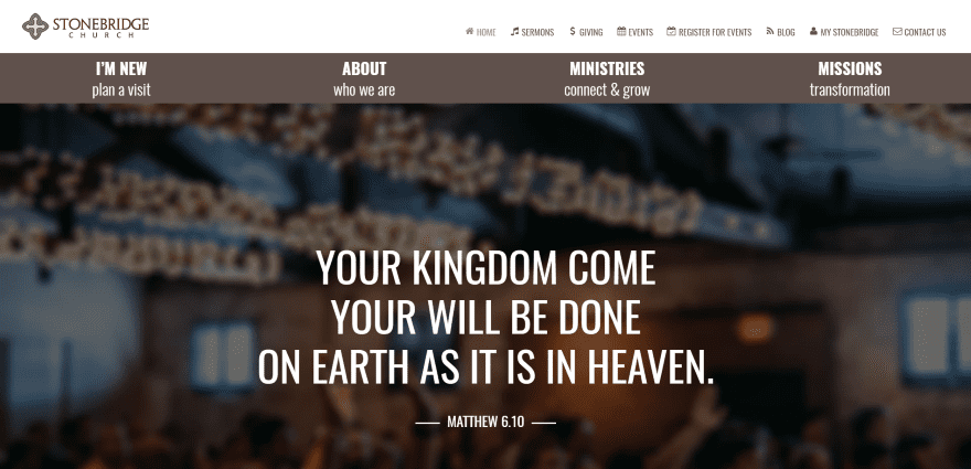
StoneBridge Marietta displays a full screen image and includes a unique full width menu under the primary menu. The events calendar is powered by EventOn and visitors can register for events. Donations are powered by Gravity Forms. Sermons are provided through blog posts and include audio and PDF downloads. Service times are displayed on the I’m New page. The site has lots of information and has several ministry pages, uses a clean layout, has a non-scrolling map, and makes great use of images, color, and text.
2. Tabernacle Family
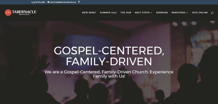
Tabernacle Family displays a full screen image and includes embedded video sermons with a menu structure that divides them by series, speaker, book, or topic. An events page lists the events in chronological order with a registration form that takes you offsite. The Hub page provides the schedule on a single page. Service times are provided on the New Here? Page. The site uses an alternating image layout with a non-scrolling map and makes great use of images.
3. Exodus Church
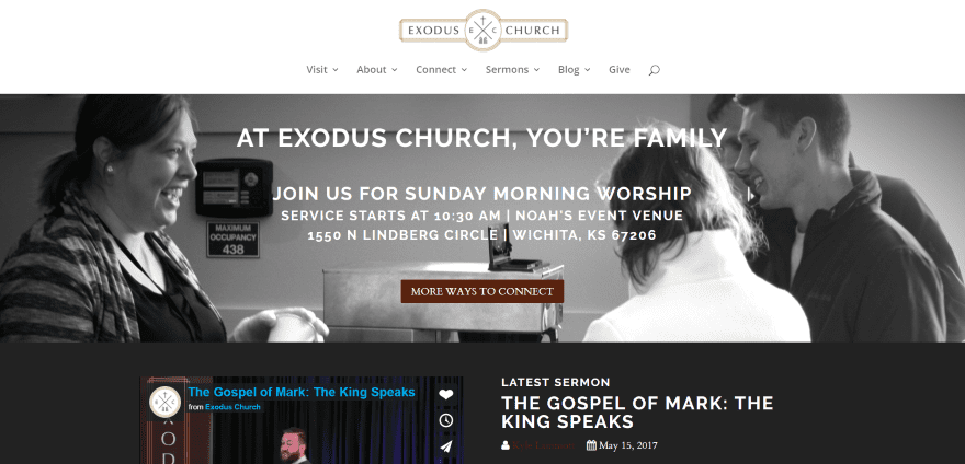
Exodus Church uses a simple but clean layout that displays a full width image, service times, and events using CTA’s. Each CTA takes you to a page for that event where you can register via Facebook. Events can be viewed by month, category, or on a calendar. Sermons are provided as embedded video, audio, and as audio downloads. They can be sorted by series, speaker, and book. Giving takes you offsite to Tithe.ly. The site makes good use of branded color.
4. Gateway Community Church
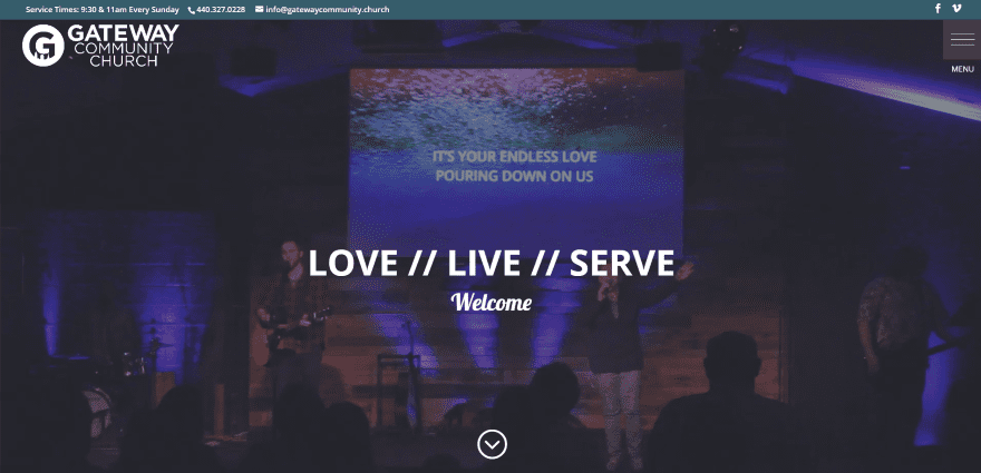
Gateway Community Church uses a full screen video and a right-side collapsible vertical menu. The layout includes an embedded event calendar with popups powered by EventOn. Giving takes you offsite to Easy Tithe. Ministry pages include toggles for schedules. The Messages page includes a series archive where you can listen to embedded audio. The non-scrolling map includes service times. The site makes great use of color, images, and fonts.
5. Grace United Methodist Church
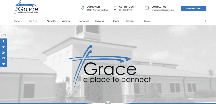
Grace United Methodist Church has an elegant layout that’s similar to a magazine design with links to all of the relevant pages. It includes a full screen image, section separations, and hover animations. The top menu includes contact info and a giving CTA that’s powered by eServicePayments. Newsletters are provided as PDF downloads. Sermons are provided as embedded video. Events are displayed using All in One Event Calendar. The site makes great use of color and images.
6. Hope Singapore
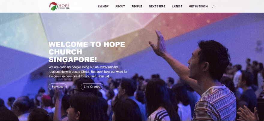
Hope Singapore uses a clean layout with a full screen image and lots of CTA’s. Sermons are provided using a unique sorting menu to allow you to search by series, speakers, and topics and includes video, audio, and a film. Events are displayed within a calendar powered by Google Events Calendar. The Stories page provides information about the members as text or video. The sites makes excellent use of color and fonts.
7. Christ Place.Church
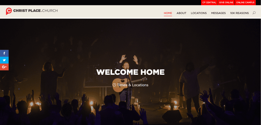
Christ Place.Church displays a full screen image with CTA’s in the top menu. The layout includes video, alternating images in parallax, and location information. Messages are sorted by speaker, holiday, series, and stand alone and are provided as video and audio. Giving is handled by an embedded form within Bootstrap. Each of the locations have their own site built with Divi using elegant layouts and color.
8. Lakepointe
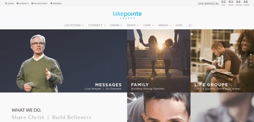
Lakepointe includes a grid layout with links to the various pages. The top menu includes a live service countdown while the primary menu uses the mega menu design. Events are displayed as links to pages, which include detailed layouts and schedules. The site includes a link to the Church’s app for both iOS and Android. The store is powered by WooCommerce. Messages are provided as embedded video. Giving is handled through an embedded Web Form. The site makes great use of layout design.
9. Sevier Heights
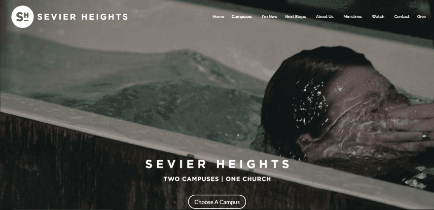
Sevier Heights displays a full screen video with links to the two campuses. Services are provided as embedded videos that can be sorted by series, speakers, and topics powered by Series Engine. The online store is powered by WooCommerce. The Missions page displays mission opportunities in a list format by month. The campus pages includes service times. The site uses an elegant layout and makes great use of color.
10. Thalia United Methodist
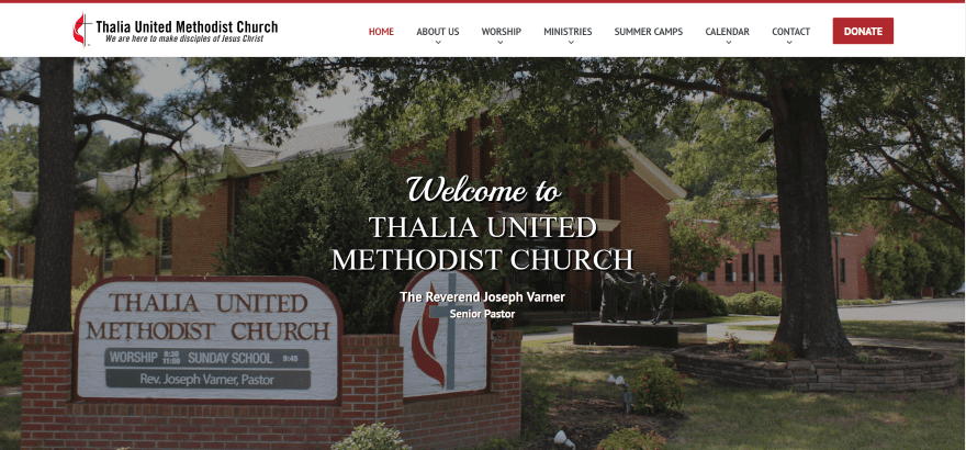
Thalia United Methodist includes a full screen image and an elegant layout with events and announcements using bold colors. The menu includes a donate CTA powered by eServicePayments. Sermons are provided in audio and video, and are sortable by series, pastors, and verses. Events are displayed using Events Calendar Pro. Prayer requests can be submitted through a contact form. The site makes great use of bold color.
11. FUMC Arkadelphia
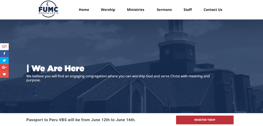
FUMC Arkadelphia uses a full screen image with parallax that moves in the opposite direction. A Vacation Bible School CTA remains on screen which takes you to a page with signup form. It uses interesting hover animations, making images overlap each other. Worship times are displayed with images or video from services from those times. Sermons are provided as blog posts with embedded video and sermon notes. The site makes good use of images and color.
12. Two Cities Church
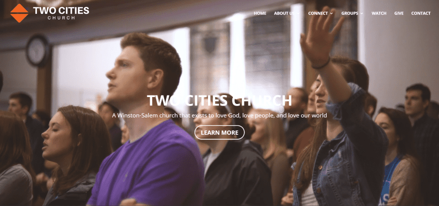
Two Cities Church displays a full screen video with CTA followed by service times and a non-auto-scrolling map. Sermons are provided as embedded video that’s sortable by series, speakers, and topics. Giving is handled through an embedded form. FAQ’s about groups are provided within toggles. Events are displayed on pages and link to offsite signup forms. The site uses an elegant layout and makes great use of color.
13. First Church
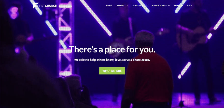
First Church uses a full screen video with a screen-door effect. You can listen to music using the embedded Spotify player. Watch sermons with the embedded video that’s sortable by series, speaker, and topic. The Creative Arts page includes job information with links to sign up for auditions. Online giving is powered by qGive. The site makes good use of branded color.
14. Eastridge Church
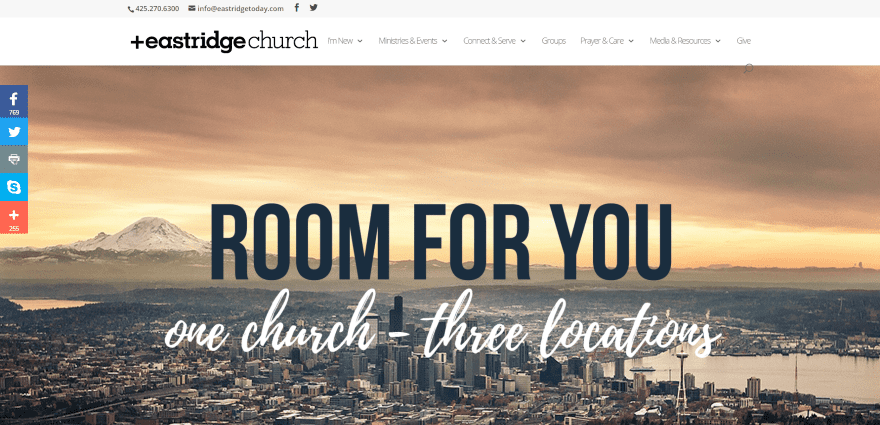
Eastridge Church includes a full screen image with CTA. Prayer requests are accepted through a contact form. Sermons link offsite. Events are displayed using the Tribe Events Calendar and are searchable. Online giving is handled by PushPay. The Conferences pages include information about guest speakers using images and toggles. Links to the various sites include service times. The site uses an elegant layout and includes a link to get the Church’s app.
15. Bethel Tabernacle
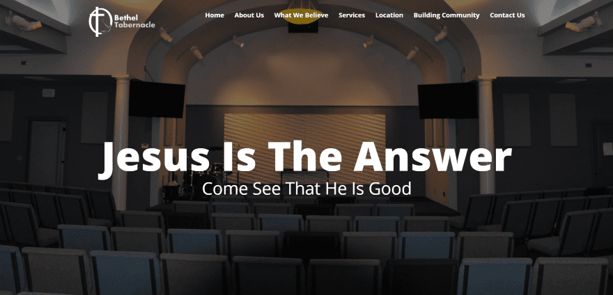
Bethel Tabernacle has a one-page design that uses a full screen image followed by a contact section with service and location information. Their beliefs are displayed using toggles. The full width map is in monochrome and doesn’t auto-scroll. The site keeps the information simple, making it easy to navigate and keeping the layout clean. It includes section separators, elegant colors, and matching fonts.
16. Lighthouse Sheringham
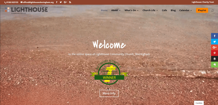
Lighthouse Sheringham displays a full screen video with an animated CTA in the menu on scroll. It includes a 360 degree (VR compatible) virtual tour of the location powered by You Visit. The Playlist page displays embedded video. The Café page includes a downloadable food menu in PDF. Prayer requests are taken through a contact form. Events are displayed as images in a poster wall and are downloadable as PDF’s. Upcoming events are displayed using All in One Event Calendar. The site uses branded color.
17. CityHill
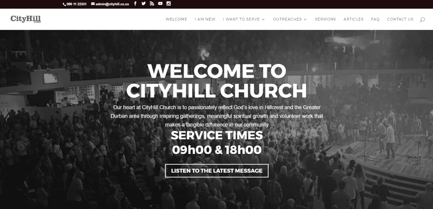
CityHill uses a full screen image with their service times displayed in an overlay in parallax. Quick links use large icons. Sermon video, audio, and downloadable notes are embedded within blog posts. Mission CTA’s use offsite forms. The site has a clean layout and makes good use of large header fonts.
Final Thoughts
These 17 Church websites using Divi are great for getting inspiration and for seeing how they use images, video, audio, event calendars, online giving systems, display service times, embed sermons, and lots more. There’s bound to be something here to inspire your next Church website design using Divi. I have to go work on mine now.
We’d like to hear from you. What are your favorite elements of these Church websites built with Divi?
Featured Image via Rvector / shutterstock.com


Looking at the Lakepointe site, how was the grid menu achieved in Divi?
Loved doing Gateway Communty Church’s site! Thanks for including our small little church. 🙂
Beiing a member of one of the biggest churches in Holland i find this a great read.
This is awesome! I’m inspired to do more church layout for my website. 🙂
Great inspiration for me. I’m about to redesign my church’s website.
Thank you for this post! I work with several churches and it is so hard to find good church layouts. Great inspiration!
This is a great article. Since I’ve got a lot of connections in the church world I’ve had to do multiple church websites and get requests pretty commonly. This will be great for future inspiration, thank you!
Agreed, Jacob. [Bookmarked] 😉