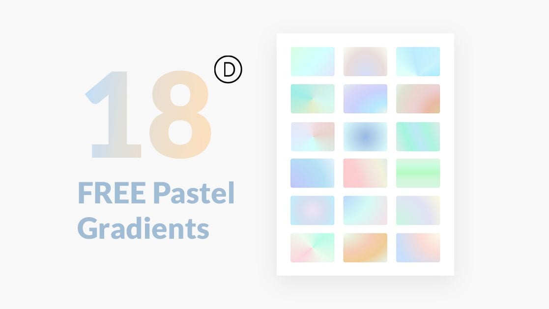
Adding a gradient to your website is a great way to integrate color and add an interesting background to your page. Pastel gradients look especially stunning in web design since they use lighter colors to create subtle blends, enhancing the page without being too overpowering. With Divi’s new gradient builder, designing a beautiful gradient is easier than ever. With powerful functionality and extensive customization options, you can create unique, custom designs and add them to any element. In this post, you can get your hands on 18 FREE pastel gradients built with Divi’s gradient builder. Additionally, we’ll show you how to implement these gradients into your website with some step-by-step instructions.
Let’s get started!
Subscribe To Our Youtube Channel
Sneak Peek
Here is a preview of the free gradients.
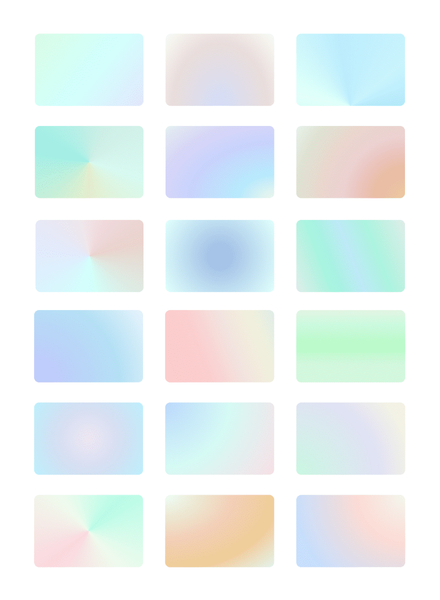
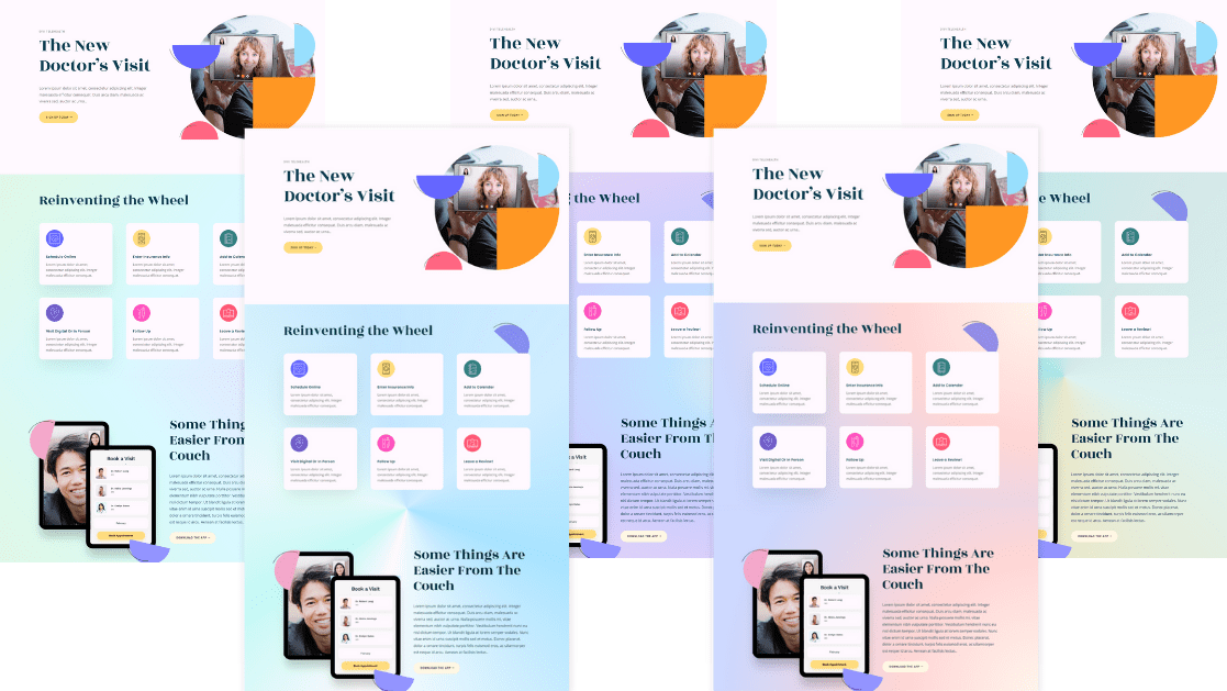
Download The 18 FREE Pastel Gradients
To lay your hands on the free pastel gradients, you will first need to download them using the button below. To gain access to the download you will need to subscribe to our newsletter by using the form below. As a new subscriber, you will receive even more Divi goodness and a free Divi Layout pack every Monday! If you’re already on the list, simply enter your email address below and click download. You will not be “resubscribed” or receive extra emails.
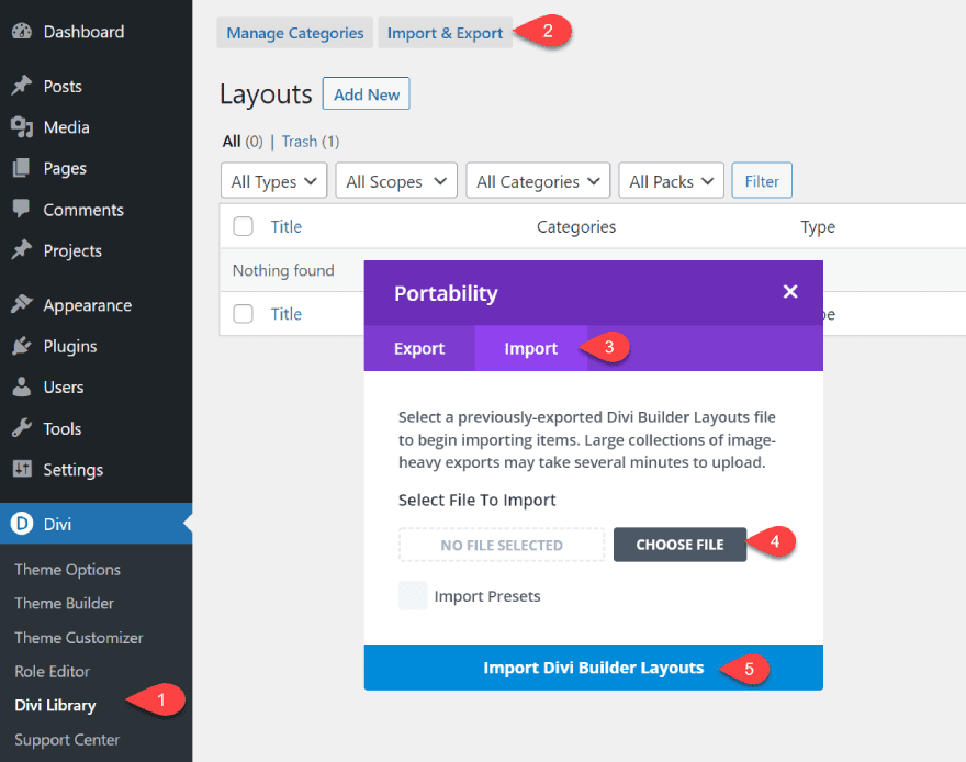
You can import this layout to your website by navigating to the Divi Library. Click the Import & Export button at the top, then select the import tab. Select the file you downloaded, then click import. The layout will now be available in your Divi Library.
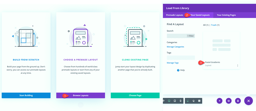
You can add the layout to your page by choosing a premade layout and using the layout from the “Your Saved Layouts” tab.
How to Add Pastel Gradients to your Design
Create a New Page
Let’s start by using a premade layout from the Divi library. For this design, we will use the Telehealth Landing Page from the Telehealth Layout Pack to show off our gradients.
Add a new page to your website and give it a title, then select the option to Use Divi Builder.
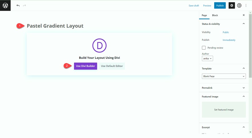
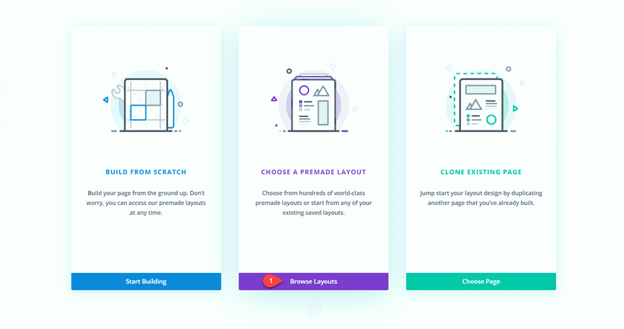
We will use a premade layout from the Divi library for this example, so select Browse Layouts.
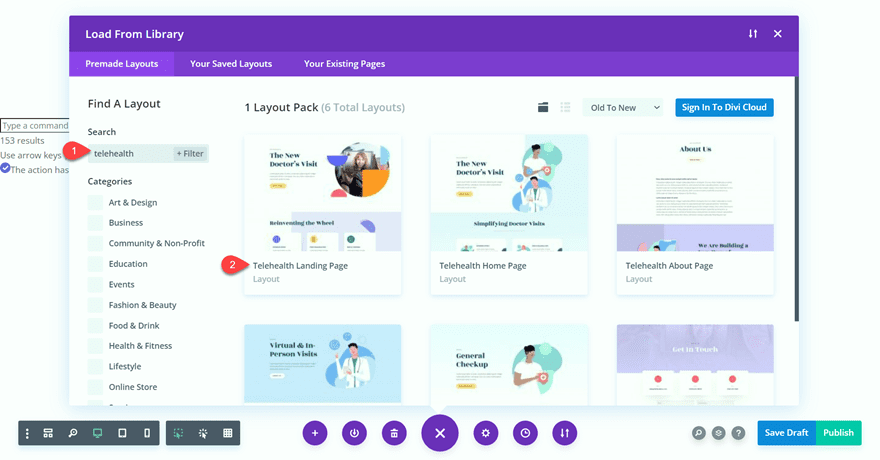
Search for and select the Telehealth Landing Page layout.
Select Use This Layout to add the layout to your page.
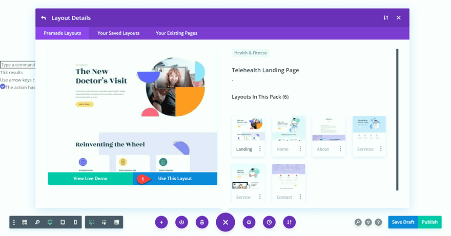
Now we are ready to build our design.
Adding the Pastel Gradients
If you are following along with the tutorial, open the layout pack for this tutorial in another tab for easy access to the premade gradients. We will be copying the background gradient styles from this layout to the telehealth layout.
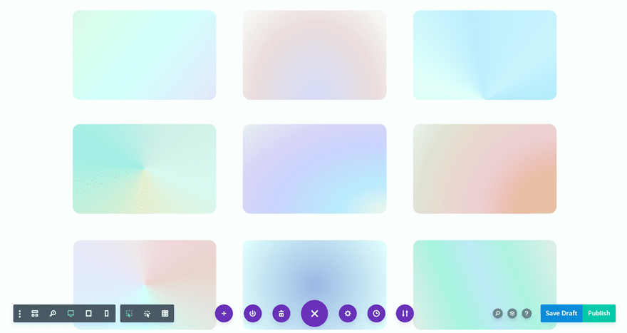
Open the module settings for the gradient you want to use in your design and copy the background.
You can copy the background by right-clicking over the Background section in the module settings or by clicking the three dots next to Background and selecting Copy Background.
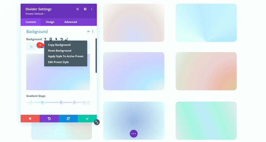
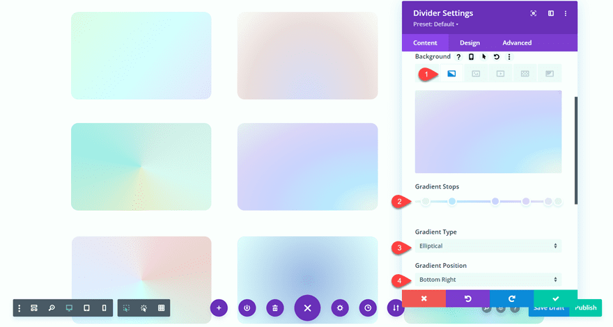
While copying and pasting the background from our layout is the easiest way to recreate the look in your own design, here are the settings for the gradient we’re using in this tutorial:
- Gradient Colors:
- 5%: #eaeff2
- 24%: #bfe4ff
- 55%: #ceceff
- 77%: #dfd1f9
- 93%: #e6e3f5
- 100%: #eaeff2
- Gradient Type: Elliptical
- Gradient Position: Bottom Right
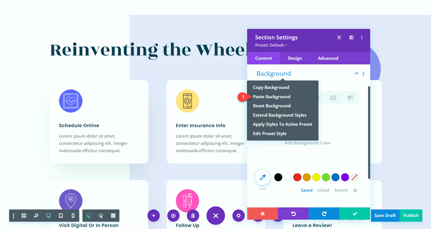
Now let’s open the Telehealth layout and add the background gradients. You can paste the background gradient to a module, section, or row by clicking the three dots or right-clicking in the section settings and selecting Paste Background. You can also paste the background with the keyboard shortcut Ctrl + Alt + V while you hover over the module.
Start by adding the gradient background to the “Reinventing the Wheel” section.
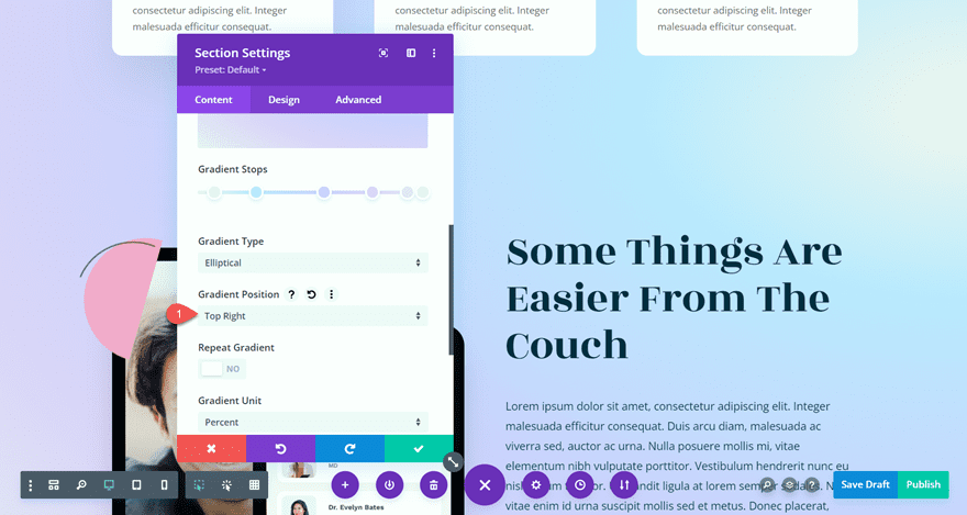
For the “Some Things are Easier From the Couch” section, set the background gradient position to Top Right so that it blends with the section above.
- Gradient Position: Top Right
Next, add the background gradient to each of the circular blurb modules surrounding the image.
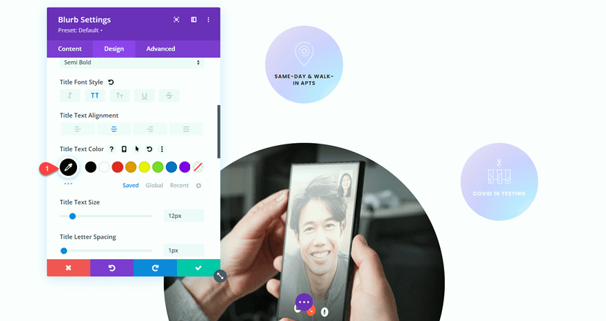
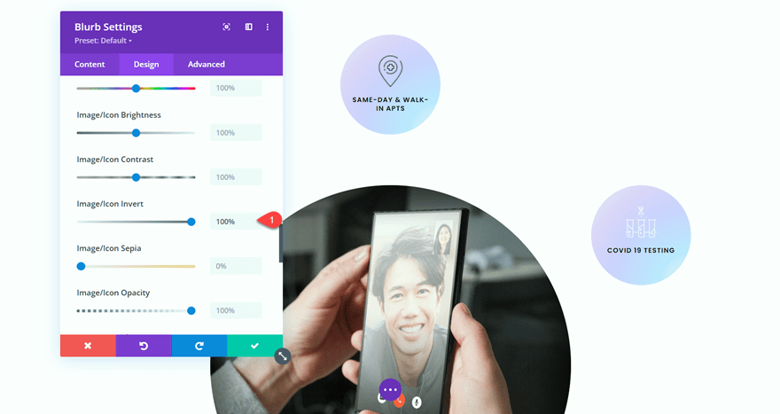
We need to adjust the text and icon color for these blurbs so that they stand out against the background gradient.
- H4 Text Color: #000000
- Image/Icon Invert: 100%
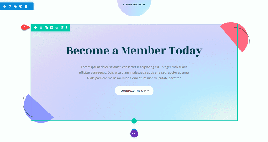
Next, add the background gradient to the “Become a Member Today” row and the testimonial modules in the next section.
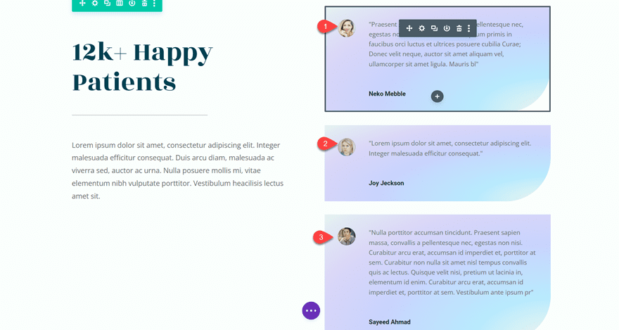
Finally, add the background gradient to the footer, and you’re done!
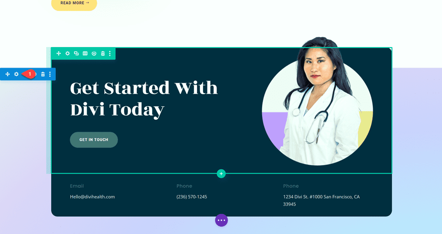
Final Result
Now let’s take a look at the final design with the pastel background gradients.

Final Thoughts
Divi’s gradient builder makes it easy to design beautiful gradients to add to your website. With endless design possibilities, you can create unique backgrounds in just a few clicks. You can use the 18 FREE pastel gradients in our layout to get started! If you want to learn more about Divi’s gradient builder, check out our tutorial for combining background gradients with masks and patterns. Have you tried Divi’s new gradient builder yet? Let us know what you think in the comments!



Brilliant. Thank you. Very handy for us non-designers.
Hi Anika.
Thanks for this great tutorial. At one time I used to favor video tutorials but this type of tutorial with text and screenshots is just so easy to follow without having to constantly rewind I actually prefer them.
I am absolutely loving Divi’s gradient backgrounds, patterns, masks, etc. The possibilities are endless and all without slowing down the page loading speed.
Kind regards from Manchester, England (rainy Manchester today, the Queen’s Jubilee celebrations last night were so lucky to have had a perfect break in the weather. ttfn)
Nice post..@ divi
Hi, Thanks for this Gradients
Cheers from México !!