Show more toggles can come in handy for a lot of different applications on a website. Traditionally, show more toggles are used to show more text when clicking a show more link (like read more toggles). This is helpful for keeping the initial design more compact and concise, leaving it up to the visitor to click for more info if they need it.
In this tutorial, we are going to show you two ways to create custom Show More Toggles for your Divi site. The first way includes transforming a Divi toggle module into a show more toggle that sits under a module, ready to show/hide addition text. The second method will involve creating a show more toggle that can show/hide entire Divi rows or modules. As you can imagine, this opens the door to show or hide basically any content you want!
Let’s get started.
Sneak Peek
Here is a quick look at the show more toggles we’ll build in this tutorial.
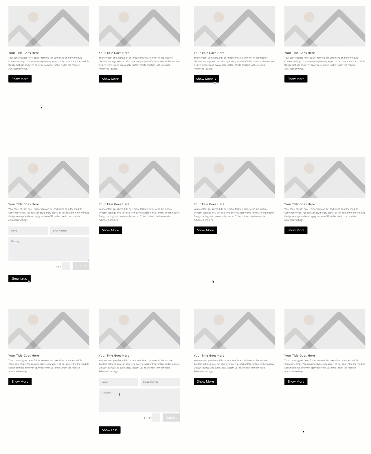
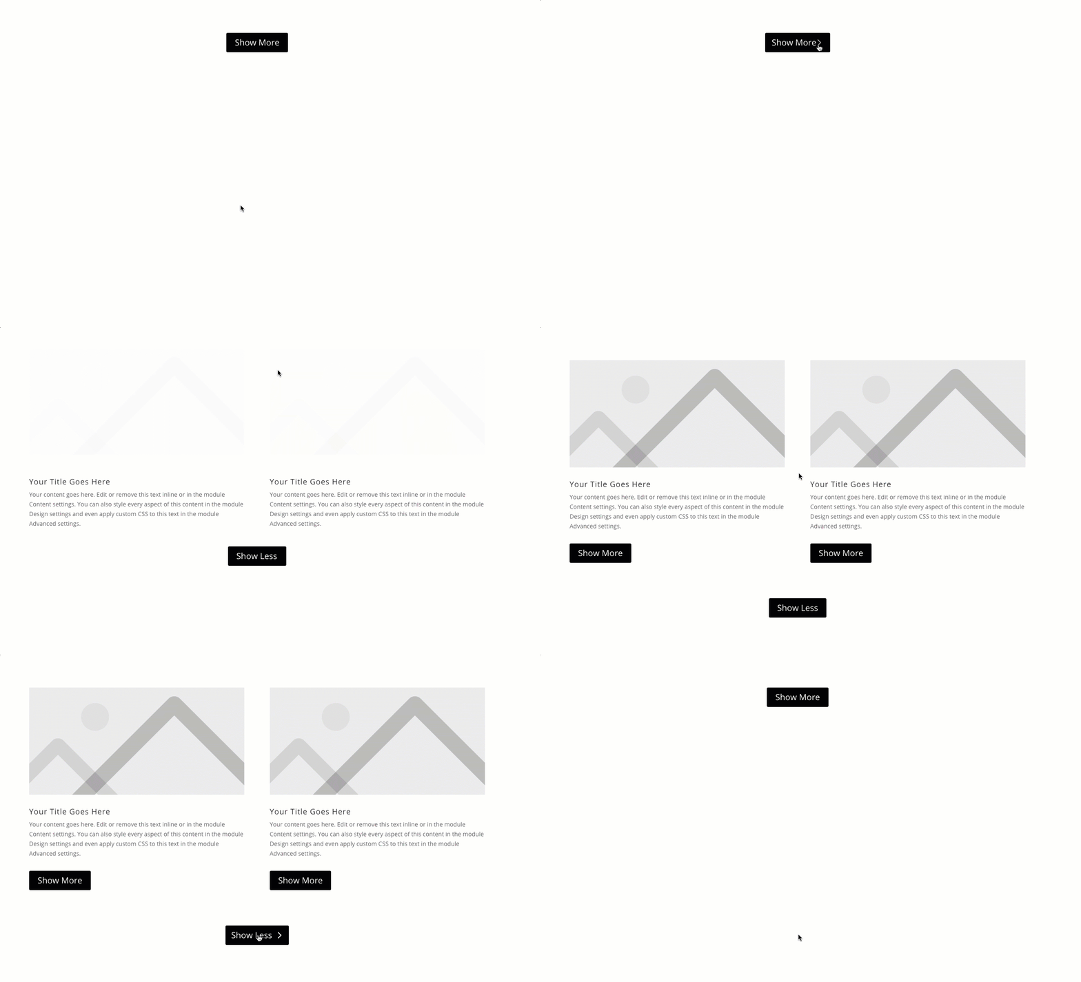
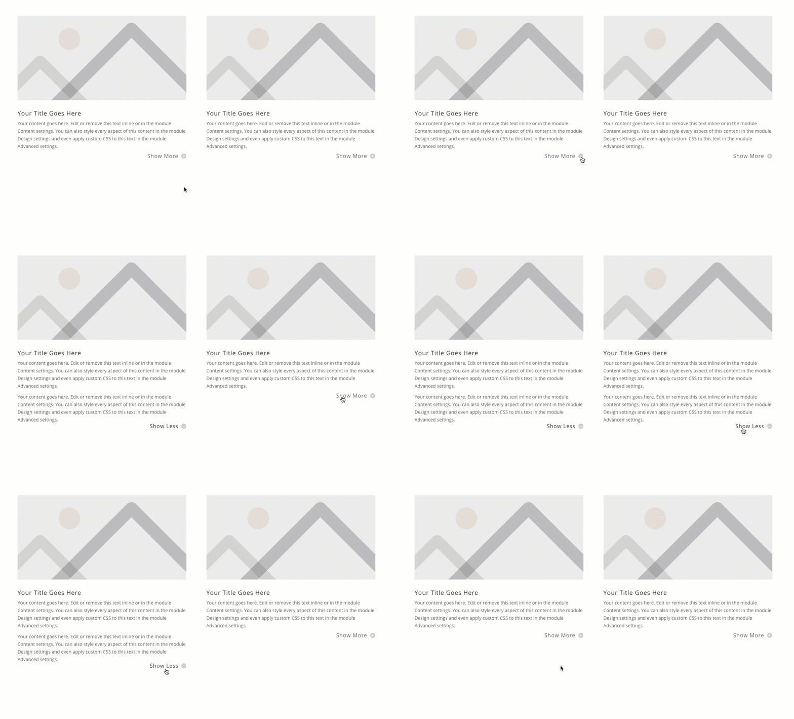
Download the Layout for FREE
To lay your hands on the designs from this tutorial, you will first need to download it using the button below. To gain access to the download you will need to subscribe to our newsletter by using the form below. As a new subscriber, you will receive even more Divi goodness and a free Divi Layout pack every Monday! If you’re already on the list, simply enter your email address below and click download. You will not be “resubscribed” or receive extra emails.
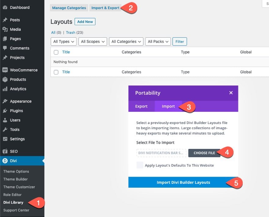
To import the section layout to your Divi Library, navigate to the Divi Library.
Click the Import button.
In the portability popup, select the import tab and choose the download file from your computer.
Then click the import button.
Once done, the section layout will be available in the Divi Builder.
Let’s get to the tutorial, shall we?
What You Need to Get Started
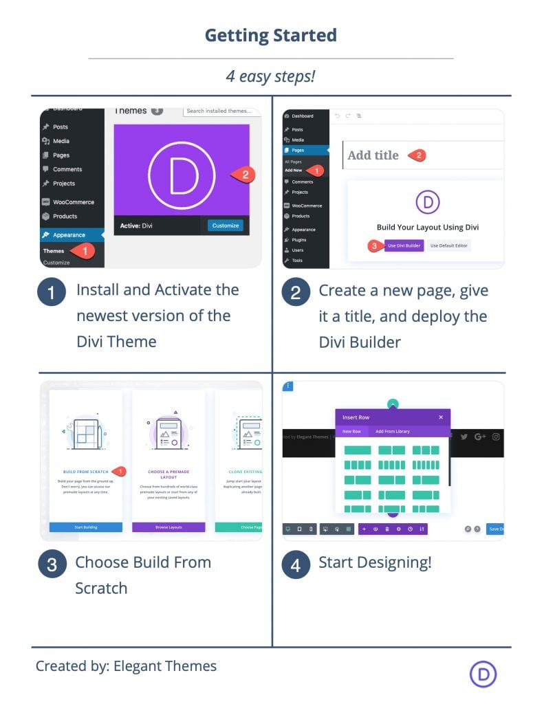
To get started, you will need to do the following:
- If you haven’t yet, install and activate the Divi Theme.
- Create a new page in WordPress and use the Divi Builder to edit the page on the front end (visual builder).
- Choose the option “Build From Scratch”.
After that, you will have a blank canvas to start designing in Divi.
1st Way: Building a Show More Toggle using a Divi Toggle Module
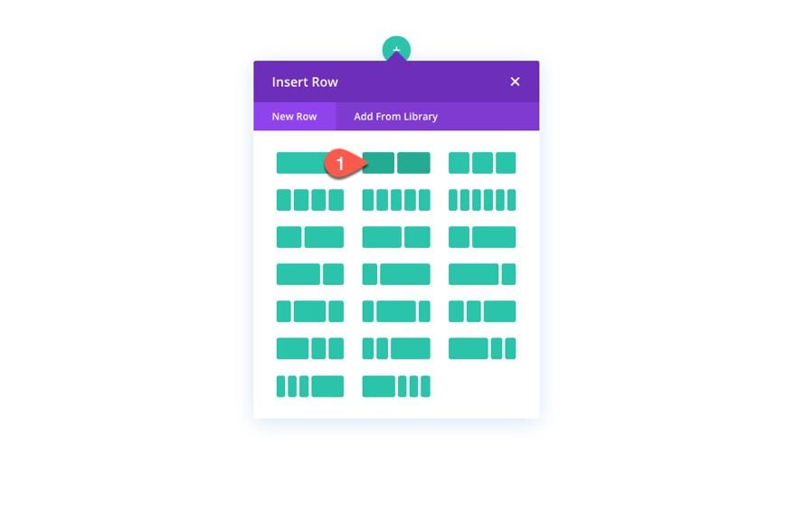
First, add a two-column row to your section.
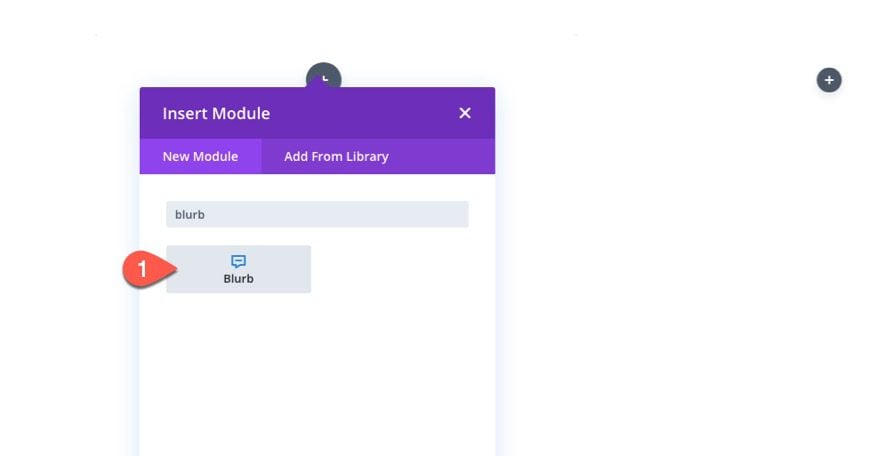
In the left column, add a blurb module.
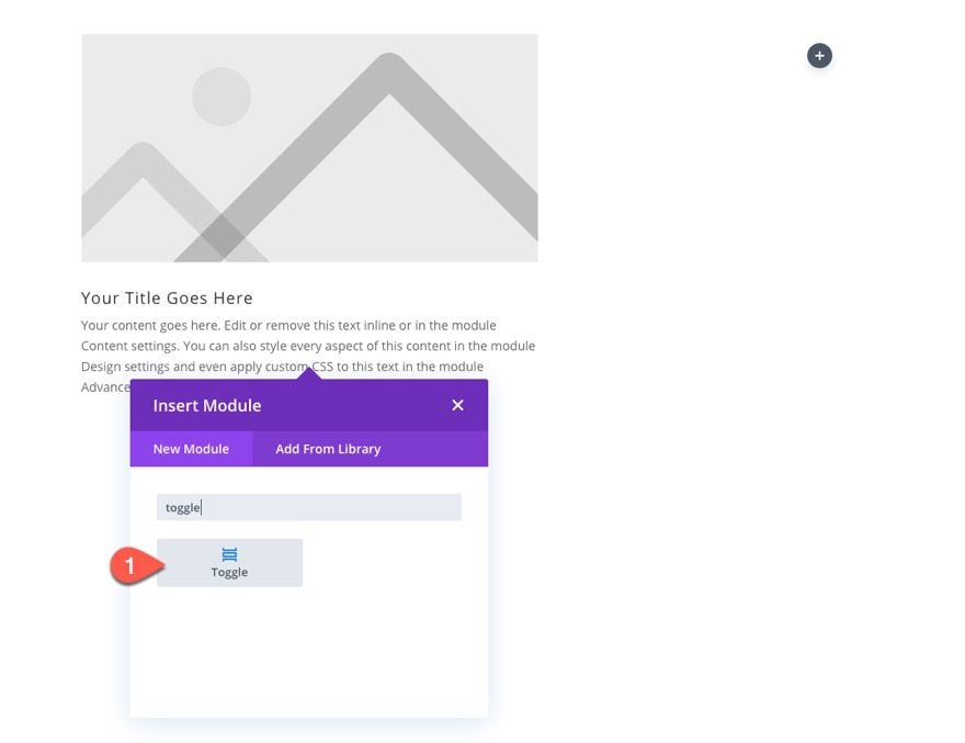
Under the blurb module, add a toggle module. We are going to turn the toggle module into a show more toggle so that it will show/hide more text under the blurb module when clicking the toggle.
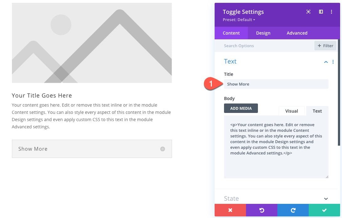
To do this, open the toggle module settings and update the title text:
- Title: Show More
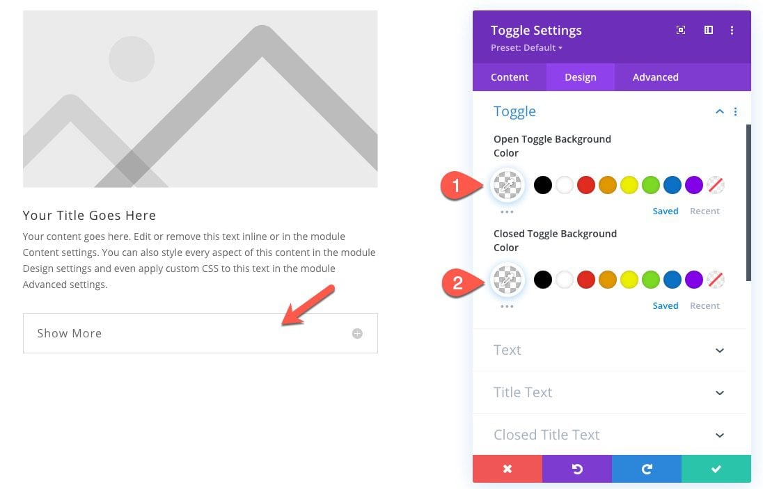
Under the design tab, update the following to strip away the default styles:
- Open Toggle Background Color: rgba(0,0,0,0);
- Closed Toggle Background Color: rgba(0,0,0,0);
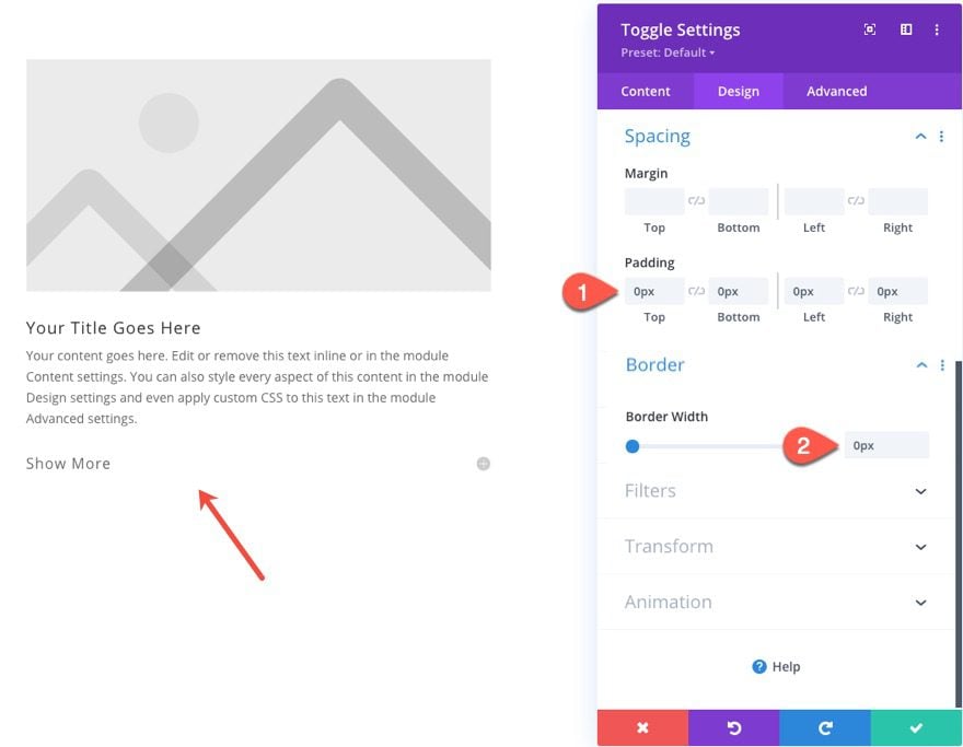
- Padding: 0px top, 0px bottom, 0px left
- Border Width: 0px
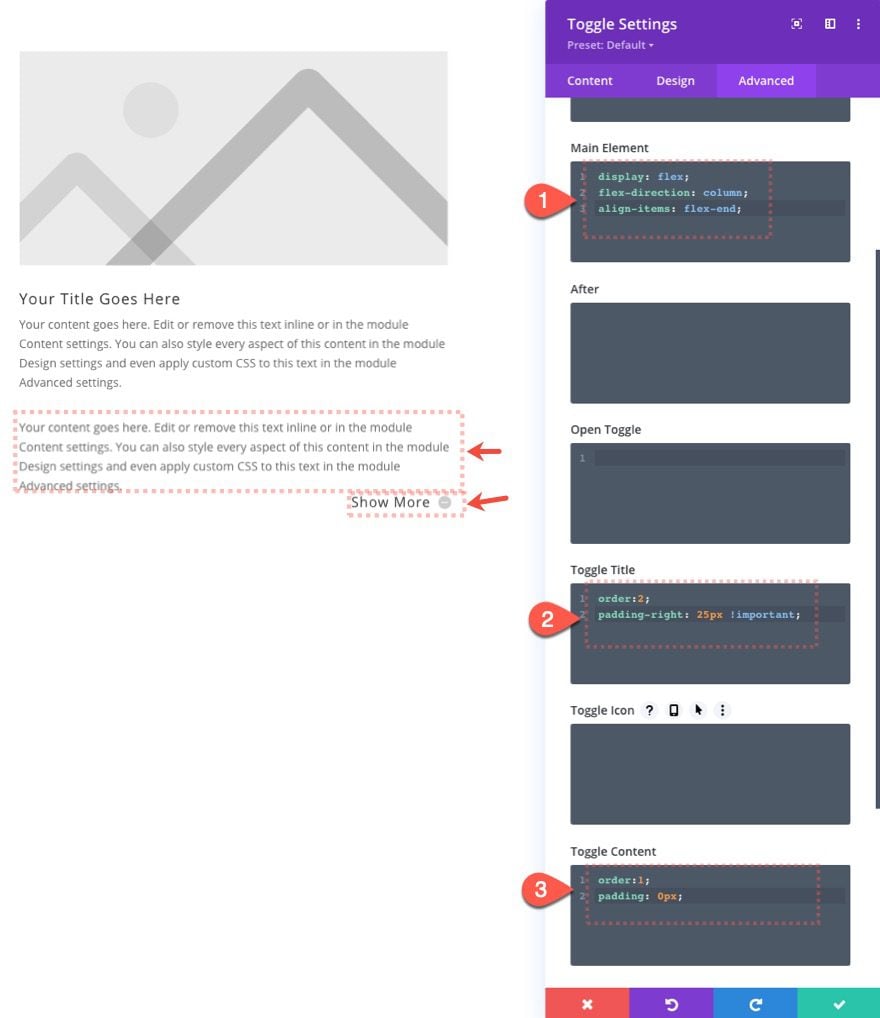
Under the Advanced tab, update the Custom CSS for the following:
For the Main Element…
display:flex;
flex-direction: column;
align-items: flex-end;
For the Toggle Title…
order:2;
padding-right:25px !important;
For the Toggle Content…
order:1;
padding: 0px;
This toggle title and toggle content are ordered differently using the order property with display:flex. Now the clickable title sits below the content so that it will function like a show more toggle.
Now, add the following CSS Class to the toggle module:
- CSS Class: et-readmore-toggle
This is needed to target the module with our JQuery code that we’ll add to change the title text when clicking on the toggle.
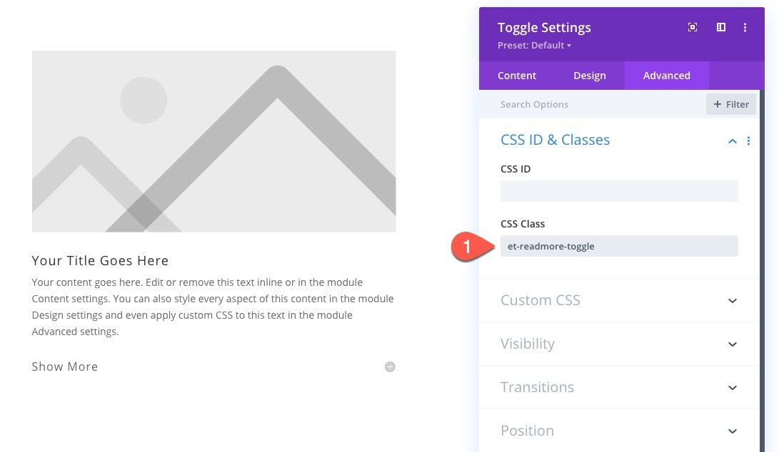
We’ve clean up the toggle module and taken out all the padding so that the toggle should sit directly under the blurb module above. However, there is still too much bottom margin in the top blurb so the text within the toggle will be too far from the previous paragraph.
Open the settings to the blurb module above the toggle and update the margin:
- Margin bottom: 10px;
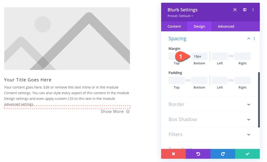
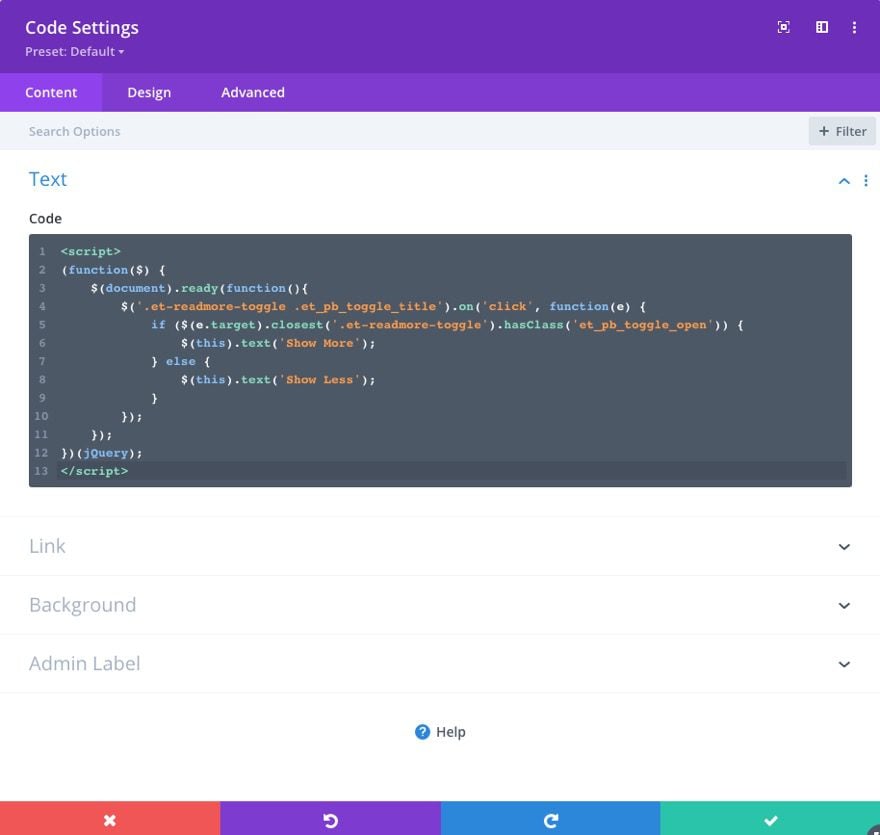
Now we are ready to add the JQuery needed to change the toggle title text to read “Show More” or “Show Less” when clicked.
To add the code, add a code module under the toggle module.
Then paste in the following JQuery making sure to wrap the code in the necessary script tags.
(function($) {
    $(document).ready(function(){
        $('.et-readmore-toggle .et_pb_toggle_title').on('click', function(e) {
            if ($(e.target).closest('.et-readmore-toggle').hasClass('et_pb_toggle_open')) {
                $(this).text('Show More');
            } else {
                $(this).text('Show Less');
            }
        });
    });
})(jQuery);
Here is the result.

This design is obviously basic. Feel free to add more design to the toggle using the built-in Divi options to fit your needs.
2nd Way: Building a Show More Toggle to Show/Hide Any Divi Module or Row
If the first show more toggle using the toggle module seems a bit too limiting, this next method will interest you. We are going to build a custom show more toggle that you can use to show/hide and Divi module or even an entire row!
Building a Show More Toggle for a Divi Module
Here’s how to do it.
First, create another two-column row just like you did in the first example.

Then add a blurb module to column 1.

Under the blurb module, we are going to add a contact form module.
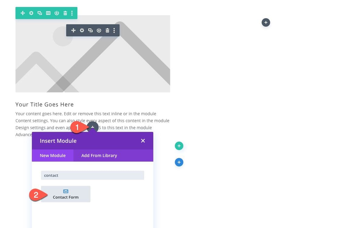
This contact form will be the module we will show/hide when clicking a show more button.
To target this module in the code, open the settings for the contact form and add the following CSS Class:
- CSS Class: et-show-more-content
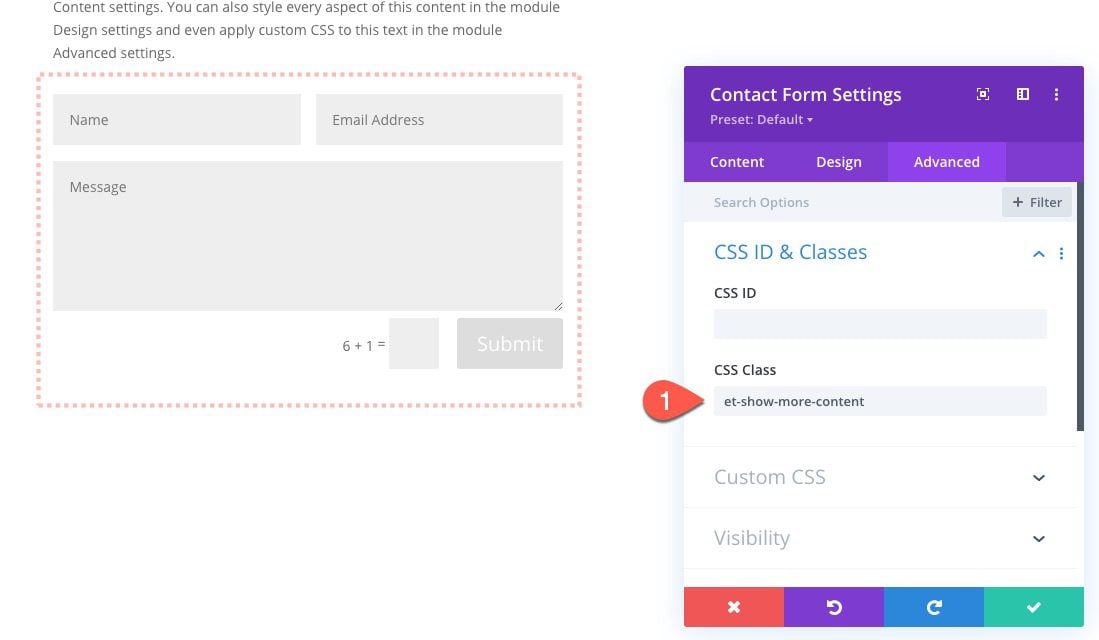
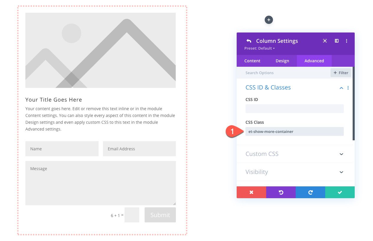
We’ll also need to target the parent container of the module we want to show/hide. This will allow us to add multiple show more toggle instances on the page if needed. In this case the parent container of this contact form module is column 1. Open the settings for column 1 and add the following CSS Class:
- CSS Class: et-show-more-container
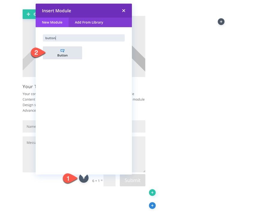
To create the show more toggle button, add a button module under the contact form module.
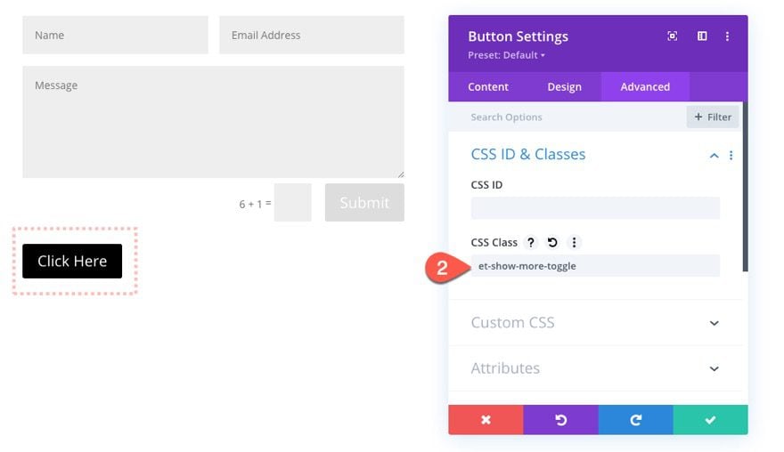
You can design the button however you want. When you are done, 0pen the button module settings and add the following CSS Class:
- CSS Class: et-show-more-toggle
Then change the button text to read “Show More”.
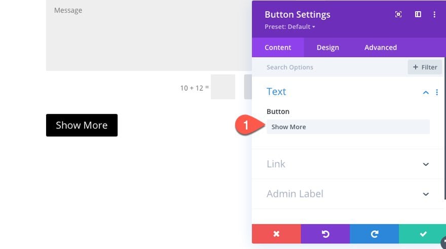
Now we are ready to add the code needed to get our show more toggle to work.
Under the button, add a code module so we can drop in our CSS and JQuery.
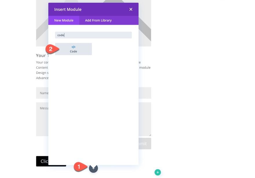
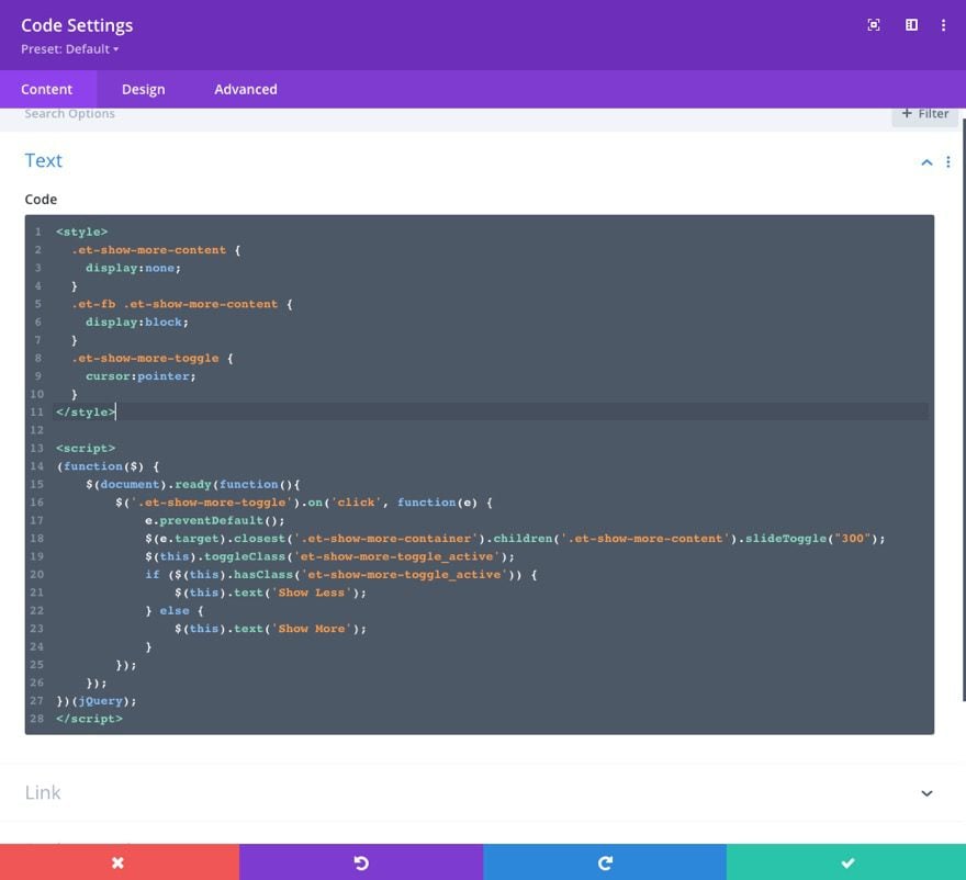
First paste the following CSS inside code box making sure to wrap the code in the necessary style tags:
  .et-show-more-content {
    display:none;
  }
  .et-fb .et-show-more-content {
    display:block;
  }
  .et-show-more-toggle {
    cursor:pointer;
  }
Then under the CSS, paste the following JQuery making sure to wrap the code in script tags:
(function($) {
    $(document).ready(function(){
        $('.et-show-more-toggle').on('click', function(e) {
            e.preventDefault();
            $(e.target).closest('.et-show-more-container').children('.et-show-more-content').slideToggle("300");
            $(this).toggleClass('et-show-more-toggle_active');
            if ($(this).hasClass('et-show-more-toggle_active')) {
                $(this).text('Show Less');
            } else {
                $(this).text('Show More');
            }
        });
    });
})(jQuery);
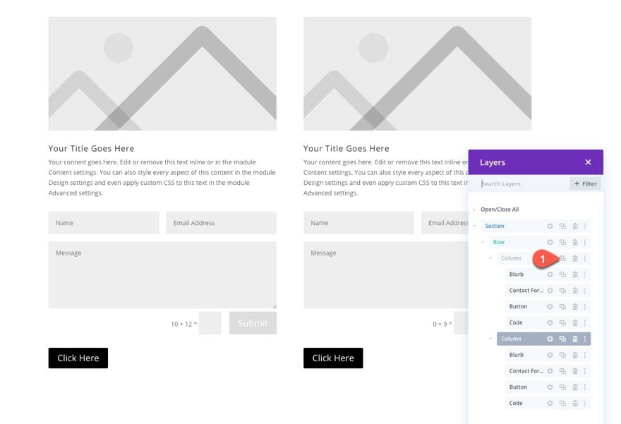
To balance our design, duplicate column 1 to create another identical column. Make sure to delete the empty third column and the extra code module that was carried over with the duplicate.
Here is the result.

Creating a Show More Toggle for a Divi Row
Now that we have our show more toggles for a Divi Module, let’s build on this to add a new show more toggle to toggle the entire row.
First, create a new one-column row to hold our new button.
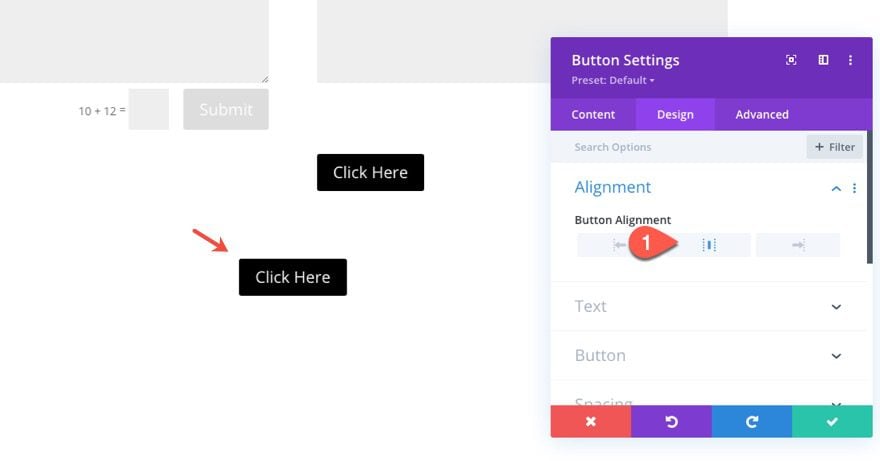
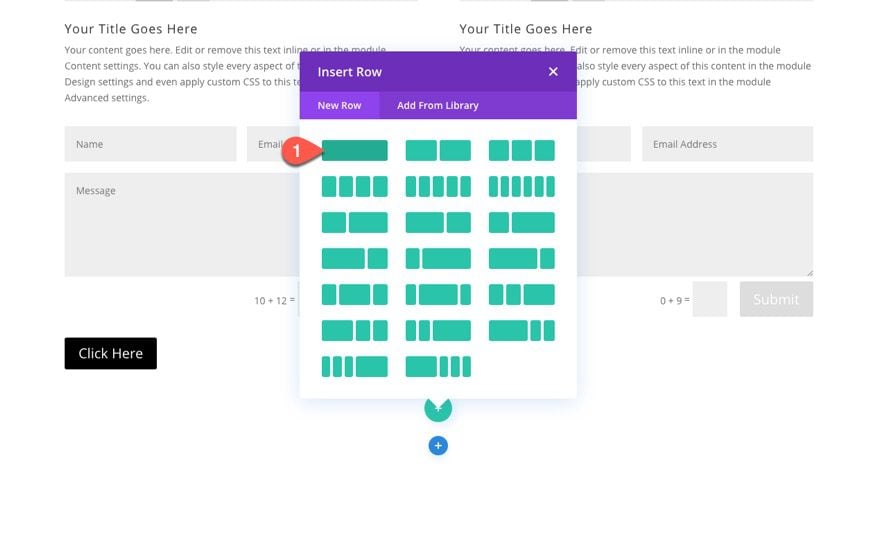 Then copy one of the existing show more button modules and paste it inside the new row. Then open the button settings and change the button alignment:
- Button Alignment: Center
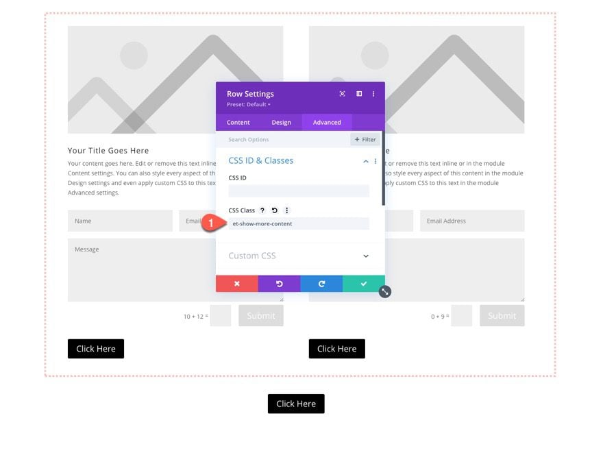
Since we want to target the row as the content we want to show/hide, open the settings of the row containing the show more toggles for the contact form modules. Then add the following CSS Class to the row:
- et-show-more-content
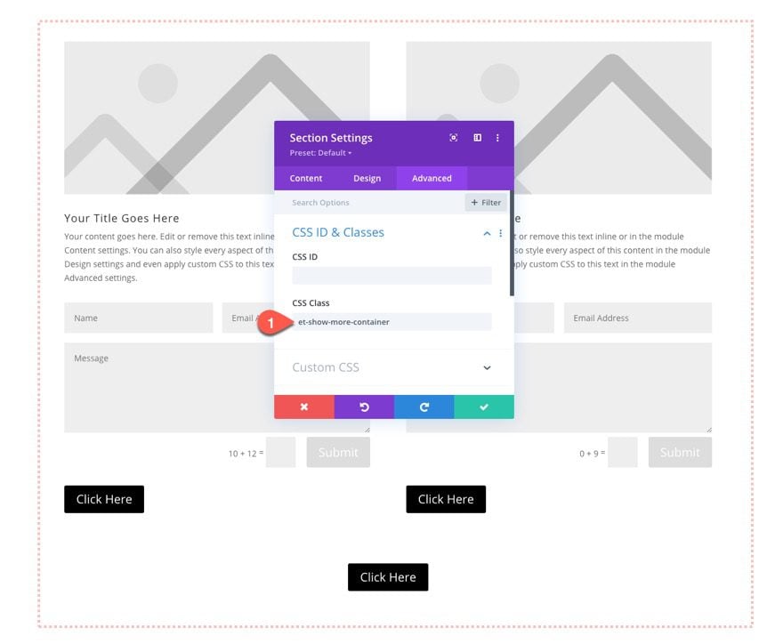
And we also need to add a custom CSS Class to the parent container of the row (which is the section). Open the section settings and add the following CSS Class:
- et-show-more-container
Here is the result.

Final Results
Here are the final results for the three show more toggles we built.


Final Thoughts
The purpose of this tutorial was to show you a few methods for creating your own show more toggles in Divi. Hopefully one of them will come in handy down the road so that you don’t have to use a plugin. Although we didn’t add any spectacular designs to these examples doesn’t mean it can’t be done. With this functionality in place, you can have a blast designing these show more toggles using the Divi builder. Or you can even pull in some of our premade layouts to experiment with as well.
I look forward to hearing from you in the comments.
Cheers!



I’m creating a Show More Toggle for multiple rows within a single page but everytime one of the “Show More” buttons is selected, all rows are activated and it all quicks opens and closes. How can I fix this?
I had this same issue and the problem is you need to make the CSS class items unique per section you are building out.
One section would be:
et-show-more-toggle1
et-show-more-container1
et-show-more-content1
Next section would be:
et-show-more-toggle2
et-show-more-container2
et-show-more-content2
You would need to update the JQuery code for each section as well.
Good luck.
I am having a similar problem. The toggle button quickly opens and closes the hidden content.
I would like to use this to hide/reveal a whole section – but I can’t figure out where to place the parent class or how to modify the code so that it doesn’t look for the parent class… can anyone help me? Thanks!
The custom CSS class should be added in the Toggle Module Settings > Advanced > CSS ID & Classes > CSS Class. Check this screenshot: https://www.elegantthemes.com/blog/wp-content/uploads/2020/09/divi-show-more-toggles_19.jpg
nice
Agree with Britt. Wouldn’t it be a nice feature – for modules and columns and rows – to have a ‘show more’ button by default, to be flipped on or off?
How does this work in terms of accessibility? Guidelines say that links should be descriptive so ‘show me more’ wouldn’t be accessible, but then as all the content is still on the page (just partly hidden initially), maybe it doesn’t matter. Should the button/link be hidden to screen readers maybe?
I would much rather see content like this that can be achieved via Divi without another plugin pitch.
Really helpful! I really like all these guides you put into your blog!
Thanks!
I have many divi sites and read more is a huge Seo concern for many.
Does this method work good for seo ?
I also used a css only method with a shading and a button
Exciting! I can use this!
These are very helpful. Corralling excess content is always a struggle and I appreciate the additional tool.
Thanks!