Welcome to Day 52 of our Divi 100 Marathon. Keep tuning in for 100 days in a row of awesome Divi resources as we count down to the amazing release of Divi 3.0 on the final day of the series!
Last week we announced the 2016 Divi Showcase Contest and invited the Divi community to submit their best websites for a chance to win from $17,782 in prizes (thanks to a list of very generous sponsors)! We received over 2,300 website submissions, and over the past week I have been going through each website on the list one by one, slowly narrowing down the competition to a manageable list of our top 20 favorites.
It wasn’t easy. The competition was stiff! I had to leave out so many great websites, so don’t feel bad if your site didn’t make it into the finals. I think this year’s contenders are some of the strongest we have ever had. If you are looking for some inspiration for you next Divi site, I suggest browsing each and every one of the awesome sites listed below.
- 1 The Finalists
- 2 1. Bookin Agency
- 3 2. Converge
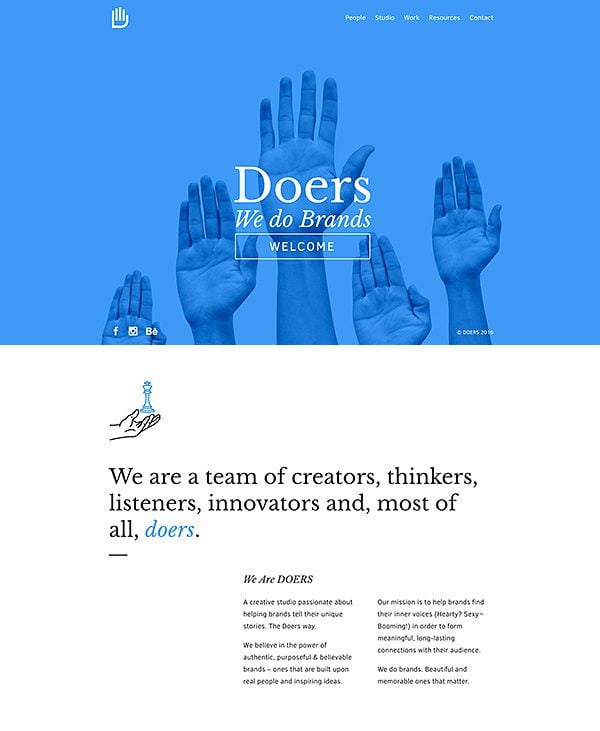
- 4 3. Doers
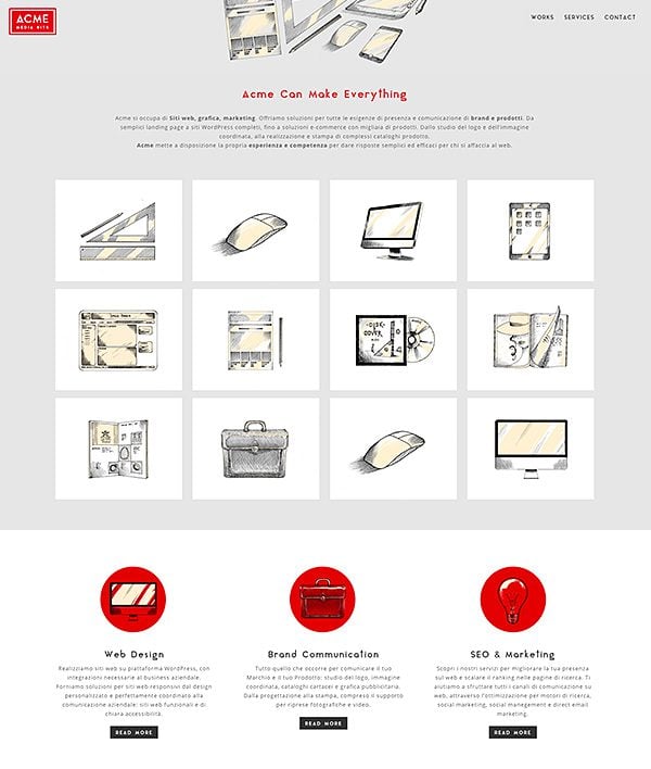
- 5 4. ACME Media Kits
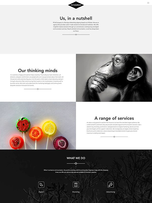
- 6 5. PS & Company
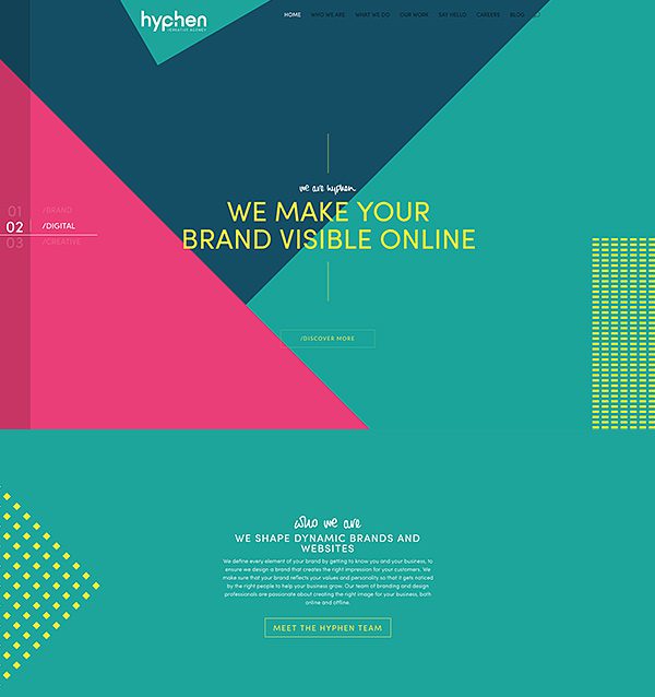
- 7 6. Hyphen
- 8 7. Mugs Cafe
- 9 8. Trishia Grace
- 10 9. Coffee Times Coffee
- 11 10. display4media
- 12 11. netsil
- 13 12. Otraforma
- 14 13. The Generation
- 15 14. Number 11
- 16 15. Ofia Seghaou
- 17 16. Pensiunea Roua Muntilor
- 18 17. Hupla
- 19 18. Studio Caro
- 20 19. Kornetten
- 21 20. Pixel x Code
- 22 Cast Your Vote And Help Us Choose The Winners!
- 23 Divi 100 Day 52
- 24 The Countdown To Divi 3.0
The Finalists
As mentioned above, the original list of 2,300+ websites has been narrowed down to 20 finalists. Now it’s time for the Divi community to vote for their favorites and decide which 3 websites will claim 1st, 2nd and 3rd place! To cast your vote, simply browse the list of sites below and then select your favorite. The three websites will the most votes will win.
1. Bookin Agency
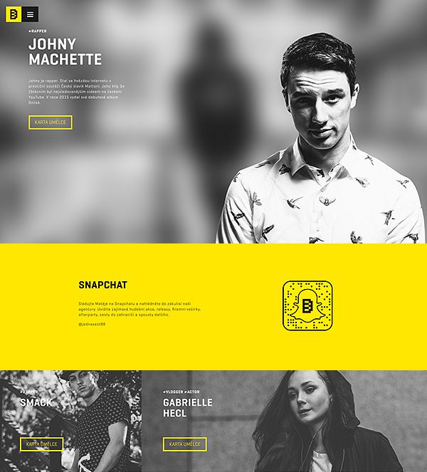
Submitted by Robin Remsa, Bookin Agency is a website filled with wonderful contrasts, great typography and a strong color palette. I love the bright yellow set against the black and white photos and the generous white space given to each paragraph. You can tell that each detail was thought over with great care.
2. Converge
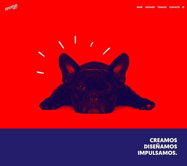
Submitted by Fabricio, Converge is imbued with loads of personality. You are greeted with a blinking dog that tells you right away the type of company you would be working with; one filled with fun-loving and talented people! The colors are bold and vibrant, teetering on the edge of chaos but handled with skill. Sometimes you are rewarded when the boundaries of design are pushed.
3. Doers
Submitted by Arthur Lim, Doers puts on a clinic in good typography. Each title and paragraph is a joy to look at, which makes reading each page a wonderful experience. I love the simplicity of this website. Sometimes the simplest things are the hardest to master, and these guys know what they are doing.
4. ACME Media Kits
Submitted by Mirko Bianco, ACME Media Kits is subtle and sophisticated. I love the colors here. Red, white and gray are classics, but the addition of yellow amongst the hand drag elements really brings this one home for me. I also enjoy how they have used a background image along with a transparent navigation bar to really transform the header into something unique.
5. PS & Company
Submitted by Vicente Latag Jr, PS & Company is super duper clean. I love their enlarged and emboldened headers contrasted by the smaller off-black paragraphs. The header is also great, made unique by forcing the mobile dropdown menu on desktop resolution and offsetting the logo to play off their logo’s hard and angular attributes. They also make great use of video backgrounds towards the bottom of the page, and I love the looping black and white video they have found to sit behind their info boxes.
6. Hyphen
Submitted by Jenni Cabrelli, Hyphen really pushes the boundaries with its wonderful interplay between sections. Repeating shapes and colors bring the page together and entice you downward. Their header is great, especially how they have made use of Divi’s fixed navigation bar settings. Here you can see the transition between transparent to green background colors, as well as the transition between hidden and visible logo states. The logo size has also been increased so that it sits at the top of the browser, mimicking how the triangular sections of the page sit against each other.
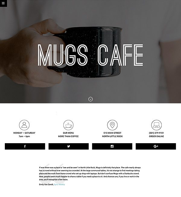
7. Mugs Cafe
Submitted by Michael Carpenter, Mugs Cafe is no stranger to the Elegant Themes Showcase Contest! This year they are back with a brand new design built with Divi, and it looks great. I love the bold header and its unique background overlay. Further down the page, the website keeps things simple with stark black and white text. Sometimes that’s all you need.
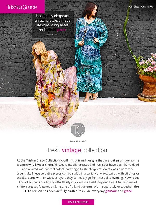
8. Trishia Grace
Submitted by Nicolle Prince, her website reminds us of the importance of good photography. Not only has she filled her site with excellent photos, those photos have been chosen carefully and are fully aware of their surroundings. I especially like how she has used elements in the first photo to both create and break the frame of the first section. Gravity pulls the woman’s skirt down the page, and with it so are we.
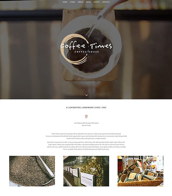
9. Coffee Times Coffee
Submitted by Eric Novak, Coffee Times Coffee shows us what a video header is supposed to look like. I really love the repeating shots used and the way they play with the overlaying logo. I can’t help but be intrigued when I land on this page, enveloped in that spinning vat of what must be some incredibly delicious coffee beans.
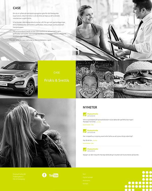
10. display4media
Black, white and green! Submitted by Pelle, Display 4 Media gives us yet another simple color palette that just works. If you are looking to give your own website a modern feel, this is always a great option. Just a few hints of that radioactive green are all you need, and I really like how they have used it in their footer and the news feed towards the bottom of the page.
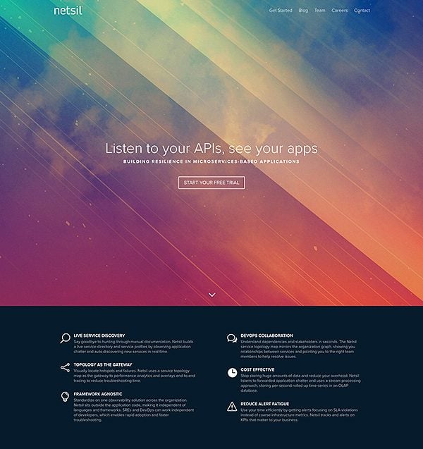
11. netsil
Submitted by Chris Besett, Netsil immediately brings you in with its fantasy-filled header. Sometimes API’s can feel like a nebulous topic, and I think the imagery here is quite fitting. The bright header contrasts well with the blue-gray info section below, and I also like their use of the transparent navigation bar.
12. Otraforma
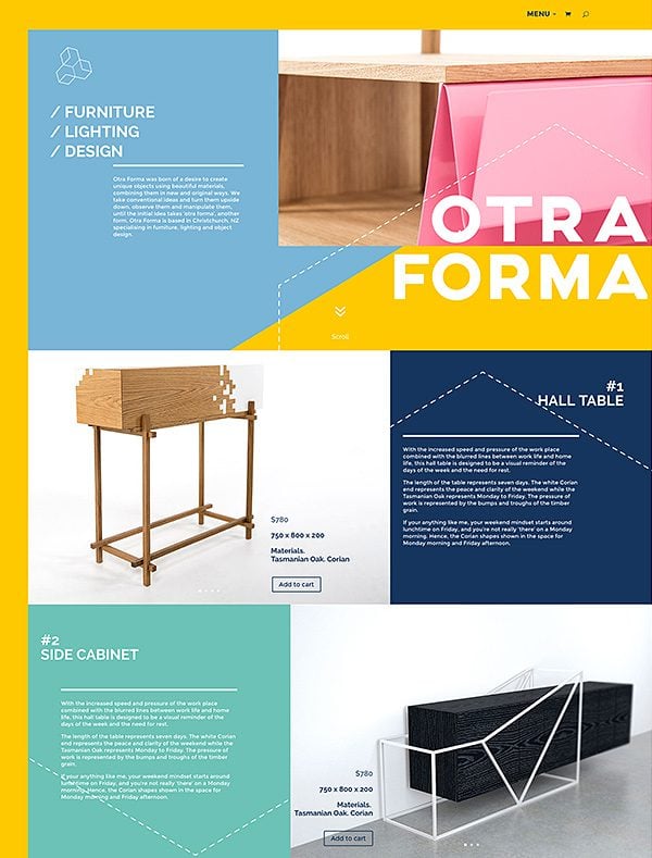
Submitted by Shalona Thathiah, it’s hard to tell that Otraforma was even built with Divi. I love finding examples of Divi sites that really push the boundaries of customization, and it shows you just how creative you can get if you put your mind to it. I quite like the repeating dashed line that explores the page at angles that mimic those found in their furniture.
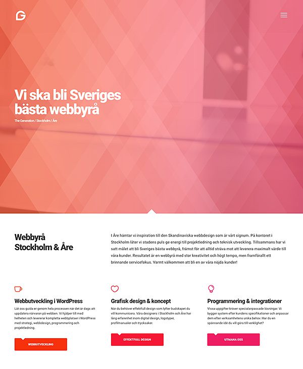
13. The Generation
Submitted by Robert Hallgren, is another website that really makes Divi its own. I love the repeating red-purple gradient here. You can even see it transpire horizontally through their buttons as each one moves from red to purple as if part of the gradient itself (how nice!). There are many more similarly subtle touches that make this website great, such as the custom dropshadow in the header that gives it a unique sense of depth, and the perfectly crafted Divi header that seems to be part of the initial section due to its use of size and transparency. Only when you scroll does the logo and hamburger menu break off from the main structure of the page.
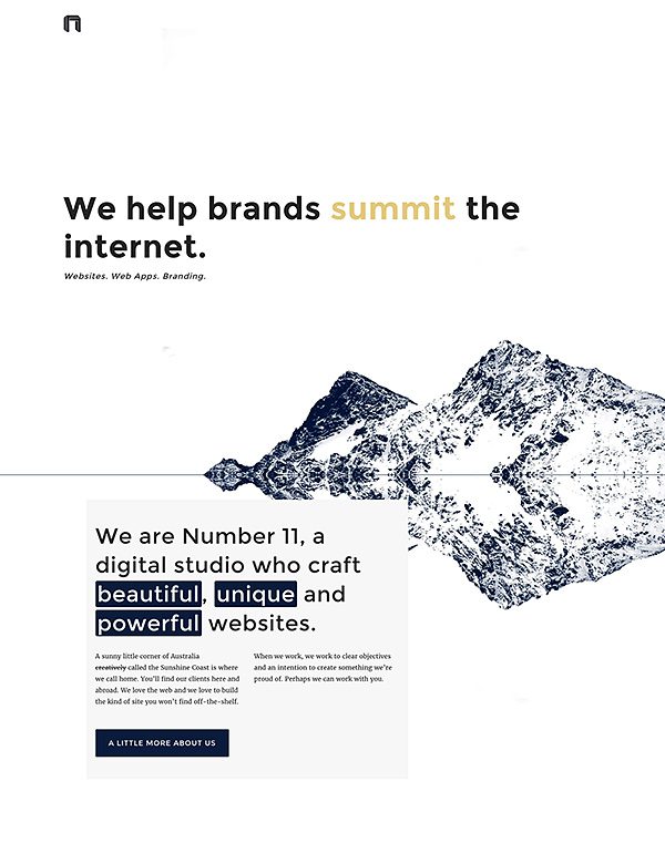
14. Number 11
Submitted by Rob Stinson, Number 11 is another great example of the power of white space and good typography. Mastering these two elements is enough to create a beautiful website, but that’s not all that makes this website great. I really like the header image, which is repeated to create the illusion of reflection as it pulls you down to their main CTA.
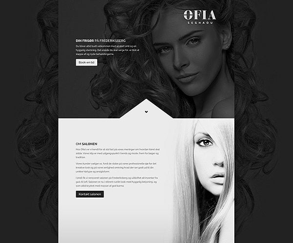
15. Ofia Seghaou
Submitted by Karsten Hede, Ofia Seghaou is sleek, dark and wondrous. I really like how the main background image plays off the header image. Inside the header, the text, logo and the focal point of the photo all work together perfectly. There is absolutely no color in the top half of the page, but it really doesn’t need any.
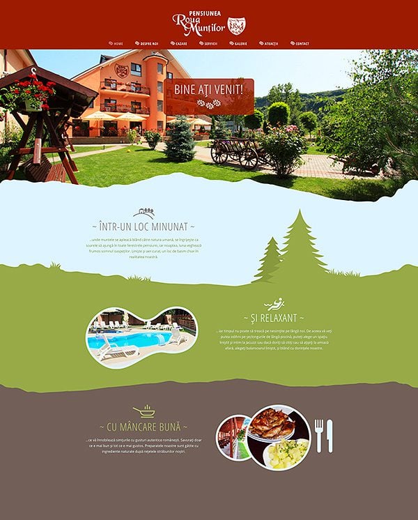
16. Pensiunea Roua Muntilor
Submitted by Cristian Dragos, Pensiunea Roua Muntilor is a lot of fun. I love how they have separated each section with an illustrated edge as you travel down from the sky, through the forest and into the ground. The trees, which are Divi image modules, seem to grow as the upward animation pulls them up from the ground below.
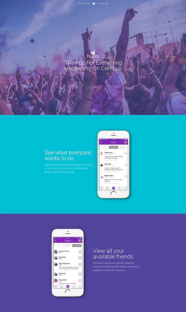
17. Hupla
Submitted by Kelsey Frizzell, Hupla is a great example of a modern app website. Not only is the website well designed, the app is too! It’s easy to learn what this app does as you scroll down the page, and the white iPhones look great against the purple and blue sections. The photos are already filled with color, but also enjoy the purple overlay used. Their custom Monarch color scheme looks great too!
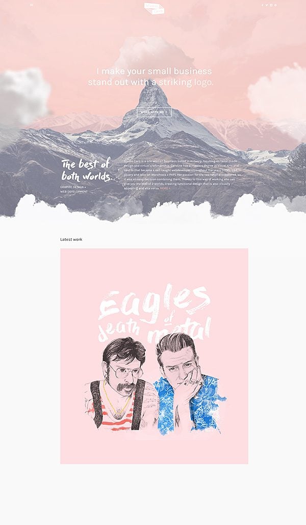
18. Studio Caro
Submitted by Caroline Vermeir, Studio Caro is filled with fun and whimsy. I really like her about page, including the live text and animated image. She likes “handlettering, wandering and dreaming out loud,” and I get the sense she is dreaming up something quite spectacular at this very moment.
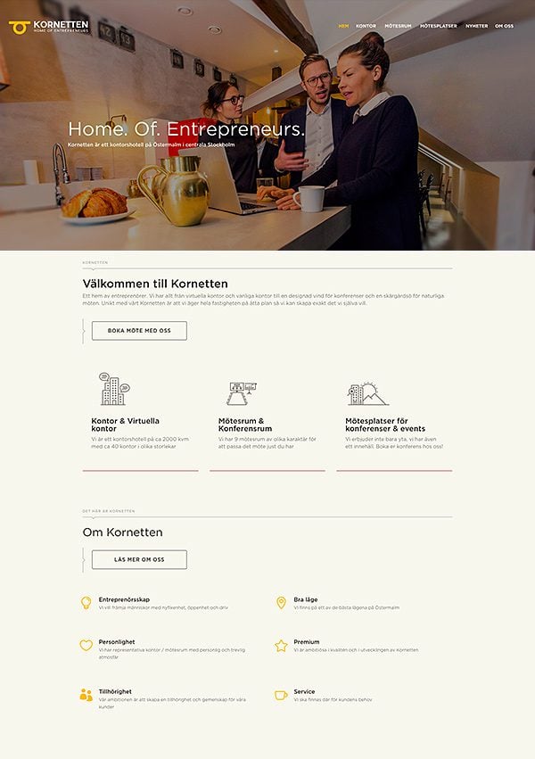
19. Kornetten
Submitted by Gustav Jonsson, Kornetten is a sleek and modern site that makes great use of its muted color palette and thin line motif. I really like the hover effect on the info boxes below the main header, and I think the undersaturated blue, red and orange go great with the off-white background.
20. Pixel x Code
Submitted by Kaye, Pixel x Code welcomes you with as classic idea: “Good design, when done well, becomes invisible.” You can tell that this ideology has informed every part of their design, and I really get the sense that each decision was intentional and well though out.
Cast Your Vote And Help Us Choose The Winners!
To vote for your favorite website, simply fill out the form below. I know how hard it can be to pick one website from such a great list sites, but do you best! The polls will remain open for 5 days, after which the stats will be collected and the winners will be announce next Thursday. Thanks so much to everyone who participated, and congrats to our 20 finalists 🙂

Divi 100 Day 52
The Countdown To Divi 3.0
This post is part of our Divi 100 marathon. Follow along as we post free Divi resources for 100 days in a row! This 100-day countdown will end with the game-changing release of Divi 3.0, including our brand new visual editor built from the ground up using React. Divi 3.0 will change the way you build websites with the Divi Builder forever!
Let the countdown begin.



Wow every design is mind-blowing, however, entry 14 – Number II wins my vote. Elegance, timeliness, and simplicity were all present in that design.
Love them all, inspiring stuff but entry 14 gets my vote (Number 11).
Converge gets my vote, absolutely awesome!
Number 6 and 15 are my favorites. Though all of them are beautiful. I wish I could design like that!
#1 ) 1
#2) 15
#3) 8
#4) 10
Love #14, that gets my vote.
Well, no one else mentioned them, but I liked PS and Bookin. Otra Forma seems very sophisticated, so gets an honorable mention from this peanut in the gallery.
Great work, everyone, and yes, I am still bummed that I did not get my site live on time. It’s live today, though–finally! Phwew.
Thank you so much Leha!!! OtraForma was a challenge at the start hehe but turned out just how we wanted it!!!
Loads of inspiration here – I’m looking at number sixteen: Pensiunea Roua Muntilor – really love the illustrated edges of the sections – trees, mountains etc. Anybody care to point me in the way of some tips and/or tutorials on how to create the css needed for overlapping effect?
My vote is #14 – Number 11
I was inspired by the Coffee Times site.
I vote for #14
number 11 great website, crisp look.
I love Hyphen. So my vote goes to Hyphen. Thanks for sharing such a great list.
Thank you for your vote 🙂
Can someone recommend a plug-in or hack to achieve the effect in BOOKIN (#1)?
Thx
I mean the logo/mobile menu flush left on the page.
The bookin website is using the Jumbo: A 3-in-1 full-screen menu for WordPress plugin and the Dewdrop Custom Scrollbar plugin as well.
thanks. Appreciate it.
Wonderful website collection here.I like most of the website.eveyone did a excellent job
I’m really confused here, I don’t see my website….
Thank you Nick for including us in the finalist. We are a Divi oriented company and are very proud for this goal.
Really inspiring. Done vote!
Wow thanks so much for making us a finalist alongside so many amazing websites. Well done to every one else on being shortlisted!
Number 12, Otraforma, gives a 502 Bad Gateway. Not accessible.
Hi Gerard,
Thanks for letting me know 🙂 I’ve emailed the hosting company…
My vote is for Doers, they have blended font &colors very well with the Divi theme, the website looks elegant.
Thank you for this excellent inspirations ! Very very cool sites!
I can not decide…
Our vote goes to hypen this is awesome website. We love it so much. By the way all web design are amazing and have a unique features. Thank you Nick for this outstanding contest.
Thanks very much for your support, we really loved making our site 🙂
I like Doers, it is one of the best example of fine fonts and color combination with innovation.All the best Doers team , my vote is for you
#17 Hupla is the best ?
Wow! That’s a lot of talent packed into one post! I wish I could have picked my top 4 favs . . . 2, 6, 16, 18 . . . because I love all four of them!
These are awesome! I didn’t realize just how versatile Divi can be.
Very impressive! Like seeing a great magic trick and trying to figure out “how did they do that!” I need to start thinking outside of the box (or grid)!
Voting will be tough!
Omg yipppieeee!!!! My very first job and all the hard work has paid off!!!!!! So proud my work was selected for top 20 ???
Amazing work everyone!!!
Wow! Shalona, if that was your first, you’ve got an epic career in web design ahead of you!
Thank you for your kind words Rob!!! I hope to grow more and create more websites that I love ?
Well done
Don’t keep us in suspense lol, which one is yours? I tried to click on your name/link, but it doesn’t attach to a site 🙁
Hey Ashley,
Mine is Otraforma 🙂 The link should work :/
We’ve been here for over 30 minutes and still can’t pick a favourite..
This is a lot tougher than voting for the recent elections, that only took 10 minutes LoL!
Good Luck to All 😀
Thanks for including us Nick. :). So honoured to be counted amongst some seriously epic work.
Holy cow, Doers is stunning. So fresh and so clean (clean). Super inspiring that this level of design is being achieved in Divi.
Thanks Brandi and Richard for the awesome compliments 🙂
Nice look site. The full set of animated .gif files does help it make it look a whole lot different from the other 19 sites on this list.
Great list. I love websites that do the job. It’s coffee times coffee for me.
Number 6 is amazing…. How to do that?
I like it…
🙂
Thanks for your support Quartavio it’s much appreciated 🙂 We created the effects with background images in the end as this was most responsive friendly
Look at the CSS for #6. Each section uses a background image to get the angled look they have for the site.
I’m humbled and impressed by all of these innovative websites! I see I have a lot to learn and much room for growth as a designer. It’s super exciting and inspiring to discover more of what Divi is capable of as I browse through this list. Congratulations to everyone featured! You earned it. 🙂
These are all very wonderful. I had it narrowed down to 3 (or was it 4? . . .) and then it was pretty much eenie meenie minie moe . . . Very hard to choose just one.
Wow, so many great designs. Doers definitely did it for me. Such a great site, my mood lighted up just by scrolling through it, nice images, love the humour. And the Ofia is just beautiful.
Thanks Olga! Haha glad you like our sense of humor 🙂
Doers really shows how it’s done #1! Bookin and Ofia 2nd & 3rd…
What a nice group to check out.
Thanks for the support Mark 🙂
Dazzling! I love these contests because they really inspire, by showing what you can do by pushing the boundaries of Divi in really unique and exciting ways! Thanks ET, and everyone who entered!
Bookmarked! Some really, really nice work here. It’s hard to choose one! Congrats to all the submissions! A lot of talent out there.
Absolutely beautiful!! I’m definitely pinning these pages for inspiration!! 🙂
What an honor to be featured on this list! We like many of the websites listed. Good luck to all!
Wow, there’s so much talent and inspiration in that list. I like so many things from many of them. Choosing just one is very difficult.
With that said I really like Number 11.
the team at Hyphen sure put a lot of time into that website,,
i like converge too… good luck to all
Thanks Noz for your support! We really enjoyed creating our new site, and have lots more plans to expand it further, this is just the beginning for us 🙂
Happy to make the list! These are all beautiful sites… great inspiration. Glad to see the Divi community pushing the boundaries
Bookin Agency all the way! Love the simplicity and cohesiveness of the layout. Whoever did the photography is very talented as well.
Well, out of these choices I went with Mugs Cafe.
Doers WITHOUT a Doubt. Nice work, gentlemen!!
Thanks for the vote of confidence Vincent!
I love Studio Caro!! The about page is really cool. 🙂
15 – Ofias is awesome!!
Ofias totally agreed!
Wow this is a great bunch! Some great use of color and creative inspiration!
Glad to be included in this amazing list. I will have fun checking all of these out!
ET, I can see why you’re asking for help deciding. How could you possibly pick the best?!? They are all sooo good!
JUST ** WOW ** APPLAUSE!!!!
GREAT, GREAT WORK!!!
Damn I can’t choose just for only 1 :/
I was forced to pick one it was really hard coz there were some terrific sites here showing a different types of stuff you can do with Divi. Wish they had categories you could put them in instead of picking 1.
What a great and inspirational list of Divi sites!
For me, “Doers” are hands down the best website from the list.
You can try, and then you can even fly, however SIMPLICITY always prevails over anything else in design.
And I just absolutely love their custom GIF images for each section of the website.
Absolutely inspirational work guys!
SWEEEEEET!! These are so great, it will be a tough choice!! 😀
Leslie, yep, a tough choice indeed! 🙂
I love Converge. So Converge it is, at least for me 🙂
So do I 🙂 It’s in my top 3!
ha! It’s because you guys work there. lol
Not at all, and you can find that out easily, the answer is one clic away 🙂
Eddy, just a pure admiration for the talent, that’s all! 🙂
No they don’t! We’re a two people agency. I’m glad you like it guys!
Thanks for featuring Doers! It’s always amazing to see how everyone else is pushing the boundaries for Divi. The sky’s the limit and its a great honor to be featured among the other finalists.
Time to check out the other amazing sites =)
This is a great example of Divi but also just a great Site in it’s own right. Really thoughtful and well executed!
Thanks Timur, Jeff and Rob 🙂
It means a lot to us Doers. We had great fun designing our own site, which is usually the toughest job if you know what I mean. Have an awesome weekend!
Doers got my vote. I love your site and your work. Nice!
What a great site!
Arthur, you and your team have truly conveyed simplicity throughout your website. Great work indeed! And those custom GIF images – they are simply awesome! And a shuffle heading too 🙂
Congratulations on being featured in the list and good luck for taking the trophy! You and your team definitely deserve it!
Can’t say that I’m satisfied with the websites picked.
– 1/3rd looks like just pure templates taken from DIVI100
– other 1/3rd is ??, can’t say that I see any purpose in them. Hard navigation, no point, no CTAs etc
– the last 1/3rd are good websites which are meant to be here.
My 2 cents.
Just for your information core design of Bookin agency (1) was made in 2014. No DIVI100 needed.
Agreed. Don’t understand the rationale for some of these choices.
Lots of incredible inspiration here! This list of 20 websites clearly show the power of Divi. Congrats to all the entries! 🙂