It’s difficult to design a layout that’s completely unique from start to finish. Most sites need a good layout with basic information and most use similar elements to display that information. In this article we’ll look at 23 Divi websites that have unique page layouts.
Many of these site will only have one unique feature while others will be completely unique. I’ll show an image of the unique feature and discuss what I liked about it.
The websites are in no particular order. Hang around to the end for a few links.
- 1 1. 24 Hour Fitness Sunland
- 2 2. Harmony Pilates
- 3 3. SDG Nederland
- 4 4. WPDev.Work
- 5 5. Hailey Sault
- 6 6. Powdi Studio
- 7 7. VEEZ
- 8 8. Simple But Creative
- 9 9. Eat Thai Restaurant
- 10 10. Contentools
- 11 11. Bookin Agency
- 12 12. Colorstone
- 13 13. Free 4 Life
- 14 14. Mary and the Dot
- 15 15. Viva Design Studio
- 16 16. The Floating Shelf Company
- 17 17. interVisionit
- 18 18. Veggies and Chocolate
- 19 19. Bamboo Beats
- 20 20. Yawplife
- 21 21. EventCreative
- 22 22. Hyphen
- 23 23. Hocking Consultants
- 24 Ending Thoughts
1. 24 Hour Fitness Sunland
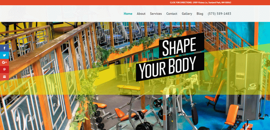
This site uses lots of angled sections with text. Some are multi-colored, some are solid, others are transparent, several use parallax, and at least one is an overlay. Several include blocks of text that angle with the section. They work great as highlights and don’t get in the way of the content.
2. Harmony Pilates
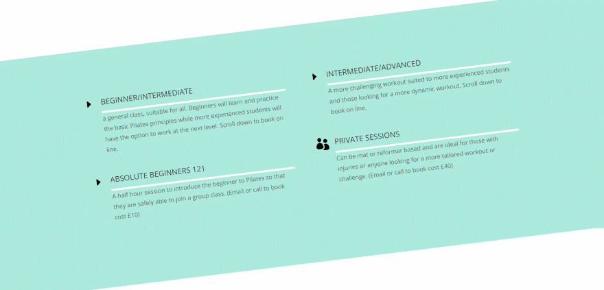
This website has a section with tilted text. I’ve actually wanted to see tilted text for a while. Text doesn’t have to be horizontal. Tilted images and graphics have been used for years but it’s uncommon to see titled text. The tilt alone is enough to make this section stand out.
3. SDG Nederland
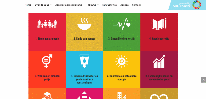
This one has lots of blocks within its layout that provide links to goals. The blocks are multi-colored and use both graphics and text. They also include an overlay on hover.
4. WPDev.Work
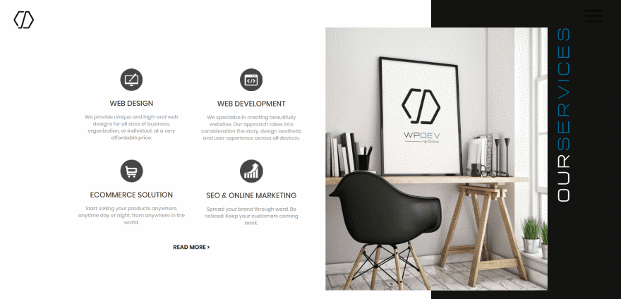
One of the elements that stands out about this site is the alternating sections with overlapping images with vertical text. The text is multi-colored and is placed over the dark background. The images appear and slide into place on scroll.
5. Hailey Sault
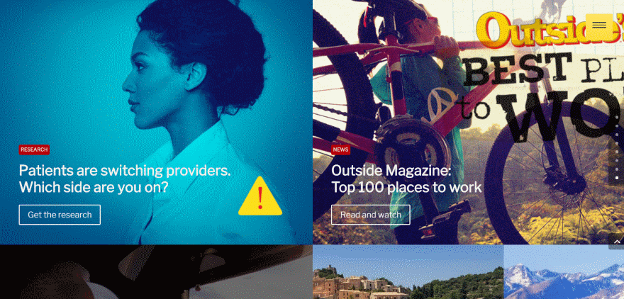
Using images as links to pages is fairly common but this website does it in a unique way. The images are place in two columns in full-width, completely removing the space on all sides. The categories are placed within red boxes that stand out. Each of the images use elegant overlays.
6. Powdi Studio
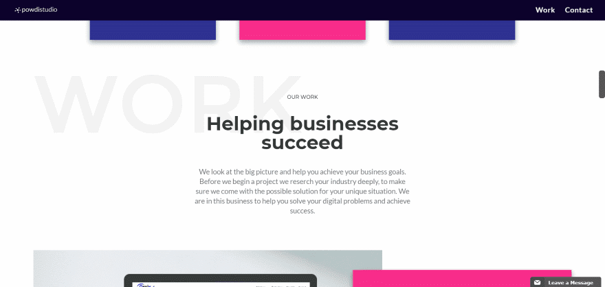
This website introduces each section with an offset title in the background that stands out just enough to see. Text is displayed over the background title to show another title in small text and a tagline in a larger text.
7. VEEZ
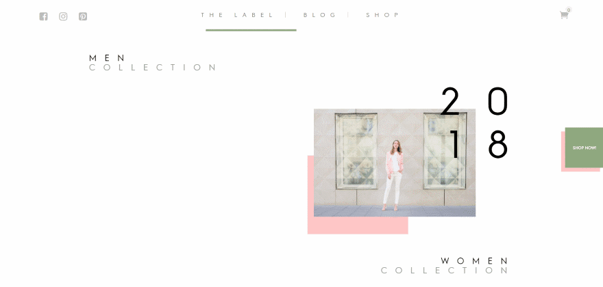
This site has a unique set of links to show the various collections. The links are placed on one side of the screen, leaving the rest of the screen empty. They show an image offset over a small background block and display the year of the collection in large text over one corner of the image. The title is placed to one side under the image. The same design is used as a shop CTA.
8. Simple But Creative
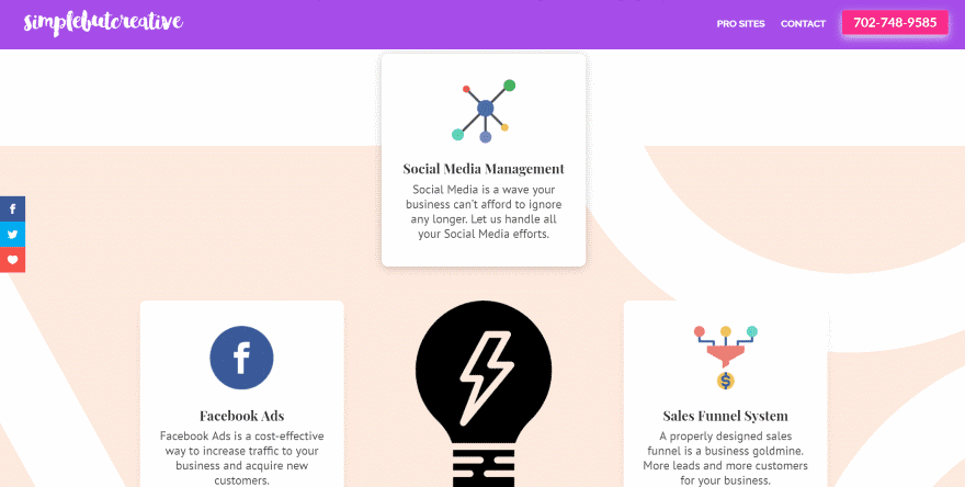
This one has an interesting section with four cards that overlap the previous and next sections. The section itself displays a two-color pattern with circles and an angled line. The cards use shadow effects.
9. Eat Thai Restaurant
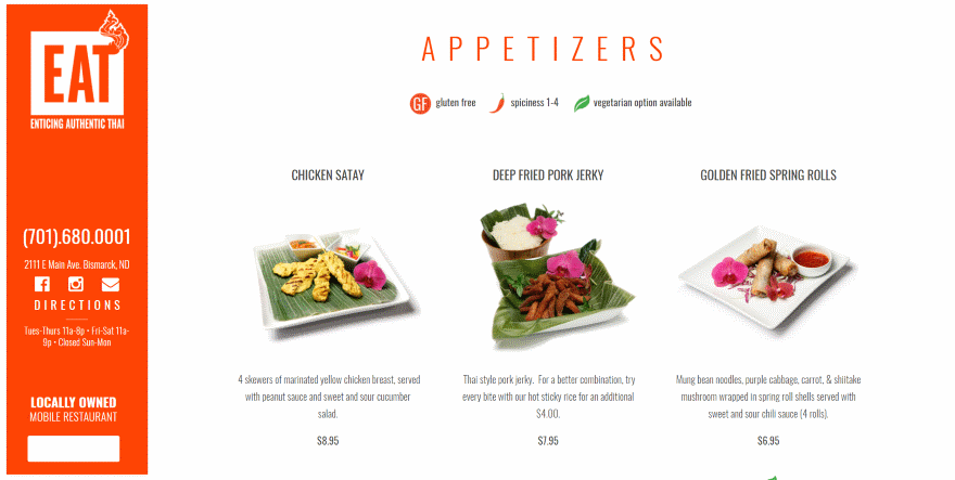
This is a one-page design where the majority of the layout is the food menu. It doesn’t need navigation. The logo, contact information, social follow buttons, link to directions, hours of operation, and a link to order online appear in a vertical bar that remains on screen. The bottom of the page includes a map.
10. Contentools
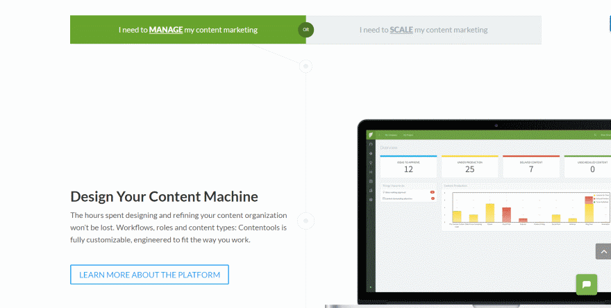
This website makes excellent use of a timeline layout. It provides two options at the top of the timeline. Clicking on the option you want displays a layout for that option. A timeline steps you through the process. Both timelines use alternating design and are mirror images of each other.
11. Bookin Agency
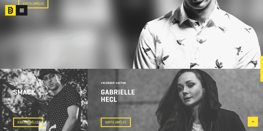
This layout focuses on the artists. It displays black-and-white images in a multi-column layout with no space between them. Hashtags are used for their categories. Yellow buttons take you to their detailed information pages.
12. Colorstone
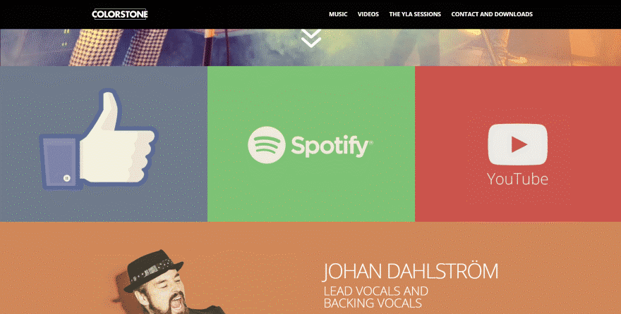
This site uses lots of large blocks of color for the backgrounds. The first section with color displays three social links in full-width. Following this is a section for each of the band members that use alternating colors in full-width. Their images includes their shadows, so the background looks like it’s part of the image.
13. Free 4 Life
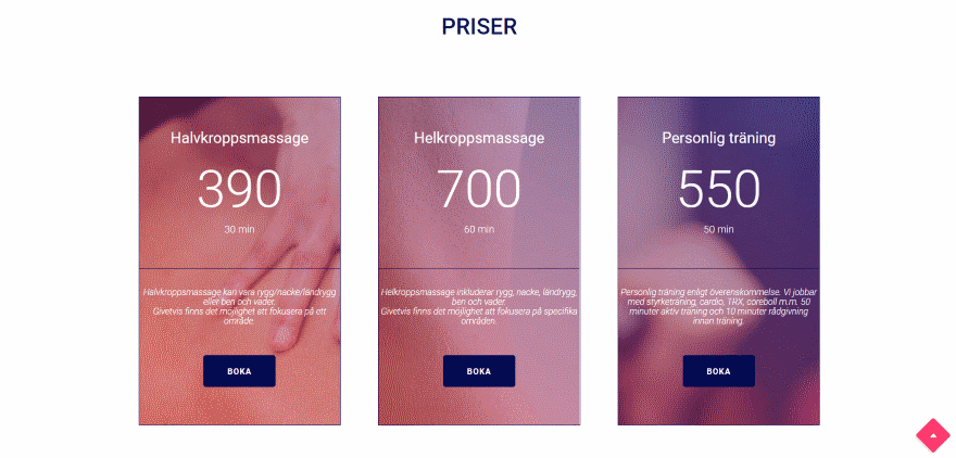
This site uses lots of elegant overlays and gradients within its alternating sections in parallax. The thing that stands out as unique though is this one section with three CTA’s that use the backgrounds from the website in parallax. They’re clean and blend perfectly with the site’s design.
14. Mary and the Dot
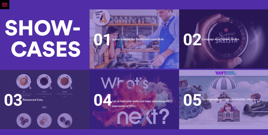
There are a lot of things I like about this one. I especially like their use of yellow, red, and overlapping elements. One thing that stands out as unique is the portfolio section. It displays the portfolio in full-width with each item being numbered with large numbers. Hovering brings in a title and link.
15. Viva Design Studio
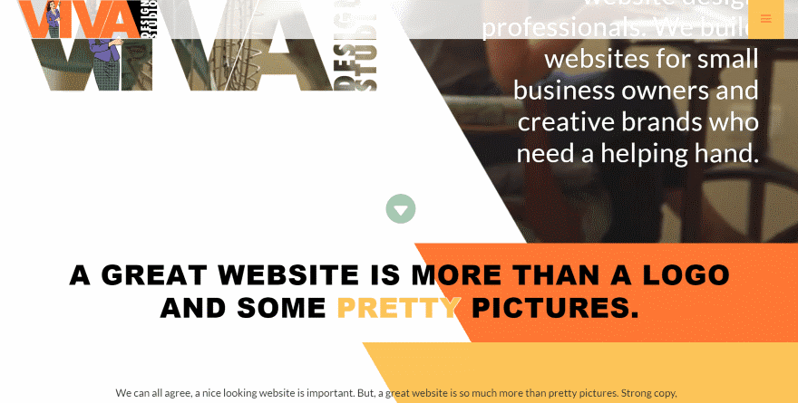
This one uses some unique graphical elements in the backgrounds. The hero section displays a video that moves from side to side and peeks through the text. Portions of the video are hidden behind a background with an angle that’s carried through the rest of the site. Blocks of color create these angled areas. Most of them have text that are styled to be readable over the various colors. One section has text that’s angled with the colored block.
16. The Floating Shelf Company
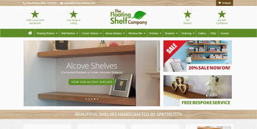
The hero section of this online store creates a clean magazine-style design with the product slider and two smaller banners to the right. The banners use hover animation to push the image upward and reveal a sales message, information about the service, and links.
17. interVisionit

This site uses a boxed design and keeps the logo and menu on screen when you scroll. The top of the scrolling area shows the site fading as you scroll. I particularly like this section that displays an image in parallax with several different section separators.
18. Veggies and Chocolate
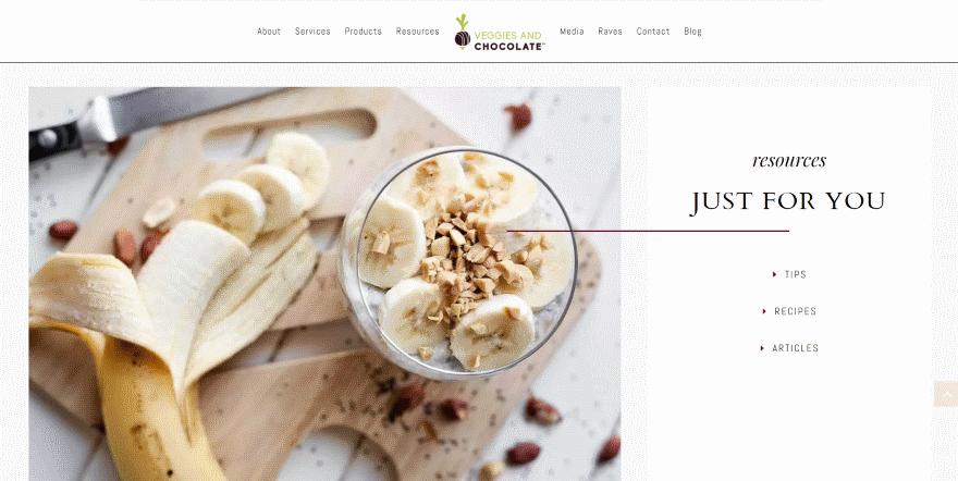
This one has a unique way of creating a list of links. It uses a 2/3 1/3 column layout to show an image in the larger side to catch your attention. The other side includes the title and links, which are centered and include an arrow for bullets.
19. Bamboo Beats
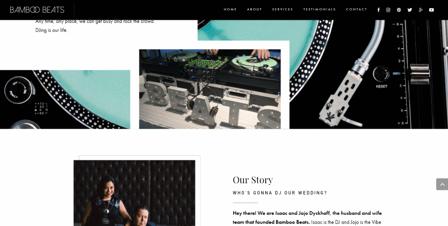
This site has several unique elements including a diamond-shaped award that connects several images, an image inset within another image, several offset and overlapping image and text modules, and multiple borders that overlap each other.
20. Yawplife
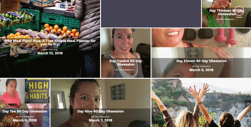
This one has a unique blog section that displays the posts within a multi-column layout. Some display as a large block, some are small, and others are wide. Those without images are rest days and they have different colored text than the others.
21. EventCreative
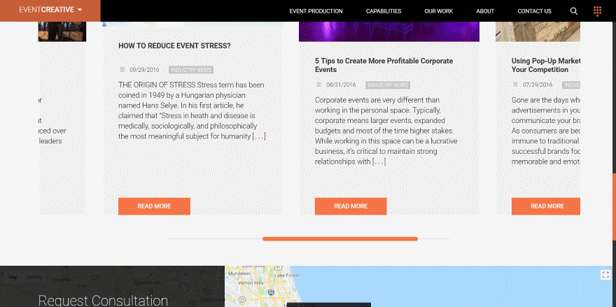
This one has several interesting elements. One that I found particularly unique was the blog section. It uses large cards that look elegant and include the expected information: image, title, meta, excerpt, and read more button. What stands out though is that you can scroll through them from side to side using a scrollable bar under the blog section.
22. Hyphen
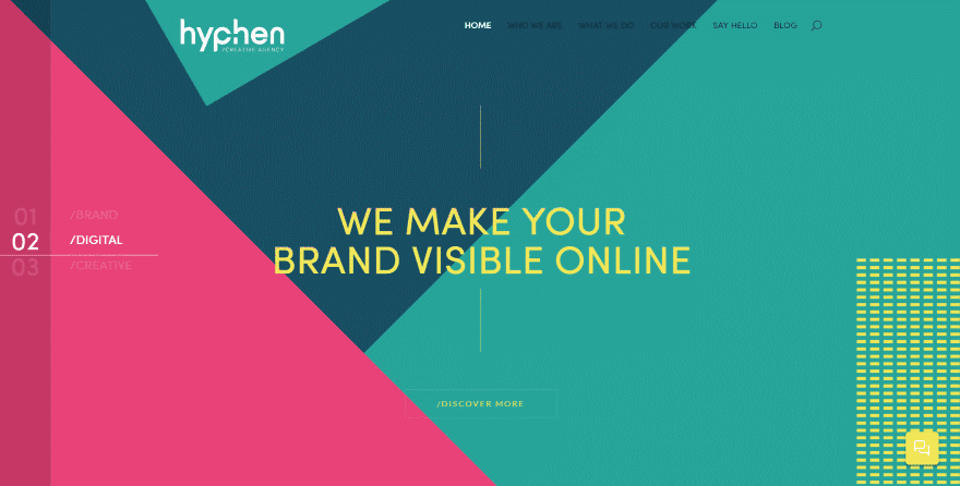
This one uses lots of interesting angles and patterns of color throughout the site. In some sections the angles give the impression that the site is tilting when it’s not. The slider displays the number and title of each slide and highlights the name of the slide that’s visible.
23. Hocking Consultants
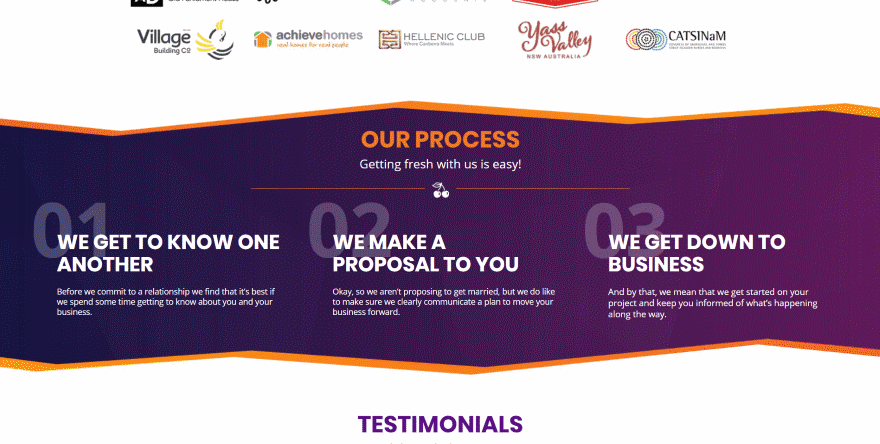
This site includes lots of elegant background gradients. My favorite section shows their process. The section includes styled separations for the top and bottom that includes multiple angles and color that matches the site’s design. Each step of the process has a number within the background with the text over it. I also like the line with an icon. This design is used throughout the site.
Ending Thoughts
That’s our look at 23 Divi websites with unique page layouts and design elements to help inspire you for your next Divi website.
In our world of amazing designers I can be difficult to design something unique. Fortunately there are lots of articles here at the ET blog about layout design with Divi. Here are just a few:
- How to Create an Abstract Gradient Hero Section with Divi (6 Gradient Color Palettes!)
- 4 Layout Design Tips to Optimize Your Divi Web Content
- Design a Striking Divi Product Layout with Image Perspective and Colorful Abstract Waves
- How to Design a Standout Work Experience section for Your Freelancer Site with Divi
- How to Use Text as an Abstract Design Element in Divi
- How to Create Pop Out Sections with Divi’s Boxed Layout
- How to Overlap Modules and Rows to Create Unique Layouts in Divi
- 25 “Hidden” Divi Features to Boost Productivity and Design
- How to Choose the Right UI Design Colors for Your WordPress Site
- 6 Color Matching Techniques for WordPress Web Designers
We want to hear from you. Which of these page layouts are your favorites? Let us know in the comments.



Thanks for the feature ET! This was unexpected. I was wondering where the traffic spike was coming from lol.
Hello!
Thanks for post.
How to obtain the parallax effect from the video in the header as on website no. 5. Hailey Sault?
Hey guys does anyone know how do show only categories of blog posts (no author, nor excerps) and highlight it like int he example 5 Hailey Sault in Divi?
Can we do the layout of WPDev.work on default DIVI theme? its pretty cool, I like the design. Simple but Elegant!
Awesome Layout for #4
Awesome Post, i was exactly looking for the same, Thank You.
Some of these designs use of white space is spot on!
Sweet! I’m always looking for creative uses of Divi, especially for landing pages and home pages. Loved the Viva Design Studio example best of all!
Thank you Brandon!
Lovely layouts. We’re proud to be using Divi on Muffin Marketing. Love how flexible the theme is!
Viva design studio is very creative, nice work!
Thank you Don! Very kind of you!
Your welcome! I love it!
Awesome list, thank you for this post. In number 18, Veggies and Chocolate, how did they make it so that the divider line appear on both divs? Also, is there a way to make a diagonal line?
Thanks
I love the layout of “Simple but Creative” and WPDev.work, are these available??
Wow! This is unexpected! Thanks Rosanne!
Where can I find the 23 Layout Packs you show on your website today?
I suspect that many of these, like my own, are custom Divi designs, not built from layout packs.
the Harmony Pilates site is built with the free “1 Page Divi Layout for virtual assistant/VA” layout from Divi Theme Examples
The “Yawplife” website looks to me amazing. It has background image and text over on it.
And I think it also uses Masonary jQuery that arranged it properly.
Anyway, thanks admin.
I built one very similar to #11, i loved it. Shame its not up anymore 🙁
I have been a web developer for almost 20 years and currently have 3 major projects using WP & Divi with a range of plugins, I could not live without it now for my WP builds it is a must have & have recently upgraded my membership to lifetime.
Thanks guys keep up the good work I am not quite as adept as some developers on here with the DIVI library, however i’m getting the hang of it fast please check out my first Major deployment just made live a few weeks ago.
great ! Thanks !