In today’s post, we’re going to provide you with three different ways to style the sub menu of your vertical navigation. In one of the previous posts, we’ve already shown you how to make a transparent vertical navigation that overlaps your website when looking at it from a desktop.
The examples we’re going to share will be made on top of that transparent vertical navigation. That way, you’ll immediately have the possibility to create your vertical transparent navigation from A to Z. Throughout this post, you’ll experience different style settings that can bring your vertical sub menu to life.
Before showing you the examples, it might be interesting to see the sub menu without any changes. As usual, the vertical sub menu takes over the settings of the main menu items. Without making any additional modifications, this is what the sub menu looks like:
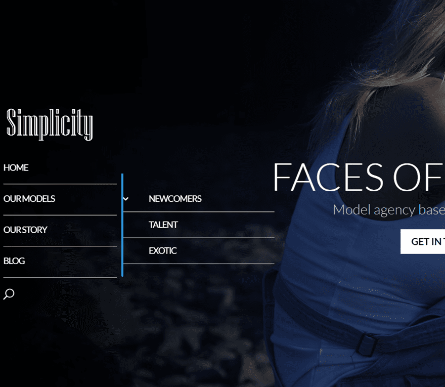
Now, let’s have a look at the three examples we’ll show you how to recreate.
First Example:
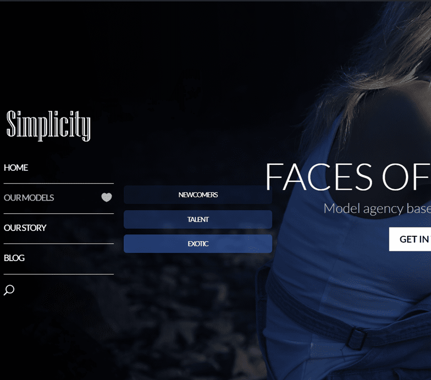
Second Example:
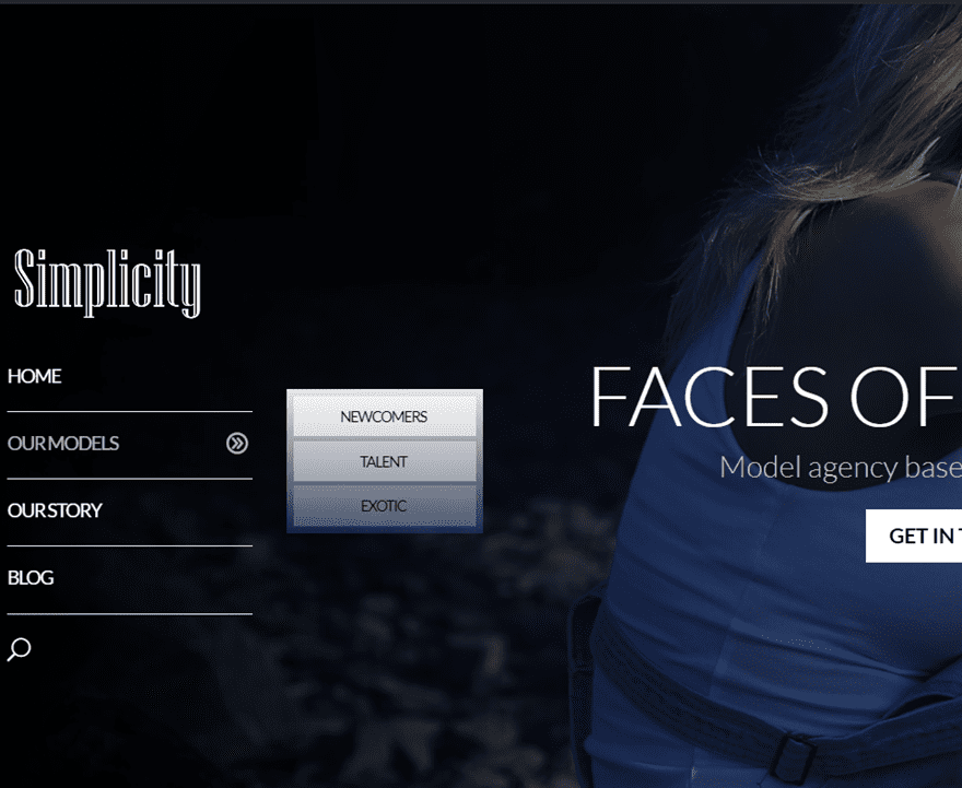
Third Example:

Subscribe To Our Youtube Channel
Before diving into the different examples that we’ve provided, we’re going to handle two general steps that are necessary before getting started. Before you design the sub menu items according to your needs, you must do two things: add the sub menu items to your menu and look for the different CSS IDs of our sub menu items. After we’ve gone through those steps, we’ll share the CSS code you need to achieve the example results.
Since there are three ways to add CSS code to your Divi website, we’ll handle each method individually. However, you can use your preferred way to add the CSS code for each one of the examples.
The first thing we’re going to do, if you haven’t done that already, is add the sub menu items. In our example, we’ve only added some sub menu items to the ‘our models’ menu item to show you how to do it. You can, however, apply the changes to other menu items as well.
If you’re on your WordPress Dashboard, go to Appearance > Menus. If you have already created a menu, use that one. If not, start by making a new menu. Then, add the main menu items to your menu. Once you’ve done that, you can add the sub menu items. Add a sub menu item and simply just put it right under the primary menu item. Do this for all the sub menu items you’d like to add to your vertical navigation.
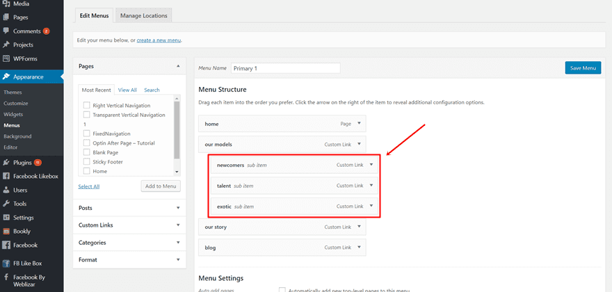
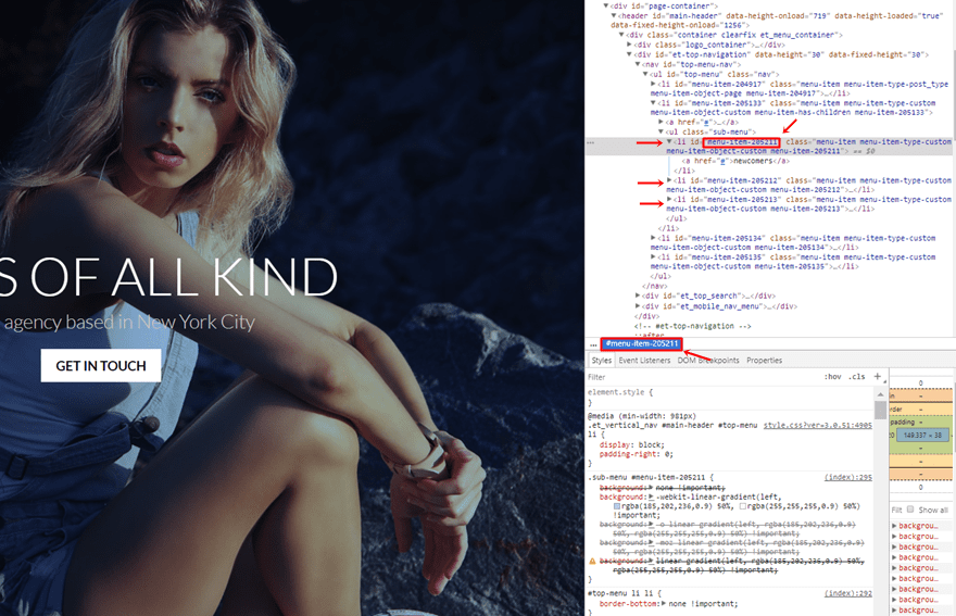
In our examples, we’ll have to make some CSS modifications to each sub menu item individually. That’s why we’ll have to look the CSS IDs up in the source. Every item has a different ID. You have to modify the CSS code according to the CSS IDs that are specifically used on your website. These could differ from the ones that are used in these examples. That’s why we’ll show you briefly where to get the IDs so you can make the modifications for your items in particular.
Go to your homepage, put your mouse on the menu and start inspecting the code. You’ll see the CSS ID appear on the menu item that’s selected. Copy each one of the CSS IDs in the sub menu list and save them for later.
Now that you’ve done the two steps, you can go over to creating the examples we’ve made.
Create The First Example

In this part of the post, we’ll show you exactly how to recreate the first example of the vertical sub menu. As you can see, the structure is really straightforward, yet, adds that extra color to your website. The primary menu items are simple and use a transparent background color. You can, of course, keep that same simplicity in your sub menu. Or, you can choose to draw a little bit more attention to it.
The colors that are being used match the background image with the gradient overlay. Keeping that kind of consistency of colors in your sub menu is recommendable if you’re trying to achieve a simple and modest result.
Add The CSS Code Through Theme Options
There are different ways to add CSS code to your page. You can, for instance, add the CSS code to one page in particular. You can also add it to the whole website through the Theme Options or the Theme Customizer. For this example, we’ll simply just add the code through the Theme Options. If you’re on your WordPress Dashboard, go to Divi > Theme Options > Scroll down the general tab and paste the following code into the Custom CSS box:
.nav li ul {
border: none !important;
}
#top-menu li li {
border-bottom: none !important;
}
.sub-menu #menu-item-205211 {
background-color: rgba(60,105,205,0.1) !important;
border-radius: 5px;
margin-bottom: 10px;
}
.sub-menu #menu-item-205212 {
background-color: rgba(60,105,205,0.3) !important;
border-radius: 5px;
margin-bottom: 10px;
}
.sub-menu #menu-item-205213
{
background-color: rgba(60,105,205,0.5) !important;
border-radius: 5px;
}
@media (min-width: 981px){
#top-menu li li a {
padding: 1px 0px 1px 0 !important;
text-align: center !important;
font-size: 11px !important;
}
.et_vertical_nav #main-header #top-menu li ul {
margin-left: 5% !important;
}
.et_vertical_nav #main-header #top-menu > li > a:after
{
right: 45px !important;
}}

#top-menu .menu-item-has-children > a:first-child:after, #et-secondary-nav .menu-item-has-children > a:first-child:after
{
content: "\e089" !important;
}
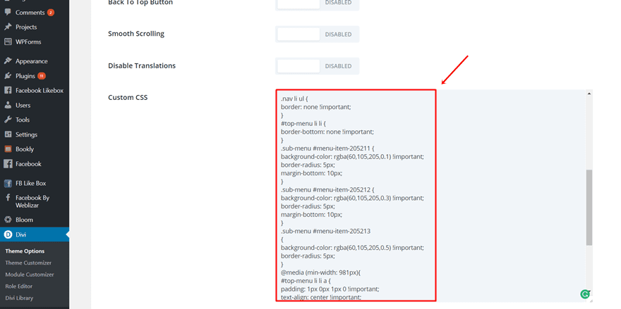
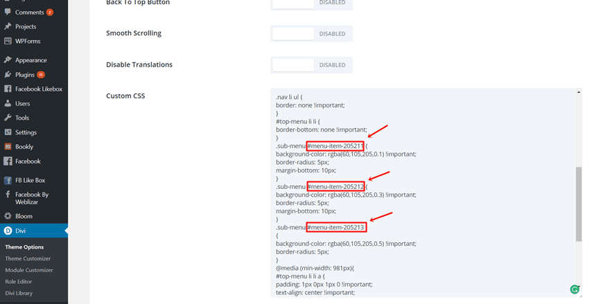
Replace the following CSS IDs in the code with the ones that apply to your sub menu. In the previous step of this post, we’ve shown you where you can find those.
Create The Second Example

The next example we’ll show you how to make has a certain gradient effect to it. The different colors that are being used are in line with the background image that is being used. We’ve added a gradient background to the complete sub menu and some individual transparent colors to each one of the sub menu items.
Add The CSS Code For One Page in Particular
Although you’ll probably want to add this code to your complete website, we’ll show you how to make this example apply to one page in particular. If you don’t want to add the CSS code lines to one page in particular, feel free to add it through the Theme Options (as shown in the first example) or through the Theme Customizer (as shown in the next example).
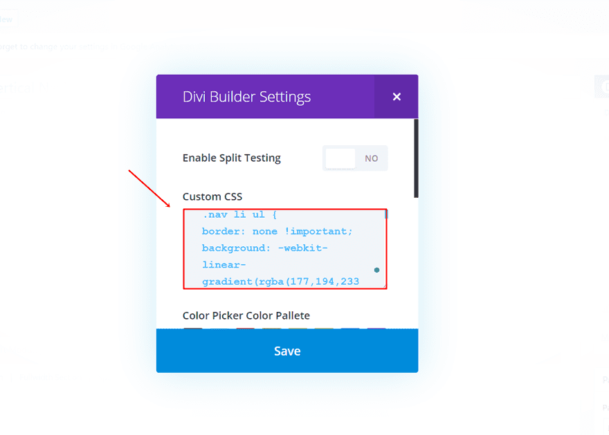
Start by opening or creating the page where you want to add the sub menu design. Now, click on the following button in the right corner of the Divi builder:
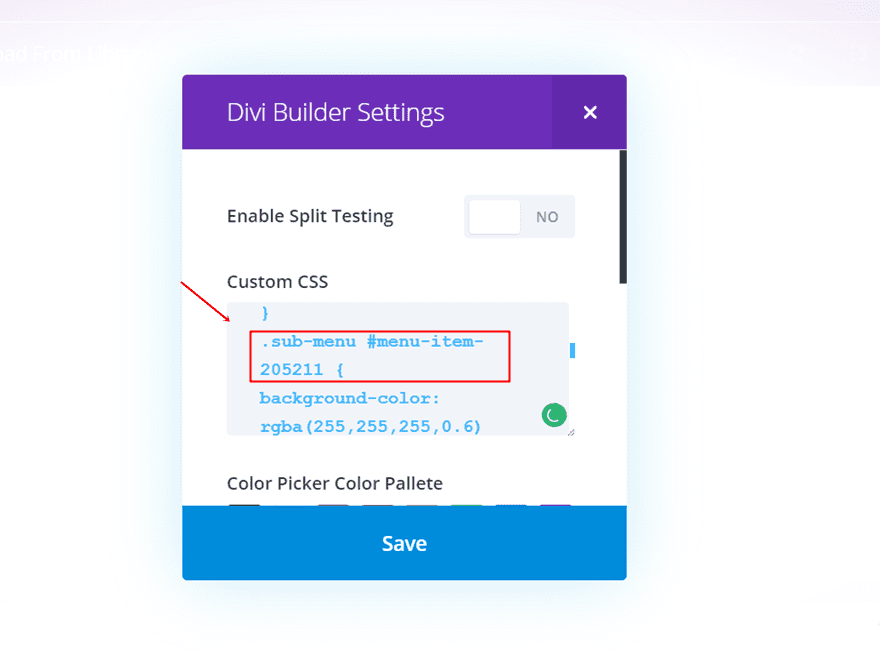
In the screen that appears, copy and paste the following lines of CSS code in the Custom CSS field:
.nav li ul {
border: none !important;
background: -webkit-linear-gradient(rgba(177,194,233,0.5), rgba(35,61,120,0.5)) !important;
background: -o-linear-gradient(rgba(177,194,233,0.5), rgba(35,61,120,0.5)) !important;
background: -moz-linear-gradient(rgba(177,194,233,0.5), rgba(35,61,120,0.5)) !important;
background: linear-gradient(rgba(177,194,233,0.5), rgba(35,61,120,0.5)) !important;
padding: 3px !important;
width: 80% !important;
}
#top-menu li li {
border-bottom: none !important;
}
.sub-menu #menu-item-205211 {
background-color: rgba(255,255,255,0.6) !important;
margin-bottom: 3px;
}
.sub-menu #menu-item-205212 {
background-color: rgba(255,255,255,0.4) !important;
margin-bottom: 3px;
}
.sub-menu #menu-item-205213
{
background-color: rgba(255,255,255,0.2) !important;
}
@media (min-width: 981px){
#top-menu li li a {
padding: 1px 0 1px 0 !important;
text-align: center !important;
color: #000000 !important;
width: 80% !important;
font-size: 11px !important;
}
.et_vertical_nav #main-header #top-menu li ul {
margin-left: 10% !important;
}
.et_vertical_nav #main-header #top-menu > li > a:after
{
right: 45px !important;
}}

#top-menu .menu-item-has-children > a:first-child:after, #et-secondary-nav .menu-item-has-children > a:first-child:after
{
content: "\61" !important;
}
Replace the following sub menu items in the CSS code with your own:
Create The Third Example

The last example we’re going to share how to make has a hover effect to it. By adding this hover effect to your sub menu, you’ll engage with your audience in a nice way without making your main menu too busy. Since the sub menu only appears when moving over the main menu item. Your visitors will therefore not constantly be confronted with the effect.
Add The CSS Code For One Page Through Theme Customizer
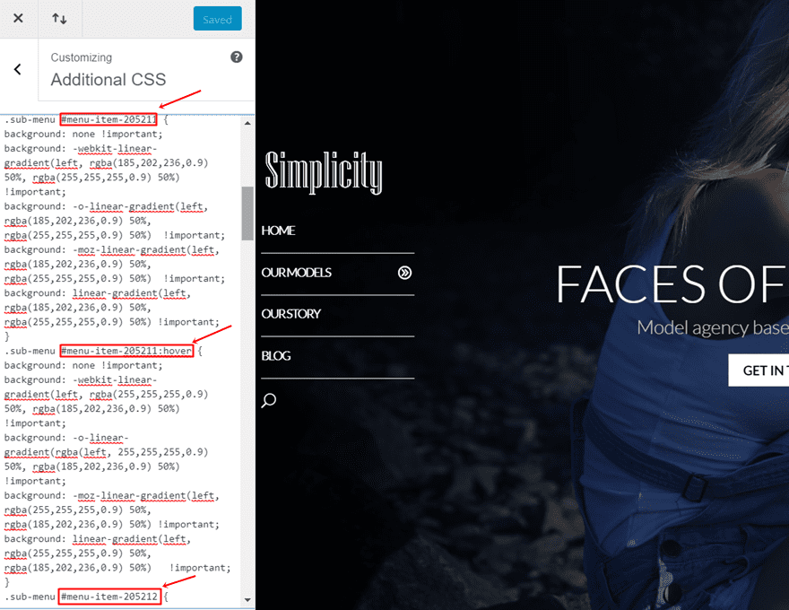
For the last example, we’re going to show you how to add the CSS Code through the Theme Customizer. If you’re on your WordPress Dashboard, go to Appearance > Customize > Additional CSS > and copy and paste the following lines of code:
.nav li ul {
border: none !important;
width: 95% !important;
}
#top-menu li li {
border-bottom: none !important;
}
.sub-menu #menu-item-205211 {
background: none !important;
background: -webkit-linear-gradient(left, rgba(185,202,236,0.9) 50%, rgba(255,255,255,0.9) 50%) !important;
background: -o-linear-gradient(left, rgba(185,202,236,0.9) 50%, rgba(255,255,255,0.9) 50%) !important;
background: -moz-linear-gradient(left, rgba(185,202,236,0.9) 50%, rgba(255,255,255,0.9) 50%) !important;
background: linear-gradient(left, rgba(185,202,236,0.9) 50%, rgba(255,255,255,0.9) 50%) !important;
}
.sub-menu #menu-item-205211:hover {
background: none !important;
background: -webkit-linear-gradient(left, rgba(255,255,255,0.9) 50%, rgba(185,202,236,0.9) 50%) !important;
background: -o-linear-gradient(rgba(left, 255,255,255,0.9) 50%, rgba(185,202,236,0.9) 50%) !important;
background: -moz-linear-gradient(left, rgba(255,255,255,0.9) 50%, rgba(185,202,236,0.9) 50%) !important;
background: linear-gradient(left, rgba(255,255,255,0.9) 50%, rgba(185,202,236,0.9) 50%) !important;
}
.sub-menu #menu-item-205212 {
background: none !important;
background: -webkit-linear-gradient(left, rgba(255,255,255,0.9) 50%, rgba(185,202,236,0.9) 50%) !important;
background: -o-linear-gradient(rgba(left, 255,255,255,0.9) 50%, rgba(185,202,236,0.9) 50%) !important;
background: -moz-linear-gradient(left, rgba(255,255,255,0.9) 50%, rgba(185,202,236,0.9) 50%) !important;
background: linear-gradient(left, rgba(255,255,255,0.9) 50%, rgba(185,202,236,0.9) 50%) !important;
}
.sub-menu #menu-item-205212:hover {
background: none !important;
background: -webkit-linear-gradient(left, rgba(185,202,236,0.9) 50%, rgba(255,255,255,0.9) 50%) !important;
background: -o-linear-gradient(left, rgba(185,202,236,0.9) 50%, rgba(255,255,255,0.9) 50%) !important;
background: -moz-linear-gradient(left, rgba(185,202,236,0.9) 50%, rgba(255,255,255,0.9) 50%) !important;
background: linear-gradient(left, rgba(185,202,236,0.9) 50%, rgba(255,255,255,0.9) 50%) !important;
}
.sub-menu #menu-item-205213
{
background: none !important;
background: -webkit-linear-gradient(left, rgba(185,202,236,0.9) 50%, rgba(255,255,255,0.9) 50%) !important;
background: -o-linear-gradient(left, rgba(185,202,236,0.9) 50%, rgba(255,255,255,0.9) 50%) !important;
background: -moz-linear-gradient(left, rgba(185,202,236,0.9) 50%, rgba(255,255,255,0.9) 50%) !important;
background: linear-gradient(left, rgba(185,202,236,0.9) 50%, rgba(255,255,255,0.9) 50%) !important;
}
.sub-menu #menu-item-205213:hover
{
background: none !important;
background: -webkit-linear-gradient(left, rgba(255,255,255,0.9) 50%, rgba(185,202,236,0.9) 50%) !important;
background: -o-linear-gradient(rgba(left, 255,255,255,0.9) 50%, rgba(185,202,236,0.9) 50%) !important;
background: -moz-linear-gradient(left, rgba(255,255,255,0.9) 50%, rgba(185,202,236,0.9) 50%) !important;
background: linear-gradient(left, rgba(255,255,255,0.9) 50%, rgba(185,202,236,0.9) 50%) !important;
}
@media (min-width: 981px){
#top-menu li li a {
padding: 5px 0 5px 0 !important;
text-align: center !important;
color: #000000 !important;
width: 95% !important;
font-size: 11px !important;
}
.et_vertical_nav #main-header #top-menu li ul {
margin-left: 10% !important;
}
.et_vertical_nav #main-header #top-menu > li > a:after
{
right: 45px !important;
}}
#top-menu .menu-item-has-children > a:first-child:after, #et-secondary-nav .menu-item-has-children > a:first-child:after
{
content: "\61" !important;
}
Take the CSS IDs of your sub menu items and replace the ones in the example with yours:
That’s it! Your design should now look like in the example shown above.
Final Thoughts
In this post, we showed you some possibilities on how to get creative with your vertical navigation. More specifically; we showed you how to make your vertical sub menu look great. If you follow this post, step by step, you should be able to recreate the vertical sub menu perfectly. If you have any questions or suggestions; let us know in the comment section below!
Be sure to subscribe to our email newsletter and YouTube channel so that you never miss a big announcement, useful tip, or Divi freebie!


Rather than using the menu items’ IDs, you could (should) use nth-child selectors. That way when you move menu items around or add/remove items, you don’t need to edit your CSS all the time.
I’m new wordpress user.I have used sub navigation before but your hacks was really awesome.YES! It’s worked & looks really wonderful.I really like second navigation example.Good job.thanks for your css tricks
Hi Donjete,
Once again your post has me thinking about something new I can try!
I have used the vertical navigation before but I do like your transparent background designs.
I’m going to try using this today!
Nice one thank you.
Excellent, I got ideas from your post on how can i do vertical sub menu option. Thank you.
Are poor in vertical and horizontal menus, it is their weakness have to learn from wix
(I use google translation)
Thank you for your work and especially for the CSS in a particular page!
I will use this for the site I finish.
Greetings – bruno
Thanks, you saved me a few hours of customizing.
I’m just wondering why you need the menu item id. Can’t you just style for any submenu ?