Existing Divi users will already be familiar with its module system. It’s a hassle-free yet powerful way to help users of all levels design complex and stylish websites. However, given the number of options we pack into each module, you’d be forgiven for missing one or two of their key elements.
In this article, we’ll introduce you to three small (yet significant) Divi module elements you may have overlooked. We’ll tell you how to find them, before teaching you how they can help you build even better websites. However, before we jump in, let’s talk for a minute about Divi modules in general.
What Divi Modules Are (And How They Can Help You)
Divi is essentially modular, which means your site is built up using blocks that offer different functionality. You add them to your site using the integrated Divi Builder, which also comes as a standalone plugin for Elegant Themes members. On the whole, the plugin enables you to build stylish websites faster, add complex features to your site, and interact with individual elements with ease all from your WordPress editor screen.
To get started, enable the builder from your WordPress editor while working on any page or post. Once you’ve done that, you can separate your page into as many rows and columns as you want (up to six per row), and fill each of them with your chosen modules.
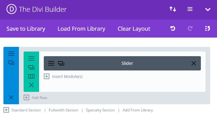
If you’re a regular reader of our blog, you’ll know we often devote entire articles to discussing a single module. If you’re looking for general advice on how to use some of the individual modules available (along with how to style them), here are some our favorite articles:
- How to Add a Floating Action Menu to Divi with the Code Module.
- An Introduction to the Divi Number Counter Module (and How to Style It).
- How to Style Divi’s Countdown Timer Module with Simple Elegance.
However, with so much functionality packed into Divi, some aspects of certain modules are often forgotten. Let’s set that straight!
3 Key Divi Module Elements and How to Interact With Them
Most Divi modules are easy to get to grips with. With that in mind, you’ll do well to simply add modules to a test page and begin exploring. However, for this piece, we’re focusing on some additional tweaks you can implement using CSS code that can enhance your website’s design.
Of course, before jumping in, make sure you’re using a child theme to protect your changes from any theme updates, and also make a backup in case any changes you make play havoc with you setup.
1. The Accordion Module’s Icons
The Accordion module enables you to pack a lot of information into a compact area. It’s perfect for Frequently Asked Question (FAQ) sections and other similar pages where users are looking for something particular among dense information:
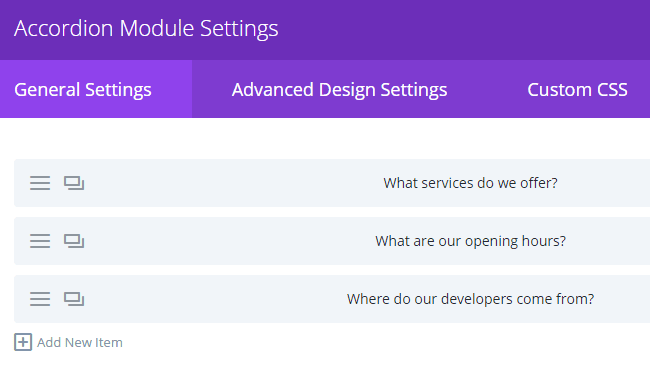
For this tweak, we’ll teach you how to modify the icons on the right side of each item on your accordion:
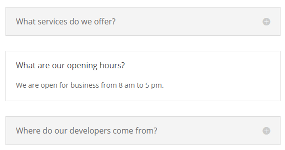
By default, Divi only enables you to adjust the color for your accordion icons. However, if you’re not happy with their size, we can enlarge them with a little CSS code. To do this, simply open the settings for your Accordion module and navigate to the Custom CSS tab. Once here, scroll down until you reach the Toggle Icon section.
Any CSS code you enter here will modify the icons in question. While on the front end these icons appear as images, under the hood they’re actually similar to a custom font. As such, you’ll need to override the default font-size property for each particular selector. Here’s how that would look:
![]()
You can use the preview function to check out what your new icons would look like…
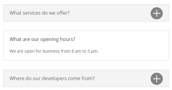
…and tweaking as necessary before saving your changes. Easy, right? Now keep in mind you can get as creative as you want using the Custom CSS section for each module, so feel free to experiment with other styles too.
The Person module is perfect for introducing yourself or other members of your team to your site’s visitors. It provides essential information that visitors or potential clients need to know about your team members, including their job role, a brief biography, and links to any relevant social media profiles:
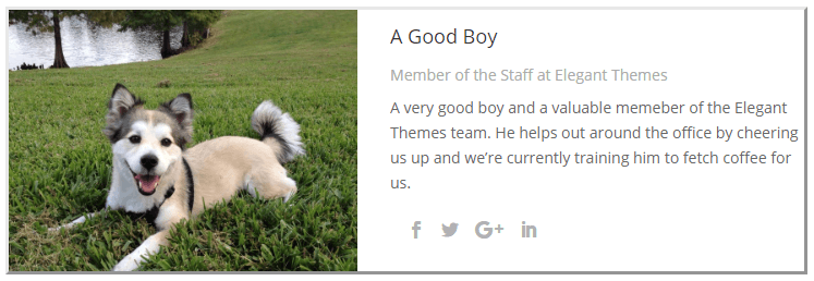
For this example, we’ll be playing around with the social media icons that appear below the biography section. Although you can tweak the colors, they don’t stand out much by default. In addition, we’re not able to easily modify their size as we did with the previous example, so it’s time to get creative!
To kick things off, open the relevant Person module’s settings, then head to the Custom CSS section. Once there, scroll down until you find the Member Social Links field. This time around, we’ll use the text-shadow property to give our icons a little visibility boost:

The pixel numbers dictate where the shadow lies horizontally and vertically in relation to the original icon, and the hex code sets its color. Feel free to experiment with the positioning, and also change the color depending on your page’s style. Here’s how our example looks:
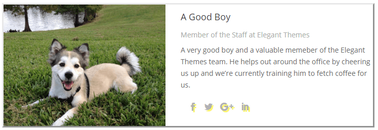
We’ve chosen a soft color so that we wouldn’t overpower the social media icons. However, you’re of course free to choose something to suit your particular design.
3. The Bar Counter Module’s Percentage Bars
Finally we have the Bar Counter module, and it’s very straightforward to use. It enables you to display multiple percentages using simple horizontal bars – each of them with its own title and progress indicator:
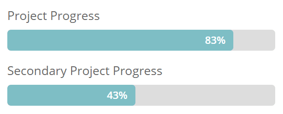
However, although it’s simple to use, it’s one of the most comprehensive Divi modules of the bunch. You’re able to modify almost every element including its title, the progress bar, and even the percentage text within. Even so, we can still have some fun with it by using the module’s Custom CSS tab. Head there and firstly find the Counter Container field.
Let’s start by applying the skew transform property along our percentage bar’s horizontal axis. Simply put, this enables you to apply a slight slant to your percentage bars. You can tweak this property by modifying the degree that you want to apply, but keep in mind it’ll also distort the text within the container.:

Lets see how it looks in our example:

Finally, if you want to liven up your percentage bars even further, you can do away with regular colors and style them using gradients. To achieve this, we’ll use the linear-gradient CSS property, and specify the colors it should transition between:

While getting to grips with the settings you can apply takes some time, it can enable you to finely tune your gradient to your exact requirements. In a nutshell, you apply a direction for your gradient, along with some suitable colors. For this example, we applied the to bottom right property so our gradient would proceed in that direction:
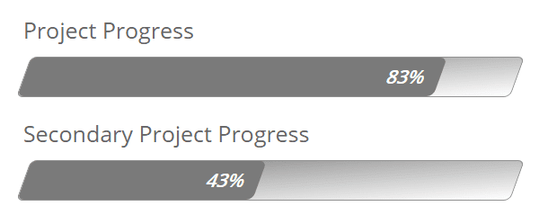
Getting gradients to look good for your percentage bars can be tricky, since you’ll need to match multiple colors to make it work. However, we’re quite fond of the creative styles you can achieve using this trick.
Conclusion
Divi’s greatest feature is probably how easy it is for new users to pick up the theme and start building complex websites with it. This is possible in large part thanks to its module system – the Divi Builder – which was designed to be as intuitive as possible.
However, getting to know all the tricks and secrets for each module may take a while. With that in mind, these three elements are a great place to start if you’re looking to customize your Divi site even further:
- The Accordion module’s icons.
- The Person module’s social media icons.
- The Bar Counter module’s percentage bars.
What Divi module do you consider to be the most useful? Subscribe and share your thoughts with us in the comments section below!
Article thumbnail image by venimo / shutterstock.com





#2 is great to know! Thanks for sharing 🙂
Hello.
I am devoeloping this site, and I have an accordion modul, which I need the + icons to the left of the header or title. How can I achive that?
Thanks
Hi Miguel! It’s hard to say without seeing your exact setup, though you’ll likely have to get your hands dirty with some coding. Try posting in our forums (https://www.elegantthemes.com/forum/) to see if another user can help.
Hi, friends. Thanks for tell us how to maximize our design with CSS. Please, don’t stop it!
I want something to add to this post. I suggest that, instead to use “linear-gradient” declaration on Counter Container Class, you should use it on Counter percentage bar. Doing this, you’ll get a really progressive linear gradient, join to the progressive percentage. You can try with this CCS code:
background: linear-gradient(to right, red , yellow). It just works for me. I hope that for y’all too. 🙂
You’re welcome, Omar! Thanks for the tip. 🙂
Hi John, I’m a new ET member and still trying to work through the masses of learning! I can’t get my head around Divi Builder (as a plug in) and any of the other Themes I can bring in, such as Divi Theme. I understand that Divi Builder isn’t a theme but a plug in. so do I need to bring this in to all my builds, as well as my chosen theme? I’ve been practicing in Divi Theme, and deleting sections/rows/mods etc and moving these around, and bringing in Demo layouts from the ET layout options, but all without Divi Builder on site.
Is this right? Kind of need this clarification to understand where the child theme goes. Im confused!
Hi Yvonne,
The Divi Theme, Extra Theme, and Divi Builder Plugin all have the same builder at their center: the Divi builder. So if you have either theme installed, you do not need to add the plugin to it, because it’s already included in the theme! If you’re using any other theme and you’d like to add the Divi builder to it, just install the plugin.
Hope this helps clear things up.
Best,
Nathan
Great, I’m starting with divi and I love to learn every day the great amount of possibilities it offers. In a simple way you can create truly attractive sites for visitors.
Great work, thank you very much
You’re welcome! We think Divi is pretty awesome too. 🙂
Dang! It happened again. Reading yet more excellent ET posts and forgot my coffee. Now it’s cold.
Thanks … thanks a lot!
All kidding aside, looks like I’ll be jumping on board with an ET membership. The value provided is absolutely over the top. Thanks for all your hard work. Looking forward to being part of the community.
You’re welcome, Cate. 🙂 We’re glad to hear you’ve decided to purchase a membership! Please let us know if you have any questions: https://www.elegantthemes.com/contact/.
Cool tweaks! Especially the progress bar module settings!
Thanks! 🙂
#2 was surprising! I did not realize that. Thank you!
You’re welcome, Ed! We’re glad you found that information useful. 🙂
I wish we could add basic styling to all the modules:
Size, Position, Background color overlay (of image)
These would be HUGELY useful. I spent all day yesterday trying to get a circle counter to look good. It was on the left of the element—would have been nice to be able to “Center” And the size was weird. I wanted an image background with a color overlay and realized I couldn’t do that.
I love DIVI and adding these to every module would be EXCELLENT. Thank you
Hi Chris! If you have suggestions for a future version of Divi, feel free to post them in our forums: https://www.elegantthemes.com/forum/.
Very useful post. Keep up the good work..
Thanks for your comment! 🙂