One of the best ways to learn to use Divi is by following the many tutorials found on this blog. If you’re interested in learning more about Divi and designing a unique header for your Divi website, this article is for you. In this article, we’ll look at over 30 helpful Divi header tutorials that you can use with the Divi Theme Builder. The tutorials include settings for desktop and mobile, and they include downloads for the example headers. This makes them easy to use.
- 1 1. Creating a Global Header
- 2 2. Creating a Sticky Header
- 3 3. Creating a Fullscreen Header
- 4 4. Creating a Slide-in Header
- 5 5. Creating a Slide-Down Header
- 6 6. Creating a Vertical Navigation
- 7 7. Creating a Transparent Floating Header
- 8 8. Creating a Transparent Sticky Header
- 9 9. Creating a Custom Rotated Header
- 10 10. Creating an eCommerce Mega Menu
- 11 11. Creating a Dropdown Menu
- 12 12. Revealing a Global Header While Scrolling Up and Hiding it While Scrolling Down
- 13 13. Creating a Mobile Collapsing Nested Menu
- 14 14. Animate a Global Header
- 15 15. Design an Inline Login Form for a Global Header
- 16 16. Add Side-by-Side Buttons to the Global Header
- 17 17. Automatically Place the Header Below the First Section
- 18 18. Add a Dropdown Contact Form the Global Header
- 19 19. Swap the Header on Scroll
- 20 20. 5 Global Presets for the Menu Module
- 21 21. Add a “New” or “Featured” Corner Label to a Menu Item in Your Header
- 22 22. Add and Animate an SVG Logo Inside Your Global Header
- 23 23. Blend Your Header and Body with Post Content Module and Section Dividers
- 24 24. Add a Dynamic Site Title and Tagline to Your Global Header
- 25 25. Optimize Your Logo Image with Global Presets
- 26 26. Add a Fixed “Latest Episode” Audio Bar to Your Header
- 27 27. 8 Delayed Button Animations for Your Header CTA
- 28 28. Change Your Sticky Logo on Scroll
- 29 29. Use Different Headers on Different Templates
- 30 30. Hide Your Header on Specific Pages
- 31 31. Add a Background Image to Your Header
- 32 32. Use a Different Header on Homepage
- 33 33. Add a Button to Your Header
- 34 34. Save Space on Your Header with Toggle Icons
- 35 35. Make Your Logo Cross the Primary and Secondary Menu Bars Inside Your Header
- 36 36. Create a Compact Testimonial Slider for Your Header
- 37 How to Find Free Divi Headers in the Elegant Themes Blog
- 38 Ending Thoughts on Divi Header Tutorials
1. Creating a Global Header
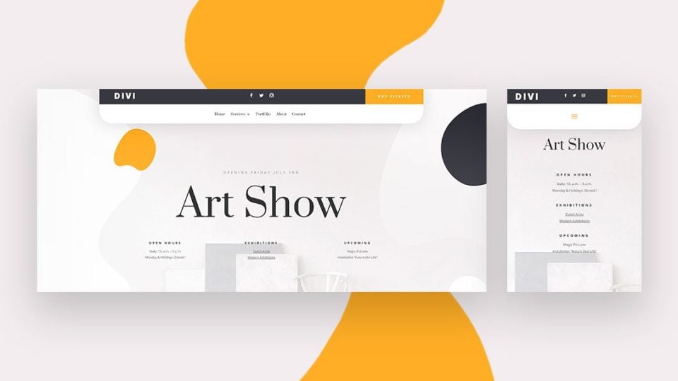
This tutorial shows how to use the Divi Theme Builder for creating global headers. It includes a top bar and a navigation bar, both styled differently. It shows how to add a top bar with a logo, social follow icons, and a CTA button. The bottom bar includes a navigation menu and it’s styled with rounded corners to stand apart from your website.
2. Creating a Sticky Header
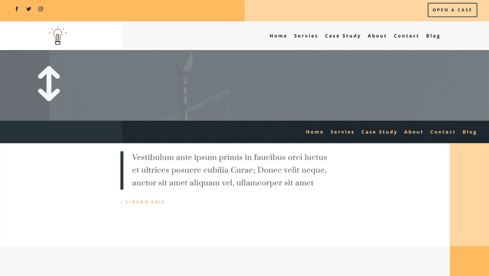
This tutorial shows the proper heading structure with both a top bar and a navigation bar. It shows how to use Divi’s sticky options to make the header stick to the top of the screen when the user scrolls. It also shows how to make the styling of the elements change when the user scrolls, giving the header a different look and feel.
3. Creating a Fullscreen Header
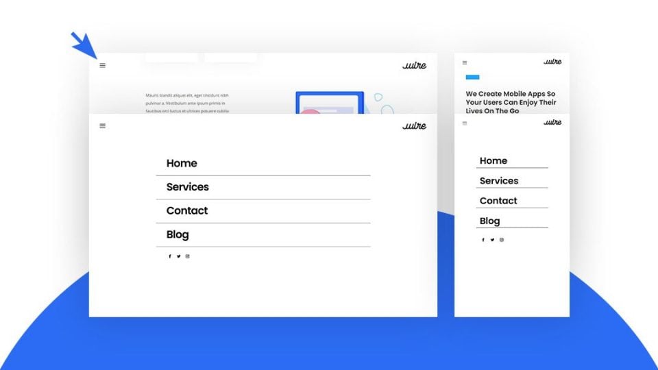
This tutorial shows how to build a custom header that opens in full screen when the hamburger menu icon is clicked. Each of the menu items is Divi modules, so you can create links or a mega menu. It uses jQuery and the code is included within the tutorial and the download file.
4. Creating a Slide-in Header
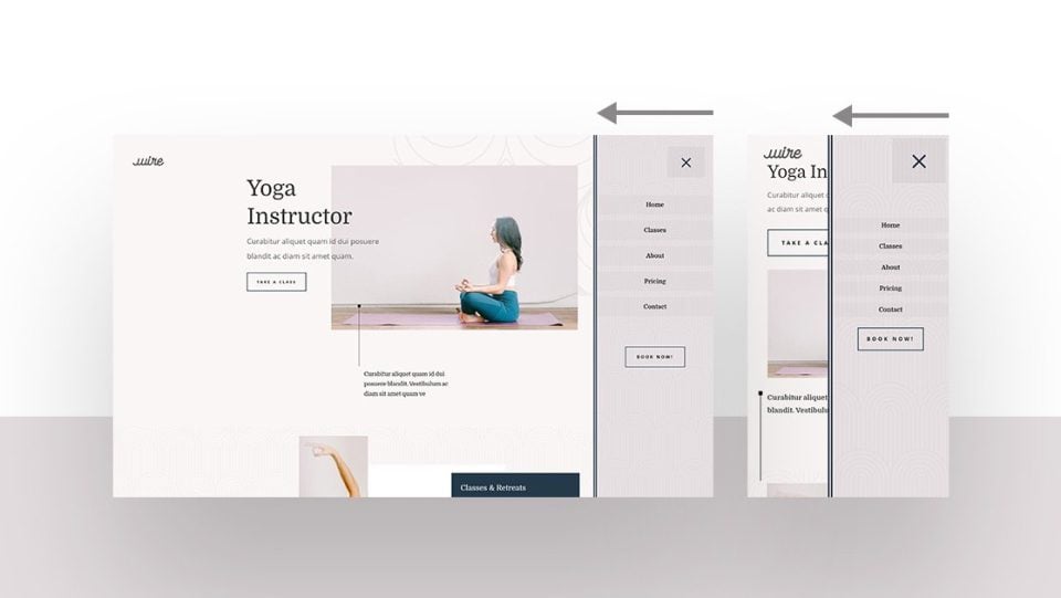
This tutorial shows how to create a menu that slides in from the right when the hamburger menu icon is clicked. The menu items are Divi modules, so you can create a mega menu. The click function uses custom jQuery that’s included in the tutorial and the download file.
5. Creating a Slide-Down Header
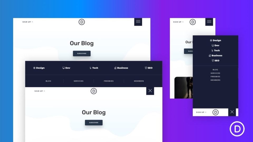
This tutorial shows how to create a header that sides down from the top and pushes the content down when the hamburger menu icon is clicked. This keeps the menu from covering the content, so you can still see it on the screen. Code is included in the tutorial and the download file.
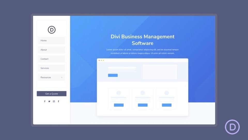
This tutorial shows how to create a vertical navigation bar that sits on the left side of the screen. It shares the screen with the website’s content and remains in place when the user scrolls. The content area is smaller than normal so both can share the same screen.
7. Creating a Transparent Floating Header
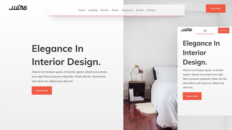
This one creates a transparent header that floats near the top of the page. The menu is kept in place with an absolute CSS position. It includes a logo, a navigation menu, and a CTA button. Since it’s transparent, the page shows through as you scroll.
8. Creating a Transparent Sticky Header
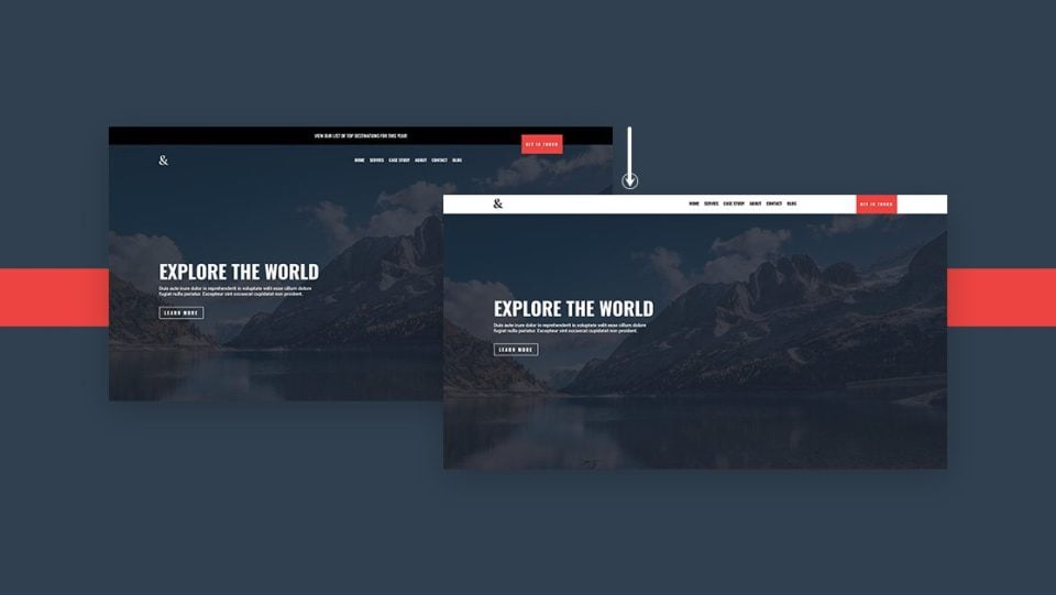
This tutorial shows how to create a navigation bar that becomes sticky and changes styles when the visitor scrolls. It has a top bar above the navigation menu that isn’t sticky. Once the navigation bar reaches the top, it becomes sticky and changes color.
9. Creating a Custom Rotated Header
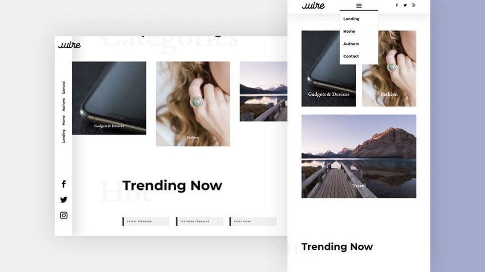
This one creates a vertical header that’s placed on the left side of the screen and it’s transparent. It remains in place as the user scrolls and the website’s background shows through. The navigation links are also placed vertically. The header is placed at the top of the page on mobile devices.
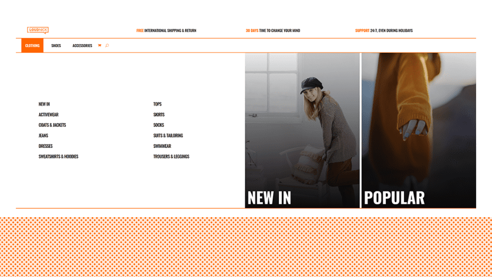
This tutorial shows how to create a mega menu built with Divi modules. Add as many modules as you want. You can even include WooCommerce modules, making this menu a great choice for eCommerce websites to showcase your products and categories. This is an advanced tutorial that includes code within the article and the download files.
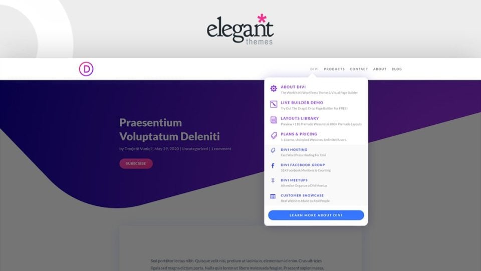
This tutorial shows how to replicate the Elegant Themes dropdown menu using the Divi Theme Builder. This is an advanced mega menu with text, icons, and CTAs. You can also add more modules to create your own custom variation on the ET menu.
12. Revealing a Global Header While Scrolling Up and Hiding it While Scrolling Down
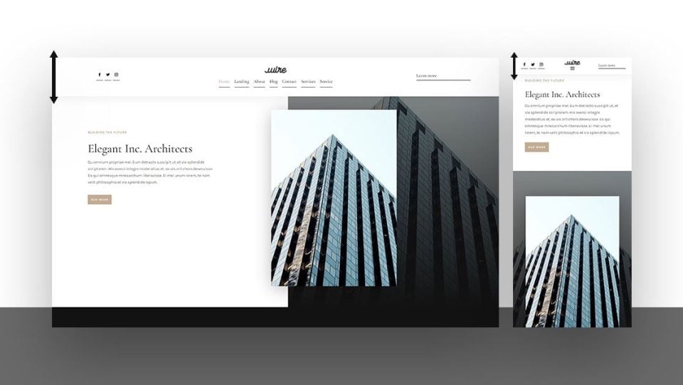
This one shows how to create a unique header that’s revealed when the user scrolls up, but it hides when the user scrolls down. This allows you to show more content when they’re scrolling down but has the benefits of a sticky header when they’re scrolling up.
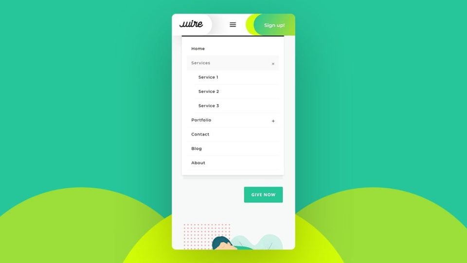
This tutorial shows how to create a menu specially designed for mobile. The menu items are nested. It uses a mobile collapsing effect for the navigation menu. Und users can easily open or collapse the menu items on mobile devices.
14. Animate a Global Header
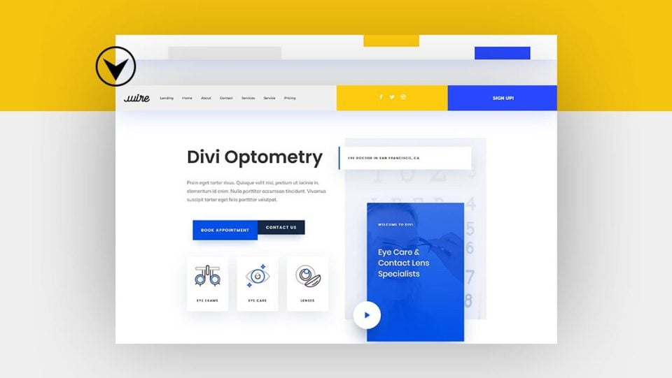
This one shows how to animate the elements of your global header so they stand out and grab attention. Animated elements include the navigation menu with a logo, social media follow icons, and a CTA button. The elements stack on mobile screens and appear one at a time.
15. Design an Inline Login Form for a Global Header
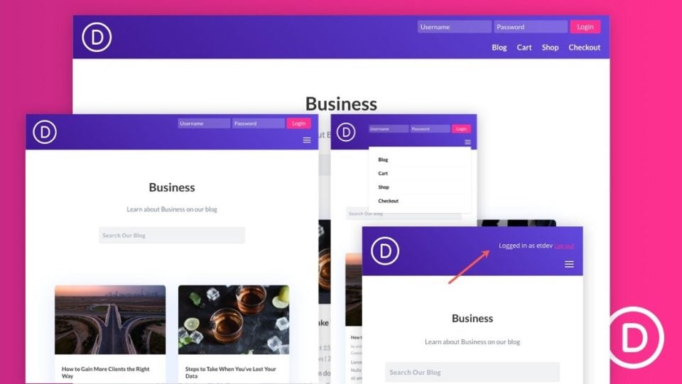
If you want to create an inline login form for your header, this is the tutorial you need. It adds the Divi login module to the header above the navigation menu and adds some extra styling with CSS. The CSS is included in the tutorial and the download file.
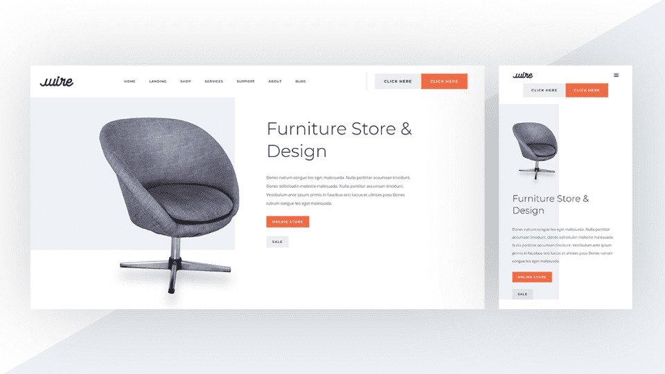
This tutorial shows how to use a unique button design to create interesting CTAs for your header. The buttons sit side-by-side, so they’re attached. Each still looks like a different button. One is a primary button and the other is a secondary button.
17. Automatically Place the Header Below the First Section
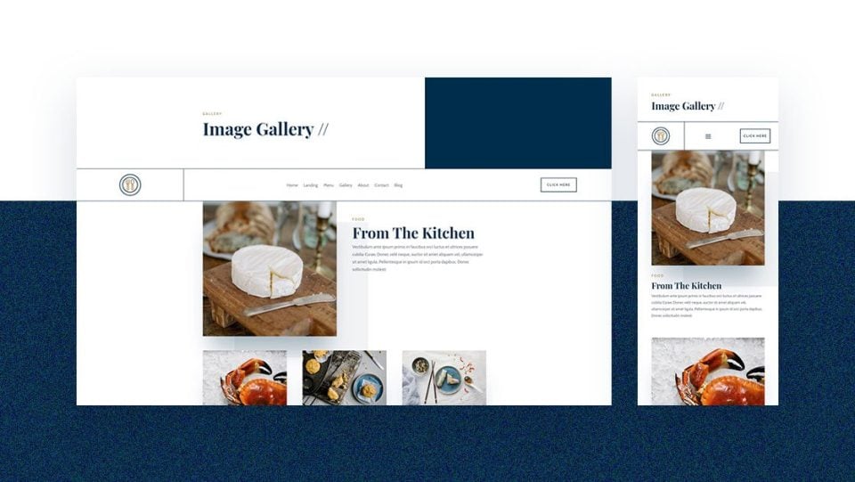
This tutorial shows how to automatically place the header below the first Divi section on each page. This allows the hero section of the page to display first, and then the header with the logo, navigation menu, etc., appears below that.
18. Add a Dropdown Contact Form the Global Header
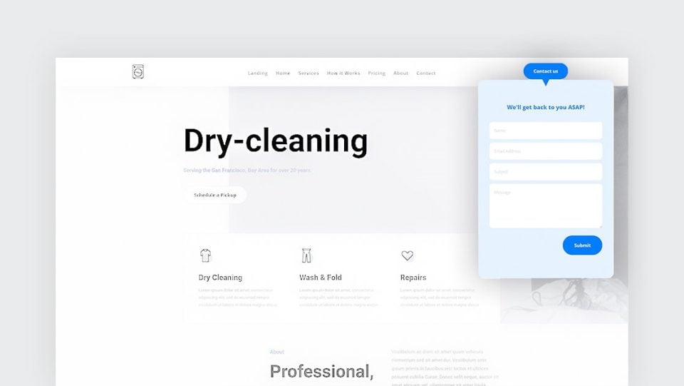
This one shows how to add a dropdown contact form to your global header. The contact form is small and opens when a contact button is clicked. This keeps the header clean while providing easy access to the contact form. It includes jQuery and CSS in the tutorial and the download file.
19. Swap the Header on Scroll
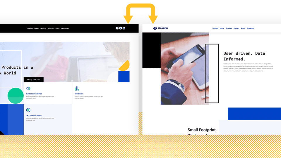
If you’ve ever wanted your header to change to a different header when the user scrolls, this is the tutorial you need. The two headers can include different content and have different colors. It includes jQuery in the tutorial and the download file.
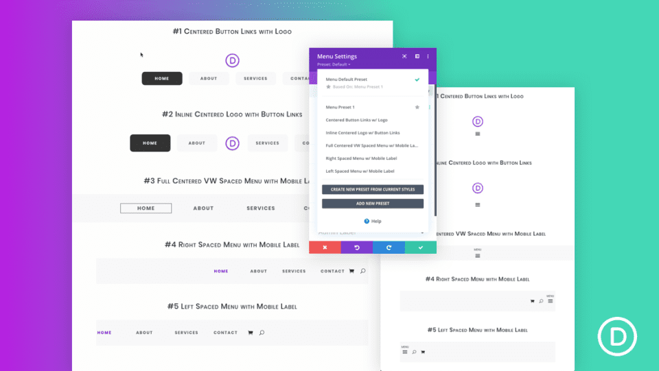
Presets are a great way to save time and create a consistent design with the Divi Builder. This tutorial shows how to create 5 global presets to help you streamline the process of creating Divi headers. Even though the presets are created from scratch, you can also download them from this tutorial.
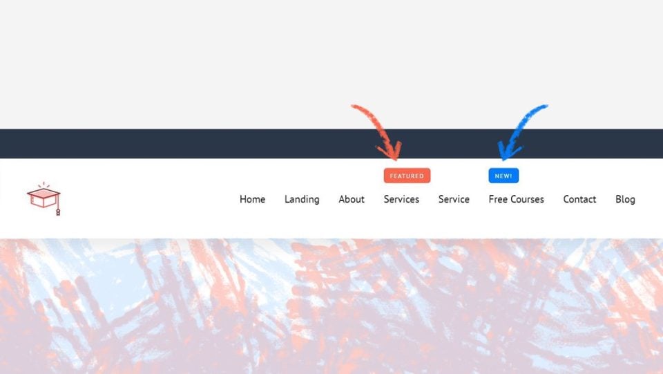
New and Featured labels are a great way to draw the attention of your visitors to your products and posts. They look great and they help your visitors find the most important pages on your website. This tutorial shows how to create them for menu items to draw attention to specific links.
22. Add and Animate an SVG Logo Inside Your Global Header
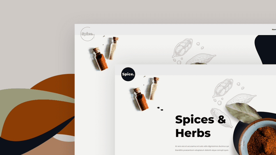
This tutorial shows how to use SVG files for your logo, so you’re not limited to just PNGs. It goes even further and shows how to animate the SVG logo. The animation is handled with the Anime JS library. You can use it to animate any logo.
23. Blend Your Header and Body with Post Content Module and Section Dividers
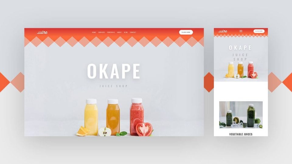
Section dividers are a great way to create a smooth transition between Divi sections. This one shows how to use Divi’s built-in section dividers to create a transition between the header and the body content.
24. Add a Dynamic Site Title and Tagline to Your Global Header
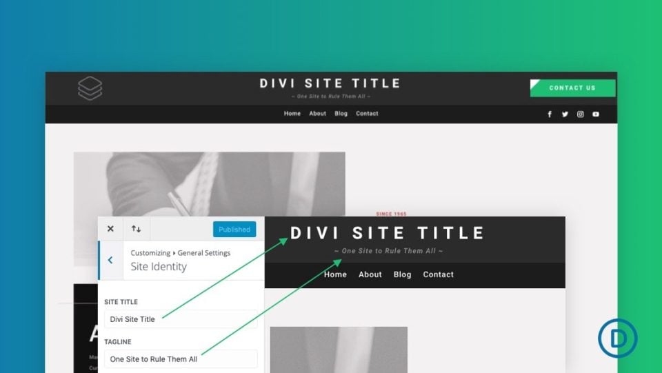
A site title works great as a replacement for the logo or to provide a brief description of the site. Dynamic site titles allow you to change the title in one location and it’s automatically changed anywhere that uses the dynamic title. This tutorial shows how to add dynamic site titles to your global header.
25. Optimize Your Logo Image with Global Presets
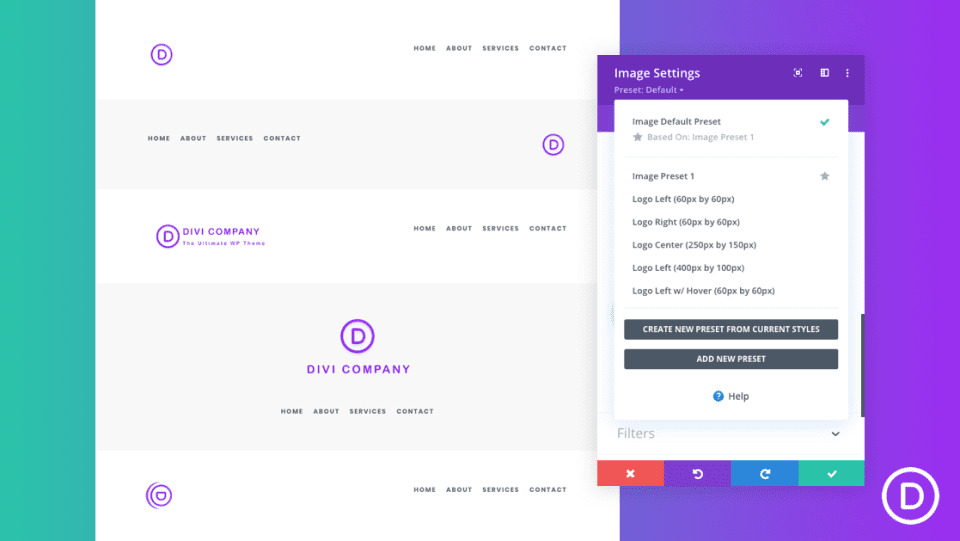
If the site logo image is unoptimized, it can cause every page to load slowly or not fit correctly on the screen. This tutorial shows how to use Divi’s optimization options to create the right size, position, and style. It also shows how to turn your settings into presets that you can use again and again.
26. Add a Fixed “Latest Episode” Audio Bar to Your Header
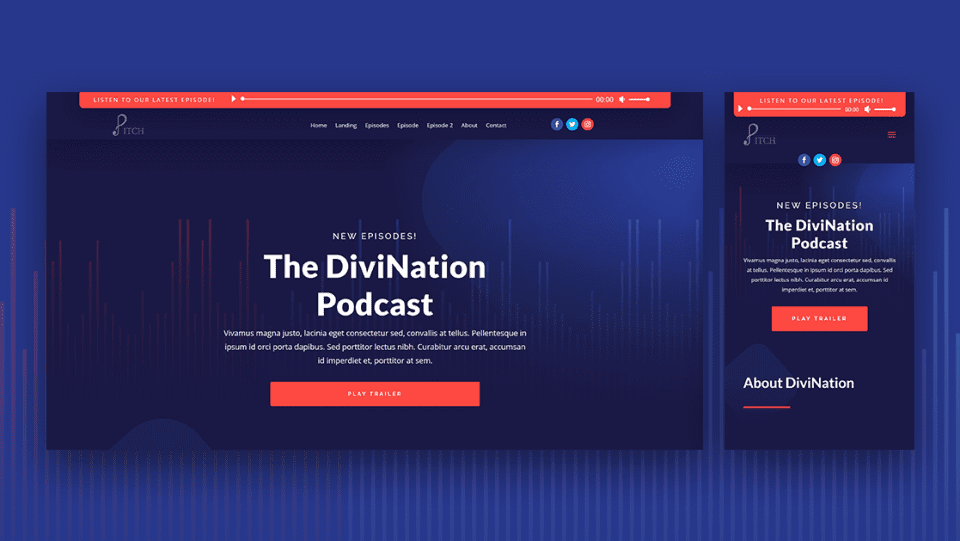
Divi’s audio module is excellent for those who host podcasts. This tutorial shows how to add an audio module and text module to add an audio bar to your header with your most recent episode. The text module includes a loop animation to draw the visitor’s attention.
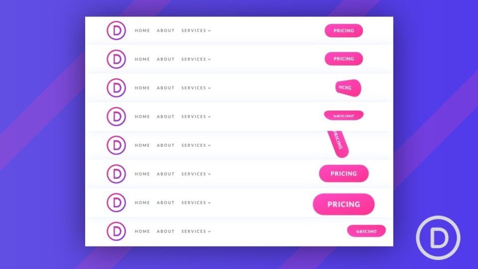
Button animations are great for drawing attention to your CTAs. This tutorial shows how to create 8 delayed button animations to create a custom header CTA. The animations are created using unique combinations of Divi settings. They can be used anywhere on your website.
28. Change Your Sticky Logo on Scroll
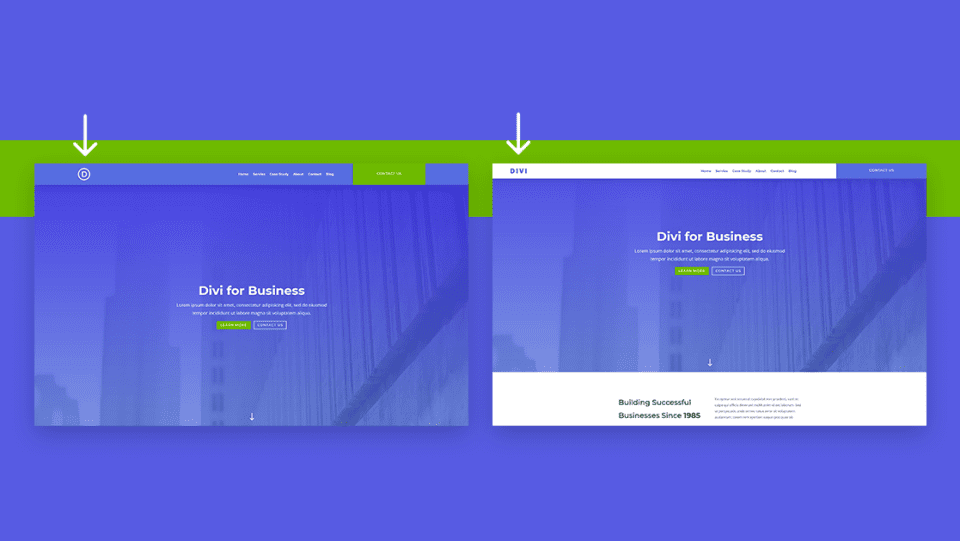
Even if your header is sticky, it’s possible to change the logo when the user scrolls. This is a great way to highlight the header or make it stand apart from the design of the page. This tutorial shows how to do this along with changing the style of the global header on scroll.
29. Use Different Headers on Different Templates
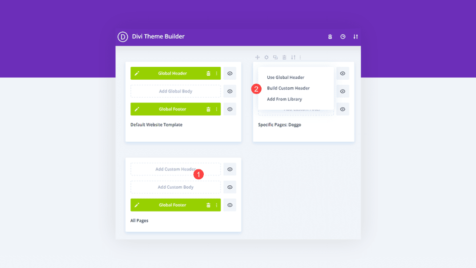
This tutorial shows how to use specific headers for certain pages and posts. The Divi Theme Builder lets you create a global header, but you can override that header on any page or post. You can have a different header for each template if you want, and it only takes a few clicks to assign them.
30. Hide Your Header on Specific Pages
Not only can you use a different header for different templates as we saw in the tutorial above, but we can also hide the header on specific pages. This tutorial shows how to do that using the Divi Theme Builder settings. You can hide the header based on the specific page, post type, category, tag, etc.
31. Add a Background Image to Your Header
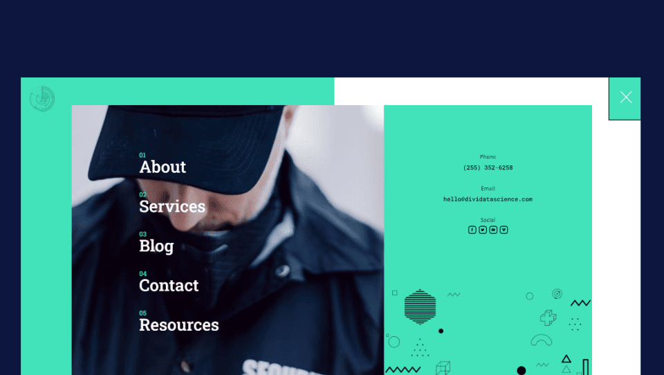
A background image is a great way to have your header stand out from the crowd. It’s easy to do with the Divi Theme Builder. This tutorial shows how to add a background image to your header and adjust it for the back effect.
32. Use a Different Header on Homepage
Another option for using different headers on different pages is to use a different header on your homepage then you use everywhere else. This is especially helpful if you want to create a landing page or interior page with a different purpose than your homepage. This tutorial shows how to do this with the Divi Theme Builder.

Buttons are some of the best CTAs you can add to your header. They draw attention and make it easy for users to click. This tutorial shows how to add a button to your Divi header for your entire website or specific pages. You can also use this knowledge to place them anywhere on your website.
34. Save Space on Your Header with Toggle Icons
![]()
Toggling content is a great way to save space in a header and keep your design clean. Rather than seeing the content in its entirety, you can display an icon. When the user clicks the icon, the content will then display. This tutorial shows how to toggle the content for the phone number, email address, and social sharing buttons. This tutorial includes CSS and jQuery in the article and the download file.
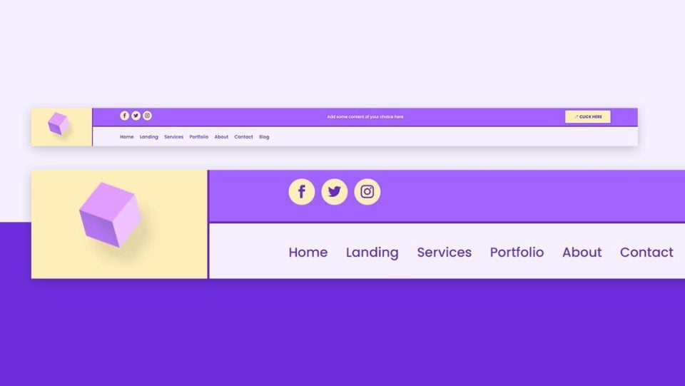
Placing the logo in either the top bar or navigation bar looks great, but it can also limit your design options. This tutorial shows how to place your logo so that it crosses both menu bars inside the header. CSS for this tutorial is included in the article and the download file.
36. Create a Compact Testimonial Slider for Your Header
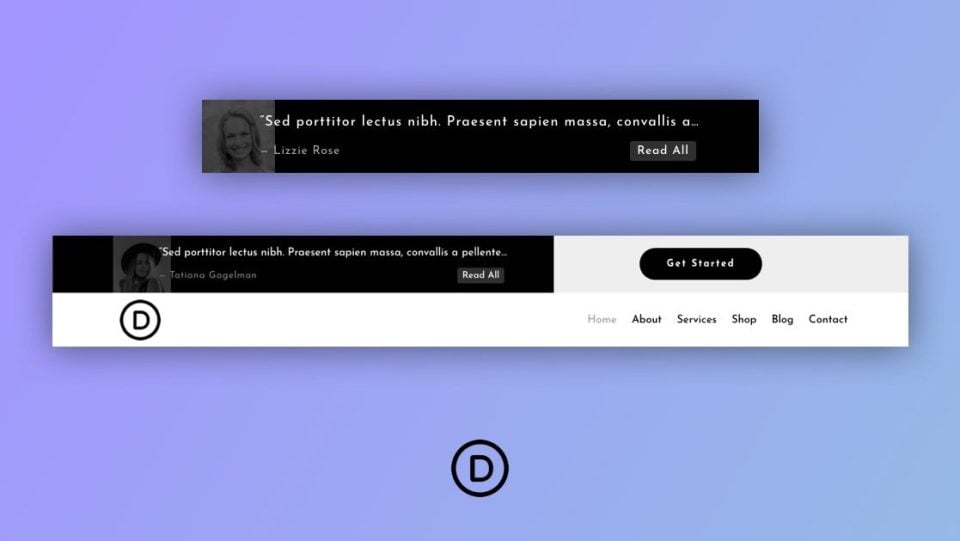
Adding short testimonials to the header is a great way to make your header unique and draw attention to your services, build trust, and build credibility. This especially works great with short testimonial sliders. This tutorial shows how to create a compact testimonial slider for your Divi headers to showcase your short testimonials.
How to Find Free Divi Headers in the Elegant Themes Blog
There are lots of free Divi headers in the ET blog. Simply search for “free header”, “free divi header”, or similar keywords. You’ll find lots of free headers to choose from.
Ending Thoughts on Divi Header Tutorials
That’s our look at 30+ helpful Divi header tutorials using the Divi Theme Builder. There are lots of ways you can customize your Divi headers to stand out from the crowd. These 30+ tutorials are a great way to learn the details of the Divi Builder and Theme Builder while developing your own unique elements.
We want to hear from you. Have you used any of these 30+ helpful Divi header tutorials? Let us know which is your favorite in the comments.



Awesome and useful post – thanks so much!
Randy thank you very much, congratulations for such a good idea, because it is true that it takes time to find the tutorials when you need them and this tutorial provides an invaluable time saving, hopefully new tutorials will be repeated
Thanks for this.
Hello,
It’s a really good idea!
Because it is sometimes difficult to find the right tutorial
when we need it, among your hundreds
excellent tutorials.
thank you
Great article and interesting header designs in one place. And if possible make one slide in headers and off-canvas headers mobile (right-left/left-right/top-bottom/bottom-tio side in animations) menu template too and share the layout design block. Thnak you
Wow lots of ideas in that list, thanks this will come in useful.
Wow that was a good one, perfect.