Animated Scroll buttons have a simple yet important job of grabbing a users attention and leading them down your web page. These type of buttons are normally found above the fold so that a visitor can simply click the button without having to scroll to the next important section of the web page. In fact, Divi has this scroll button feature built-in to the fullwidth header module.
In this tutorial, I’m going to show you how to create completely custom animated scroll buttons in Divi. So, if you are looking for a creative alternative to Divi’s built-in scroll button in the fullwidth header module, these animated scroll button designs will help point you in the right direction (literally).
- 1 Sneak Peek
- 2 Download the Animated Scroll Buttons Layout for FREE
- 3 Download For Free
- 4 What You Need to Get Started
- 5 Building the Header Section
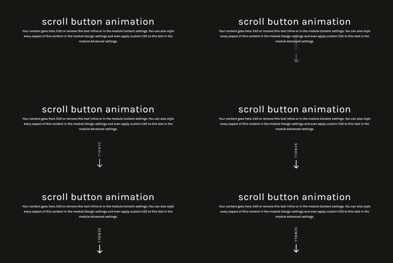
- 6 Animated Scroll Button Design #1: Vertical Text with Slow Bounce Animation
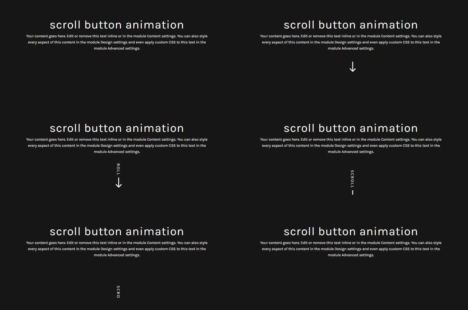
- 7 Animated Scroll Button Design #2: Vertical Marquee Text Animation
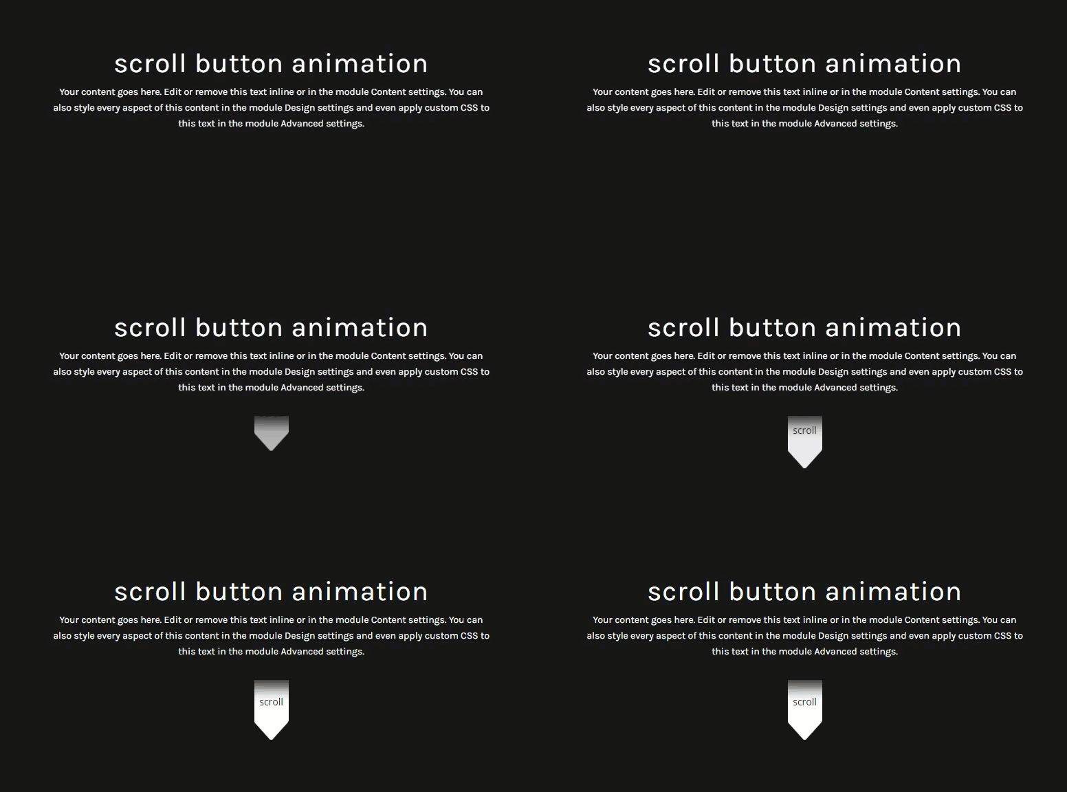
- 8 Animated Scroll Button Design #3: Arrow Tab with Delayed Slide Down Animation
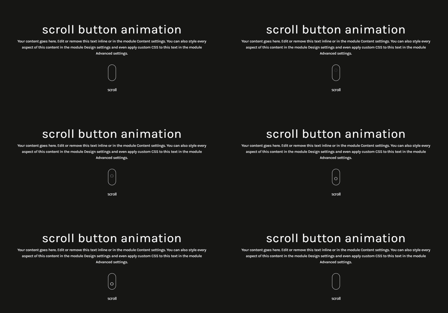
- 9 Animated Scroll Button Design #4: Mouse Scrolling Animation
- 10 Adding Anchor Link Functionality
- 11 Get Creative!
- 12 Final Thoughts
Sneak Peek
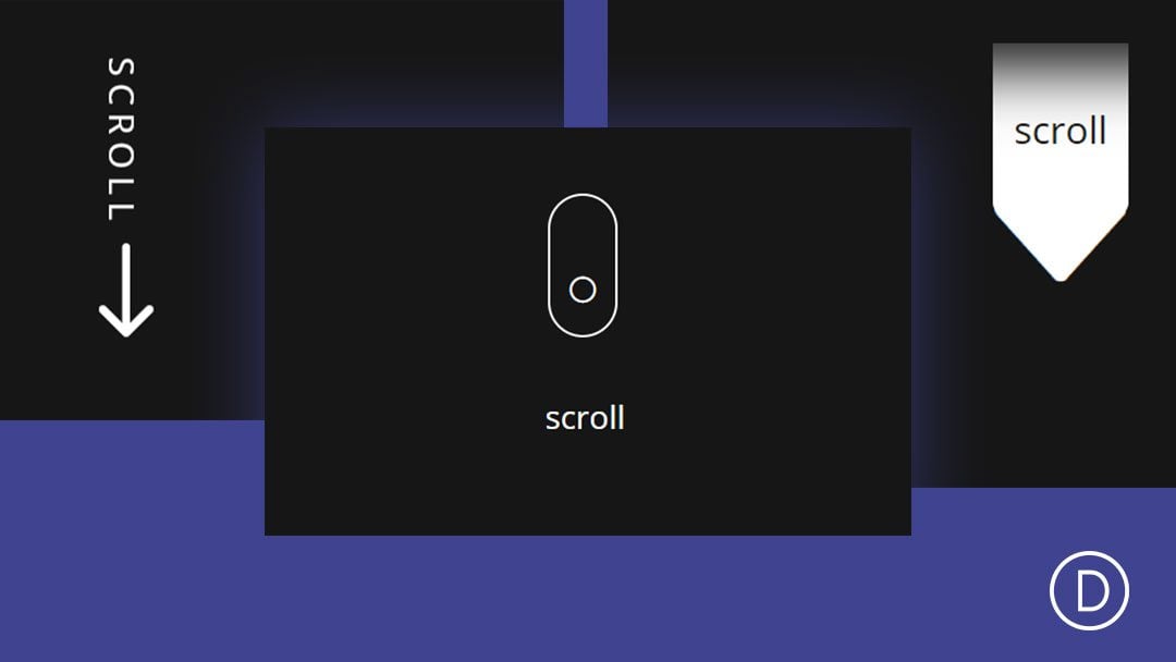
Here is a quick look at the designs we will build together.
To lay your hands on the designs from this tutorial, you will first need to download it using the button below. To gain access to the download you will need to subscribe to our newsletter by using the form below. As a new subscriber, you will receive even more Divi goodness and a free Divi Layout pack every Monday! If you’re already on the list, simply enter your email address below and click download. You will not be “resubscribed” or receive extra emails.
Subscribe To Our Youtube Channel
To import the layout to your page, simply extract the zip file and drag the json file into the Divi Builder.
Let’s get to the tutorial shall we?
What You Need to Get Started
To get started, you will need to have the following:
- The Divi Theme installed and active
- A new page created to build from scratch on the front end (visual builder)
- Images to be used for mock content
After that, you will have a blank canvas to start designing in Divi.
Building the Header Section
Before we start designing the animated scroll buttons, we need to set up our mock header section. Since we are going to concentrate more on getting the animated scroll button designs, we are going to keep the header design simple with a dark background. Once done, we can duplicate the section to tackle each new scroll button design.
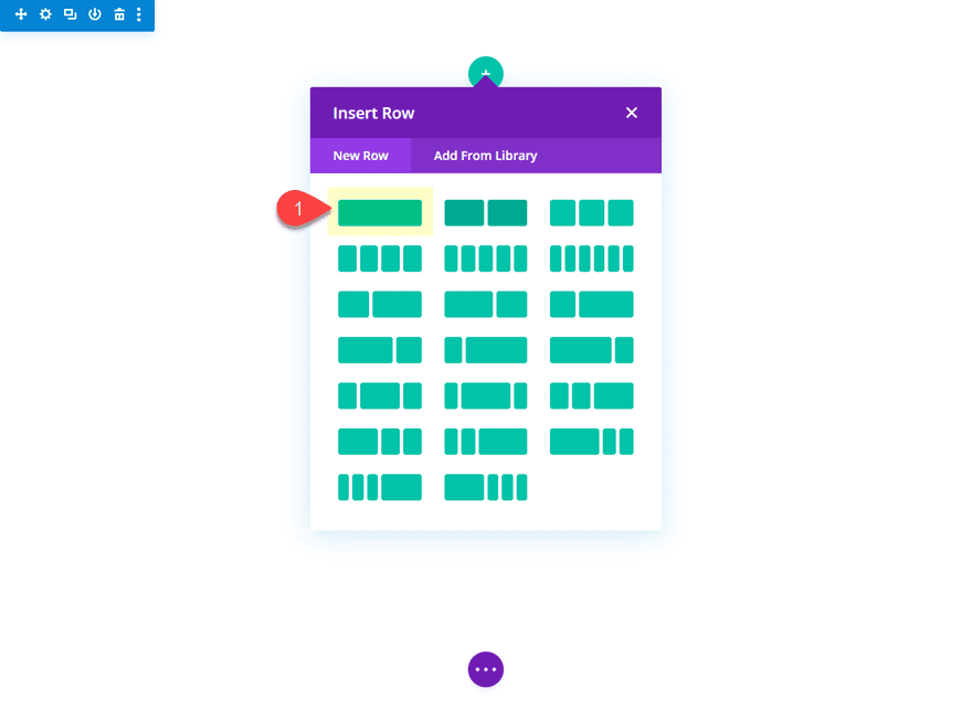
To start, create a regular section with a one column row.
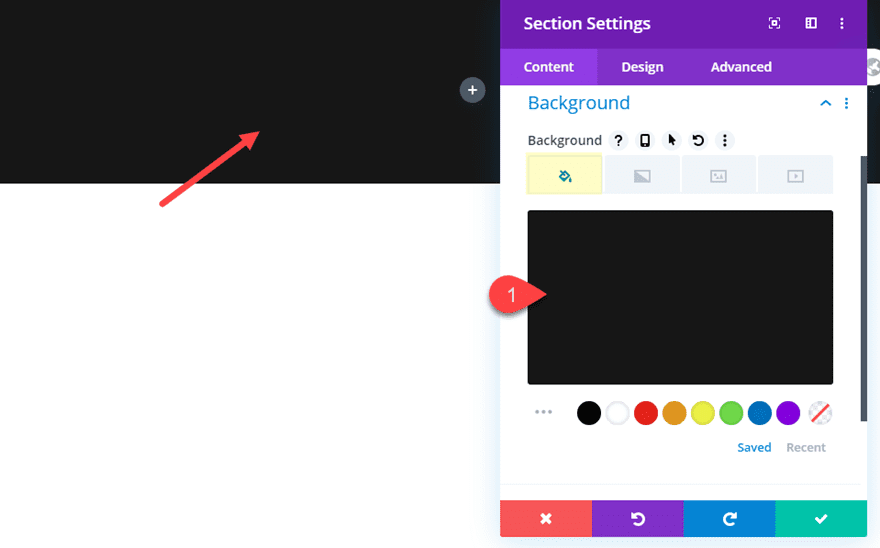
Then before you add a module, open the section settings and add a dark background as follows:
Background Color: #222222
Any dark background will work.
Add the Header Text
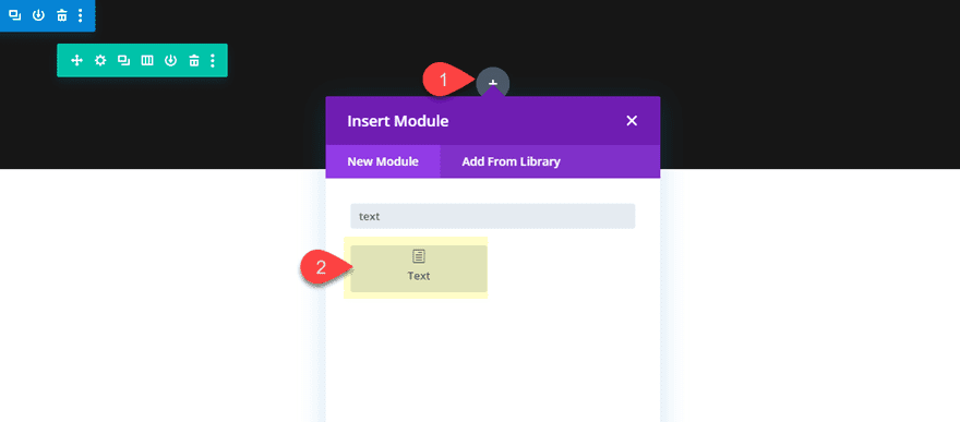
To create the mock header text, add a new text module to the one column row.
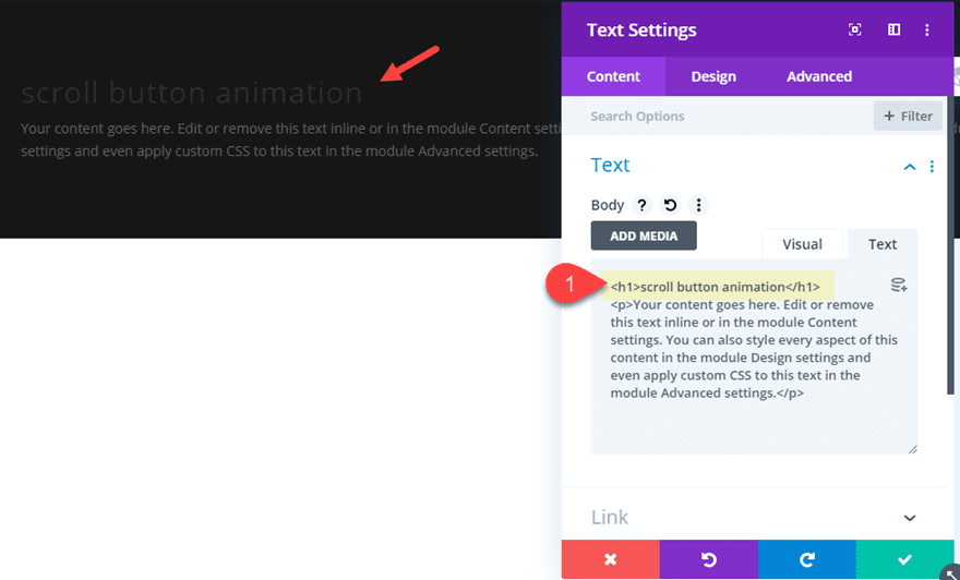
Then update the body content with an h1 header just above the default paragraph text.
<h1>scroll button animation</h1>
<p>Your content goes here. Edit or remove this text inline or in the module Content settings. You can also style every aspect of this content in the module Design settings and even apply custom CSS to this text in the module Advanced settings.</p>
Then update the design settings as follows:
Text Font: Karla
Text Text Alignment: Center
heading Text Size: 5vw
Text Color: Light
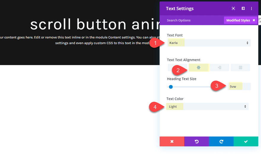
This will be the basic section design we will use for our different animated scroll buttons.
With our basic section design in place, we are ready to add our first animated scroll button. This scroll button consists of a blurb module that will have an icon on the right side. Then the text and icon will be rotated vertically so that the arrow icon points down. After that we will add the bounce animation with a slow duration.
Here’s how to do it.
First, add a new one-column row just below our row containing the header text.
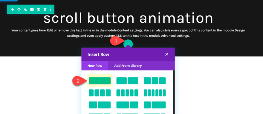
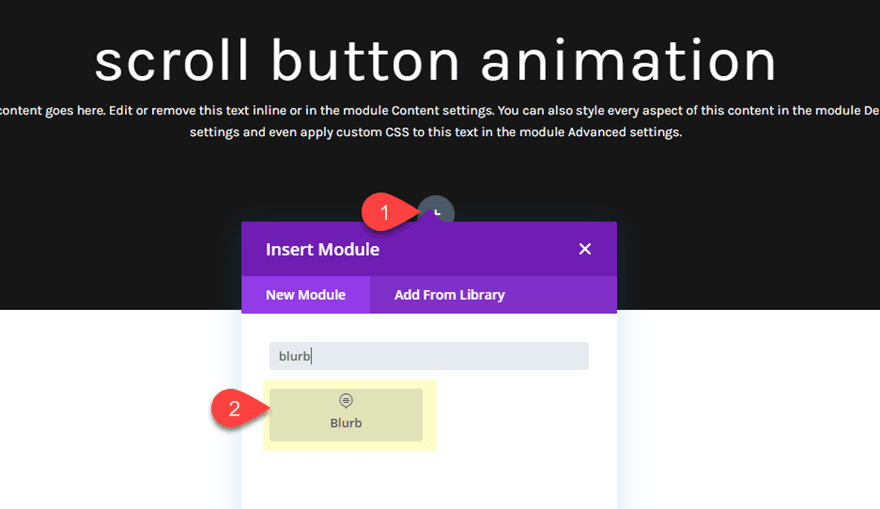
Then add a blurb module to the row.
Under the blurb settings, delete the default body content and add the following:
Title: scroll
Use Icon: YES
Icon: right arrow (see screenshot)
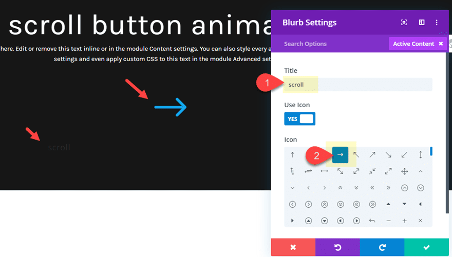
Then update the design settings as follows:
Icon Color: #ffffff
Image/Icon Placement: Left
Use Icon Font Size: YES
Icon Font Size: 50px
Title Font Style: TT
Title Text Color: #ffffff
Title Text Size: 14px
Title Letter Spacing: 3px
Title Line Height: 50px (the same as the icon font size)
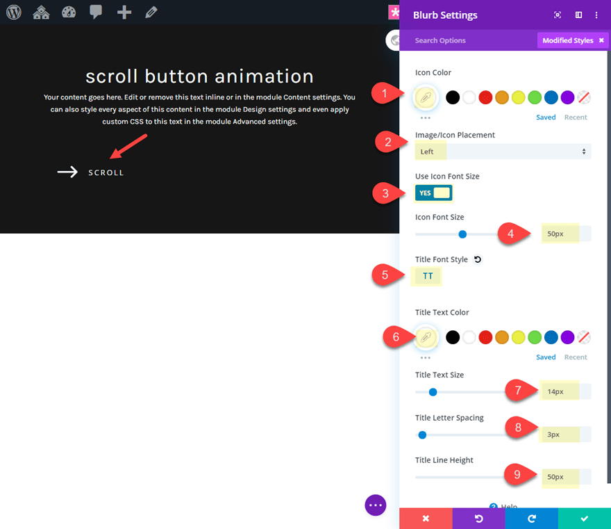
Next, we need to give our blurb a set width and rotate it vertically as follows:
width: 132px
Module Alignment: center
Transform Rotate Z axis: 90deg
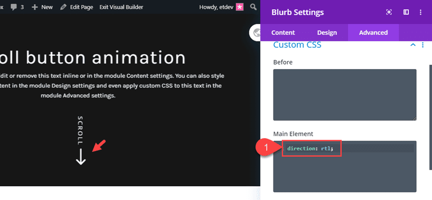
Now all we need to do is reverse the content order of the blurb so that the arrow icon is on the right of the blurb instead of the left. This will make the arrow display under the vertical text as intended. To do this we need to add the following custom CSS to the Main Element:
direction: rtl;
Adding the Slow Pulse Animation
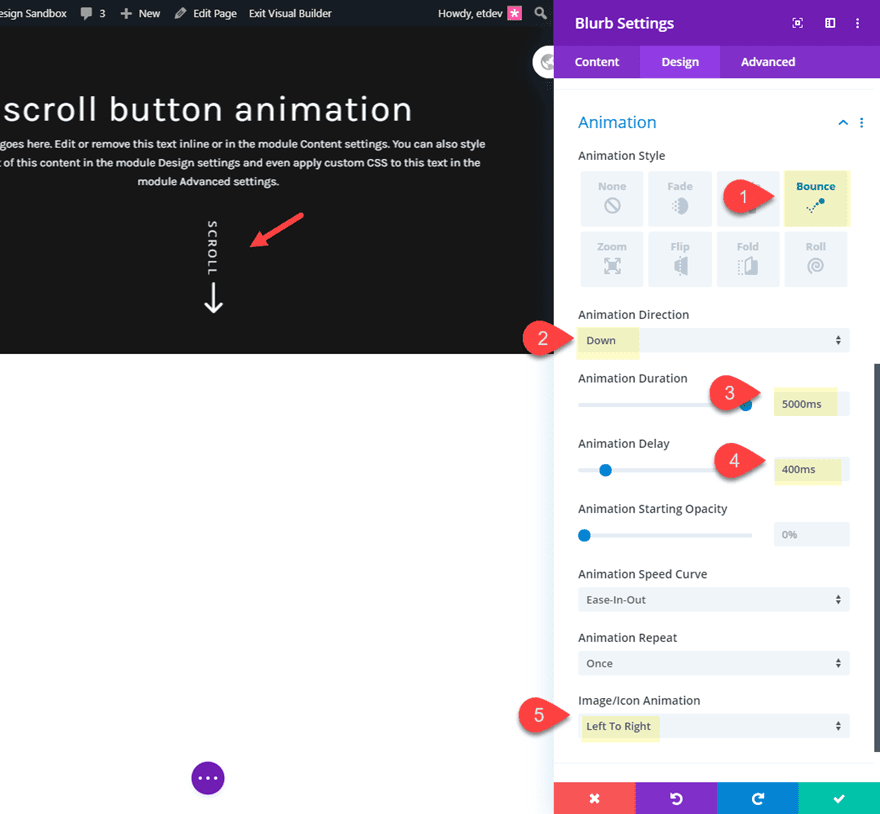
To add the animation, update the following:
Animation Style: Bounce
Animation Direction: Down
Animation Duration: 5000ms
Animation Delay: 400ms
Image/Icon Animation: left to right
Final Result
Now let’s check out the final result for design #1.

This next design builds off of design #1 in that we will keep the vertical text scroll button created using the blurb module. The difference will be the animation. For this design we are going to add a slide animation that begins with the scroll button being hidden above the row container and then ending with the button being hidden below the row. With the animation on loop, this will create a text marquee animation effect that catches the user’s eye.
Here’s how to do it.
First duplicate the entire section of the design #1.
Update Row 2 Settings
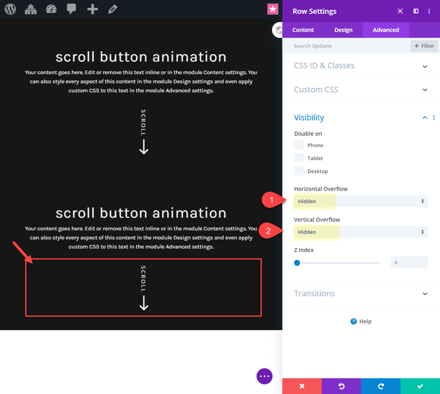
Next, update the section row containing the blurb module/scroll button as follows:
Horizontal Overflow: hidden
Vertical Overflow: hidden
Update Blurb Module Settings
In order to create the marquee animation, first we need to use transform translate to move the blurb text below the row container (hidden from view). This will be the position the text will be at the end of the animation. Update the following:
Transform Translate Y axis: 115px
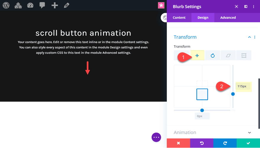
Next, add the following animation settings:
Animation Style: Slide
Animation Direction: Down
Animation Duration: 4000ms
Animation Intensity: 195%
Animation Starting Opacity: 100%
Animation Speed Curve: Linear
Animation Repeat: Loop
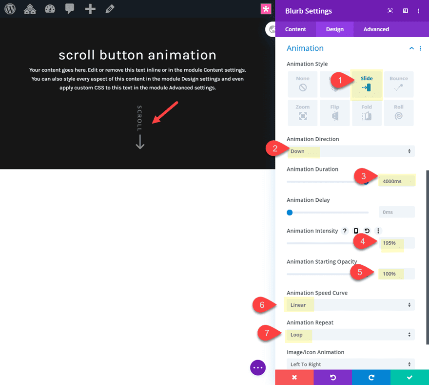
Final Result
Now let’s check out the final result for design #3.

For this next design, we are going to combine a text module and a blurb module to create a unique arrow tab design.
For this design we will start with the basic header section design. So you can duplicate duplicate design #3 section and then delete the blurb module in row 2.
Then add a text module to the one column row directly under the first row.
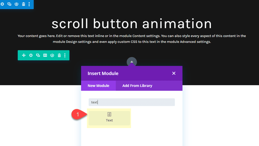
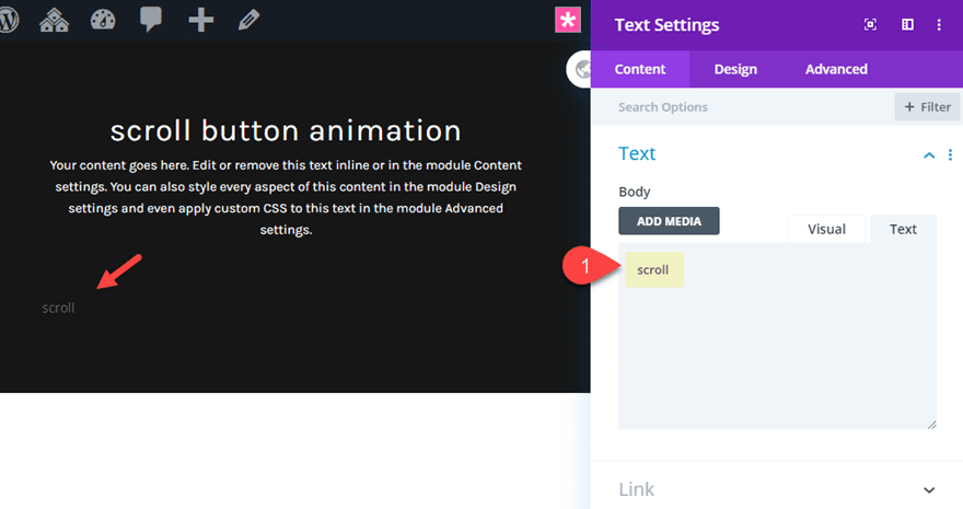
Then update the body content with the word “scroll”.
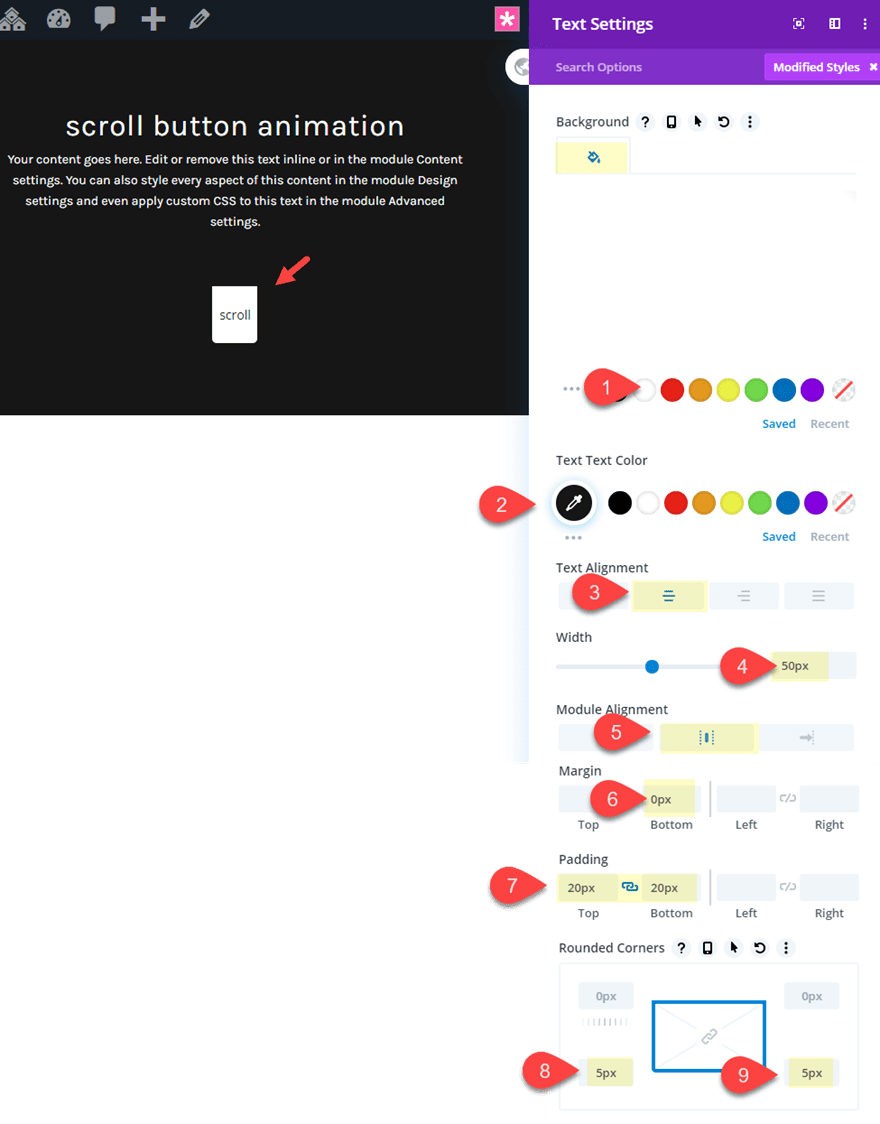
Then update the design settings as follows:
Background Color: #ffffff
Text Text Color: #222222
Text Alignment: center
Width: 50px
Module Alignment: center
Margin: 0px bottom
Padding: 20px top, 20px bottom
Rounded Corners 5px bottom left, 5px bottom right
Add the Blurb Icon
Now that the text module is in place, we need to create the blurb icon directly below it to complete the arrow tab design. To do this, add a new blurb module under the text module.
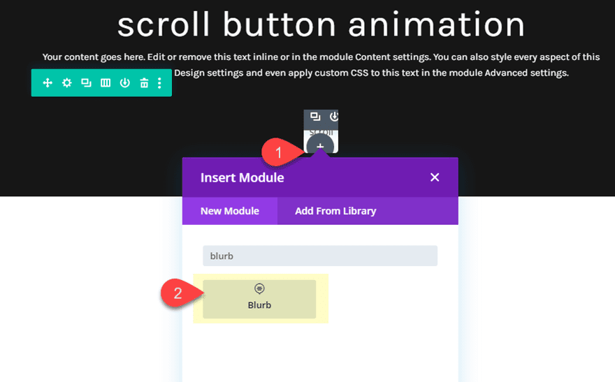
Then delete the default title and body text. Then add update the following:
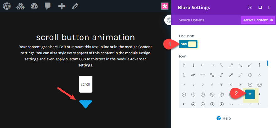
Use Icon: YES
Icon: bottom arrow triangle (see screenshot)
Then update the settings as follows:
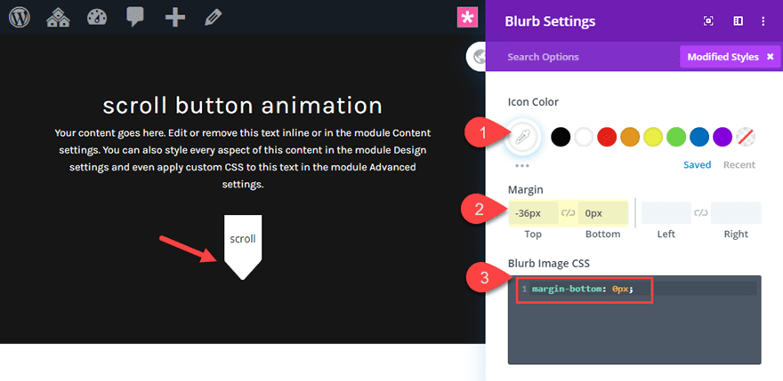
Icon Color: #ffffff
Margin: -36px top, 0px bottom
This negative margin will attach the arrow to the text module for a nice arrow tab design.
Then add the following css to the blurb image to take out some unnecessary margin below the icon.
Blurb Image CSS:
margin-bottom: 0px;
Row 2 Settings and animation
Since we want to add the same animation to both of the modules that make up the scroll button design, we will need to add the animation to the row that contains them. Update the setting for the row as follows:
Max Width: 100px
Padding: 0px top, 0px bottom
Animation Style: Slide
Animation Direction: Down
Animation Duration: 1200ms
Row 1 Background Color and Box Shadow
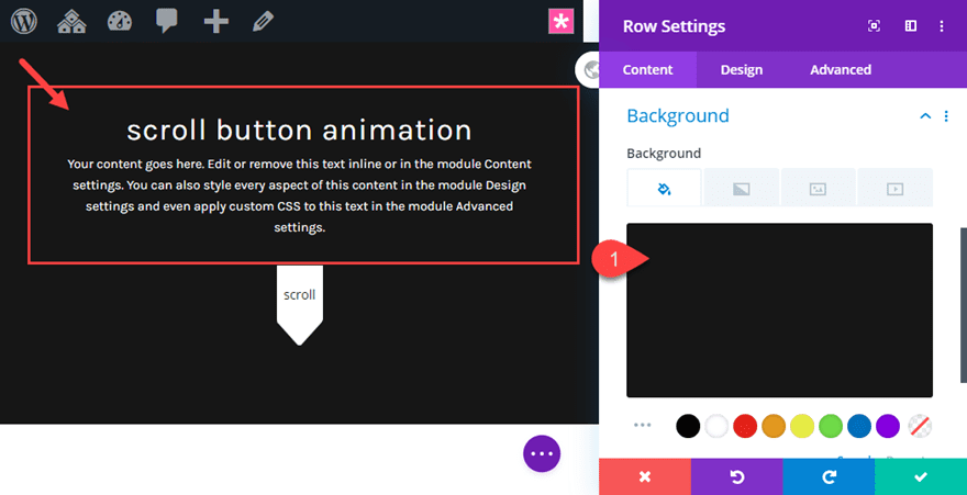
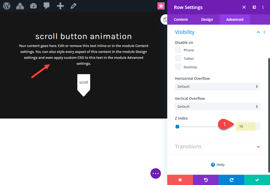
The final touch of this design involves adding a background color to the first row directly above the scroll button row. And by updating the Z index of that row, we will allow the scroll button animation to appear as if it is breaking out through the header.
Open the settings for row 1 as follows:
Background Color: #222222
Z-Index: 10
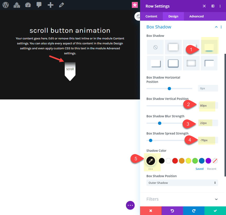
Box Shadow: see screenshot
Box Shadow Vertical Position: 80px
Box Shadow Blur Strength: 22px
Box Shadow Spread Strength: -70px
Shadow Color: #222222 (make sure this matches the background color)
Final Result
Now check out the final result.

For this last animated scroll button, we are going to create a mouse scrolling animation by combining a text module and a blurb module.
Here’s how to do it.
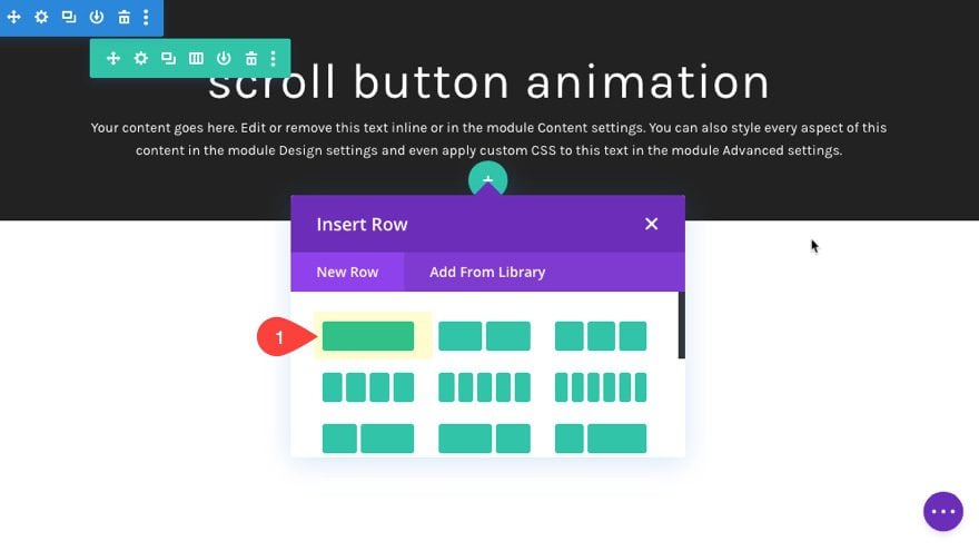
To get started you can use the basic header section. Then add a new row under row 1.
Add the Blurb Module
Next, add a blurb module to the row. Then delete the default title and body text.
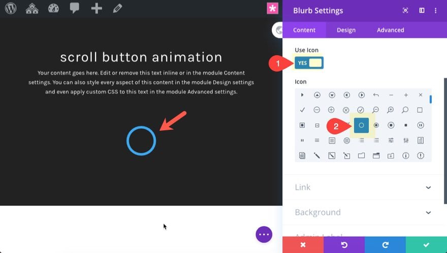
After that, update the icon as follows:
Use Icon: YES
Icon: circle (see screenshot)
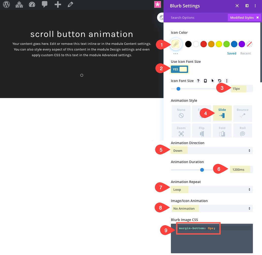
Then update the blurb design settings as follows:
Icon Color: #ffffff
Use Icon Font Size: YES
Icon Font Size: 15px
Animation Style: Slide
Animation Direction: Down
Animation Duration: 1200ms
Animation Repeat: Loop
Image/Icon Animation: No Animation
Then add the following custom CSS to the Blurb Image:
margin-bottom: 0px;
Add the Text Module
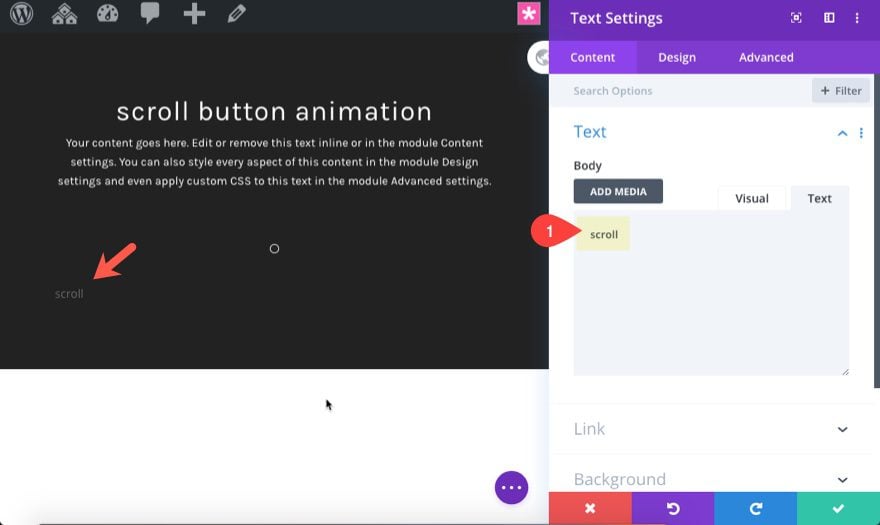
Next, add a new text module directly under the blurb module. Then update the body text with the word “scroll”.
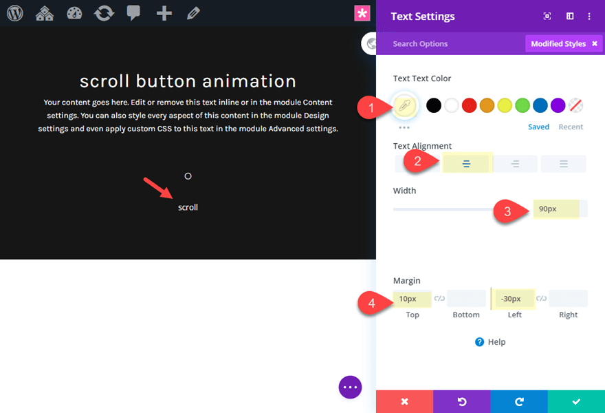
Then update the following text settings:
Text Text Color: #ffffff
Text Alignment: center
Width: 90px
Margin: 10px top, -30px left
Update Row 2 Settings
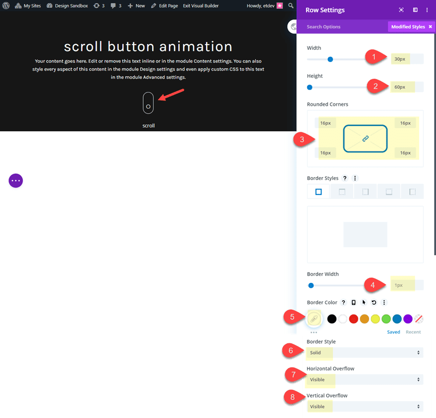
Now update the row settings as follows:
Width: 30px
Height: 60px
Rounded Corners: 16px
Border Width: 1px
Border Color: #ffffff
Border Style: Solid
Horizontal Overflow: visible
Vertical Overflow: visible
The final result
Now Let’s check out the final result:

Adding Anchor Link Functionality
Anchor links are those links that jump to different sections of a page. They are often used in one page websites. We can use the same concept to add an anchor link to our scroll buttons so that they jump down the page to the desired section. To add the anchor link functionality to your animated scroll buttons, there are two main things you need to do.
- You Need to Add a CSS ID to the Section or Row you want to jump to
- You Need to Add anchor link with the same CSS ID to your scroll button
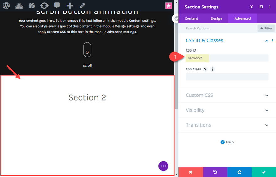
Here is how this would work. First, create a new section under the header section containing the scroll button. Then give the new section a CSS ID under the advanced tab.
Then find the element/scroll button you want to turn into your anchor link and add a url that begins with a hashtag (or pound symbol) and is immediately followed by the CSS ID of the element you are jumping to.
For example, if the CSS ID of the section is “section-2”, then you would add “#section-2” as the link URL.
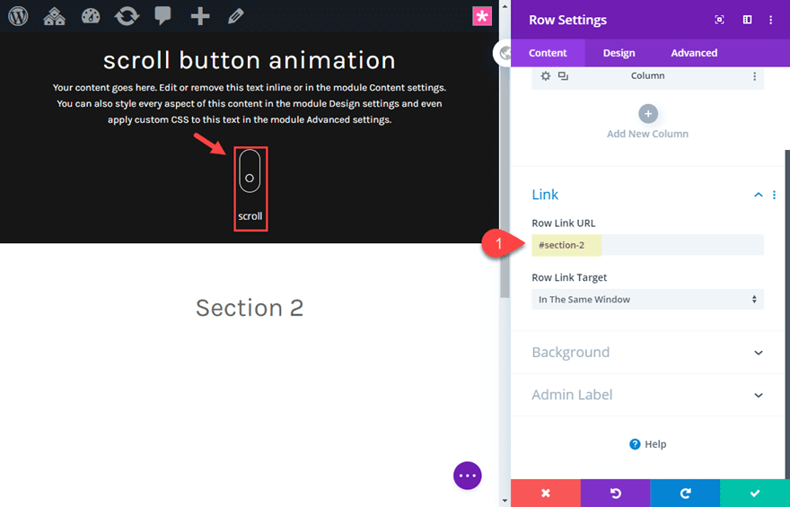
Remember, Divi allows you to add link URLs to every element in Divi so feel free to add links to the entire row containing the animated scroll button.
For more info, check out some cool things you can do with anchor links.
Get Creative!
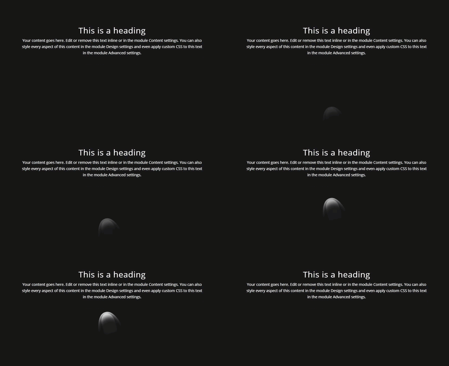
Don’t be afraid to combine different modules and animate them in different ways. In fact, as I was exploring new ways to design scroll buttons with Divi, I created a fun thumb scroll animation that could be used for mobile. I’ve included it in the free download above in case you want to check it out.
Final Thoughts
Animated scroll buttons like these are easy to build with Divi. And they can be used in more places than the header if you treat them like anchor links. I hope these designs will inspire you to create some brand new scroll button for your next project.
I look forward to hearing from you in the comments.
Cheers!



The animation is the thing which grabs the user attention. It makes your website unique from other sites.
Thanks for sharing, keep sharing! 🙂
I loved the idea. I take note for my next designs in DIVI.
Greetings,
Woah, layout’s broken. Probably a tag or shortcode that wasn’t closed.
I’ll come visit this post again later I guess.
Thanks!
I love the last one! Thank you for the download link!