The footer is a valuable space on your WordPress website. Utilized correctly, it can help visitors find what they need and stay on your website longer. The WordPress footer shouldn’t include anything and everything. It should be designed well and serve its purpose. In this article, we’ll look at 4 Divi footer elements to include in your website’s footer. We’ll also see how to add them with Divi.
For my examples, I’m showing footers from the various free footer templates available in the Elegant Themes blog. To find free footer templates, search for “free footer”. There are lots of footer templates available and each article shows how to use them.
Although I’m discussing 4 elements, each has multiple options. I’ll show 16 different options plus several alternatives to some of them. There are many more ways these 4 elements can be created than I’m showing, but this should give you a good start.
First, we’ll look at contact information. This type of information makes it easy for customers to talk to you and find your physical location. It’s often included in detail on a contact page but having some of the information in the footer is helpful. Shorter versions of this information are great for Divi footer elements.
Basic Contact Information
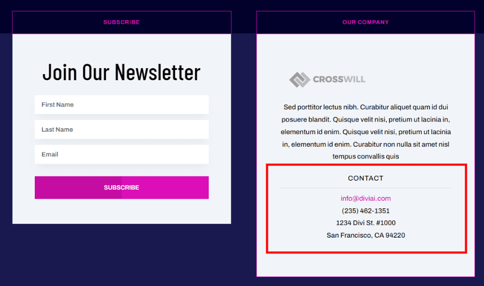
Basic contact information includes the email address, phone number, and address. For a store, you can add opening hours and other information. These are often added with individual text modules. Other modules add elements that make them stand out such as titles and dividers or styled borders.
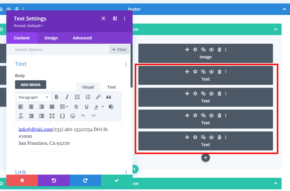
All these elements can be created with text modules, as seen in this example.
Contact Form
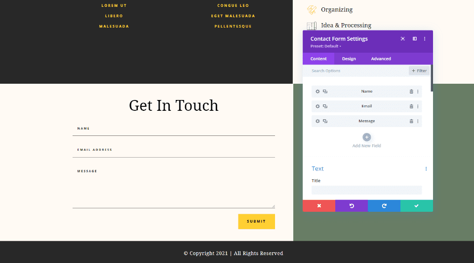
Add a contact form so your visitors can reach you easily. This is done with a contact form module. Add the specific fields you want, but it’s best to keep it simple for the footer.
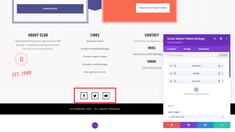
Social media follow buttons are ideal for almost any footer. Add them with the Social Media Follow module and choose from over 30 social networks.
Map
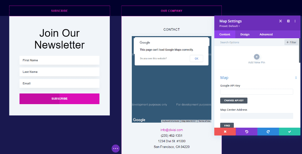
Maps are great for providing directions to your physical location or the location of events. They’re easy to add with a Map module. They can be full-width or just take a up small column. Alternately, you can add Google Maps HTML to a Text or Code module.
Next are CTAs. Calls to action are powerful Divi footer elements. Adding a call-to-action to the footer gives you one more chance to push something important to your business goals. This can be an email subscription, membership, link to your shop page, a reminder to ask for information, etc.
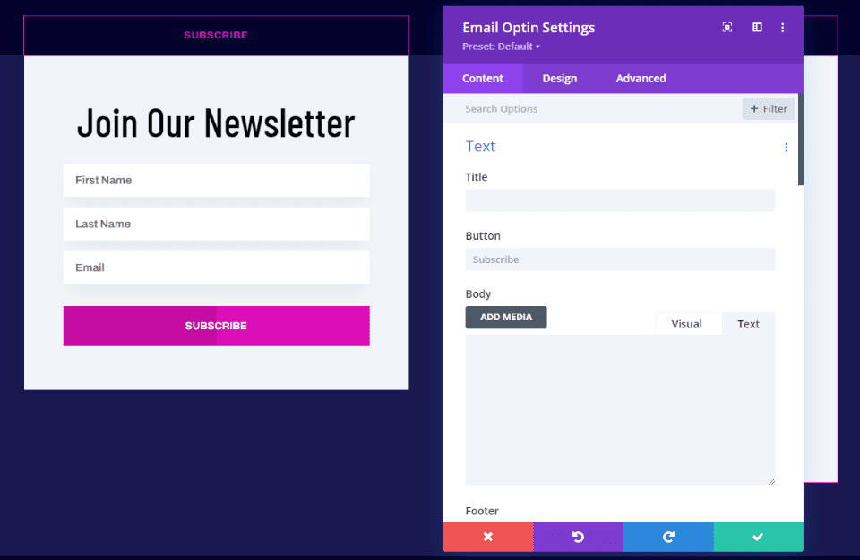
Adding an email or newsletter subscription is as simple as adding an Email Optin module. This one uses a Text module to create the title, but you can add it to the Email Optin module if you prefer.
Purchase Call to Action
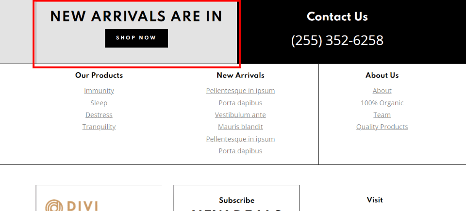
Create a link to your online store to remind visitors where they can shop. The shopping CTA should be larger than most other links and stand out. They can be full-width or fit within one of the columns.
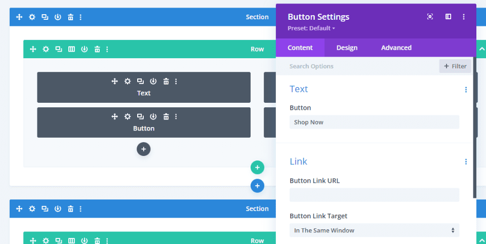
This one was created with a Text module for the title and a Button module to provide the link. The background color was added to the column.
Project CTA
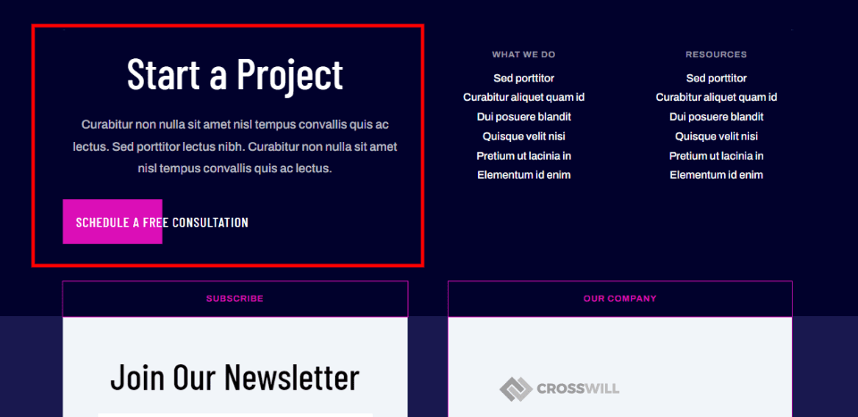
A project CTA can nudge the visitor into requesting a quote or contact you for more information. They work best when they’re larger than other elements around them, but still keep them simple and clean.
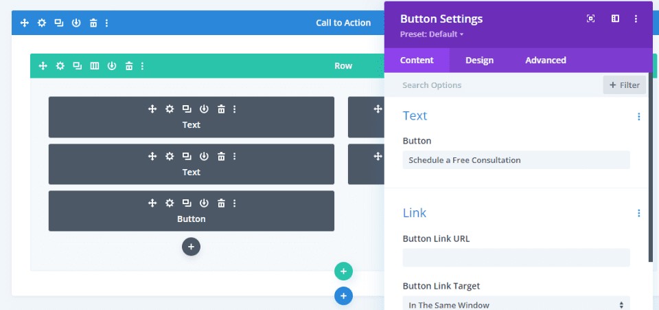
This project CTA was created with Text and Button modules. The button can lead to a contact form on another page.
Next, let’s talk about links. Links are some of the most popular elements we see in a WordPress footer. They work great as Divi footer elements and they’re easy to add. They can link to pages, posts, comments, products, events, services, and lots more. There are several ways to create them.
Links to Pages
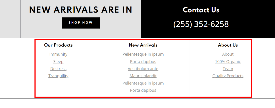
Links to pages can include specific products, legal information, about your company and team, your contact page, etc. It’s also good for links to pages that you don’t want to place in your primary menu. These links are usually created manually.
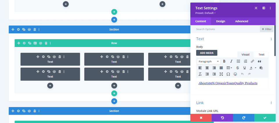
All the links in this example were created with Text modules.
Posts and Products
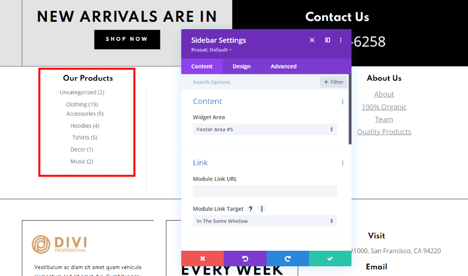
Display a list of your latest posts and comments. You can also display WooCommerce products based on category, featured, hand-picked, or popularity. Add the proper widget to the WordPress widget area and then add them to your Divi footer using a Sidebar module. This example displays the WooCommerce categories.
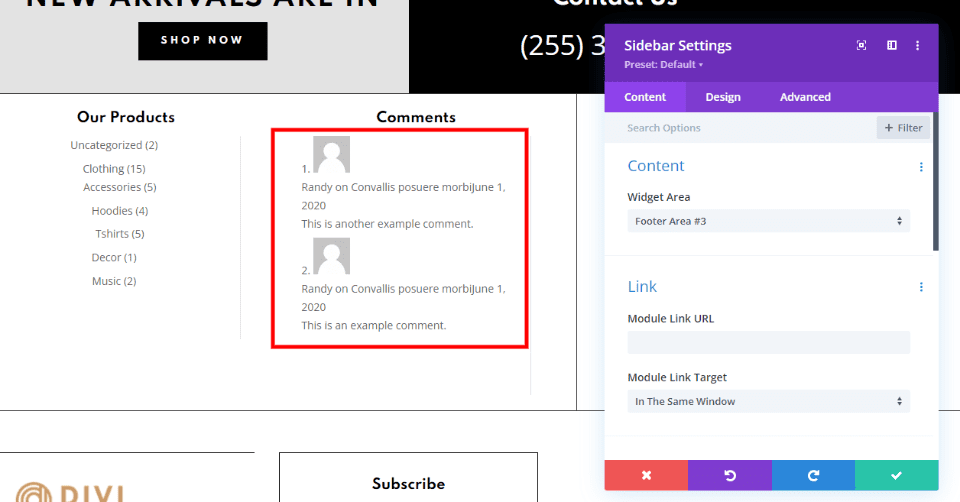
This example shows the most recent comments.
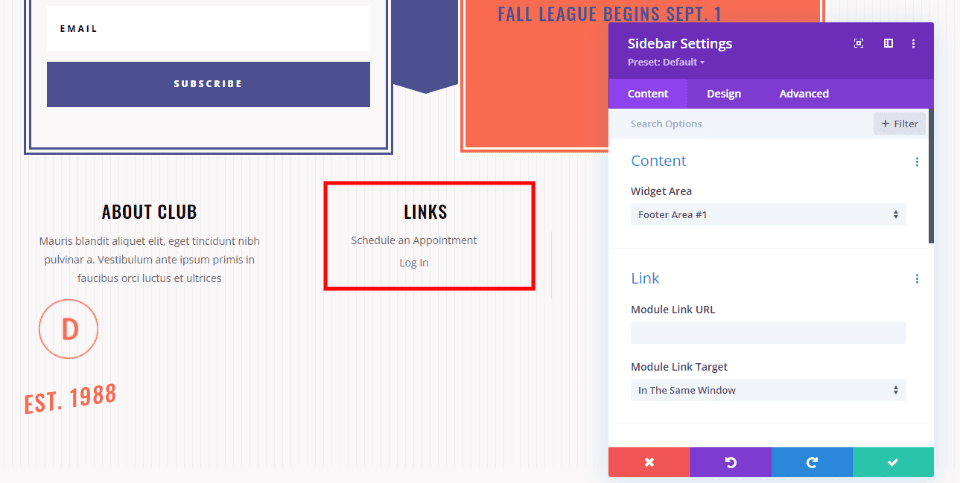
Navigation menus look great when the links are stacked. You can add a stacked navigation menu widget to a footer area in your Widgets screen and then use a Sidebar module in your Divi footer. Select the footer area within the module’s options. This displays the navigation menu in a vertical stack. If you want the menu to display horizontally, use a Menu module.
Services and More
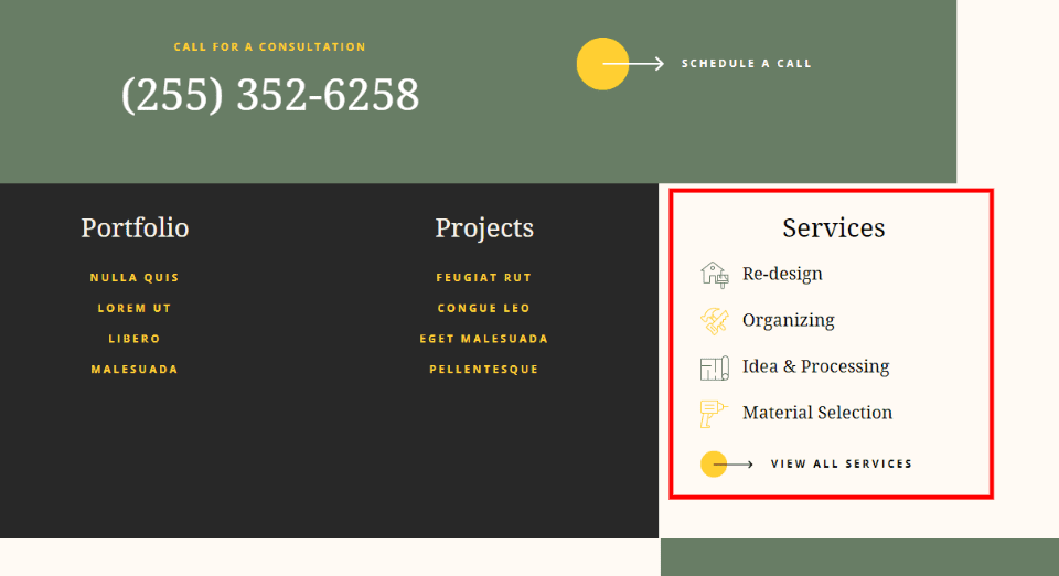
The footer is an excellent place to add links to your services, projects, portfolio, resume, case studies, events, etc. They work the same as regular links or you can highlight them with images or icons. Use only a few links rather than linking to all your projects and services.
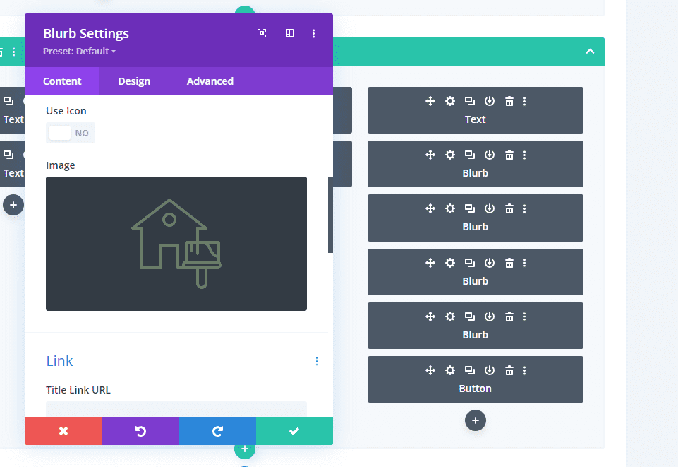
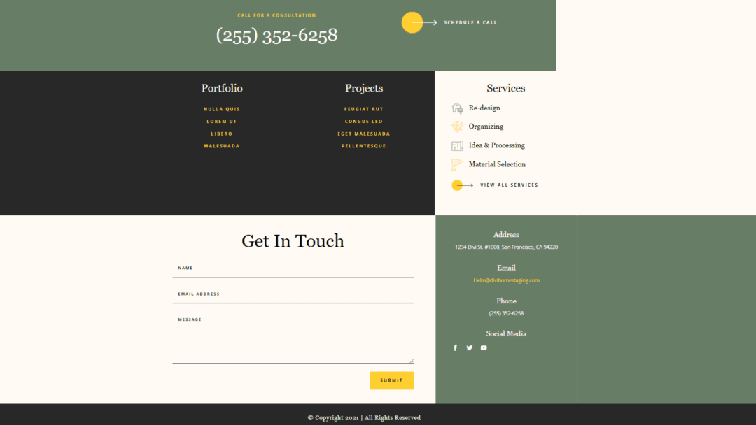
These Services links were created with Blurb modules using images placed to the left and a title with a link to the page for the service. The projects and portfolio links in this example were created with Text modules.
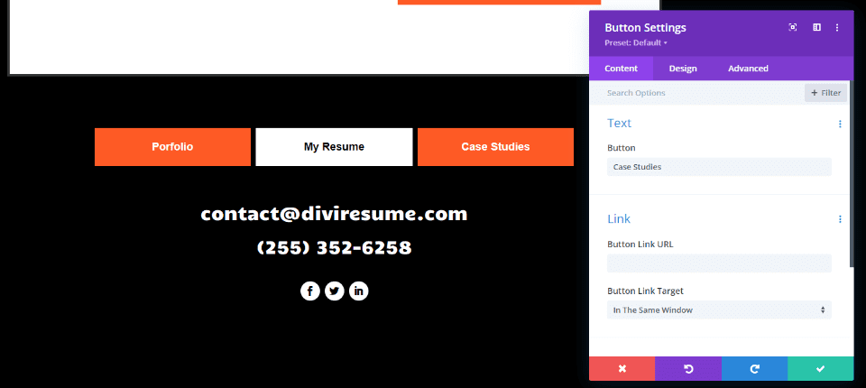
These links to the portfolio, resume, and case studies were created with Button modules.
Finally, we;ll look at Company information. This is one of the most important of the Divi footer elements. Often, this type of information doesn’t fit well anywhere else on the page. This also works as a summary of the information. This includes copyright, company mission statement, information about the company, photos of people or products, etc. Be sure to keep it simple.
Copyright Notice
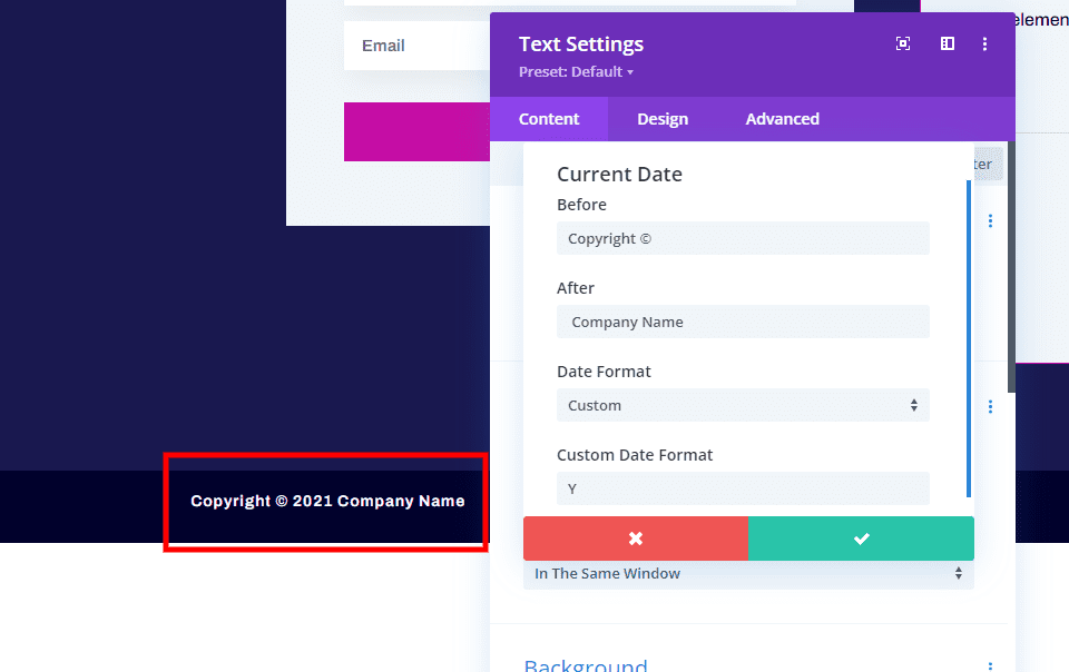
The copyright notice usually appears at the very bottom of the footer. Create it with a Text module. You can enter the year manually or dynamically. For a dynamic copyright date, select the icon within the content editor of the Text module, select the current date, choose Custom for the Date Format, and enter Y for the Custom Date Format.
Mission Statement
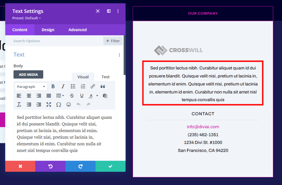
Mission statements can be powerful messages about your company. They’re especially important for companies, such as charities and churches, that help others and accept donations that need to build strong relationships with donors. Mission statements are easy to add with Text modules.
Branding
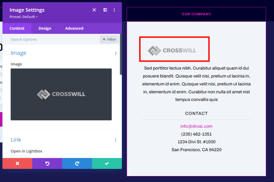
Adding branding, such as a logo, reminds visitors of who you are. Add a logo using an Image module.
Photo
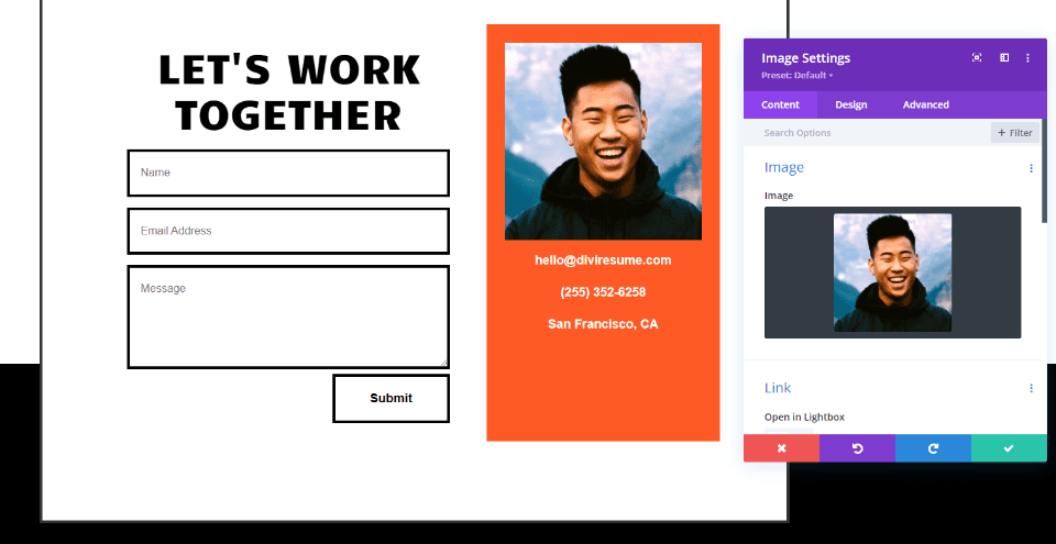
Photos can be a great way to make yourself relatable to your audience. Add an Image module along with Text modules for your name or contact information. You can also add photos of your products or an example of your work. One or two small photos are all you need in the footer.
Testimonial
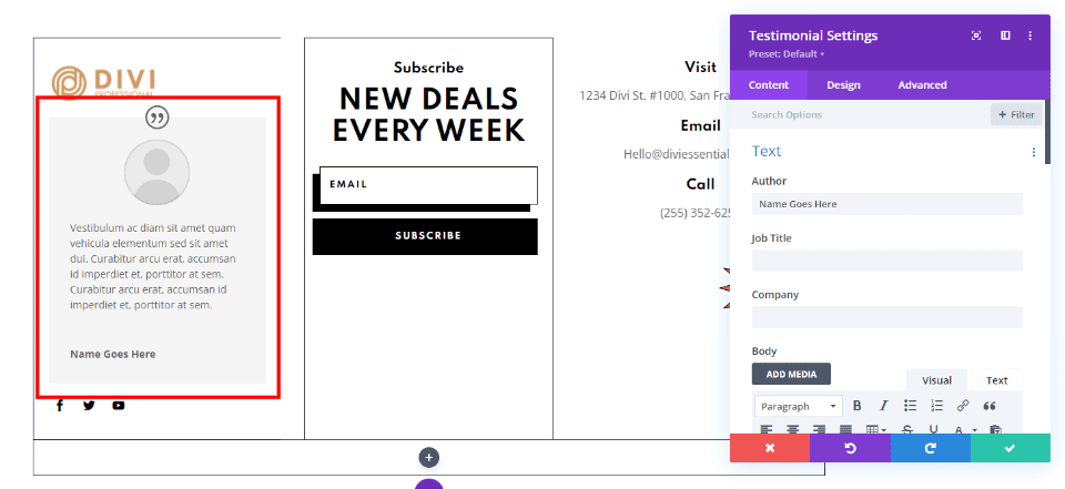
A testimonial can help build credibility. Add one with a Testimonial module. You can add more with a Slider module and set it to display one at a time. Keep them short.
That’s our look at 4 Divi footer elements that can’t be missing from your website and how to add them. The details of the elements are up to you, but every footer needs:
- Contact information
- A CTA
- Important links
- Company information
These examples show one method of how to create these elements, but they can be created using other modules and footer placements. There is a lot of flexibility on what these are and how you create them. Be sure not to clutter the footer area. Use borders and different background colors to separate the elements and footer sections. Building these 4 important footer elements with the Divi Theme Builder will make your footer more valuable and useful to your visitors.
We want to hear from you. Do you use these 4 Divi footer elements in your website? Let us know in the comments.



Go to Divi > Theme Options in the WordPress Dashboard. Scroll down to see the option to hide or show each social media item, as well as a text box that allows you add your link
Hi Randy,
Thank you for such a detailed description of the tool and the footer features. I am currently changing my website’s elements and the footer is one of them. The idea to place an image there is very interesting:) I think footers are very often overlooked and underestimated, though they can also be engaging!
Nice summary! You hit the bull’s eye.