Divi’s blurb module makes it easy to display an image or icon grouped with a heading and some body text. It’s a great way to highlight some features or services or even demonstrate steps in a process. Within the blurb module settings, you have full control over the styling and can even add unique animations to the blurb modules to help them stand out on your website.
In this tutorial, we will show you 4 different ways you can apply animation effects to your blurb module. If you’re looking for a way to add some movement to your website design with Divi, this tutorial is for you.
Let’s get started!
Sneak Peek
Here is a preview of what we will design.
Blurb Animation 1: Slide Animation
Blurb Animation 2: Flip Animation
Blurb Animation 3: Bounce Animation
Blurb Animation 4: Fade Animation
What You Need to Get Started
Before we begin, install and activate the Divi Theme and make sure you have the latest version of Divi on your website.
Now, you are ready to start!
4 Ways to Animate Your Divi Blurb Module
Create a New Page with a Premade Layout
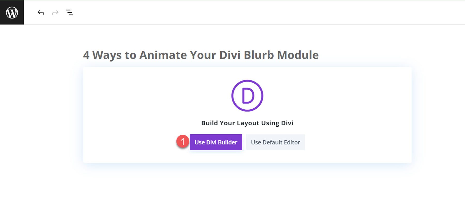
Let’s start by using a premade layout from the Divi library. For this design, we will use the Coaching Landing Page from the Coaching Layout Pack. Begin by adding a new page to your website and giving it a title. Next, select the option to Use Divi Builder.
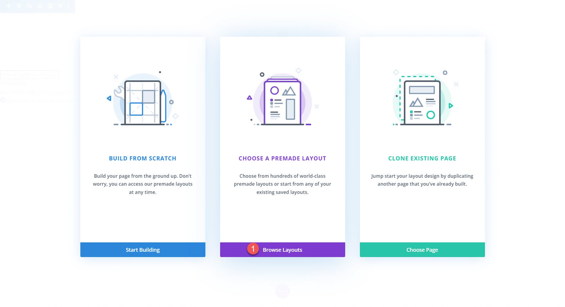
We will use a premade layout from the Divi library for this example, so select Browse Layouts.
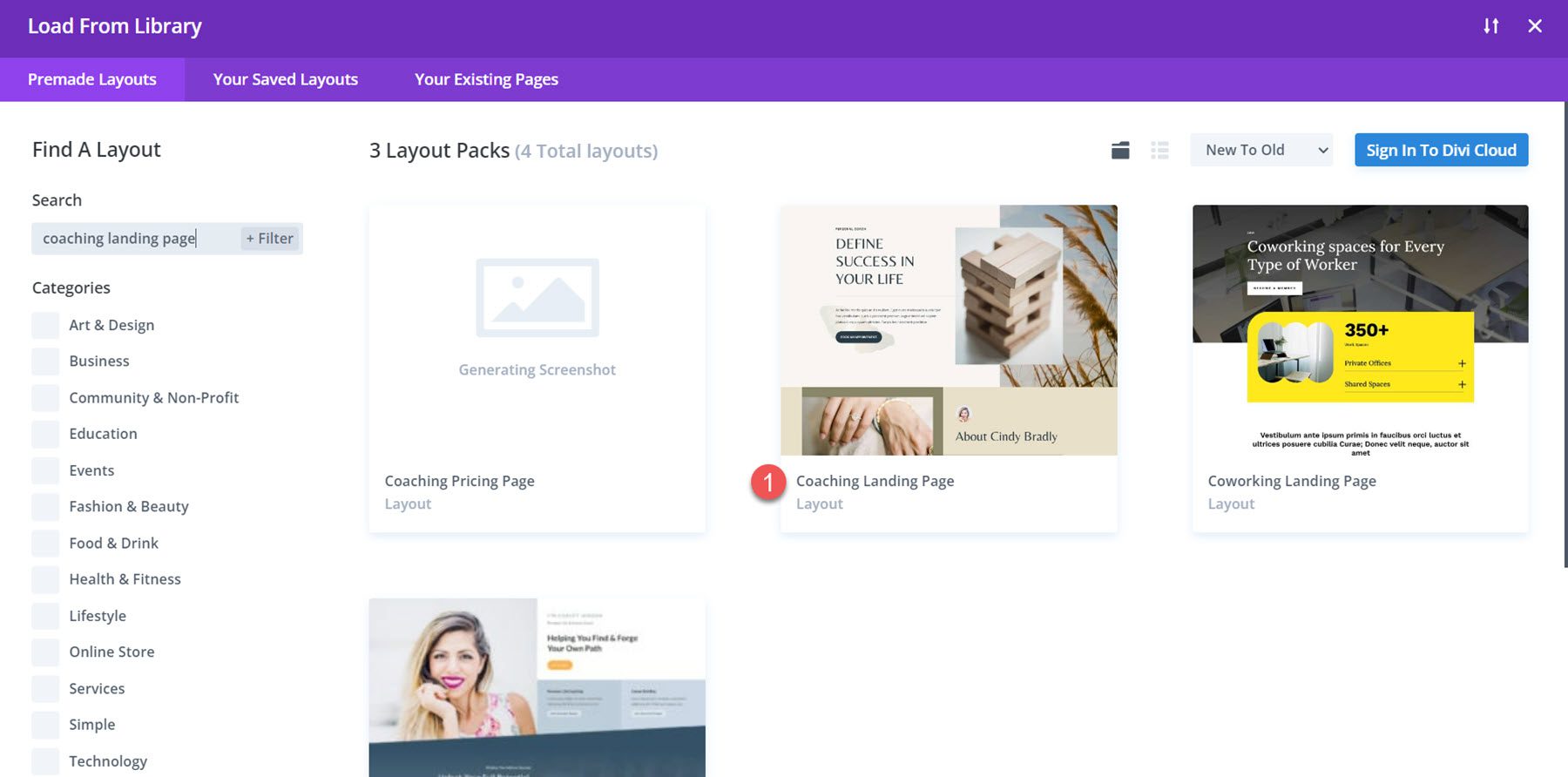
Next, search for and select the Coaching Landing Page layout.
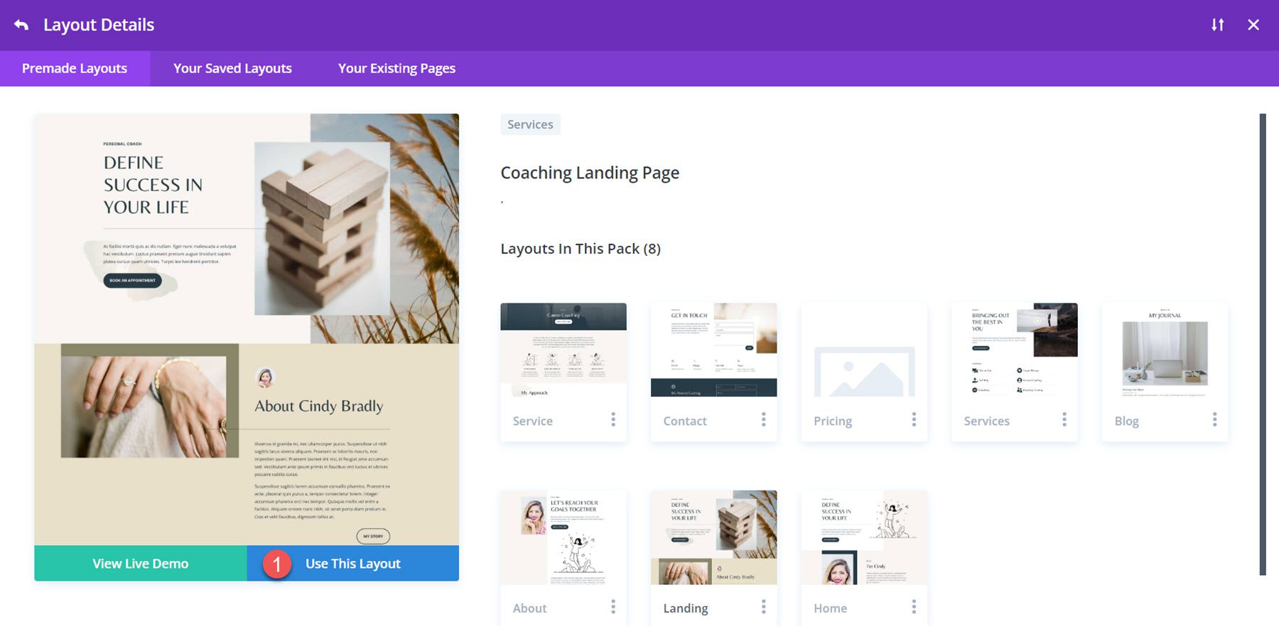
Select Use This Layout to add the layout to your page.
Now, we are ready to build our design.
Blurb Animation 1: Slide Animation
For our first blurb animation tutorial, we are going to use the content in the My Services section of this page. In this section, the service title and icon are displayed using blurb modules.
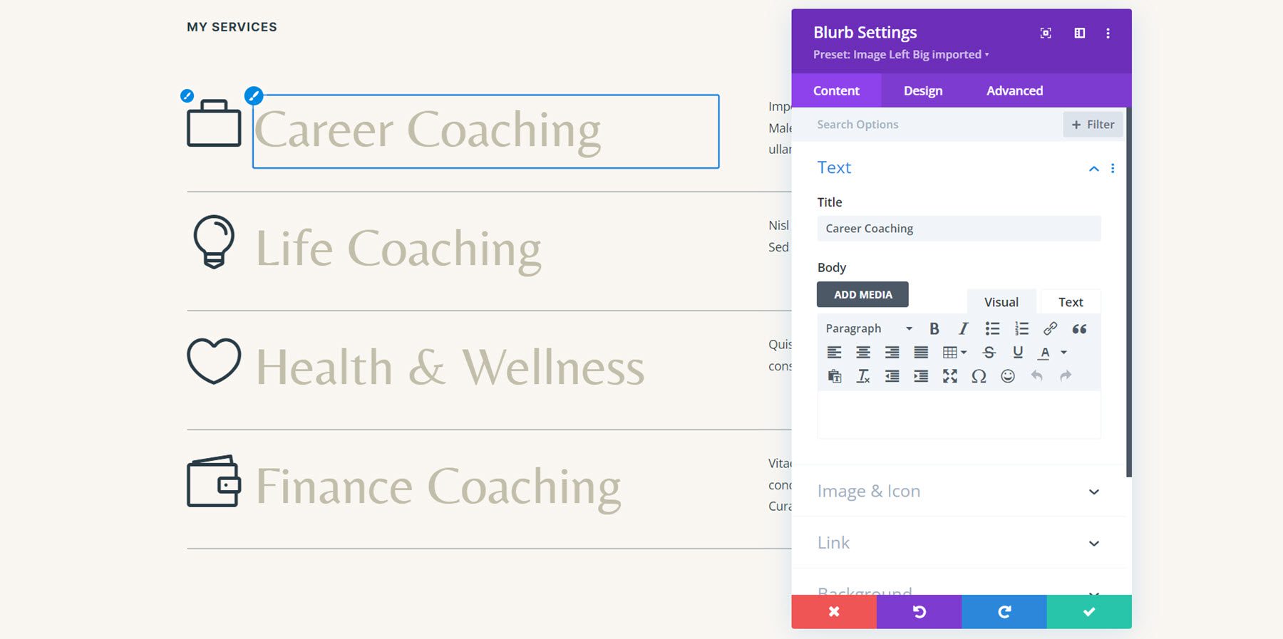
Since our content is already in a blurb module, we can jump right into adding the animation. Open the settings for the first blurb module for the career coaching service, then navigate to the animation settings in the design tab. For this design, select the slide animation style.
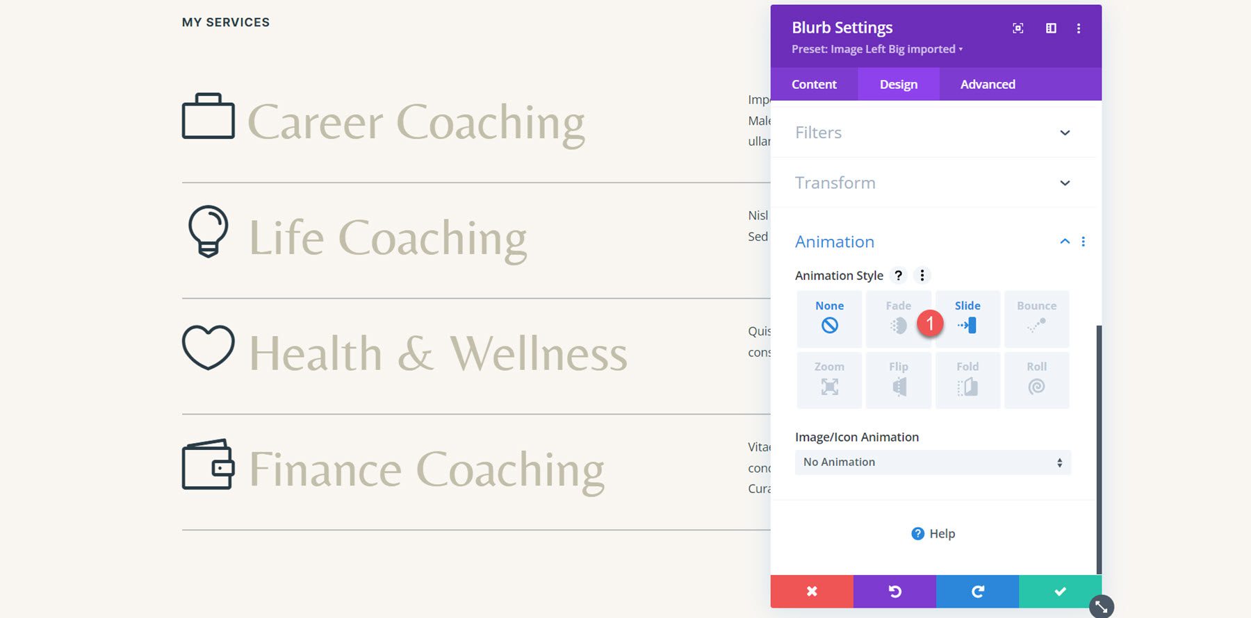
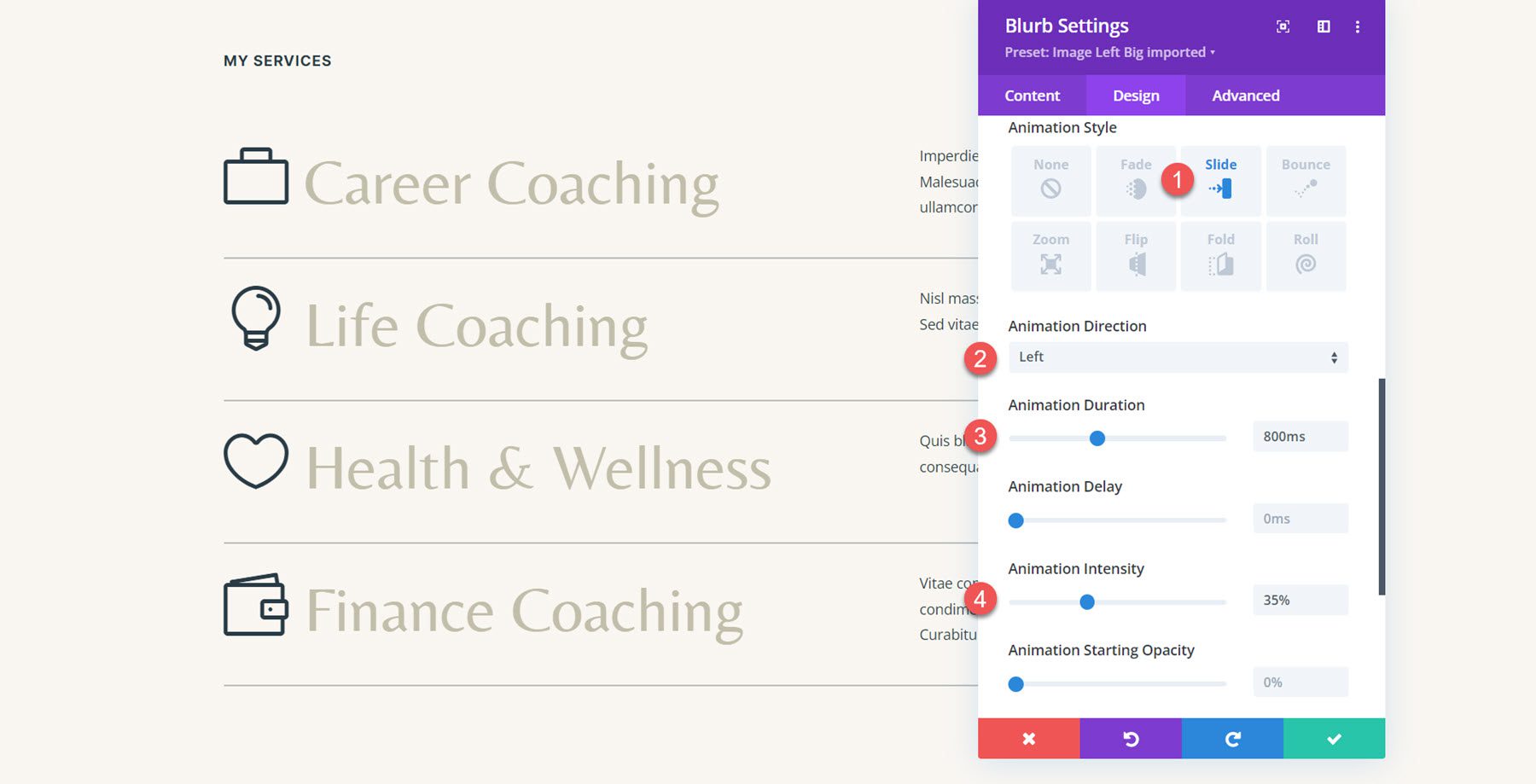
With the slide animation style selected, we can further customize the way the animation looks and behaves. I’m setting the animation direction to the left, decreasing the animation duration a little bit to 800ms, and setting the animation intensity at 35%.
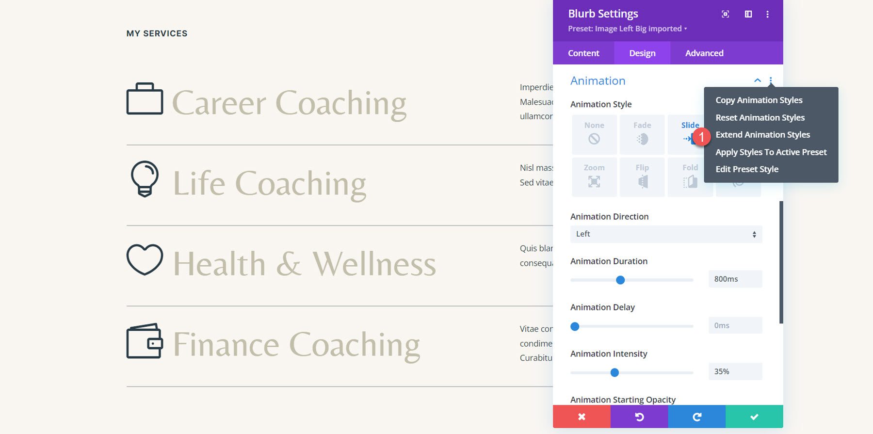
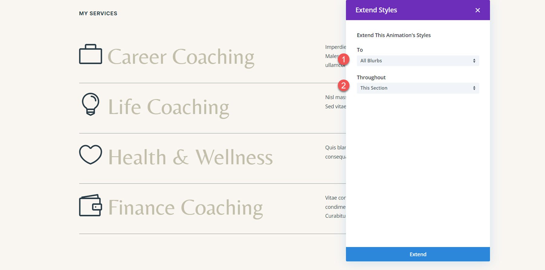
Now, we want to apply the same animation to the rest of the blurb modules in this section. To do so, simply click the three dots in the Animation section header, then select Extend Animation Styles.
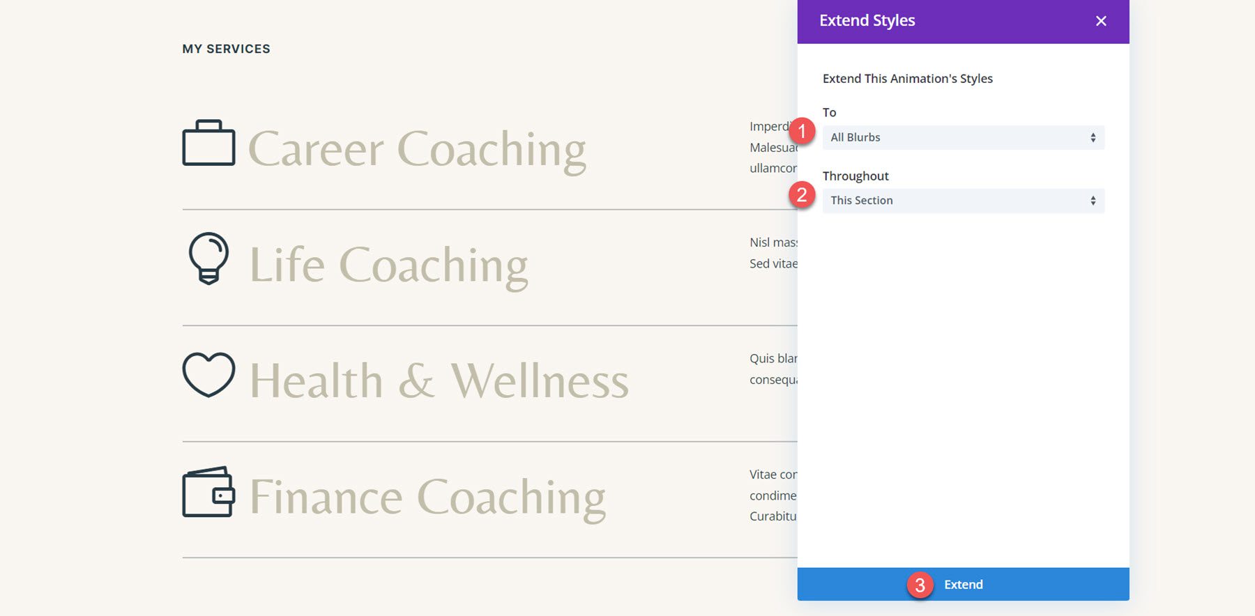
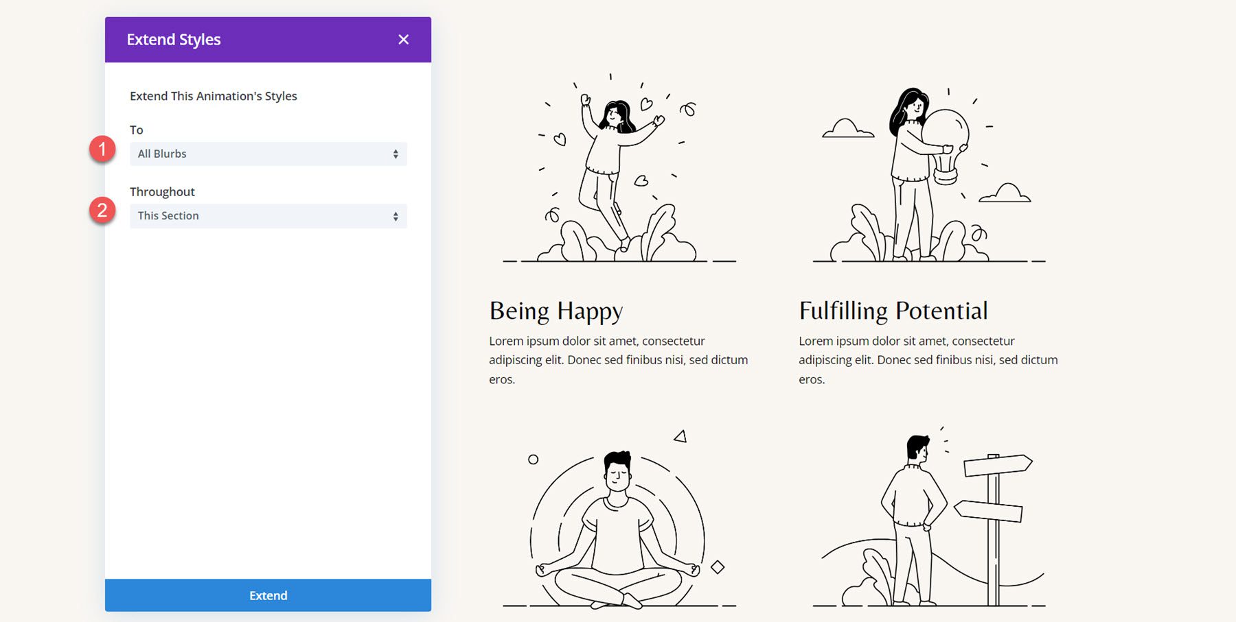
Next, choose to extend the animation styles to All Blurbs throughout This Section, then click Extend to apply the changes.
Now, all the blurbs have the same animation effect. However, I want to add a little delay to give the animation a staggered effect and provide some visual distinction between the blurbs when they load. Open the animation settings for the Life Coaching blurb, then set the Animation Delay to 150ms. By adding this delay, the Life Coaching blurb will animate slightly after the first Career Coaching blurb, creating a nice delayed effect.
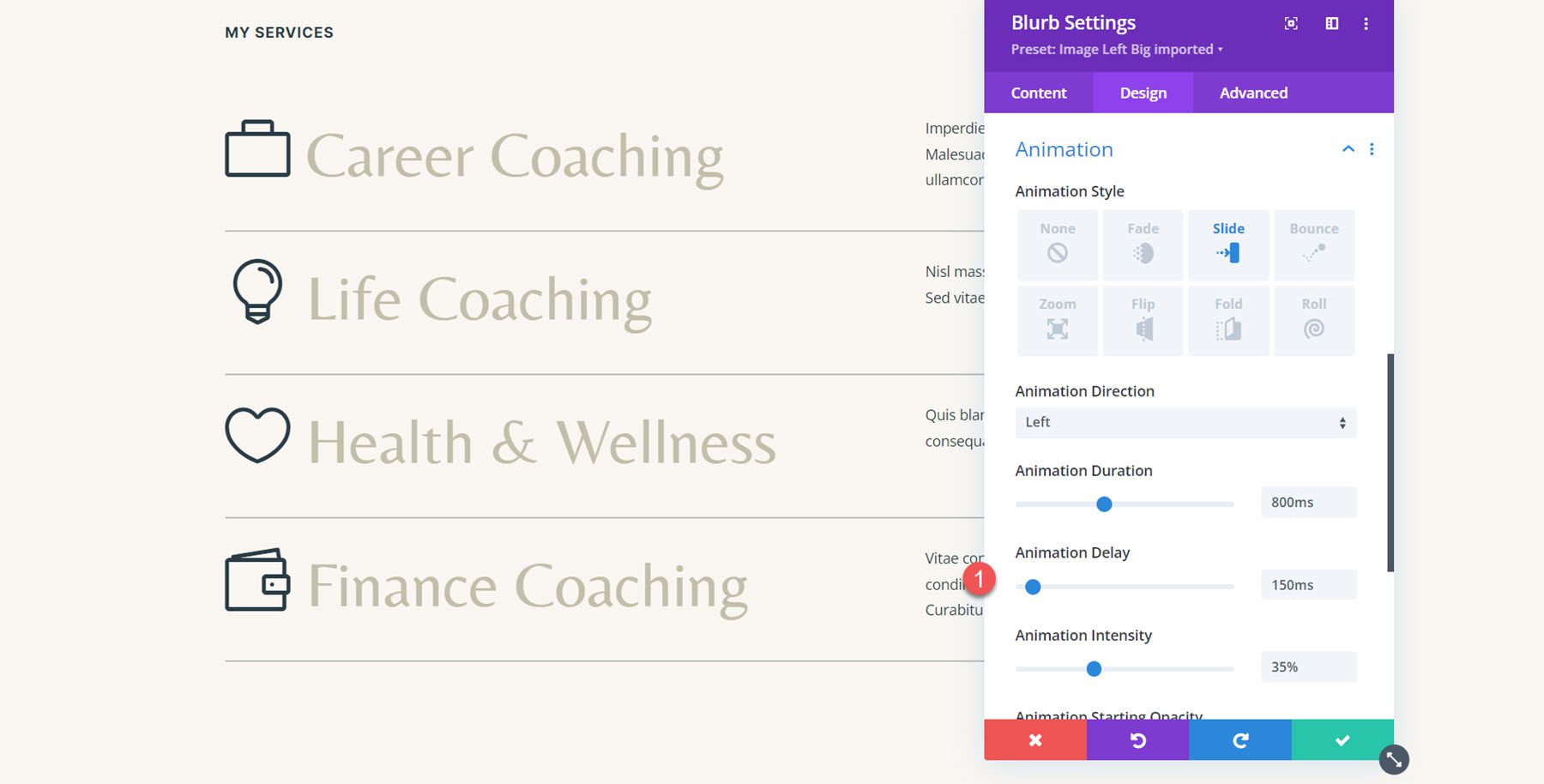
Next, add an Animation Delay to the two remaining blurbs. For the third blurb (Health & Wellness), set the Animation Delay to 300ms.
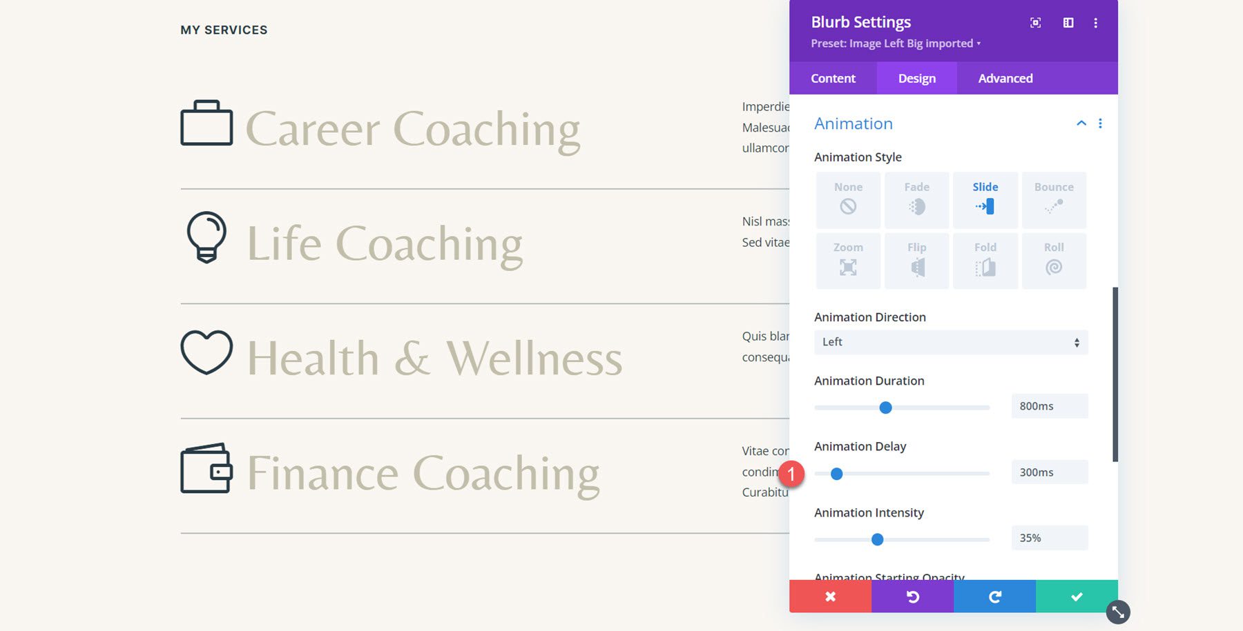
For the final Finance Coaching blurb, set the Animation Delay to 450ms.

Final Result
Here is the completed design with the slide-left animation.
Blurb Animation 2: Flip Animation
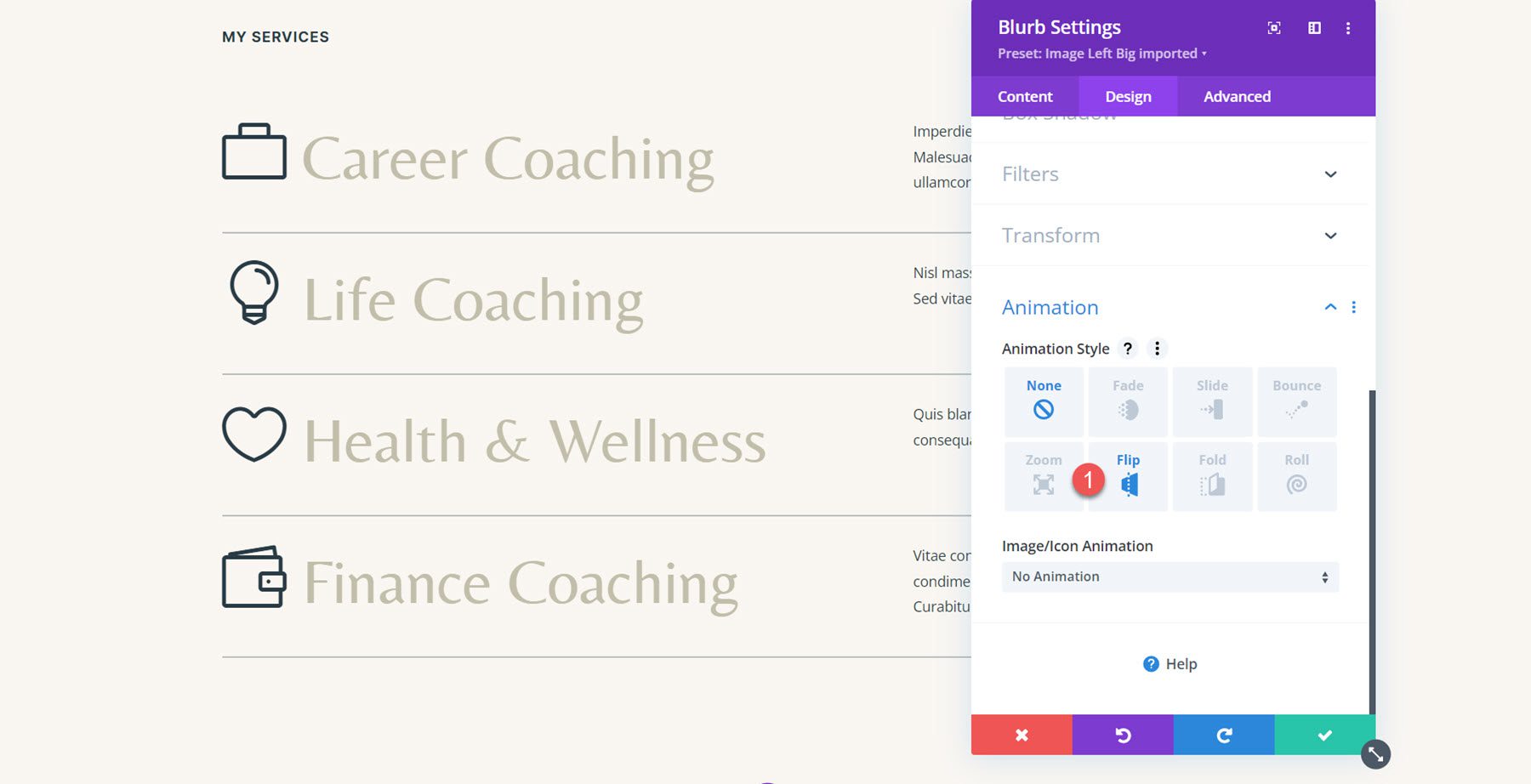
For the second blurb animation, we will use the same services section and apply a flip-style animation to each blurb. Open the settings for the first blurb and navigate to the Animation settings in the Design tab. Next, select the flip animation style.
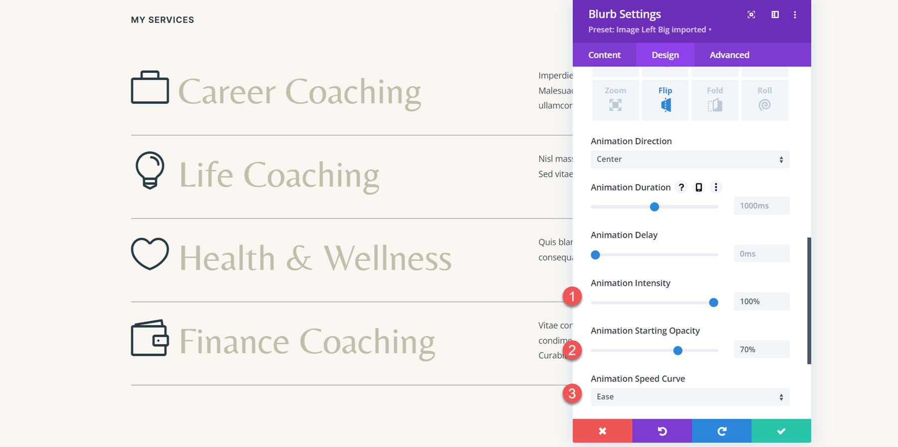
Set the Animation Direction to Center. Next, set the Animation Intensity all the way up to 100%. Additionally, bump the Animation Starting Opacity to 70%. Finally, set the Animation Speed Curve to ease.
Next, extend the animation style to all of the blurbs in the section.
Final Result
Here is the layout with the flip-style animation applied to all the blurbs.
Blurb Animation 3: Bounce Animation
For the third animation, let’s move on to the Let’s Grow section in the layout. The layout is made with image and text modules, so we’ll first have to recreate the layout using blurb modules.
Recreating the Layout with Blurb Modules
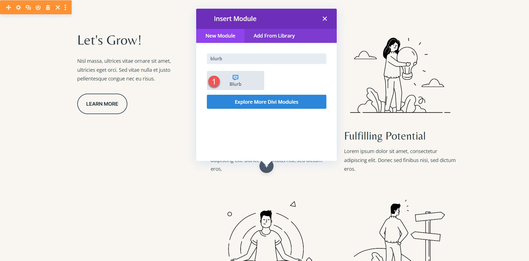
Start by adding a new blurb module to the layout.
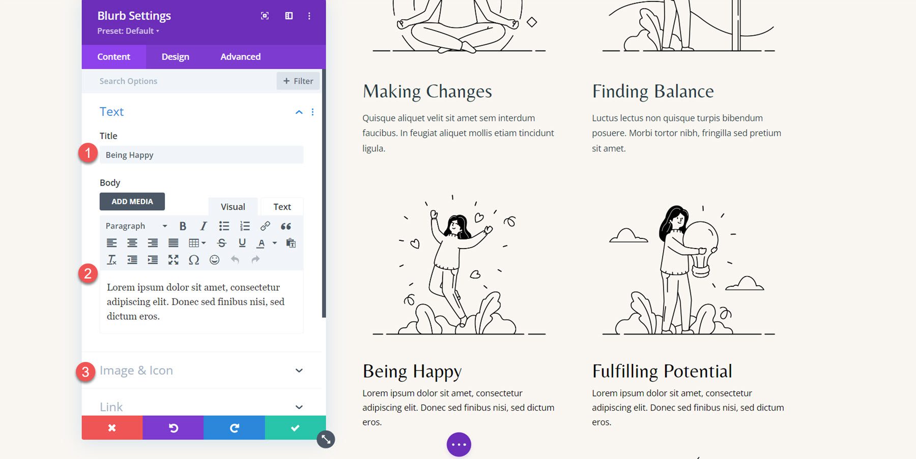
Then, modify the content to match the original example.
- Title: Being Happy
- Body: Lorem ipsum dolor sit amet, consectetur adipiscing elit. Donec sed finibus nisi, sed dictum eros.
- Image: coaching-35.png
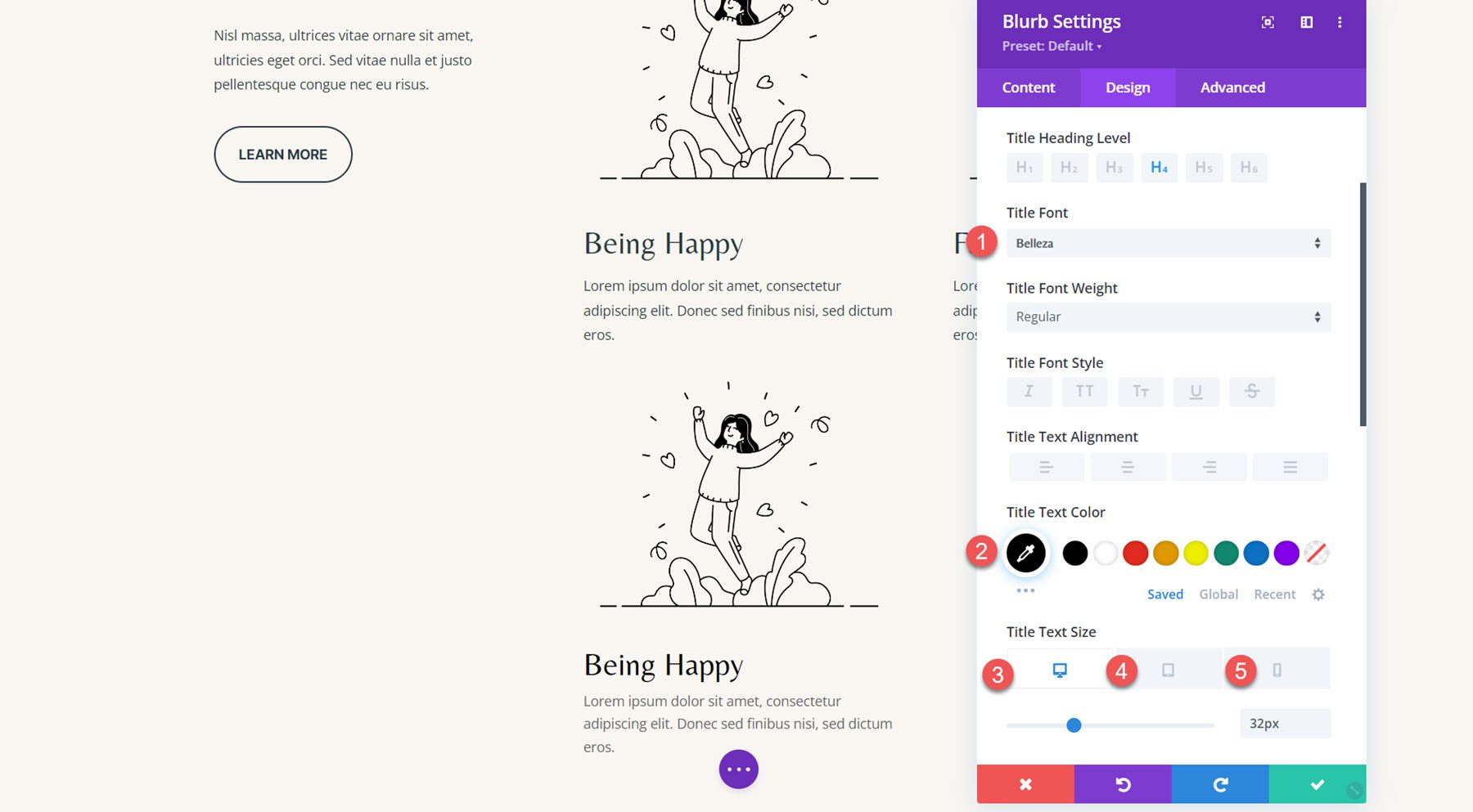
In the design tab, modify the following options under the Title font settings.
- Title Font: Belleza
- Title Text Color: #000000
- Title Text Size Desktop: 32px
- Title Text Size Tablet: 16px
- Title Text Size Mobile: 15px
Next, modify the body text color.
- Body Text Color: #000000
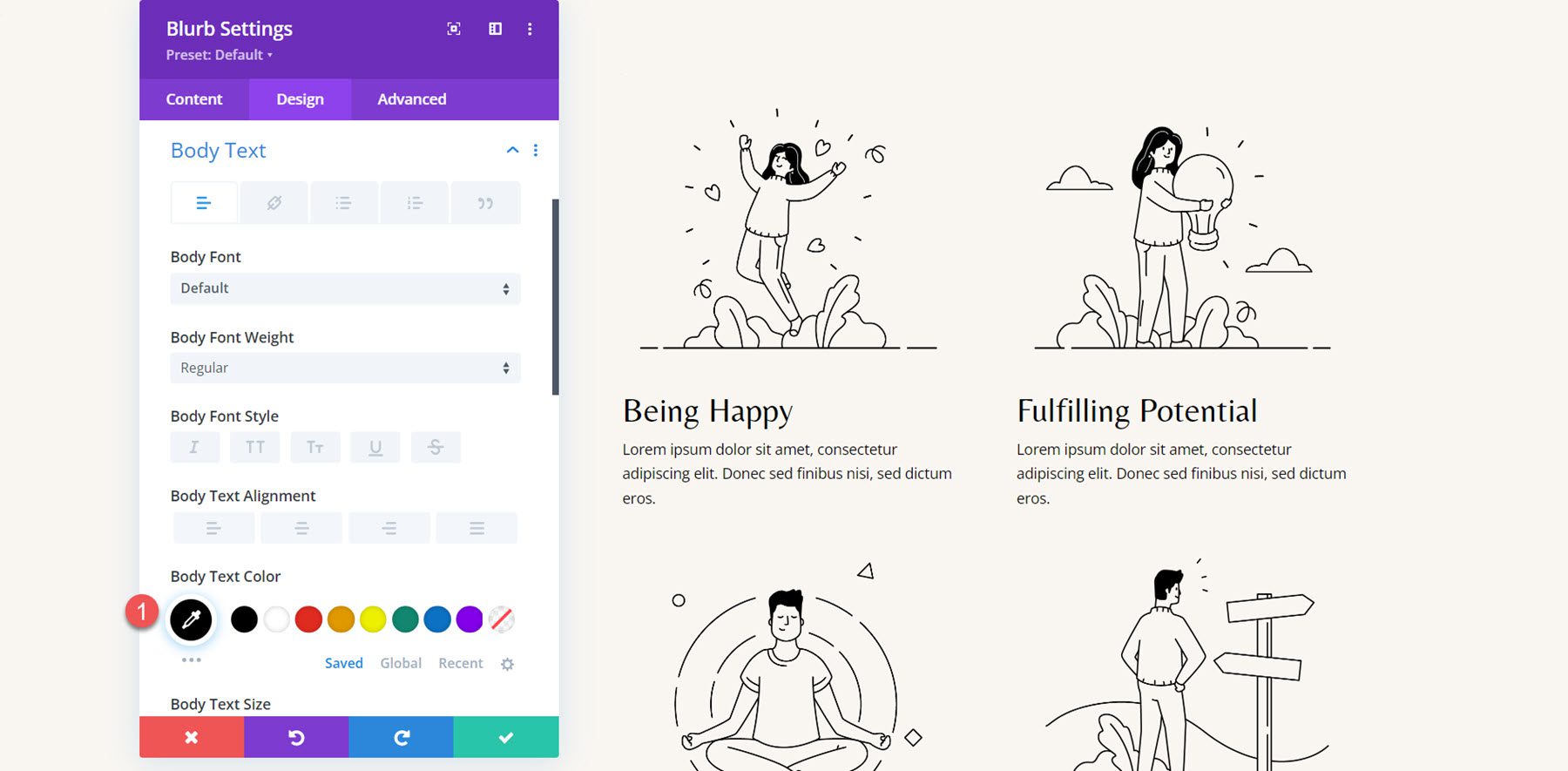
Repeat these steps to recreate all 4 sections with the blurb module, then delete the old sections.
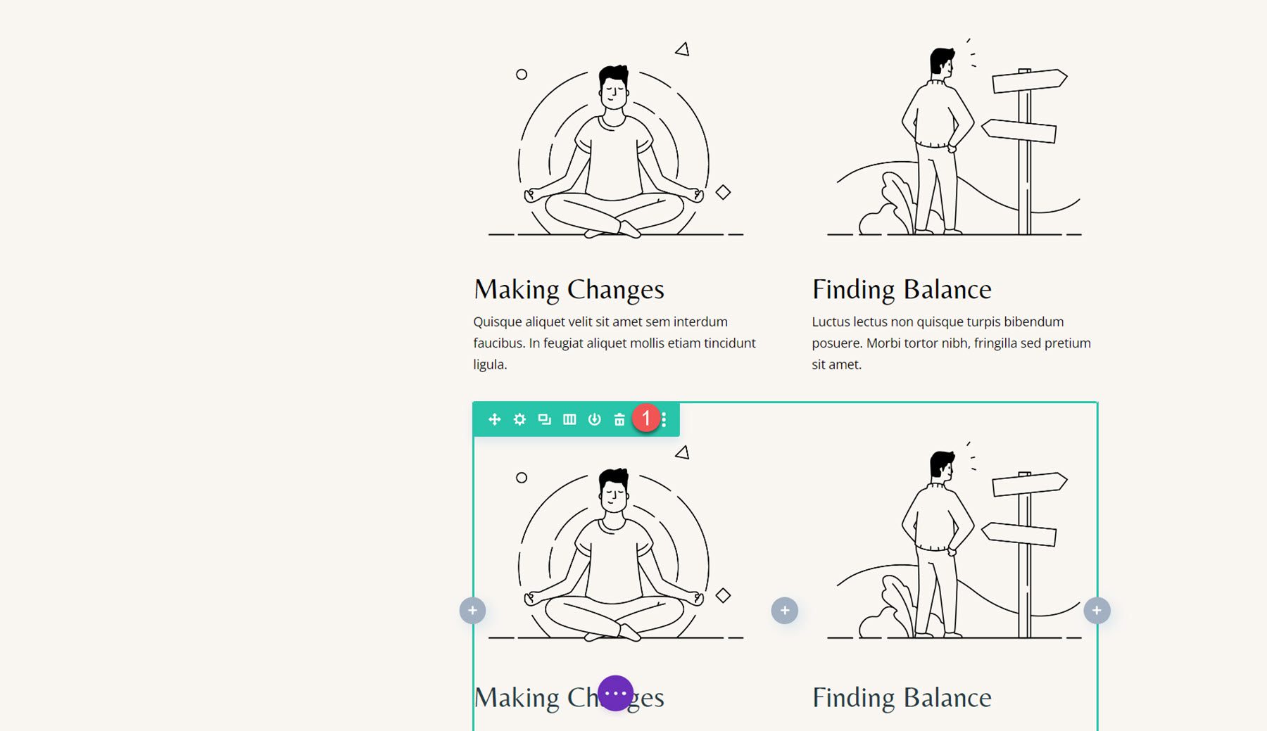
Blurb Animation
With our layout complete, we can add our animation settings. Open the settings for the first blurb and navigate to the Animation settings under the Design tab, then select the Bounce animation style.
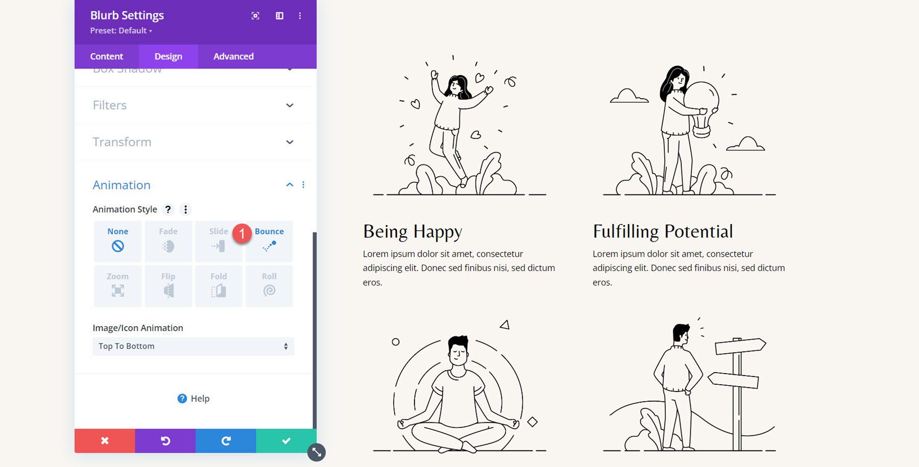
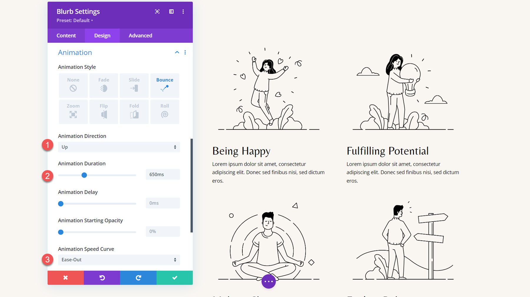
Next, set the animation styles as follows:
- Animation Direction: Up
- Animation Duration: 650ms
- Animation Speed Curve: Ease-Out
Extend the animation styles to the other blurbs.
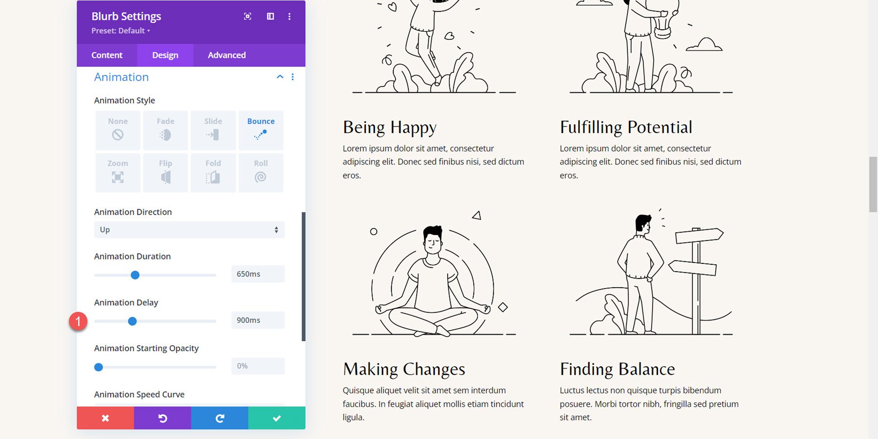
I want to add a staggered delay to the animations for each blurb so that the animations aren’t happening simultaneously. Set the following animation duration for the blurbs.
- Animation Delay for Blurb 2: 300ms
- Animation Delay for Blurb 3: 600ms
- Animation Delay for Blurb 4: 900ms
Final Result
Here is the completed design with the bounce blurb animations.
Blurb Animation 4: Fade Animation
For the final example, we are moving on to the Why Choose Us section of the Coaching Landing Page template. The layout for the three blurbs is currently set up using an icon module and a text module. We’ll start by recreating the section using a blurb module.
Recreating the Layout with Blurb Modules
To begin, add a blurb module to the first column.
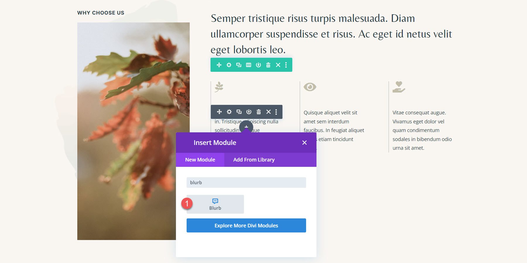
Next, remove the title from the blurb module and add the body content.
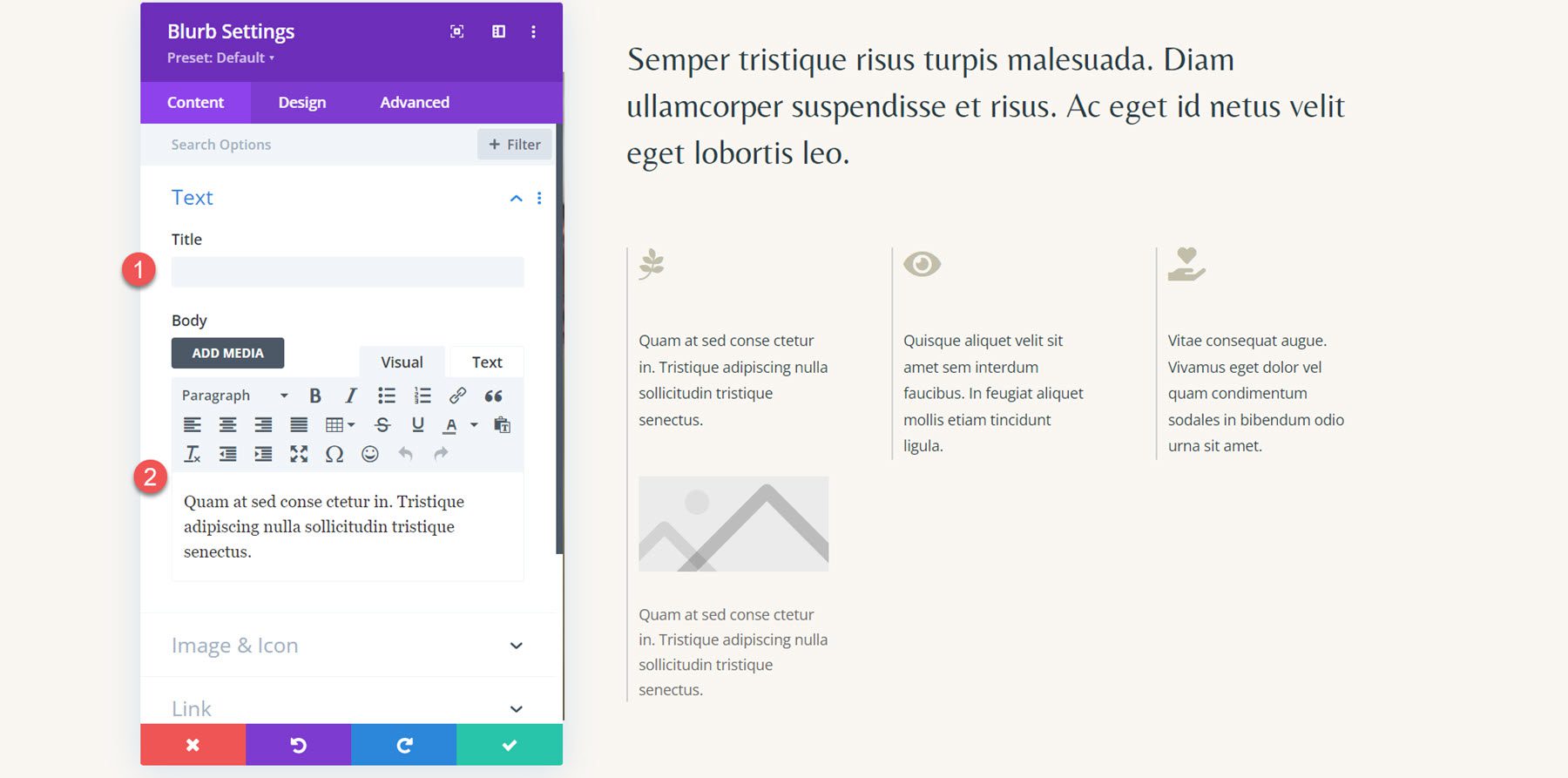
Enable the icon option in the image and icon settings, and then select the leaf icon for the first blurb.
![]()
Next, move to the design tab and open the Image & Icon settings. Set the icon color, image/icon width, and image/icon alignment.
- Icon Color: #c2beaa
- Image/Icon Width: 32px
- Image/Icon Alignment: Left
![]()
Lastly, set the text color and adjust the line height in the body text settings.
- Body Text Color: #293b45
- Body Line Height: 1.8em
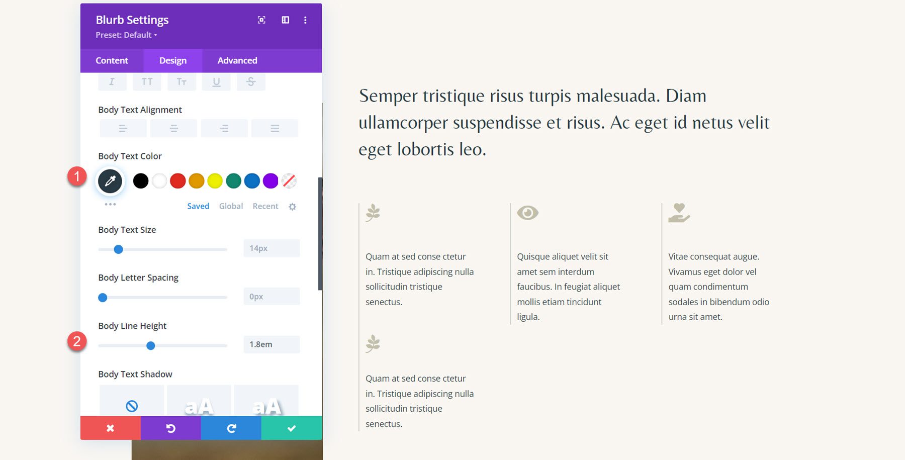
Repeat the steps to recreate all three sections.
Blurb Animation
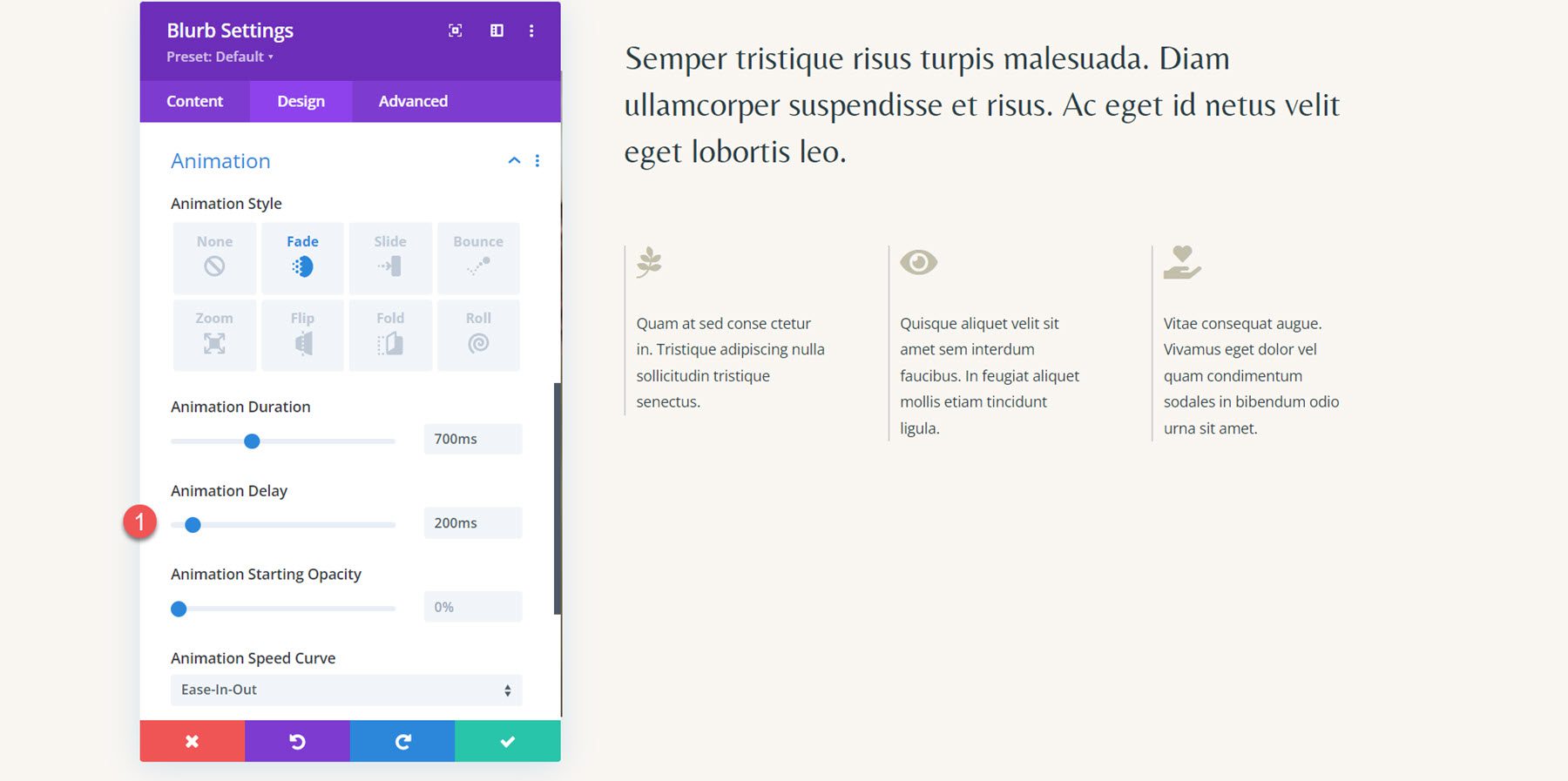
Now that each section is laid out using a blurb, we can apply our animation styles. For this layout, we will create a simple fade animation effect combined with an icon animation. Open the Animation settings in the Design tab, then select the fade animation style for the first blurb.
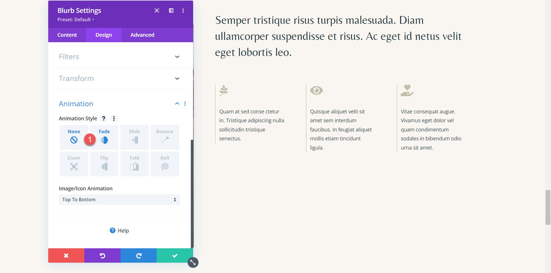
Next, set the animation settings as follows:
- Animation Duration: 700ms
- Animation Speed Curve: Ease-In-Out
- Image/Icon Animation: Bottom To Top
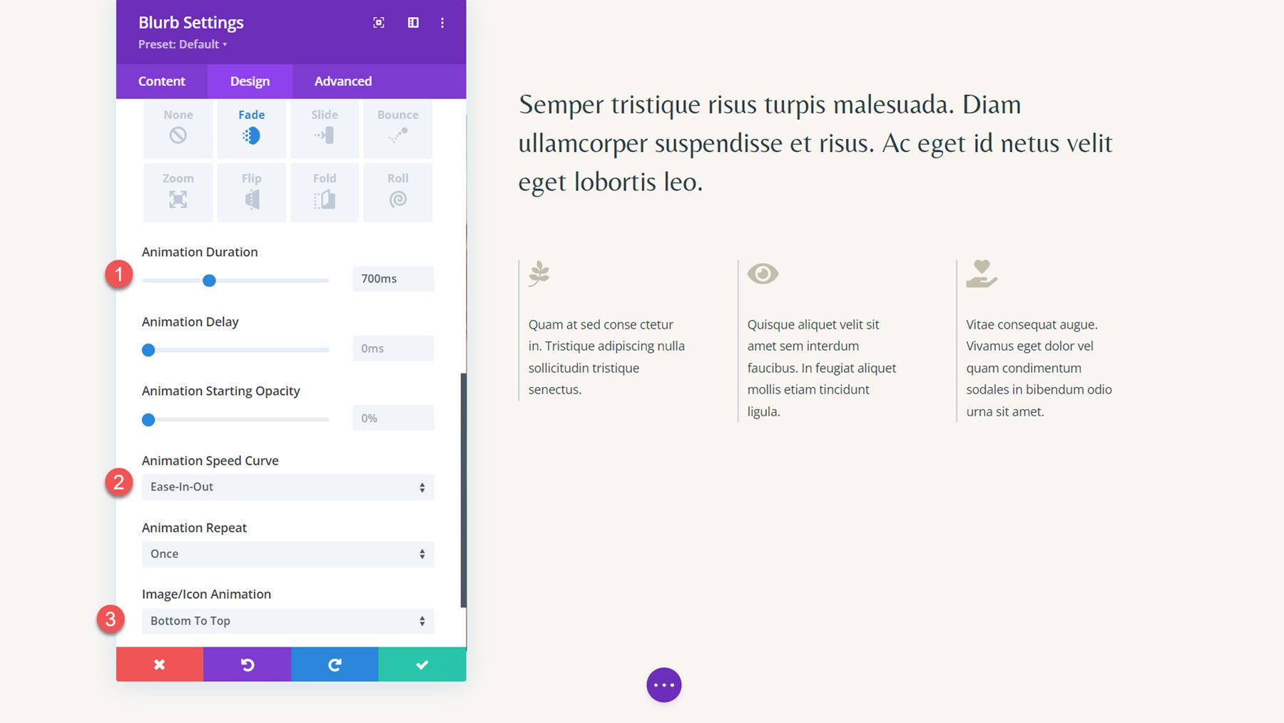
Extend the animation settings to the other two blurb modules in the section.
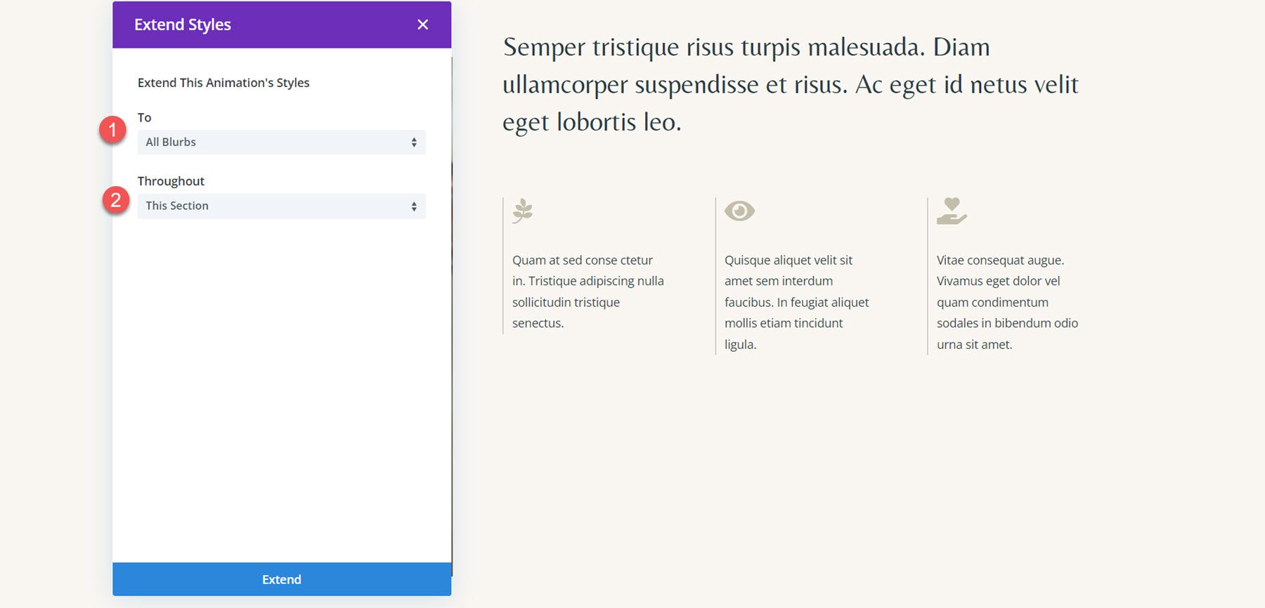
Finally, add some delay to the second and third module animations.
- Animation Delay for Blurb 2: 200ms
- Animation Delay for Blurb 3: 400ms
Final Result
And here is the final design with the fade animation and bottom-to-top icon animation.
Final Result
Let’s take another look at the final blurb animation designs.
Blurb Animation 1: Slide Animation
The first animation uses a slide-left animation style.
Blurb Animation 2: Flip Animation
This animation uses a flip-style animation.
Blurb Animation 3: Bounce Animation
In this animation, the blurbs have a bounce-up animation style applied.
Blurb Animation 4: Fade Animation
Finally, the fourth animation features a fade animation effect.
Final Thoughts
Divi’s blurb module can be used to creatively showcase your services or highlight key points on your website. Additionally, by adding animations to your design, you can emphasize the blurbs and draw your user’s eye toward that content. In this tutorial, we covered just four options for how you can animate your blurb module; however, there are endless designs you can achieve with Divi’s design options and the customizability of the animation settings. For more on the blurb module, check out this tutorial: How to Get Creative with your Blurb Icon Background in Divi.
Have you applied animation styles to Divi’s blurb module in your designs? Let us know in the comments!



Leave A Reply