Welcome to Day 75 of our Divi 100 Marathon. Keep tuning in for 100 days in a row of awesome Divi resources as we count down to the amazing release of Divi 3.0 on the final day of the series!
The Divi Shop Module is highly customizable, giving businesses the opportunity to display their products in innovative ways. With that in mind, this article will guide you step-by-step through the creation of five simple Divi Shop styles. By the end of this tutorial you will be more familiar with the possibilities that the Divi Shop module offers, and you’ll be able to quickly and simply create a beautiful showcase of your products.
Getting Things Set Up
Divi is WooCommerce compatible and we recommend using it alongside the Divi Shop Module. If you don’t already have WooCommerce installed you can find the latest version here. Once you have WooCommerce up and running you can go to the Product tab and upload your products.
The Default Shop Module
Before we get started, let’s take a look at what the Divi Shop Module looks like by default.
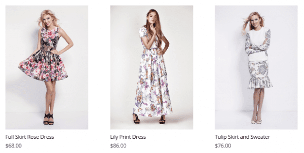
This is the starting point we’re using in each example below. To get the same results that we’ve achieved simply follow the instructions under each example.
1. Flat Card
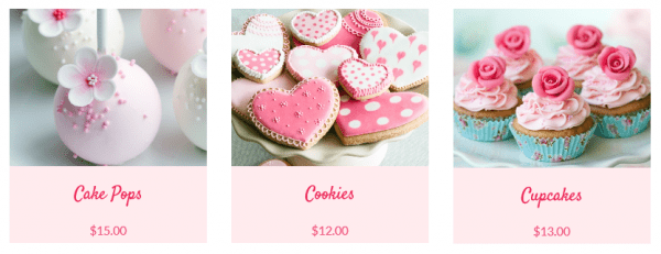
This simplistic but elegant look is quick to achieve using the Divi Shop Module.
These are the general steps that we will be following to begin creating most of the styles in this article:
- Go to Pages and New Page
- Click on Use The Divi Builder
- In the Divi Builder you have your usual row within a section
- Click on Insert Column(s)
- Select the first option (which shows one large tile)
- Click on Insert Module(s) and select Shop
- This will lead you directly to the Shop module settings section
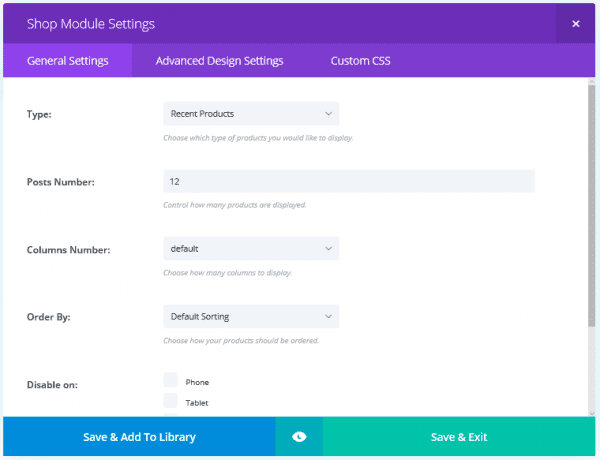
- In Type select the products you want to show
Note: If you want a particular category, select Product Category, and a list of your categories will automatically appear in a new section below the Posts Number section.
- Check which category you would like to display
- In Posts Number select the total number of posts you want on your homepage (for this style we selected three)
- In Columns Number select the number of columns you want in that particular module (for this style we selected three)
- You also have the Order By setting to select how you want products to be sorted
In the Advanced Design Settings tab you can change the font and size of the title and price. For this look we have used size 30 Satisfy Font and size 20 Lato Font for the title and price respectively. The text color for both is #ef285a. You can also adjust the letter spacing and line height for these elements.
To make this look more interesting we also wanted to change the background color of the card and center align the font. The background color can be changed in the Custom CSS tab by entering the following code in the Product box:
background-color: #ffebee;
The color code can be adjusted to your desired color.
The font alignment can also be changed in the Custom CSS tab using the following line of code in both the title and price section:
text-align: center;
This look is achieved without leaving the Divi Shop module. No changes to the section or row settings were required.
2. Material Cards
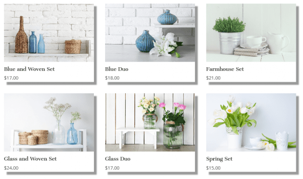
The material card adds interest and texture to the flat card look by using shadows to create depth in the image.
To achieve this particular design we first created a Divi Shop Module as in the example above. This time the number of posts and columns were six and three respectively. In the Advanced Design Settings tab the title was set to size 18 Cantata One Font and the price was set to size 17 Open Sans Font.
Now we need to create the shadow effect. To achieve this go into the Custom CSS tab and add the following lines of code to the Product section:
-webkit-box-shadow: 10px 10px 5px 0px rgba(0,0,0,0.4);
-moz-box-shadow: 10px 10px 5px 0px rgba(0,0,0,0.4);
box-shadow: 10px 10px 5px 0px rgba(0,0,0,0.4);
The size and color of the shadow can be adjusted by altering the numbers in the code. Play around and see what kind of effects you can create!
3. Minimal Overlay
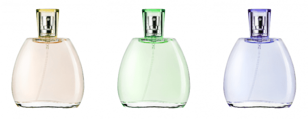
This style aims to achieve a minimalist look in which the viewer sees only the product image. Additionally, when they hover over the image they only see an icon.
For this style we again created a similar Divi Shop Module to the examples above. In the General Settings tab we selected three posts and three columns. We didn’t adjust the title and price settings this time around, since they won’t be visible.
We want to remove the title and price so that only the product image is visible. To remove these features from view you need to go into the Custom CSS tab. Under both title and image type the same line of code:
visibility: hidden;
For this style we only want to see the hover icon when we hover over an image. Therefore, we need to remove the visibility of the overlay. In the Advanced Design Settings tab you can go to Overlay Color and set the color and transparency so that the overlay is clear – i.e. rgba(0,0,0,0). Also, in this tab you can change the image and color of the hover icon to suit your site’s style. We set the hover icon to show a pale pink heart.
![]()
The overall effect is that when anyone hovers over a product they only see our selected icon:
![]()
You can of course use this effect for any number of means – it’s perfect for anyone going for a minimalistic look.
4. Closed Grid

This shop style fills the entire screen with imagery and can be extremely impactful. To get this look we created a separate Divi Shop Module for each tile. To do this, when you click on Insert Column(s), select the one that shows three tiles labeled “1/3”.
In the first column click Insert Module(s) and select Shop. You’ll just be selecting one post and one column. Again, we don’t want the title and price to be visible for this look, so go into the Custom CSS tab and under both title and price enter this code:
visibility: hidden;
These types of grids often work well with a contrasting overlay. To change the overlay settings, go into the Advanced Design Settings tab and change the color and transparency of the overlay to suit your site’s image. You can also change the hover icon color to suit your brand.
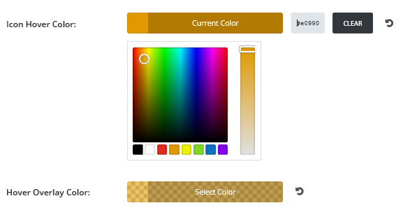
You can then clone this module twice and drag and drop the copies to the other two columns. You’ll just need to go into each module to change which product you want to display. To clone the module, click on the icon on the left of the module that shows two overlapping rectangles:

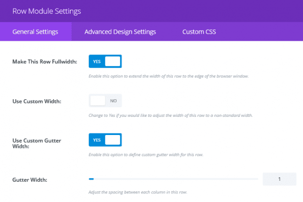
To get the tiles to span the full width of the screen you need to go into the row menu and in the General Settings tab select Yes for Make This Row Full Width. Then to eliminate the space between the tiles, you’ll need to select Yes to Use Custom Gutter Width. A setting of 1 will eliminate the space between tiles.
5. Irregular Grid
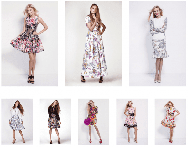
For irregular grids you can combine rows of Divi Shop Modules to obtain the look you desire. For this style we stacked a row of three products on top of a row of five products. To do this you first create a Divi Shop Module with general settings of three posts and three columns. Then click on Add Row below the first row.
In the new row, insert a Divi Shop Module with general settings of five posts and five columns. We also removed the title and price from these images to give it a cleaner look. To do this, as before, go into the Custom CSS tab and under both title and price, add the following code:
visibility: none;
The default space between rows was too large for our liking here. To decrease this space we went into Row Module Settings (the three line icon on the left of the row module). We set Custom Padding to 0 for the bottom of the top row and the top of the bottom row.

Wrapping Up
Although it can seem like a tall task to project your brand’s image and passion in an online store, you can see with Divi’s Shop Module that so much is possible. By using the vast number of easy-to-use settings you can create countless beautiful designs for your store. Which ideas from this tutorial will you be incorporating?
Be sure to subscribe to our email newsletter and YouTube channel so that you never miss a big announcement, useful tip, or Divi freebie!
Article thumbnail image by Titov Nikolai / shutterstock.com.

Divi 100 Day 75
The Countdown To Divi 3.0
This post is part of our Divi 100 marathon. Follow along as we post free Divi resources for 100 days in a row! This 100-day countdown will end with the game-changing release of Divi 3.0, including our brand new visual editor built from the ground up using React. Divi 3.0 will change the way you build websites with the Divi Builder forever!
Let the countdown begin. Learn More About Divi 3.0


this is cool, just wondering how to make the store page the default one for woo commerce and at the same time retain its layout design, by default woo commerce uses /shop and it replaces the contents of the page with its own
anyone know how to accomplish this?
Pedro, I don’t I’m afraid. You could always try our forums (https://www.elegantthemes.com/forum/). There are a lot of helpful people there who may have come across the same need.
Good luck. 🙂
Hey Tom,
Thanks for opening up the possibility of the shop module. I had one question though. When I drop in the visibility code in the CSS field you mention nothing happens. Is there something I’m missing with Builder 3.0? Or have there been some changes that make this not functional any more. We’re wanting our prices not to show on the shop module & this seems like a perfect solution. Any direction you can give me would be great. Thanks.
Sincerely. Brian
Hello Brian,
That’s slightly odd. We haven’t heard of any changes that would affect this. It may be worth dropping us a message, so we can take a look further (https://www.elegantthemes.com/forum/).
I sometimes have a lot of wording with a product. With the result that the add to shop button lies way down in the bottom. Is there a way to let the button appear on top?
Great ideas here!
I’d love to see an easy way to do a DIVI / Woo featured product slider module or instruction!
Flat Out of Heels rollable flats are stylish, comfortable, durable and compact enough to fit in a small clutch purse
The “visibility: none;” hack doesn’t work for me. Featured Products selected (only 1 item and column), and it’s a Grouped prod in Woo.
Ended up having to color the text to match the background.
Just FYI.
Do you know why when I add my products using the shop module in the preview I have my image’s product with the price but without the name of the product and an horrible blue button with a “select option” text just underneath the price? I’m going crazy
I don’t, Donatella 🙁 Your best bet is to drop us an email or post in out support forums. You can find the relevant information here – https://www.elegantthemes.com/contact/.
Would it be possible to display product that links to a PDF to download instead of going to a store/cart?
I’m not sure that’s possible, Tari. Your best bet may be to ask the question in our support forums – https://www.elegantthemes.com/forum/. You may find other users with a solution that suits you.
Thanks for your question. 🙂
Hello
I have a question on the theme to use.
Can use an elegant themes or should I use a theme WooCommerce?
Do I know if the megamenu plugin works correctly?
Can you tell me if in the future you can integrate the body text and photos in your themes to guide us how it is done.
Hi Michael, if you’re interested in using this tutorial then yes you will want to use the Divi Theme (by Elegant Themes).
Thanks for sharing a nice e-commerce Module.
You know, as much as I love Divi and where 3 is going, not all sites need a shop. When one doesn’t use e-commerce on their site, all the WooCommerce related CSS still gets loaded. So I still believe it’d be beneficial (both in terms of site speed and usability) if the WooCommerce parts that are built into Divi would be separated and could be ‘turned on’ via a switch.
Can any customize option in ecommerce like set “add to cart” button on specific place, add wishlist button, specification of products, Buynow button, and more…
The Shop Module and WooCommerce would definitely use some attention, I have to think that many more of the Divi users feel the same. I forgot to mention it in the survey.
I’m with Gavin.. There are some very frustrating stuff with this module..
Paging unsupported. Etc..
Hope divi 3 is more in the business
The shop module is all well & good… but you have to go through and build custom pages for everything, then there is no support to customise the Category, Tags & other taxonomy archive pages. So it renders it kind of pointless since no one wants an inconsistent site.
Also you can’t choose to include products from specified tags.. only products from specified categories. Making even less useful.
Great day 🙂
Can you please subscribe more about shop cards – style, mousehover,product information…
And please show us what is the best plugin for custom fields for DIVI ( product and post ) and how we use them. Customization and style of post is something that our clients want to see. That will be bring more creative ideas for us.
Thanks
Thanks for the helpful post.
I really liked the material cards style.
I would suggest if you can come up with a video tutorial for that. This will be easier for us to understand how to do it.
Regards
Diana
Tom,
Lovely examples, thank you. Eliminating title and price helped me put the items on a shelf. I added an image of a shelf in the image module below the shop module row and made the padding-top: -200px.
Waiting impatiently for Divi 3.0.
Some nice ideas.
The shop module is such an underused module by Elegant Themes. Considering it’s the only woocommerce module in divi I am constantly amazed at how little has been added to it.
The fact there is not even am option to add the ‘Add to Cart’ button to the products in the module is crazy. Very frustrating you need to be messing about with the functions.PhpBB file in your child theme to add these buttons.
Please please PLEASE give this module some much needed attention. The rest of divi is amazing but it really suffers in this module.
Thanks
Gavin.
Like other premade styles, pls also provide premade styles for Shops, because of increasing number on online shops worldwide. It will provide a big help to promptly create shop pages. Thanks
I never used the Shop Module, as quite frankly, I didn’t know what to do with it. These are very nice examples. I would like to see a more extensive tutorial on how to use the Shop Module to actually function as an e-commerce store for purchases. I’ve used Woo-commerce, so I’m wondering if it connects up to that somehow?
Love it! =)
This would be very useful for the shop module. Keep doing this great work guys. Luv you.
when i hover nothing happened. was i supposed to see a mouseover?
Are you referring to the Minimal Overlay section Prema?
Tom,
Excellent post thank you very much,
A recommendation would be to create a small video tutorial.
Finally, you can create a new post about adding overlay effects for WooCommerce.
Cheers!
We’re working on that video Luigi! I’ll see what we can do about the post idea you mention…
I see that this module can create a five column presentation. Can I use the module for THAT but NOT use it for Woo Commerce?
Also, setting the padding to 0 makes me want to know: What is the DEFAULT padding?
And, when I change a padding/margin to a number, am I totally replacing the default setting or am I adding/subtracting to the default?
Thanks.
When you specify margin and/or padding, the value you specify replaces the default setting.
Good questions – I’d like to know this too – be helpful in adding the right numbers in from the start. Thanks – hope it gets answered.
Finally some tips to help improve the Woocommerce functionality of Divi. Definitely something that I’m sure many Divi users would love to see more customization options in the future, or even (who knows) a separate theme, like the Extra of ET ecommerce. The powerful customization options of the Divi builder would make it a huge player in the Woocommerce theme world. Definitely keep up the Shop customization tips ET! Thanks!
Love it~, love it~!
I needed them… ?
Thank you !
This is definitely an overlooked module that could use some customized love. These are very nice examples! Thank you!
Our pleasure Kathy!
n1 idea, but i thikn think there are more important things like showing products by tag, useable filters and number of products from x and pagination.
Please provide sample content xml for the woocommerce products in Divi. It will be helpful for us developers to quickly style them. Thank you,
Thank you, there is very little help from DivI about the Shooting Module and e-commerce, so this is helpful and I hope to see more in the future!
Hi Tom. These will come in handy (I’m actually building a site that uses the shop module right now). I especially like the look of the closed grid and irregular grid. Thanks!
You’re welcome Randy!