Using Anchor links in Divi (or any website) can improve navigation and help organize your content, especially on a website with long-form content. One of the other main benefits of using anchor links other than navigation is the fact that they are awesome for SEO. While the concept of using anchor links is very simple, it can be hard to know where to start. It’s actually one of the first things I went hunting for when I got started developing WordPress websites.
This article shows you 5 cool things you can do in Divi with anchor links. For these examples, all you need is Divi and a desire to learn.
Let’s go!
You’ll Learn how to:
- Scroll to and Open a Toggle with an Anchor Link in Divi
- Create a One Page Navigational Menu
- Jump to a Page Section from Another Page
- Use the Divi Dot Navigation
- Add Anchor Links to Your Headings
5 Cool Things You Can Do In Divi with Anchor Links
Subscribe To Our Youtube Channel
Scroll to and Open a Toggle with an Anchor Link in Divi
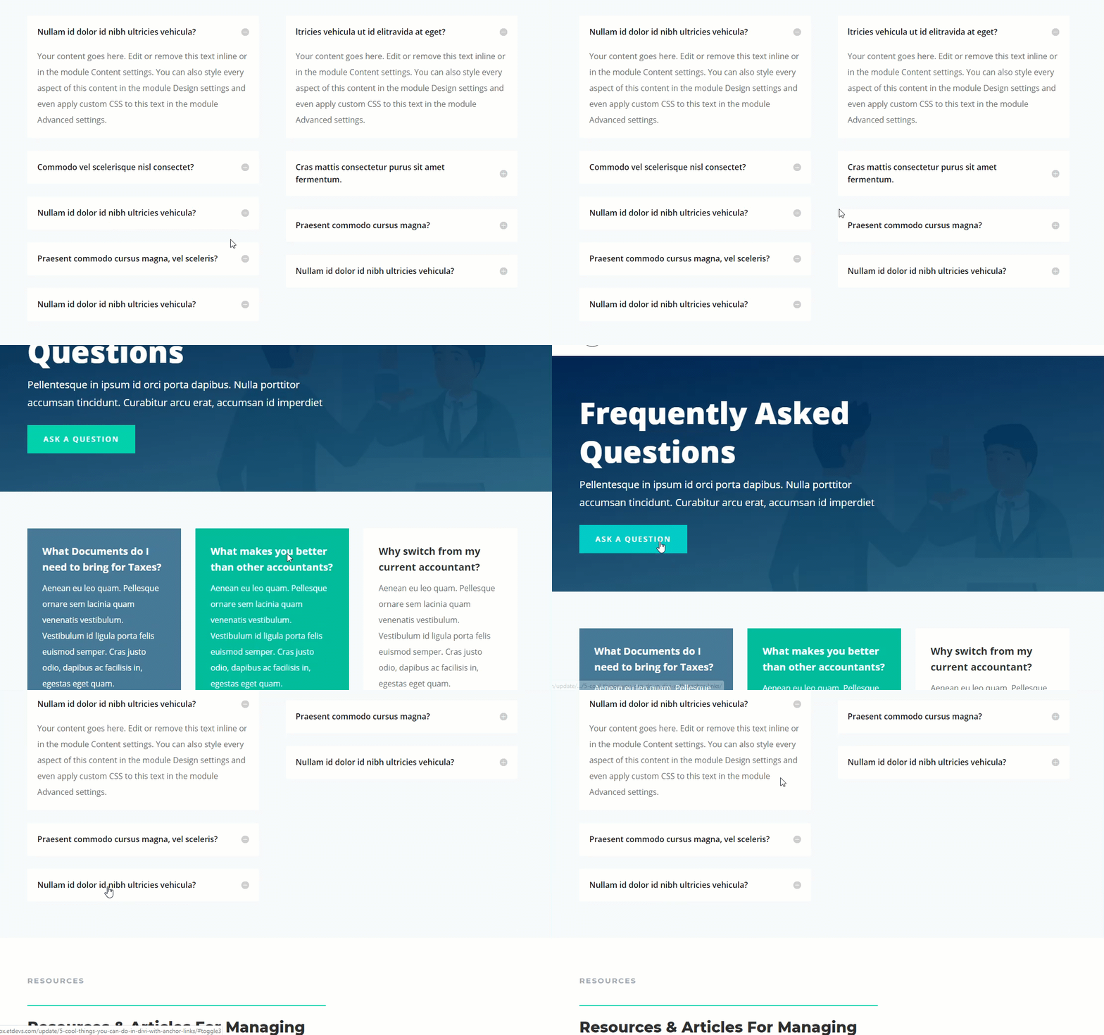
Toggles are one of those elements that can enhance user experience. Call me lazy (I’d use the word efficient) but the easier it is for me to get my information, the better. I’m a big fan of toggles for certain types of content.
One of the best uses I’ve seen for toggles is for FAQ pages. They work great for revealing small bits of information that the user wants to focus on. This will only take a minute and a few lines of JavaScript to complete. You can also use a variation of this method to open tabs or accordions and while this may seem difficult, it’s really not too complex. A simple method may be by using a FAQ plugin, but either way, consider this use of jump links for better site UX.
First, create a new page and deploy the visual builder. Then select the option “Choose a Premade Layout”. In the Load from Library popup, find the Accountant FAQ page layout by typing “faq” in the search bar. Then click on the layout and on the preview that comes up click the Use This Layout button to deploy it to your page.
Now you are ready to add your anchor link functionality. For this example, I’m going to use the button in the top header section as the anchor link so that, when clicked, the page will scroll to a specific toggle which will simultaneously open automatically.
To do this, first, open the button settings and add the following link URL for your button:
Button Link URL: #toggle3
I gave this anchor link the id “toggle3” to help remember that I want to link to the third toggle on the page. This id name will correlate to the toggle CSS ID we will add later so that the button knows to what toggle to scroll.
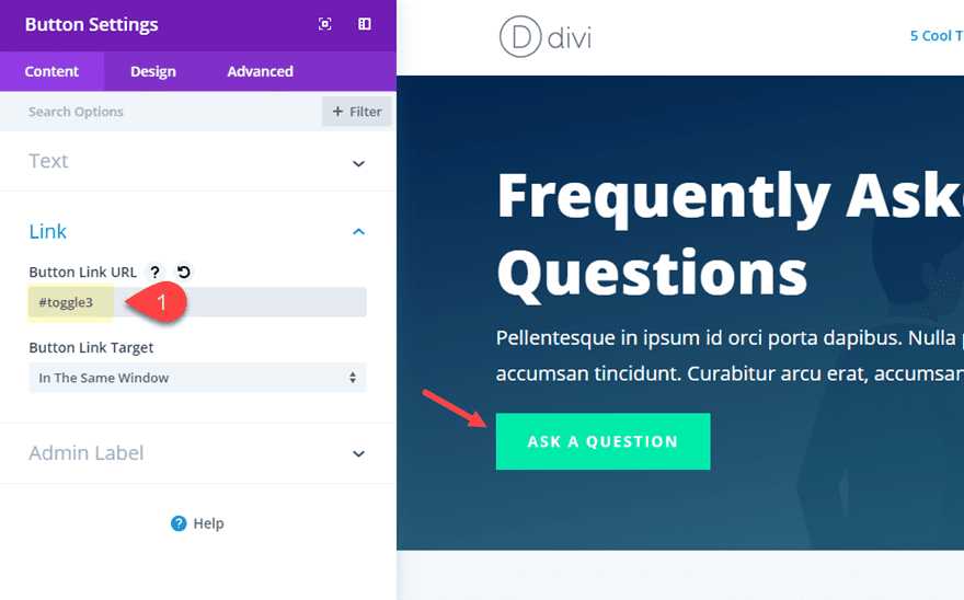
Next, add a unique CSS Class to the button module:
CSS Class: open-toggle
Then save your settings.
This class name helps remind you of the action of the toggle opening when clicking the button. We will use this class in our custom jqeury to get the desired functionality in a little bit.
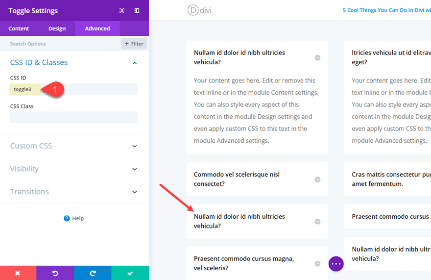
Next scroll down the page to the row containing the two columns of toggle modules that are being used for the FAQs. Open the setting of the third toggle module in the first column. This is the module we want to scroll to and open when clicking the Button (or anchor link).
Under the Advance Tab, add the following CSS ID:
CSS ID: toggle3
It is important that this exactly correlates to the button link URL used earlier. The only difference here is that you must leave out the “#”.
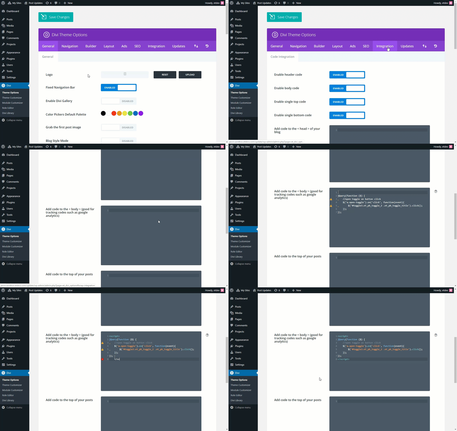
The last step involves adding some custom code to the body of our page. To do that, navigate to the Divi Theme Options, and open the Integration Tab then paste the following into the body section as shown in the GIF below.
jQuery(function ($) {
    //open toggle on button click
	$('a.open-toggle').on('click', function(event){
        $('#toggle3.et_pb_toggle_2 .et_pb_toggle_title').click();
	});
});
Don’t forget to wrap the code in the proper script tag.
Now you can test out your page to see if it works.

To understand a little about what this code is doing. Let’s take a closer look. Here is the snippet again:
jQuery(function ($) {
    //open toggle on button click
	$('a.open-toggle').on('click', function(event){
        $('#toggle3.et_pb_toggle_2 .et_pb_toggle_title').click();
	});
});
In the code, the selector “a.open-toggle” refers to the button with our custom class. The selector “#toggle3.et_pb_toggle_2 .et_pb_toggle_title” refers to the the title of the the toggle with the id “toggle3” and the class “et_pb_toggle_2”.
The class “et_pb_toggle_2” is actually the class associated with the third toggle. That is because Divi gives the first toggle the class “et-pb_toggle_0”, the second toggle “et-pb_toggle_1”, and so on.
So if you want to know what the class is for a particular toggle on your page, you can simply count from 0 starting with the first toggle on the page and work your way down. Or you can always just inspect the HTML code to find the class that way.
This is important to know so that you can update your code accordingly. For example, if I wanted my button to open the second toggle on the page, I would replace “#toggle3.et_pb_toggle_2 .et_pb_toggle_title” with “#toggle3.et_pb_toggle_1 .et_pb_toggle_title”.
This code snippet is a variation of the following concept. I tried to keep it as simple as possible.
This cool technique would also work for tabs and accordions. The trick is to identify the right CSS classes for the accordion item or tab so that you can use it in the code.
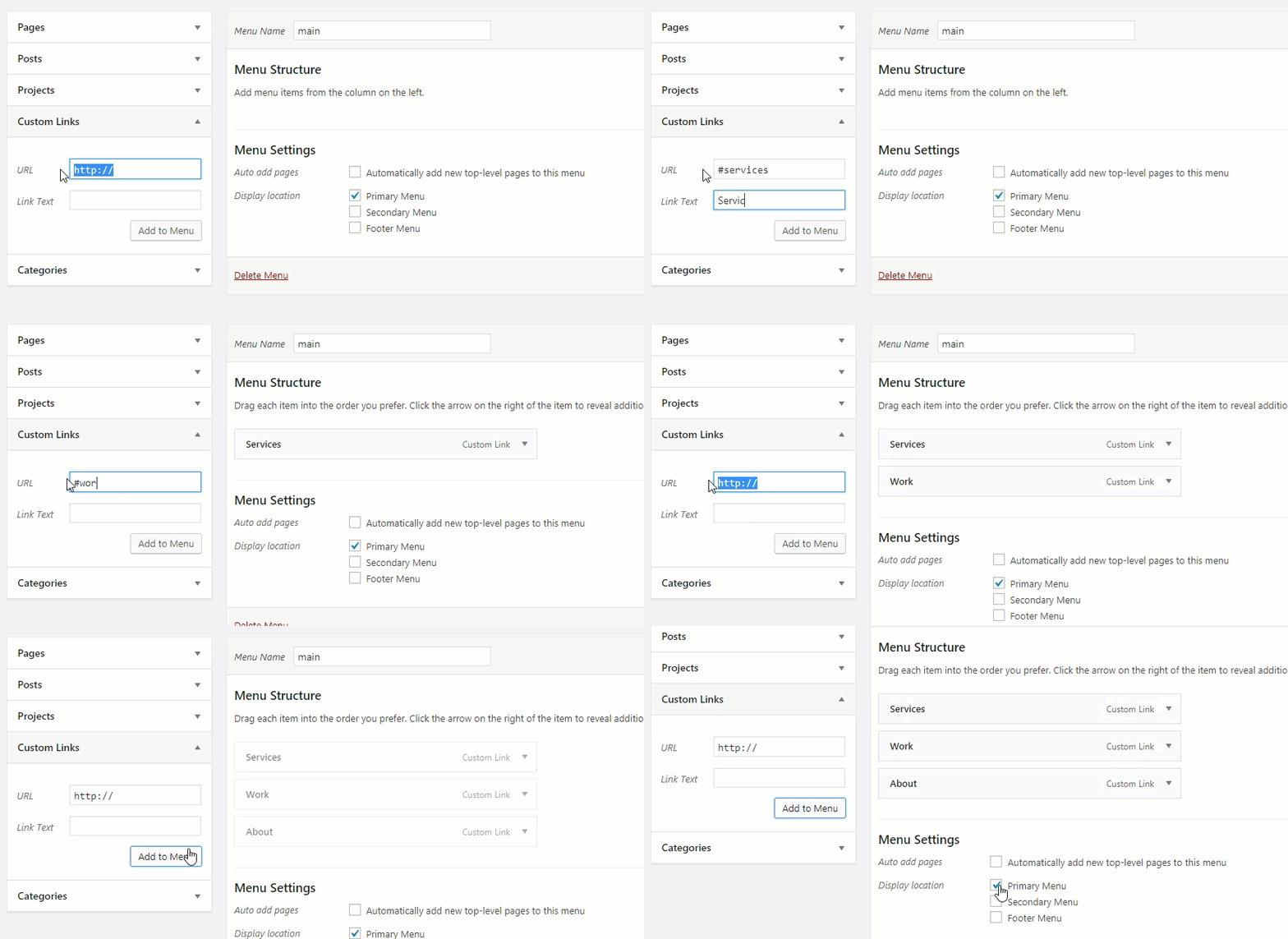
This sort of menu design is popular for one-page sites. It can be useful to create links in the menu to jump from section to section on your page. This is especially helpful if you are building a one-page site or a landing page. You can check out the documentation on how to create one-page websites with Divi for more info on this process.
Here is a quick overview of how to do this.
This will work for any premade layout, but for this example, I’m going to use the Web Freelancer Home Page Layout. Create a new page, deploy the visual builder, select “Choose Premade Layout”, and then deploy the Freelancer Home Page Layout to your page.
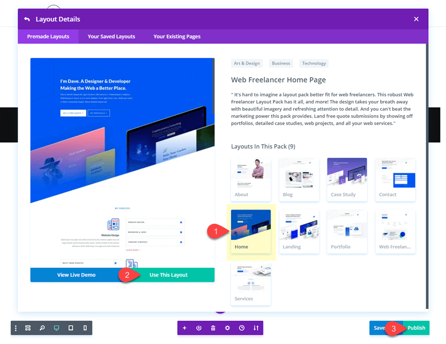
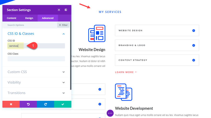
Now you need to add CSS IDs to each section that you will want to link (or scroll) to. Find the section titled “My Services”. Open the section settings, click the advanced tab, and add the following CSS ID:
CSS ID: services
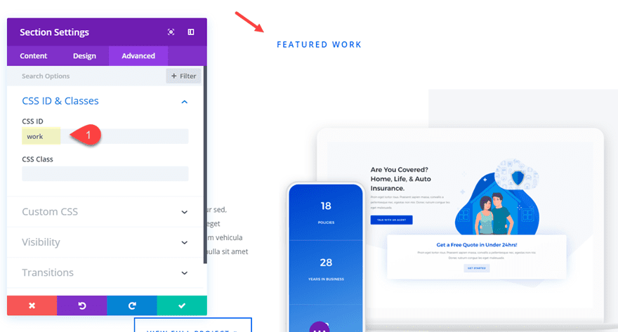
Next, find the “featured work” section and give that section a CSS ID as follows:
CSS ID: work
And add the following CSS ID to the “About Us” section as well:
CSS ID: about
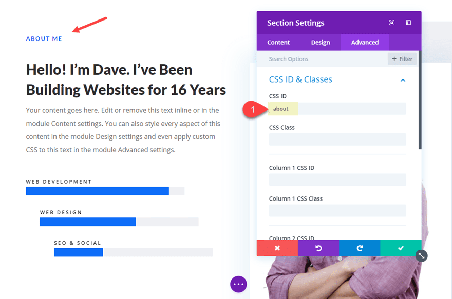
With these three sections properly set up with their unique CSS IDs, we can now create our menu anchor links.
From the Dashboard, navigate to Appearance > Menus and create a new Primary Menu. Then Create three custom links with the following URL and Link Text:
Custom Link 1
URL: #services
Link Text: Services
Custom Link 2
URL: #work
Link Text: Work
Custom Link 3
URL: #about
Link Text: About

Don’t forget to select set your display location to Primary Menu. Then save your menu.
Now when you visit your page you can try it out. You may notice that there is smooth scrolling. This is because the Divi theme automatically adds smooth scrolling – this feature was added in Divi version 2.4.
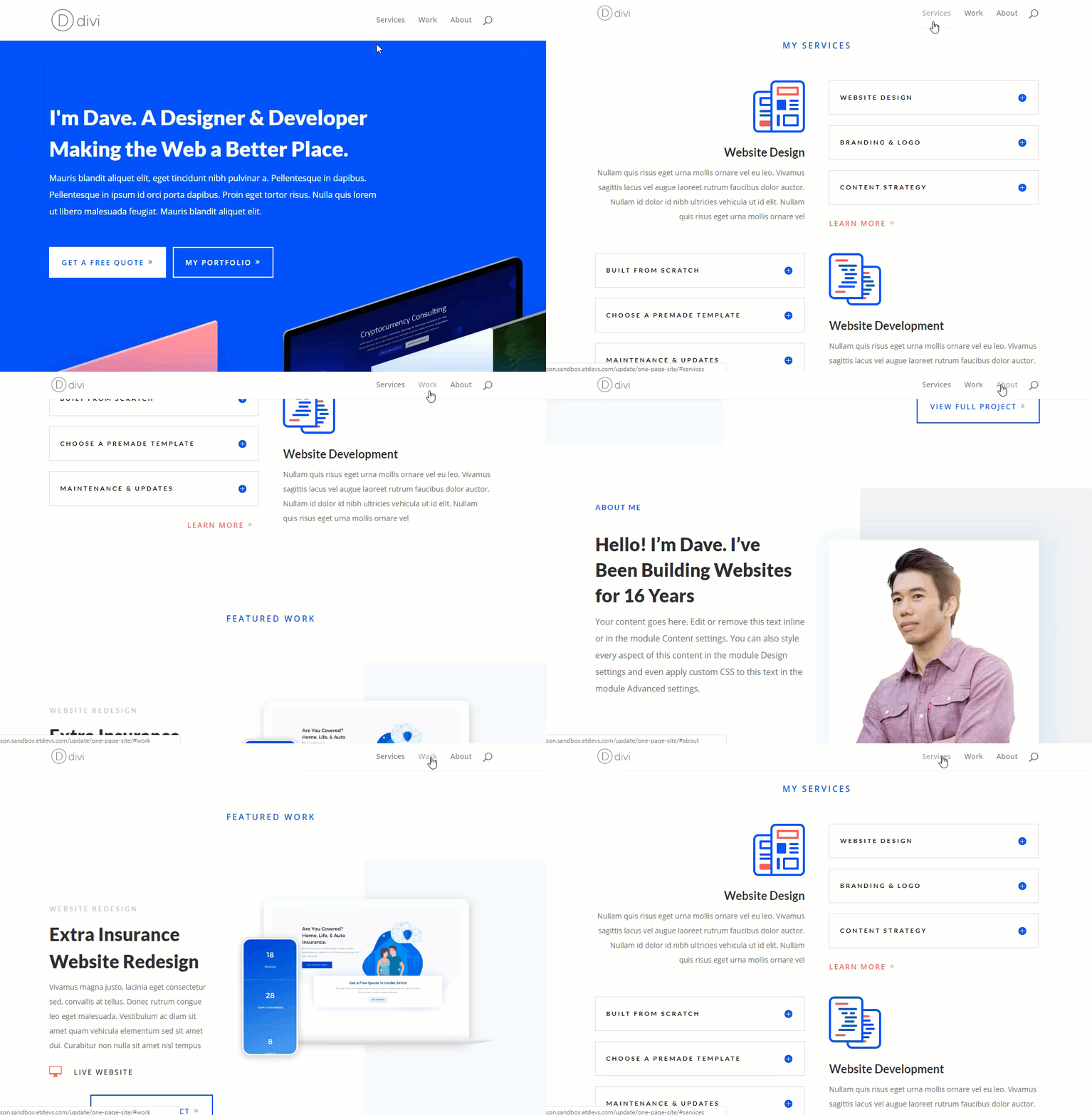
For more inspiration on building killer one-page style websites, check out these posts:
- How to Build a Responsive Fixed Sidebar With Anchor Links
- How to Create Full Screen Sections with Top and Bottom Scroll Links with Divi
- How to Create Active Links on Scroll for One-Page Divi Websites
Jump to a Page Section from Another Page
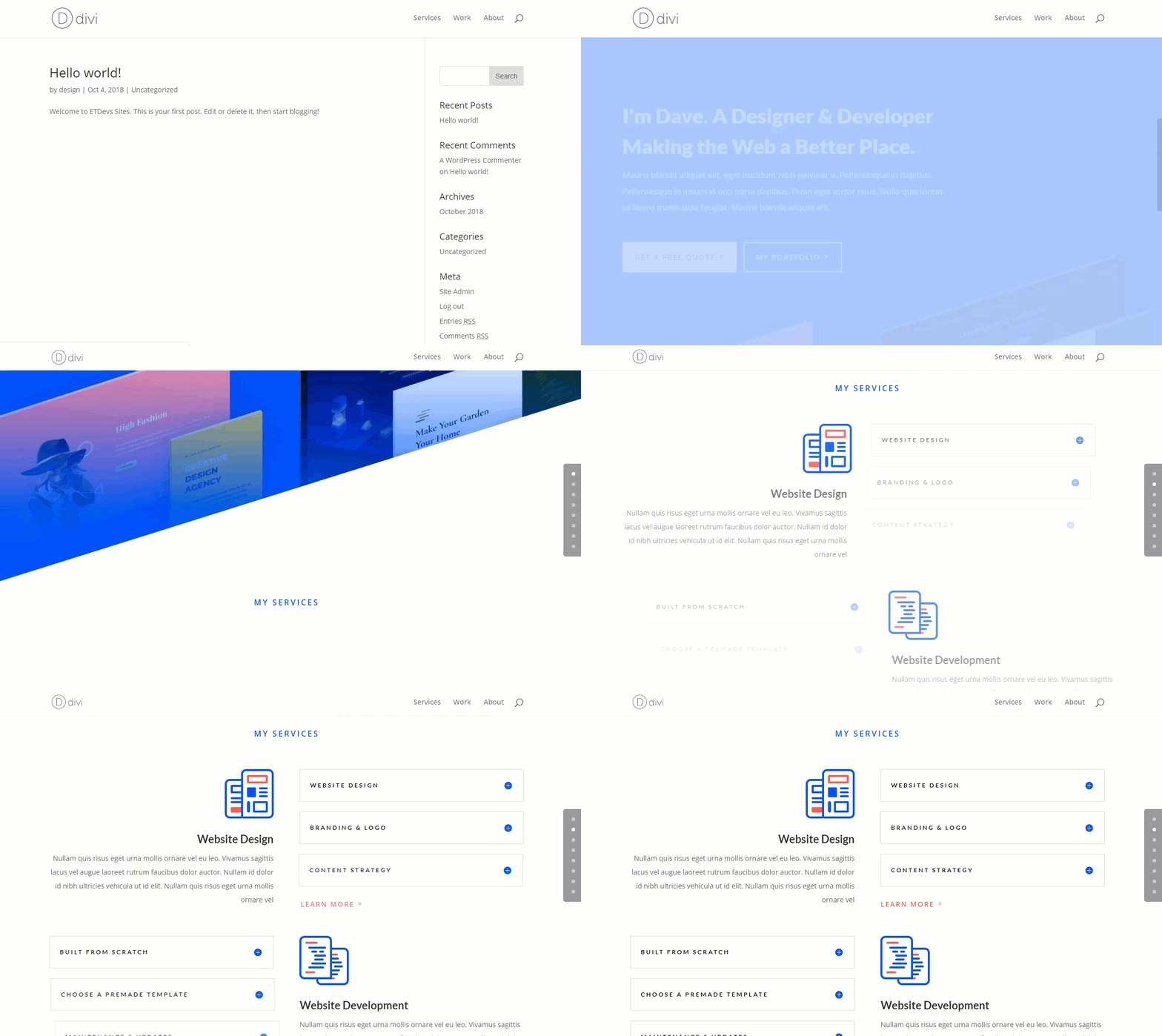
We can use the example from above to demonstrate this. Since we added a CSS ID to three sections on the page (services, work, about), not only can we jump to those sections using our menu anchor links, but we can also jump to those sections from a completely different page.
All you need to do is use the URL of the anchor link when creating a link on a different page. If you wanted to put a link to the services section with the ID “services”, it would look something like www.yourdomain.com/page/#services.
Here is an example of how the page will load and scroll to the “My Services” section when linking to that section from another page.

This works great for many different calls to action (i.e. learn more, get Divi, vote for me!, etc.) that you may want to jump to from different pages of your site.
Technically these are built-in anchor links. You won’t need to add your own CSS section ids. The Dot Navigation feature automatically creates anchor links out of your sections. To turn on dot navigation for your page, simply set the Dot Navigation option to “ON” under the Divi Page Settings at the top right of the screen when editing your page. Once you turn on Dot Navigation, Divi automatically adds a transparent menu on the side your page. Each dot scrolls to the sections throughout your page when clicked.

For more info, there is a great post on how to add labels to your dot navigation.
Add Anchor Links to Your Headings
Adding anchor links to your headings is always a good idea. It is a great way for indexing longer pages with a lot of content, allowing you to easily navigate to each heading within the same page or to create links to these headings from other pages on your website. It also helps search engines crawl your site.
To add a CSS ID to your headers using the Divi Builder, open the module containing your heading text. Make sure you have the text tab open. Find the header tag (h1, h2, h3, etc…) and then enter an id within the brackets of the beginning header tag. Here is an example of an h3 heading with the id “webdesign”:
<h3 id="webdesign">Website Design</h3>
Now I can link to this header from anywhere as long as I use the correct anchor link URL. Which for this example should look something like this:
www.yourdomain.com/page/#webdesign
This will also come in handy for pages or posts that aren’t using the Divi builder. To add Anchor Links to your headings for these pages or posts, open up the Text tab in the WordPress text editor. Simply locate the heading of your choice and add the id inside the heading tag as shown below.
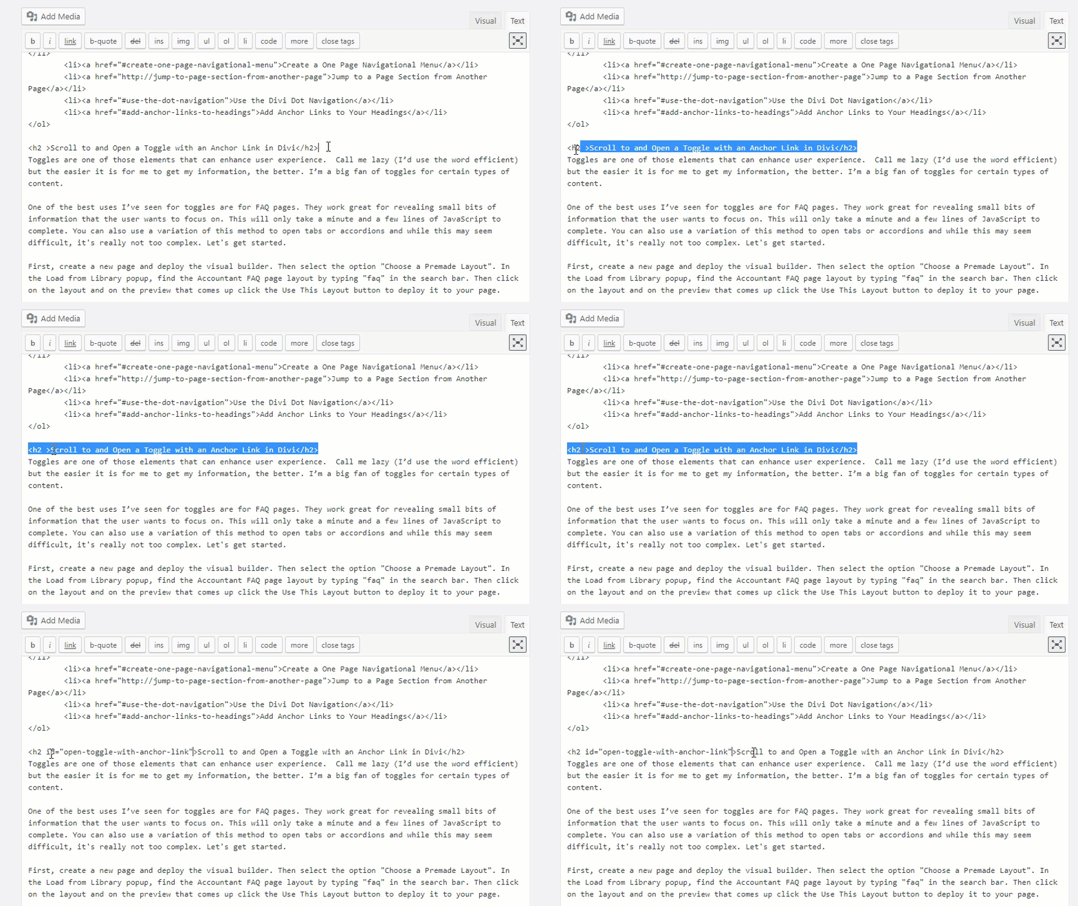
This is exactly what I did for this post. The section links at the top of this post serve as a nice table of contents that links to the different headings on the post. Read more about using the method for creating Table of Contents sections for your pages and posts in WordPress.
Pretty cool stuff.
If you wanted to, you could also use a table of contents plugin to help you add one to your content.
Wrapping Up
Anchor links have a few great practical uses, but don’t go too crazy with them because you must always first consider your audience and your goals. Remember, good design is about usability and function so, in some instances, anchor links can be very helpful. But in others, it just means users zap back and forth over the parallax sections and wind up getting lost. Hopefully, you were able to get some useful tips from this post.
Do you have any tips or questions about anchor links? Let us know about your experiences in the comment section below.


Considering how much your company should already know about website viewing and that the majority of people browsing now do so on a mobile device, it’s crazy that when these videos play back on a cellphone your promotional junk obscures a clear view of what you’re trying to share.
Very useful tips in general – BUT: the Akkordeon-module doesn’t seem to have the option to put CSSID to specific toggle items. Therefore this tutorial seems to be useless for my use case.
Thank you very much for the “Alternative scroll-to-anchor method” trick. I’ve been struggling with this bad positioning for a long time. That was so easy to fix. I did not notice this setting before. Shame on me.
Hi
Thanks for this tutorial. I’m using the Divi Slider Module. I’m trying to use the built in “button” feature in each slider to navigate to the next slide in sequence. Do you know how I can achieve that?
I made an anchor link for a contact form which lives at the bottom of the home page. It works fine but now if you are on the Home page, both Home and contact menu items are the “active page” color. Is there a way I can make contact stay the inactive page color?
Hi Amanda,
Yes, we’ve had exactly the same thing. Let’s say you have two links in your primary menu;
Home
Contact
…and as you describe, the Home link may go to “/” and the Contact link may go to “/#contact” – because both URLs are the same, both links in the menu contain the ‘active’ class and will both be styled accordingly.
But the logic is, that if you’re on the homepage, you want the Home link to be styled active and not the Contact link. If you’re on any other page then the Contact link is still not active and shouldn’t be styled as such. So there will be no time when that Contact link should be styled as active.
What we did was to edit the menu (Appearance > Menus) where you have entered the menu item for your Contact link, and on that page enable classes (at the top of the Menus page, click Screen Options, then enable CSS Classes). You can then add a class to your Contact link, such as ‘never-active’ (without quotes).
In your CSS, create a style for the .never-active class that ensures that link is always displayed with the normal menu formats (whatever that may be – usually this will be a colour, but remember to check the :hover selector styles as well).
I hope that helps.
Any way to do something similar to scroll and open toggle, but instead scroll and apply focus to a specific video in a video slider? Would be very valuable for simple LMS functionality. Thanks!
I second this request!
Great work and laudable article.
Thanks, Admin
I find that this type of approach works well for smaller to medium sized websites that don’t require lots of pages and sub pages as you can fit the content onto 1 page in sections, with the menu items linking to each section.
It’s also great to get your keywords into the content naturally for SEO reasons.
Agreed. The one-page website navigation works best for things like landing pages or small websites.
Please make a video of this! 🙂
The video is coming soon.
Sounds great, but I personally need a movie to understand it better… I give up reading very technical stuff halfway through, not because it’s uninteresting, but because I find it too complicated. Perhaps if visually explained, I might venture into it.
That’s understandable. The video is coming soon. 🙂
I have tried two browsers (safari and firefox) and none of your graphics (images) are showing up. I’m getting the little blue box with a ? in it, or nothing at all.
It is hard to follow along without the visuals. Any advice?
The ability to use anchors in one page websites is really great.
However, I have struck a problem when using the mobile menu on one page sites. The menu does not hide after a menu item with an anchor link is clicked.
This is not a great UX as the page section is either partly or fully obscured (for example divi switch full page mobile menus) depending on what sort of mobile menu you are using.
Does anyone know of a solution to this problem?
I have the same problem with fixed menu selected, don’t happen with centered
here is the problem i am having. i am building a two page website and the menu will be using anchors to get to other parts of the pages. my menu is designed to have the page that is active be a different color in the menu so at a glance, you can look at the menu and see what page you are on. the problem is, if i have five pages in my menu, and 3 are via anchors, those three items are always a different color because it sees that you are already on that page and thus active. so, is there a way around this or do i have to disable this ‘different menu color’ feature?
Hey guys “Jump to a Page Section from Another Page” link is broken
In “Create a One Page Navigational Menu” is not told/shown how I get the anchors into the menu. So how???
In my opinion, any article about dot navigation is incomplete without information on how to disable individual dots. This bit of CSS works for me.
/* Disable Dots in Dot Nav */
/*Change the digit for each specific dot to remove*/
ul.et_pb_side_nav li.side_nav_item:nth-child(4){ display: none;}
ul.et_pb_side_nav li.side_nav_item:nth-child(6){ display: none;}
Thanks for the tip, Dan. You make an excellent point!
Hi!
Great article but I think you have one big mistake – link to the 3. Jump to a Page Section from Another Page is not working, i.e. it is not linked correctly 🙂
Oh those pesky links 😀 (The “3. Jump to a Page Section from Another Page” link at the top of the post is broken)
To the folks having problems with this not linking to the right spot. I’ve been fiddling with this quite a lot, and it seems, that the link to a section on another page, actually makes that section load at the top of the browser window, but that any “fixed menu” is placed on top of that section, covering content. I found that the only workarounds are a) to avoid fixed menues, b) to use menus with lower height than the sections padding. Not exactly what I want, but ok.
I hope this feature will be made available for the Extra theme.
You can do all of this in Extra too.
Cant wait to try this out…
Hello,
Thanks for the great article. I have been using anchor links on the site and it has helped cut down a lot of pages and condense lots of content into a single page. I have noticed and really like the new template you guys have been using for the blogs lately. Is there anyway we could get a sample of this template or tutorial on how to achieve it mainly the background with the two different colors at the top?
Thank You.
Great article Brenda and thanks for linking to my ‘Using anchor links to open accordions and tabs in Divi’ article.
For those readers who are interested in learning how do to that from a different page, I posted a follow up article on that very topic – https://jonathanbossenger.com/using-anchor-links-to-open-accordions-and-tabs-in-divi-from-another-page/
Awesome! Thanks so much for the followup. I’m certain this will help a lot of people out.
To get the “Open an Accordion Item with an Anchor Link in Divi” to work, I had to make some changes:
Ad and to the beginning and end of the script.
Change #my-accordian twice into #my-accordion in the script.
Add an extra bunch of accordion-items, to make the page actually scroll.
But after that: it worked! Thanks
Great job. And excellent article for those who work DIVI
Thank you
Hi Brenda
The most adventurous that I’ve ever been is “Add Anchor Links to Your Headings”.
Anything that is “… awesome for SEO.” always gets my attention.
This is so so cool. Though it took me a little bit of time to comprehend.
Thank you for providing this article, as it touches on a technique that I have used occasionally. Creating a page menu (links on the page that jump to another part of the page) works quite well.
However, I have never been able to get this to work right when coming from another page. The link jumps to a spot below the desired spot. I believe this has to do with the way the header of the page is formatted or executed. It may have something to do with the fixed header option because the landing spot (coming from another page) may be offset by the same height as the page header.
I’ve solved this by placing the anchor ID higher than the position where I want the link to land. This is imprecise and will change when you add additional content to the page. I’ve found this on more than one Divi site and using another site using a theme that comes with Visual Composer.
Brenda, have you found that the anchor links work exactly the same way, when on the same page or coming from a different page?
Did you try to set Divi options > Navigation > General Settings > Alternative scroll-to-anchor method ?
I found a solution that seems to work well.
1. Measure the height of your header.
2. Put this in your custom CSS, replacing the numbers below with the height of the header:
.anchor {
padding-top: 200px;
margin-top: -200px;
}
3. Add “anchor” as a CSS class to the element that you are targeting (e.g., a section heading), or put this in your code (where “subheading” is the unique name for this, and only this, heading):
Text That Displays
4. In your menu system, make a custom link like this:
/cool-page/#subheading
(where “cool-page” is the URL of a specific page)
This is working quite well on a non-Divi site built with Visual Composer, and it’s working on a site I’m building with Divi.
No guarantees that this will work, but if you’re having the problem I described above, it’s worth a try.
Jonathan, you may find my following up article of interest – https://jonathanbossenger.com/using-anchor-links-to-open-accordions-and-tabs-in-divi-from-another-page/
Great name by the way 😉
We should form a club!
Yup this is the issue I was asking about. I’m having a lot of trouble fixing it. I’ve tried two different CSS solutions with inconsistent results depending on whether the click comes from the same page or another page. Would really appreciate an official response for this.
I have a site with a fixed menu and the headings are getting hidden underneath when using anchor links. What’s the best way to fix that in Divi?
I think you may have missed a step in “Create a One Page Navigational Menu?”
I think so too – some good tips here though.