Welcome to Day 69 of our Divi 100 Marathon. Keep tuning in for 100 days in a row of awesome Divi resources as we count down to the amazing release of Divi 3.0 on the final day of the series!
When designing a website, the sidebar can sometimes be a little neglected. It’s easy to get carried away putting together a knock-out blog landing page and forget to remove the standard widgets and style them to match the rest of your site. Remember, even if your prefer the look of a full width post, the standard sidebar will still appear on archive pages.
Your sidebar is a great way to help your users navigate your blog area. You can use widgets to help them find the posts that will most appeal to them, as well as utilizing it for external advertising or internal marketing like newsletter sign-ups.
The Divi sidebar module also allows you to place an unlimited amount of custom sidebars on your layout pages. I particularly like using custom sidebars as part of the blog landing area. Here is a great example.
In this post, I’m going to share five of my favorite ways to spice up your sidebar. Before we get started, I’m going to be focusing on the standard sidebar, which you can edit, like all widget areas, via Appearance > Widgets in the WordPress Admin’s menu.
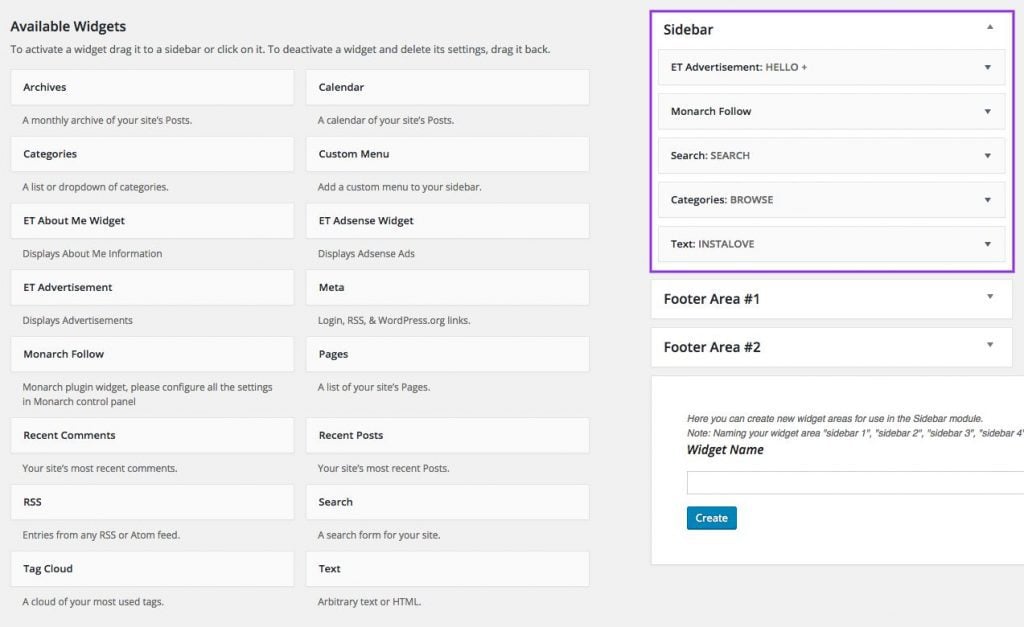
1. Use the Elegant Themes Advertisement Widget
Although Divi doesn’t come with an image uploader widget, the ET Advertisement Widget is your secret weapon when it comes to adding images to your sidebar. You can of course add images using the standard WordPress text widget and writing the HTML to create an image link, but this ET widget makes it easy for you. You still need to pre-upload the image you want to add and copy the url from the media library, but you don’t need to know how to write the HTML code. You can add as many images as you wish, under just one heading (see below). You can also add additional titles and alt tags.
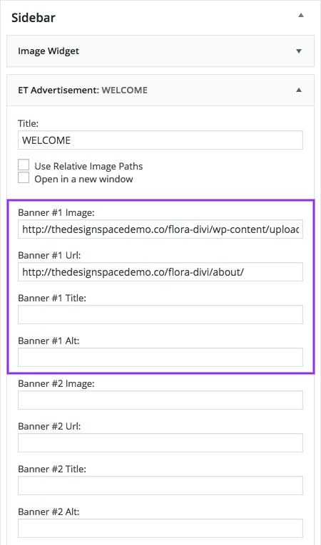
2. Style the Widget Titles
The widget titles in the standard sidebar will inherit the style of your H4 tags but if you want to customize them further, you can target them using the class .widgettitle. Using that class in the Divi Theme Options box, you can then change the font, size, color, alignment and padding.
You can find the Custom CSS box at the bottom of the Divi Theme Options > General tab.
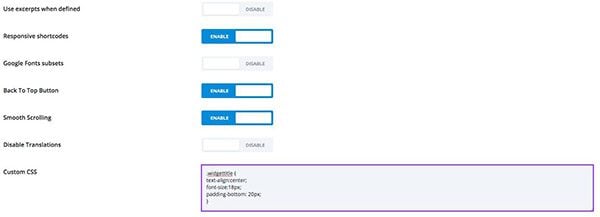
For example:
.widgettitle {
text-align:center;
font-size:18px;
padding-bottom: 20px;
}
One of my favorite styling tricks is to add a bottom border to the widget title, using the border-bottom property. Have a look at this example which has a nice editorial feel.
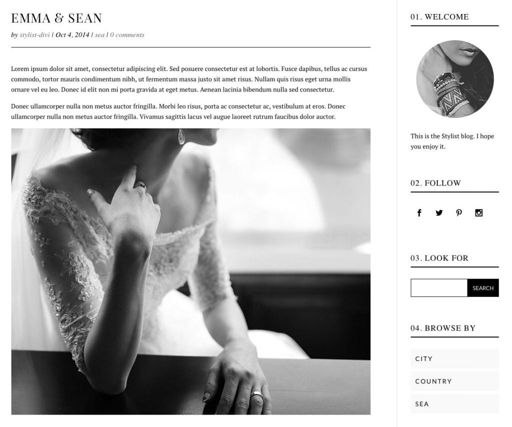
You can achieve this effect by adding the following code snippet to your .widgettitle class.
.widgettitle {
    border-bottom: solid 2px #000000;
    margin-bottom: 25px;
}
3. Adjust the Margin Between Widgets
If you’d like to reduce the space between your widgets, or alternatively give them a little breathing room, you can adjust the bottom margin percentage. It’s quite hard to find by inspecting the code, so here’s a handy shortcut.
.et_pb_sidebar .et_pb_widget {
margin-bottom: 14% !important;
}
The standard WordPress categories widget gets the job done when you want to display categories in your sidebar but it’s tricky to style. It doesn’t allow you to display the categories in the order you want or to pick and choose which ones appear. This is annoying when you accidentally leave a post as uncategorized.
Instead, I like to use the Custom Menu Widget to display categories and it’s much easier to style.
First, create a new custom menu in the Appearance > Menus area. Then add your chosen categories and save the menu. There is no need to assign it to an area.
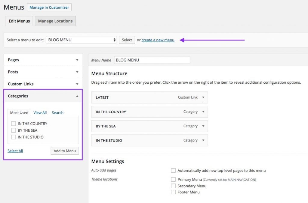
You can then select that menu, Appearance > Widgets, using the Custom Menu widget.
If you’d like to really give your custom menu some style, you can add a background color and padding, as well as styling the font properties, as I have done below.
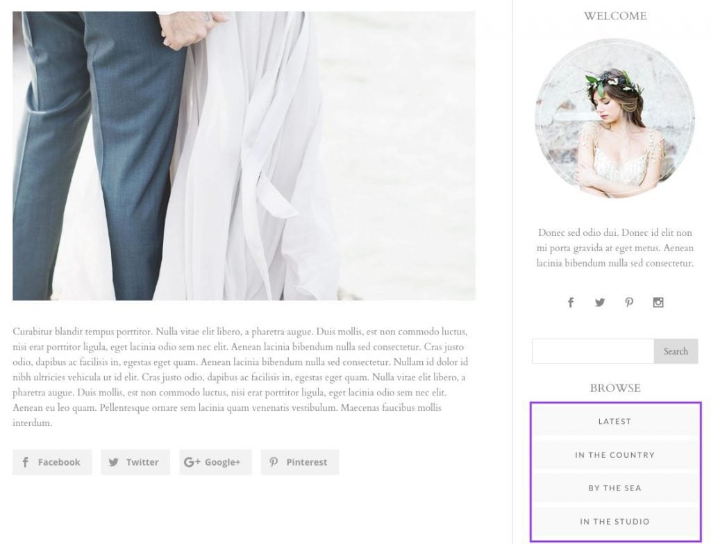
In the example above, I targeted the custom menu links, using the following code:
.et_pb_widget ul li {
background-color: #f9f9f9;
padding: 10px;
}
Lots of bloggers love to add an Instagram feed to their sidebar. It’s a great way to keep your sidebar looking fresh and encourage visitors to follow you on social media. You can embed the code from Instagram manually in the text widget (see this great post about it on the ET blog) or add a free plugin like Alpine Photo Tile for Instagram. However, I don’t like to add plugins when I don’t have to and embedded code feeds are harder to style.
Instead, there is a new breed of widget generators that allow you to generate responsive code and style it easily before adding to your text widget (or code module if you want to add it to a builder layout).
My favorite is Lightwidget.
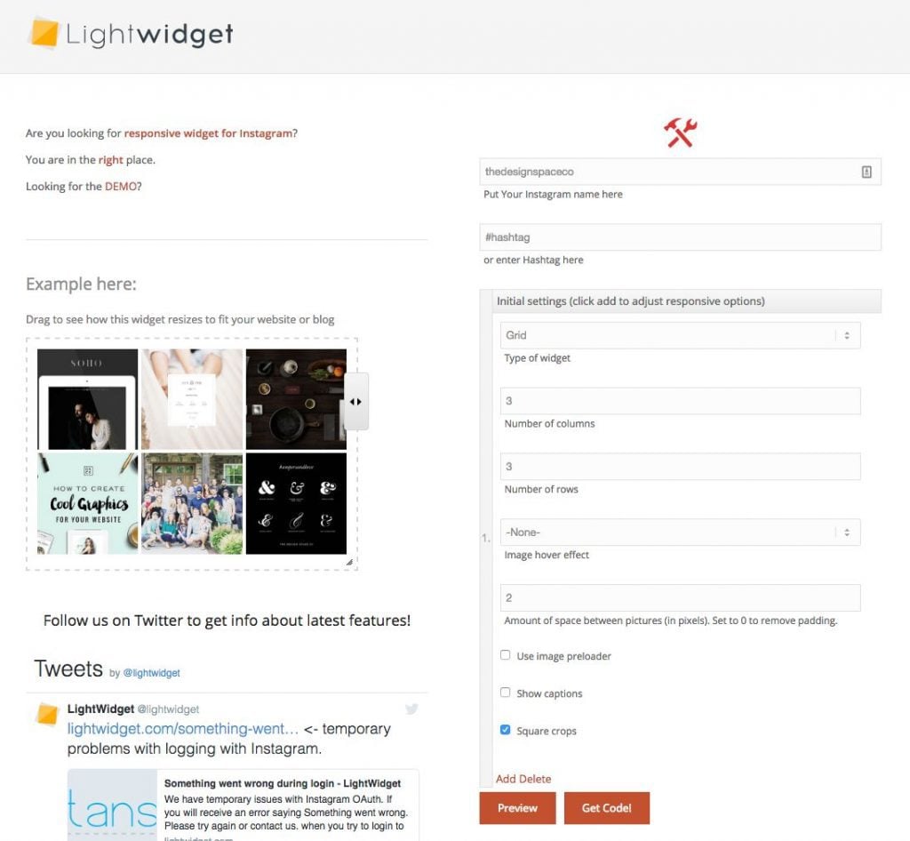
To use it, you’ll need to register and then log into Instagram online so that you can grant permission for the widget generator to access your account. Then choose your preferred number of columns and rows, preview your widget and grab the code.
Note: If you’d like to use the widget on a site with an SSL certificate (ie. which has https: in the url prefix), you’ll need to upgrade to the pro version.
Wrapping Up
I hope you enjoy spicing up your Divi sidebar. The above tips deliver small improvements which add up to a big impact. The devil is in the details!
Be sure to subscribe to our email newsletter and YouTube channel so that you never miss a big announcement, useful tip, or Divi freebie!
Featured image background image via Martina Vaculikova / shutterstock.com

Divi 100 Day 69
The Countdown To Divi 3.0
This post is part of our Divi 100 marathon. Follow along as we post free Divi resources for 100 days in a row! This 100-day countdown will end with the game-changing release of Divi 3.0, including our brand new visual editor built from the ground up using React. Divi 3.0 will change the way you build websites with the Divi Builder forever!
Let the countdown begin.



Hi
How can I display ET Advertisement Widget please?
Hi there, you can find that in Dashboard > Appearance > Widgets. Check this screen recording: https://i.imgur.com/4qTYxgd.gif
I’m trying to use this one
.et_pb_sidebar .et_pb_widget {
margin-bottom: 14% !important;
}
But it doesnt seem like its working.
Any tips?
That is a lovely sidebar.
I tried to put the same codes in my Divi Theme Custom CSS section but nothing is shown. The title is not centralized and there is no bottom border to it.
The codes I placed are as follows:
.widgettitle {
text-align:center;
font-size:18px;
padding-bottom: 20px;
border-bottom: solid 2px #000000;
margin-bottom: 25px;
}
And my site is http://www.ilovekanchanaburi.asia
Could you assist to check as I really like what you have done?
Thanks and regards
Judy
Hi
Not sure what happened but it is working now. Looks great.
Thanks.
Thank you for such a useful post! Bookmarked.
Great resource!!! I love DIV theme…
Thanks for Great information
I’m using the Japanese version of WP. Site language settings is the “Japanese”. In this case, “ET advertising widgets” does not appear. So I changed to “English”, the widget was displayed. After I set for this widget in the sidebar, I changed the language of the “Japanese”. Currently, this widget is displayed, I will be able to use.
Wowowww….that really damn awesome post.
Thanks a lot.
This is just perfect, however when I create ‘new widget areas’
border-bottom: solid 2px #000000;
the black line is longer in width than the sidebar
On the normal sidebar, it sits just perfect
Any advice please, I am a total novice who freely helps voluntary charitys
And personally I prefer tutorials, videos tend to lose me 😉
Kind regards
Alison
Sorry for double messages. I got an error when I tried to submit my first comment and it didn’t show up until I submitted the second comment.
Thank you for this post! I love the colored blocks behind my menu items, but they’re also showing up behind the social media icons. I realize that it’s because the CSS provided will apply to everything in the sidebar, so could you tell us what the code would be removing them from designated sections?
Love this! Thanks so much Melissa! One quick question – – how do you center the text in a “Text” widget. I tried playing around with some CSS, but I couldn’t get it to center like you have in in the Flora sidebar. Thanks!!
I’d love to know how to get the colored blocks effect behind the menu, but the clear background behind the social media icons! (If I change the code for one it affects them all.)
I totally agree about how the sidebar is really important, this article is amazing.
Thank you Melissa for this post. I think, the sidebar should be given some Extra attention and Elegant About Widget is antediluvian! Don’t like to use it simple, not interesting. We need more extra beautiful sidebar widget and title headers design.
Thanks for sharing this information
I like it
Some great ideas there thanks. I have been needing some inspiration to help us mix things up a little!
Great. If you can, please write a post on how to make users convert sidebar ads more efficiently.
Thank you Melissa! This post is really comprehensive and gave my blog a more sophisticated look. Btw; I’m a newbie too, but found it completely understandable.
I have added the ET advertisement widget to the sidebar, entered links to fields, saved the widget settings and still nothing is displaying on any posts or pages which are displaying the rest of the sidebar widgets. Is there something obvious I am missing! Thanks.
Very nice. I love the tip about using the advertisement widget.
Hi Melissa:
Simple yet concise piece, thanks! already implemented underling and made a good difference.
Notice in some of the image references a divider line between the text/content and the sidebar. Any assistance creating that is much appreciated. Also interested in knowing how you changed the font for each side bar widget title.
Thanks again!
Great, the side bar has been neglected for a long time. I love the examples showed here.
I’m reading this in my cell while traveling and can’t wait to try some of these. Thanks for sharing your talents Melissa!
When are you released on bail Maureen?
Thanks for a great article, LightWidget is a handy new tool.
I’ve been waiting for this 😀
Thank you so much Melissa. The sidebar was always my weak point. I used to ignore it most of the projects. Now i will think of adding much of twist to each of my websites sidebars. You have opened up ideas in my head for the same.
Thanks for the tips!
But how to style the search button, exactly?
cheers !
How do you add the bottom bar in the ET advertisement widget??
Hi Amber. I haven’t come across a bottom bar on that widget but if you’d like to link to an example, I’d be happy to show you.
Will Divi Builder ever be able to be used directly to build a sidebar?
I tried to do build a sidebar with Divi myself this past weekend and ended up requiring 3 elements to do so – a Global Sidebar module, which is linked to the Divi Custom Widget, which is linked to a 3rd party widget which selects Divi Library elements.
Of course because it’s 3rd party it takes a lot of tweaking to get to look even close to how I’d like it >.< so rather than this extremely convoluted method will Divi ever support sidebar creation natively? If you use the Divi theme then I figure this shouldn't be too difficult to implement for users. It's weird trying to use widgets to display the images, text or whatever when I'm used to pretty Divi Builder.
thanks good article.
in Best 2016 seo themes Please Add SmartMag too.
I always found the sidebar ugly. Not anymore 🙂
Can you please do a tutorial or more description. Many bloggers use Divi and this seems like a very brief over view for something that is so useful and needs better costumizing options. I would love to add the underline option and my my photo circular and these descriptions are so vague I still have no idea how to do it. You guys kind of just skimmed over everything. Can you please expand on this, its the one thing I found useful that I can’t use.
Hi Sondra
You can add the following code to your Divi Theme Options Custom CSS box to add an underline property (I like to add a little bottom margin to balance the spacing properly:
.widgettitle {
border-bottom: solid 2px;
margin-bottom: 25px;
}
Hi Melissa I added this code into the css box but nothing happened. It didn’t seem to make a difference. http://www.prettyfitfoodie.com all the posts have the side bar.
Hi Sondra
The code isn’t there when I inspect the widget title. Are you sure it’s in the Divi Theme options Custom CSS box as above?
Yes I put it in the CSS box when you go into Divi Theme Options. I can make a token if that helps. I have other CSS in that box as well and copied your code at the bottom but it didn’t seem to change anything =(
Hi there,
I can not find the “ET Advertisement Widget” on my widgets area. Is it a special widget that I need to download? On my wordpress end, on widget section I have ET Adsense widget but it is not what I need to apply what the post is about.Any help? Thanks in advance
Hi Luis, in the German version of WP the name of “ET Advertisement Widget” ist “Werbung” please check your language version
Hi Luis
You should be able to find the ET Advertisement widget in the left hand column of unused widgets. If you look at the very first screenshot in this post, you can see it there just below the ET About Me widget.
Hi, Melissa. I can’t understand the use of anticipate. When, I activate it, then my whole website shows nothing. What’s the problem? Would you give me any suggestion, Melissa?
Hi Janet. I haven’t used Anticipate but you might want to double check the documentation here in case you’ve missed anything.
http://www.elegantthemes.com/gallery/anticipate/readme.html
Great inspiration for those poor neglected sidebars, thank you Melissa.
These tips are useful for creating a sidebar, but there is a larger question: In a mobile-first web world, what purpose does the sidebar play? Many WP themes, when viewed on mobile, push the sidebar below the main content or eliminate it entirely. Shouldn’t we learn how to design pages with no sidebar at all? Moreover, shouldn’t themes offer an option where “full width” text is an appropriate width for readability?
In many WP themes, when you eliminate the sidebar, you are left with a page on which the main text is way too wide (on the desktop). For maximum readability, the text probably should not be more than 60 characters wide (regardless of the font size). Theme designers often don’t seem to take this into consideration.
On occasion, I’ve dealt with this by inserting supportive, but not essential images into the sidebar.
Another solution, using Divi, is to create sections with varying column layouts, whereby, for example, the text covers 3/4 of the width and a supportive image or callout covers 1/4.
I’d love to hear some other opinions on this.
My comment is not a critique of the author, just a general point about the function of sidebars.
Jonathon,
I come to Divi/WP/Web from print.
The rules for print are either unknown to many web designers, ignored, or considered old-fashioned.
You are right. There IS a finite width beyond which reading is impaired, a width at which your brain says, “I can’t do this without moving my head! I quit!” And almost ALL themes allow that width to be exceeded. So, I too, find ways to keep the line length within the visible parameters that work with your brain’s willingness to continue reading.
In this same regard, centered type is also not easy to read. The brain doesn’t know where the eyes should go when they return to the next line and it “hurts” to bounce around. Reading is often suspended.
Left framed/aligned/justified text is always best for reading, especially when it’s more than 3 lines of copy. Centered headers are fine, just keep the number of lines to 3 or fewer (not “less”!!!)
Also, all CAPS is hard to read beyond one short line. The brain has to translate all caps into lower case to understand them. And the brain actually remembers/reads the shape of the words and fills in the characters after it moves on to the next words/phrases. Since using ALL CAPS produces words that are identical in shape and vary only by length, the brain actually has to translate the caps into lower case in order to read the words. Thus, it’s harder to read and slows down comprehension. The brain balks at that.
Any thing that slows down reading, is bad design. Period.
First paragraph:
“Remember, even if your prefer the look of a full width post, the standard sidebar will still appear on archive pages.”
A new style in widgets. Thanks
This was a great post. I appreciated the clear how-tos, esp. the code. I’ve done the custom menu thing (even before Divi) but the others are great new ideas.
I find myself going into the widget page of another website I’ve designed in the past, and copying and pasting stuff to a new website because the widget area of WP doesn’t have built-in stuff like the toolbar above the text area of a page/post. Another thing to do is to create a post, format the text and images and then switch to the code view and copy the whole thing into the widget area. I do that often when I want to format stuff and I’m too lazy to type out all of the coding for formatting.
Thanks for the great reminder to give some TLC to the sidebar – and for some great tips on how to do that. Melissa, would you be able to add a screen shot of how #1 looks after you have used the ET Advertisement Widget?
Melissa as always your genius and elegant I love your design!!!
Aaah! thank you. Have been looking for this.
Thank’s for the inspiration! The sidebar and the archive pages are somewhat painful area once you created a beautiful divi site.. We can hope for some of the Extra Category Layout features to be ported to divi eventually (but I guess you have enough on you hands currently ;))
If you are a bit nerdy, you can add divi modules to the sidebar using global module shortcodes: https://www.youtube.com/watch?v=-RhT8z7FAb8 (unsupported and may break)
Thank’s again for spending som time on the overlooked sidebar 🙂
Thanks Bjarne. I’ve grown to love my sidebars!
You should do a video. There is only so much that words can convey. This is one of the least clear Divi illustrations so far. For example, the reference to Theme Options Box. You stopped just there. For someone new to Divi, they have no idea where that is. There are many other gaps in your explanations that novices will never get near to what you are trying to say.
Maybe someone that is “new to Divi” should be learning the basics before undertaking something like this?
Yeah, I also can’t help but feel that people are trying to nitpick these blog posts lately; we had a video the other day people were asking for a write-up; now we got a write-up and people want a video.
Please get a grip… these are FREE additional resources for Divi, one of the most powerful WordPress themes. I don’t need 80% of these freebies as I know how to accomplish what they’re showing with the layout packs, etc. and I still ENJOY these blog posts immensely. So how hard can it be for someone who hasn’t set up 50 websites to like these posts?…
Thanks for the feedback, Eden. I’ll edit the post with some screenshots first thing.
Buena idea Melissa, yo porque ya e explorado algo DIVI y se algo de Wpress, pero si, en realidad, las imágenes ubican mejor a cualquiera, ya sea que sepa o no del tema. Slds, excelente tuto de la barra lateral, ciertamente si, sin tener forma de darle vistosidad, en principio parece ser encajonada a lo que es….no da opciones las barras laterales, esta forma con DIVI me parece genial.
The theme options ‘box’ is the custom css found in the Divi Theme Options.
From your WP dashboard > Divi > Theme Options > scroll all the way down unto you see ‘Custom CSS’. That’s the box being referred to.
The post is geared toward those who are already familiar with WordPress
, I found it very helpful and well written and.
Thank you Melissa.
Is this also available for Extra???
I’m sure this will work with Extra too, Melina, but if you’d like to reply with a link, I can check it for you.
Lovely~!
Lovely resources/tips… ?
Thanks Melissa. The sidebar is often ignored. This will help give it some flare.
Thanks Randy. I think sidebars can end up being the least favourite part or the last thing you do to get a website finished. Good luck with your next one!
Hi Melissa Love… I love you