What takes a website from good to great is attention to detail, particularly when it comes to adding some interesting finishing touches to your text areas. Many people spend a long time perfecting their home page only to run out of design inspiration when creating pages with lots of copy and fewer images. Adding a few simple features will elevate even the most text-heavy page, helping you to add interest and breaking up the content for your readers.
In today’s post I’m going to show you five different ways that I style text with WordPress and Divi.
Subscribe To Our Youtube Channel
1. Add Dropcaps
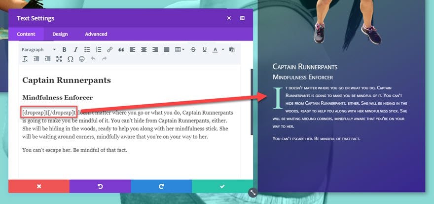
I can’t resist a dropcap. In fact, I add them to nearly every website I design. Dropcaps or initial caps are often used to great effect in printed magazines and newspapers and they are very straightforward to implement in WordPress. A dropcap gives any page section an editorial feel and you can style your dropcap fairly easily with a contrasting color, if you wish.
There are plenty of plugins that automatically add a drop cap to your first paragraph but I like to have a little more control. Did you know that all of the themes from Elegant Themes have a built-in dropcap shortcode? Even better, it is really easy to style with CSS using the .et-dropcap class.
To use it, add the following code either side of your initial capital letter like this:
[dropcap]yourletter[/dropcap]
If you want to style the ET dropcap differently from the standard version, here are the lines of CSS you can add to your Divi Custom CSS box in the Theme Options > General tab.
The code snippet below will allow you to change the font-size, line height (ie. does the cap fill two lines or three), change the font family and also change the color. It might take a little fiddling with the font size and line height values to get it just how you want it.
.et-dropcap {
    font-size: 95px;
    line-height: 0.7;
    color: #9ae5d3;
    font-family: Times;
    padding-top: 10px;
}
2. Mix & Match Text Styles in a Module
When it comes to mixing and matching fonts in a single text module, you have it easy. You don’t need to install a plugin or any external files. All you have to do is click into a text box, and a contextual menu will pop up. From here you can adjust the style, formatting, and even the font family of any characters you choose. You can even add in new H tags and adjust colors from here, too. Anything you highlight can be formatted separately from the text around it.

Also note that you can do this with any module that you can edit text in-line, such as Blurbs or Testimonials.
3. The Divi Testimonial Module
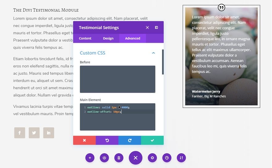
Speaking of the Testimonial module, it happens to be one of my favorite ways to break up a text-heavy page. It’s perfect for creating attractive callouts on your page, and if you add a background image and an offset keyline border, your content will really stand out. To add the border, just paste this code into your settings. Under the Advanced tab of the module settings, add this snippet of code to the Main Element box of the Custom CSS area. If you want a background image, you can set it under the Content tab.
outline: solid 1px #000;
outline-offset: 10px;
The CSS code below will make the offset keyline show up around the outside of the image. The code for the offset keyline code will work with almost any Divi module, too. And don’t worry if you don’t need to use testimonials on your site. You can style the module however you want for many different highlighting options. In this post, for example, we use a testimonial module with overlay to highlight staff members.
4. Fullwidth Text Blocks

Adding full-width text blocks can give your website a really sleek modern feel, particularly if you add a solid background color to one column in the row (or both!) and vary the style or size of fonts you are using.
For this example, we just need a row with two columns and a text box in each column. In the Row Settings, you’ll need to make the row full-width, set the Custom Gutter Width to 1, and turn on Equalize Column Heights. Depending on your color choices, you may need to add in some custom padding in the Spacing section.
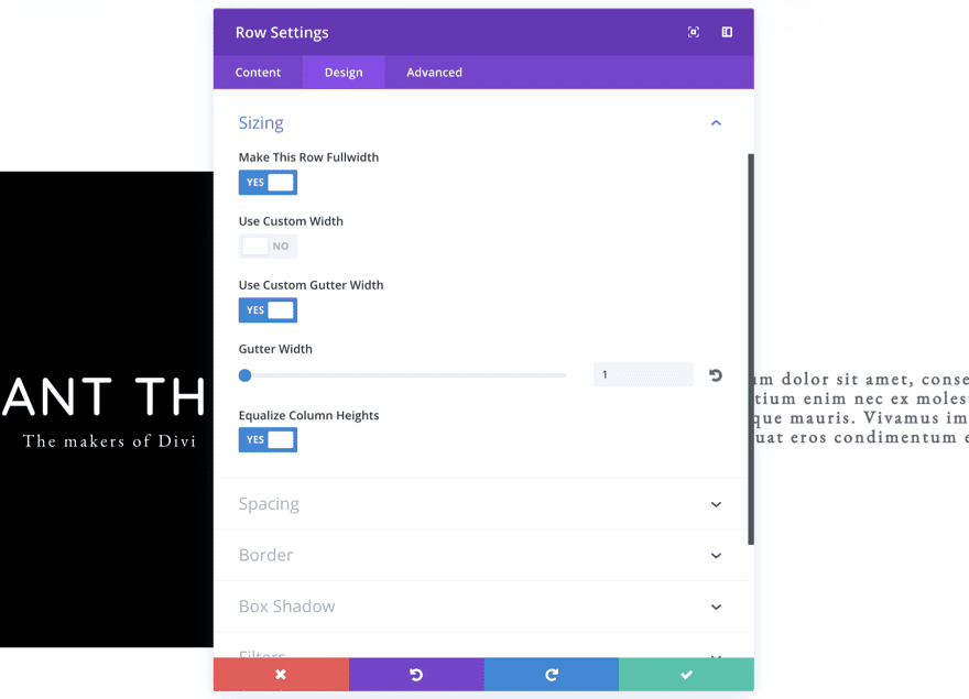
Once all that’s done, add your text and have fun playing with font styles and sizes.
5. The Divi Toggle Module
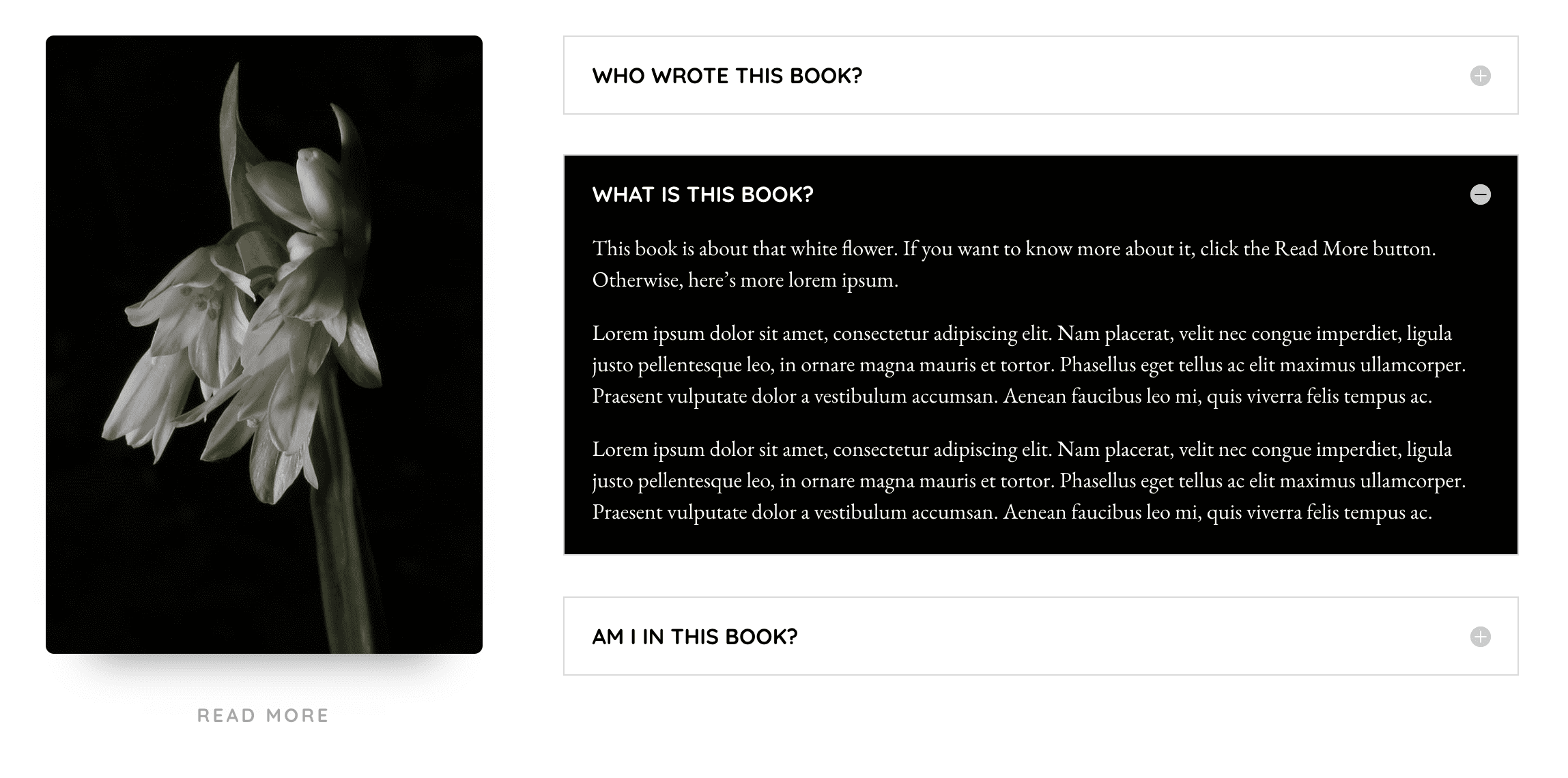
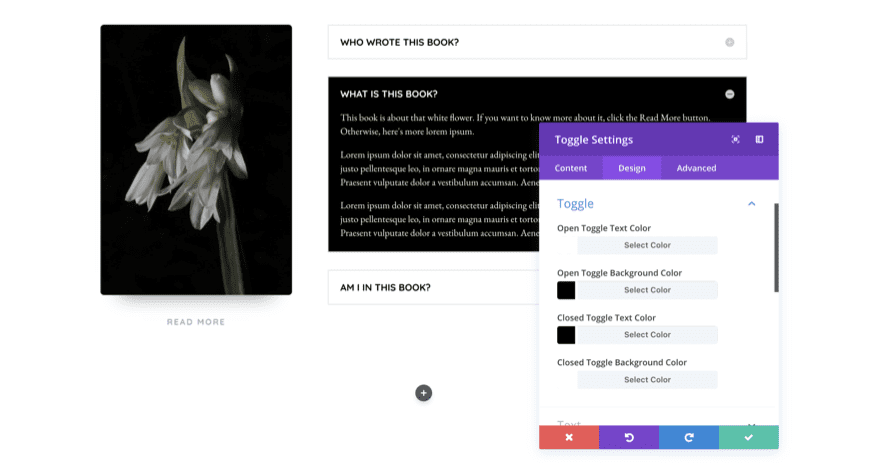
The Divi Toggle Module is a handy tool when it comes to handling sections of your website that can be a little dull, such as FAQs. I like to use a mixture of open and closed toggles with different styling effects, to add interest and break up the page. Each module is made for a single open/close toggle, so you will need to add in as many modules as you want entries in your display. For this one, I used three separate Toggle modules.
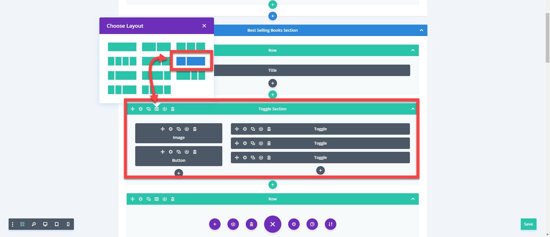
First, add a new section and choose a 1/3 and 2/3 column layout. Add an image module and button to the 1/3 column. Then, add the all the toggles you need into the 2/3 column and style the text and background color in the Design tab of each module. Personally, I think alternating the text and background colors looks really nice, and it as a bit of dynamism to your website as your users click through your content.
Wrapping Up
Getting creative with text doesn’t mean you have to stick to text modules. Not only can you use the Testimonial and Toggle modules, but you can also more attractively display your content with the Call To Action, Blurb, and Accordion modules as well. Implementing some of these ideas may just save you from design boredom and your readers from a wall of text with your next project. Oh, and don’t forget those delightful Divi dropcaps!
Be sure to subscribe to our email newsletter and YouTube channel so that you never miss a big announcement, useful tip, or Divi freebie!


I used the dropcap on a website with success, but then I tried to apply it to other 2 websites and somehow the font size edited on the code doesn’t reflect on the page, and I always get a small dropcap that doesn’t give me the expected effect. Anyone knows how to fix it?
VERY DIFFERENT WAYS OF USING TEXT
Wow! Dropcaps?! Didn’t know about this…I’m sure I missed it lol.
I’ve used or applied the last 4 techniques at one point in time. But Dropcaps! Thanks for showing me the hidden gem ET Team!
What happened to the Divi design initiative?
2 layouts pack every week, but last and this week only 1.
I’m starting to worrying …
will it be helpful in making event blogs ? i need a framework asap….
I’m having an issues with Use Any Font and the divi blog module where it changes in the editor but when saved, it defaults back to Times New Roman
How do you add the default Divi Fonts to the Use Any Font plugin? This part is not clear.
Thank you!
This worked for my site at abitupnorth.com
/* Add Drop Cap to 1st letter of post */
.et_pb_section .et_pb_row .et_pb_column .et_pb_module:last-child:first-letter {
background: #4db2ec;
display: block;
float: left;
font-size: 3.2em;
line-height: .4em;
margin-right: 0.15em !important;
padding: .25em .1em 0.28em .1em !important;
}
forgot to add that I add my posts in a text module.
gave the text module a custom class of single-post-text because the original code was affecting other pages. Now it looks like this:
/* Add Drop Cap to 1st letter of post */
.single-post-text:first-letter {
background: #4db2ec;
display: block;
float: left;
font-size: 3.2em;
line-height: .4em;
margin-right: 0.15em !important;
padding: .25em .1em 0.28em .1em !important;
}
Thanks for sharing Bill!
Been using the Divi builder and theme for about 8 months now, continue to be impressed by it.
Thanks for sharing this ideas, I was looking how to implement Dropcaps in my site and I found this great article, I’ll try the plugin too it look very well. Thanks again
I did not need to read who wrote this blog post to know who it was! Melissa your sites are always beautiful
Beauty in serenity…
It makes me want to take time & read all of them…
(Even if i’m bored with lorem ipsum and I prefere to read the Ricksum 😉
Magique…
Thanks for the clever ideas!
I have a question, though: I use the Divi theme, but when I surrounded the first letter of one of my blog post words with [dropcap] [/dropcap], nothing changed. Did I miss a step? Or is that shortcode no longer automatic with the Divi theme?
Looks cool. thinking to try divi.
Love it! More inspiration on styling in divi is what I need! Thanks.
My best tip on text styling in accordions, toggles and tabs, is:
– Insert a toggle or tab.
– Switch from Visual to Text editor tab
– Use the [ONE HALF], [ONE THIRD] etc shortcodes, to break up wide text into two, three or more columns _within_ the toogle, tab etc. Quite useful for larger amounts of text.
Works perfectly in divi without additonal plugins and is responsive – tested extensively on phones and tablets.
This post arrived in my inbox at the perfect time! Thank you Melissa
I have really enjoyed reading the awesome posts over the last 85 days – almost without fail there is something of real value we can use. Once again, the team at Elegant Themes have provided real actionable content….Thanks Melissa.
Does anyone have a recommendation for the most elegant way to do the larger text size just for the first paragraph of a post?
Thanks!
A separate text module just for the first paragraph with the font size made larger?
Andrew, I just create a new class called .lead and manually add it to the post paragraph. Then use the “exerpt” for the intro text.
thank you for this post. It is good to do some different things to set a website a little above the ordinary.
It is easy to forget about the ET shortcodes including dropcaps – I must revisit them so that you
Great tips. I used several of them within a few minutes of reading about them. End users (and Pros) just have to love wordpress!!!
Absolutely love these tips. Thanks Melissa for sharing these.
Love the DropCap! But one thing I discovered is it disappears if you remove the bolding from the letter you’re encapsulating – which makes sense when you think about it – but is something to be aware of for sure.
As a novice with DIVI (& WP) I’m really enjoying these posts. Thanks Melissa!
Really wonder how you got Use Any Font working in the WP editor? I bought the plugin, got an API key, but no possibility to use it in the editor.. any thoughts?
TIA
Helen
Hi Helen, Did you toggle the toolbar on in the text module? You can then see the fonts in a dropdown?
It just appears in the Editor as soon as the API key is entered and the fonts are uploaded, Helen. You do have to upload some fonts first though.
Just tested this. It works fine with Divi. You need to activate the “Tool Bar Toggle”
Hi Melissa, thank you for your reply. Funniest thing.. I just contacted the plugin builder and he told me the Use Any Font plugin does not work inside the Divi editor, only the WP editor itself. But on your screenshot I can clearly see the Divi Builder, and a font list?
I have the same problem, I have nothing different in my divi text editor =(
Thx for help.
Great post! Thank you. Very useful information to spice up a site without a ton of CSS to do it! You did a great job describing the effect and how to do it. Well done!
Great ideas. Thanks!
Hi Melissa, Thank you for the tricks! I will surely apply it on the next pages I will be creating soon. More tricks and tips! I always love learning tricks in web designing so I have options.
Great tips, I didn’t know that there is a shortcode for dropcaps and I wasn’t even thinking about using a drop cap in my designs but now I will.
Melissa I saw a comment that there is a post for styling the widgets. Can you give me the link please.
Thanks
“I can’t resist a dropcap.”
Neither can I Melissa and it really adds interest to the beginning of a page or article.
OMG such wonderful tips!!! thank you so much Melissa! there is love in them. Thank you from my heart
Very cool – I’m actually using a full width block on my website to showcase testimonials so this was nice to see.
Thank you so much, Melissa, for those awesome Tipps. I also liked your post about styling Widgets. Look forward to see more of your elegant styles 🙂
P.S. I have one question (and I understand when you like to keep the secret, because you live of it): By surfing on your shop I discovered this awesome header – the text field is rushing under the header image on smaller screens:
http://thedesignspacedemo.co/stylist-divi/about/
How is this accomplished? I would so much love to implement this effect 🙂
No secret! It’s a set of three text modules in a 1/3 column with lots of extra padding at the top of a column and you can add as much extra padding as you need on mobile to reveal less or more of the image. The image is in the section background area.
WOW, dear Melissa, thank you sooooo much for your answer. I’ll try it out ASAP. Have a great day 🙂
Superb! Love the use of the Testimonial module. GREAT idea! I always forget about dropcaps and worry that they might look gigantic on a mobile screen. But I love the way it can add color to a dense block of words.
This is great, Melissa. Thank you!
I like dropcaps, too, but I hardly ever use them in blog posts because it messes up the preview summary text. “We think it’s great” becomes “e think it’s great” or, worse, “[dropcap]W[/dropcap]e think it’s great”. Anyone have a fix for this?
You can use css only. This is from css-tricks.com:
https://css-tricks.com/snippets/css/drop-caps/
Thanks a lot! I intend to try this out.
Perhaps a jquery remove class function on the preview page?
$( “.et-dropcap” ).remove();
Well David you can test this out in your functions.php file and see if it works:
add_filter( ‘the_excerpt’, ‘wpsdc_filter_excerpt’ );
function wpsdc_filter_excerpt( $content )
{
$content = str_replace( ‘[dropcap]’, ”, $content );
$content = str_replace( ‘[/dropcap]’, ”, $content );
return $content;
}
This has to be one of my favorite recent posts!
Simple yet Stylish!
TOTALLY AGREE – thank you!
Very creative!
I was just thinking that myself!!
Great post. Has something useful for every site!
Thanks Bradley!