The absolute position property is one of four main position types available within Divi and its new position options. In this tutorial, we will explore what it means to give an element an absolute position in Divi and how you can use it to your advantage when designing Divi sites.
Overview of Divi’s Four Types of Positioning
The absolute position is one of four position options available in Divi. Here is a quick overview of each one below.
Static (Default)
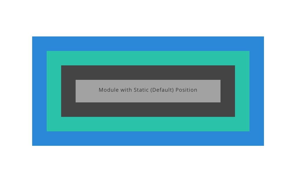
Static elements technically aren’t “positioned” since they stay with the normal flow or order of elements on the page, and they don’t respond to the top, right, bottom, and left properties like other positioned elements (which is why no offsets are available in Divi for elements in the static/default position). The static position is the default position for any CSS element. In Divi, when you choose the default position for a module, you are choosing the static position. It is also worth mentioning that some elements in Divi (like rows and sections) will have a relative position by default (not the static position).
Relative
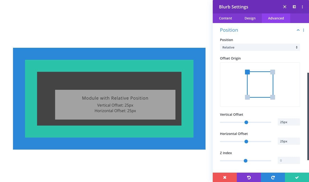
Relatively positioned elements are kind of like static elements in that they follow the normal flow of the page. The main difference is that relatively positioned elements can be positioned using the top, bottom, left, and right properties. Also, unlike static elements, they can also be positioned using the Z Index property.
Absolute
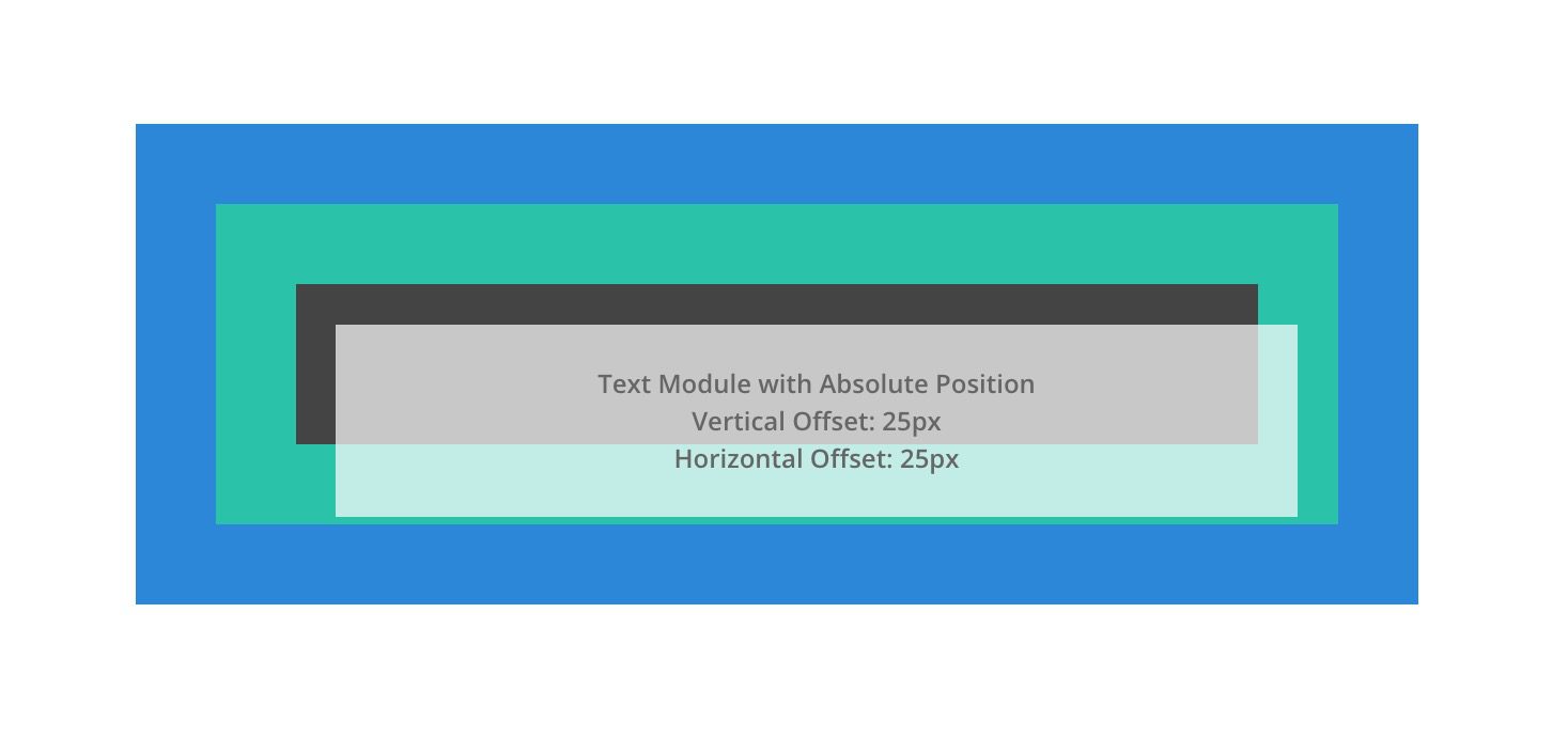
An absolutely positioned element breaks out of the normal document flow and therefore no actual space is created on the page for the element. You can think of it as an element that is floating on top of the other elements on the page that take up actual space. It will be positioned relative to the nearest positioned parent container.
Fixed
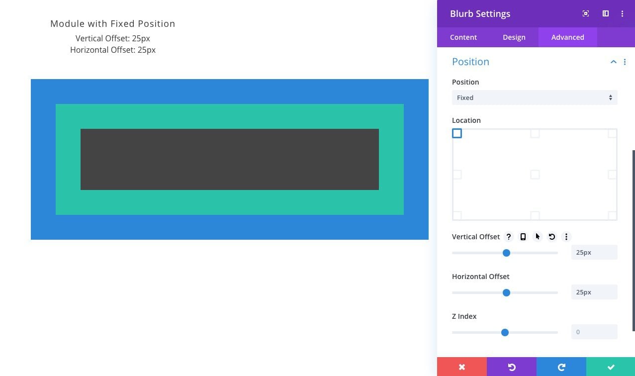
Like the absolute position, elements with the fixed position will break out of the normal flow of the page and have no actual space created within the page. The key difference between absolute and fixed is that the fixed position is relative to the browser window or viewport. In other words, no matter where the element is within the normal flow of the page, once it is given a fixed position, its position will now directly relate to the browser window. You can use the top, bottom, left, and right properties to position the element within the viewport. Because fixed elements will often hover behind or in front of other elements on the page, Z Index will help order fixed elements above others.
NOTE: There is another type of positioning in CSS called sticky. A stickily positioned element behaves like a relatively positioned element until you scroll to its container (at some point determined by the top value). Then the element becomes fixed (or stuck) until the user scrolls to the end of the container. However, the sticky position can be a bit unpredictable since other factors may inhibit the functionality. In Divi, the sticky option isn’t available within the built-in options for this reason. However, there are ways to use position:sticky in Divi.
How the Absolute Position “positions” an element in Divi
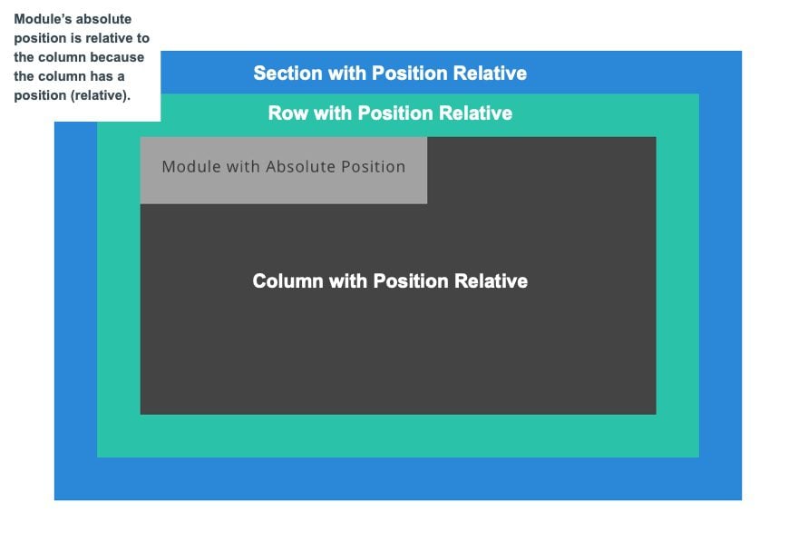
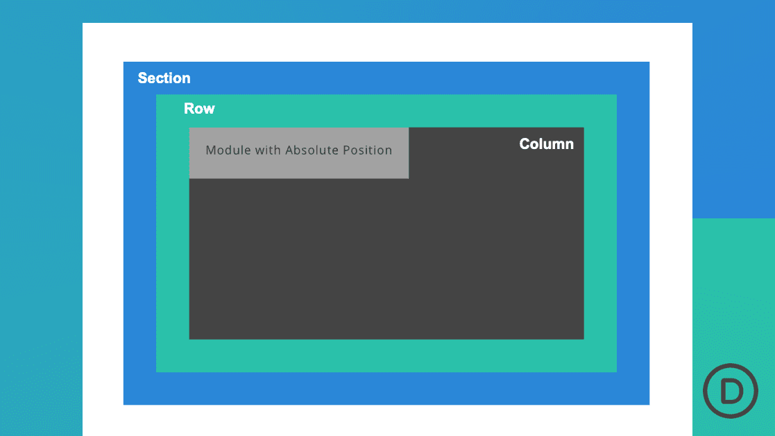
As mentioned in the overview, an absolutely positioned element will be positioned relative to the nearest positioned parent container. A positioned parent container is any container that is given a position value of anything but static (ie. relative, absolute, fixed). That is why in most cases if you want to position an element (like a module) absolutely within its parent container (or column), you will want to give the column a relative position before positioning the child module absolutely. If not, the absolutely positioned module will look further up the document/page for the closest ancestor with a position other than static. For this reason, in Divi, sections and rows both have the relative position by default so that you can position elements absolutely within those elements easily.
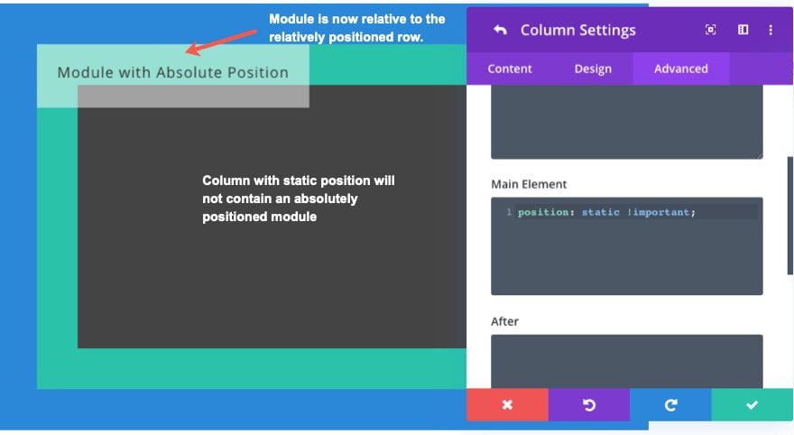
Here is an illustration of what the absolutely positioned module will do if I override Divi’s default position for a column and set it to static. Notice that since the column no longer has a position, the module will now become relative to the row which does have a position (relative).
Benefits and Drawbacks of Using the Absolute Position in Divi
The absolute position is just one of the various methods for positioning elements. Therefore it would be useful to cover some of the benefits and drawbacks for using the absolute position instead of others.
Benefits
Here are a few benefits of using absolute position over other positioning properties like Transform Translate or Margins:
Good Design Tool
Absolute Position Breaks out of the normal flow so the actual space of the element doesn’t affect the design after positioning takes place. Although this can also be a drawback, this can be beneficial whenever you want to add elements to an already established design without any additional clean that may be needed for adding additional space to the layout. In other words, you can add elements to the page without having to move existing elements around to do it.
A Good Alternative to Floats and Margins
With the absolute position, you don’t have to depend on floating elements or using margins to accomplish similar positioning. Although not a native option within Divi, those who are familiar with CSS know that you can use floats to position elements to the right or left which can be a bit buggy and unpredictable in some cases. The same goes for using margins to position elements. Sometimes it is hard to predict the exact margin values to position an element just right without leaving behind unnecessary spacing. Using an absolute position can be a good “precise positioning” alternative both for floats and margins.
Good Browser Support
The absolute position property is widely supported on all major browsers so you can usually trust that it will not break things on other browsers unexpectedly.
Drawbacks
Here are a few drawbacks to consider when using the Absolute Position:
Risk of Isolation
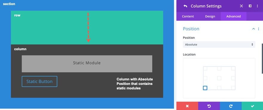
Because absolutely positioned elements break out of the normal document flow, it can be difficult to add additional elements near it. They become isolated from other elements on the page. For example, normally in Divi, if you want to add a button under a text module, you can simply add a module and it will automatically reside under the text module. But if the text module was positioned absolutely, you would also have to position the button module absolutely and then use the top, bottom, left, and right properties to position the button under the text module. However, it could be easier to position a column (the parent module container) absolutely so that all of the modules within the column can following the normal document flow (like positioning a group of modules instead of one).
Less Responsive
Also because absolutely positioned elements break out of the document flow, it can be difficult to make the positioning responsive for mobile devices. In fact, a lot of developers avoid position:absolute because of the challenges that come with responsive design. Therefore, it is important to use relative length units (like vw or %) instead of absolute length units (like px) when needed.
Using the Location Points with the Absolute Position
The Position location options that are built into the Divi builder make it really easy to position elements absolutely simply by clicking a location point. Once the location point has been selected, you can use the vertical and horizontal offsets to make additional position adjustments from that location point.
By default, the location point will be set to the top left. So adding the vertical and horizontal offsets to that location will add additional spacing from the top and from the left.
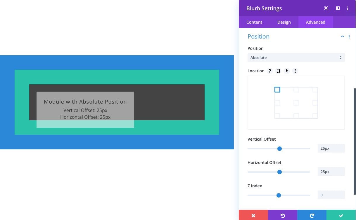
From the top right corner location, the vertical offset will add space from the top and the horizontal offset will add space to the right.
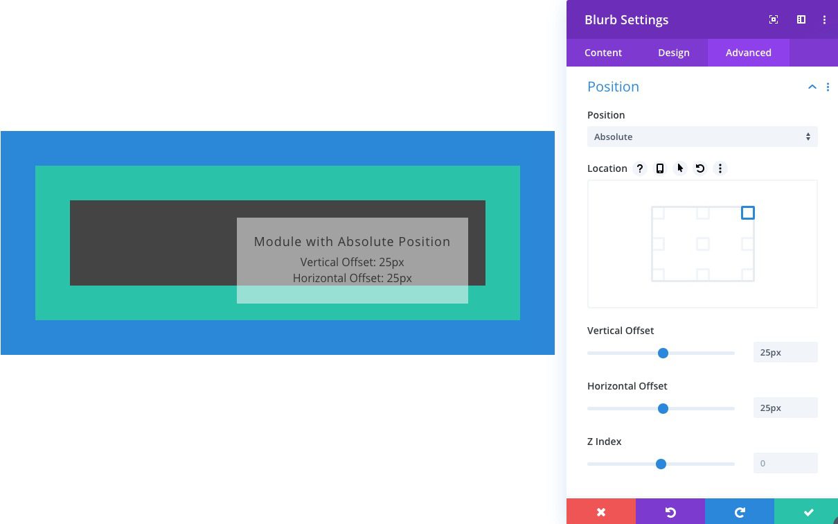
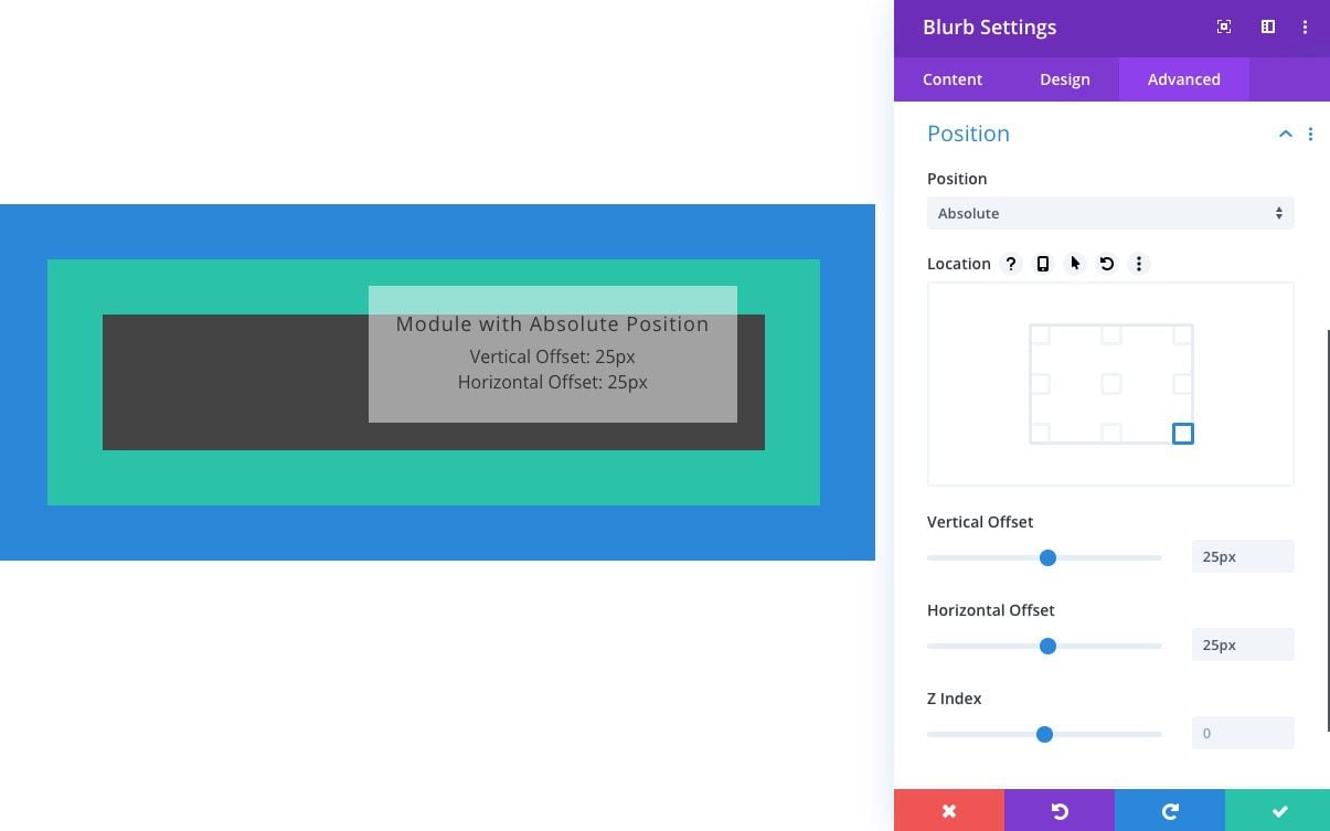
From the bottom right corner location, the vertical offset will add space from the bottom and the horizontal offset will add space to the right.
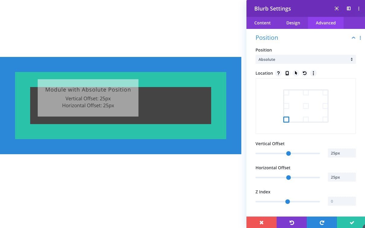
From the bottom left corner location, the vertical offset will add space from the bottom and the horizontal offset will add space from the left.
Making adjustments to Centered Absolute Elements
Whenever you select a location option with a centered position, Divi uses a combination of CSS properties to make sure the element is perfectly centered no matter the size. For instance, if y0u select the position location left centered, Divi will position the element as follows:
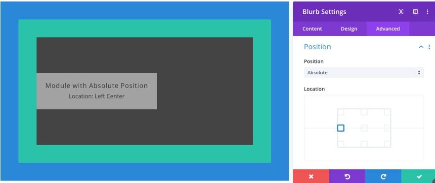
Here is what the CSS looks like in the backend.
position: absolute!important;
top: 50%;
bottom: auto;
left: 0px;
right: auto;
transform: translateY(-50%);
The top:50% is there to position the top of the element exactly 50% from the top of its container. The transform:translateY(-50%) is there to bring the element upward exactly one half its own height. This gives you a perfectly placed element no matter what the height may be.
This is important to know in case you want to make additional adjustments (or offsets) to an element in a centered position. You don’t want to make the mistake of using the transform translate option without knowing the values already being used. For this reason, it would be best to make smaller adjustments using the margin property in Divi instead of transform translate unless you understand what you are doing.
Using the Transform Translate Option to Position multiple Absolute Elements for the Centered Location
If you do understand how transform:translate is being used, it can actually be very useful for offsetting centered elements without having to know the width of the element.
For example, let’s say you position a module to be centered both vertically and horizontally with a column in Divi. It would look like this.
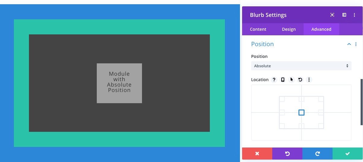
If I gave the element a transform translate as follows, nothing will change:
- Transform Translate(Y): -50%
- Transform Translate(X): -50%
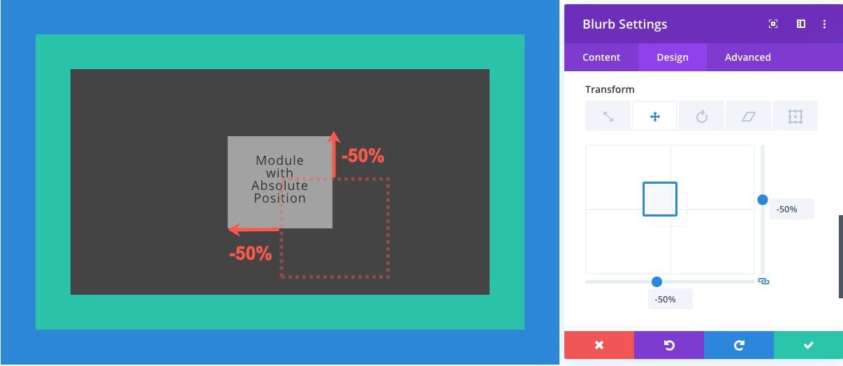
This is because Divi already does this automatically in the backend for you. Knowing this, you can make adjustments from the center point location by using the transform translate option. And if you use the percentage length unit, you don’ t have to know the module’s width or height to make adjustments since 100% equals the width or height of the module. So, if you want to add four modules to the center of the column, you can use the transform options to offset each of the absolutely positioned modules.
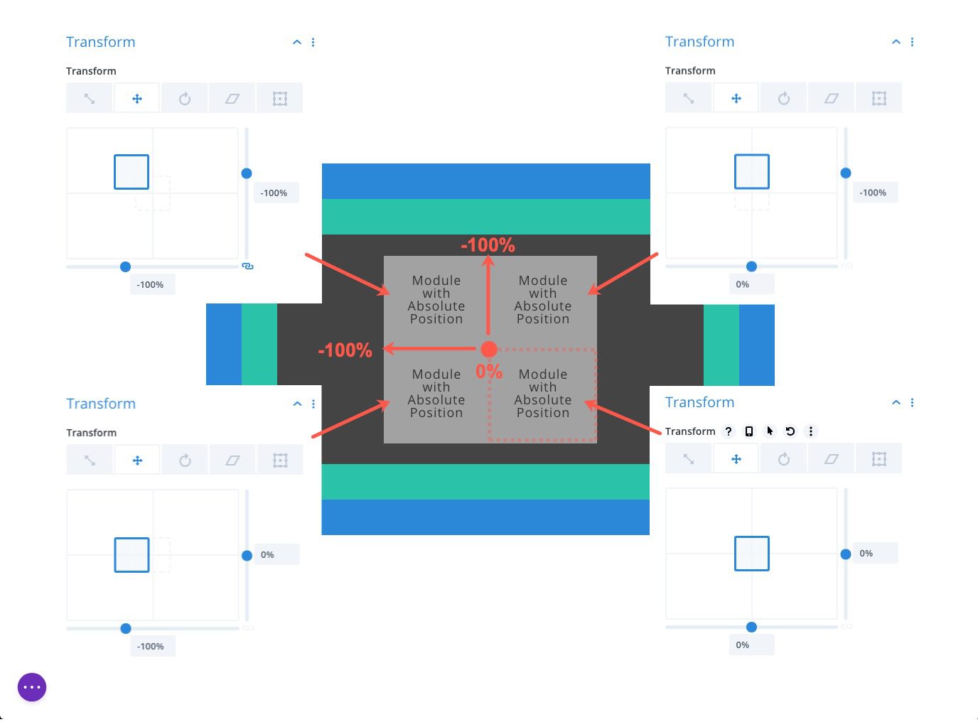
To do this, you would create four modules and give them all an absolute position with a location that is centered vertically and horizontally.

Then, use the transform translate options to adjust the position of the modules according to the percentage of the width and height of the module accordingly. For example, giving a module a transform translate Y-axis value of -100% will bring the module upward the exact height of the module. Giving the module an X-axis value of -100% will move the module over to the left the exact width of the module. This can be a great wat to combine elements that are centered absolutely.
One practical application of using the absolute position in Divi is to give a button an absolute position inside of a column so that the button remains at the bottom of the column even though the amount (or height) of the content above it may change. This can be a great way to keep the design consistent when featuring items on your page.
Here’s how to do it.
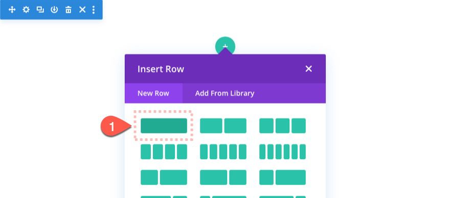
First, add a one-column row to the section.
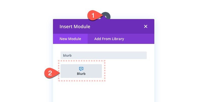
Then add a blurb module to the column.
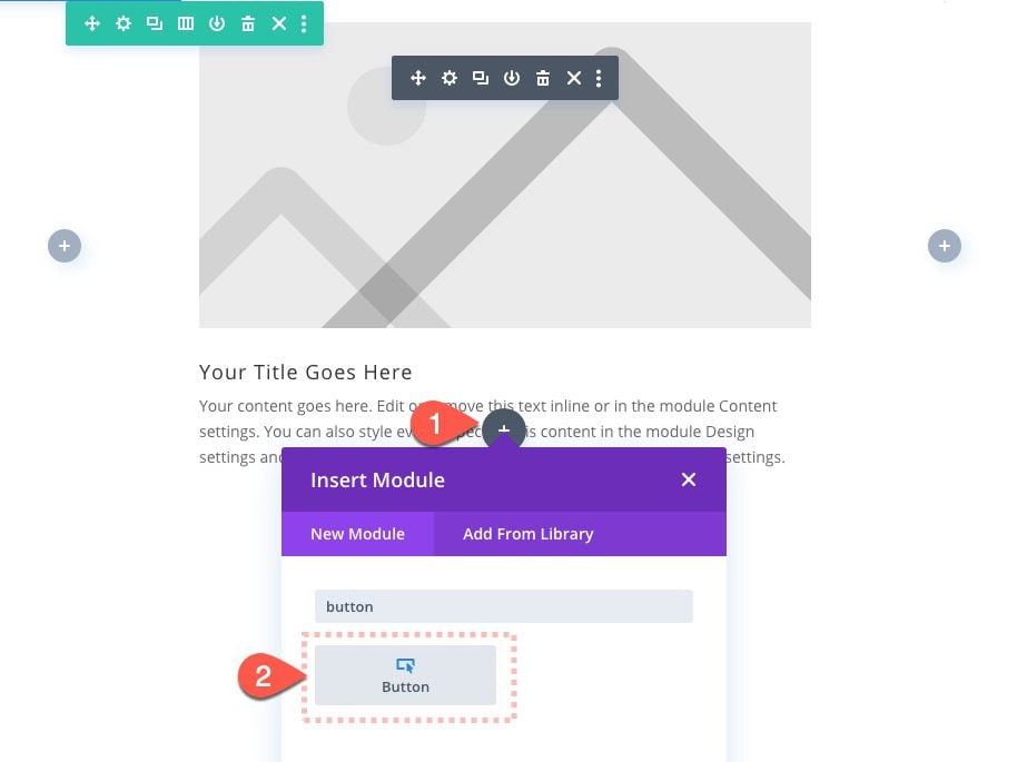
Next, add a button module below the blurb module.
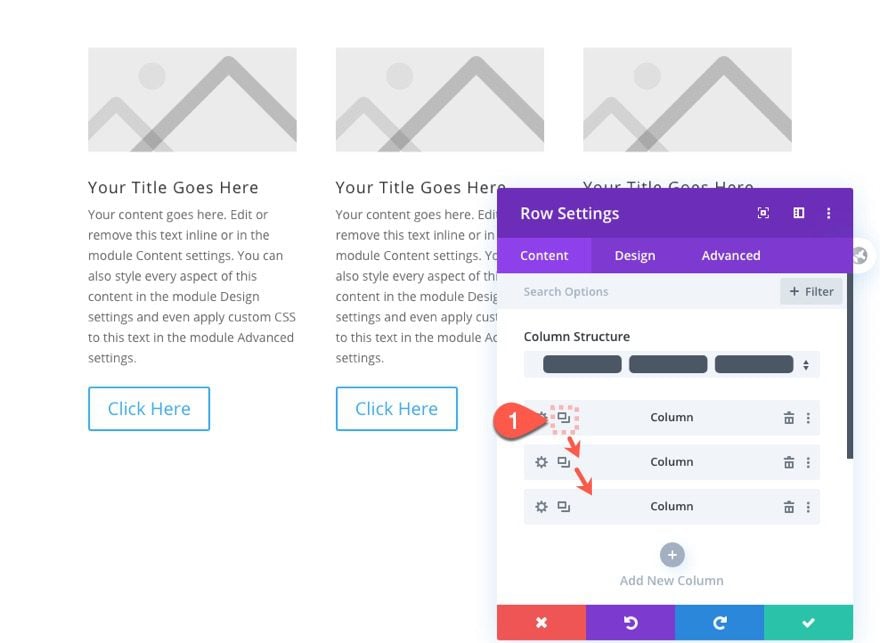
Open the row settings and duplicate the column twice to get a total of three identical columns each with the same blurb and button module.
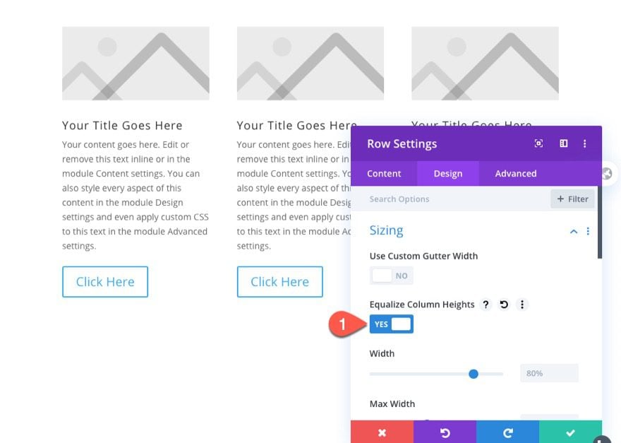
Then go to the row settings and select the option to equalize column heights. This will make sure the columns will adjust to the height of the column with the greatest height (or most content).
Now update the body content of each of the blurb modules so that the content amount differs with each column. You should see that the button below will move to the position directly below the blurb module, making each of the buttons in a different position within the column.
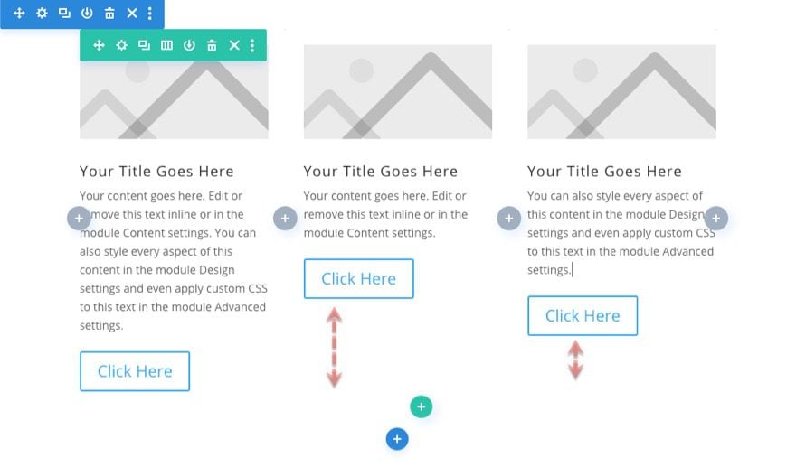
Using multi-select, select each of the button modules and update the following element settings for each of the buttons:
- Position: Absolute
- Location: Bottom Left
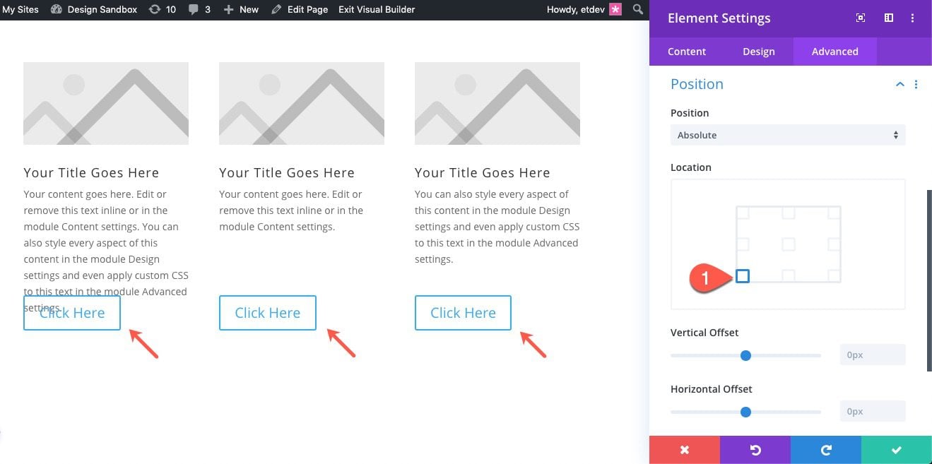
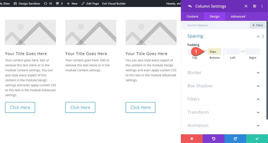
This will position each of the buttons absolutely at the bottom left of the column. But since the buttons are now outside the normal flow of the elements on the page, you will notice that there is some overlap with the button and the blurb module in the far left column. To fix this we simply need to make some actual space for the button by adding some padding to the column as follows:
- Padding: 50px bottom
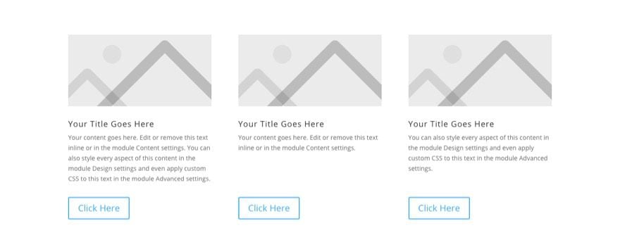
Now you have three featured items with a consistent button placement for each even though the amount of content (or height of the blurb) may change.
Final Thoughts
I hope this post has shed some light on the absolute position property and how powerful it can be used within Divi. Once you understand how the position works, you can use to add all sorts of precise design elements that will take your website to the next level.
I look forward to hearing from you in the comments.
Cheers!



Hello,
I know that an absolutely and fixed positioned element breaks out of the normal document flow and therefore no actual space is created on the page for the element.
And question is: If I want to use absolute or fixed positioning for a section or module inside this kind of section, is there any good practice where to place these kind of sections inside of designed page in Visual Builder? I mean in relation to the normal sections that are in the normal document flow. For example above all normal sections or vice versa under all normal sections or does it not matter where absolutly and fixed positioned sections are?
Thank you
Libor
Jason, Thanks for a clear explanation of some complicated terms!
I really like the idea of being able to move around everything. it’s one thing I really don’t like about the more basic themes. Might have to check out DIVI 🙂
Great to hear!
Another great tutorial.
Thank you
Very Nice Feature, Thanks for sharing. Its really helpful post.
You’re welcome. Glad you like the new feature. It really does open up some cool design possibilities.
Cool. Curious to see the sticky solutions when you’re ready.
I’m working with the latest Divi download 4.2.2 and I can’t see the ‘position’ facility under design. Is it available for all modules? My present page only has an image module which I was hoping to move.
Brian,
The position option group is located under the advanced tab.
Whoops – thank you.
This is a great feature forever. I love this update. It’s helping to create more unique design by using absolute positioning.
very nice :o)
thank you
Clearly explained! Thanks Jason.