Divi’s new backend editor is a brand new feature that brings the power of the visual builder into the backend. The new backend editor has a familiar interface (like the classic builder) but with all the new features that weren’t available to the classic builder before now. We understand that any change (however big or small) requires some adjustments to your usual workflow. In this tutorial, I’ll be giving a hands-on rundown of all the new features now available in Divi and its backend editor. I think you will be surprised by the improvements and excited to try them out on your next project.
Here is a breakdown of the features we will be covering in this tutorial:
- Speed
- View Modes with 100% Accurate Page Rendering
- New Builder Menu Structure
- Builder Settings
- Copy and Paste Divi Elements Between Pages
- Filtered Search
- Quick Access
- Color Manager & Magic Color Suggestions
- Find & Replace
- Extend Styles
- Drag and Drop File Upload
- Dynamic Content
- Hover Options
- Bulk Editing and Multiselect
- 1 Accessing the new Divi Backend Editor
- 2 #1 New Divi Backend Editor UI
- 3 #2 Speed
- 4 #3 View Modes with 100% Accurate Page Rendering
- 5 #4 New Builder Menu Structure
- 6 #5 Builder Settings
- 7 #6 Copy and Paste Divi Elements Between Pages
- 8 #7 Filtered Search
- 9 #8 Quick Access
- 10 #9 Color Manager & Magic Color Suggestions
- 11 #10 Find & Replace
- 12 #11 Extend Styles
- 13 #12 Drag and Drop File Upload
- 14 #13 Dynamic Content
- 15 #14 Hover Options
- 16 #15 Bulk Editing and Multiselect
- 17 Final Thoughts
Accessing the new Divi Backend Editor
The new Divi Builder experience (Divi 3.18) includes the new Divi Backend Editor features discussed in this article. It was released to integrate smoothly with the recent release of WordPress 5.0. For more info on how to access the new Divi Builder Experience with WordPress 5.0, check out this post.
Now let’s get to those awesome features!
#1 New Divi Backend Editor UI
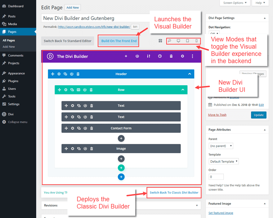
The new Divi Builder backend has a few new elements that you may need to familiarize yourself with first. For the most part, things will look very familiar, but there are a few important differences.
- The “Use the Visual Builder” button has been replaced by a “Build on the Front End” button. This is only a change in wording. The button will allow you to design your page on the front end just like the Visual Builder has in the past.
- The View Modes Now Available on the Backend (more on this later).
- The New Divi Builder UI which defaults to wireframe view mode.
- Link to Switch Back to Classic Divi Builder. This allows you to go back and forth to the classic Divi builder and the new Divi builder.
#2 Speed
Speed is one of those features that is difficult to show you in a post, but it is so important to workflow I thought I would mention it here. Some of you may have avoided using the Visual Builder in the past because it wasn’t as fast as the Classic Backend Builder. But now you can enjoy a much faster visual building experience on the backend and on the front end made possible via cache leveraging. Go and check it out for yourself!
#3 View Modes with 100% Accurate Page Rendering
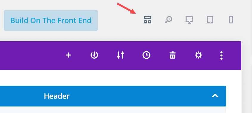
The view modes on the new Divi Backend Editor is where you can quickly toggle from the default wireframe view mode to other view modes (desktop, tablet, smartphone, and zoom out) that give you a visual building experience on the backend.
Here is what each view mode looks like as you toggle through each of them.
Wireframe View Mode
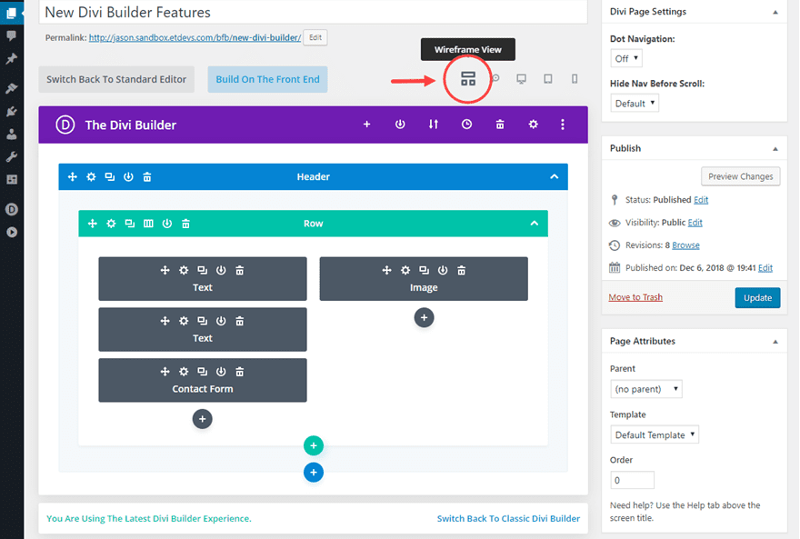
This essentially replaces the classic Divi backend builder with all the Visual Builder features built in. This is also a great fail safe view for editing pages with a lot of customization or custom code that would make certain elements difficult to edit in one of the visual modes. For example, if you have elements that are overlapping, it might be difficult to access the settings menu for an element. So, all you would need to do is toggle over to the wireframe view mode, open the settings modal for that element, and then toggle back to edit the element visually.
Zoom Out View Mode
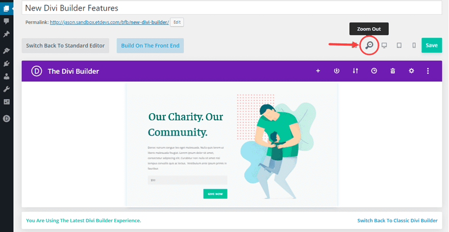
This view mode allows you to edit your page visually from a broader perspective. It allows you see the overall design of your page without having to load it in a new browser. It allows you to move larger elements (like sections or rows) around much easier. Plus, if you are using features like multiselect and find and replace to make design adjustments throughout your entire page, this will allow you to see those changes in real time without having to scroll as much.
Desktop View Mode
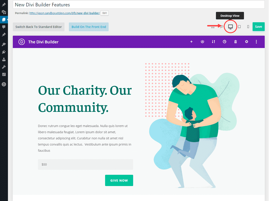
This view is where you will do most of your visual builder editing on the backend. The view mode spans the full width of the builder. And since the builder view spans almost the entire width of the browser, you can have an accurate desktop depiction of the page on the backend.
Tablet View Mode
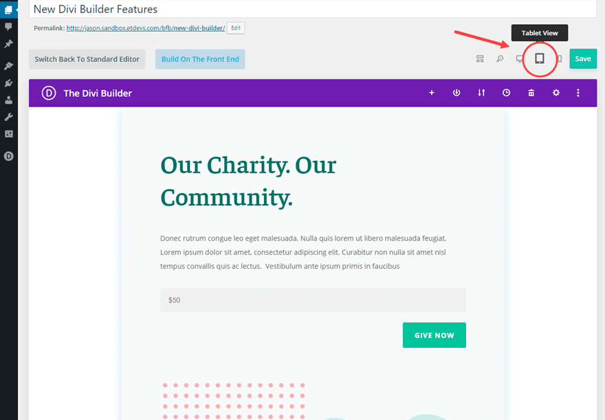
The tablet view shows what you page will look like at 768px wide (a common portrait orientation for tablets).
Smartphone View Mode
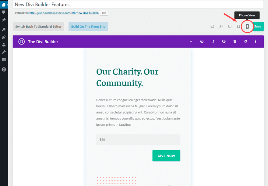
Smartphone View Mode gives you an accurate depiction of your page at 479px wide (a common portrait orientation for smartphones)

The new menu structure includes all the options as before in a one convenient and compact place. There is also a new Builder Settings option to the far right that wasn’t available on the backend until now (more on this below).
#5 Builder Settings
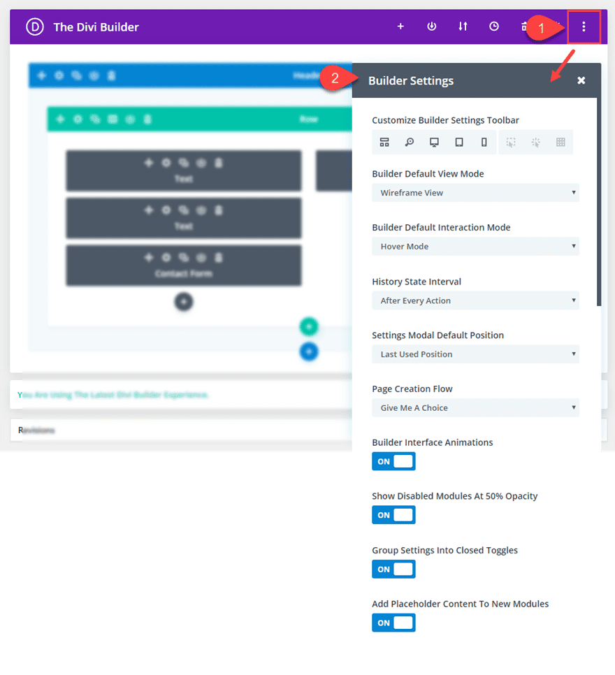
The new Builder Settings are now available on the backend builder. This powerful feature allows you to customize your Builder Experience to fit your own workflow.
All of these options will come in handy for setting up how you want Divi to work by default. Here are a few of the options that may surprise you.
Customize Builder Settings Toolbar with Hover Mode, Click Mode, and Grid Mode Options
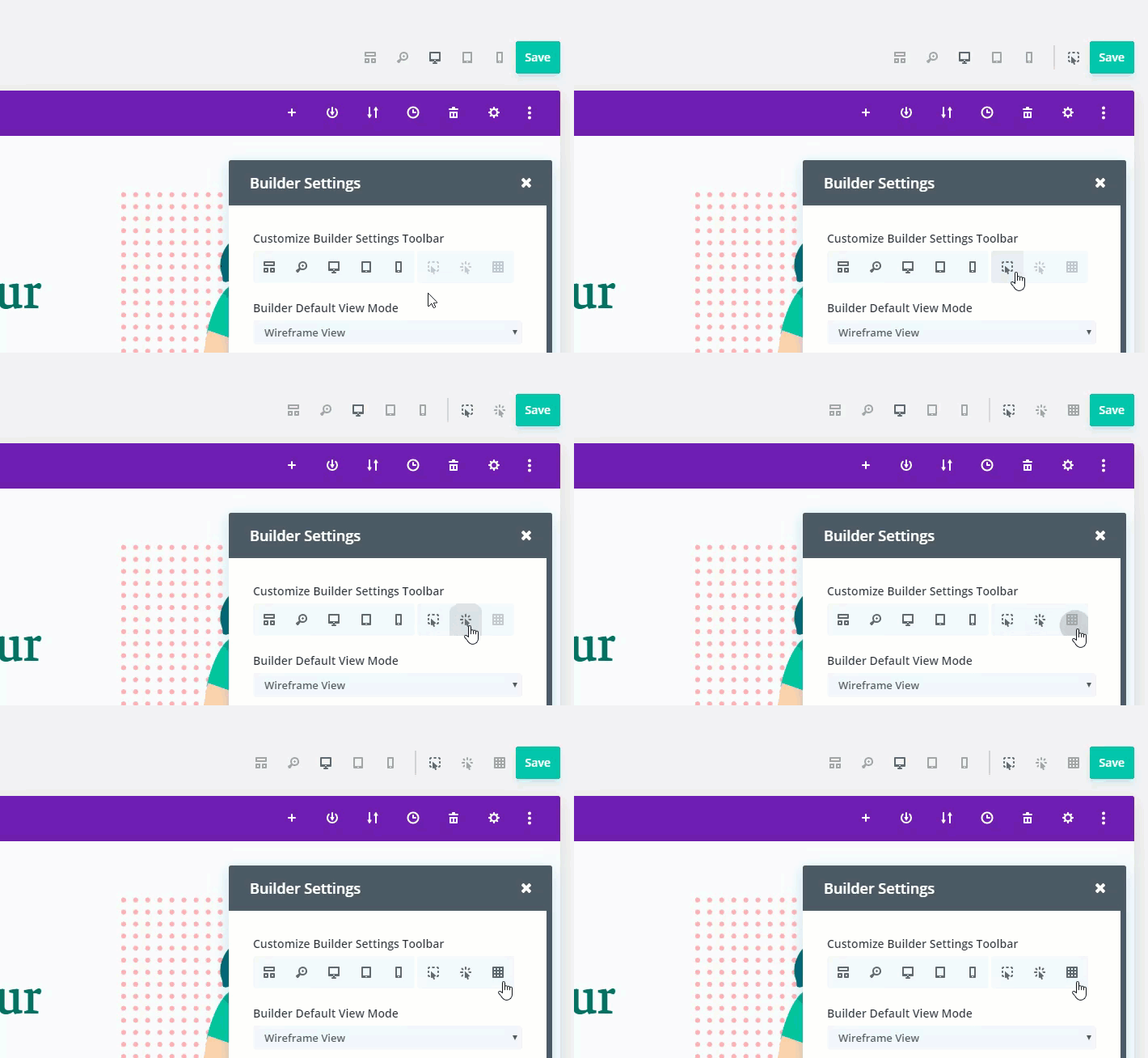
When editing a page on the backend in one of the visual view modes (like the desktop view mode), you can add or remove items from the toolbar with this option. You can even add Hover Mode (the default interaction), Click Mode, and Grid Mode to your toolbar so that you change the way you interact with Divi on the fly.
In Hover Mode (the default interaction mode), hovering over modules, rows and sections reveals their controls and these controls can then be clicked.
In Click Mode, controls are shown when you click on an element rather than when you hover over it. Once an element has been clicked, its controls stay visible until you click on something else or exit out. Click mode also highlights elements on hover which can be very helpful for identifying small modules on a page.
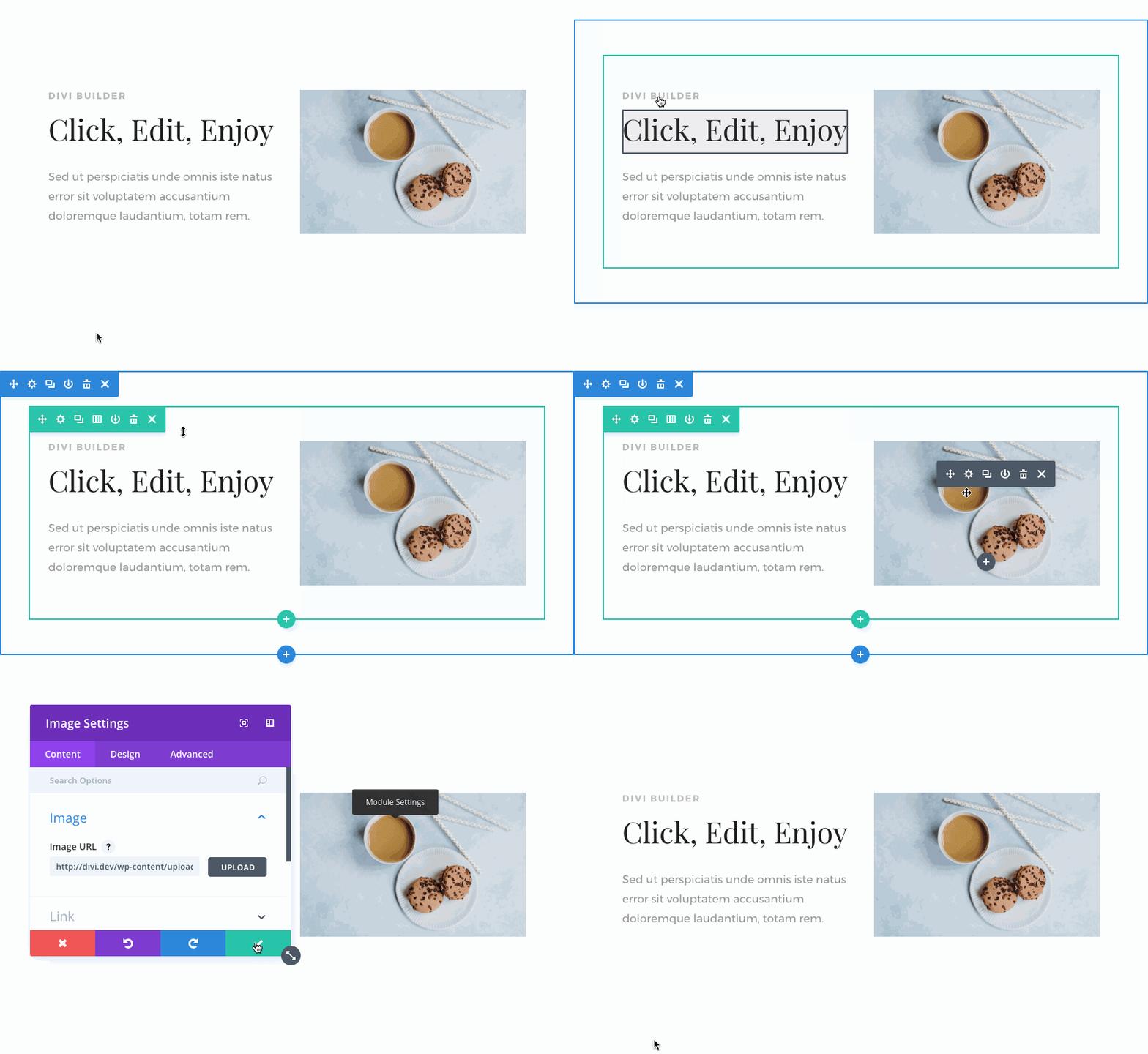
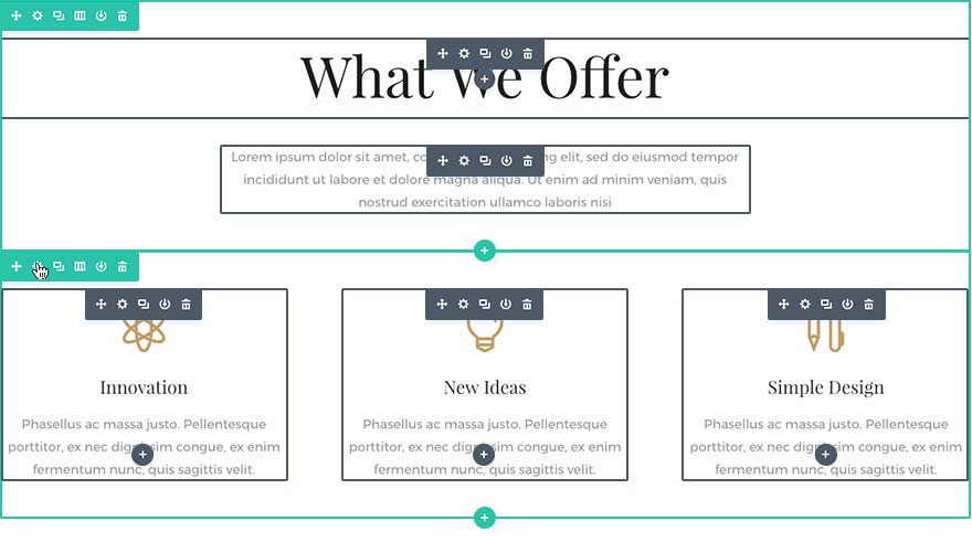
In Grid Mode, all of the module, row and section controls on the page are displayed at once.
There is even an option to set the default intaction mode under Builder settings as well.
Optimize Page Creation Flow
You can optimize your page creation flow to fit your needs. For example, instead of being prompted to choose your page creation method everytime you create a new page, you can set the page creation flow to always begin building a new page from scratch.
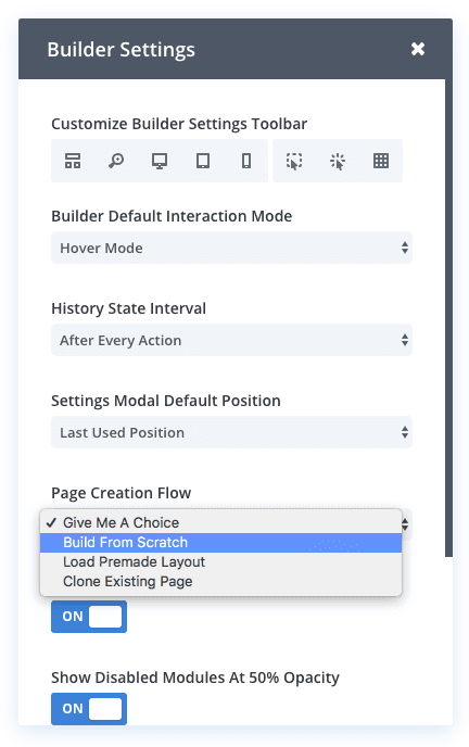
Now when you create a new page and deploy the Divi Builder, you will go straight to editing the page from scratch saving you some valuable time during development of a new site.
You can also read more about these Builder settings on the feature blog post.
#6 Copy and Paste Divi Elements Between Pages
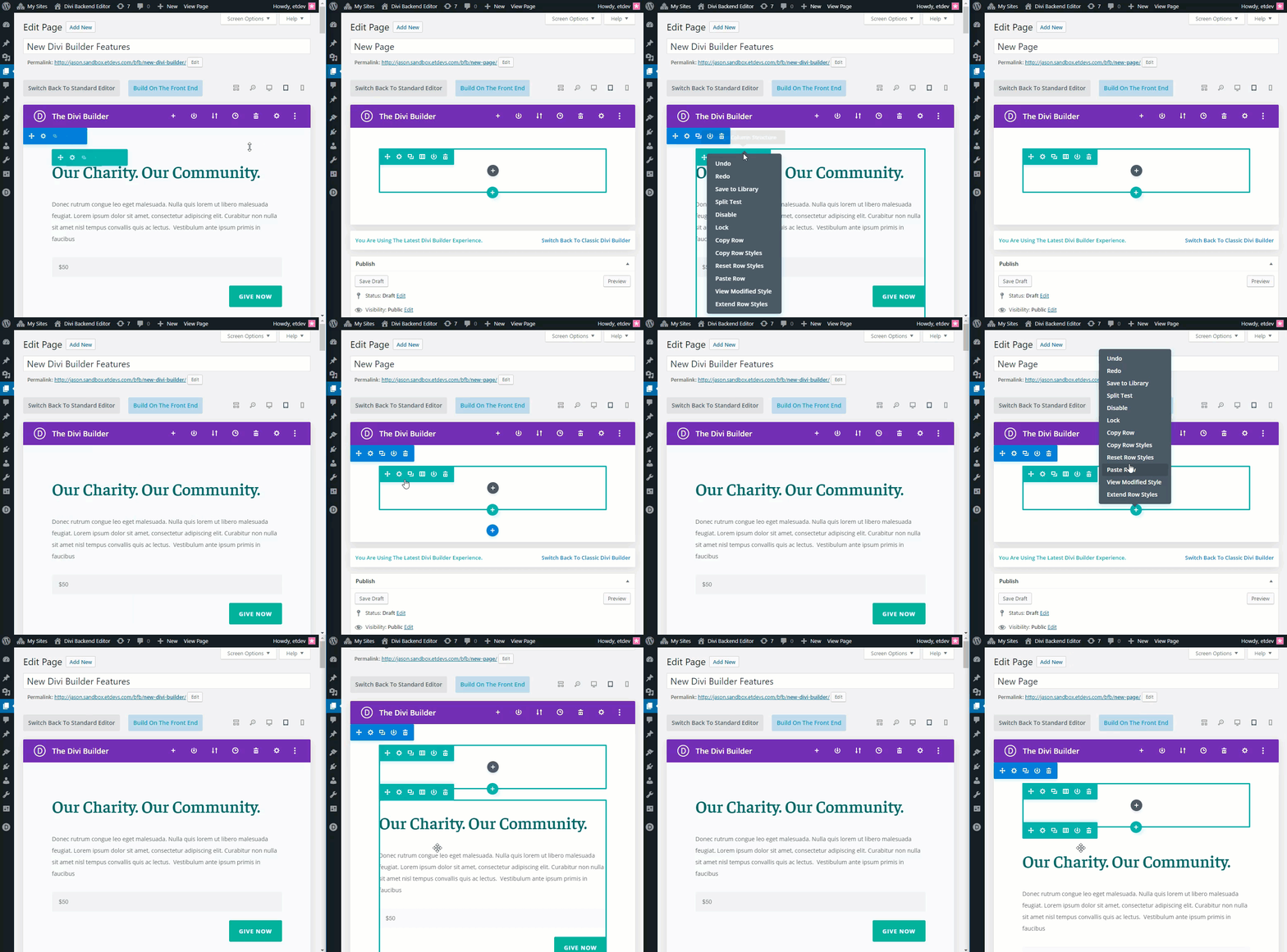
Now you can copy entire Divi Elements or Styles from one page and paste them into a completely different page. This saves you a ton of time when building you website. Instead of saving your element to the divi library and importing it to a new page, all you need to do is copy and paste it!
#7 Filtered Search
Filtered Search is one of the wonderful design effeciency improvements that used to be available only on the Visual Builder.
This allows you to type in search queries at the top of your settings modal to find a certain option faster. And you can select certain filters to show modified styles, responsive styles, hover styles, and active content. You can even combine search queries with filters for a more targeted search.
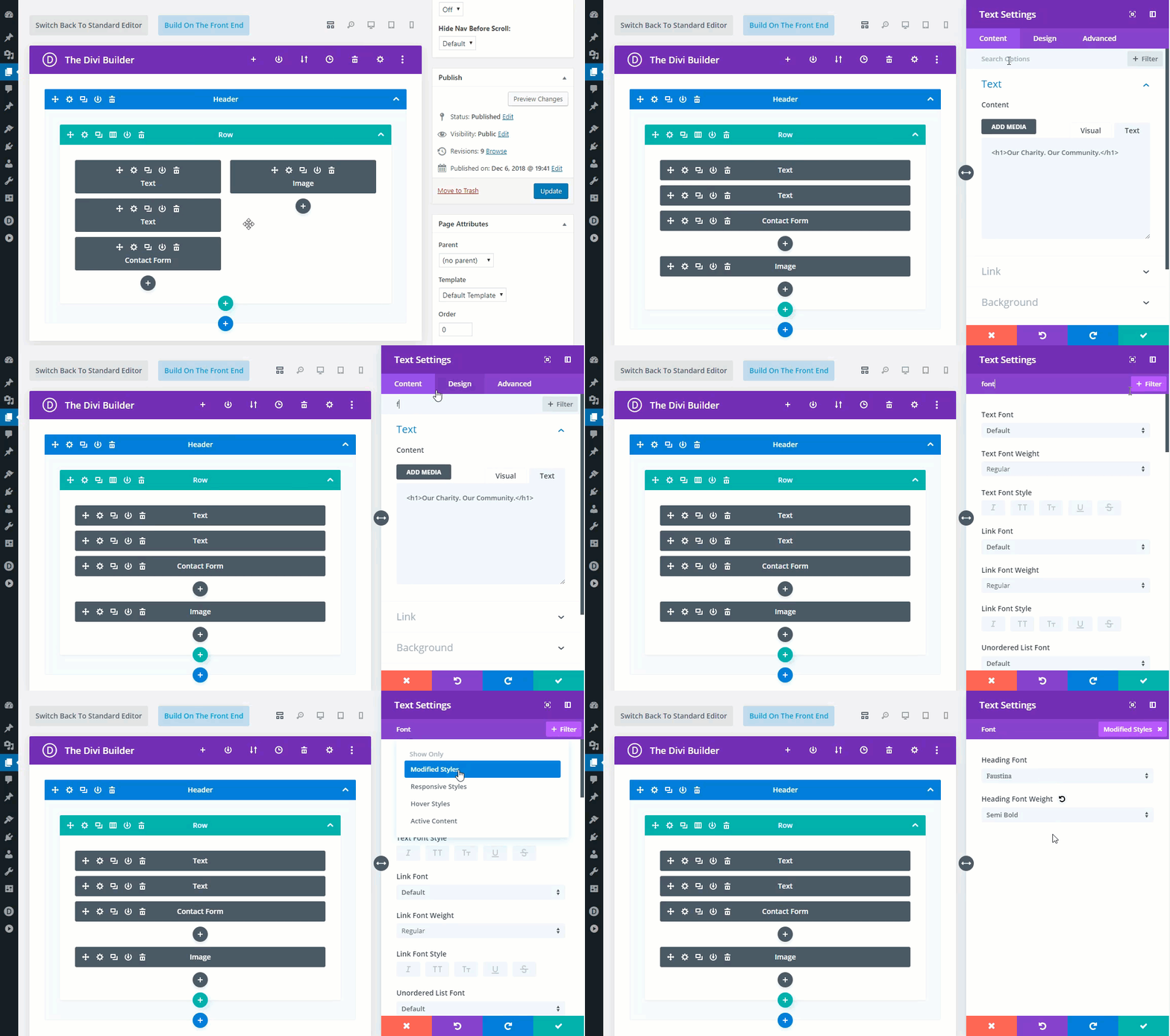
For example, you could type in the word “font” in the search bar of the settings modal to show all font related design options. Then you could add the filter “modified styles” in combination with your search query to reveal all the font options that have modified styles.
It is a quick and easy way to inspect the design options of your own designs as well as many of the premade layout designs available. Other Filters include Responsive Styles (values set for tablet and smartphone), Hover Styles (values set for hover), Active Content (content and/or settings active under the content tab).
#8 Quick Access
Quick access is an easy feature to overlook but it is a significant development time saver. This feature works only in one of the visual builder view modes. When you open the settings of a module, you can hover over elements of the module in the visual builder to reveal blue border highlights and quick access buttons. When clicked, these new quick access buttons will take you directly to the relevant design settings for that particular element within the module.
For example, notice how easy it is to navigate to the style settings for a heading in a text module.
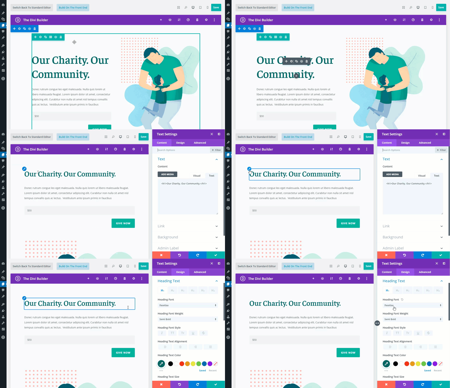
This feature functions the opposite way as well. Quick Access also makes it easy to identify relevant elements on the page within module settings. As you search (or hover) through options, Divi will indicate which module element each option group belongs to with a blue highlight border.
Notice how the heading text element is highlighted when hovering over the “Heading Text” option group in the module settings.

#9 Color Manager & Magic Color Suggestions
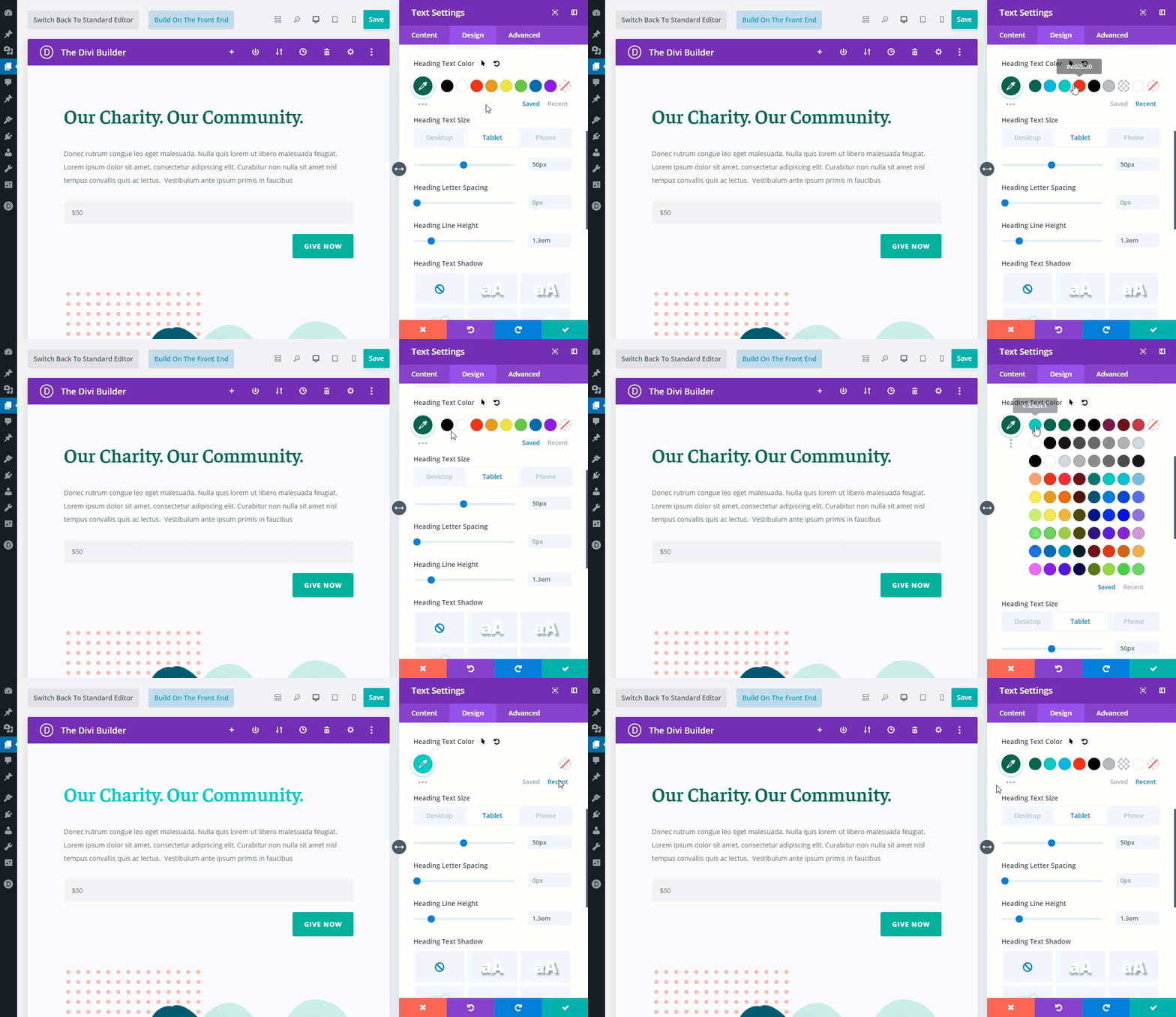
The Color Manager and Magic Color Suggestions feature is extremely convenient when changing the color of an element in the settings modal. For example, you can quickly toggle recent colors use as well as your saved color palette. And, you can open the magic color suggestion grid to reveal a row of suggested colors for each of the colors in your saved or recent color palette.
#10 Find & Replace
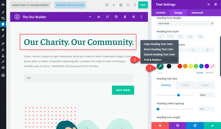
Find & Replace allows you to replace any value throughout your page with a completely new value in seconds. Simply right click on a setting and choose the Find and Replace option. This will allow you to search through your entire page, or a particular part of your page, for specific values and replace those values with something new. This means you can change your entire page’s color scheme, fonts and more in a matter of seconds.
For example, if your page is styled with the same green color throughout, you can right click on any color option using that color (like a heading text color) to find a replace that color value with a different one.
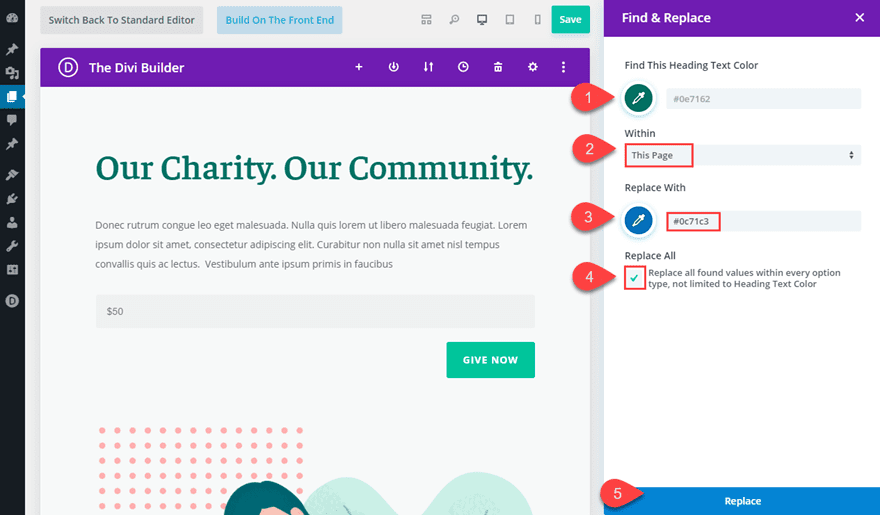
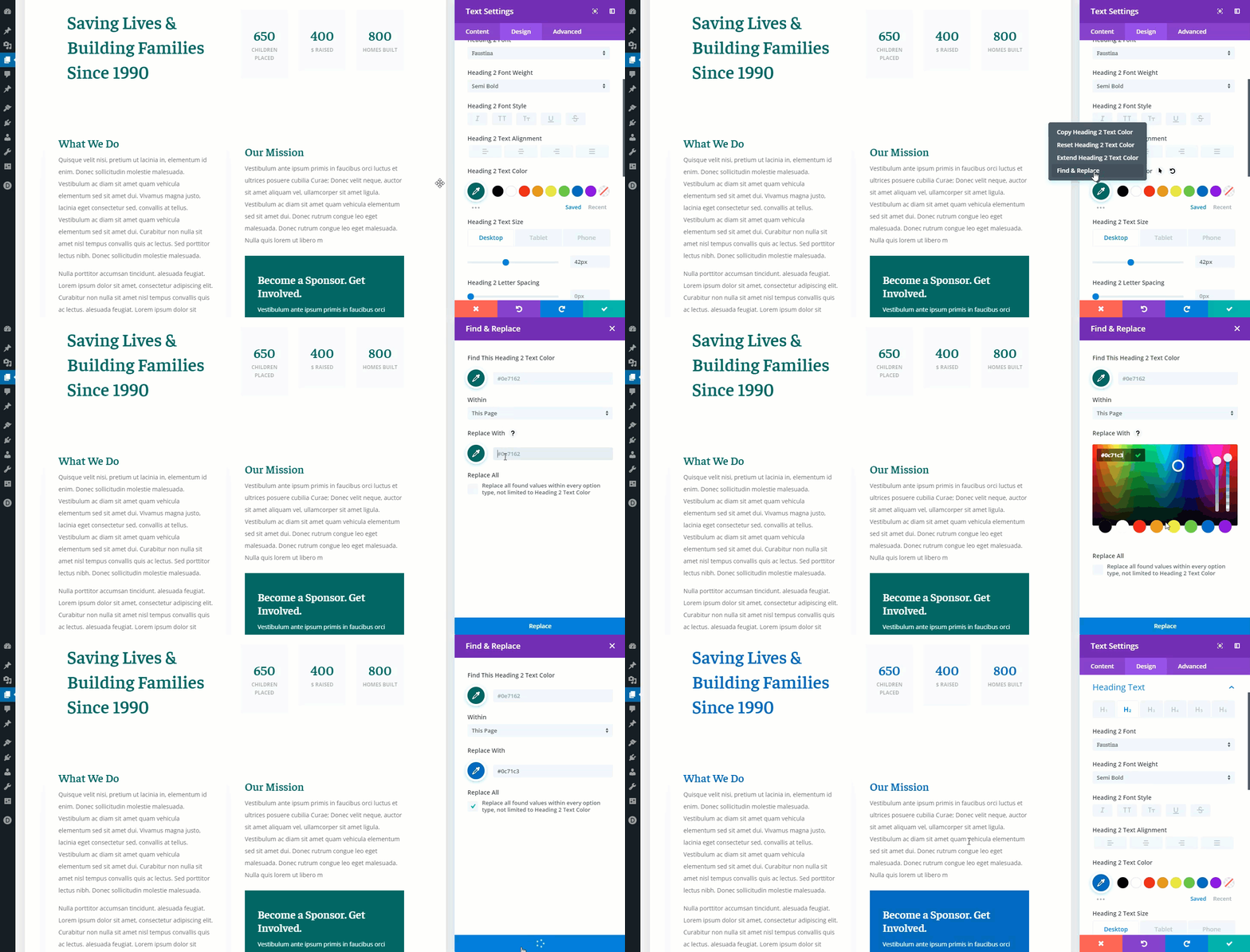
In the Find & Replace popup, you can choose to replace the color within the entire page with a blue color. Then, if you select “replace all”, the color value will be replaced on all instances of that color no matter which element is using it.
This changes the entire page’s color scheme in seconds.
#11 Extend Styles
Extend Styles allows you to extend a specific style option or the styles of entire element to other elements throughout your page.
To Extend Styles in Divi, simply right click on any element, option or option group, and choose the Extend Styles option. You can then choose where and to which elements you would like to extend the styles. You can extend styles to specific modules within specific locations, or you can extend styles to all modules across the entire page using location and element targeting.
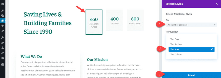
For example, let’s say you have designed a number counter module and want to extend all the styles of that module to the other number counter modules in that row. Simply right click on the number counter module and select “Extend Number Counter Styles”. Then, in the extend styles modal, select to extend the styles throughout the Row.
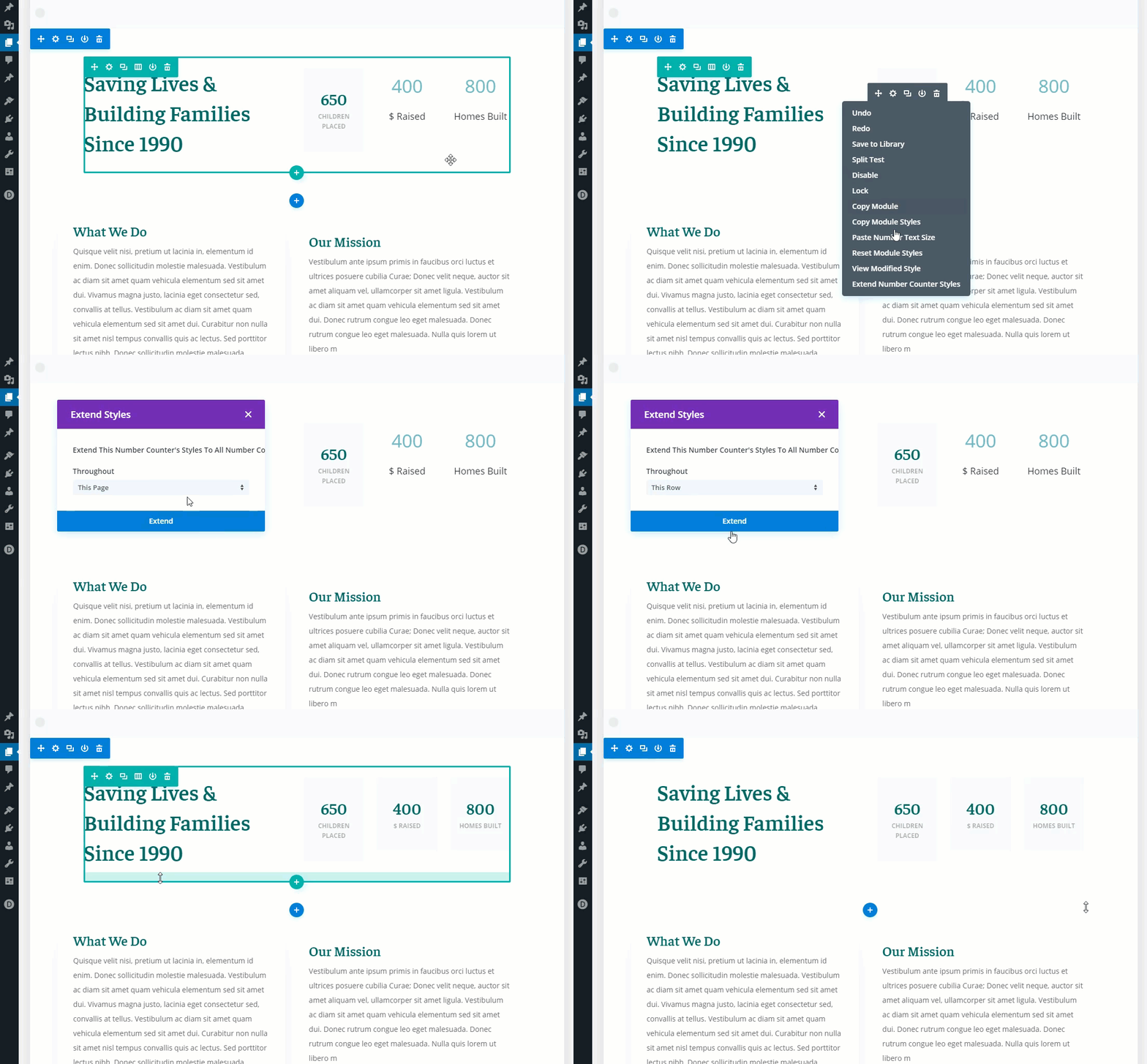
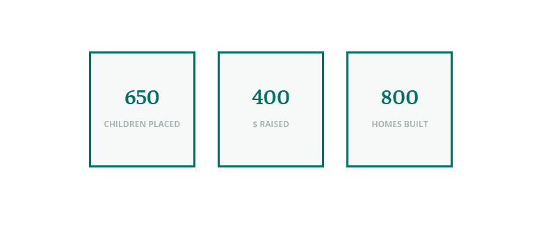
All number counter modules will inherit the styles of that module.
You can also extend styles of particular design options (or option groups). For example, let’s say you have added a border to one of your Number Counter Modules and what to extend those border styles to the other modules in your row. Simply right click on the border styles option group and select “Extend Border Styles”.
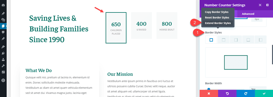
In the Extend Styles modal, select to extend the border styles to all number counters throughout the row.
This will extend the row styles to all the number counter modules in that row.
#12 Drag and Drop File Upload
With the Drag and Drop File Upload feature, you can now drag and drop files from your computer directly into the backend builder. Divi detects the types of files you are uploading and automatically transforms them into a number of different modules, or applies them to the page in creative ways.
For example, you can drag in a number of images into the Divi Builder to automatically create an image gallery at the bottom of your page. Simply highlight the images you want on your computer and then drag them into the builder. That’s it. Divi does the rest!
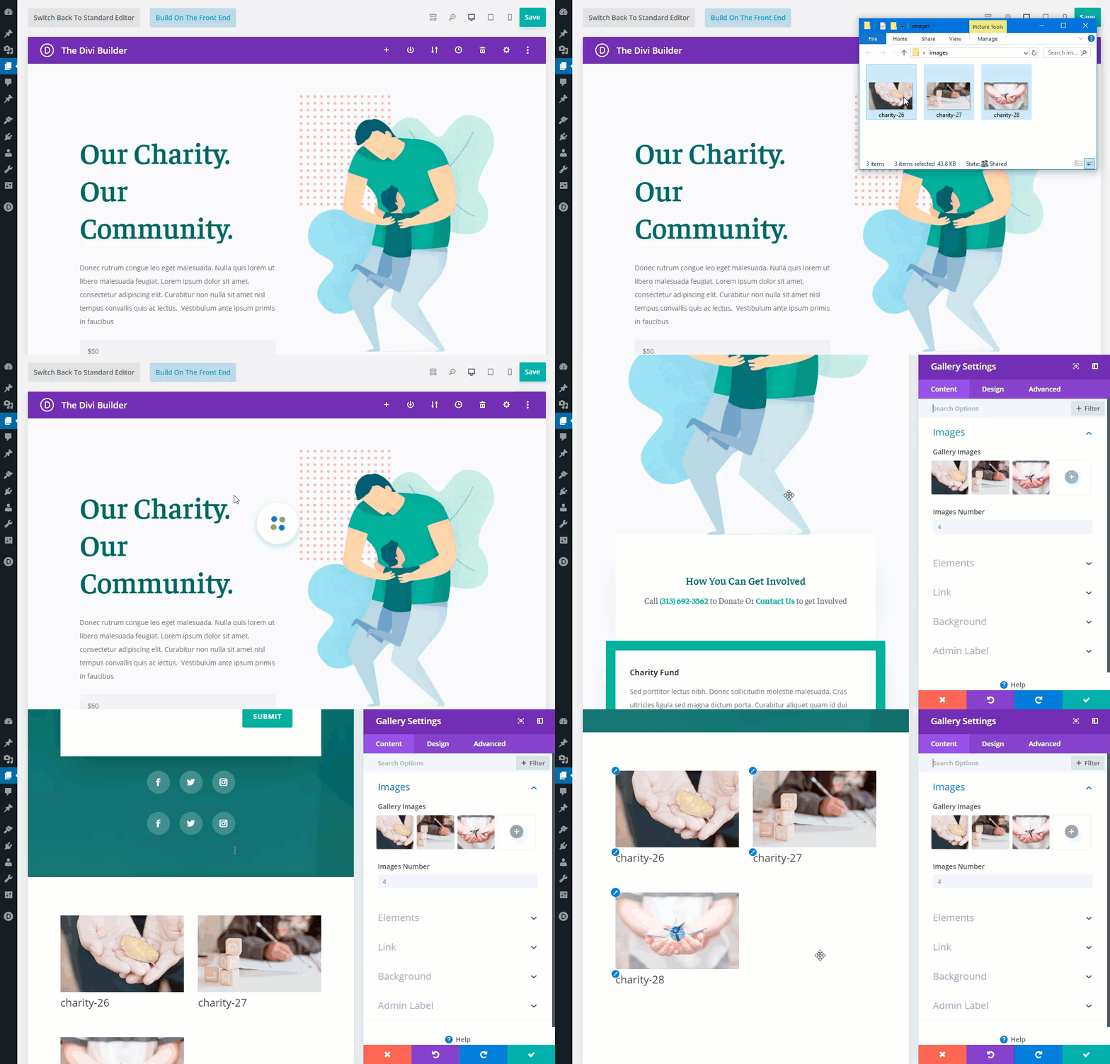
Check out some other cool ways to use the Drag and Drop File upload feature to boost productivity.
#13 Dynamic Content
Dynamic Content allows you to turn any Divi module into a dynamic element that pulls its dynamic content from the database via post meta, custom fields and more.
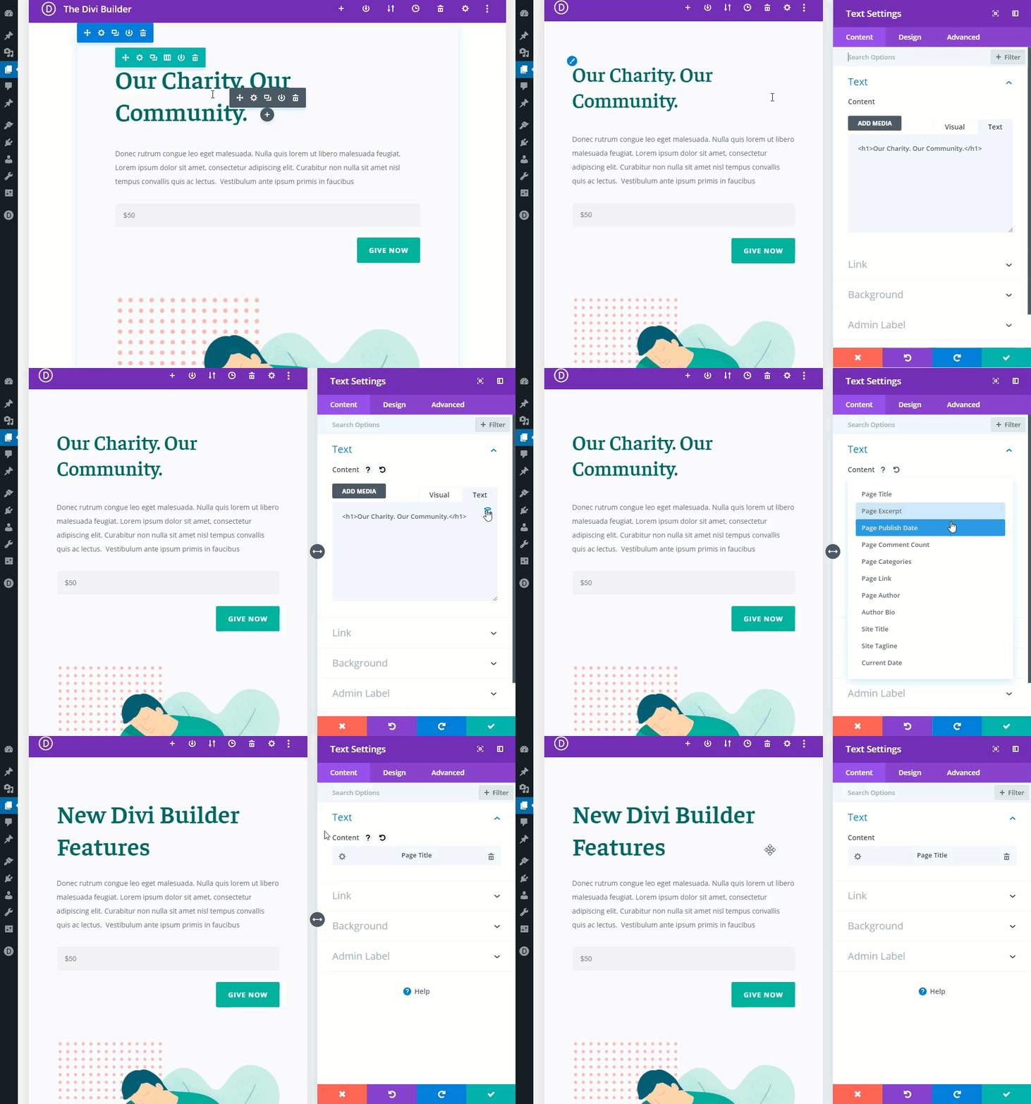
For example, you can easily use dynamic content to display the page title for in the main header of your Divi layout. Simply open the text settings modal and click the dynamic content icon that pops up when hovering over the content box. Then select “page title” from the list of dynamic content options available.
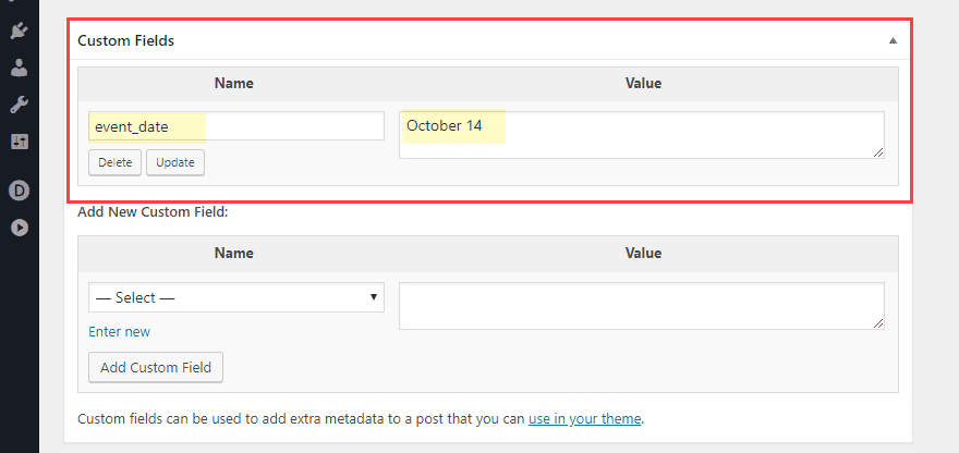
Create your own custom fields.
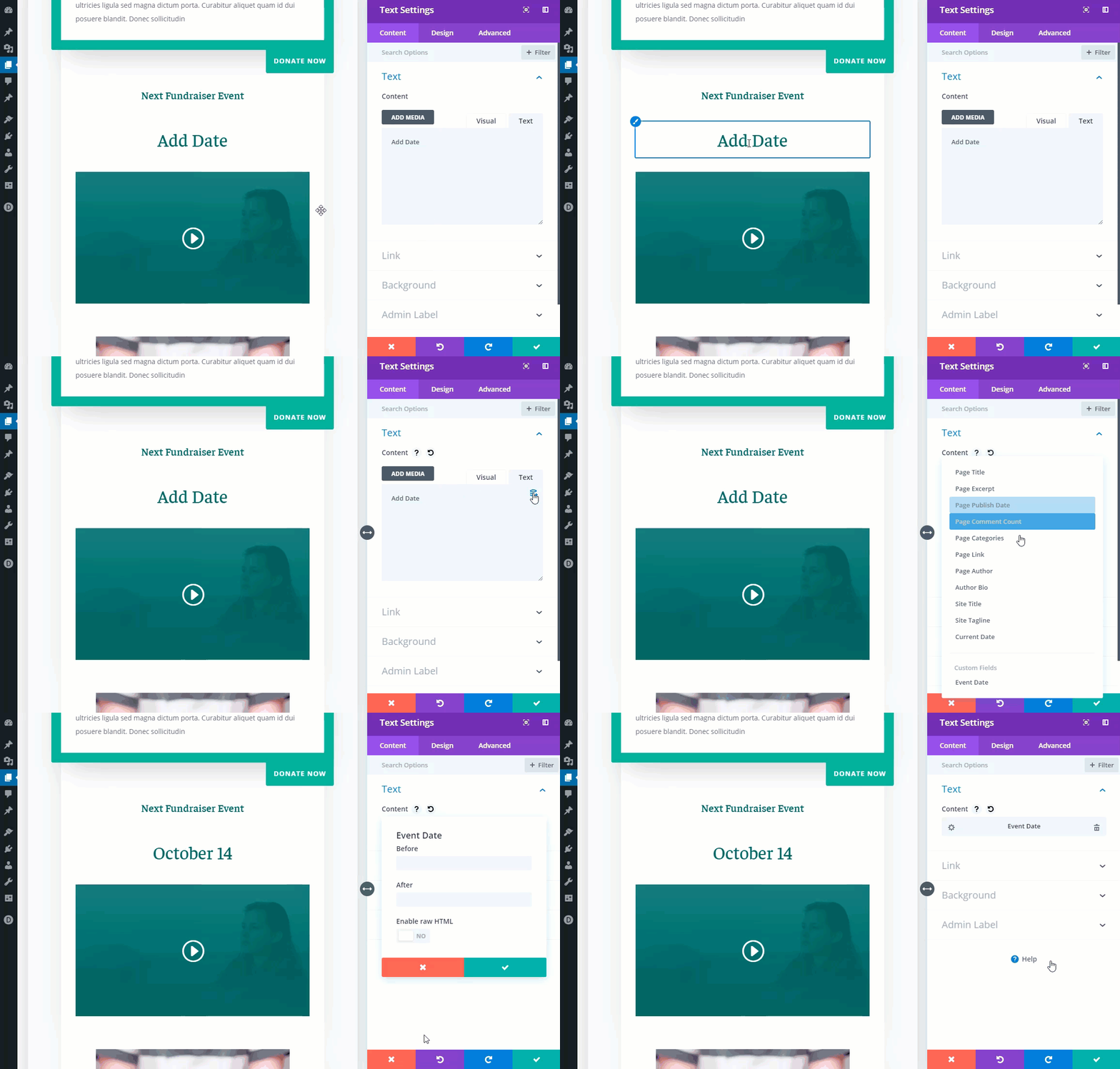
Then add that custom field as dynamic content onto your page layout.
#14 Hover Options
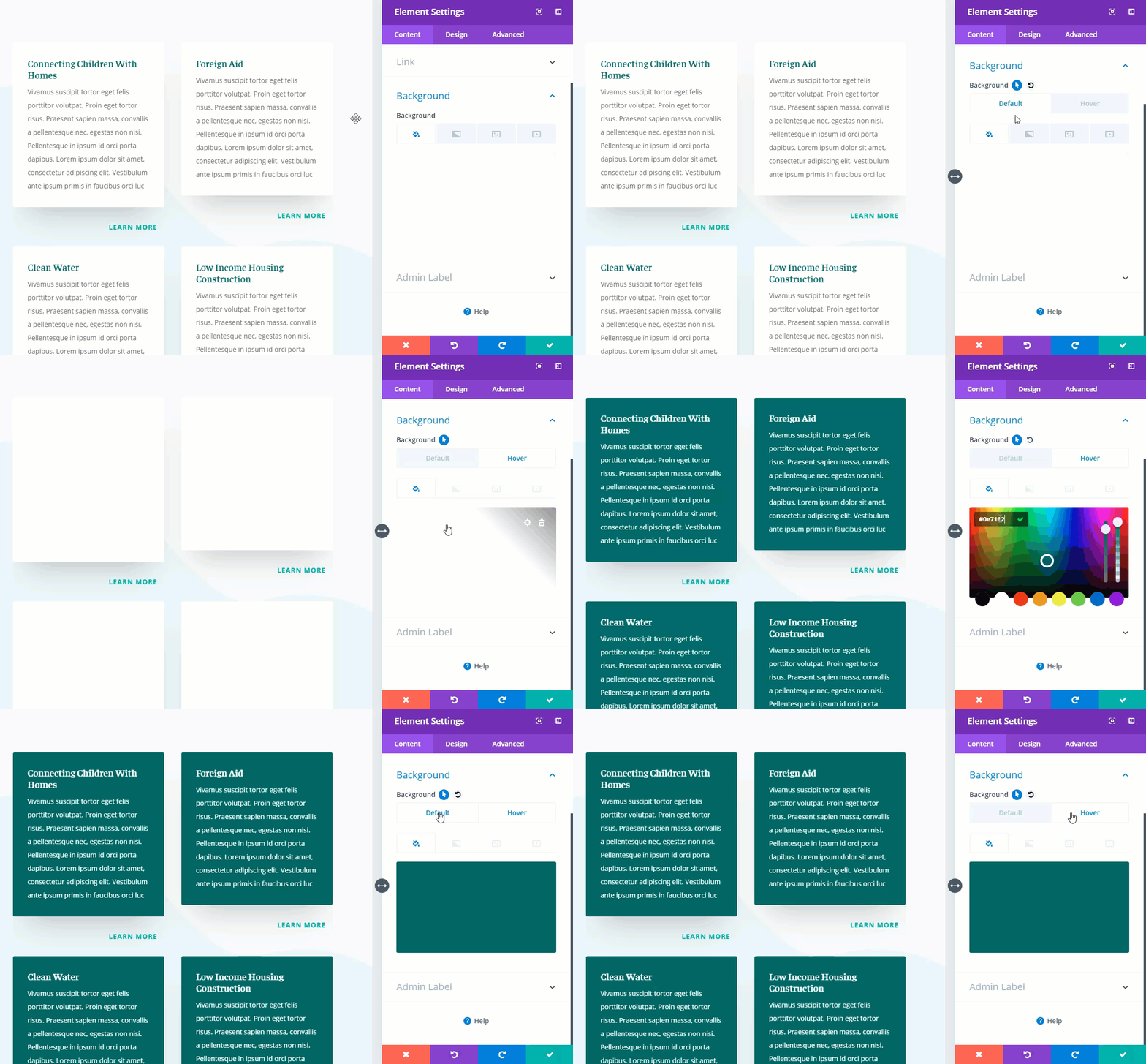
Hover options are also available within the new Divi backend builder. You can deploy a hover option for an specific element by clicking the hover icon that pops up when hovering over an option within the settings modal.
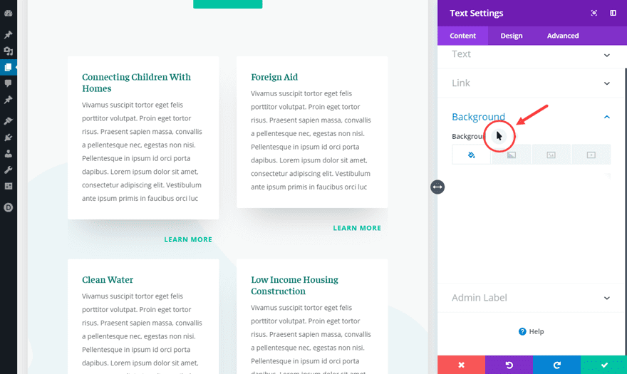
Let’s say you want to change the background color of a text module on hover, you would deploy the hover options for background color and change the background color under the hover tab. Now when you go back and forth between the default and hover tabs, you can see the hover effect in real time.
#15 Bulk Editing and Multiselect
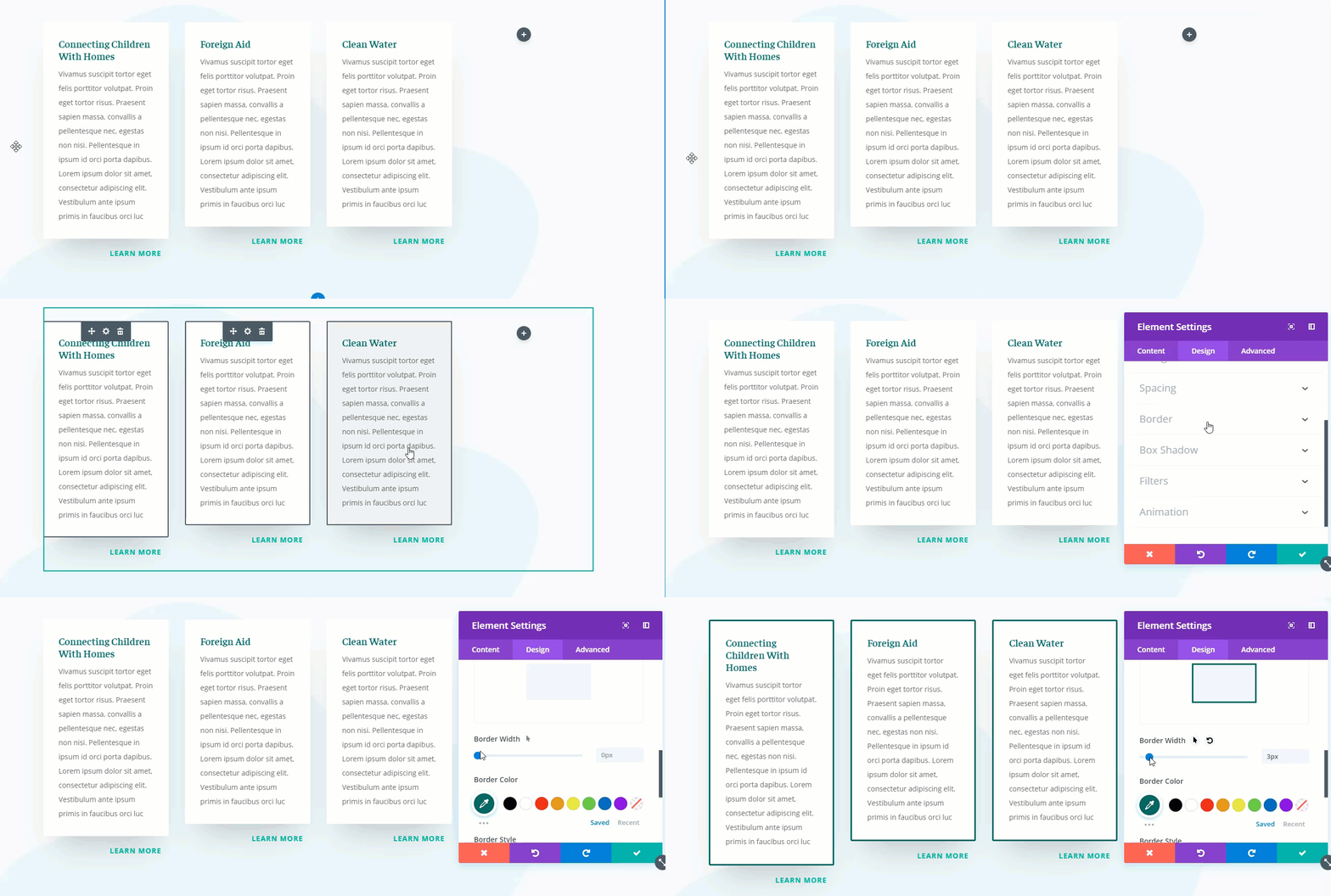
Bulk Editing and Multiselect allows you to select multiple elements (modules, rows, sections) on your page in order edit them all at once.
Let’s say you want to add a border to all text modules in a particular row. Simply hold down the control (or command) key and click all the modules you want to edit in bulk. Then add the border style you want in the element settings modal. Anything you change will be applied to all modules at once.
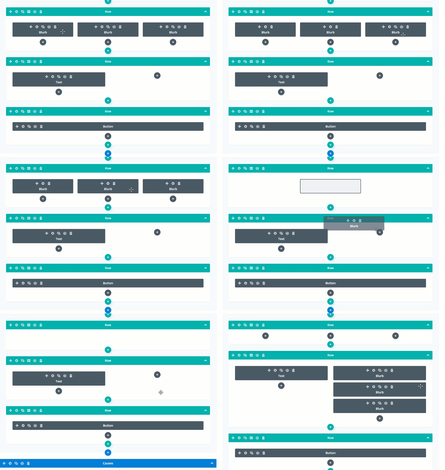
Bulk editing and multiselect works in all view modes including the wireframe view mode. This is useful for moving or copying and pasting multiple elements at once to reorganize your layout much easier. Simply hold control/command and select the items from you layout and then you can drag them anywhere you want. Or once, selected, right click on one of the elements to use copy and paste.
Final Thoughts
The new Divi Backend Builder has inherited some pretty amazing features with the new update of Divi 3.18. So if you have been using the Classic backend builder to build your websites or if you just need to be reminded of the power of Divi, I hope this article sheds some light on all that you may have been missing out on. Feel free to share some of you favorite features with us!
I look forward to hearing from you in the comments.
Cheers!



I would have given DIVI a 10 rating before this release but now I don’t know what to do. It’s so much better these days. I love it more than ever. Now I’ll be one of those people that includes a wish inside a compliment. I hate those people… but… The flipping between the display modes of wireframe, desktop, phone and tablet is an amazing boost to those like me that never really liked the full DIVI visual browser. I’d love to see a tweak that asks me; do you wish this change to be JUST for the phone display or for all displays. Sometimes a change for just one is required and currently, that is a lot of steps. If I click mobile display and make a minor tweak, it’d be awesome to have that change optionally be ONLY for that version.
However, even if this doesn’t happen, I love the tool, the changes, the Facebook support and the videos.
Re vids: PLEASE STOP USING MUSIC, NICK!!! Divi is great but the music SUCKS and is DISTRACTING.
I am an infamous very published early punk rock photographer. I LOVE and LIVE music. But NOT when I teach. I taught at MAJOR computer centers, UCLA, Santa Monica College and more.
Did they play music when you were in school?
NO because it interferes with the brain’s ability to understand and retain info. STOP HAVING BACKGROUND MUSIC, PLEASE I BEG YOU.
Esp cos the music is really really really awful.
Suggestions: GIVE US LINKS to the cool tutorials you have to help us USE Divi. We should not have to google to go or search your site.
How about you just include a list of links walking us through stuff?
Pls remember not all of us read and follow every update, every tutorial you publish.
That would REALLY help.
Before I travel, I get maps. I get a lay of the land and plan my daily activities.
I’m asking for MAPS, cos YOU know better than I which tutorials will help us.
Pls don’t assume we all are ready to hit the ground running.
Cos your approach ramps up the anxiety of a lot of users.
I love Divi’s ability to let me design various layouts. I don’t need all the bells and whistles. I don’t care about overlapping boxes and hovering whatsits.
I have to wade through all that to get to the basics.
That’s all I’m asking: give us links to what you are showing us. Then we can pick and choose what we want as we watch these fast fast fast little vids or screen recordings of various steps.
Pls consider it. Cos it takes awhile for some of us to calm down and dig our way through this to zoom in on the features we want.
I am glad there are many features: something for everyone.
But pls NOT so fast without links. OMG.
ANYONE reading these comments? I would love to know if I’m wasting my time by commenting.
Thanks and all that jazz.
I’m reading!! And thank you! I’m also a site admin that cares nothing for the whatits – maybe I might try one of them in the future but I have content HEAVY sites to update and WOW, yeah, I don’t have time to wade thru a bunch of instructions before I get to actual work! Come on guys – fancy is fine for the three-page sites – I lost count on how many post/pages on just one of mine…. loosing stuff is my nightmare! Posted on Saturday night with an early Monday morning drop-dead, gotta have it done tasks…. Now, instead of having tomorrow to rest… well, you know the rest…. Oh and guaranteed someone is reading…. And again – not all of my ire is directed at the ET programmers and designers….all y’all out there … you know who you are, stop creating madness and mayhem for USERS, please.
How much coffee you all drinking? You couldn’t slow down the animations and vids, could ya?
No, you want us to move our eyeballs really fast to see all you are doing, then do it again and again and again til we see deets and ‘get’ these REALLY FAST small vids.
WHAT IS WRONG WITH YOU ALL???? ANY quality testing to people who are NOT in your teams? Like real users?
Can ya PLEASE SLOW DOWN!!!
I have BEGGED you to do this for awhile. I taught ppl at major universities, colleges and training centers. They would have fired me if I dared showed ppl all these screens SO quickly.
ANY idea how people learn? S-L-O-W-L-Y.
I am beyond livid. Depressed. Crying.
I think there are some cool features. But don’t ask me where items are.
LONG lists of items, screens that change depending upon what you choose from those LONG lists of items.
SLOW DOWN. SLOW DOWN. SLOW DOWN. You are ramping up our anxiety.
Show us SCREENSHOTS!!!! OF EVERY STEP.
Stop being so lazy you think fast vids work. #EPIC FAILURES.
I still need help for the VISUAL Builder. Unless I should still stick with back end. Right now, cos I’m under intense deadlines, I’m using Classic Editor. But I don’t know how long you will allow us to use it.
YOU are SO proud of yourselves. La de da.
What about the users? The people who PAY your salaries? No thought of HOW WE LEARN. SLOWLY.
I’ve put so many hours into Divi since it was launched. I am beyond burned out.
Bah humbug.
I think there are good features, ok? But geez, what we have to do to figure this out … whoa.
Maybe I can find third party vids on youtube which are actually helpful. SHAME ON YOU.
Great product you presented so badly. 🙁
I just wanna cry or die. I’ve been such a hardcore Divi user. ET member for eons.
HOW can you treat us like this??? I type fast, I talk fast, and I have to constantly remind myself to slow down. And I’m exhausted just looking at this page.
Sad, really sad.
Awesome Post, awesome features, some I didn’t know they had been added yet, however I love this post and will need to refer back to it as a quick reminder of what’s new!
Thank you so much for all of your hard work. It seems to be coming hard and fast, sometimes it’s hard to keep up with you, but you keep me young and on my toes so who can complain about that not me !! 🙂
Brilliant job of the new Update. I like it a lot. and I’ll love it when I get used to it.
Lots of great reasons to try it out or switch if you haven’t already. Just a visual thing but I like the way the section and row headings appeared vertically to the left on the classic builder as opposed to horizontally across the page on the new builder – but that’s just me. While I am being nitpicky (lol) using #F1F5F9 throughout the backend on various items like section containers, input boxes etc. makes it very hard to see as #F1F5F9 is pretty close to white. I’ve had to adjust and recalibrate so I can see where to place my cursor. That could also be due to staring at a computer screen for the last 20 years.
I think the speed improvement of the new builder is such an added bonus and helps stop users from using the front-end editor. Having this option from within the back-end of the builder too is just perfect…great update 😉
Nice, I like divi builder.
Oh wow that was a great article.
Your article will help me.
Thank you and looking forward to learn more from this blog.
#6 Copy and Paste Divi Elements Between Pages
nice little update in that the “paste after” has been removed and it automatically just pastes after the section you right click on rather than putting it at the bottom of your page… which was annoying on long pages 🙂
Hello Divi nation,
I just want to chime in and provide a little of my own insight here, as I’ve see some people offering complaints about the new builder experience.
First, a little background. I have been a Divi user for about 1.5 years now. I’d like to think that I’m more of a Divi power user, as I’ve used it to build larger sites and I use a lot of custom CSS, JS, and PHP. I maintain about 20 Divi sites, and I am constantly looking up and implementing tutorials to customize my sites. I say that so you understand Divi is a part of my regular day-to-day life.
With that out of the way, I can say that this new builder experience is impressive. This small team of developers has just combined two different code bases and brought all of this functionality, along with speed, to the backend of WordPress at the exact same time as the release of Gutenberg and WordPress 5.0. I mean, come on! That is freaking amazing. That shows dedication to this platform and to its customer base. With other builders and WordPress itself already building like this in the backend, Divi had to go through this change.
Now before you scream “FANBOY!!” I have to be fully transparent, I was not a fan of this change prior to it happening. You can probably find plenty of my salty comments throughout the ET blog. Heck, I even reached out to popular Divi devs to start conversations about it. I loved my backend builder and I did not want it to go away. I was, in fact, very scared about how this new builder experience would play out.
However, after waiting a few days for ET to release a few versions of the new Divi, I finally started updating things on some of my sites. I can say I have not experienced one glitch. I updated all plugins, Divi, and WordPress core and it just worked. Furthermore, as a dedicated backend user, I can say the wireframe mode is a comparable replacement. Yeah, it’s not exactly the same but with time I will get used to it, just like when I switched to dark mode on my Mac.
Also, I’ve been impressed with switching between the desktop, tablet, and phone modes. Though it’s still not truly 100% accurate in it’s visual depiction, it is A HECK OF A LOT better than it was.
So, from me, ET gets two big thumbs up for their roll out of this update, and that’s coming from someone who was a skeptic.
Now, as for people saying Divi is getting too complicated, or that there are too many features, or basically saying hand coding HTML sites is easier by comparison, I think it’s not as straight forward as that. Remember, Divi is trying to empower users to create well performing sites that can also be visually stunning, all while minimizing the amount of custom coding that needs to be done. The only way that happens is if there are a lot of features and controls to take advantage of. Also, this allows for different levels of users. If you just want to spin up a site in a week, just use layout packs and adjust basic settings. If you want to have a site with functionality and unique designs, you can take advantage of even more features, but it’s going to take you some time to master.
I know from my experience with Divi, I wanted to walk away from it many times, but I stuck with it. Now I find myself getting more and more efficient and creative.
So, if you want to try to hand code and maintain a modern 20 page mobile friendly website because you think it’s easier, be my guest. If you want to just use a simpler theme that is easy to setup but can’t really scale with your business or brand, that’s fine.
Me, I’m going to say thank you Divi and keep sticking with it.
I’ve been using Divi since it was introduced in 2013 @ version 1. I have worked on the dev team with them numerous times and I have over 250 clients sites running on it. All of my clients have different levels of competency when it comes to computers let alone working with a website. The new changes to WP and Divi are a nightmare and are slowing down processes that used to take seconds or minutes to achieve. You may very well be an exception to the case that you aren’t experiencing major setbacks. However, when they start coming you will be right there with the rest of us holding off on updates.
Nicely said! Yes, thumbs up ET!
Thanks ET team,
An interesting set of features released. While using the custom fields to create pages and if I export the page layout and use it in a new page, will the new page have values of custom fields from the newly created page or from the page where I exported the layout?
For the people here struggling with the new updates, I’d highly encourage you to put aside a bit of time to have this post (or others regarding the new features) sitting there, and try out each of the items.
I was used to spending most of my time in the back end because I was comfortable there. The front end took much longer to load, and moving stuff around was more difficult.
But this new update combines the best of both for me. It loads fairly quickly (not quite so quickly as the older backend, but close), but it’s things like filtering options or copy-paste of styles, as well as a single button click to switch between ‘back-end’ and desktop/tablet/mobile in the same interface that make dev so much faster and more enjoyable.
There are lots of subtle improvements that streamline things. It does take a little bit of time though to get used to using them… but that’s the same with evolution of most tools.
Honestly, there are some interface revamps that feel like a massive step backwards… and this Divi revamp isn’t one! Loving it.
I couldn’t have said this better myself!
I have to agree – as someone wedded to the old BEB who has been bitching about the it falling behind in functionality – this new version and the much better FEB has transformed my use of Divi/WP.
For sure there have been some funnies but the rapid rate of updates over the past week has (for me ) addressed the gotchas. Is there more to be done ? Always but in terms of the editing experience – really pleased
Well said, Minty. I appreciate the comment.
Along with a multisite and (away from the day job) having a couple of other sites to maintain, I’ve happily kept away from WP50. I’ve updated one relatively simple Divi site (where the client/friend is interested in only me handling it), and everything works just fine. But it has minimal plugins and it’s a professional site with lots of text. So far so good.
I’m not even remotely considering WP50 for the multisite. In 4.8, there are a few users who are using the updated Divi VB and seem to find it easy to use. From what I’ve been reading, upgrading to 5.0 breaks lots of stuff.
I’m still trying to figure out why WordPress would take what could charitably be called a mediocre plugin and build their entire system around it.
Wow, I love the option of copying from one page to the other. Thanks Divi and Merry Christmas!
Yes. That was one feature that surprised me. Very helpful though. Merry Christmas!
Yeah, I have been waiting on this one for quite a while myself. <3
I’ve already been lost in so many resources.
For me, an editor for headers and footers (theme editor) would be more useful.
Page builder is useful for small websites, homepage or special pages. For large sites, hardly anyone will use Divi to create each page.
I agree. One of the things that has kept me from using Divi on any live sites is that it’s difficult to use the default WordPress editor on some pages and the Divi builder on others. I can manage it, but clients would muck up pages if they tried to update anything, not least because they’d click on the “Use the Visual Builder” option even when the page is using the default WordPress editor.
Hi Mike,
What Divi needs to do with the upcoming theme builder/templates updates is do what Toolset Types and Views does. You build your content template away from the content and then set it to load on the front end of designated post types. This fits well with the separation of content from design.
On the backend there is an option to keep Divi completely hidden. All you see is the main content area of TinyMCE and any custom fields. You can build as many layout templates for posts, pages and CPTs that you think your client needs and set one as the default. AT post creation time the user can select a template other than the default, if so required.
This would help alleviate the mucked up pages you talk about.
Of course now that we are heading into the world of blocks and new pardigms all of the above is irrelevant, redundant even.
I meant to add. Divi needs to add a module that picks up the body content that is entered in TinyMCE. Pagelines had this option when I worked with it years ago.
From someone who learned letterpress printing in the late-1950s, then started web design back in the mid-90s with manual HTML coding, the learning curve seems to be getting steeper by the day – instead of getting easier. The number of constantly added new features seems somewhat overwhelming – or is it just me?
No john paul, It’s not just you, I started in a very similar way back in 1999 with plain old HTML and here I am now creeping into 2019 just as overwhelmed as you with the same learning curve which is actually getting steeper as technology changes at a turbo charged pace!
You are definitely not alone…. I know many elders going through the exact same thing. One of them is 80Yrs 🙂
Sure, the learning curve is somewhat steep, but it’s not insurmountable. As a 71-year-old designer who started with Pagemaker 1.0 for magazine work, I welcome every change Divi brings about. This is the first time ever that I’ve felt a website could be created using a WYSIWYG interface. And the Divi chat support people are the best I’ve ever worked with. I’m stickin’ with Divi.
I agree, John. I started out coding Web sites back in 2000 and moved to WordPress in 2009. I heard about Divi for a few years and decided that, if so many people seem to like it, it must be good.
I subscribed to Elegant Themes in 2016 and to date, I haven’t used any of their products on a single live site. I keep going back to other themes and plugins that are much easier to use, both for me and my clients.
Nice 😀 You work on Windows 😀
Thanks for taking time to write this feature guide. I will bookmark it, it’s very helpful. You are doing an excellent job Divi Team!!!
Merry Christmas!
Divi is awesome !!
Just updated WordPress to 5.0 and I am less than impressed with the new experience of how it works with DIVI/EXTRA. I now have zero idea of how to do anything. I have DIVI installed on a number of clients sites. This is going to cause me massive headaches fielding all of their questions. I anticipate having a rubbish christmas spent on the phone.
I felt the same. I needed to do a quick edit and drop a picture alongside some text – 30 minutes later I restored the backup copy and kept things pre-5.0 and pre divi update.
Edit done in 30 seconds.
I’m sure we’ll all get there, but it’s been far from smooth.
Nice refresher. There are so many features I almost forget that they are there to use.
This is going in the right direction. But I have already logged 6 support tickets with issues that exists with this new experience. Hopefully they can be fixed quickly.
One of them is regarding #3 above. The new experience definitely doesn’t have a 100% Accurate Page Rendering. It’s better then before, but the page background (color or image) isn’s shown and modules with negative margins are also rendered in the wrong spot.
It’s cool to have the Visual builder in the backend. I kept on switching back from front to back for page settings, yoast and more. Now I can do more work in the back, but now I have to keep switching to the front to use the theme customizer :/
Agree it may not be 100% accurate but with some instances where I was having issues with things not appearing in the visual builder, some digging around revealed some misconfuguration of things in my child theme that were not causing problems before but which were doing so with the Divi update. It’s worth checking out if your site is customised to some degree.
Very nice and good post.