A number counter can be a beautiful and practical component of your WordPress website. They can be used to show off facts and figures about your business, or other statistics that may be of interest to your readers. Divi’s Number Counter module has everything you need to create a stunning yet informative showcase for your company’s statistics.
In this post, we’ll delve into the module’s available options, and show you three beautiful ways to style it, with step-by-step instructions for how to achieve each look. Let’s get started!
What the Divi Number Counter Module Does (And Why You’d Want to Use It)
The Number Counter module enables you to display multiple statistics as numbers or percentages, side-by-side. The module is fully customizable with options for colors, fonts, borders, and more. It is an animated module, and each number counts quickly from zero when the page is viewed:

Number counters are popular features on a wide range of websites. They can be applicable for virtually any business, since every company will have some sort of figures worth showcasing. Statistics often include aspects such as the number of clients you’ve helped, or how far along you are with a major project.
Counters can also give the opportunity to convey fun facts and can often be injected with a little humor, for example displaying the number of cups of coffee drank or all-nighters undertaken. It’s not for every business, but if you do go down this route, you should probably try to keep things fresh and different – otherwise you may become known as a company peddling in clichés.
Aside from conveying useful statistics at a glance, number counters can also provide an important element of social proof along with an attractive design. With that in mind, if you do decide to add a number counter to your website, it’s important to style it to fit your brand and website.
3 Beautiful Ways to Style the Divi Number Counter Module
For this piece, we’ve created three stylish designs using the Number Counter module. We’ll start with a simple and modern example, before moving onto more embellished designs.
To follow along, you’ll need to add the Number Counter to your site. Firstly, in the Divi Builder, select Insert Column(s), and choose the number of columns you want. You’ll need to add one module for each statistic, so if you want to display three numbers side-by-side (as we’re doping throughout), select the three column option:

Next, click on Insert Module(s) in the first column and select the Number Counter module:
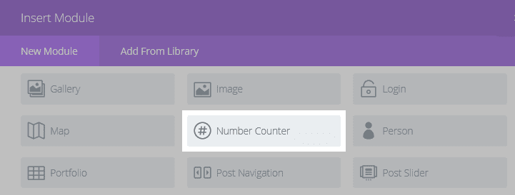
For the examples below, we’ll use the same three column setup, but we encourage you to change things up as you see fit. We also recommend styling the first module before copying it however many times you need. That way, you’ll only need to alter the text as appropriate.
Before we get to our styling section, here’s a quick look at the default Number Counter module:

As you can see, the default settings provide an almost blank slate for creating your own unique look – and you have plenty of customization options to do so.
Style #1: Add a Colored Background
Although this design looks vastly different to the default module, it takes surprisingly few steps to get here. This style showcases how simply changing colors and fonts can give you a striking, modern look:

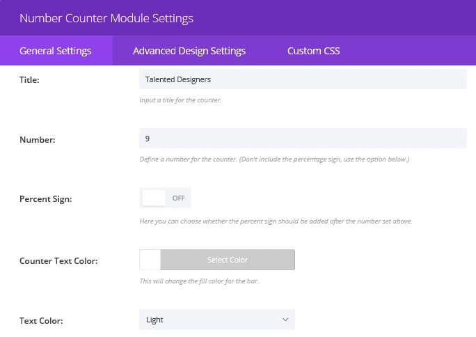
Firstly, navigate to the module’s General Settings tab, and enter your chosen Title and Number. We’re not displaying percentages, so switch the Percent Sign button to Off, change the Counter Text Color to white, and the Text Color to Light:
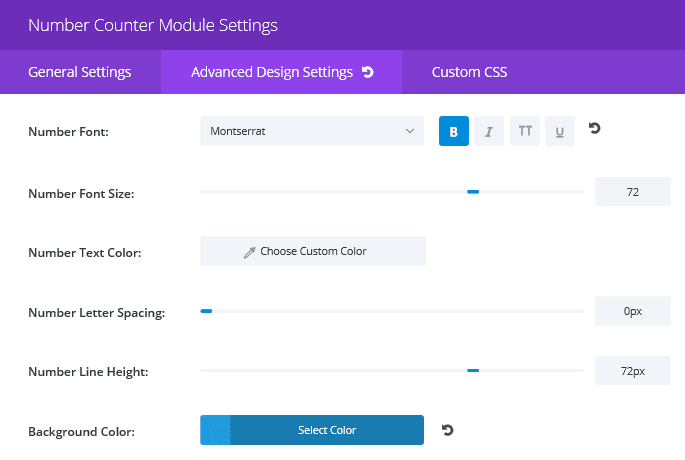
Then, switch to the Advanced Design Settings tab, change the Number Font to bold Monserrat, and the Background Color to #1f9bdd.
The last thing we need to change in this tab is the padding. Scroll to the bottom and, in the Custom Padding section, enter 15px for all four fields. Your first module is now complete! Now copy it however many times you need (three in our case) using the button in the Divi Builder…

…then drag and drop the copied modules to your empty columns. Change the numbers and titles in each, as appropriate, as well as the colors (the color we used in the second module is #1dd1c2, and the one in the third is #22c0f4).
Now all that’s left is to change the background color. For this, navigate to Section Module Settings > General Settings, where you can set the color (For ours we used #0044b2):

That’s it – you have your beautifully modern number counter ready for action! Now let’s add some other embellishments.
Style #2: Use a Background Image
For our second design, we’ve deviated a little further from the default by adding a background image. To ensure our title and numbers still stand out over the image, we’ve introduced an overlay effect for their backgrounds:

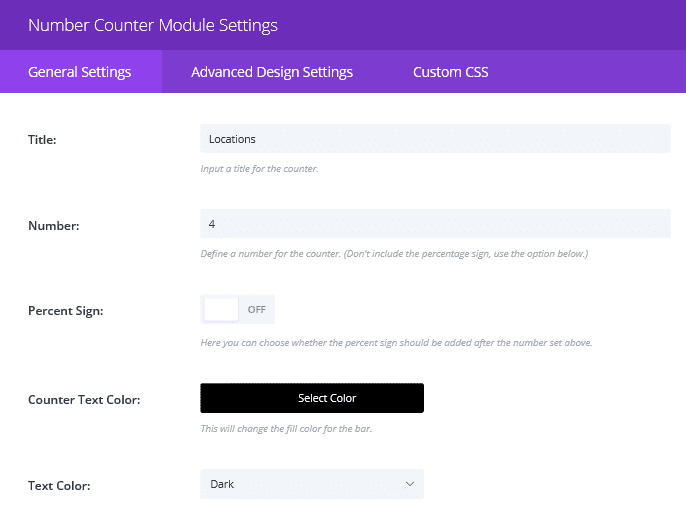
As we did before, head into the first module’s General Settings tab, enter your title and number, turn the percent sign off, change the Counter Text Color to black, and select Dark for the Text Color:
In the Advanced Design Settings tab change both the Title Font and Number Font to Lora, and make your Title Font italicized. For this look, we also wanted to add a translucent background so that the text stands out against the image. For this, we set the background color to rgba (255, 255, 255, 0.74). We also set the Custom Padding to 15px as we did earlier:
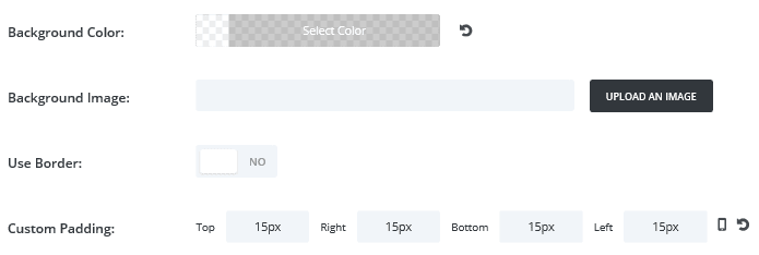
Now the first module is complete, copy it however many times you need, adjust the titles and numbers, then drag and drop them into your empty columns. All that’s left is to add our background image. In Section Module Settings > General Settings, click Upload Image:

Upload a file or select one from your media library, and there you have it – a striking number counter with an image background!
Style #3: Give Each Counter a Styled Border
For our last style we will introduce one more element that can be used to enhance your number counter’s styling – custom borders for each counter:

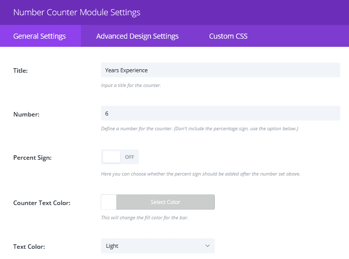
We’ll start once again by adding our Title and Number to the first module instance, and turning Percent Sign off. Then, we’ll change the Counter Text Color to white and the Text Color to Light:
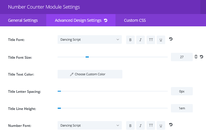
In the Advanced Design Settings tab, select a suitable Title Font and Number Font (we’ve chosen Dancing Script). We’ve also changed the Title Font Size to 27 for legibility:
Next, scroll almost to the bottom of the module and toggle the Use Border button to the Yes (i.e. blue) position. In the resulting options, make the Border Color white, set the Border Width to 4px, and change the Border Style to Double:
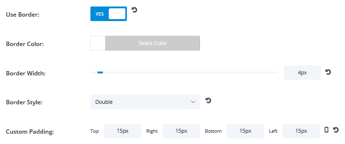
Finally, as before, set the padding for all sides to 15px. Now you’ve customized your borders, all that’s left is to add your background image in the section settings, in exactly the same way as we did in the second style.
Now you have three very different styles to choose from, to use as a base for your next Number Counter module creation!
Conclusion
A number counter is a fantastic way to provide key information about your business. Visitors can learn about your team, projects, clients – and more – at a glance. While the content of your number counter is key, it’s also important that its design is appealing and fits the overall look of your site.
In this article, we’ve introduced you to Divi’s Number Counter module and shown you how to style it in three different ways. All that’s left is for you to decide which facts you want to share, then get styling!
Do you have any questions about using the Number Counter module? Let us know in the comments section below, and don’t forget to subscribe so you can follow the conversation!
Article thumbnail image by james weston / shutterstock.com.


Placed a ticket about “comma issue,” response from support is “not designed to display commas”- So, I guess there is no intention to fix it. Poor choice in design.
I would avoid “Commas” for thousands since in most part of Europe we use the . (9.800 not 9,800 – for us 9,800 = 9,8 it is used for decimals)
So, at this point it’s better to keep it without . or ,
Maybe let the people choose?
And.. will it be possible to have a form (or a table) that does calculations? like an excel grid?
thanks and keep up the great work!
That’s an excellent point. As for your question, I’m afraid I don’t have an answer, but someone else in our forums (https://www.elegantthemes.com/forum/) might know!
Hi, I have set this up on our site but on iPads, but on the iPad mini only, it doesn’t show well, I wouldn’t want to disable it on tablets altogether, is there a different way to solve this? Thanks
That’s a good question, Sebastian. You may have to get your hands dirty with some CSS editing. 🙂 Or try asking around in our forums (https://www.elegantthemes.com/forum/) to see if another user has a solution.
It would be nice if we could specify a thousands-separator and/or decimals. Also being able to specify a symbol or icon before or after the number (eg. $ before, € after) would be helpful. The same goes for the circle counters, which should have the percentage ‘filled’ separate from the number shown in the circles.
Other than the above mentioned, I like the counters, though I’ve yet to find a use for them myself.
Great suggestions, Roland. If you have some ideas for a future version of Divi, try contacting us (https://www.elegantthemes.com/contact/) or posting in our forums (https://www.elegantthemes.com/forum/). Thanks!
Fantastic!
Thanks for all!
José Luis
You’re welcome, Jose! 🙂
How can I add currency sign like $, please suggest me.
Thanks in advance.
Hi Teena! Check out this resource for instructions on how to add a currency sign: https://tinyurl.com/zmbuaaz
I used to overlook this section in the module. Now with more light shed on it, I am persuaded to explore further 😉
Worthy info. Thanks.
Thanks James, we’re glad you found the information useful!
Does it support transition in responsive design. On different screen sizes.
Hi Sreejesh! Divi is fully responsive, and that includes all of its modules.
Thanks, thanks, thanks… lets try to change them just right now.
It’s a great module. Thanks for bringing it up 🙂
I can see in this post that this number is rendered with a comma.
How to add commas to big numbers using this module?
I want: “9,765”
What I get in Divi is: “9765”
Thank you,
Thanks Ashkan! If you enter a comma when you type the number into the module, it should show up when the number is displayed. 🙂 Check out this tutorial: https://www.elegantthemes.com/gallery/divi/documentation/number-counter/
Hey John! Thanks for the replies – any updates on the comma fix?
My numbers aren’t being truncated following commas, but commas still arent showing.
Thanks!
Doesn’t seem to be working at this time. Truncates the numbers right of the comma. If you put 17,000 counter outputs 17 17.000 displays 17
WP 4.7.2
Divi 3.0.33
What the tutorial shows, simply doesn’t work anymore.
I double that. Please fix, we need commas 🙂
Fix the million comma issue first please!!
I’m sorry Alex, I’m not sure what you mean. If you’re experiencing an issue, you can contact us using this form: https://www.elegantthemes.com/contact/. Or if you have a suggestion for a future version of Divi, feel free to post it in the forums (https://www.elegantthemes.com/forum/). Thanks!
Can the counters populate dynamically? or just a static number?
Hi Chris! The number counter is designed to show static numbers, such as company statistics or goals.
The counter was one of the features a client wanted to use and I installed it. The issue I have is the spacing between the number and the title under it is too much. I have yet found a way to fix that. Also, the numbers sometimes skip quickly from the first to the last number.
Hmm, those are some troubling issues. I’d recommend starting a post in our forums (https://www.elegantthemes.com/forum/) – another user may have found a way to resolve those problems. You may need to get your hands dirty with some CSS editing. 😉
It would be nice to have a text before this module. Example: Join more than (x clients) happy clients today!
That’s a good point, Andre. 🙂 If you have a suggestion, feel free to add it to our dedicated forum (https://www.elegantthemes.com/forum/). It’s read by Divi’s developers, and it may end up in a future version!
Andre, you can put a text module above each number counter module. Only thing is to play with font and margin.
Is there a way of setting get the counter to automatically increase by 1 each day. I manage a site where the ability to display ‘days since last emergency call’ would be excellent. I originally used thextensively counter and updated it manually but gave up after a while.
Many thanks
Great question, Tim! This counter module is designed to display static numbers. You may need to look into a plugin solution – Google will be your friend here. 🙂
John (or anyone),
Is their a way to have the numbers counter read external data? Numbers from post / product count or an external data source (google sheet) would be awesome. This way nobody would need to monitor the number counts, they would update themselves.
That’s a great question, Carmine! I’d like to know the answer to that myself. 🙂 Try creating a post in our forums (https://www.elegantthemes.com/forum/) to see if another user knows how to do it.
Is possible add some icons with the counters?
The Number Counter Module does not have an icon feature but you could easily pair it with an image module or a blurb module to add an icon.
John – any way to slow the counter down as it approached the final number? I was looking into it and would prefer not to load another library.
Hi Devin. I’m not sure how to slow the counter down, but try posting in our forums (https://www.elegantthemes.com/forum/). Someone else may know the answer!
Great info! How can I include a currency sign?$$$$$
Good question, Joe. Jim has provided an excellent solution! 🙂 For more info on how to do this, check out this article: http://goo.gl/3ByiwZ.
Add .dollar to number counter module css class
Add this to css in Divi options:
.dollar .percent-value:before { content:’$’;}
thanks for the article, is it possible to put only numbers in the bar modules?
Thanks for the question! If you simply leave the title field blank, your numbers should display without any text. Check out this tutorial for more info: https://www.elegantthemes.com/gallery/divi/documentation/number-counter/
Is it possible to make the module show a dollar amount instead of percentage?
Hello Eyal,
You definitely can! Check out this link (goo.gl/3ByiwZ). 🙂
Great stuff, I can see how it would be very useful. Now I need some awesome numbers to show off… umm…
Thanks Luke. I’m sure you’ll think of something. 😉