Welcome to part 3 of this 4 part series on how to develop a product review site using Extra. If you are racking your brain on how to get started with developing a product review site, this series is for you. With its built-in review functionality and smart post categorization, Extra is specially equipped to create great looking reviews, product post templates, mega menus, and category layouts in minutes. Join me as we explore the power of Extra.
In part 2 of this series we created our product review post template using Extra’s built-in settings and the Visual Builder. With the new post template, you were able to add additional posts and assign them to there respective categories.
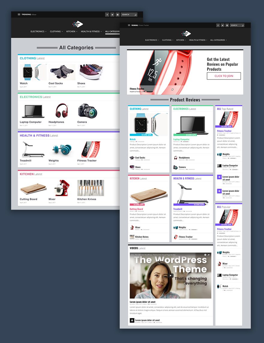
Today we are going to build two category layouts using Extra’s Category builder. The first layout will display the posts/product reviews on your homepage highlighting the most recent and popular reviews. The second layout will showcase all of the categories on one page using the carousel slider module. Once you have completed this tutorial, you will have a good foundation for a well-designed product review site.
Here is a Sneak Peek of What We Are Going to Build
Preparing the Design Elements
Since the category layouts largely depend on post content, make sure you get enough posts added so that you can get a feel for how the site will look once you add your own content. As discussed in part 2 of this series, my category layouts are populated with 4 categories and with 3 products in each category. I’m using stock images from shutterstock for the featured images of my posts.
To design the category layouts we will be using Extra’s Category Builder and a little Custom CSS.
Let’s get started.
Building a Product Review Site with Extra – Part 3
Subscribe To Our Youtube Channel
Building The Category Layout for the Homepage
By default, extra uses a category layout for the homepage. To create a custom layout, from the WordPress dashboard sidebar, go to Extra > Category Building. Find the category layout already there named “homepage” then hover over it and select edit.
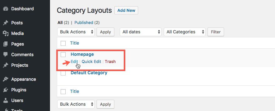
Next, click “Clear Layout” on the purple builder menu in order to erase the current default layout.
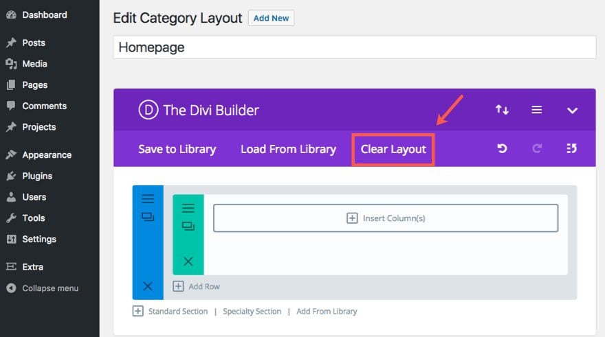
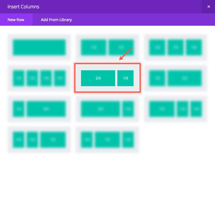
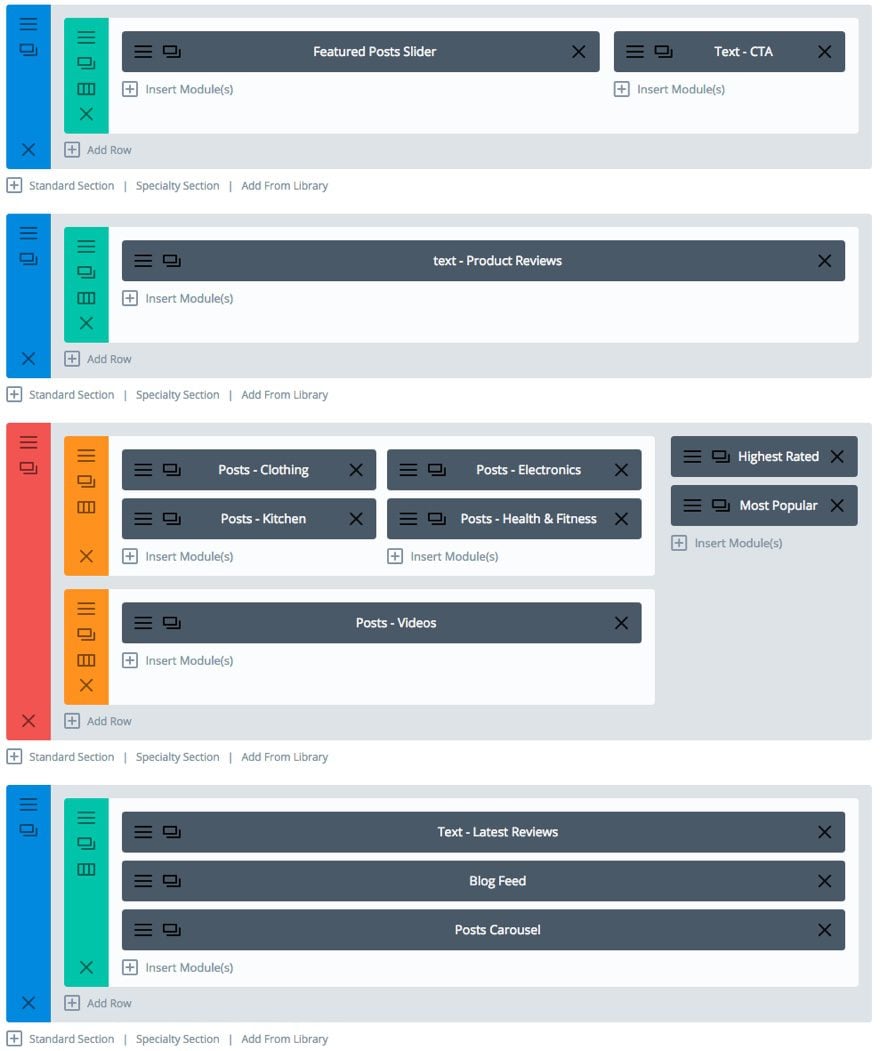
Now we can start building our custom layout. Begin by adding a two-thirds one-third column to the row in the standard section.
To the left (two-thirds) column, add a Featured Posts Slider.
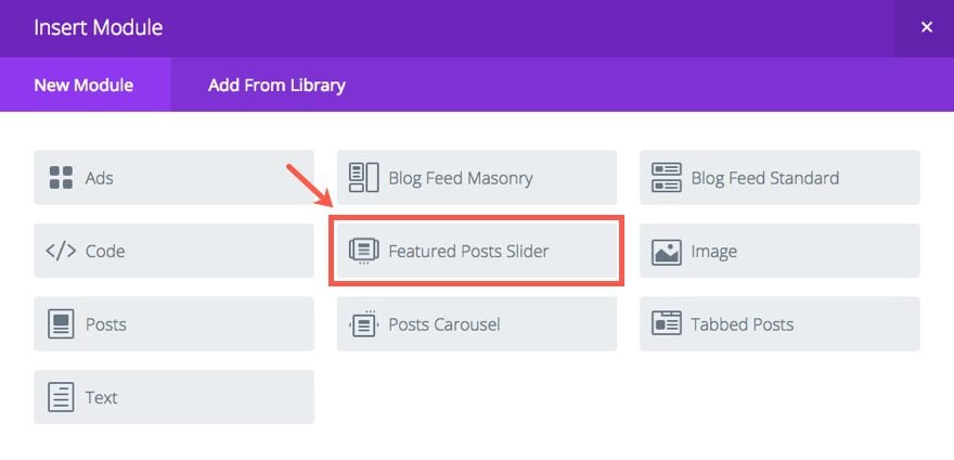
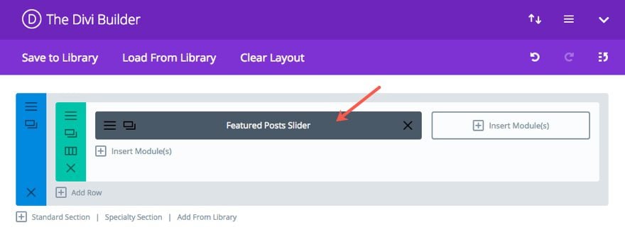
Update the Featured Posts Slider Module Settings as follows:
Under the Content Tab…
Categories: All
Display Featured Posts Only: [I would keep this off until you decide which posts you want to feature. You can designate a certain post as featured in the Extra Settings box in the post editor page.]
Show Author: OFF
Show Date: OFF
Under the Design Tab…
Nav Arrow Color: #ffffff
Nav Arrow Background: #000000
Caption Background: rgba(255,255,255,0.4)
Title Font-size: 24px
Title Text Color: #000000
Meta Font Size: 16px
Meta Text Color: #000000
Custom Margin: bottom 0px
Under the Advanced Tab…
Enter the following custom CSS in the Main Element text box:
border: none !important;
-webkit-box-shadow: none !important;
-moz-box-shadow: none !important;
box-shadow: none !important;
margin-bottom: 0px !important;
Save Settings
Now add a Text Module to the right (one-third) column and update the Text Module Settings as follows:
Under the Content Tab, add the following html to the text tab of the content box:
<h1>Get the Latest Reviews on Popular Products</h1>

<a class="join-cta" href="/reviews" target="_blank">Click to Join</a>
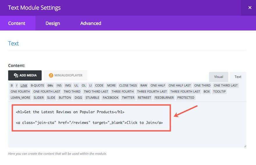
The link here is meant to serve as a mock CTA button. You can choose to use it however you want. Simply update the URL and the link text.
Tip: You could use Bloom to trigger an email optin popup box when clicking this CTA. That way visitors will be able to stay up today with products with your email marketing campaign. To do this you will need to install Bloom, add a popup form, and integrate your email provider. Then choose to display the popup when clicking the CSS selector “a.join-cta” which corresponds to the link class in the html code above.
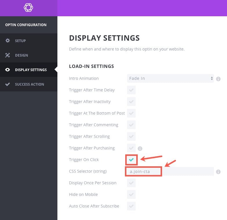
You can also read more on how to make the bloom optin form popup when clicking a button.
Now back to the Text Module Settings.
Under the Design Tab…
Text Font Size: 40px (desktop), 24px (tablet and smartphone)
Header Font Size: 42px (desktop), 38px (tablet), 28px (smartphone)
Custom Padding: 40px (top), 15px (right), 15px (bottom), 15px (left)
Save Settings
Now go to the Row Settings so we can style the background of the row.
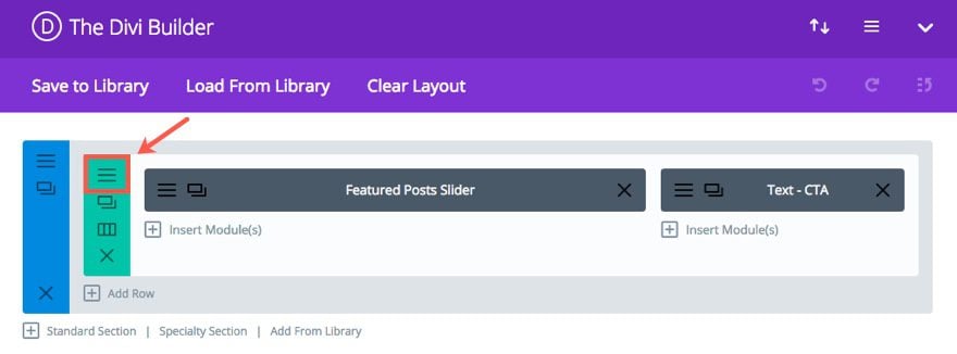
Then update the following:
Under the Content Tab…
Background: #ffffff
Under the Design Tab…
Make This Row Fullwidth: YES
Equalize Column Heights: YES
Under the Advanced Tab, add the following Custom CSS to the Main Element input box:
border-top: 10px solid #121212;
border-radius: 3px;
-webkit-box-shadow: -1px 0 2px 0 rgba(0,0,0,0.12), 1px 0 2px 0 rgba(0,0,0,0.12), 0 1px 1px 0 rgba(0,0,0,0.24);
-moz-box-shadow: -1px 0 2px 0 rgba(0,0,0,0.12), 1px 0 2px 0 rgba(0,0,0,0.12), 0 1px 1px 0 rgba(0,0,0,0.24);
box-shadow: -1px 0 2px 0 rgba(0,0,0,0.12), 1px 0 2px 0 rgba(0,0,0,0.12), 0 1px 1px 0 rgba(0,0,0,0.24);
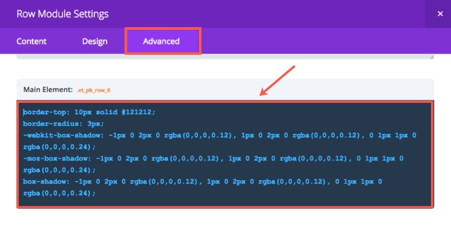
Save Settings
Check out your custom featured slider section now.
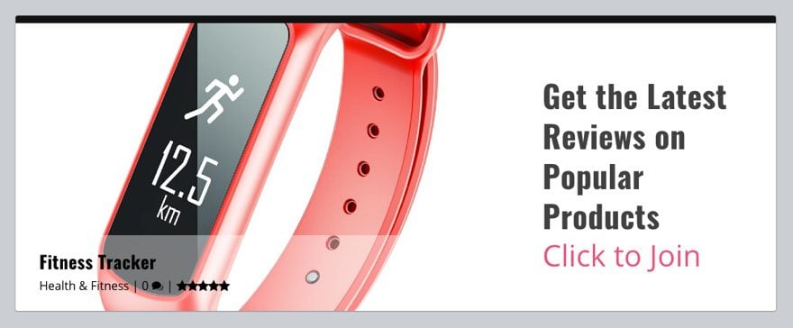
Looking good so far.
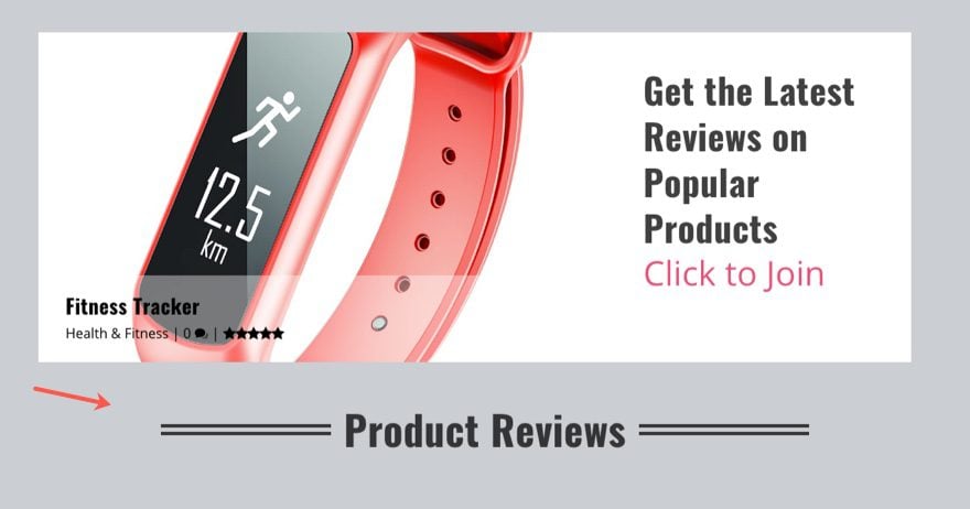
Let’s continue. Go back to the Category Builder and add a standard section below the current section and add a one-column row with a Text Module.
Then update the Text Module settings as follows:
Under the Content Tab, add this html headline in the text tab of the content box:
<h1 class="subtitle fancy"><span>Product Reviews</span></h1>
Under the Design Tab…
Text Orientation: Center
Header Font: B (bold)
Header Font Size: 48px (desktop), 42px (tablet), 36px (smartphone)
Save Settings
This will serve as the title of the section below which will display your product reviews.
Next add a Specialty Section with the following three-fourths one-fourth column structure:
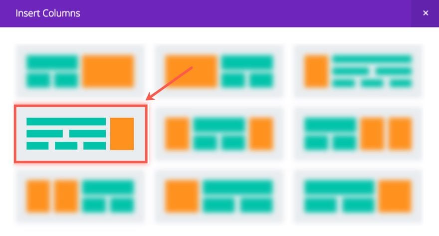
In the left (three-fourths) section, add a two column row.
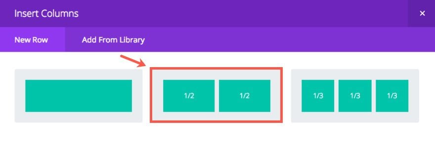
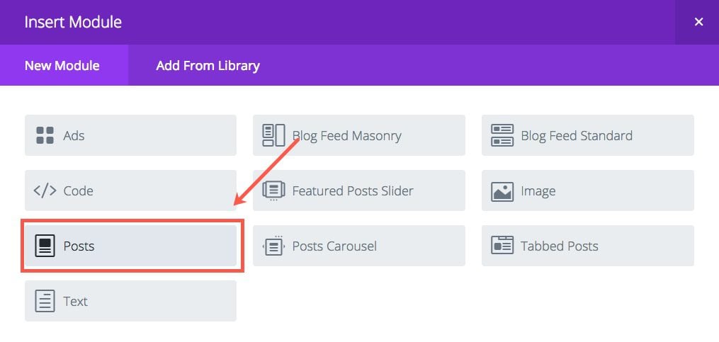
In the left column of that row, add a Posts Module
Then update the Posts Module Settings under the Content Tab by assigning a category to the module. This way the Posts Module will only show that Category. To do this, I’m going to select “Clothing” as my category.
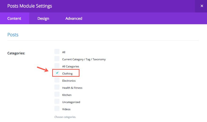
Then update the following:
Show Author: NO
Show Date: NO
Save Settings
Duplicate this Posts Module so that you have two posts modules stacked on the left column and 2 on the right.
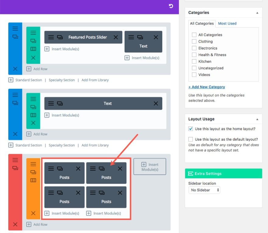
Then update the Settings in each module with a different category. The categories I have are Clothing, Electronics, Kitchen, and Health & Fitness.
If you want to add a Posts Module that displays video reviews, you can add that here. First you will need to add a new post category called Video, assign the category the color #222222. Then create a new post, select “Video” for the Format and add the Video URL to Extra’s built-in Video Format Options box.
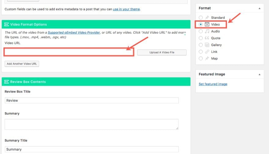
Then you can add your review box contents to display under the video.
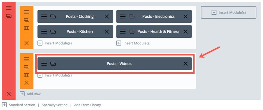
Once you have a few videos uploaded, make sure to add them to the Video category. Then go back to the Category Builder for your homepage and add a one-column row under the row containing your four posts modules. Then duplicate a Posts Module from the previous row and add to the new row. In the Posts Module Settings under the Content Tab, select the category “Video”. Now you have a posts module that will display videos.
On the right (sidebar) area of the specialty section we are going to add two more Posts Modules stacked on top of each other.
For the first one, update the Posts Module Settings to include “All” the categories. Then select the Sort Method “Highest Rated”.
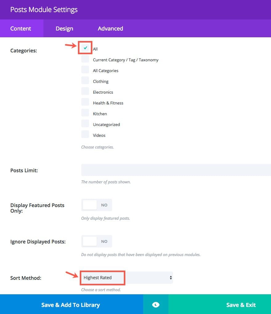
Duplicate that Posts Module so that another stacks under it. Then update the Sort Method on that one to “Most Popular”.

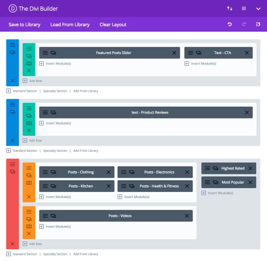
Go ahead and update the post to save your settings. Here is what the layout should look like so far.
Next duplicate (or copy) the second main section containing the Text Module with the title “Product Reviews”.
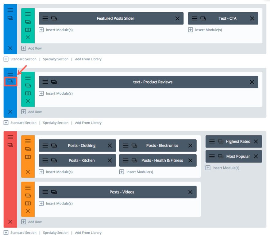
Then drag (or paste) the duplicated section under the specialty section. In the new section, update the Text Module Settings content with the following html:
<h2 class="subtitle fancy"><span>Latest Reviews</span></h2>
Save Settings
Next we are going to add a blog feed that displays all of the product reviews starting with the most recent.
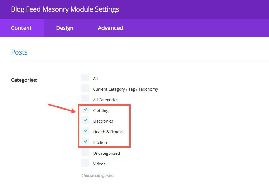
Under the Text Module you just updated, add a Blog Feed Masonry Module to the column. In the Blog Feed Masonry Module Settings, under the Content Tab, select all the categories you want to be displayed in the feed.
Save Settings
And finally, under the Blog Feed Masonry Module, add a Posts Carousel Module. Update the Posts Carousel Module Settings under the Content tab to include all categories and select YES to display featured posts only.
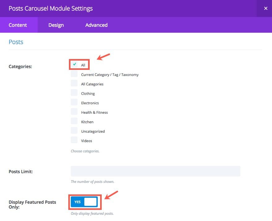
This carousel is meant to display only the posts you have selected as featured items when creating your product review posts.
Now let’s see what the final layout looks like.
Adding a Few Lines of Custom CSS
To bring the design together, we need to add a few lines of Custom CSS. Go to the Theme Customizer > Additional CSS and add the following at the top of the current CSS code already there:
.et_pb_extra_module, .posts-blog-feed-module.masonry .hentry {
box-shadow: -1px 0 2px 0 rgba(0,0,0,0.12), 1px 0 2px 0 rgba(0,0,0,0.12), 0 1px 1px 0 rgba(0,0,0,0.24);
border-top: 10px solid;
}
Then, inside the media query brackets set to a min width of 980px, add the following:
.join-cta {
display: block;
text-align: center;
border: 3px solid #333;
color: #333;
padding: 20px 15px;
text-transform: uppercase;
font-weight: 600;
font-size: 30px;
}
The first CSS snippet adds a slightly darker shadow and a higher top border, to the modules. The second customizes the “Join Now” button in the top section.
Well, that’s it for the Homepage category layout. Here is what the final result looks like:

In addition to the Homepage Category Layout, let’s add one more simple layout to display all our categories on one page.
Building the “All Categories” Layout
This layout is really simple to create now that you have all of your posts loaded, your categories set, and the theme styling in place. The purpose of this layout is to create a page that displays all of the categories and products on one page. This can be done many different ways, but with Extra, I wanted to take advantage of the posts carousel module to display the categories and posts in a layout similiar to what you would see on video streaming websites like Hulu and Netflix.
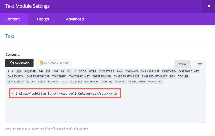
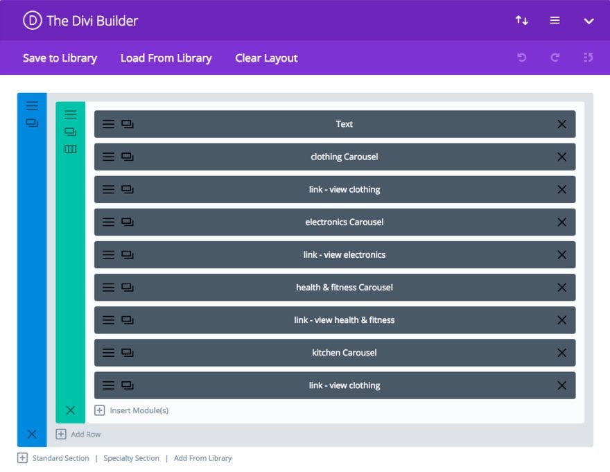
To add the layout, scroll to the top of your current category layout and select Add New. Using the Category builder add a one-column row to a standard section. Then add a Text Module to the Row. Update the Text Module Settings, under the Content Tab to include the following h1 tag in the content box:
<h1 class="subtitle fancy"><span>All Categories</span></h1>
Save Settings
Then add a Posts Carousel Module under the Text Module. In the Posts Carousel Module Settings, select Clothing as the Category.
Save Settings
Then add a Text Module under the Clothing category posts carousel. In the Text Module Settings, add the following link to the Content box under the Content tab:
<a href="/category/clothing">view all clothing reviews</a>
The URL and/or link text may need to change according to your site, but the idea is to link to the category page for that particular category in order to show all of the product reviews for that category.
Under the Design Tab, change the Text Orientation to “Right”.
Save Settings
To display the next three categories in the same manner, repeat the process of adding a Posts Carousel Module assigned to a specific category followed by a Text Modules containing a link to the corresponding category page.
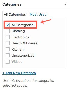
In the category box on the right of the builder, add a new category called “All Categories” and select it for this layout. That way whenever we link to the “All Categories” category page, this template will show.
The final layout should look like this when you are finished.
And here is what the category layout looks like on the site.
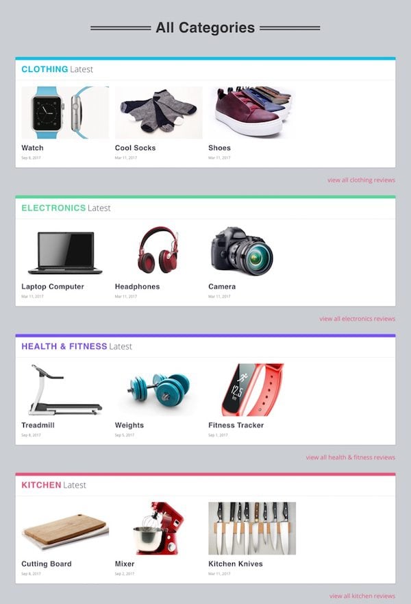
You can tell right now because we don’t have a lot of products added yet, but this will eventually function as a convenient way to shuffle through products for each category using the posts carousel slider module.
That’s it for today’s post. I hope you have enjoyed part 3 of this 4 part series on building a product review site with Extra.
I hope you aren’t getting tired yet, we have one last post to go in our series.
Coming Up
In the final post of our series, we will be customizing the header and navigation elements of our product review site. In addition to creating your menu, I will be showing you a cool way to assign colors to your menu links that correspond to the category colors throughout the site. I will also show you how to build mega menus with a few clicks.
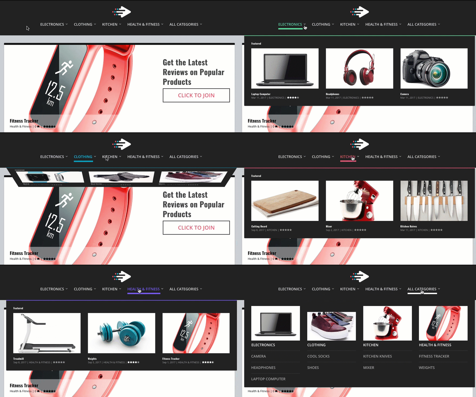
I look forward to building the last part of our website together.
As always, feel free submit comments below.





hello,
Can you provide the layout or templates files to import this review pages into extra?
Just curious. Is there a particular benefit to using Extra over Divi?
Im in process creating such a site in the Divi Theme … perhaps I should use Extra theme?
Thanks
I love the content! Keep it up!
i can not access some of the features including filtered posts and posts
There might be an issue with your updating your theme. Trying checking with our support team.
amazing .. looking forward for mega menu tutorial ..
It should be coming tomorrow. Thanks!
Stunning!
Amazing!