In my last post, I showed you how to style buttons using Divi’s background options interface by layering the button module over column and row backgrounds. Today, I’m going to show you how to design responsive clickable banners using Divi’s background options interface.
We are going to be using the same techniques as we did for the button backgrounds with a few minor tweaks. Basically I am going to show you how to create really large buttons and design them a little more like banners. The important factor here is that the entire surface area of the banner remains clickable. However, you should know from the start that we can only making simple banners using this method. Because we are limited by the button module’s text input, we can only create banners with one string of text. However, by utilizing the column background options we can create some pretty cool looking banners in no time using the Visual Builder.
There are a lot of advantages to using html banners (banners built using html elements) over image banners (banners built as a single image without any html elements). For html banners, the text is recognized by web browsers (essential for page translators and screenreaders). They scale with the size of browser windows so they always look crisp, unlike images which can get distorted or illegible. And perhaps my favorite aspect of using html banners over image banners is that html is really easy to change. I can change the text with a few keystrokes instead of searching the depths of my hard drive for an original file I will need to edit in a photo editor. And, I can quickly make another version of the banner to do a split test using Divi Leads.
This method of turning buttons into banners opens the door for some helpful applications like creating a customized featured post, category, or series for your blog (or podcast).
Let’s get started.
Sneak Peek
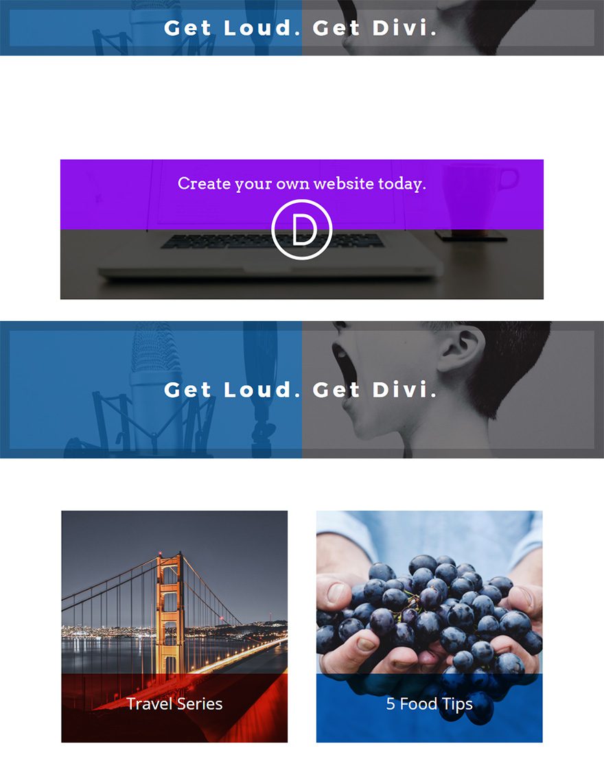
Before we officially get kicked off. Here is a sneak peek of the banners we will be building in this post.
Implementing the Design with Divi
Subscribe To Our Youtube Channel
Using the Visual Builder, add a regular section with one column and one row.
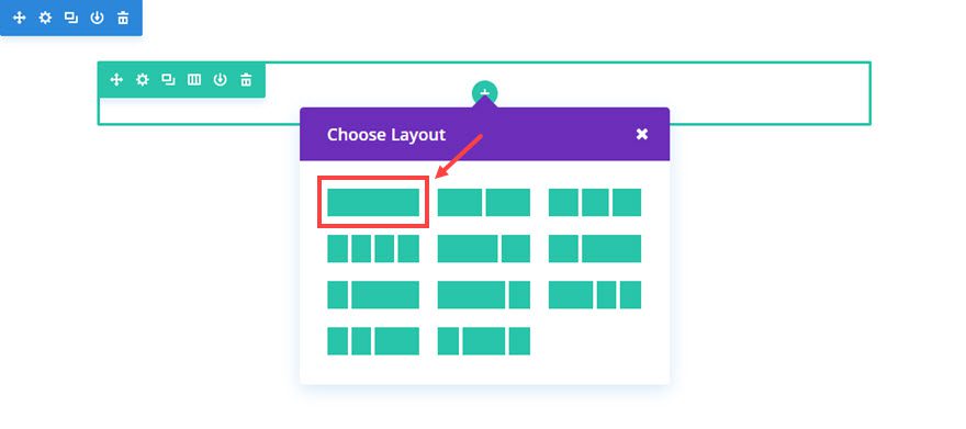
Next add a Button Module to the row.
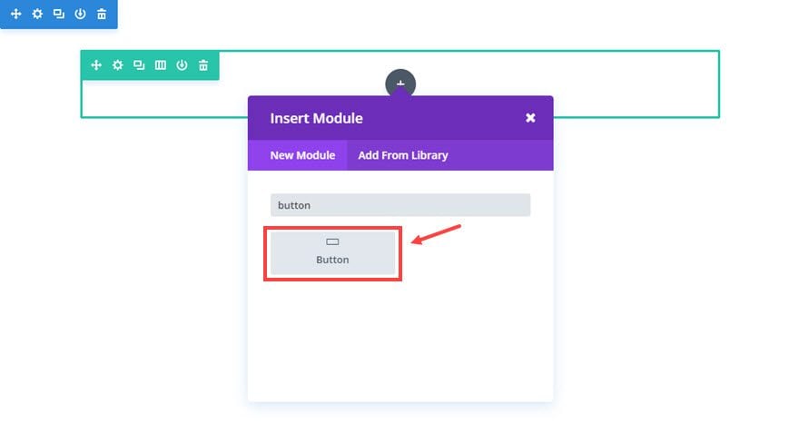
Then update the button module settings as follows:
Content Options
Button Text: [enter the text you want to use for your banner message]
Button URL: [enter URL]
Design Options
Button alignment: Center
Text Color: Light
Use Custom Styles for Button: YES
Button Text Size: 32px
Button Border Width: 0px
Button Font: Arvo
Button Icon: [add icon. I’m using the cursor icon]
Only Show Icon On Hover For Button: NO
Advanced Options
We need to set the width of the button to 100% in order to fill the width of the column. We also need to expand the height of our button to provide enough room for our banner content. To do this, enter the following custom CSS in the Main Element box:
 Width: 100%;
padding: 20px 0 200px;
Note: The custom padding here is the key to adjusting where you want the banner text to be displayed. Since the button alignment is already centered, all I need to do is adjust the text vertically. Therefore giving the button text a shorter padding at the top and a longer padding at the bottom will adjust the text toward the top of the banner.
Save settings
Things are still all white and invisible right now but that’s okay. We are going to add a background for the button module within the row and column settings.
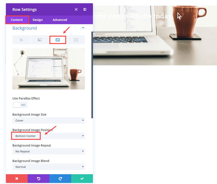
Go to the Row Settings that your button module is sitting in and update the following:
Content Options
Under background image tab
Background Image: [insert image]
Background Image Position: [use this option to adjust the image for your banner. I wanted the bottom of my image to show so I selected “Bottom Center”.]
Now scroll down a little to update the Column 1 background options.
Select the Column 1 Background Gradient tab and then click the gray circular button with a white plus symbol.
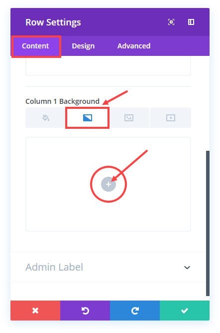
Update the following:
Background Gradient Colors: rgba(131,0,233,0.92), rgba(0,0,0,0.69)
Column Gradient Direction: 180deg
Column Start Position: 50%
Column End Position: 0%
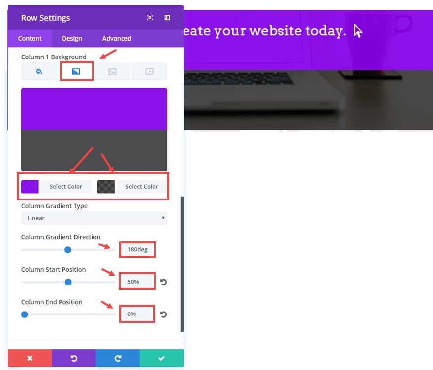
Save Settings
Next we are going to add a logo to the banner. Click the Background Image tab and update the following:
Column 1 background Image Size: Actual Size (my logo is a 120 x 120 png)
Column 1 Background Image Position: Center
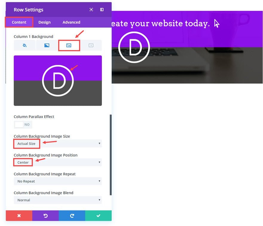
That’s it. Now you have a simple banner that is clickable and responsive. You can use the Button Module settings to add any hover effects you want to make the banner standout.

Let’s do another example.
Example #2: Simple Text Banner
For this next banner, let’s duplicate the entire section that holds the first banner you just designed. This will save some setup time.
Then go to the row settings and update the following:
Content Options
Background Image: [enter new image]
Background Image Position: Center
Column 1 Background Gradient Colors: rgba(0,0,0,0.41), rgba(12,113,195,0.66)
Column Gradient Direction: 270deg
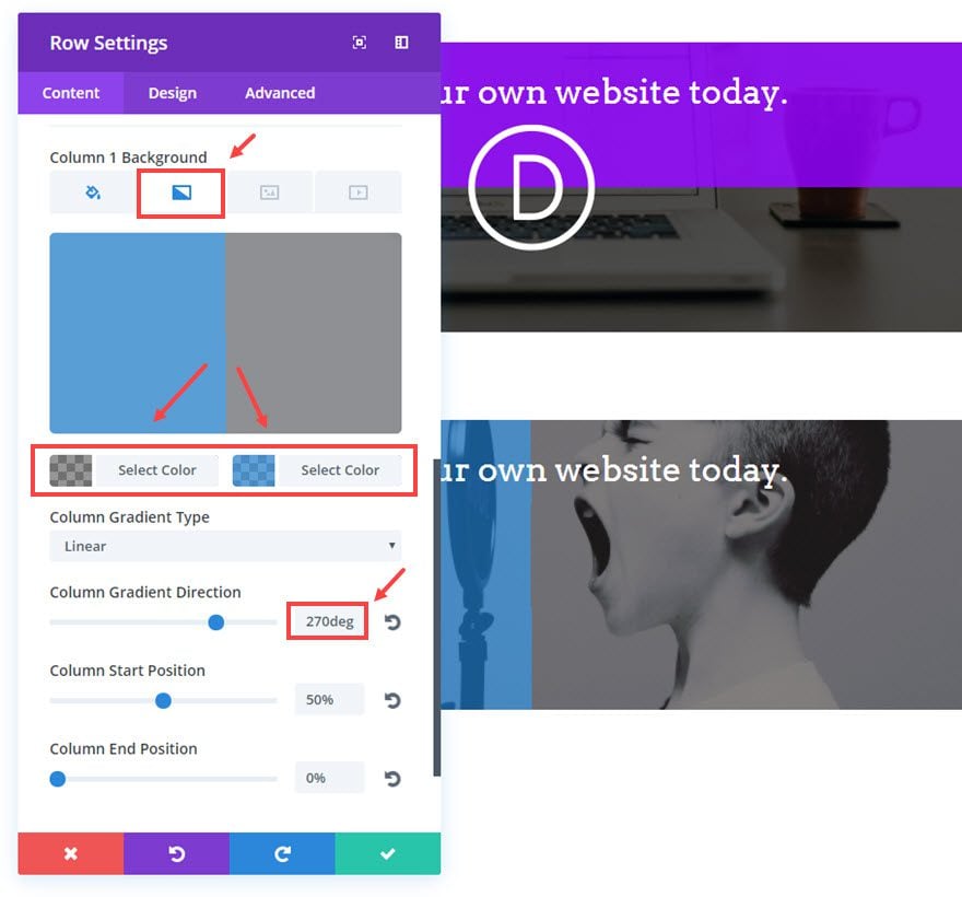
Next click on the column 1 background image tab and and delete the image/logo.
Save settings
Go to the Button Module Settings and update the following:
Content Options
Button Text: [enter text for your banner]
Button URL: [enter the URL for the banner]
Design Options
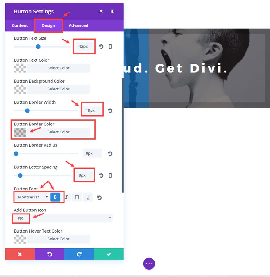
Button Text Size: 42px
Button Border Width: 19px
Button Border Color: rgba(0,0,0,0.17)
Button Letter Spacing: 8px
Button Font: Montserrat, Bold(B)
Add Button Icon: NO
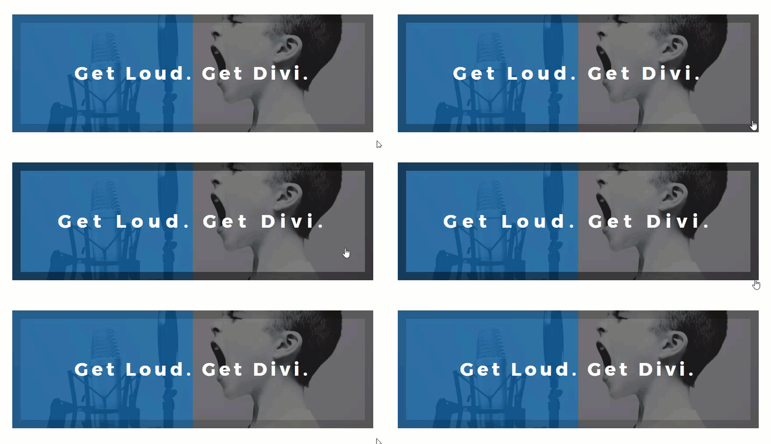
Button Hover Border Color: rgba(0,0,0,0.46)
Button Hover Border Radius: 0px
Button Hover Letter Spacing: 12px
As you can see, this example banner has a unique hover effect that changes the border color and increases the letter spacing:
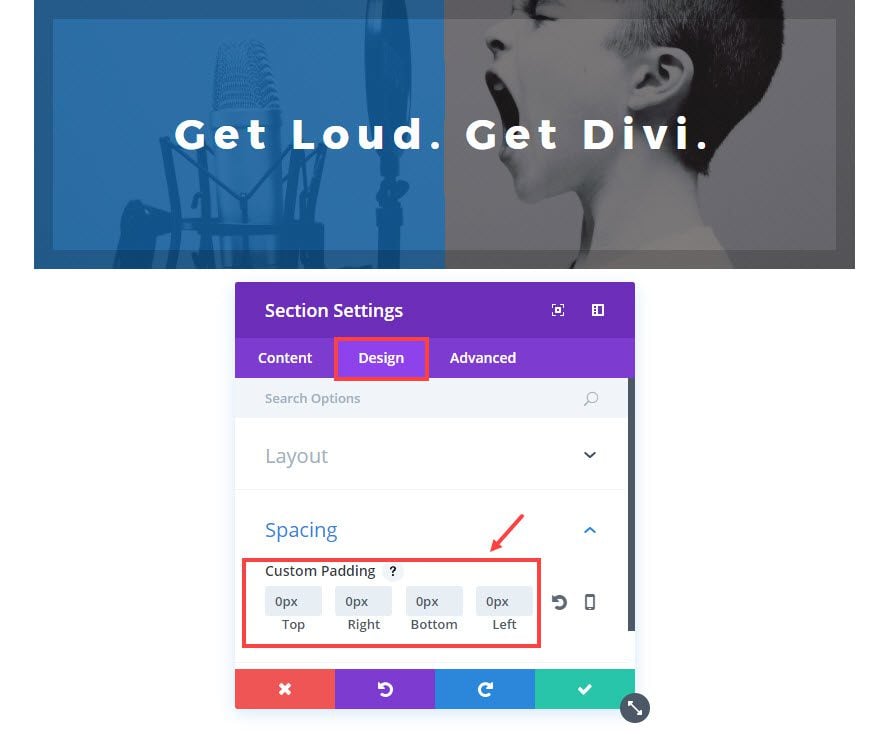
To make this banner fullwidth, all you have to do is update the Section Settings under the Design tab as follows:
Custom Padding: 0px Top, 0px Right, 0px Bottom, 0px Left
Save settings
Now go to the Row Settings and update the Design options as follows:
Make This Row Fullwidth: YES
Use Custom Gutter Width: YES
Gutter Width: 1
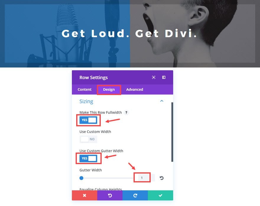
Now the banner stretches the fullwidth of the screen on all devices.
If you want you can easily make this banner fixed (sticky), and fix it at the top of your browser window. I would suggest decreasing the padding to make it a lot shorter so it doesn’t block too much of the window.
To decrease the height, Go to the Button Module Settings under the Advanced tab add the following CSS in the Main Element box:
padding: 0px 0px !important;
Now to make the entire section sticky, go to the Section Settings and update the Advanced tab Options with the following Custom CSS in the Main Element box:
position: fixed;
top: 0;
width: 100%;
z-index: 9999;
Now your entire section will stick to the top of the page and remain there when you scroll down the page.
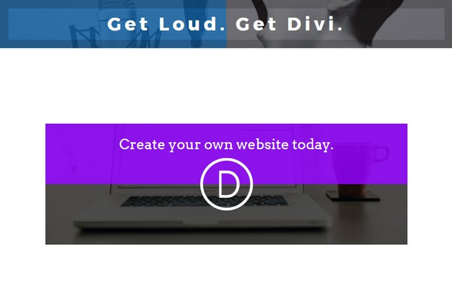
This kind of a banner would work well for promotional items on a landing page without a navigation bar, since the sticky banner would end up hiding the navigation bar.
You can also make banners on a multiple column row structure. This would be handy if you wanted to feature some items at the bottom of your page or blog.
Let’s give it a shot.
Add another regular section with a 1/2 1/2 column row structure.
 For sake of time, go ahead and copy or duplicate a button module we just created and paste or drag it into the first column.
To get the banner background design, we are going to use the column backgrounds in the Row Settings. Go to the Row Settings and update the following:
Content Options
Under the Background Image Tab
Column 1 Background: [enter background image]
Column 1 Background Image Position: [adjust the position of the image to your liking]
Column 1 Background Image Blend: Multiply
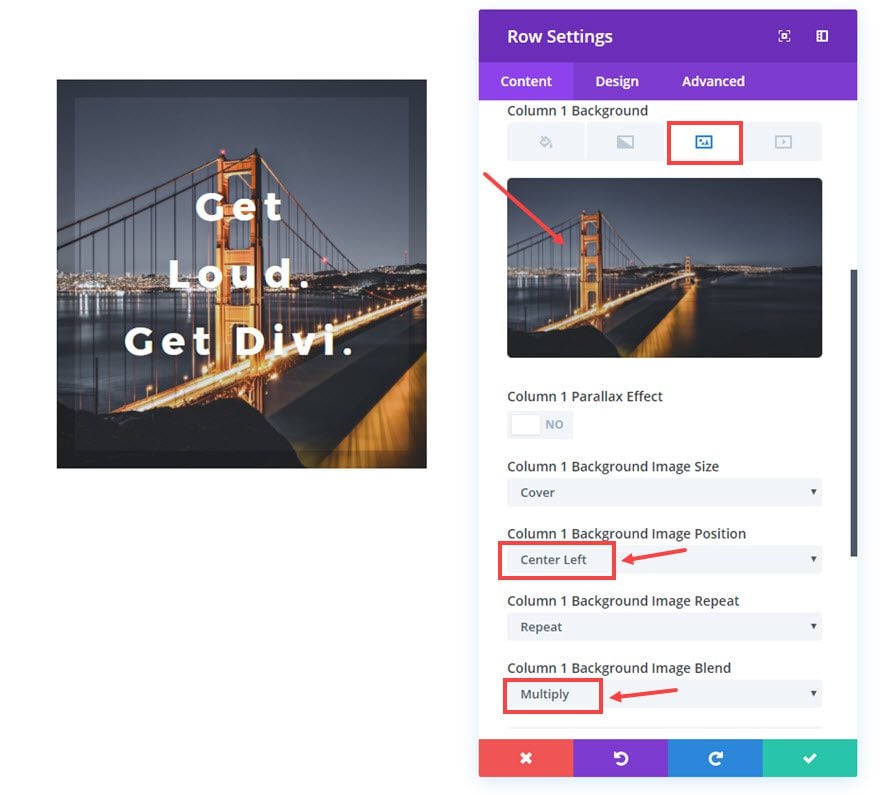
Under the Background Gradient Tab
Column 1 Gradient Colors: rgba(255,255,255,0), #e02b20
Column 1 Gradient Direction: 180deg
Column 1 Start Position: 70%
Column 1 End Position: 0%
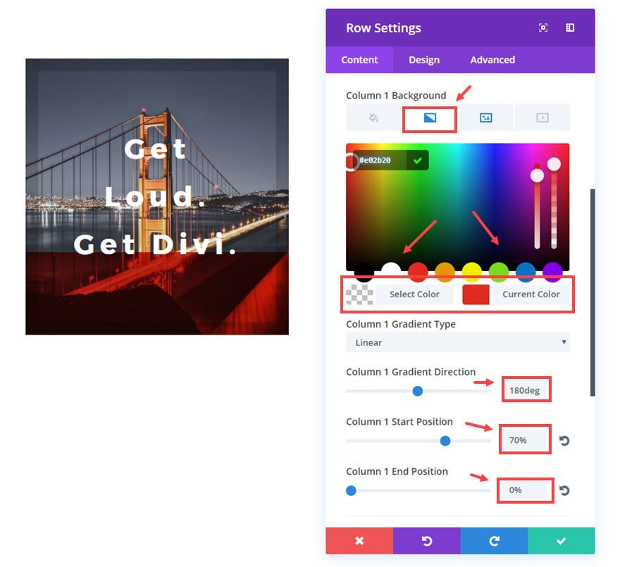
The last step is to update the Button Module Settings:
Content Options
Button Text: Travel Series
Design Options
Button Text Size: 32px
Button Border Width: 2px
Button Letter Spacing: 0px
Button Hover Border Color: #edf000
Button Hover Letter Spacing: 0px
Advanced Options
Custom CSS in the Main Element box:
padding: 350px 0px 50px;
width: 100%;
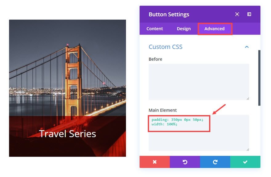
This custom css adjusts the padding of the Button module so that the text is at the bottom just behind the background gradient.
Feel free to duplicate this process for the banner in the next column and update the content however you want.
Check out the result.
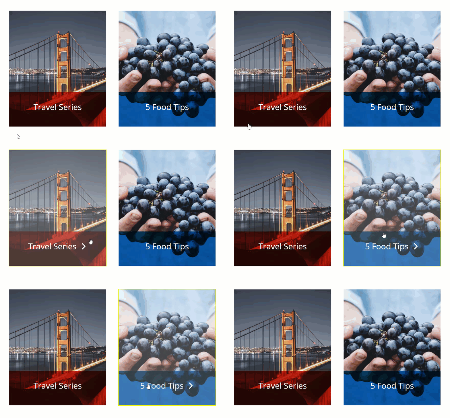
Note: I wouldn’t use the Equalize Column height when using this functionality. The column will stretch past the button module. If you want the banner heights to match perfectly, you may have to play around with the padding on the button module to get it right.
Responsive?
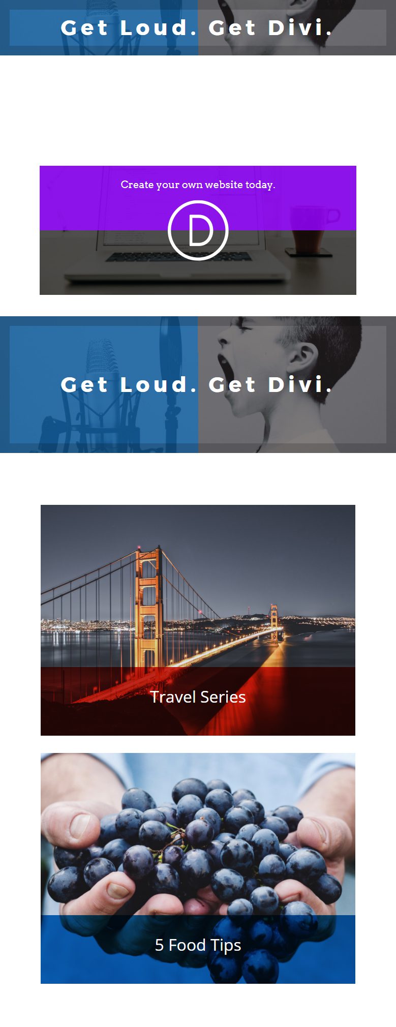
Yes. Because the buttons are built within the column structure of Divi, the buttons will respond nicely on all devices. For the horizontal banners, I would be careful about the placement of your logo and your text since they may overlap on mobile.
Here is an example of what these look like when scaling down to smaller screen sizes:
Browser Compatibility
Currently, the background-blend-mode CSS property is not supported by Internet Explorer or Edge and Safari has limited blending options. However the fallback is not considerable in my experience for most cases.
Final Thoughts
I hope you have enjoyed this small but useful design trick to create responsive banners. As long as you understand the limitations involved and keep it simple, you can create some pretty cool banners. Plus, this solution is both easily implemented and quickly customized.
And, I’m sure there are other useful applications for this. I look forward to hearing your ideas in the comments.
Cheers!



Hello, Is it possible? Or do you know how to do this with Divi? http://www.brevillecafequality.ca/
I want to be able to do what the background does but with different pictures.
I’ve tried several times now to re-create these boxes but they just never turn out the way they are shown on here. They look a mess and completely amateur. The boxes are not being responsive in multiple columns they defer to the different size of the text. The shading has a gap in it and the text won’t move to fit in the shaded area it remains in the same place? I am doing in in draft at the moment on a new landing page I’m trying to create…
Hello,
thank you for this tutorial.
But how to do when for multiple columns, the texts are different and the number of lines are not the same ?
Because it’s no more responsive
Thank you.
Thank you I’m in the process of redesigning my divi site and this is really great. 🙂 What size would you recommend an image be to render properly in the full width header? Thanks
Thank you so much. Will immediately try this on my site.
Thanks
Another great tutorial and love the designs on this. Look forward to trying them out – thanks again!
Thanks for sharing this amazing tips.. Let me try! 🙂
Thanks once again Jason for great tips using Divi.