Gradient types are part of the new Divi Gradient Builder. The new Divi gradient types give you the ability to add different shapes and colors to your backgrounds. In this post, we’ll compare these gradient types and show you how to use them to create unique backgrounds!
Let’s get started.
What Are Divi Gradient Types?
Divi’s new Gradient Builder adds several new gradient features that include gradient types. There are four gradient types to choose from:
- Linear
- Circular
- Elliptical
- Conical
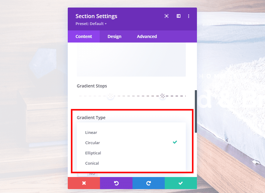
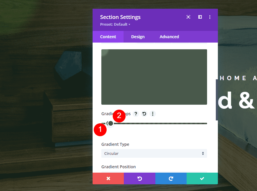
Each of the types displays the gradient differently. They’re used to shape the gradient to display as a linear color pattern, in a circle, an ellipse, or a cone. We’ll see these in detail in our examples.
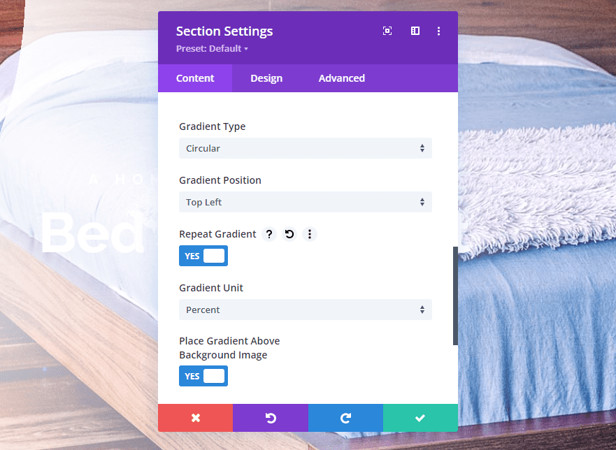
The gradient types are also affected by the other controls, such as the position, whether or not it repeats, the unit of measurement for the gradient slider bar, and placing the gradient above the background.

Every adjustment can have a small or huge impact on the gradient. The gradient can be subtle, or it can stand out. Small or large changes can be made with a single adjustment.
With this in mind, let’s look at a few examples of gradients using each of the gradient types. We’ll show three examples of each gradient type. The first will be a standard type of gradient you’d see across the web. The next two will be a little more experimental, just to see what can be done with the gradient types.
Gradient Types Examples
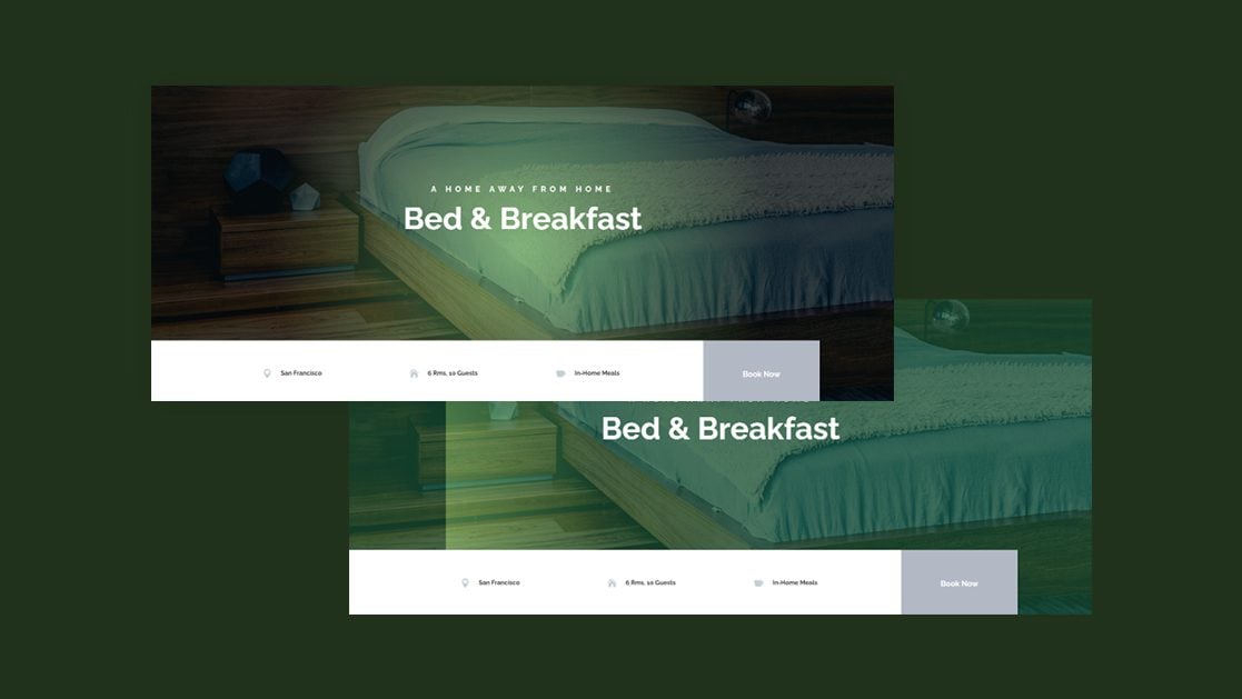
For the gradient type examples, I’m using the hero section from the landing page of the free Bed and Breakfast Layout Pack that’s available within Divi. This section already has a gradient, but we’ll replace it and do some experimenting. We can either delete the original background gradient or modify it. The results are the same. For simplicity, I’ll modify it.

I customized the title text, changing it from black to white.

Linear Gradient Type
Linear gradients display the gradient as if they were spread out across the page.
First Linear Gradient Example
Here’s a look at our first example. It displays a lighter color on the left of the screen and a darker color on the right, with a smooth transition between them.

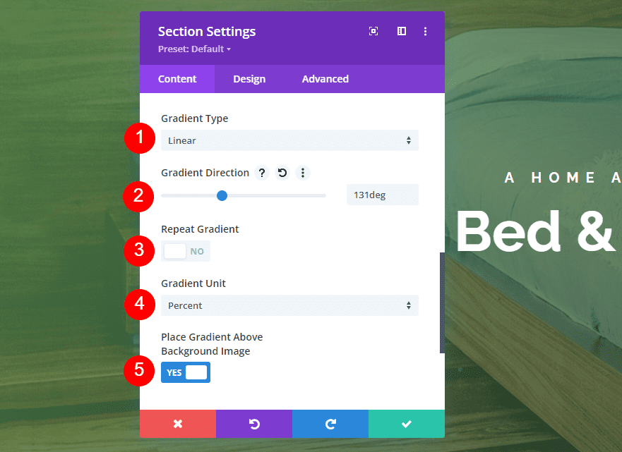
To create this example, add two colors. The first is rgba(92,158,82,0.76) at the 0% position. The second is rgba(0,10,4,0.76) at the 97% position.
- Color 1: rgba(92,158,82,0.76) (at 0% position)
- Color 2: rgba(0,10,4,0.76) (at 97% position)
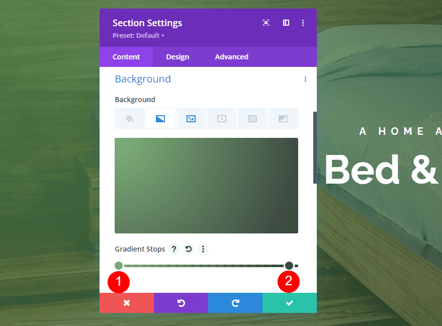
Next, change the Gradient Type to Linear and set the Direction to 131deg. Have it not repeat. Set the Unit to Percent. Place the gradient above the background image.
- Gradient Type: Linear
- Direction: 131deg
- Repeat: No
- Unit: Percent
- Place Gradient Above Background Image: Yes
Second Linear Gradient Example
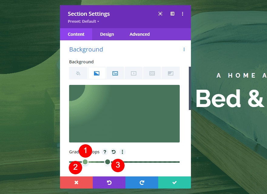
Here’s a look at the second linear gradient example. It works like the first one, but it has a hard stop on the left where a darker shade takes over.

To create this one, add three Gradient Stops. The first is rgba(18,76,41,0.76) at the 13% position. The second is rgba(92,158,82,0.76) at the 13% position. Color 3 is rgba(18,76,41,0.76) at the 34% position.
- Color 1: rgba(18,76,41,0.76) (at 13% position)
- Color 2: rgba(92,158,82,0.76) (at 13% position)
- Color 3: rgba(18,76,41,0.76) (at 34% position)
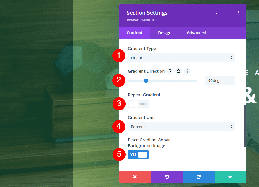
Next, set the Gradient Type to Linear and set the Direction to 90deg. Have it not repeat. Change the Unit to Percent. Place it above the background image.
- Gradient Type: Linear
- Direction: 90deg
- Repeat: No
- Unit: Percent
- Place Gradient Above Background Image: Yes
Third Linear Gradient Example
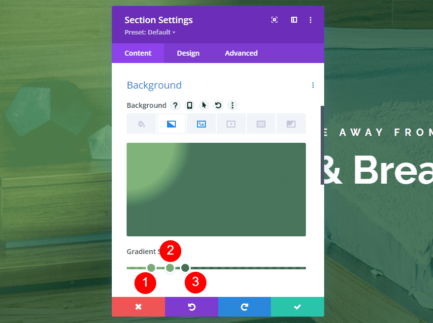
Our third example places a light line of color diagonally in the upper right corner, touching a darker line of color.

This one has three colors. Color 1 is rgba(92,158,82,0.76) at the 13% position. Color 2 is rgba(92,158,82,0.76) at the 23% position. The third Color is rgba(18,76,41,0.76) at the 32% position.
- Color 1: rgba(92,158,82,0.76) (at 13% position)
- Color 2: rgba(92,158,82,0.76) (at 23% position)
- Color 3: rgba(18,76,41,0.76) (at 32% position)
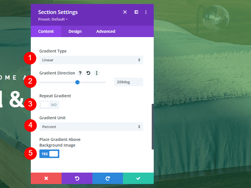
Set the Gradient Type to Linear at a Direction of 209deg. Have it not repeat and set the Unit to Percent. Place the gradient above the background image.
- Gradient Type: Linear
- Direction: 209deg
- Repeat: No
- Unit: Percent
- Place Gradient Above Background Image: Yes
Circular Gradient Type
The circular gradient type creates a circle with the colors.
First Circular Gradient Example
Our first circular gradient example places a light color in the center and a darker color around the edges.

This one has 2 colors. The first is rgba(92,158,82,0.76) at the 0% position. The second is rgba(0,10,4,0.76) at the 62% position.
- Color 1: rgba(92,158,82,0.76) (at 0% position)
- Color 2: rgba(0,10,4,0.76) (at 62% position)
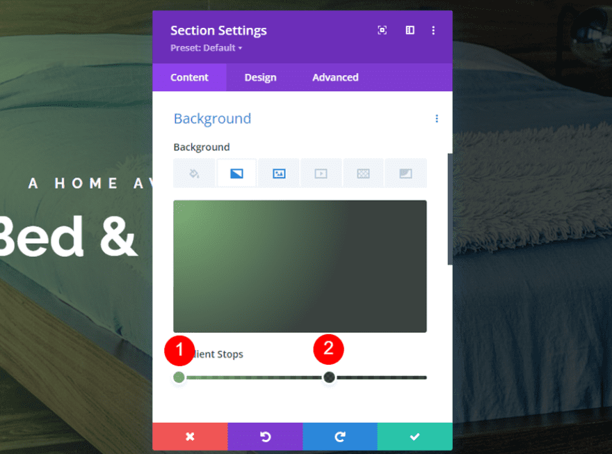
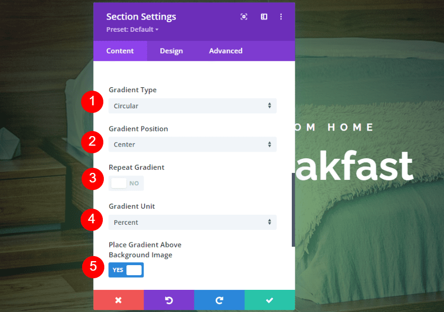
Set the Gradient Type to Circular. Center the direction. Have it not repeat, change the Unit to Percent, and place it above the background image.
- Gradient Type: Circular
- Direction: Center
- Repeat: No
- Unit: Percent
- Place Gradient Above Background Image: Yes
Second Circular Gradient Example
This gradient places a clear circular edge in the center of the screen.

It has four colors. Two colors are stacked. The first is rgba(18,76,41,0.76) at the 13% position. The second is rgba(92,158,82,0.76) at the 33% position. Color 3 is rgba(92,158,82,0.76) at the 51% position. Color 4 is rgba(18,76,41,0.76). It’s placed at the 51% position, above Color 3.
- Color 1: rgba(18,76,41,0.76) (at 13% position)
- Color 2: rgba(92,158,82,0.76) (at 33% position)
- Color 3: rgba(92,158,82,0.76) (at 51% position)
- Color 4: rgba(18,76,41,0.76) (at 51% position)
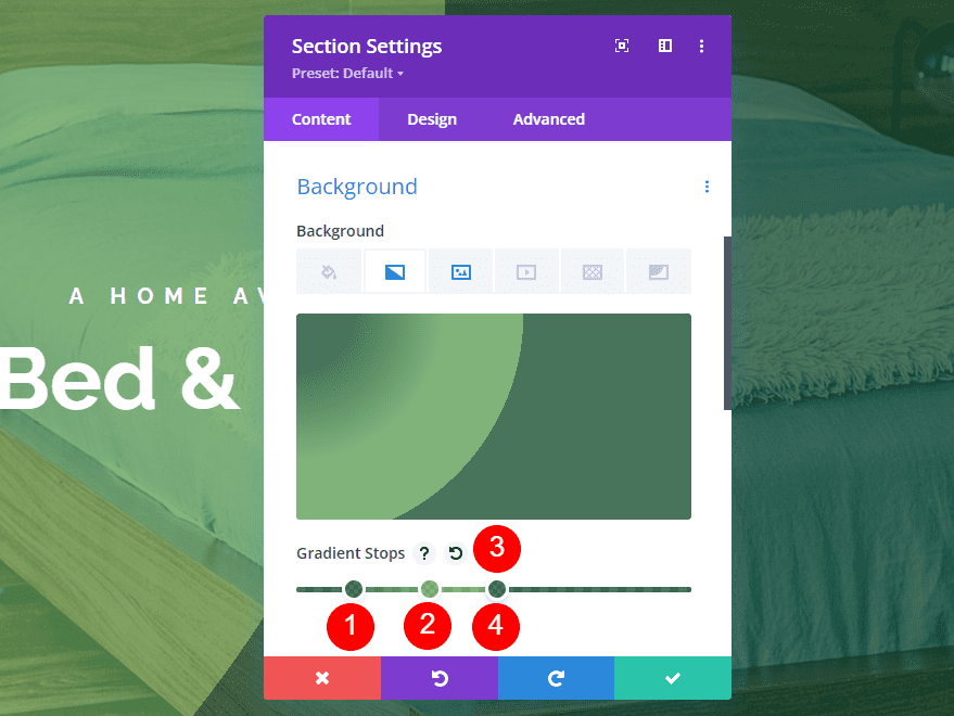
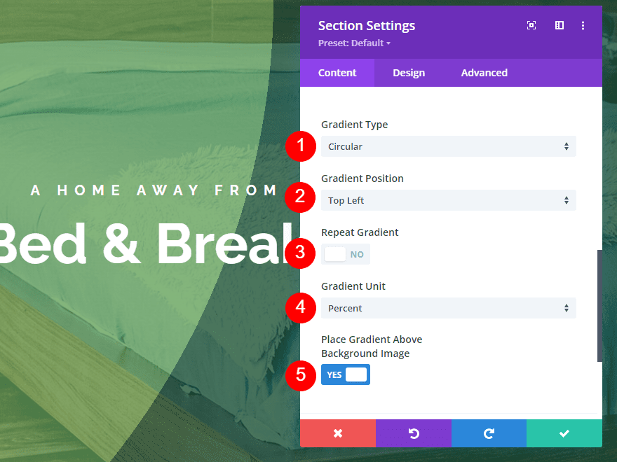
Set the Gradient Type to Circular and place the Direction at the Top Left. Have it not repeat, change the Unit to Percent, and place it above the background image.
- Gradient Type: Circular
- Direction: Top Left
- Repeat: No
- Unit: Percent
- Place Gradient Above Background Image: Yes
Third Circular Gradient Example
This example places several light circles within the darker color, starting in the middle of the circle.

This one also stacks two colors in a certain order to get this design. The first color is rgba(18,76,41,0.76) at the 13% position. Color 2 is rgba(18,76,41,0.76) at the 44% position. The third color stacks on top of the second color. It’s rgba(92,158,82,0.76) at the 44% position. Color 4 is rgba(92,158,82,0.76) at the 51% position.
- Color 1: rgba(18,76,41,0.76) (at 13% position)
- Color 2: rgba(18,76,41,0.76) (at 44% position)
- Color 3: rgba(92,158,82,0.76) (at 44% position)
- Color 4: rgba(92,158,82,0.76) (at 51% position)
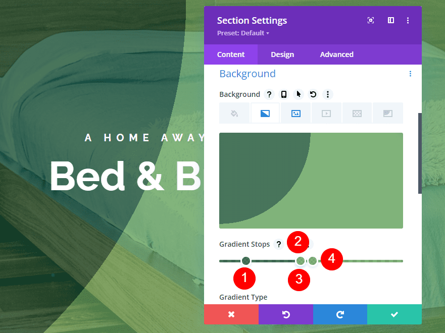
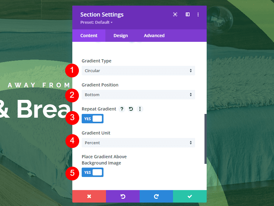
Change the Gradient Type to Circular. Place the Direction at the Bottom. Have this one to Repeat. Set the Unit to Percent and place the gradient above the background image.
- Gradient Type: Circular
- Direction: Bottom
- Repeat: Yes
- Unit: Percent
- Place Gradient Above Background Image: Yes
Elliptical Gradient Type
Elliptical gradients place the colors in an ellipse shape.
First Elliptical Gradient Example
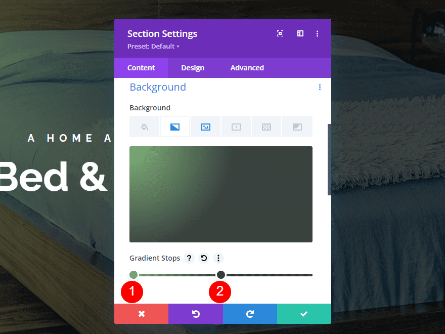
Our first elliptical example places an ellipse with a light color in the center of the screen with darker color around it.

This one has two colors. The first is rgba(92,158,82,0.76) at the 0% position. The second is rgba(0,10,4,0.76) at the 50% position.
- Color 1: rgba(92,158,82,0.76) (at 0% position)
- Color 2: rgba(0,10,4,0.76) (at 50% position)
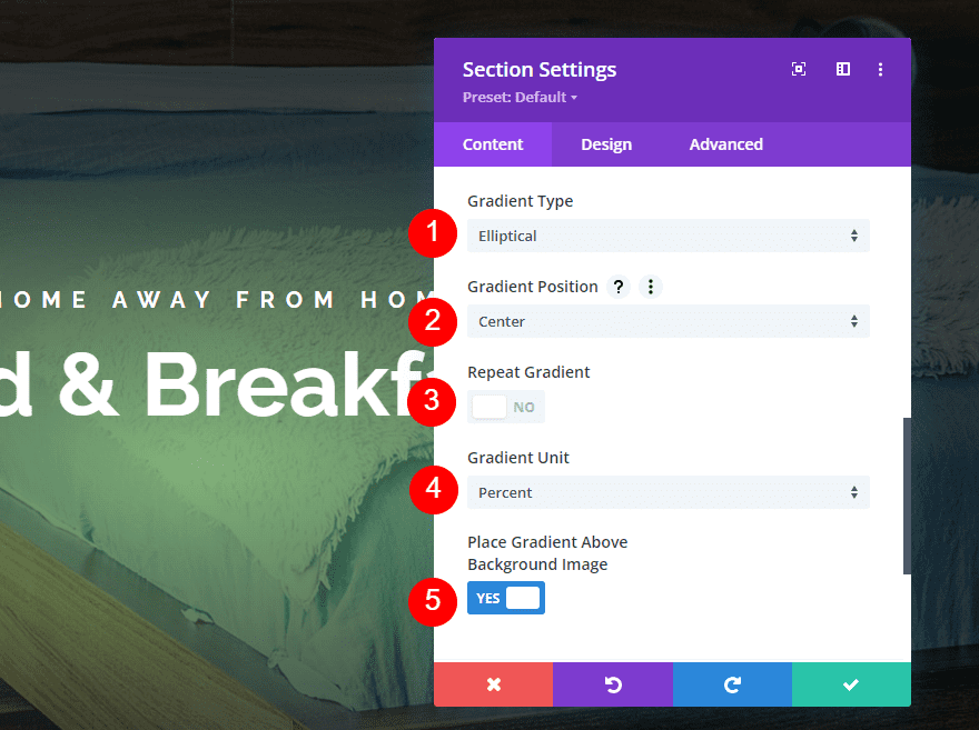
Change the Gradient Type to Elliptical. Set the Direction to Center. Have this one not repeat, set the Unit to Percent, and place it above the background image.
- Gradient Type: Elliptical
- Direction: Center
- Repeat: No
- Unit: Percent
- Place Gradient Above Background Image: Yes
Second Elliptical Gradient Example
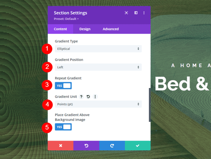
Our second example places lots of fine circular lines throughout the gradient.

It has two colors. The first is rgba(92,158,82,0.76) at the 34pt position. The second is rgba(0,10,4,0.76) at the 39pt position.
- Color 1: rgba(92,158,82,0.76) (at 34pt position)
- Color 2: rgba(0,10,4,0.76) (at 39pt position)

Change the Gradient Type to Elliptical and set the Direction to Left. Have this one to repeat. Change the Unit to Points. Place it above the background image.
- Gradient Type: Elliptical
- Direction: Left
- Repeat: Yes
- Unit: Points
- Place Gradient Above Background Image: Yes
Third Elliptical Gradient Example
Our third example places lots of half circles within the gradient.
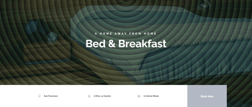
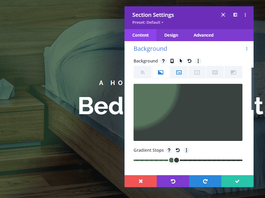
This one has two colors. The first is rgba(32,68,35,0.73) at the 34vmin position. The second is rgba(0,10,4,0.76) at the 39vmin position.
- Color 1: rgba(32,68,35,0.73) (at 34vmin position)
- Color 2: rgba(0,10,4,0.76) (at 39vmin position)
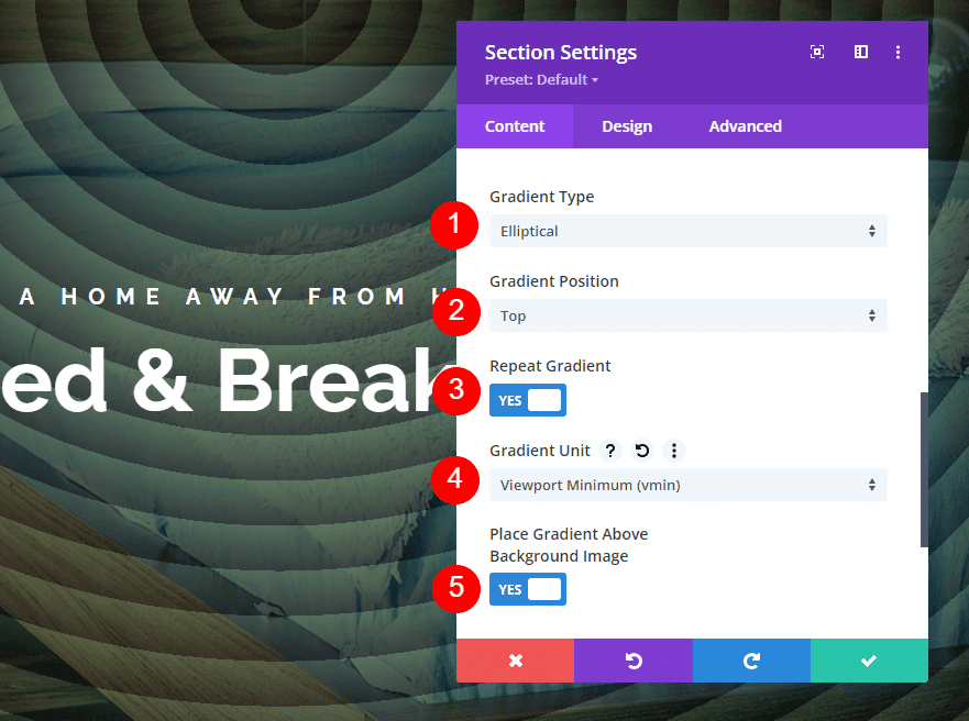
Change the Gradient Type to Elliptical and set the Direction to Top. Have this one to repeat. Change the Unit to Viewport Minimum. Place it above the background image.
- Gradient Type: Elliptical
- Direction: Top
- Repeat: Yes
- Unit: Viewport Minimum
- Place Gradient Above Background Image: Yes
Conical Gradient Type
The conical gradient type displays the gradient in a cone shape as if the cone is seen from above.
First Conical Gradient Example
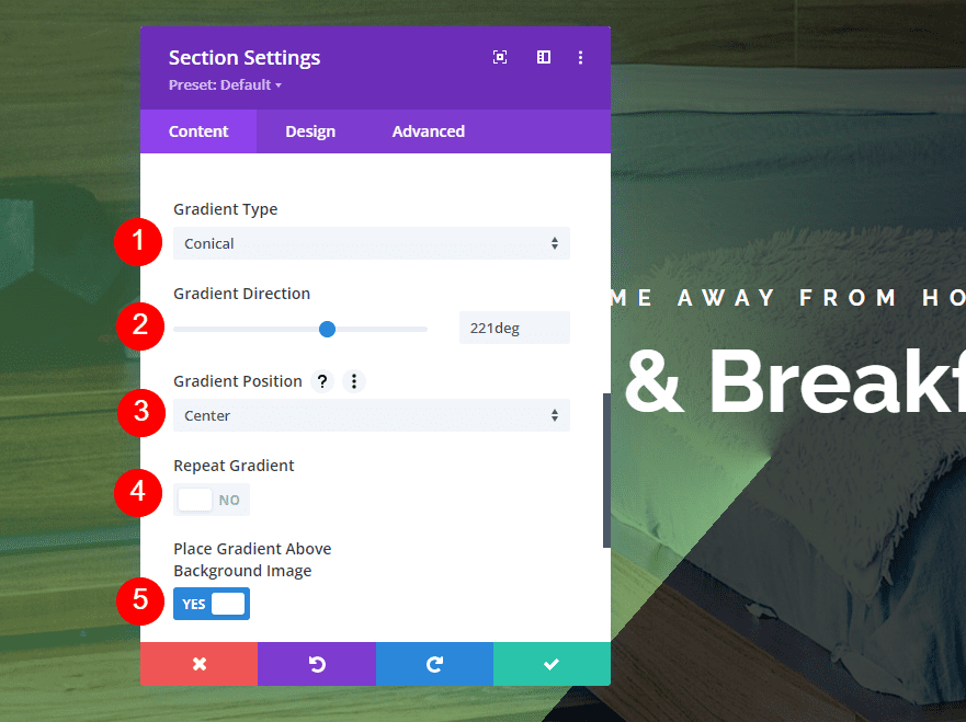
This example places a diagonal line from the center of the gradient to the left with a light color on one side and dark color on the other.

It has two colors. The first is rgba(92,158,82,0.76) at the 0% position. The second is rgba(0,10,4,0.76) at the 50% position.
- Color 1: rgba(92,158,82,0.76) (at 0% position)
- Color 2: rgba(0,10,4,0.76) (at 50% position)
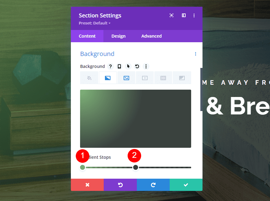
Change the Gradient Type to Conical. Set the Direction to 221deg. Center the Position and have it not repeat. Place the gradient above the image.
- Gradient Type: Conical
- Direction: 221deg
- Position: Center
- Repeat: No
- Place Gradient Above Background Image: Yes
Second Conical Gradient Example
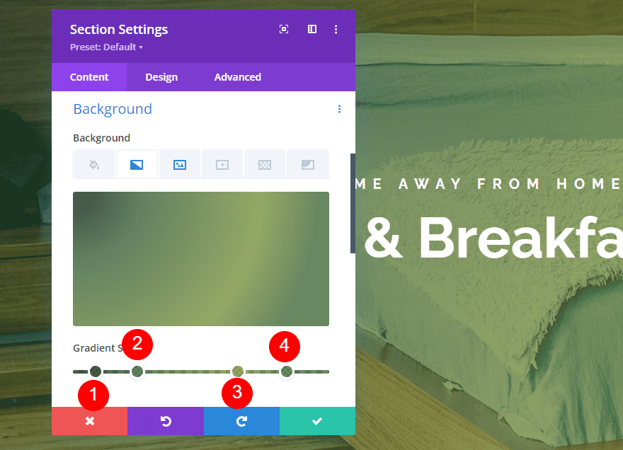
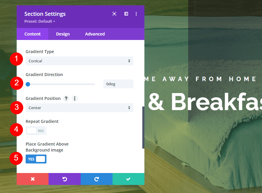
This example is similar to the previous one, but it places the line from the center upward.

This one has four colors. The first is rgba(20,40,20,0.76) at the 7% position. Color 2 is rgba(30,73,25,0.68) at the 24% position. Color 3 is rgba(103,132,30,0.68) at the 65% position. The fourth color is rgba(38,86,26,0.68) at the 85% position.
- Color 1: rgba(20,40,20,0.76) (at 7% position)
- Color 2: rgba(30,73,25,0.68) (at 24% position)
- Color 3: rgba(103,132,30,0.68) (at 65% position)
- Color 4: rgba(38,86,26,0.68) (at 85% position)
Set the Gradient Type to conical and the Direction at 0deg. Center the Position. Have it not repeat and place it above the image.
- Gradient Type: Conical
- Direction: 0deg
- Position: Center
- Repeat: No
- Place Gradient Above Background Image: Yes
Third Conical Gradient Example
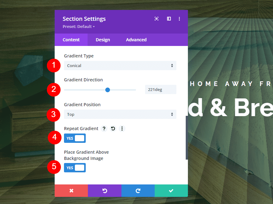
Our last example places a burst of lines from the top center of the gradient outward in all directions.

This one has two colors. The first is rgba(30,73,25,0.68) at the 5deg position. The second is rgba(20,40,20,0.76) at the 7deg position.
- Color 1: rgba(30,73,25,0.68) (at 5deg position)
- Color 2: rgba(20,40,20,0.76) (at 7deg position)
Set eth Gradient Type to Conical and the Direction to 221deg. Place the Position at the Top. Have this one repeat and place it above the background image.
- Gradient Type: Conical
- Direction: 221deg
- Position: Top
- Repeat: Yes
- Place Gradient Above Background Image: Yes
Ending Thoughts
That’s our look at comparing the gradient types in Divi’s Gradient Builder. As you can see in these examples the settings are simple, but any one of them can make a major difference in the gradient’s design. For the best results, try the gradient types with different directions and positions, and enable or disable the repeat option to see what you can create.
We want to hear from you. Have you used the different gradient types in Divi Gradient Builder? Let us know about your experience in the comments.






you have give us some informative knowledge about divi.. I am thinking to buy this theme for education webiste. is that best for education blog?
It is. Divi has also premade layouts related to schools and education. Check this link to view the demos, https://www.elegantthemes.com/layouts/category/education.
आपने बहुत अच्छी पोस्ट लिखी है धन्यवाद
I appreciate the effort, but I think this article would have been a lot better if the examples looked at least halfway decent. These dark green gradients are such a turn-off, who thought they look “inviting”? 🙁
Thanks For This Article Its helpful
Thanks for the article Randy, I have always had problems finding examples of the use of the gradient in DIVI and you have solved them for me. The only problem I see with DIVI compared to other builders is that they seem to take longer to load. I hope DIVI optimize that more in the future. All the best!
Thanks for the article Randy, I have always had problems finding examples of the use of the gradient in DIVI and you have solved them for me thank very very much for this update,you indeed deserve an award.
hi thank you for sharing the wonderful information and make my day good with your blog