Given how little time is actually spent reading your content, a marketing one sheet could be the key to increased sales. It’s a single page designed to sell your product or service to the reader. It can be printed and distributed, sent via email, or featured on your website. Creating the perfect marketing one sheet involves finding the right balance between capturing the reader’s attention, and providing them with enough information to compel them to take action.
This article will explain what a marketing one sheet is, and its benefits. We’ll then provide five tips for creating a powerful one sheet of your own. We’ll also tell you exactly how Divi’s functionality can help you along the way.
What a ‘Marketing One Sheet’ Is (and Why You’d Want to Create One)
A marketing one sheet, also referred to as a one-pager or a sell sheet, is a single page that provides information about your company or a particular product or service. One sheets are widely used as an important piece of marketing material. They are often printed and distributed during sales meetings or trade shows, and might also be sent in an email. One sheets offer more information than a brief product description, but shouldn’t require a lot of time commitment from the reader.
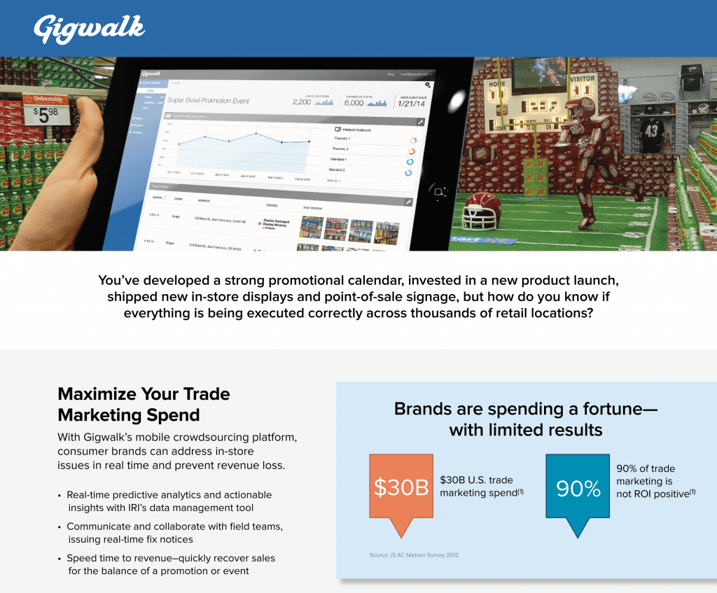
The main section of a one sheet for a workforce management platform
There are some great landing page plugins that make it easy to create a marketing one sheet in WordPress. Designing your marketing one sheet in Divi makes sense for several reasons. Firstly, creating a one sheet is similar to designing any page on your website. With the practically endless customization options that Divi has to offer, you can be confident in creating the perfect page. Additionally, you can use the same Divi elements here as those throughout your site, making for an easier design process and a more cohesive brand image.
Finally, there are lots of similarities between a marketing one sheet and a sales page. You could simply feature your one sheet on your site, or make some simple tweaks (if needed) to convert it into a sales page. Likewise, if you already have a sales page, it can also become the basis for your one sheet.
5 Tips for Creating a Powerful Marketing One Sheet in Divi
Now that you know why you should create a one sheet in Divi, it’s time to find out how. You can use these five tips to create a powerful marketing one sheet to promote your company, product, or service. Let’s take a look!
1. Create a Fantastic Headline
Your headline is the first thing readers see, and is key to drawing them in. As is the case with any piece of content you create, your headline simply must compel the viewer to continue reading. The fact that 80% of readers never make it past the headline highlights the importance of a stellar first impression.
Let’s take a look at a headline done right. This one is featured at the top of a marketing one sheet for an accountant and attorney firm. The image, which is relevant to the headline, definitely helps to grab the reader’s attention. The headline is posed in the form of a question, and implies that reading ahead will help your business become more successful. Use of the word “your” makes it more personal, and the word “ready” helps to create a sense of urgency.

There are lots of excellent resources available with pointers to help you create the perfect headline. Once you’ve got something you like, you can check how it might measure up using a tool such as CoSchedule’s Headline Analyzer.
Of course, aside from reading well, your headline also has to look good – and Divi’s Header module has everything you need to create a striking header. In the Divi Builder, you’ll see that a standard section appears by default. Just below this, click on Fullwidth Section. A new section will appear, which you can drag and drop to the top of the screen:
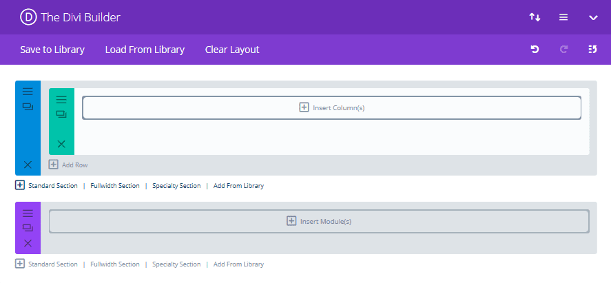
Next, click on Insert Module(s) and select a Fullwdith Header Module. You’ll automatically be taken to the General Settings tab, where you can begin crafting the perfect header.
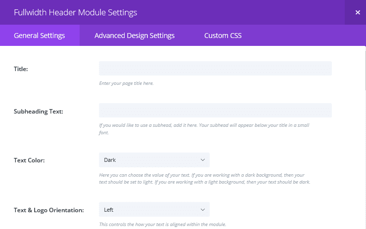
You can add images, customize your fonts and colors, expand to full screen, and more – giving you plenty of scope for not only creating your headline, but making it sparkle too.
2. Optimize Your Layout
When you’re presenting a single page to sell your products, it must be easy to read. However, this is about far more than simple readability. It’s also about making the entire page attractive, and guiding the reader to the most important content. A good layout for your marketing one sheet should ensure that the reader is directed to key areas of the page, including your main selling points, testimonials, and your Call To Action (CTA).
The one sheet below utilizes a Z-pattern to guide the reader across the headline, and left to the main section of copy. This is in preparation for the CTA starting in the bottom left corner:

Aside from Z-patterns, you can also apply principles such as adding a focal point, using the rule of thirds, and utilizing white space effectively. You can read more about all of these and more in our recent article 4 Layout Design Tips to Optimize Your Divi Web Content (to be published).
The Divi Builder truly shines when it comes to creating amazing layouts. You might find a suitable jumping-off point in your Divi Library, or you can start from scratch. In the former case, once you open the Divi Builder, select Load From Library to see a selection of your built-in and saved options.
The modular drag-and-drop system lends itself perfectly to playing around with the location of various elements until you nail your design. You can simply stack rows with as many columns as you need, and insert your modules.
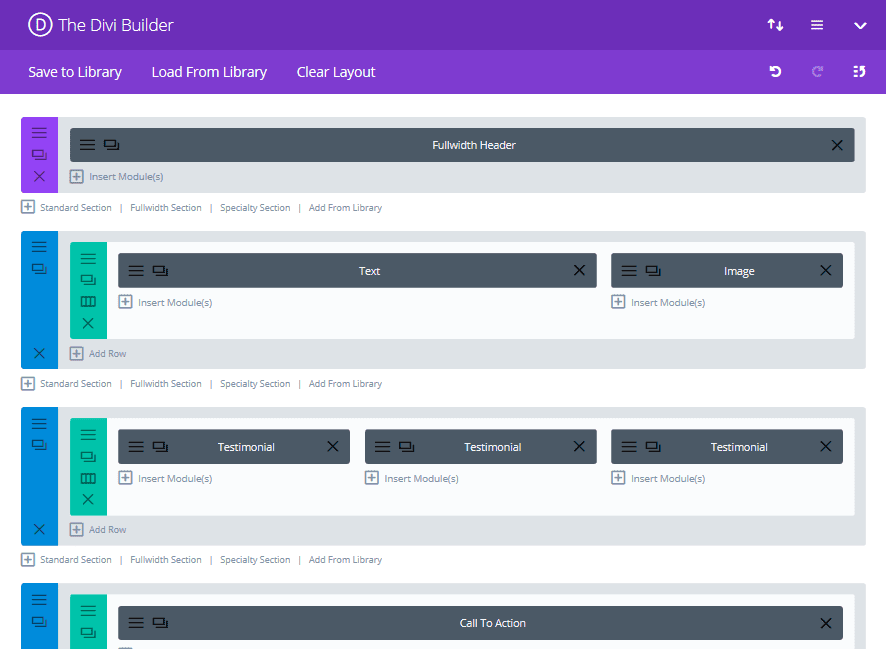
The above layout is just one of virtually unlimited possibilities that can be created within the builder. You’ll see the Header module is there, along with several others, including the Testimonial and Call To Action modules, which we’ll talk about a little later.
3. Inject Some Personality
You don’t want your one sheet to simply blend in with the rest. Adding personality involves injecting life into the page and tailoring it to reflect your brand. Aside from having a catchy headline and an easy to read layout, there are lots of other factors that can make your one sheet stand out from the crowd. Personality can be added with colors, font styles, graphics, layouts, and more.
The one sheet below definitely doesn’t look like your average sales page. Its fun, modern approach represents the brand as forward-thinking and not too serious. The color palette matches the rest of the company’s branding, and they’ve even used background shapes resembling tablets or phones – some of their main areas of expertise.
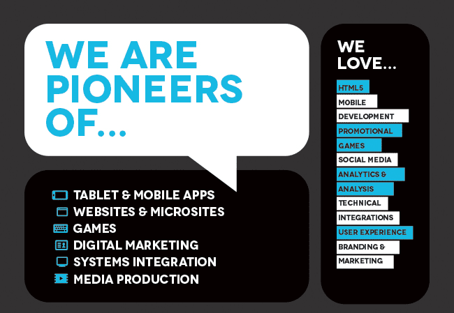
This is where you can really get stuck into Divi’s vast range of options to make your page unique. All of your elements can be fully customized with fonts, colors, images, and a myriad of other options so that your personality shines through.
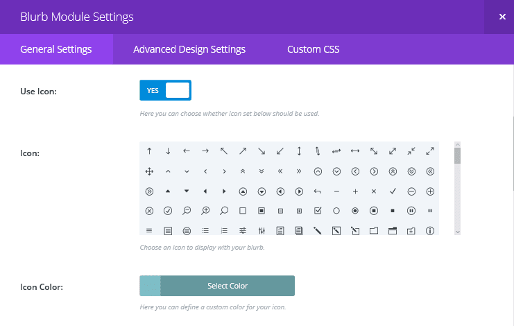
The Blurb module is ideal for injecting a little personality into your marketing one sheet.
The Blurb module is perfect for displaying the key features of your product or service, by combining a built-in icon or uploaded image with a short piece of text. To enhance your one sheet even further, you can also add maps, pricing tables, or a number of other elements. Again, all of these components can be tailored to fit your brand’s image.
4. Include Relevant Testimonials
No matter how catchy your headline is and how persuasive you make your copy, skeptics still abound. Testimonials can add credibility to your claims and build trust with the reader.
For example, this one sheet includes a testimonial towards the end of the page. At this point, readers will have skimmed or read the main copy, and might need that extra nudge of social proof to sway them:
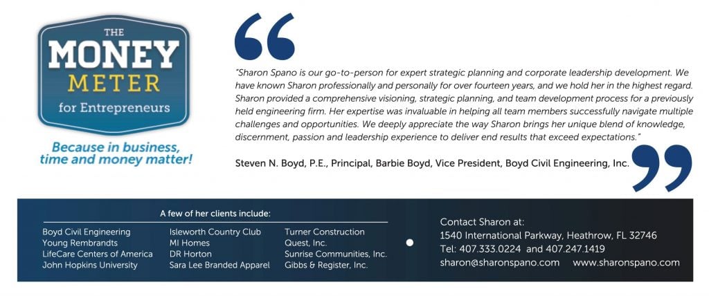
You may be concerned that adding testimonials to your marketing one sheet could take up valuable copy space, but it can be space well spent. Just make sure your testimonials are meaningful and completely relevant to the product or service you are promoting.
Divi makes it easy to integrate beautiful testimonials into your page with the Testimonial module. To insert one, first, go into the Divi Builder and select Insert Column(s). Choose the number of columns you want, considering whether you might want to insert multiple testimonials side-by-side, or have them alongside another content block such as text or an image. Next, click on Insert Module(s) and select the Testimonial Module:
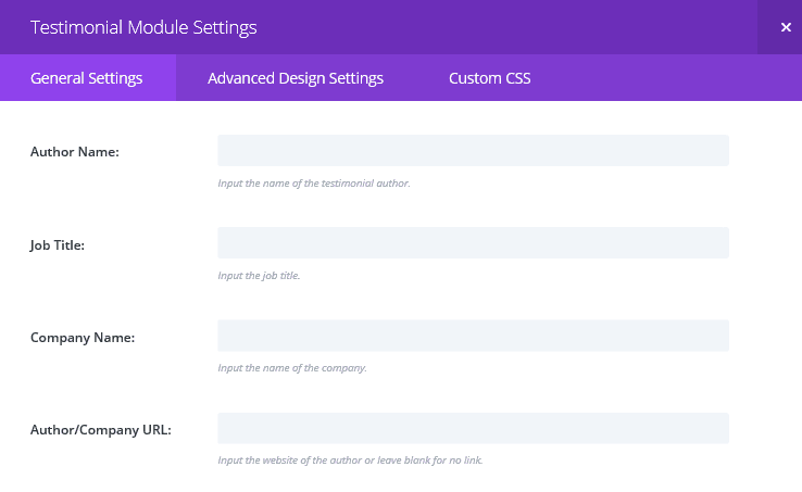
In the pop-up screen, you can input your testimonial and all of the accompanying information such as author, title, and company name. You can then use the remaining settings in this screen, along with the wealth of settings in the Advanced Design Settings tab, to tailor the look of your module.
5. Write a Compelling Call to Action
The point of a marketing one sheet is to persuade the reader to take some kind of action. This might be to hire you, make a purchase, or simply find out more about your product or services. Having a highly visible and compelling CTA is imperative if you want your one sheet to convert. While the marketing one sheet CTA below could be improved upon, it does offer a clear and simple directive with all of the information the reader needs to make a decision:

To create an incredible CTA in Divi you can use the Call To Action module:

Insert the module following the same steps as you did for the Testimonial module. Once in the General Settings tab, you can add your title and button text. Bear in mind that the way you use your button will differ depending on whether you use your one sheet online, or distribute hard copies.
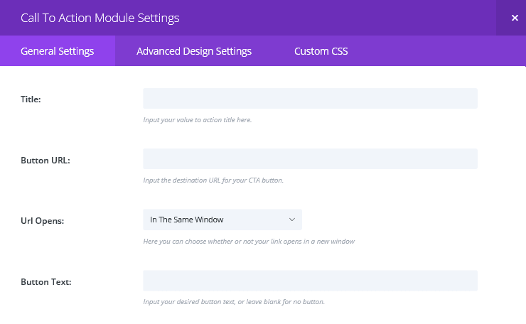
Of course, buttons aren’t going to be clickable on a hard copy, so your surrounding text will need to offer the opportunity to respond to your CTA in a different way.
Finally, in the Advanced Design Settings tab, you can add a background image and customize fonts and colors so that your CTA truly captures the attention of your reader.
Conclusion
A marketing one sheet can be a powerful tool to convey your brand and sales pitch in a concise way. However, finding the right balance between attention-grabbing and informative can be tricky.
Thankfully, Divi has plenty of functionality to help you. In this article, we’ve provided five practical tips to help you create a killer marketing one sheet in Divi. Let’s recap them quickly:
- Create a fantastic headline.
- Optimize your layout.
- Inject some personality.
- Include relevant testimonials.
- Write a compelling CTA.
Do you have any tips for creating an effective marketing one sheet? Let us know in the comments section below, and don’t forget to subscribe so you can follow the conversation!
Article thumbnail image by Oleh Markov / shutterstock.com.



I know that you addressed that companies can include these as print-outs, and send in emails. I would love to have an article that describes the technical integration of one sheets. Best practices on where it should live in navigation on a site, how to use it with email (provide a link to the site, or embed in the email,and how?) Very informative. Thank you!
+1
Hi John,
Thanks for the great post, Can you tell me how I could use the one sheet for emailing or social media if I design it in Divi?
nice post. 🙂
Thanks. 🙂
Never thought about having one in my site! Agree with Gilles! I will love to see it works!
Let us know how you get on, Jordan. 🙂
It looks interesting
thanks for sharing
No problem!
As a marketer, I approve this. Very well thought out blog post, and informative. It’s also very helpful for people to see how you built it there on the Divi builder. Mentioning something about how to “tell the story” on the page would also be helpful for readers too!
Keep up the good work!
Thanks, Jacob. 🙂
I also agree, how did you make: Section 3. Inject Some Personality?
I would like to make something like the example you used.
Thanks for this John,
It would be most valuable to have an example of how to execute the section “3. Inject Some Personality” in Divi.
Perhaps others feel the same…
Cheers!
This is tough to showcase given the context. The danger is that by showing how to create one design, that’s all you’ll be able to do.
We’d like to think that the Divi blog contains a plethora of tips, tricks, and advice to make your one sheet stand out with Divi. To start, maybe look back through the recent Divi 100 series to see what can be achieved.
Thanks for your comment – you brought up a good point!
+1
I agree 100% with Gilles