Every week, we provide you with new and free Divi layout packs which you can use for your next project. For one of the layout packs, we also share a use case that’ll help you take your website to the next level. This week, as part of our ongoing Divi design initiative, we’re going to show you how to creating slide-in CTAs with Divi’s row alignment and animation settings using the Cleaning Company Layout Pack.
To help pull this off, we’ll start off by removing all the animations that are already there. That way, we can highlight the calls to action that slide in.
Let’s get to it!
Preview
Let’s take a look at the three different examples we’re going to handle in this post:

Upload Cleaning Company Landing Page
Add New Page & Switch to Visual Builder
As mentioned before, we’re going to use the Cleaning Company Layout Pack to create this tutorial but feel free to use this approach for any website you’re building. Add a new page, enter your page title and switch over to Visual Builder right away.
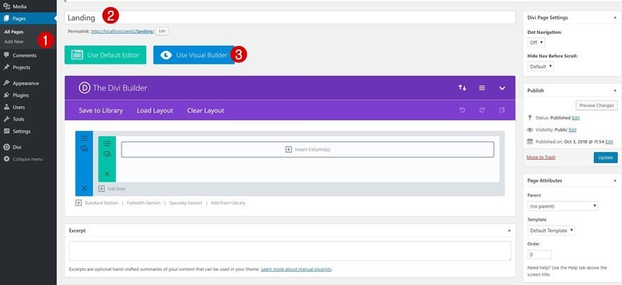
Upload Cleaning Company Landing Page
Once you do, you’ll see three options appear on your screen. You can start building from scratch, choose a premade layout or clone an existing page. Choose the second option.
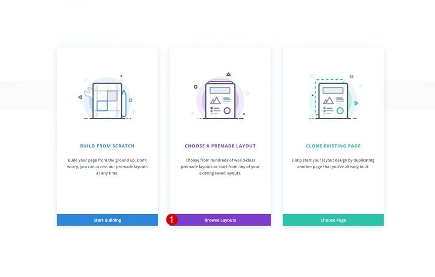
Search for the Cleaning Company Layout Pack, select the landing page layout and upload it to your page.

Removing all Animation Settings on Page
Locate Section on Page
Once the layout is uploaded to your page, go ahead and locate the following section.

Remove Animation
Open its settings and remove the animation that is already there.
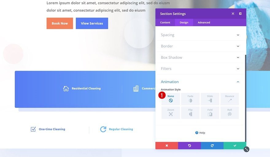
Extend Style to All Sections
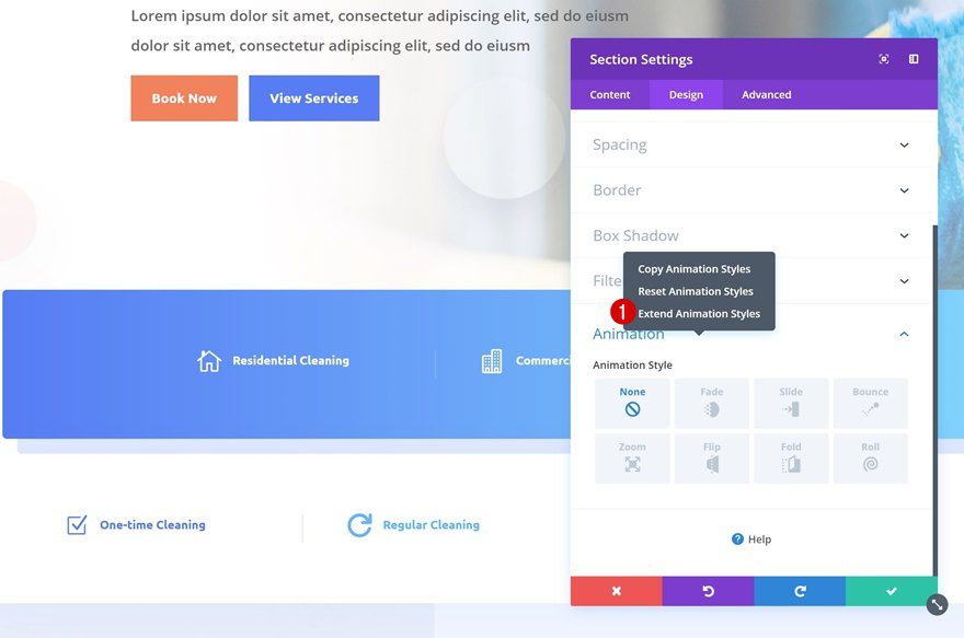
To save time, we’re going to extend this animation style to all the design elements on the page. We’ll start with the sections on our page by right-clicking, selecting ‘Extend Animation Styles’. Make it apply to all section throughout the page and click on ‘Extend’.

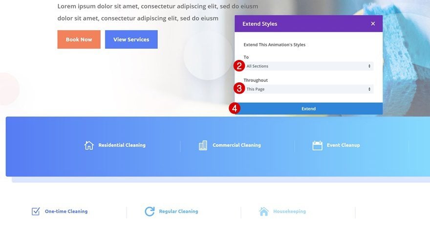
Extend Style to All Rows
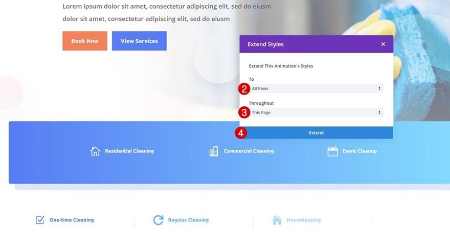
Repeat the same steps, but instead, make it apply to all the rows throughout the page.

Extend Style to All Modules
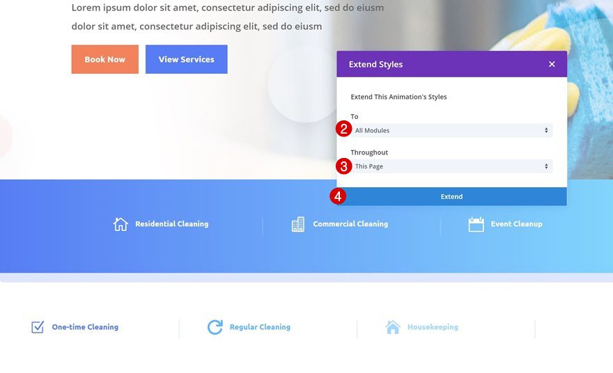
Lastly, make it apply to all modules on the page as well.
Creating CTA #1

Add New Row
Location
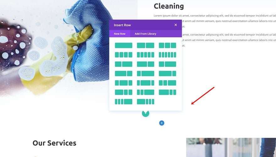
Let’s start creating the first slide-in CTA! Add a new row at the bottom of the following section:
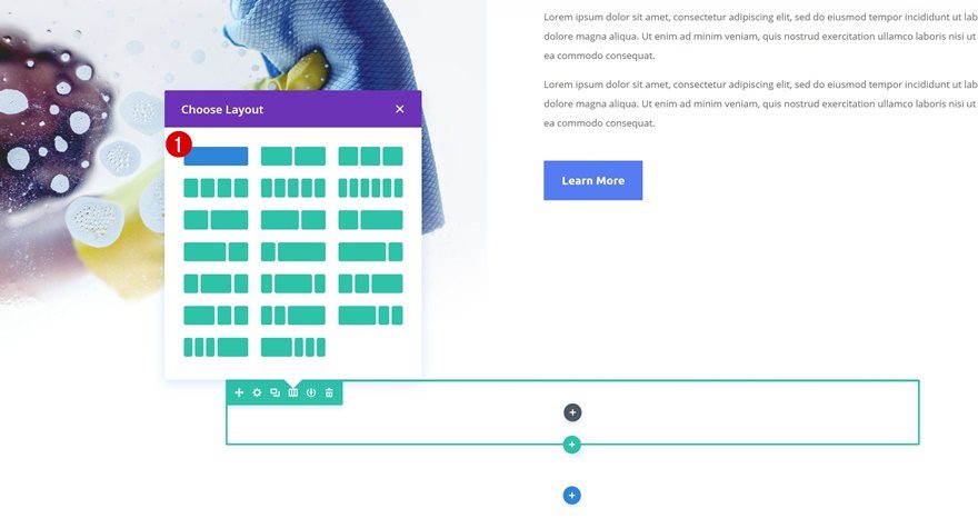
Column Structure
Choose the following column structure for the row you’ve just added:
Row Alignment
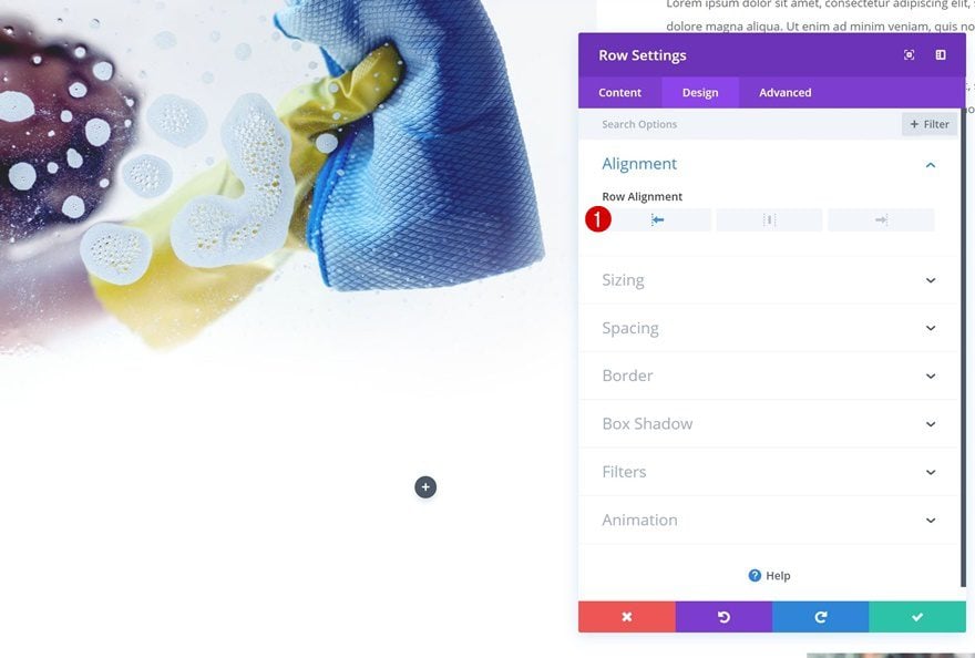
We’re going to push the row to the left to help create the slide-in effect.
- Row Alignment: Left
Sizing
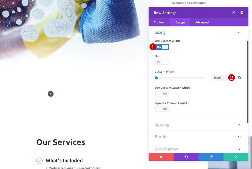
We’ll also decrease the width of our row.
- Use Custom Width: Yes
- Custom Width: 500px
Spacing
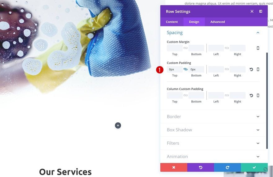
And to get rid of the unnecessary white space, remove the top and bottom padding of the row.
- Top Padding: 0px
- Bottom Padding: 0px
Add Call to Action Module
Add Copy
We can now add our Call to Action Module! Add some content of choice.
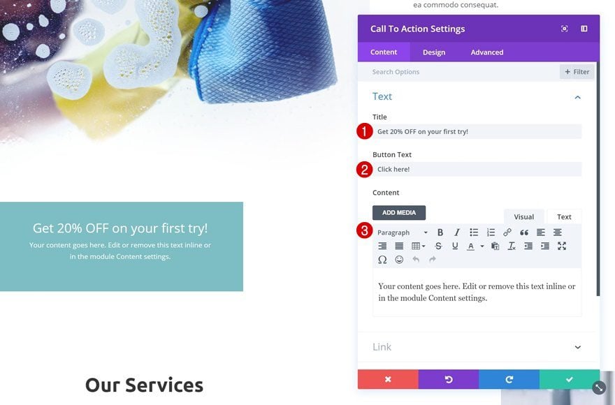
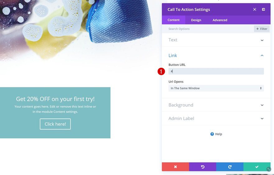
Add Link
Add a link to your CTA Module next. If you don’t have a link to redirect to yet, you can simply enter ‘#’. Without adding something to this box, you won’t be able to see the button, so make sure you don’t leave it empty.
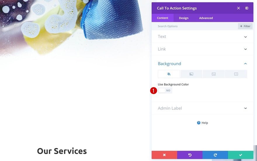
Remove Background Color
The CTA Module has by default a background color. Go ahead and remove it in the background settings.
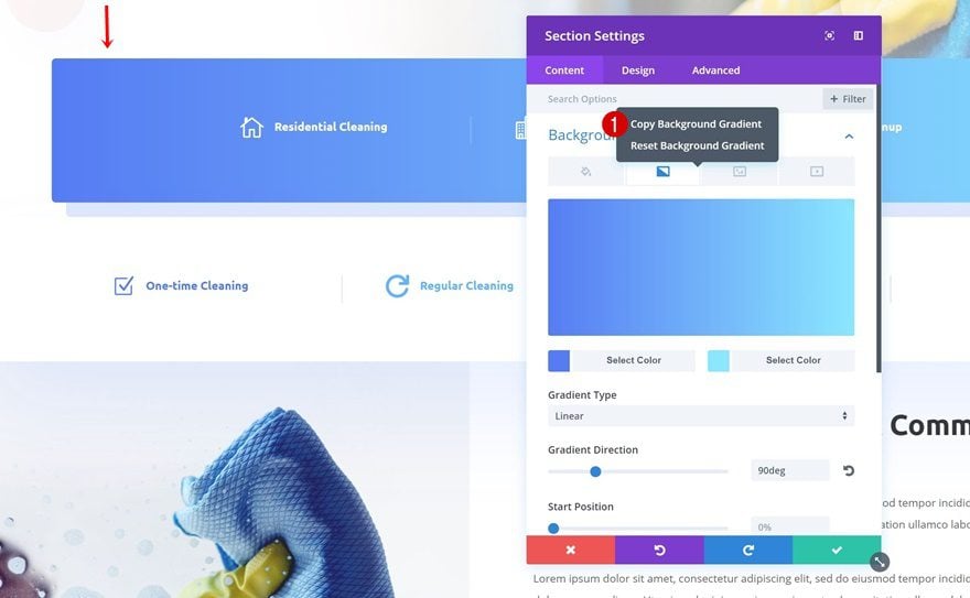
Copy Section Gradient
Open the section containing the blue gradient background. Without changing anything about it, right-click and copy the settings.
Paste Gradient in CTA Module
Paste this gradient background on the CTA Module.
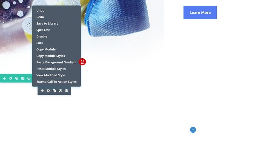
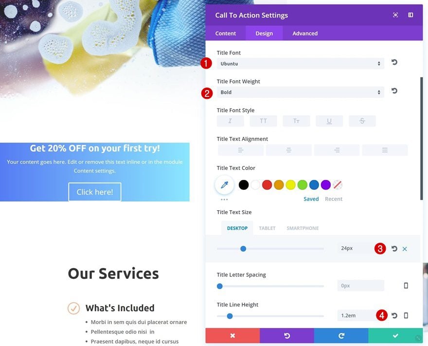
Title Text Settings
Open the CTA Module settings again, go to the title text settings and make some changes to match the layout pack:
- Title Font: Ubuntu
- Title Font Weight: Bold
- Title Text Size: 24px (Desktop & Tablet), 16px (Phone)
- Title Line Height: 1.2em
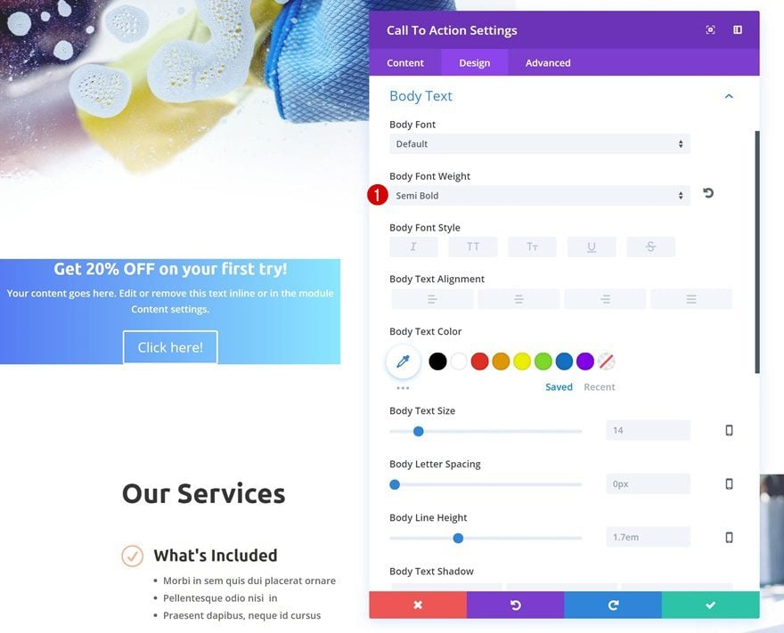
Body Text Settings
Change the body font weight of the body as well.
- Body Font Weight: Semi Bold
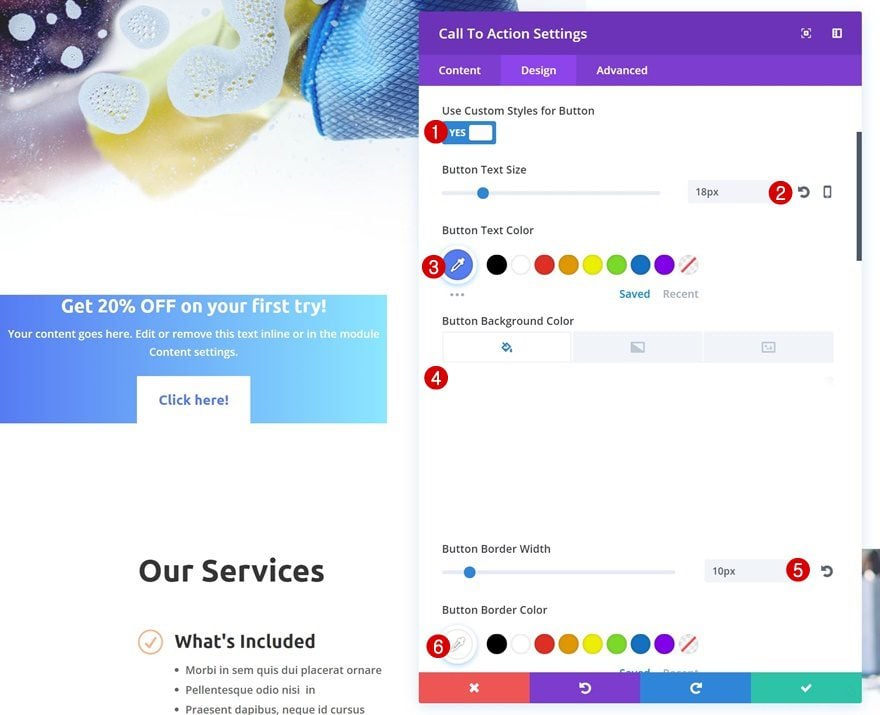
Button Settings
Change the button settings next.
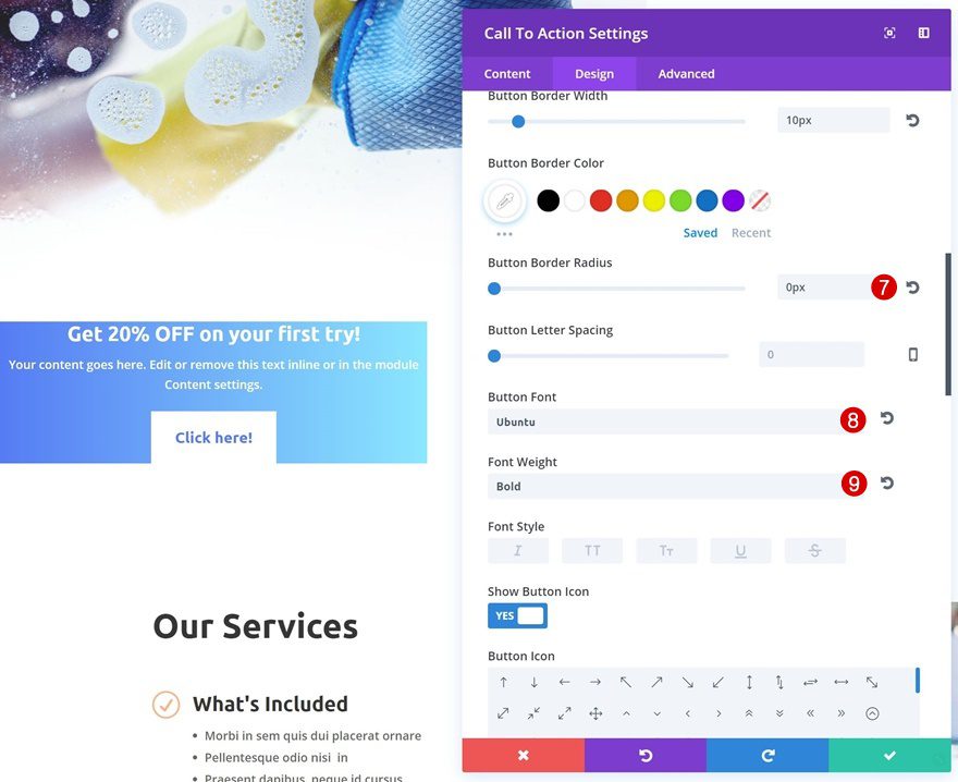
- Use Custom Styles for Button: Yes
- Button Text Size: 18px
- Button Text Color: #557df3
- Button Background Color: #FFFFFF
- Button Border Width: 10px
- Button Border Color: #FFFFFF
- Button Border Radius: 0px
- Button Font: Ubuntu
- Font Weight: Bold
Spacing
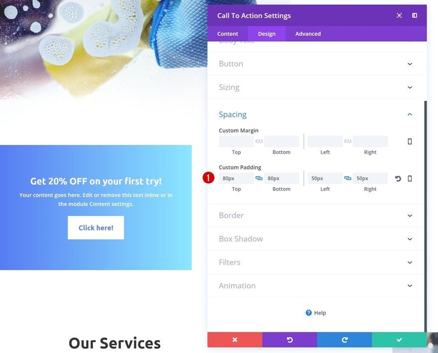
Increase the padding of the module as well.
- Top Padding: 80px
- Bottom Padding: 80px
- Left Padding: 50px
- Right Padding: 50px
Border
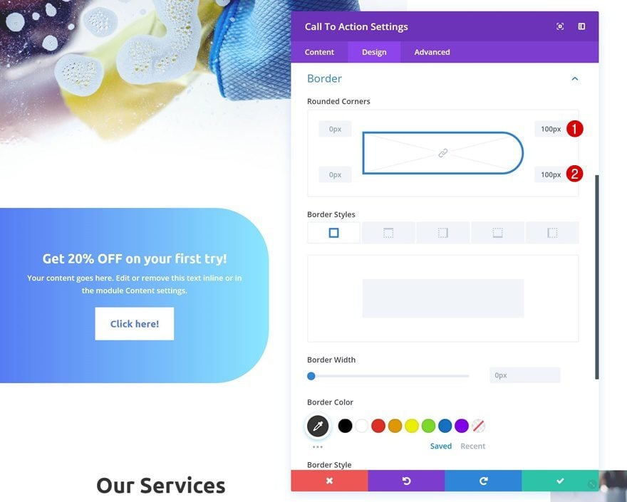
Then, add some top right and bottom right border-radius in the border settings.
- Top Right: 100px
- Bottom Right: 100px
Box Shadow
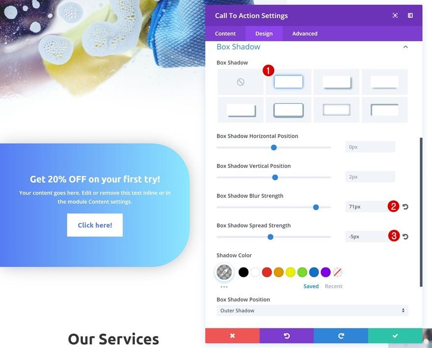
To create more depth, we’re going to add a subtle box shadow.
- Box Shadow Blur Strength: 71px
- Box Shadow Spread Strength: -5px
Animation
Last but not least, give your CTA Module an animation effect.
- Animation Direction: Right
- Animation Intensity: 100%
- Animation Starting Opacity: 100%
- Animation Speed Curve: Linear

Creating CTA #2

Clone CTA #1 Row & Make Changes
Clone Row
To create the second example, go ahead and clone the first row.

Drag to Section
Scroll down the page and place the duplicate right here:
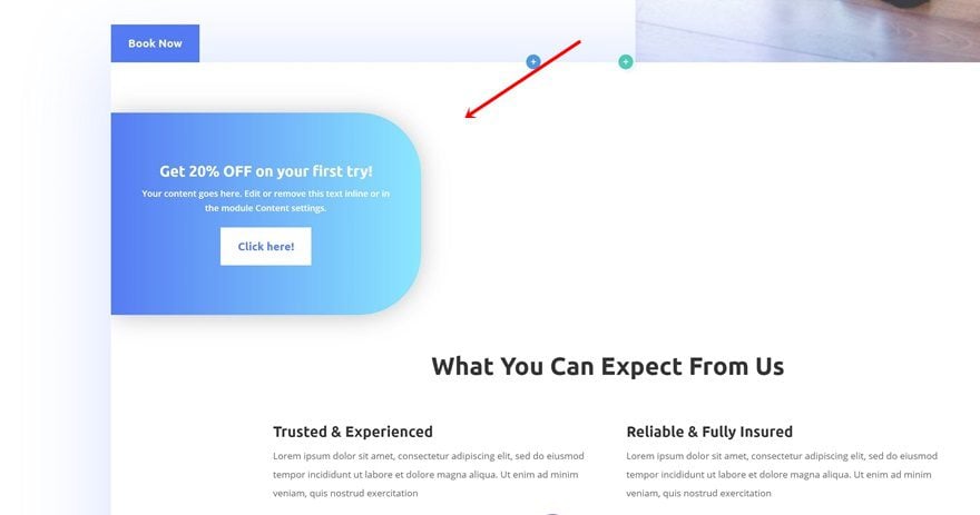
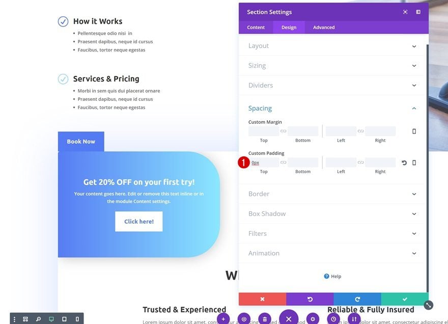
Remove Section Top Padding
Open the settings of the section you’ve put the row in and remove the top padding.
- Top Padding: 0px
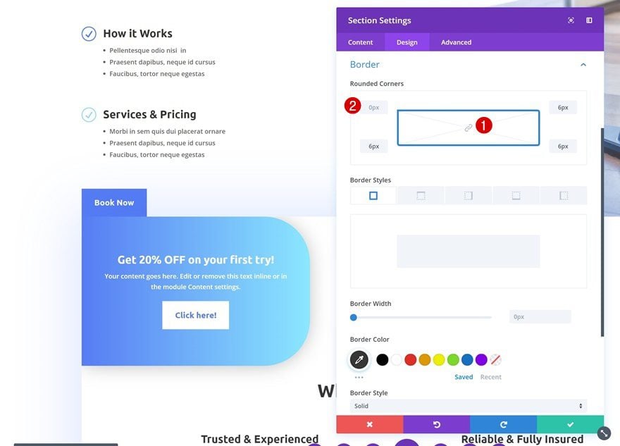
Remove Section Top Left Border Radius
Go to the Border settings next and remove the top left border-radius as well.
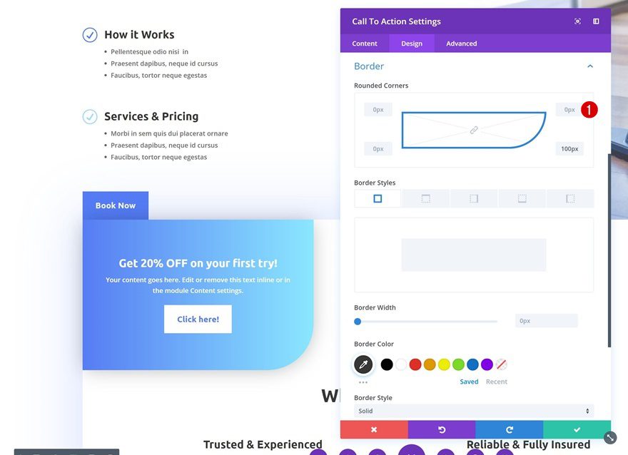
Remove CTA Top Right Border Radius
Then, open the CTA Module and remove the top right border-radius to allow the section and module to blend.
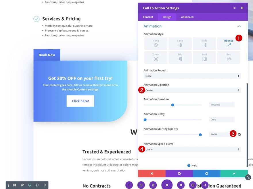
Change Animation
For this slide-in CTA, we’re going to use a different animation. Feel free to play around with other animation options as well.
- Animation Direction: Center
- Animation Starting Opacity: 100%
- Animation Speed Curve: Linear
Creating CTA #3
Clone CTA #1 Row & Make Changes
Clone Row
To create the last example, we’re going to clone the row once again.

Drag to Section
Place the duplicate in the following section:

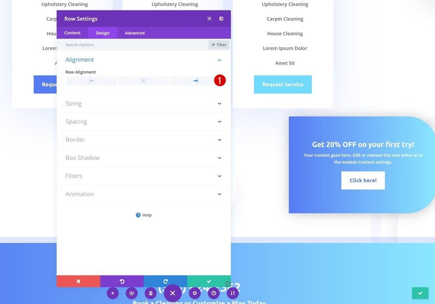
Change Row Alignment
Open the row settings of the module and change the alignment to right.
- Row Alignment: Right
Remove CTA Gradient Background
Remove the gradient background of the module as well.
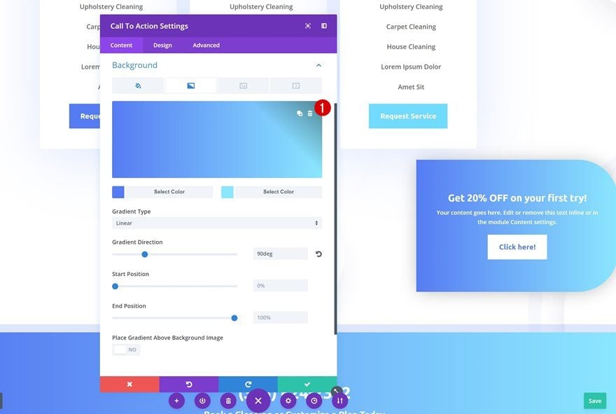
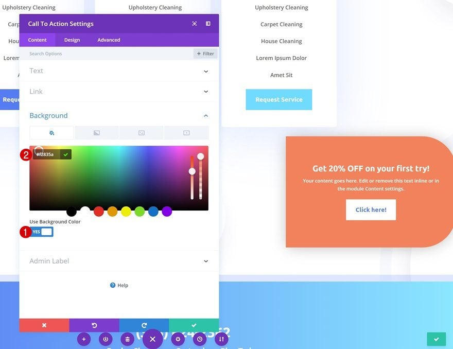
Use Background Color Instead
Use a background color instead.
- Background Color: #f2835a
Change Button Text Color
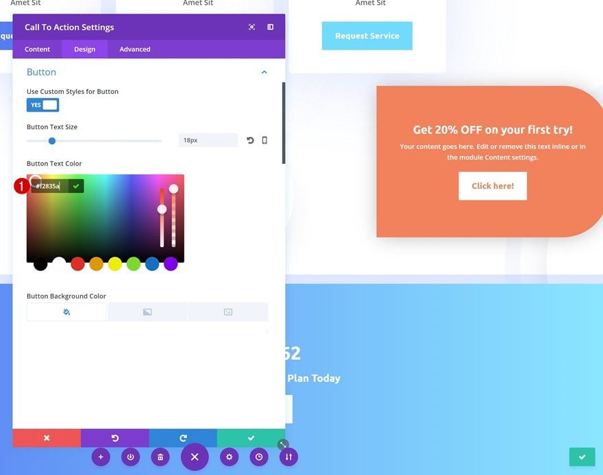
To match the background color, change the button text color as well.
- Button Text Color: #f2835a
Remove CTA Border Radius
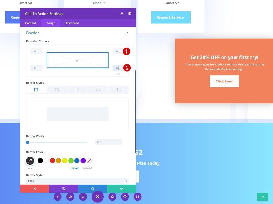
We’re turning the CTA Module into a square by removing all the border-radius it was given.
Change Animation
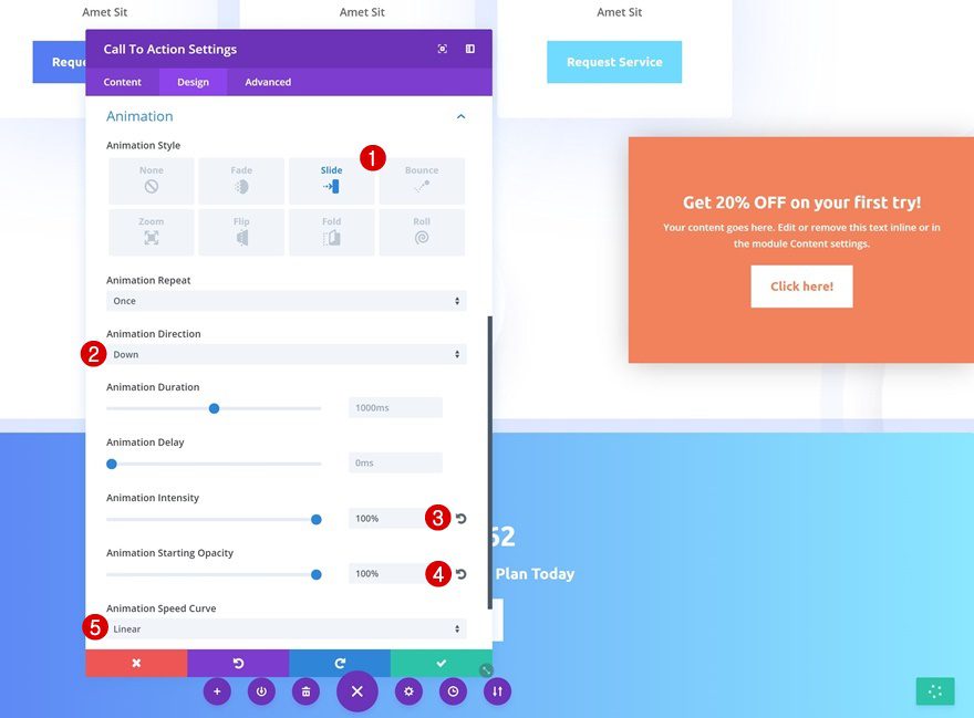
Change the animation settings next.
- Animation Direction: Down
- Animation Intensity: 100%
- Animation Starting Opacity: 100%
- Animation Speed Curve: Linear
Remove Section Bottom Padding
Last but not least, we’re going to push the module to the bottom of the section by removing the bottom padding of the section it’s placed in and we’re done!
- Bottom Padding: 0px
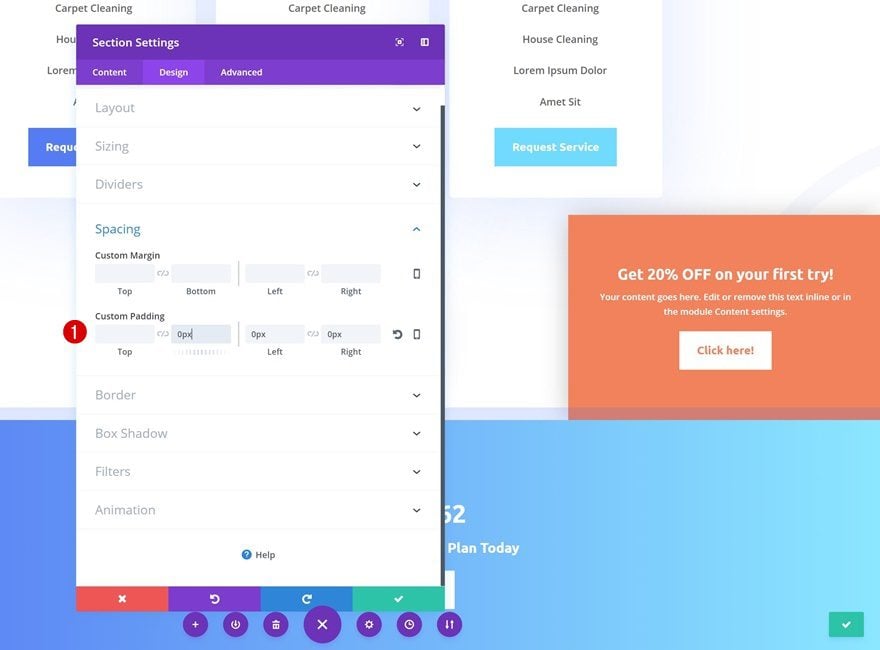
Preview
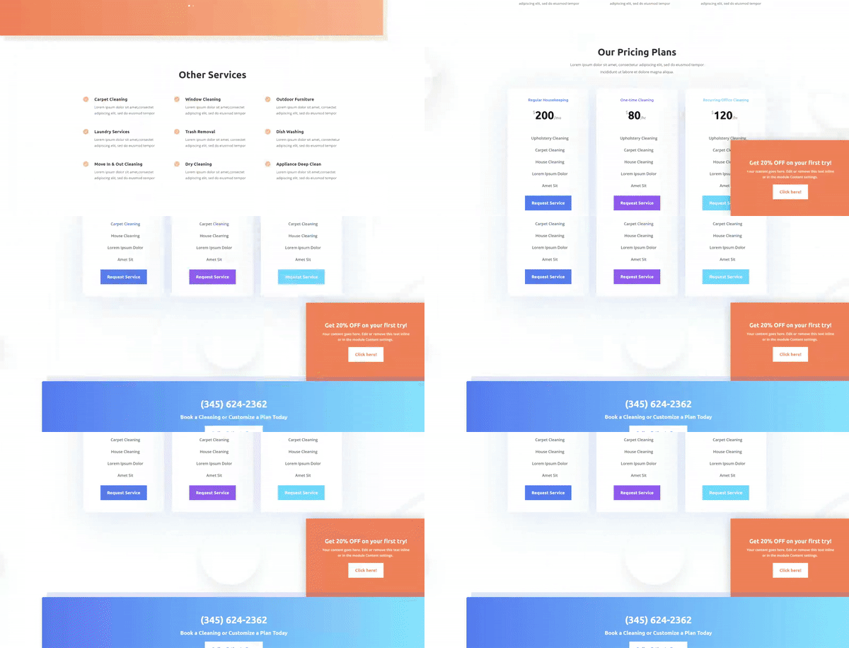
Let’s take a final look at the three examples of slide-in CTAs we’ve created.

Final Thoughts
In this post, we’ve shown you how to create slide-in CTAs using Divi’s Cleaning Company Layout Pack. We’ve started off by removing the animations that are already present on the page. After that, we’ve created three slide-in CTAs to draw attention. This blog post is part of our Divi design initiative where we try to put something in your design toolbox each and every week. If you have any questions or suggestions, make sure you leave a comment in the comment section below!



wonderfull feature ! I love it more and more
hi
To go farther still, you can insert of the js into a module code for a random(unpredictable) display(posting) of several cta:
Duplicate the created module and add this class at all modules :
element-variable
and create a module code with this code :
window.onload=function(){
var E=document.getElementsByClassName(“element-variable”);
var m=E.length;
var n=parseInt(Math.random()*m);
for(var i=m-1;
i>=0;i–){var e=E[i];
e.style.display=’none’;
}E[n].style.display=”;
}
and save
it’s great 🙂 🙂
GREAT JOB. Love it.
Can you create a layout of just the module of CTA #1?
Great! Thank you
Dear Donjete,
Thank you, as usual, for great tips and inspirations. Each time I go to youtube to watch the video of the presentation you offer. As you make the effort of doing a video, why not add it here above your wonderful explanations?
It really is an added value. Thanks again for your great work!!!
Great !! it avoids creating a div in a module code.
How it reacts on motive(mobile)?
nice work