We are always looking for new and creative ways to showcase featured items (like products and services) when designing a new website. And, with Divi and its scroll effects, new doors have been opened to take your blurb layouts to a whole new level. In this tutorial, we are going to show you how to create a blurb module layout with rotating circular elements on scroll. This unique layout features a clever use of color combinations with multiple circular elements that rotate behind blurbs when the user scroll down the page. No doubt this design would have a lot of applications for just about any content.
Enjoy!
Sneak Peek
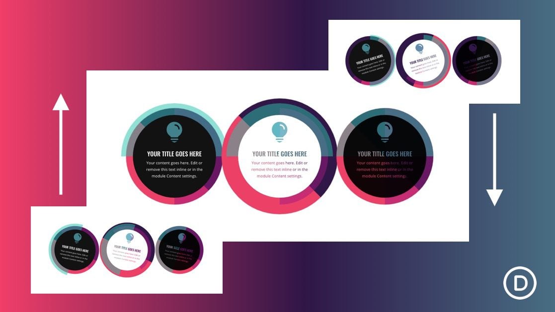
Here’s a quick look at the blurb layout with rotating circular elements we are building in this tutorial.
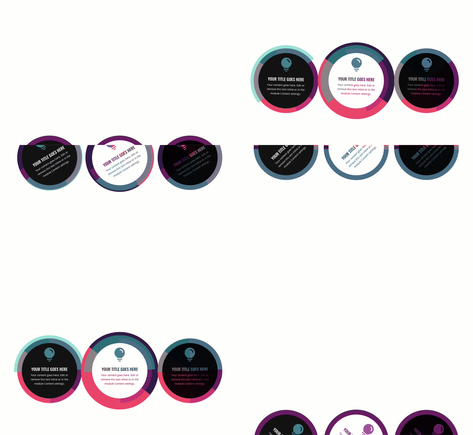
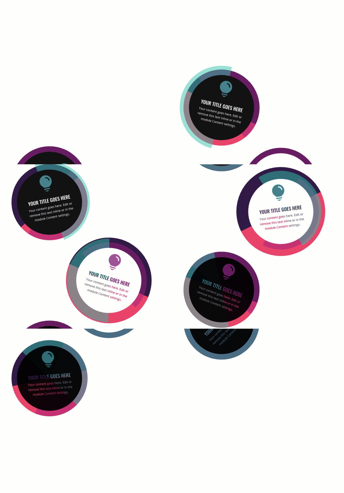
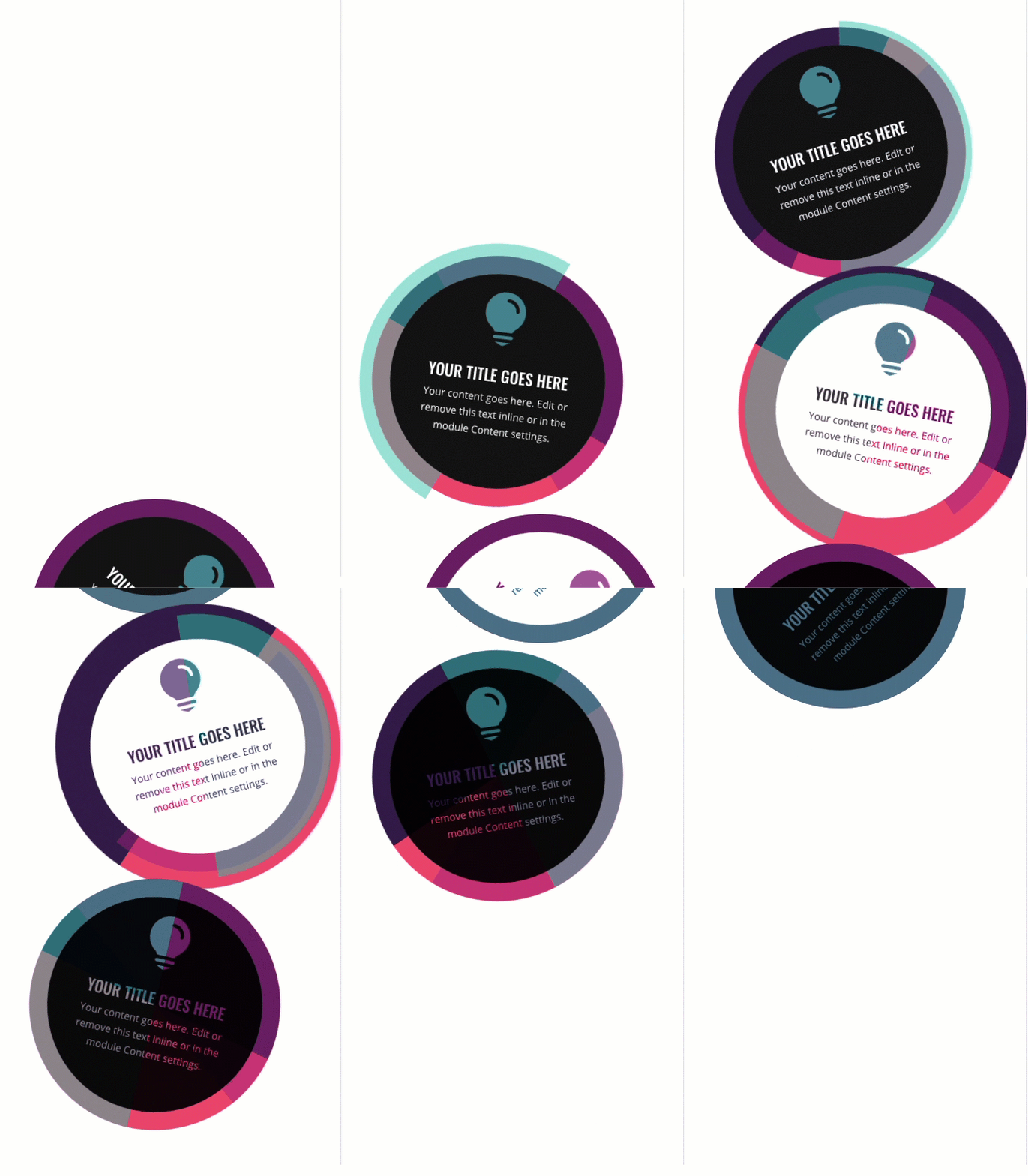
Download the Rotating Circular Elements Blurb Layout for FREE
To lay your hands on the designs from this tutorial, you will first need to download it using the button below. To gain access to the download you will need to subscribe to our newsletter by using the form below. As a new subscriber, you will receive even more Divi goodness and a free Divi Layout pack every Monday! If you’re already on the list, simply enter your email address below and click download. You will not be “resubscribed” or receive extra emails.
To import the layout to your page, simply extract the zip file and drag the JSON file into the Divi Builder.
Let’s get to the tutorial, shall we?
What You Need to Get Started
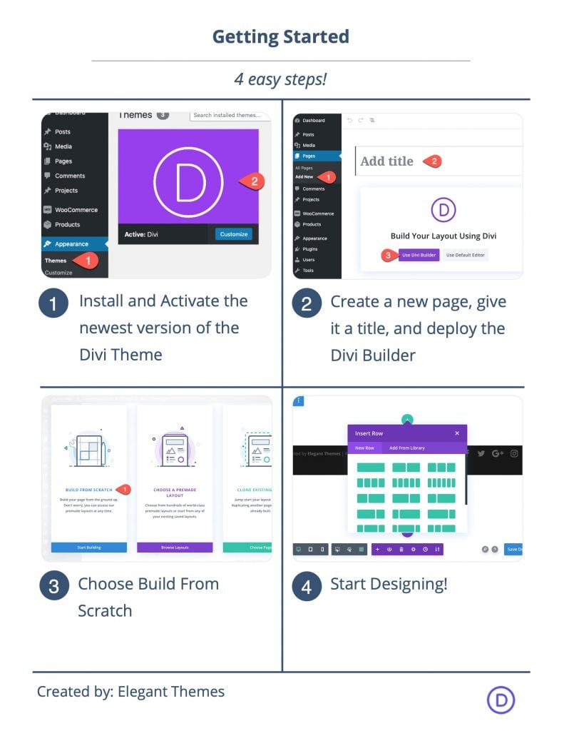
To get started, you will need to do the following:
- If you haven’t yet, install and activate the Divi Theme.
- Create a new page in WordPress and use the Divi Builder to edit the page on the front end (visual builder).
- Choose the option “Build From Scratch”.
After that, you will have a blank canvas to start designing in Divi.
Creating the Blurb Layout with Rotating Circular Elements on Scroll in Divi
Adding the Row
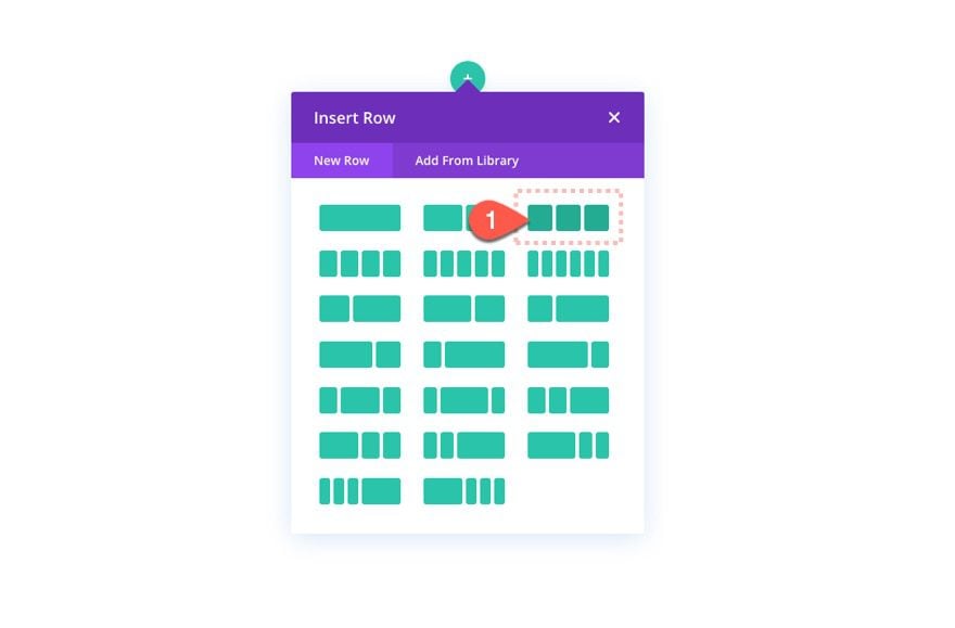
First, add three column row to the section.
Temporary Section Margin
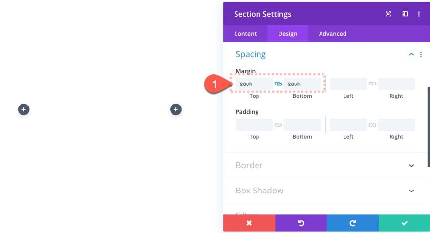
Next, add some top and bottom margin to the section in order to create some space to scroll.
Creating Rotating Circular Element Blurb Design #1
For our first design, we are going to create a blurb module with three colorful divider modules that will sit behind the blurb and rotate as the user scrolls. This first design will serve as a good template for the next two designs we will be adding to the other columns.
Here’s how to build it.
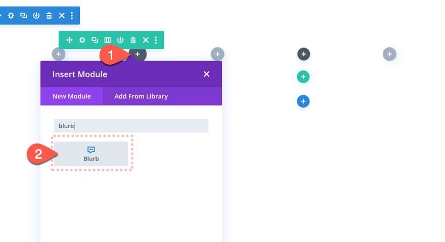
Add Blurb module
In column 1, add a blurb module.
Blurb 1 Content
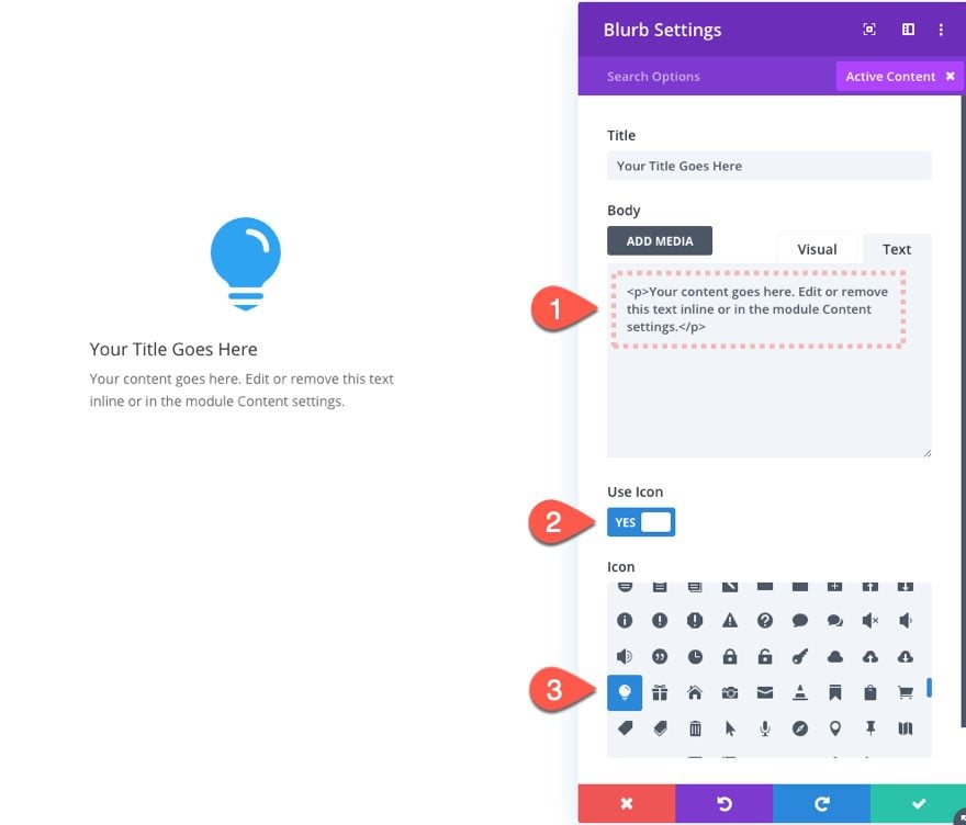
Open the settings for the blurb module and update the body content with the following:
<p>Your content goes here. Edit or remove this text inline or in the module Content settings.</p>
Then add an icon of your choice to replace the default image.
Blurb 1 Design Settings
Under the design tab, update the following:
- Background Color: #121212
- Icon Color: #41828d
- Use Icon Font Size: YES
- Icon Font Size: 75px
- Text Alignment: center
- Title Font: Oswald
- Title Font Style: TT
- Title Text Color: #ffffff
- Title Text Size: 22px
- Body Text Color: #ffffff
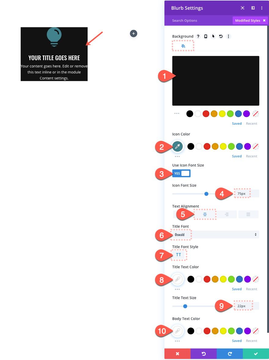
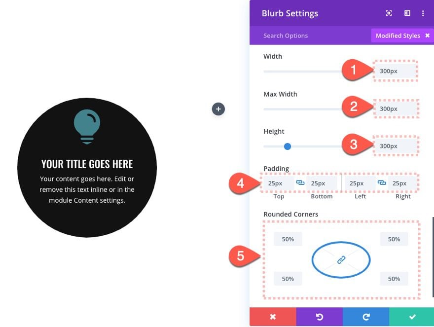
To make the blurb circular, update the size and rounded corners as follows:
- Width: 300px
- Max Width: 300px
- Padding: 25px top, 25px bottom, 25px left, 25px right
- Rounded Corners: 50%
The combination of equal width and height combined with the rounded corners is what makes the blurb circular.
Then update the position with an offset.
- Position: Relative
- Vertical Offset: 25px
- Horizontal Offset: 25px
- Z Index: 1
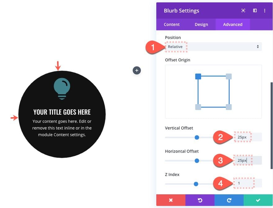
This will center the blurb within the dividers we will add later. The Z Index will make sure the blurb sits above the other dividers as well.
Next, add a rotating scroll effect to the blurb.
Under Rotating Effects tab…
- Enable Rotating: YES
- Starting Rotation: 45deg (at 0% viewport)
- Mid Rotation: 0deg (at 40%-60% viewport)
- Ending Rotation: -45deg (at 100% viewport)
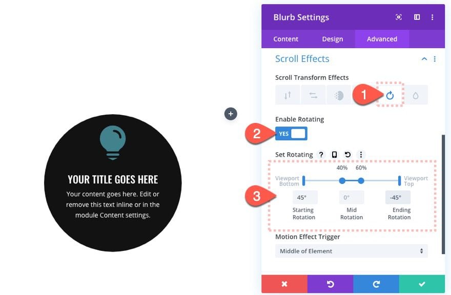
This will rotate the blurb slightly to an upright position toward the middle of the page and then rotate another 45 degrees as it leaves the top of the page.
Add Circular Divider #1
Now we are going to add our first of three divider modules that will make up our rotating circular element design.
Add a divider module under the blurb module.
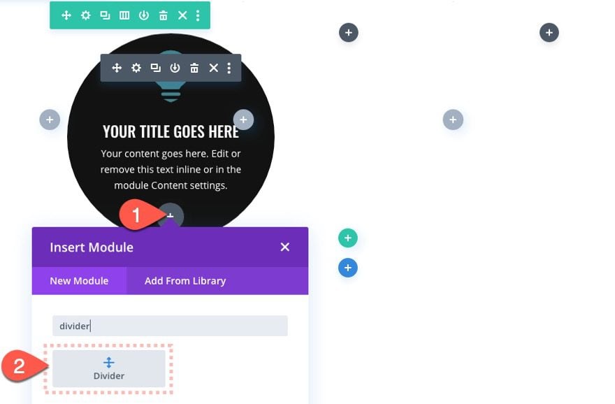
Divider 1 Settings
Open the divider settings and update the following:
- Show Divider: NO
- Background Gradient Left Color: #311847
- Background Gradient Right Color: #ec4067
- Start Position: 50%
- End Position: 50%
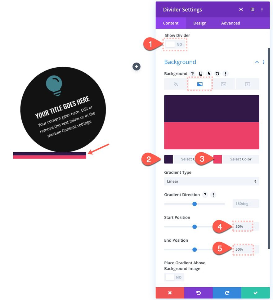
And now we make it circular as follows:
- Width: 350px
- Max Width: 350px
- Height: 350px
- Rounded Corners: 50%
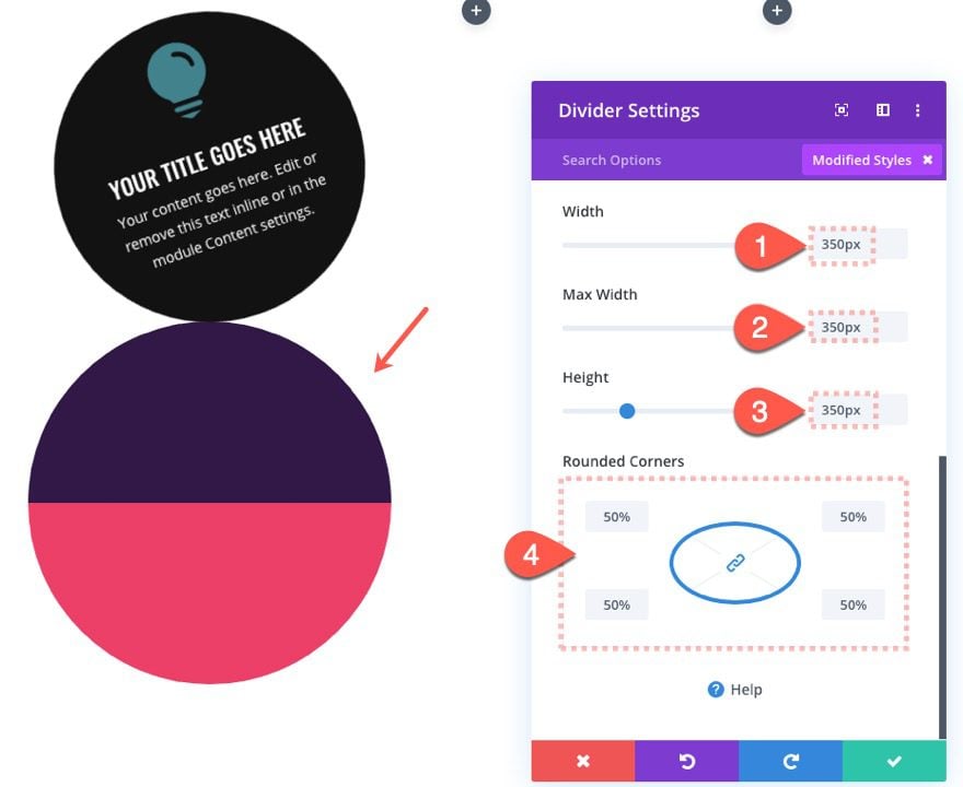
Notice that the divider is slightly bigger than the blurb module so that we will be able to see the outer rim of the divider once positioned behind the blurb.
Now we simply update the position of the divider to absolute and it will sit perfectly behind the blurb.
- Position: Absolute
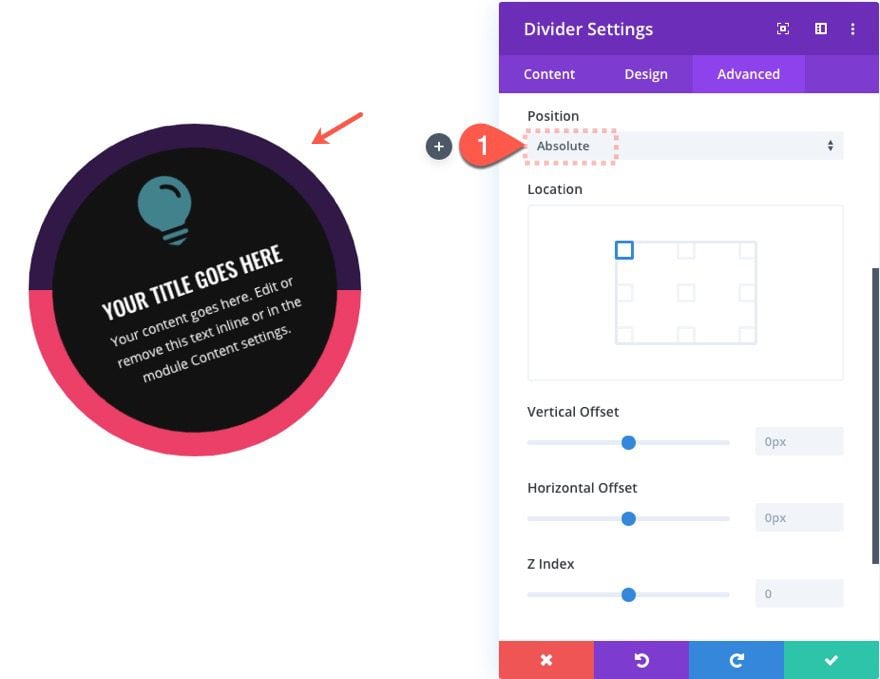
If your divider is sitting on top of the blurb, make sure you have updated the blurb z index to 1.
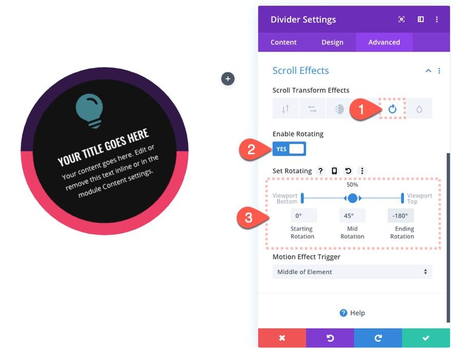
Next, add the following scroll effects to the divider:
Under the Rotating effect tab…
- Enable Rotating: YES
- Starting Rotation: 0deg (at 0% viewport)
- Mid Rotation: 45deg (at 50% viewport)
- Ending Rotation: -180deg (at 100% viewport)
Add Circular Divider 2
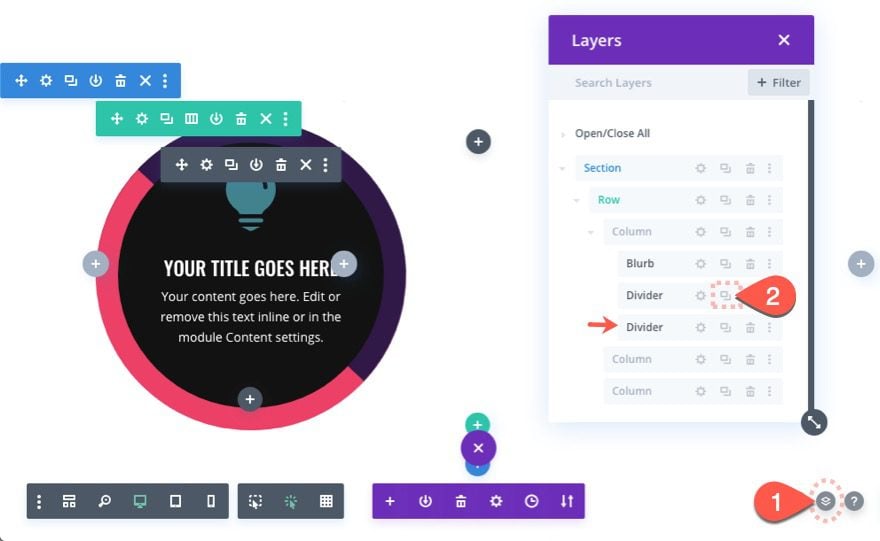
To create the second circular divider, open the layers box by clicking the layers icon in the settings menu. Then duplicate the divider module to create a new one.
Update divider 2 Design Settings
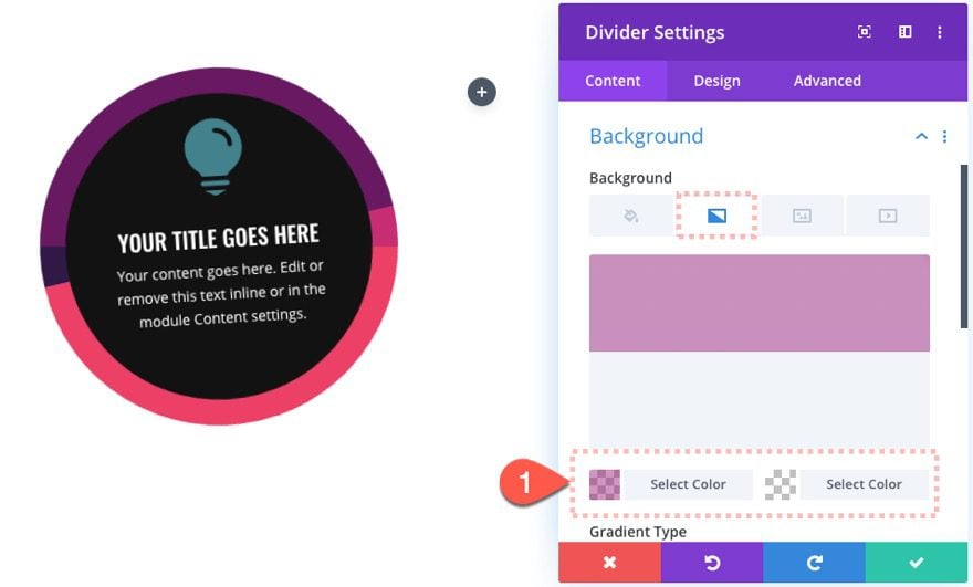
For this divider, let’s give it a different gradient background color as follows:
- Background Gradient Left Color: rgba(160,26,125,0.5)
- Background Gradient Right Color: rgba(255,255,255,0)
NOTE: It’s important to use semi-transparent colors here in order to expose the background behind it. This creates a beautiful combination of colors.
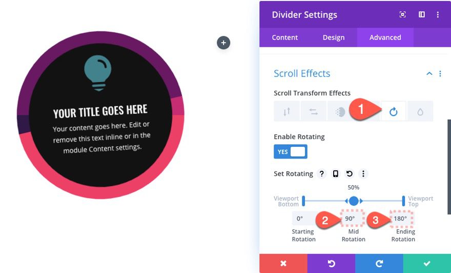
Next, update the scroll effects as follows:
Under the Rotating effects tab…
- Mid Rotation: 90deg (at 50% viewport)
- Ending Rotationg: 180deg (at 100% viewport)
Add Circular Divider 3
Continue the same process to create the third and final divider by duplicating divider 2.
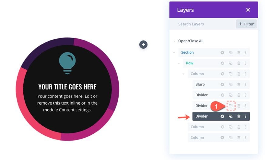
Update divider 3 Design Settings
For this divider, let’s also give it a different gradient background color as follows:
- Background Gradient Left Color: rgba(255,255,255,0)
- Background Gradient Right Color: rgba(41,196,169,0.5)
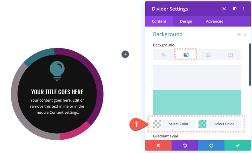
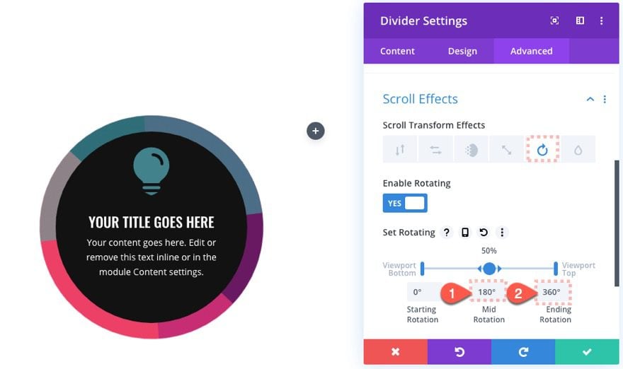
Then update the Scroll Effects as follows:
Under the Rotating effects tab…
- Mid Rotation: 180deg (at 50% viewport)
- Ending Rotationg: 360deg (at 100% viewport)
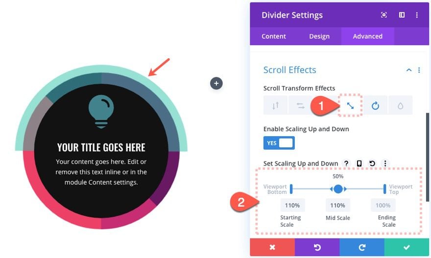
Under the Scaling Up and Down tab…
- Enable Scaling Up and Down: YES
- Starting Scale: 110% (at 0% viewport)
- Mid Scale: 110% (at 50% viewport)
- Ending Scale: 100% (at 100% viewport)
Creating Rotating Circular Element Blurb Design #2
Since we already have a completed design in column 1, let’s jumpstart the second design by duplicating the entire first column. This will carry over the four modules as well. You will need to delete one of the empty columns in order to keep the three column layout.
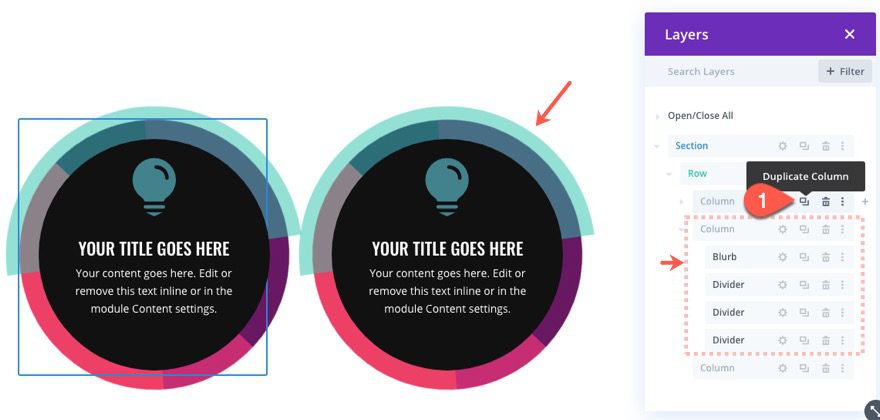
Update Blurb Module Design
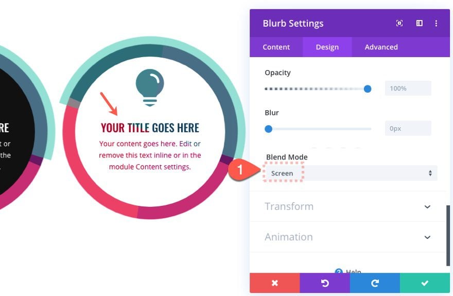
For this design we are going to go with a white blurb background so that we can use the screen filter effect to show the moving colors behind the blurb text. We are also going to add a scaling scroll effect to make the back divider bigger.
Here’s how to do it.
Open the settings of the blurb module in column 2 and update the following:
- Background: #ffffff
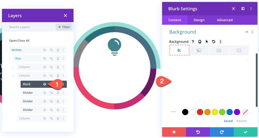
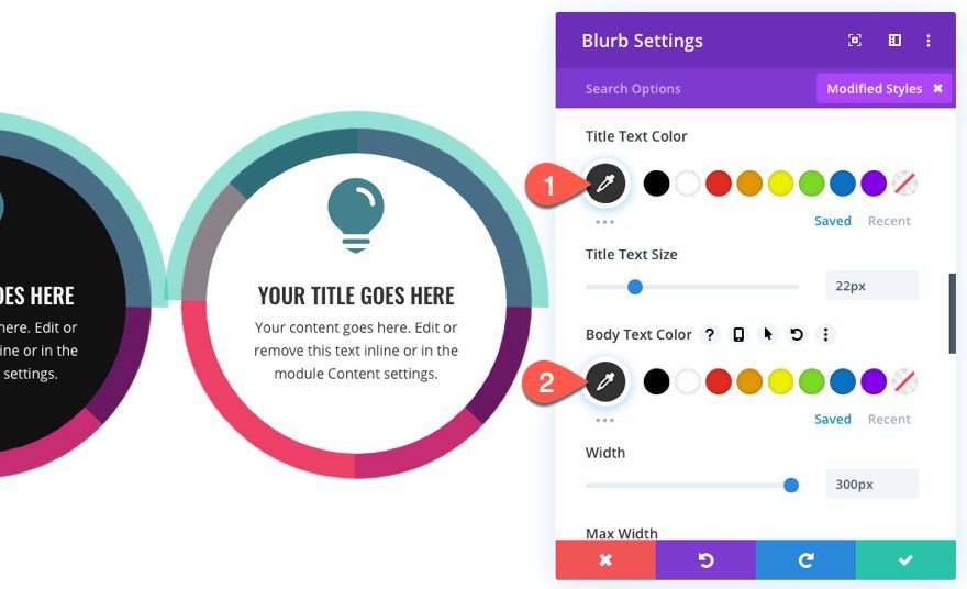
Then change the Title and Body Text Color to black.
- Title Text color: #000000
- Body Text Color: #000000
Then add the following blend mode:
- Blend Mode: Screen
Update Divider 1 Scroll Effects
Open the settings of the divider module directly under the blurb module in column 2 and update the following scroll effects:
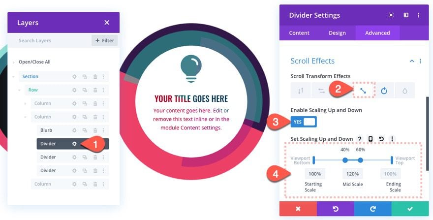
Under the Scaling Up and Down effects tab…
- Enable Scaling Up and Down: YES
- Starting Scale: 100% (at 0% viewport)
- Mid Scale: 120% (at 40%-60% viewport)
- Ending Scale: 100% (at 100% viewport)
This will cause the divider to grow by 20% its original size midway as the user scrolls down the page.
Creating Rotating Circular Element Blurb Design #3
For this last design, we are going to create a rotating circular blurb similar to the one in column 1. However, we will be adding a different blend mode to show colors through the white text on a dark background.
Here’s how to do it.
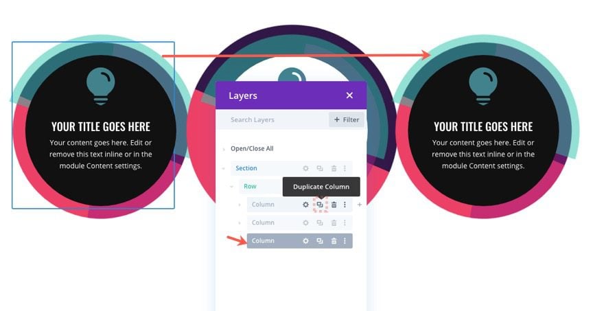
Duplicate Column 1
Since we already have a completed design in column 1, let’s jumpstart the third design by duplicating the entire first column and move it to the third column placement using the layers box. Then delete the extra empty column.
Update Blurb Module Settings
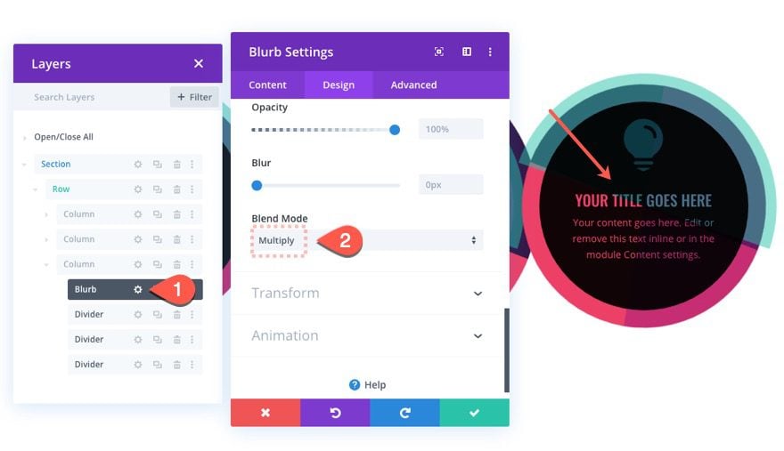
First, let’s add the multiply blend mode to show the divider colors through the white text as follows:
- Blend Mode: multiple
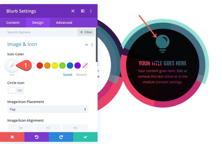
Then update the icon color to white as well.
- Icon Color: #ffffff
Update Divider 3 Settings
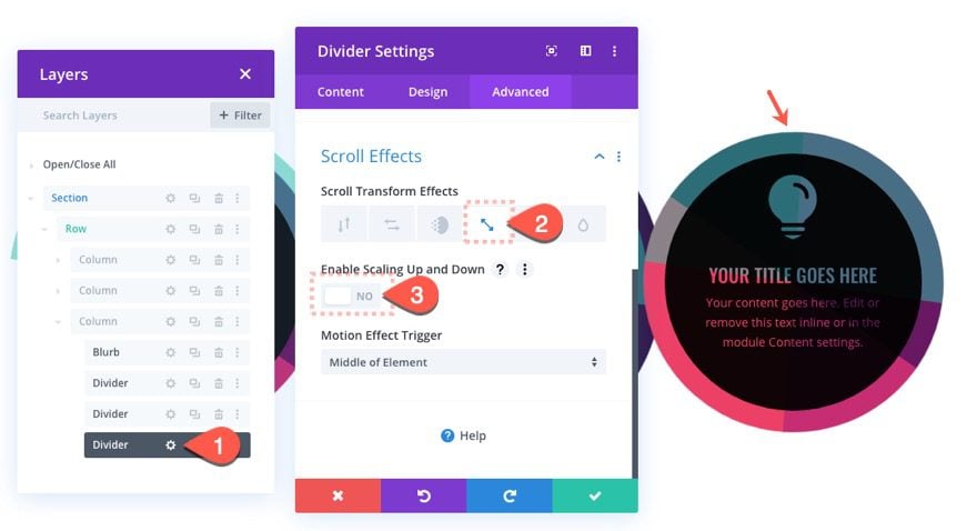
Now let’s take out the scaling scroll effect on the last (third) divider in column 3.
Open the settings for the third divider and update the following:
Under the Scaling Up and Down Effects tab…
- Enable Scaling Up and Down: NO
Adjust Column 2 Position on Mobile
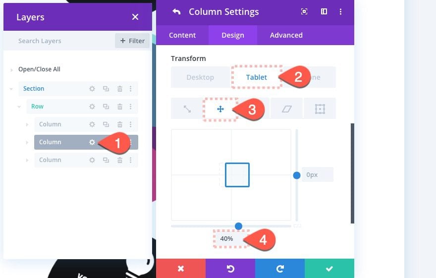
Right now the three blurb designs will align to the left of the screen on tablet and phone displays. To balance out the design, we can move the middle column over to the right easily using transform scale.
Open the settings for column 2 and update the following:
Transform Scale X Axis: 40% (on tablet), 15% (on phone)
Final Result
That’s it! Let’s check out the final result on a live page.
Here is the design on desktop as the user scrolls through the layout.

Here is the design on tablet.

And here it is on phone.

Final Thoughts
One of the best features of this layout is how creative you can get with the scroll effects and color combinations, each of which are easily tweaked using Divi’s built-in options. And once you get a better handle on how to incorporate filter effects, things really start to pop. Hopefully this will give you some inspiration for the next blurb layout you create.
I look forward to hearing from you in the comments.
Cheers!



The fact that you think this is “creative” explains why you are a blogger and no longer a web designer. This design is broken.
Not working perfectly on Tab and Mobiles. Can you help to improve this on mobile and tab ?
great! I like it
nice post