Most websites need a well-designed feature section to display the features of products or services. So, in this tutorial, I’m going to show you how to create a unique feature section in Divi. To do this, we are going to get a little creative with Divi’s Circle Counter module to add animation to your blurb icons. And by using some custom spacing, I’ll show you how you can easily position your blurbs to coincide nicely with a divider background. The final design is both clean and unique. And with a few minor touches, it can be a great addition to your next project.
Let’s get started!
- 1 Sneak Peek
- 2 Creating a New Page and Deploying the Visual Builder
- 3 Creating the Feature Section Header
- 4 Creating the Main Feature Section and Background Design
- 5 Adding Blurbs to the Four Column Row
- 6 Add Circle Counters to Overlap Blurb Icons
- 7 Use Row Padding to Position the Icons to Coincide with the Divider
- 8 How the Feature Section Looks on Mobile
- 9 Final Thoughts
Sneak Peek
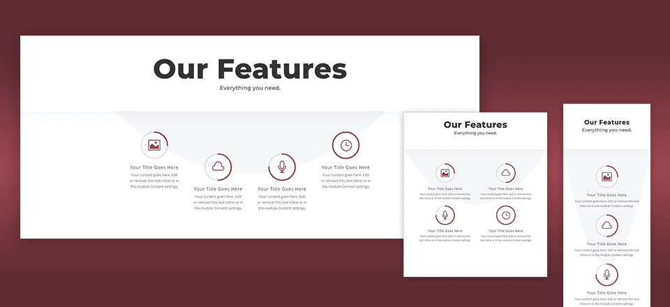
Here is a little sneak peek of the design and gif to help illustrate the animation element.
![]()
![]()
Creating a New Page and Deploying the Visual Builder
To get things started, go to your WordPress Dashboard and go to Pages > Add New. Then give you page a title and click to use the Divi Builder. Then click to use the Visual Builder. You will be prompted with three options. Choose the option to “Build From Scratch”.
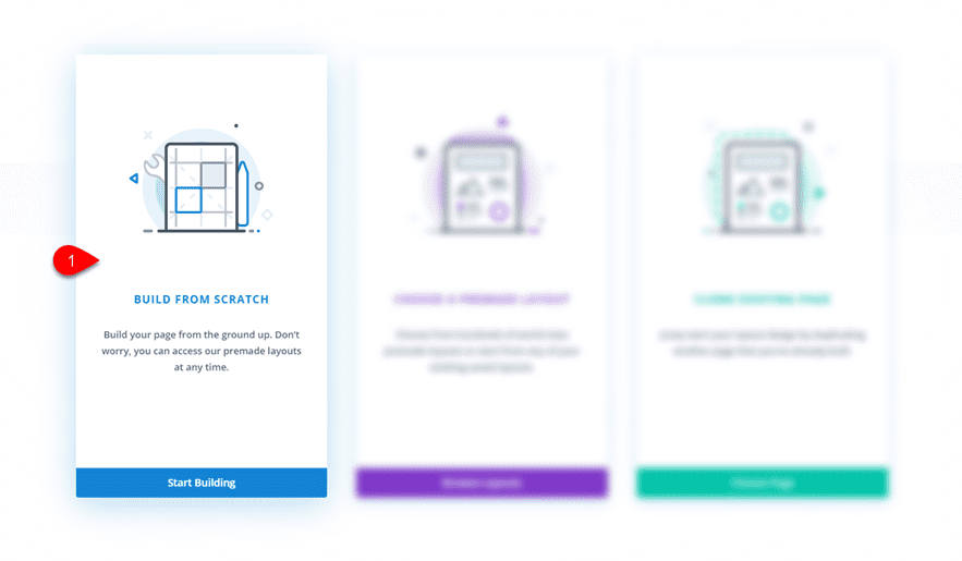
Your blank canvas awaits!
Creating the Feature Section Header
The top header for your feature section is pretty simple. The unique element is the subtle box shadow displayed underneath to give a little depth to the design.
To create it, insert a one-column row to your regular section.
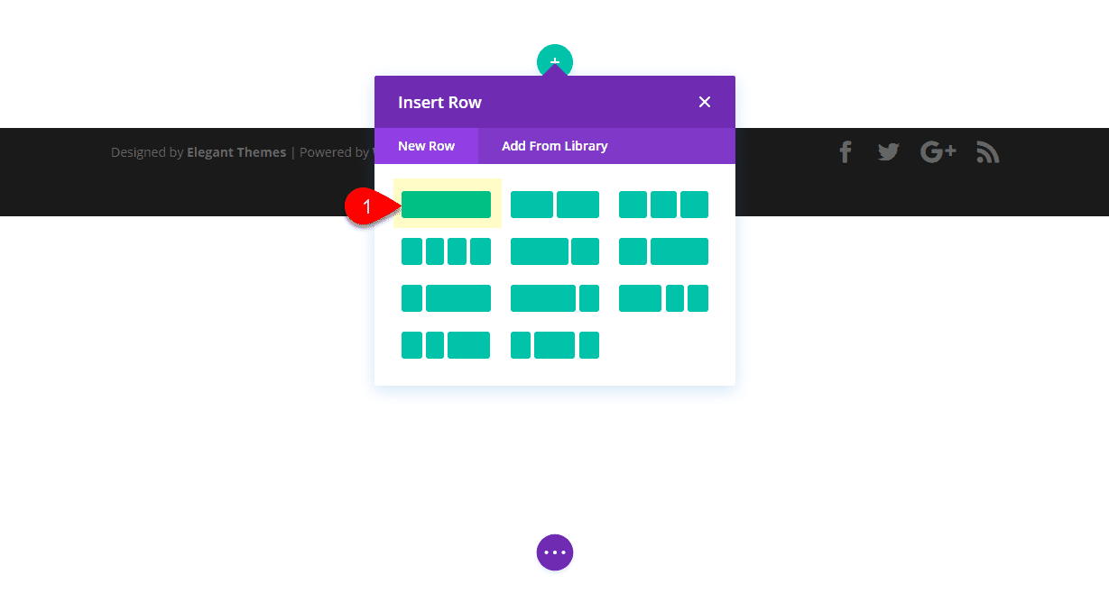
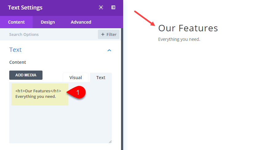
Then add a text module to the row and update the settings as follows:
Content:
<h1>Our Features</h2>
Everything you need.
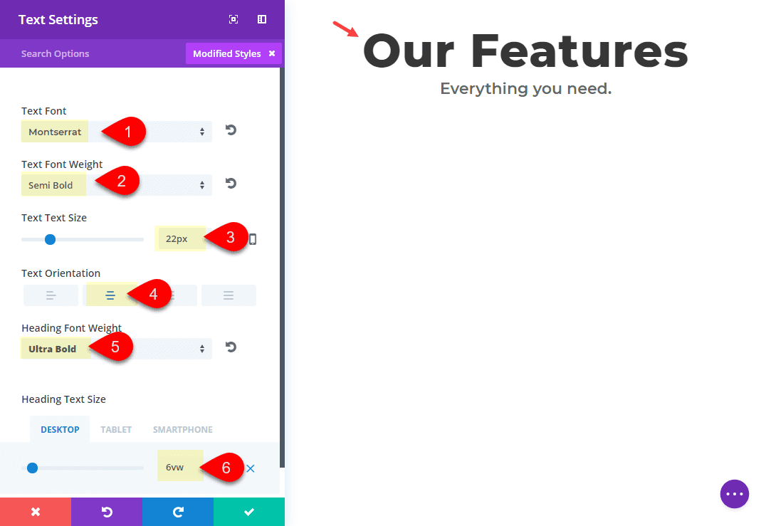
Text Font: Montserrat
Text Font Weight: Semi Bold
Text Text Size: 22px
Text Orientation: Center
Heading Font Weight: Ultra Bold
Heading Text Size: 6vw(desktop), 50px(tablet), 30px(smartphone)
Now save your settings and jump over to the section settings and add a box shadow as follows:
Box Shadow: see screenshot
Box Shadow Vertical Position: 19px
Box Shadow Blur Strength: 80px
Box Shadow Spread Strength: -16px
Shadow Color: rgba(136,150,171,0.13)
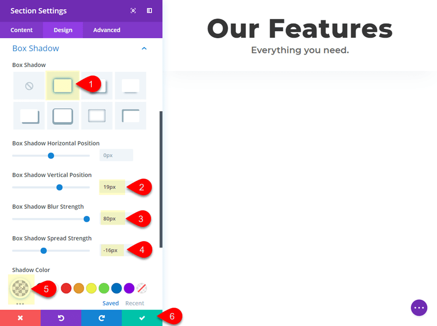
Save Settings.
Pretty simple stuff. Now let’s get to the fun part.
Creating the Main Feature Section and Background Design
We need to add a new section to hold our features. Normally, you would be able to simply add a new row to the previous section, but in this case we need to add a Divider background which is available in the Section element.
Go ahead and add a new section directly under the section you just finished. Then add a four-column layout to the row.
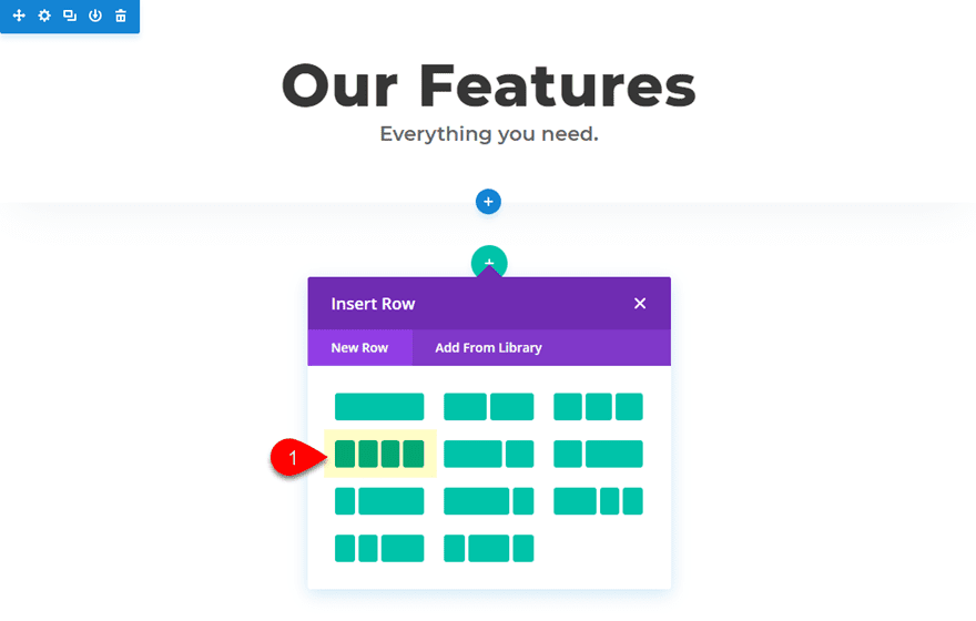
We will be adding blurbs to these columns, but for now let’s update our section settings.
For this section, we need to give it a custom max-width. This is important to keep the design in place on larger browser sizes. We also need to add a section Divider to serve as the background that coincides with the arrangement of our blurbs (more on this later).
Go to the section settings and update the following:
Width: 1080px
Section Alignment: Center
Dividers: Top
Divider Style: see screenshot
Divider Color: rgba(136,150,171,0.07)
Divider Height: 52%
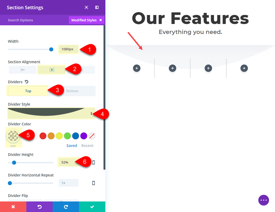
Save Settings.
Giving the section a custom width (or max-width) of 1080px is basically how your rows are setup by default within a section. So, essentially, we are making our entire section the size of a default row.
Adding Blurbs to the Four Column Row
At this point we can go ahead and start adding our blurbs to each of the four columns. Click the gray icon in the first column to add your first blurb. Update the content in the box to include less text (2 sentences), then choose to use an icon instead of an image (I chose the image icon).
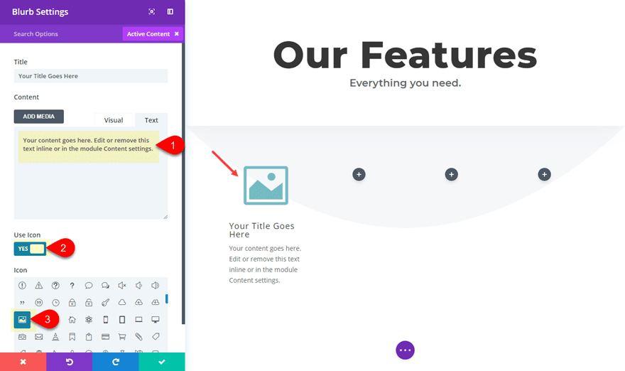
Under the design tab, update the following:
Icon Color: #974450
Circle Icon: YES
Circle Color: rgba(255,255,255,0.5)
Use Icon Font Size: YES
Icon Font Size: 48px
Text Orientation: Center
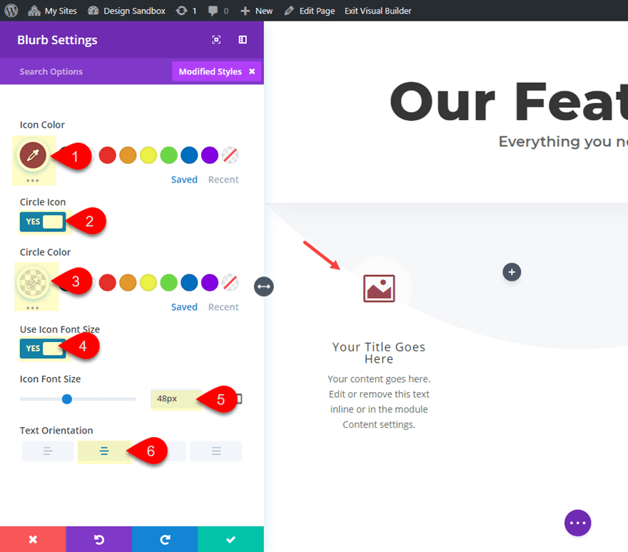
Save Settings.
Now copy and paste the blurb module into each of the remaining columns so that you have one blurb in each column.
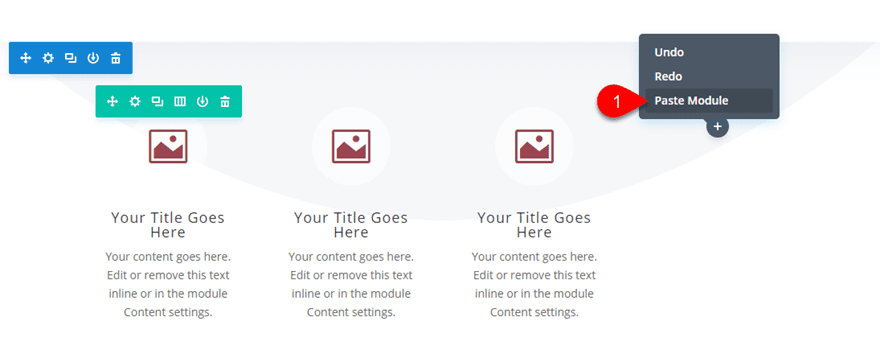
You can go back and update the icons if you want at this point, but you don’t have to.
Add Circle Counters to Overlap Blurb Icons
To add the animation to our blurb icons, we are going to overlap each icon with a circle counter that has a different number value. This will cause the circle animation to gradually increase with each icon to show progression. However, you can use whatever nubmer value you want with each circle counter.
Click the gray “Add New Module” icon under the blurb module in the first column and then add the counter module.
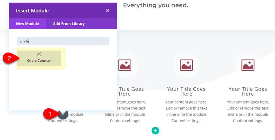
Before you start editing the circle module settings, go ahead and drag it above the blurb module. Now you can update the content settings as follows:
Delete the text in the title box
Number: 25
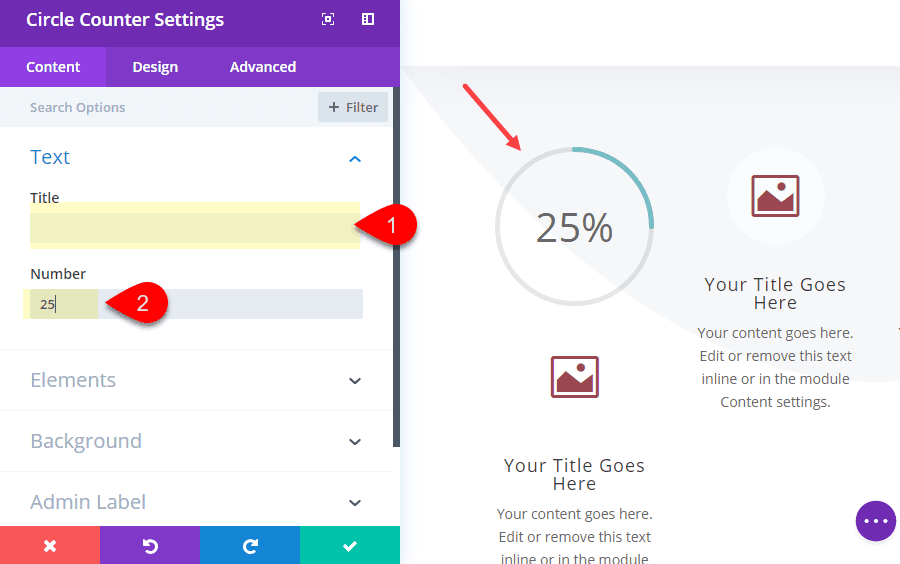
Then update the design tab settings as follows:
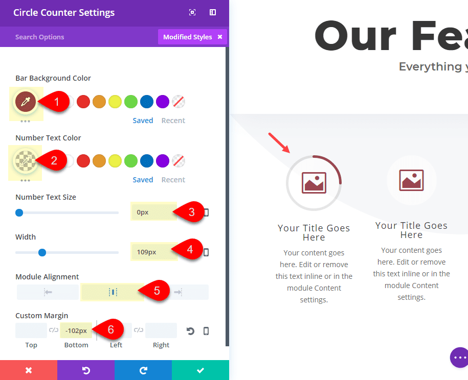
Bar Background Color: #974450 (same color as your blurb icons)
Number Text Color: rgba(0,0,0,0) (this is completely transparent so that it hides the number)
Number Text Size: 0px (to get rid of any unwanted text space within the circle)
Width: 109px (this was set based on the size of the icon it will overlap)
Module Alignment: Center
Margin-bottom: -102px (this will perfectly overlap the icon)
Save Settings.
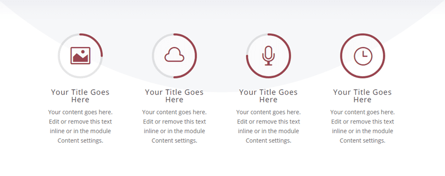
Now all you need to do is copy and paste the circle counter module into each of the remaining columns and then drag it to the top of each blurb. After the duplicated circle counters are in place, update the second circle counter number to 50, the third counter number to 75, and the fourth counter number to 100. The result should look like this after the animation is complete.
Use Row Padding to Position the Icons to Coincide with the Divider
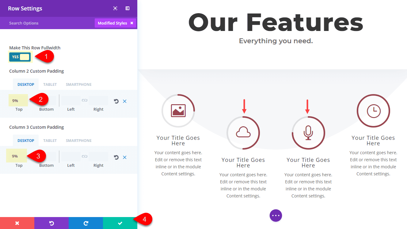
The last step to this design is to position the icons to coincide with the arc of the divider background. To do this we need to add some custom padding the the row. Open the row settings and update the following:
Make This Row Fullwidth: YES
Column 2 Custom Padding: 9% Top (desktop), 0% Top (tablet)
Column 3 Custom Padding: 9% Top (desktop), 0% Top (tablet)
That’s it!
Check out the final result.
![]()
Notice how the icons are now animated by the circle counter with varying number values. And the icons are coinciding with the divider background.
![]()
How the Feature Section Looks on Mobile
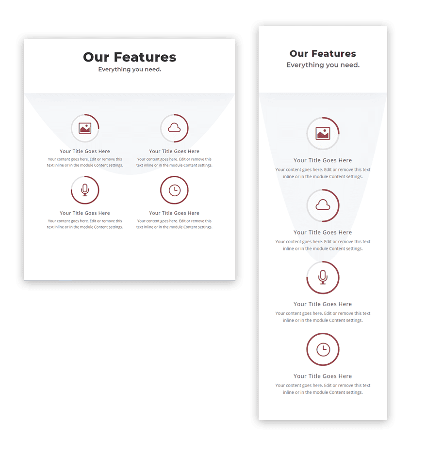
Here is a look at how the design looks on tablet and smartphone displays.
Final Thoughts
The unique elements of this feature section design are light and subtle, which should make it easy for you to incorporate into your own layouts with some minor adjustments. And if the circle counter animations aren’t your cup of tea, feel free to leave those out and simply use the circle icon of the blurb module. Or you may choose to use only the circle counters with the number values visible for a creative layout for featuring statistics. If anything, I hope this will give you a few ideas to explore on your own.
I look forward to hearing from you in the comments.
Cheers!



Hi,
Given that we can now drap and drop .json files into Divi, would it be possible to add on a .json export of the final design for each of your tutorials please.
This is a great tutorial and works well on different screen sizes.
Thanks
Thanks Shane!
Hmmm. Ok, I read and walked through it a few times. The negative margin to move the counter circles up to overlap the blurb circles doesn’t move them all the way. -102px. In fact, I can’t get them to move past this point any higher at all, which is odd.
I ended up using margin-top:-157px to get the alignment. I can lock it in with the padding still.
Leslie,
Sorry if that was confusing. Did you drag the circle counter above the blurb before applying the -102px bottom margin to the circle counter? If you are trying to move the circle counter up when it is below the blurb module, this may cause some issues.
Good idea using different Divi modules creatively. Thanks for the article.
You are very welcome!
Good combination and flexibility of the modules need more of this kind.
Thanks,
Kiran
Thanks for the suggestion, Kiran. Glad you liked it.
Great ideas. Thanks Jason. Personally however, I find the videos more helpful instead of written text. Not always easy to figure out from the pictures but we all learn differently. Nevertheless, thank you for the ideas.
I hear you Linda. We will have the video out soon. Feel free to offer suggestions to make the written content easier for you to follow. I’m always looking to improve. Thanks.
Thanks Jason.
Great technique, love it and might give it a go on my own website soon! Thanks for sharing.
That’s great to hear! Hope it works out. Thanks