Divi App is a child theme for Divi that was designed for mobile app developers. It has a one-page design with a menu that’s anchored to the various sections. Images, blurbs, and CTAs work great for presenting the various features of the app and driving the traffic through the sales funnel. In this article, we’ll look at the features of the Divi App child theme to help you decide if it’s the right child theme for your needs.
Installing the Divi App Child Theme

Installing the Divi App child theme is simple. It works like any WordPress theme and the content is imported with a single click. With Divi activated, upload and activate Divi App in the WordPress themes menu.
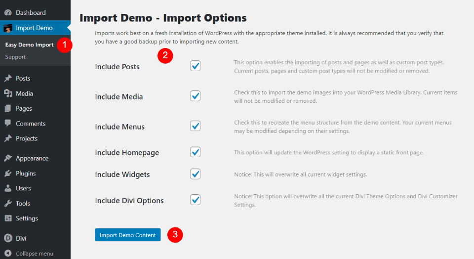
Once the child theme is activated, you’ll see a new menu item added to the dashboard called Import Demo. Click Easy Import Demo within this menu and select the items you’d like to import. This includes posts, media, menus, homepage, widgets, and the Divi theme options. Everything is selected by default. However, it doesn’t have any posts or widgets to import. I recommend leaving everything checked. Click Import Demo Content and wait for the import to finish. Don’t navigate away from this screen.
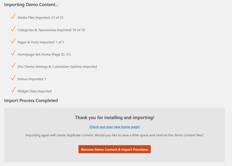
You’ll see a message that your import has finished. Your website will now look like the demo, but with placeholder images instead of the images in the demo. The homepage and menus are already set up and assigned. You’ll only need to add your content. This is my favorite way to install a child theme. The one-click import is easy and smooth.
Divi App Child Theme Home Page

The Divi App child theme is a one-page design with a homepage and navigation to eight sections on the homepage. We’ll look at it each section, one at a time. The elements include slide-in animations and some interesting styling. I’ll point them out as we go.
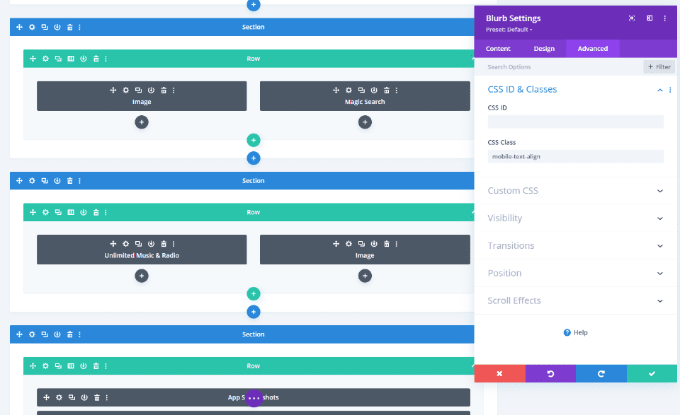
Many of the modules include CSS classes to style them and to ensure it works great with mobile. The classes are defined in the CSS style sheet. The CSS in the style sheet is commented well and even includes a table of contents, so it’s easy to customize if you’re familiar with CSS.
Hero Section
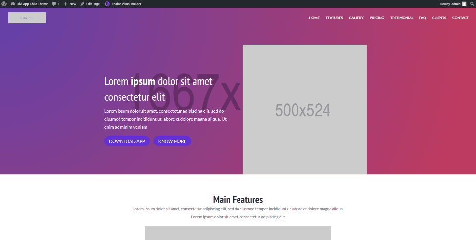
The hero section includes a gradient background with a placeholder image. On the left is a title, description, and two buttons that create a CTA. On the right is a placeholder image where you can place a screenshot of the app to draw attention to the CTA.
Features
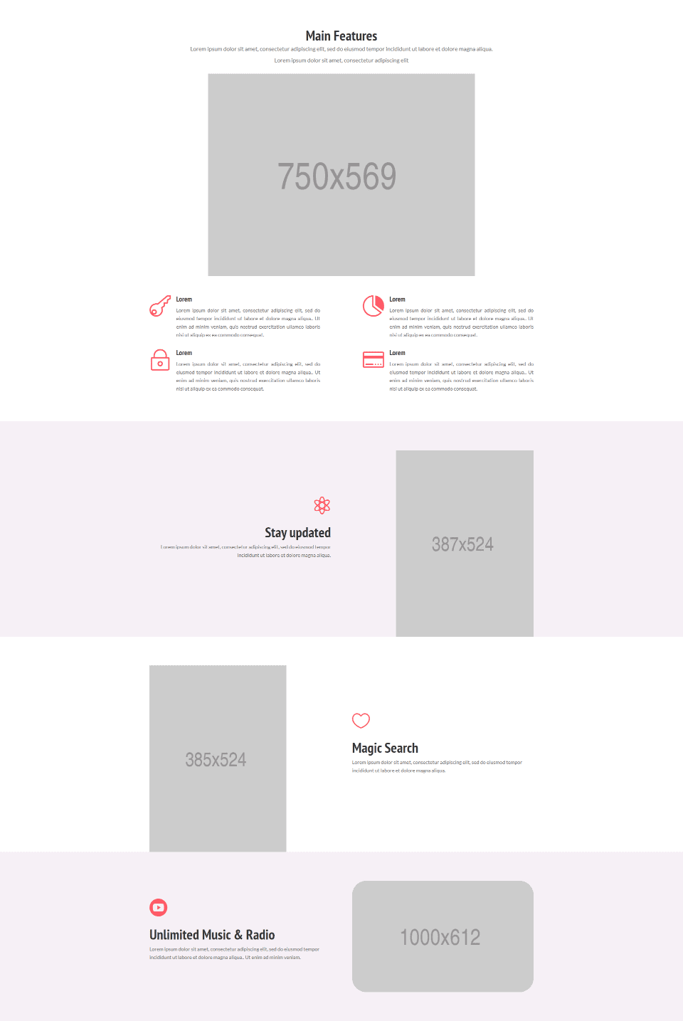
The Divi App child theme Features section introduces your audience to your app starting with a title, short description, and a large image. Styled blurbs display icons and work great to describe specific features. Each of the elements slides into place independently from both sides and the bottom of the screen.
Three rows in an alternating layout provide more details with an image on one side and a description on the other. Descriptions include icons and work as bullets. The first two images are in portrait mode while the third is in a landscape layout. The first and last display a pink background while the center row is white. This helps create some visual difference between them. The last one has rounded corners for the image, giving it an even more unique design.
Gallery
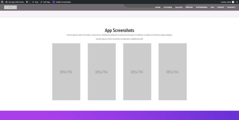
The gallery provides a way to display screenshots of the app. Four images flip into place as a single row as you scroll to this section. They’re tall and narrow, giving a shape that matches a smartphone in portrait mode, which is great for screenshots of the app. The surrounding background is clear, allowing the eye to focus on the images without distractions.
Pricing
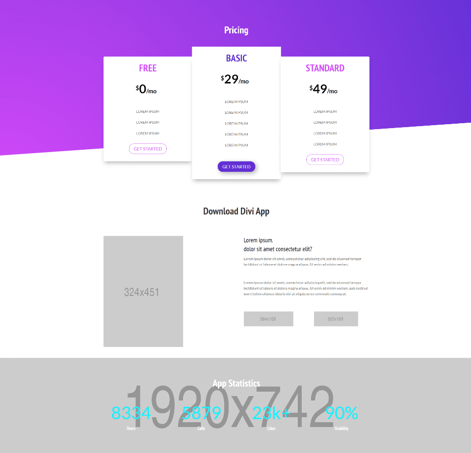
The Divi App child theme’s pricing section includes multiple rows that provide information in different ways.
Pricing tables display in three different sizes with the most popular in the center. Sizes match the recommendation, with the largest being the most recommended. They overlap the gradient background with its angled divider and include a box shadow so they stand out from the background and each other. Colors for the fonts and buttons match on the outer two tables, while the center table stands out. Hovering over a table brings it to the front.
The CTA displays a small image on one side with information and two buttons on the other. The buttons are placeholders for images of the various app stores.
App statistics display with number counters over a full-width background image.
Testimonial
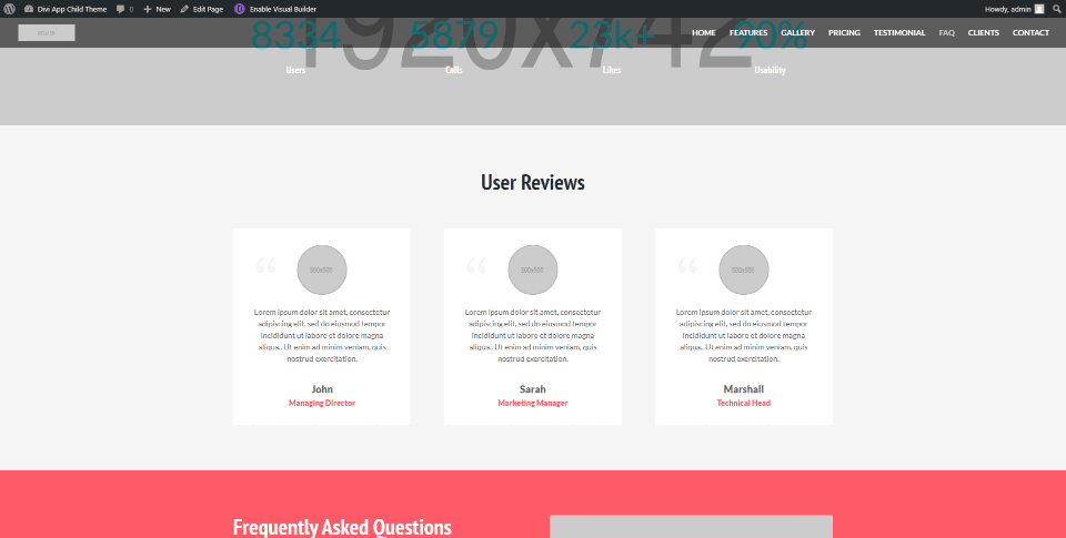
The Divi App child theme testimonials section displays three user reviews as cards with a styled quote icon, circled image, text, name, and title. Titles use colors from other sections of the child theme, such as the background in the next section. Cards pop into place as you scroll to this section.
FAQ
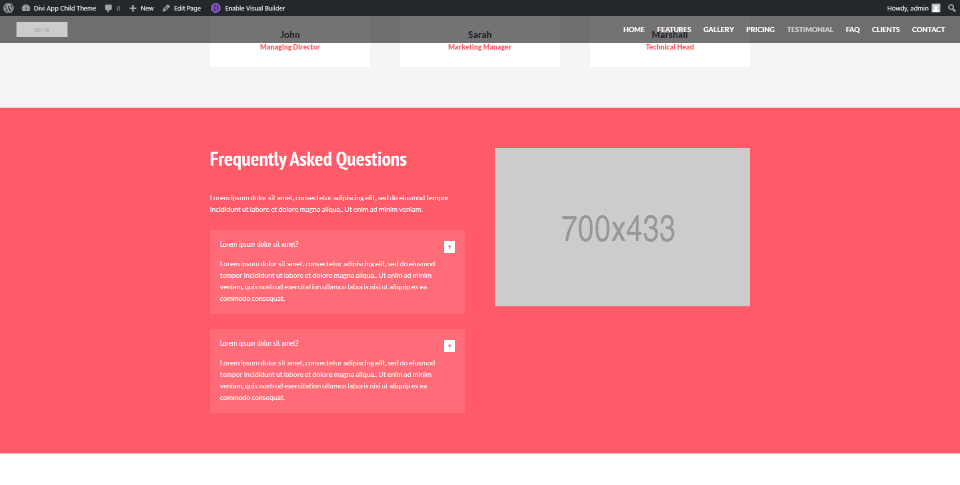
FAQs slide in from the side and display answers within styled toggles with a slightly lighter background than the section. The background color matches some of the highlights from other elements in the child theme. It also includes a placeholder image where you can use any type of image you want to draw the reader’s attention.
Clients
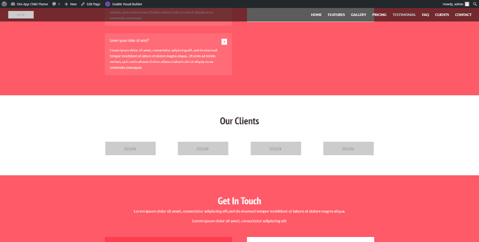
The Clients section provides a full-width area to display the logos of your clients. The logos are image modules. They appear one at a time as you scroll to this section.
Contact
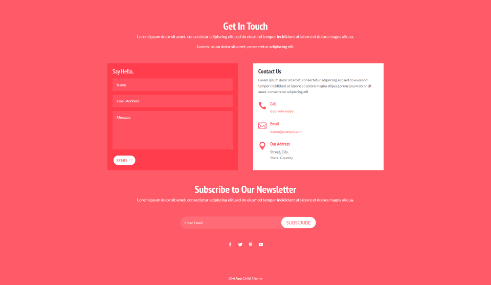
The Divi App child theme’s contact section displays several elements over a red background that matches the FAQ section. The first portion introduces the contact information, which includes a styled contact form and contact information in a two-column row. The information displays styled icons and text. Each element flips into place from the bottom.
A newsletter portion displays the title and a short description with a styled email form followed by social media follow icons. These elements fade (or, I guess un-fade) into place.
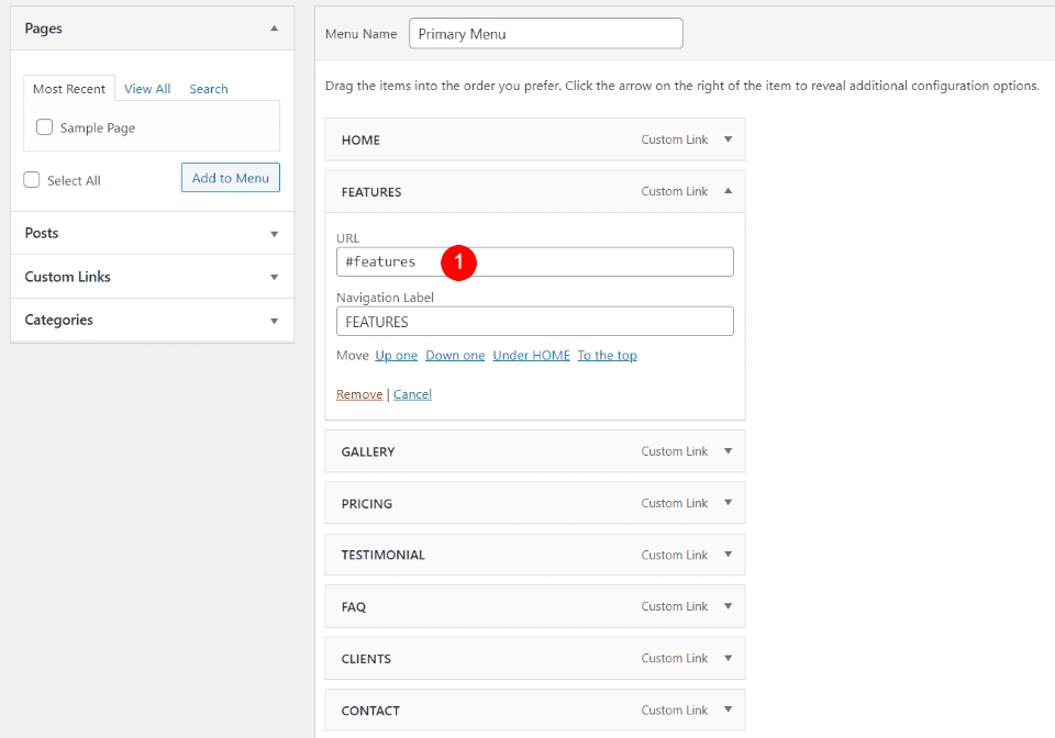
The menu includes each of the major sections of the homepage. They include the anchors for the different sections as their URLs, so each menu link will scroll to the section when clicked.
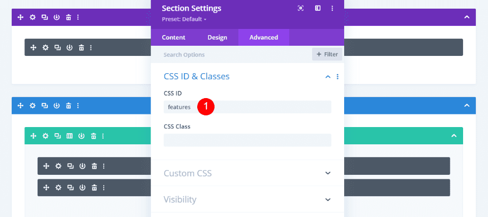
The anchors are already added to the CSS ID fields on the homepage. If you change the names of the menu links, you’ll also need to change the CSS ID in the section’s Advanced tab to match.
Where to Purchase Divi App
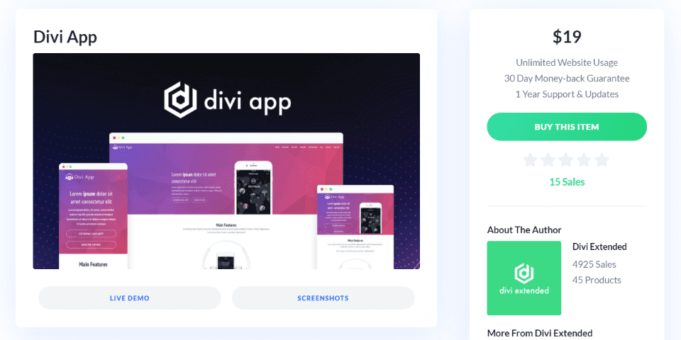
You can purchase the Divi App child theme in the Divi Marketplace for $19. It includes unlimited usage and one year of support and updates.
Ending Thoughts
That’s our look at the Divi App child theme. This one-page child theme has lots of elements to show the features of your app and provides several CTAs where visitors can make a purchase. Many of the elements include CSS classes to style them and control how it looks on mobile, ensuring that it works great with any type of device. It is a simple child theme at a great price. If you’re interested in a simple one-page child theme to highlight your app’s features, Divi App is worth a look.
We want to hear from you. Have you tried the Divi App child theme? Let us know about your experience in the comments below.
Featured Image via Julia Tim / shutterstock.com


Leave A Reply