In this post we’ll be featuring ten Divi websites submitted by community members. We get a great many website submissions but these ten have distinguished themselves and so I am very happy to share them with the whole community through our blog. I’ve put a short note under each one to draw attention the feature or features that most caught my eye. Enjoy the inspiration!
10 Community Divi Web Design Submissions
1. Live Your Best Life Now

This website was submitted by Brad Welnman. I wanted to feature this Divi website because I really liked the combination of the centered logo, primary menu, and hero image. It does a great job at “selling” the site’s purpose in the first moment.
2. The Happy Green Teacup
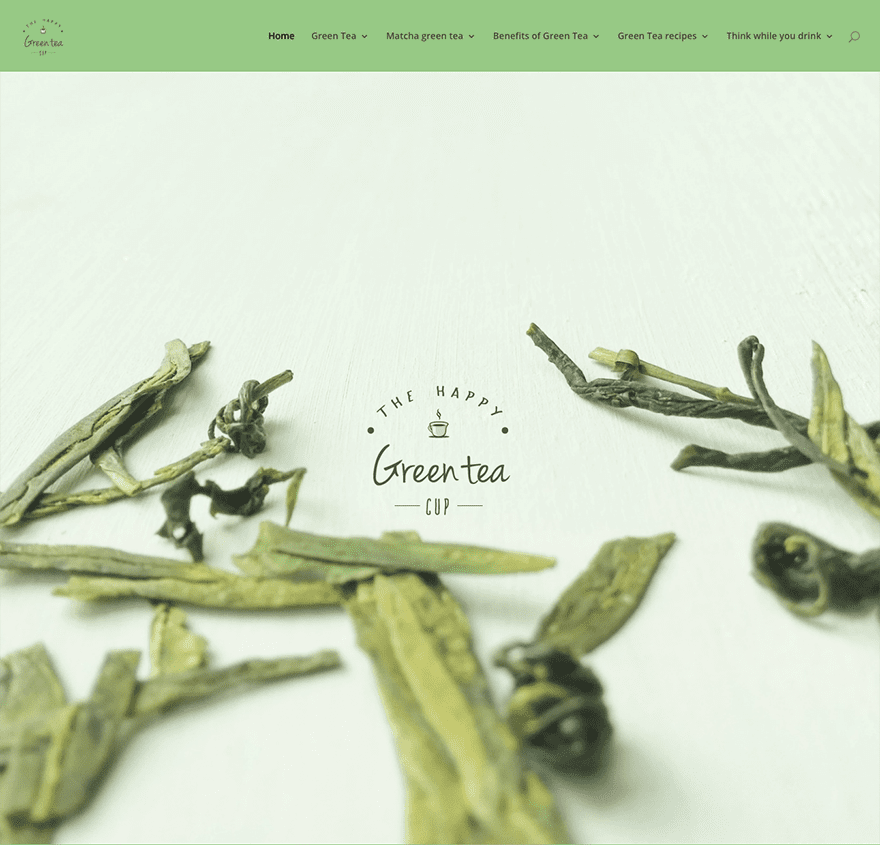
This website was submitted by Cristy Mayes. I included it in this roundup because it’s a great example of how powerful a good logo, paired with good photography, and a fullscreen header can be.
3. Indian Student Abroad

This website was submitted by David Collins. I really liked how well he organized all of the items in his menus. It’s very neat and well laid out.
4. North American Lighting
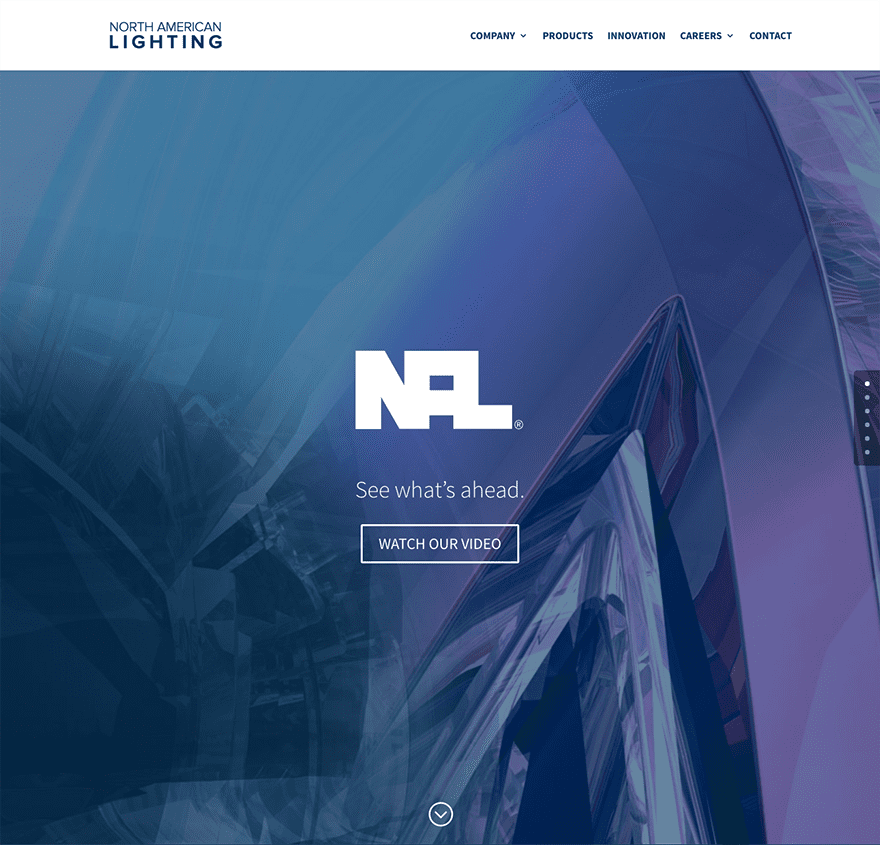
This website was submitted by Larret Wright. I included it in this showcase because it’s a great use of the fullscreen header; showcasing the services they provide.
5. Sensiweb
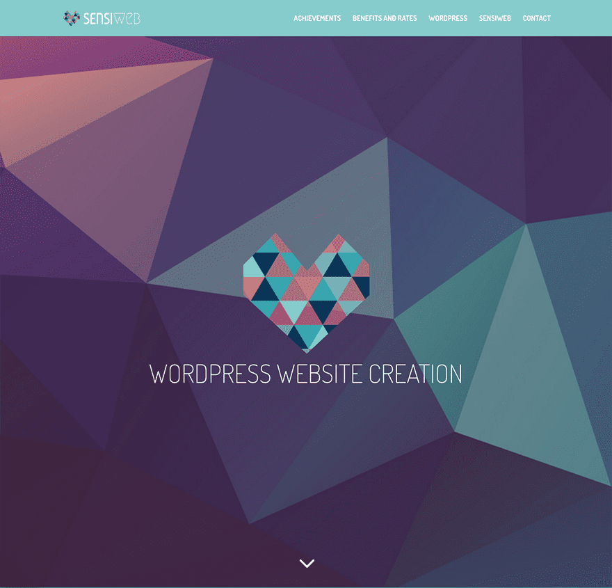
This website was submitted by Jessica Falco. I chose to showcase this website because not only do I like the basic construction of the website but the subtle variations on the color pallet throughout.
6. Dulaman Show
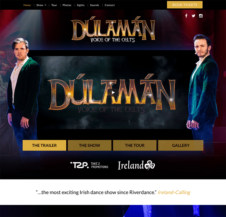
This website was submitted by Kyra Pieterse. I really like the use of layered elements, images, and parallax. It’s got a great Las Vegas style to it.
7. Cuaderno Web
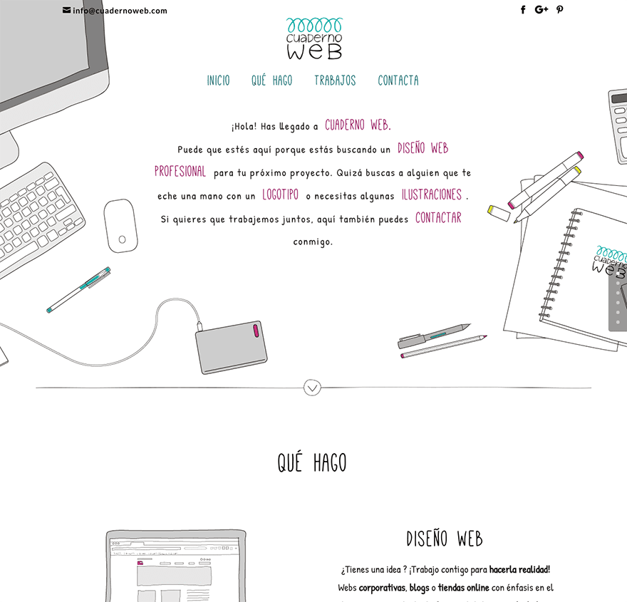
This website was submitted by Elisa Lara Campos. I included this website into today’s showcase because it’s not often you see a site with so many custom illustrations making up the design. I’m a huge fan of the entire “hand drawn” look and how appropriate it is for the subject.
8. Molecular Magic
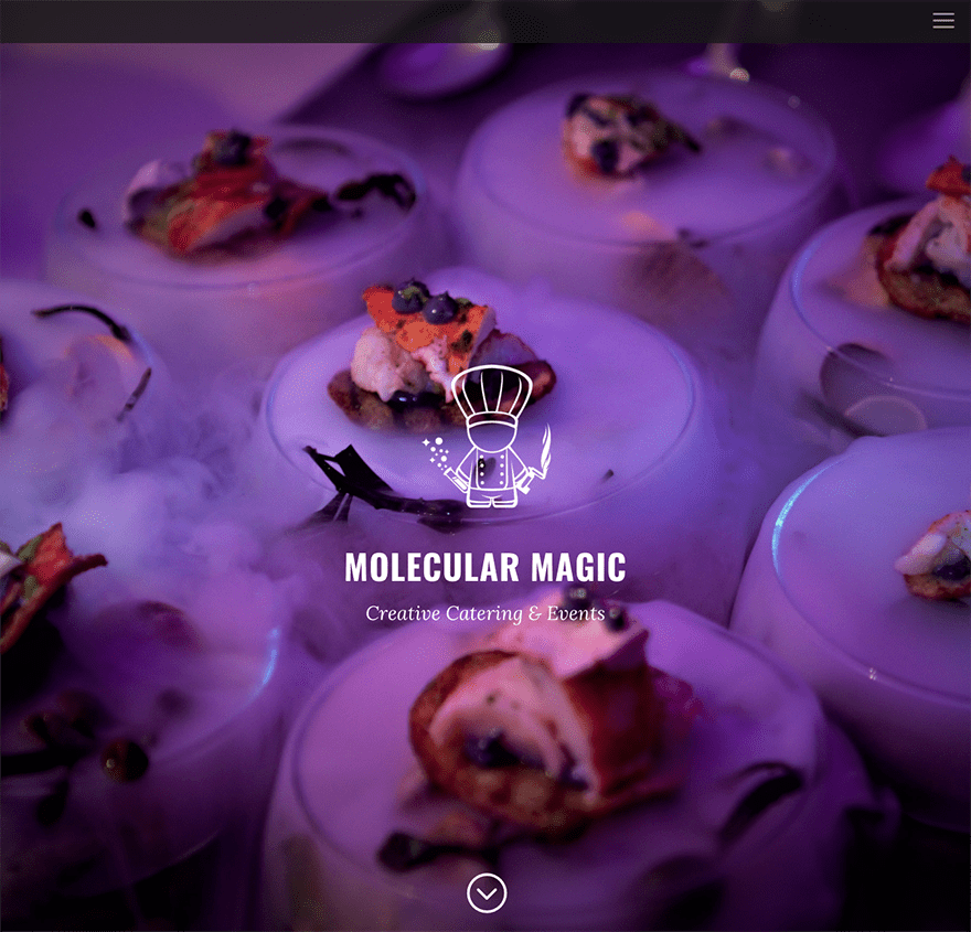
This website was submitted by Matt Oliver. This website has been included because it’s a neat and elegantly executed website with clean typography, lovely photography, and the little used full screen menu option.
9. Birdie Media
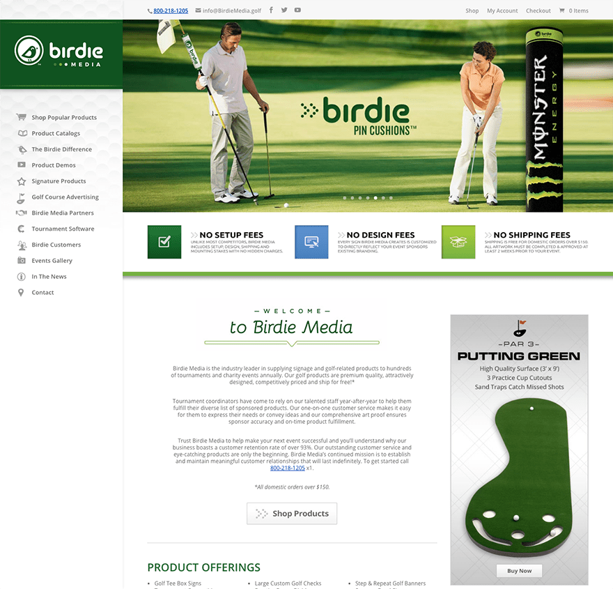
This website was submitted by Jon DuVall. This website was included in this showcase today because it’s not often we get to see Divi sites use the vertical navigation, let alone well! This website is a great example for others to follow in that area.
10. Vi Dimensions

This website was submitted by Arthur Lim. I’ve included it into today’s showcase because, well, it’s just a gorgeous website. I’d have trouble finding a detail I didn’t like so I’ll just recommend that you go visit it and enjoy the whole thing!
In Closing
Well that’s all for this roundup of Divi Design Submissions. I still have a lot more to look over for future posts. If you’d like your own design considered please feel free to email it to me at nathan at elegant themes dot com. Be sure to make the subject of the email “DIVI SITE SUBMISSION”.
We’d also like to hear from you in the comments! Tell us what you like about these websites and if there is anything they’ve done you want us to teach on the blog.
Featured image via morokey / Shutterstock.com



These are really great examples. Are there any other websites we can submit our works on to get featured?
Impressive and unique sites. Birdiemedia seems to be one of the best implementation of Divi with left navigation. Molecularmagic is heavy and takes time to load.
What’s a good tool to use to measure website speeds? Nathan, what do you use?
There’s a couple that I really like! I love posts like this!
It gives me ideas for my next project or just to play around with.
How can we submit our designs? Do we just drop it in the contact page? social media?
I would love to improve my design skills. I’m a beginner Divi user and would like to really push my designs to the next level.
Great post!
where can i able to check other people submitted site? I checked in forum didnt see any category
nice showcase … does anyone know how No. 9. – Birdie Media added icon to their Nav. ?
Looks like they are using custom class on each menu item and then css for each custom class with unique background image and some padding.
background: url(http://………./wp-content/uploads/shop.png) no-repeat 0px 0px;
padding-left: 35px !important;
The Font Awesome 4 plugin is free and allows you to add a lot of different icons to your menu. I use it on my site in the header and for the footer social icons. You will need to create a child theme to add custom icons to the footer.php file or use the Divi Booster plugin.
Nice colours, designs and layouts.
I am viewing on a simple 21″ iMac just a few years old (Yosemite OS). In 6 or 7 out of 9 of the websites the difference between the very tiny menu fonts (one menu just 3 lines) and body font is huge, not to mention the relatively extreme sizes of most titles.
Is there a reason behind this, like preference for all images and minimal content? of just because they are demos?
Impressive and inspiring work all around. Thanks for showcasing the Divi community and thanks for including the North American Lighting site! We’re thrilled to be in such great company.
Really nice websites. Nathan, By the way we are a new web design agency in Guatemala and I would be amazing that our website built 100% using divi would qualify in this kind of showcases. We are so excited to go live this month using divi 3.0
If anyone can tell me how to do the data points background on #10 I would be super grateful!!! It’s exactly what I would like for a personal project of mine.
Though I am sure there are other ways to accomplish the easiest way and likely the method they used is the FullWidth Header Extended Module, which is a third-party plugin. The plugin is very reasonably priced and has a lot of features you may find useful like the typing effect. I have used it on several sites I created for clients.
NOW THAT’S WHAT I’M TALKING ABOUT!!!
These are all great fun! Some of them feel huge with the full screen options on. In the final example, the Vi Dimensions one, how did they do the 3 x 3 grid that is 2/3 of the way down the front page? Is that a table with no thickness in cell padding or…? A 3-module across with no padding?
Although I love the Divi theme, lately I’ve been working on my page speed and finding various elements of Divi that seem to be quite consistently slowing divi pages down which in turn most likely hurts google ranking as well. I was curious about other Divi sites so I started checking the Google Page Speed Insights and confirmed that almost all of the sites that are professed to be showcase Divi sites have really bad scores! (including all of the above sites which mostly have google page speed scores between 15-40 out of 100!!) The biggest common culprits seem to be:
– Eliminate render-blocking JavaScript and CSS in above-the-fold content
– Leverage browser caching
– Minify JavaScript
– Optimize images
Now optimizing images is understandably more the responsibility of the designer, but I really have to wonder what Elegant Themes and the Divi folks could be doing to make our theme more optimized in these areas?!
I ended up spending a lot of time and using various plug-ins and Cloudflare settings to fix my site and now have a good score on my site, but couldn’t some of this work be mitigated by better programing on the theme side?
I like the first site, the life coach, but I was on the page at least 60 seconds and the main header photo was still loading when I clicked off. I went back to it later and it did load, but still took about 5 seconds.
Load time is still much better here compared to molecularmagic . Large images are major problems sometimes.
The header image on molecularmagic is larger than 2mb and 5184px in width. Pingdom shows 14 seconds of loading time.
With Divi, properly optimized images will be cherry on the cake for any website.
Good hosting, image optimization, minifying code, and caching should get almost any Divi website up to the high 90’s if not 100/100.
Hi Nathan,
I know that it’s possible to improve all of these aspects through the hosting side and the developer side, but you ignored my main question which is why don’t Elegant Themes/Divi do something about these issues on the theme side so that the theme doesn’t “weigh” so much in the first place? I’m especially interested in the issues of Eliminating render-blocking JavaScript and CSS in above-the-fold content & Leverage browser caching since these seem to come up consistently problematic when I look at all these sites that are supposed to be “showcase” examples.
I agree with you Nathan, and yes the hosting only needs to be good, not great. My name links to one of my Divi sites that scores very well in both the pingdom and pagespeed tests, but I have more, and they all score well considering they are on shared hosting accounts. Cache, minify, compression, leverage browser caching, optimize images. All pretty standard and easy to do, but ANY site using any theme that does not do these things is probably not going to score well.
Depending on how complex the site is I usually get 65-80 on mobile and 80-95 on desktops in the Google pagespeed test. Try the MSN site, they only get 74/87 (even MSN gets a red flag for “Eliminate render-blocking JavaScript and CSS in above-the-fold content”)
and how many millions do they spend? I don’t believe a site that is around 70/85 in the pagespeed test will suffer any loss of ranking as long as it is not loading slowly. Response time is a killer when it comes to rankings, and a huge problem on shared servers when your site is not cached.
Nathan, I know you have created how-to blogs on the above subjects, but for those of us new to using Divi and experiencing the issue with page load speed, can you create a single blog that hyperlinks to the “how-to”s, please? It is nice to have this sort of thing sourced from one place to reference.
Love your work too.
Sure!
Hi when I go to PageSpeed Insights they always give me Divi front builder and other js and css minified files but how do I add them to a child theme as that won’t work.
https://developers.google.com/speed/pagespeed/insights/?url=https%3A%2F%2Fsitescreated.com&tab=mobile
Yes you say to minify code and everytime I try to add a plugin that does it, the site goes crazy as it minifies Divi and Divi doesn’t work minified. Can you can suggest how to minify Divi files and get it to work?
That would be awesome, thanks.
I use WP Fastest Cache and it has worked well so far
Hi,
How did 7. Cuaderno Web get the background image to flow up under the navigation?
And in 9. Birdie Media, how did they get those icons to show beside each navigation link?
In general, are there other tutorials on how to do some of the things shown here, or does it require coding skills to customize it to have these looks?
Thanks
These are really nice. I love inspiration and seeing the things Divi can do!
Thank you, a good article with inspiring examples, I mainly liked the number seven, greetings
Nice projects! We want more featured Divi projects in your blog 🙂
Wow! Love http://liveyourbestlifenow.com/ would love to know how he did that center part. Definitely going to try it with a back drop image.
Hey, thanks for the feedback Theo! I created the header image in photoshop… pretty simple actually. First, I took a the image of my wife, Chiara, stripped out the background, then created the gradated grayish-blue background behind it, then added the text she wanted onto the image and saved it as a png.
You could probably do something similar using canva.com or another WYSIWYG graphics program, but that’s what worked for me. Hope this helps, Brad
Thank you very much for the feedback. I was referring to the section ‘This is where I come in’ Is that a back drop behind the text modules (I think) that really makes it special.
Hi Theo, I have a guess about the fixed-background image and text block that you are referring to, and maybe Brad can reply as to whether I’m correct.
I think it’s a Fullwidth Slider module, with a single slide that has CSS Parallax set, and then a block of text with a transparent background and a float:right setting for the text and white background.
I just had another idea – it might be a section with the background image, and CSS Parallax, with a two-column setting for the section with a text module in the right-hand column, but nothing in the left-hand column, and the Advanced Design settings set to “equalize column heights”
I hope Brad will let us know!
Gregg Davis
wpdevcourse.com
Hi Brad, I like your website a lot, especially the logo. Often if there are characters in my logo, it often looses the resolution when it scales down to mobile devices. Your log is all characters and looks great no matter what size of devices. Is it the jpg or png file that matters? or is it the resolution that matters?
All are beautiful!
Would love to read a post applying different logos on pages and posts!
All are EXTREMELY impressive
I love Divi, and actually I tried other builders for clients that ask but I go 100% with you guys.