We’re back with another roundup of Divi design site submissions for our second monthly installment of our (now) ongoing Divi Design Showcase series showcasing the design work of our community here on the Elegant Themes blog. This is a look at our favorites for the month of July.
The Best Community Divi Site Submissions for July 2017
There are a lot of interesting design elements in these websites. There’s sure to be some ideas here to spark your imagination. Rather than going through all of the site’s details I’ll highlight the elements that I find the most interesting or unique.
1. Globetops
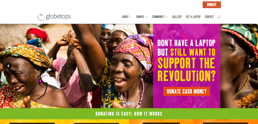
This site was submitted by Shanthony Exum. It uses eye-catching colors with the styles of the global locations they represent. It includes a four step donation process that’s labeled well, easy to follow, uses text and graphics, and has short and simple descriptions. The stand-alone donate button in the header draws attention and includes the same branded colors.
2. Carrie Design
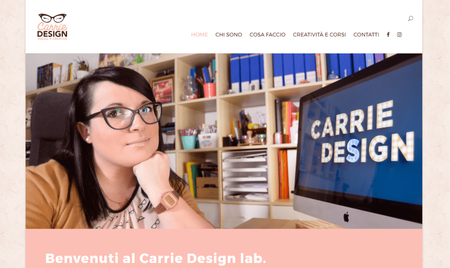
This site was submitted by Carola Speri. It uses a boxed design with an interesting background pattern and soft colors to attract the target audience. It also makes good use of parallax. The visuals for the creativity courses draw me in.
3. From Space
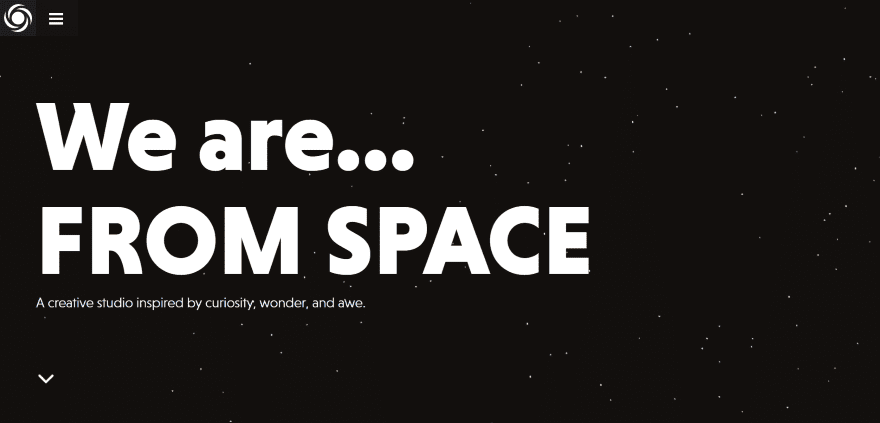
This site was submitted by Ellery Mann. It includes an interesting typing animation as it loads and a full screen menu – both with extra-large fonts that fit the site’s design. The portfolio uses a nice hover effect. Clicking takes you to a multi-column page with artwork and a full-width project slider.
4. VCC Lite
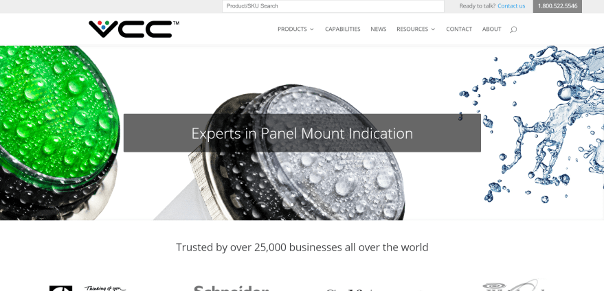
This site was submitted by Sannah Vinding. The site uses a clean and professional look with an industrial design. It focuses on products, making nice use of images and client logos. It even includes an interesting product search in the top bar and includes a contact button and phone number.
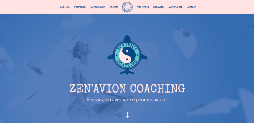
This site was submitted by Lycia Diaz. The site includes nice colors and fonts. The information section blends beautifully into a full-screen image. It includes images that overlap sections, nice use of parallax and color overlays, and perfect color-branding and font-pairing.
6. Tomas Svitorka
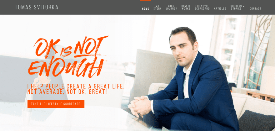
This site was submitted by Tomas Svitorka. The site includes an elegant full-screen image with CTA (call to action), lots of full-width images with overlays, and sharp 3-column testimonials with multiple layouts. The menu includes an orange line to show which page you’re on and the page names display with two lines of text. The colors and fonts are fantastic.
7. CVG Advisors
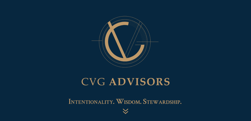
This site was submitted by Nora Kramer. This one is a great example of how to use color for the financial industry. The layout is clean and to the point. No navigation is needed. It makes great use of parallax with an overlay. The information leads visitors to a single contact form.
8. WPSifu
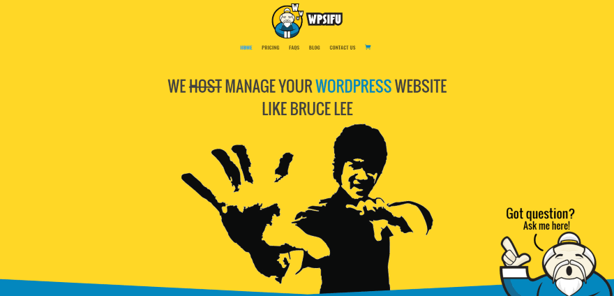
This site was submitted by Dean Loh. It makes great use of imagery. I love the yellow and blue color branding with black images of famous (and my favorite) fighters to make the company statements. A clickable cartoon character asks if you have questions remains on screen and becomes the footer itself when you scroll to the bottom. The yellow and blue continue throughout the site.
9. Be Ink
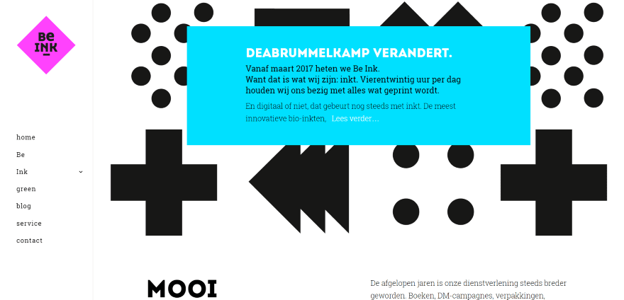
This site was submitted by Fabian van Bakel. It uses bright colors and an animated logo that changes colors and black and white background elements throughout. Primary colors create the backdrop for the pages. The site makes interesting use of black and white, blocks of color, and large fonts.
10. Tara Leaver
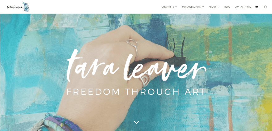
This site was submitted by Tara Leaver. The site uses a beautiful background videos to show off the artwork and studio. The fonts match the artistic style of the site perfectly. The light green highlights fit well with the branding. This site makes me want to get out my art supplies and draw and sculpt.
In Closing
Well that’s all for this roundup of Divi Design Submissions. We have a lot more to look over for future posts. If you’d like your own design considered please feel free to email our editor at nathan at elegant themes dot com. Be sure to make the subject of the email “DIVI SITE SUBMISSION”.
We’d also like to hear from you in the comments! Tell us what you like about these websites and if there is anything they’ve done you want us to teach on the blog.
Featured image via silvae / shutterstock.com




This is great! Any tutorials for the header bar on Be Ink?
How do I submit my designs?
Yes, where is the submit page?
Hello,
Could you make a tutorial how to create an top bar like vcclite.com?
Sure 🙂
Thank you for putting this together! Looking nice!
The WPSifu design is really inspired me, ready to redesign my web.
Thank you very much.
Umm…I’m pretty sure WP Sifu didn’t pay to use the names and images of famous celebrities in their promotional materials.
That site is just a lawsuit waiting to happen.
I’d have omitted that one out of the mix, too. Not the most ethical in business practices and nor is it a good influence for the design community.
In China, they don’t care.
Hi,
Just wondering……website #3 “From Space”: how to make that logo spin? Anybody ideas?
thanks, Arthur
Here you go: https://jsfiddle.net/Guruprasad_Rao/1m23cut6/2/
They used a 1.7s transition and transform: rotate(1080deg) on image hover.
You can do this with CSS. Check out my post on microinteractions here:
https://www.elegantthemes.com/blog/divi-resources/6-microinteractions-that-will-make-your-divi-site-more-enjoyable-how-to-achieve-them
Then check out the Rotate example. In the css, instead of rotating 360 degrees. have it rotate like 2000 degrees and it will spin.
Make sense?
Some great new examples thank you!