It’s that time again for our monthly Divi Showcase, where we take a look at ten amazing Divi websites made by our community members. Each month we showcase the best Divi websites that were submitted from our community and today we want to share with you the top ten websites for the month of August. Throughout the post, I’ll point out some of my favorite design features that draw me to each of the websites.
I hope you like them!
Divi Design Showcase: New Submissions from August 2021
1. Het Beweegt
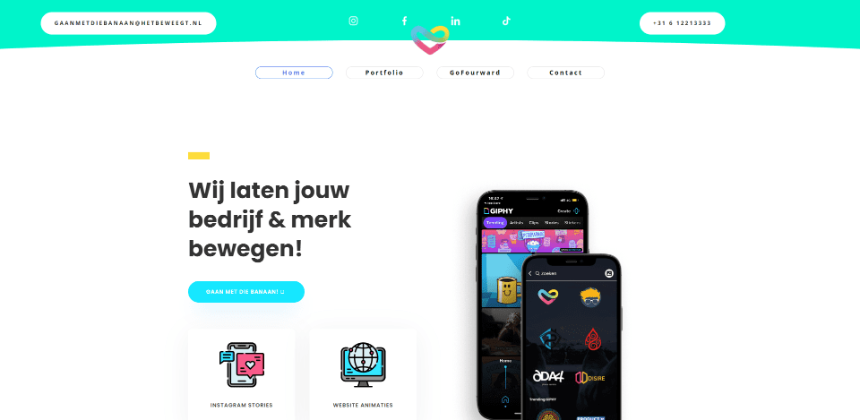
This site was submitted by Romy Lodewijk. This one uses vibrant shades of blue, green, yellow, and red to create some interesting color combinations. The colors are brought together in the logo, graphics, and icons. They’re used individually within backgrounds, text, buttons, counters, etc. A product image tilts on hover. Several other product images overlap each other or the backgrounds. The layout is clean with a strong focus on the product’s features. I also like the header design. The bottom of the header is rounded and the logo overlaps the header and the next section, which includes buttons as the menu links.
2. xViz
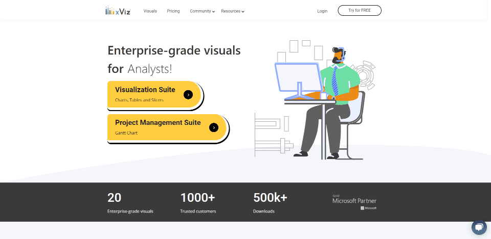
This site was submitted by KG. This one uses yellow and black highlights and dark gray backgrounds for branded colors with the whitespace to create a clean design. Flat graphics include the branded colors to draw attention to the CTA. Blurbs show mockups of charts and graphs with black and yellow highlights. They zoom on hover and change to show real charts and graphs that keep the color scheme. Tabs show the charts with larger graphics. I like the way yellow circles are used behind black icons tying the design together. It also has a well-designed mega-menu.
3. Collective Design Agency
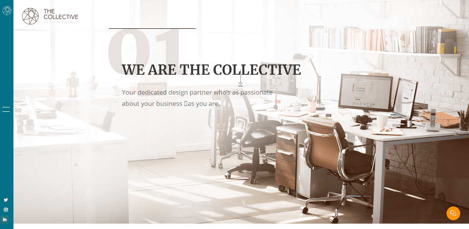
This site was submitted by Lauren K. Slack. This one makes interesting use of wide spaces and image overlays. The slim menu sticks to the left vertically. The hero section shows a full-screen image with an overlay that fades to one side. Other images use similar effects to create some interesting visuals. Some of the sections place the content in the center, while others are pushed to one side or the other. Most of the sections have a clear call to action. I especially like the projects page. It shows recent works as large images of various sizes.
4. Lesperance & Associates
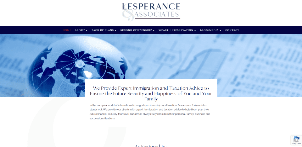
This site was submitted by Jeffrey from Geek Boutique Design. This site uses dark blue backgrounds and highlights, elegant but serious fonts, and images to inform the audience of the topic. The dark blue is used for image overlays, blurb backgrounds, text, buttons, and the footer. A CTA uses a book cover that matches the site’s design. The blog section is also interesting. It has a shadow on both sides, but not on the top or bottom. The dark blue overlays are also used for the blog’s featured image.
5. Wilkenwerk
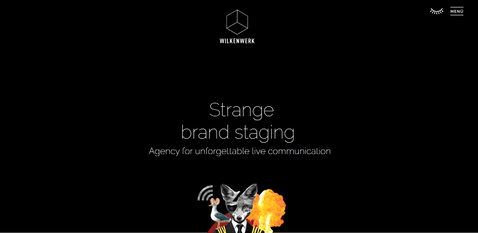
This site was submitted by Torsten Landsiedel. It uses purposely strange images throughout the site to appeal to the target audience. Many of the sections have alternating layouts and offset layouts. I especially like the alternating projects section that shows a large image on one side and an excerpt on the other. Both have black borders that separate them from each other. I also like the awards section. It uses blurbs to show the awards with a logo and a description.
6. Ulk
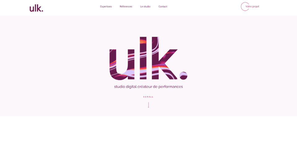
This site was submitted by Benjamin Segura. This one makes great use of typography and images. The hero section places the logo in the center with a swirly background within the text that follows your mouse. Many other sections include the swirly colors within the text, overlays, backgrounds, etc. Micro animations color text on hover, animate an icon, change the cursor, and zoom images. One of my favorite elements is the team section. Cards of the team members are stacked over each other with the one in the center being the largest. The images shift within the card and a description appears as you hover.
7. Common Affairs
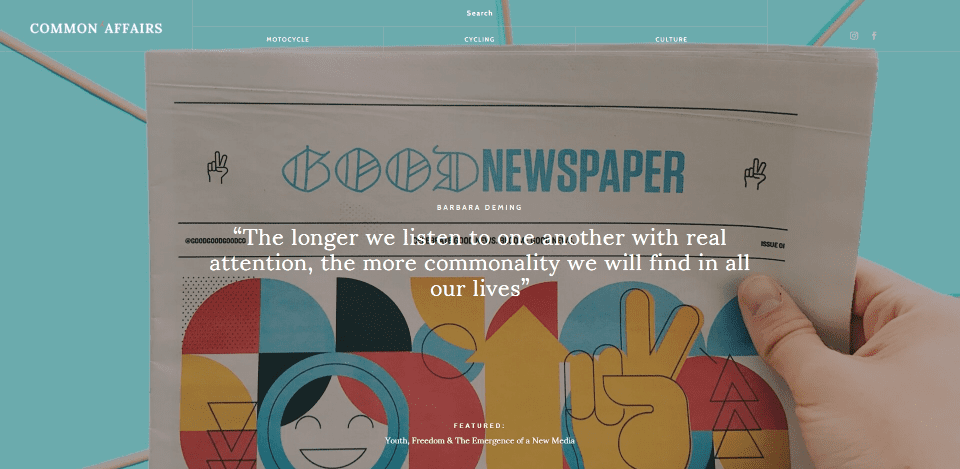
This site was submitted by Fudzil Akmal. This one makes interesting use of cards. The hero section is a full-screen post slider that shows the featured image with a quote in the center and the title at the bottom. The menu is clear, allowing the featured image to show through. The rest of the page is blog posts, but they’re not laid out like a normal blog. They’re placed in a mosaic layout with 2-3 columns per row in different sizes. The cards include a large featured image with the meta and title under the image. The blog posts place the previous and next links vertically on the sides of the page.
8. Isitec International
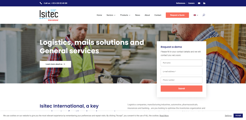
This site was submitted by Eric Wils. This one uses bold blue with a light orange/red as the branded colors along with a clean layout and images to attract the target audience. The hero section includes a full-width image with an overlapping contact form. Blurbs show the services. They stand out from the background and include icons in the left corner. Images with tags in the corners are used for case studies. I also like the blurbs that show the benefits. They blend with the blue background but include a border so they stand out. Their orange icons look great against the dark blue cards.
9. Sunshine Delights
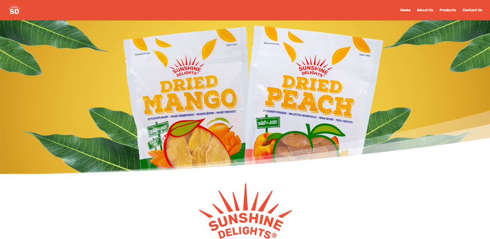
This site was submitted by John Cooper. This one uses lots of tropical colors that match the product’s branding. The backgrounds include curved dividers to stand apart from each other and create the illusion of waves. Icons in the tropical colors reveal information in an overlay on hover. A CTA to purchase the product includes a product image that overlaps two sections. Many of the sections include colors from the previous and next sections as highlights. This ties all the sections together. I like that the section dividers curve in different directions. Even the footer includes the dividers at the top and bottom.
10. Edit Ops
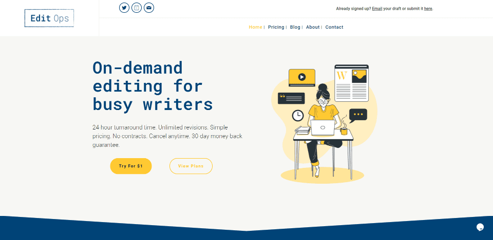
This site was submitted by Devanshi Jain. It uses lots of hand-drawn graphics with blue and yellow branded colors throughout the site. The graphical elements include blobby backgrounds to set them apart from the sections. The benefits display graphics on one side and text on the other in an alternating layout. It also includes an interesting header. It has two rows with social media follow buttons and a sign-in at the top and the menu at the bottom. The logo spans both rows. The blog is also interesting. It follows the same design and places the posts within cards using graphics for featured images.
Conclusion
That’s our 10 best community Divi website submissions for the month of August. These sites look amazing and as always we want to thank everyone for your submissions!
If you’d like your own design considered please feel free to email our editor at nathan at elegant themes dot com. Be sure to make the subject of the email “DIVI SITE SUBMISSION”.
We’d also like to hear from you in the comments! Tell us what you like about these websites and if there is anything they’ve done you want us to teach on the blog.
Featured Image via mentalmind / shutterstock.com


These look great!
I am definitely going to submit a few sites in future.
Some cool, fresh and professional selections!
Am thinking of purchasing on of the elegant theme since a friend introduce me to its features. but my fear is can i use elementor builder with it ? as this is what am expect in
You technically can use Elementor with the Divi Theme. However, I would not recommend it. You’d be adding two builders to WordPress for no reason. It would be best to choose one or the other.
ok boss. Thanks for the reply. am about to purchase the elementor theme now but will i be able to get a well direct documentation or support regarding the Divi builder because am new to it ? am not a reliable response