It’s that time again for our monthly Divi Showcase, where we take a look at ten awesome Divi websites made by our community members. Each month we showcase the best Divi websites that were submitted from our community and today we want to share with you the top ten websites for the month of March. Throughout the post, I’ll point out some of my favorite design features that draw me to each of the websites.
I hope you like them!
Divi Design Showcase: New Submissions from March 2020
1. Ertveldt
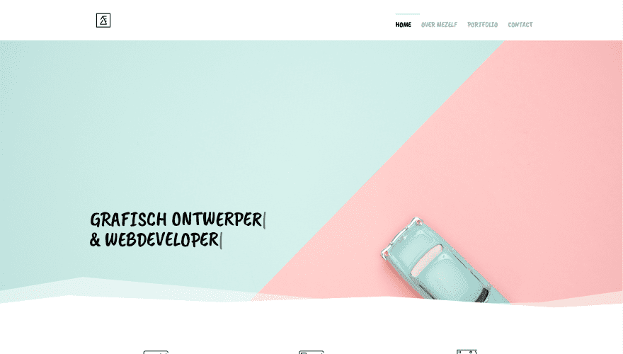
This site was submitted by Jany Ertveldt. The hero section displays a background with two complementary colors separated diagonally. A photo of a car is placed on one side in the opposite color while the text appears on the other side. The tagline is typed onto the screen as the page loads and includes flashing cursors. Services are shown within blurbs using dividers that match the two colors. More information is provided with several two-column sections that place graphics on one side and text on the other in an alternating layout. The testimonial section includes one of the two colors with a section divider in the other color. Styled section dividers in one of the two colors are placed throughout the design.
2. GTZ
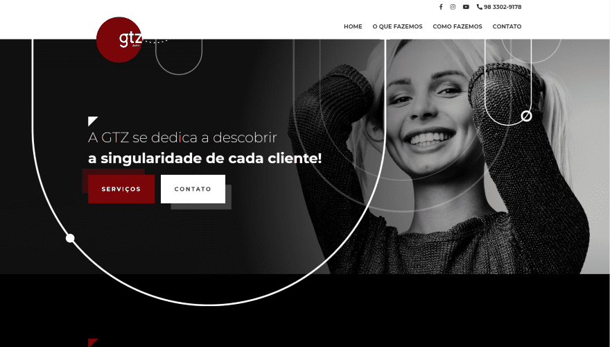
This site was submitted by Lethicia Diniz. The site uses lots of black and dark red throughout. The hero section displays a background image with the subject on one side. Circular designs are placed across the screen with the primary focus on the side opposite the photo with a tagline and several buttons to see services and contact the company. The circular design appears throughout the site. The logo overlaps the menu and hero section. Services are described within blurbs over a dark background. Information about the company is detailed with large text, images, bullets, and circular background patterns. Descriptions of the types of work are shown with blurbs using large icons with gray circled backgrounds. I love the use of bold red on this website.
3. Magic Class
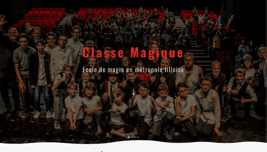
This site was submitted by Amal Vaesken. This one is a school website with a members area. A full-screen slider displays background images with the title and tagline in the foreground. Scrolling reveals information about the company, the benefits of learning magic, and information about what you’ll learn placed within tilted graphics of playing cards. More information is provided within CTAs of two columns that place large images on one side and text on the other in an alternating layout. The major sections use styled separators. The Lessons and Rates pages include the graphics for playing cards that tilt as you scroll.
4. Mihai Siscanu
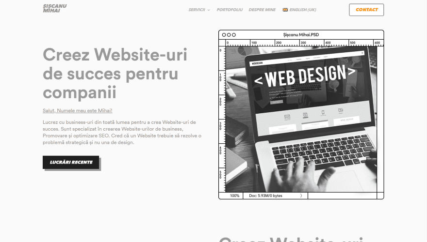
This site was submitted by Șișcanu Mihail. The hero section displays a description with a button to see recent work on one side and an image on the other. The image, like other images on this website, has an interesting border with graphics that makes the image look like it’s being edited in Photoshop. Several sections use this same layout. The images within the Photoshop border are in monochrome. The next section looks similar, but it has a smaller image that scrolls in true parallax with the image and text on the other side. Recent projects are shown as large images with titles that appear on hover. The Photoshop images are also used as CTAs. I especially like the one with the red background. The image also includes a red overlay, but the Photoshop border is the same color as the other images.
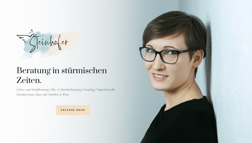
This site was submitted by DI Sibora Halili. It’s a one-page design that displays a full-screen image with the subject on one side and the logo and CTA on the other. The next section provides information with a portion of the logo in the header and splotches of color in the background. Another section shows more information within a 3-column row that includes an image on one side. The next section displays a quote with an elegant font and another hand-drawn graphic and a color-splotch. Information is provided within an accordion, blurbs, bullets, toggles, and more. The site uses beautiful watercolor splotches within the logo, backgrounds, and graphics. I love the hand-drawn graphics and colors on this website.
6. Will Flies
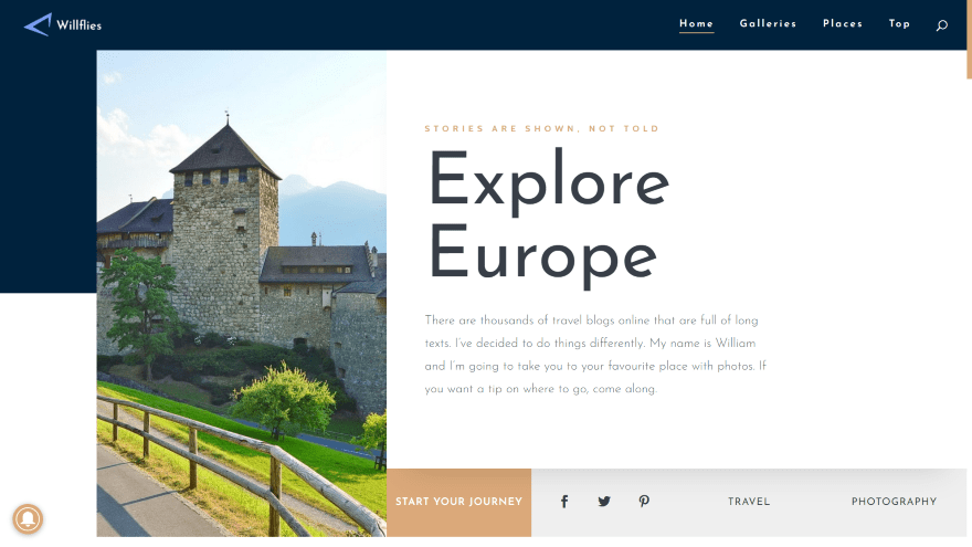
This site was submitted by Vilém Nečesaný. The site uses lots of dark blue for backgrounds and elements and gold highlights throughout, which is extended to the styled scrollbar. The hero section displays an image and text within a row that overlaps a blue background. A bar of color is placed under the text and includes a button and social links. The blog section shows the latest post with text on one side and the featured image on the other with an overlapping button. Information is provided with a two-column section with an image that overlaps the background. It also includes styled number counters, images with links to the gallery, the latest galleries with styled images, a world map, a CTA, and a styled opt-in section. I love the colors in this one.
7. Turismo Socovos
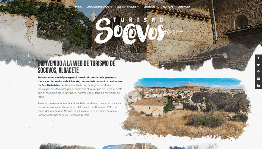
This site was submitted by Fran Martínez. This site includes lots of beautiful photography and interesting styling. The header displays a full-width image with an extra-large logo. The bottom of the image has a torn design that’s used throughout the website. When you scroll, the menu shows a background with the logo and a similar torn design for the menu’s background. Information is provided with text and an image that’s torn on all sides followed by three images for links. It also includes a blog, photo gallery, contact section, and a custom footer. A gold vine separates several sections. The styled back-to-top button fits perfectly with the site’s design. I love the images and torn edges on this site.
8. Logic Digital
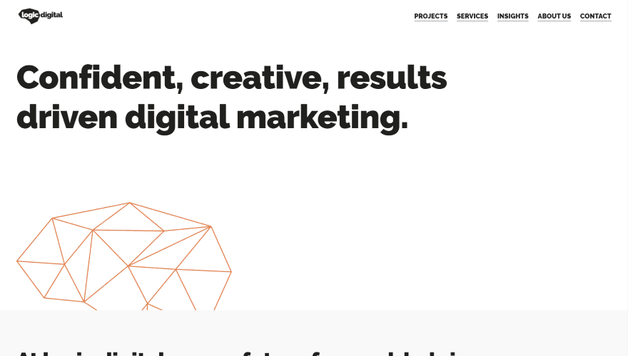
This site was submitted by Mark Donegan. This site features a clean design with lots of whitespace and extra-large text for all of the headings. The hero section displays a large tagline and a polygon graphic over a white background. The next section provides information with a link to see their projects. This section includes an image with a polygon cutout. I especially like the blog section. It displays an image to take half the screen. The other side of the screen includes the title in large text with a link to read more. Under this are titles for the next two blog posts. A section with testimonials places a testimonial slider on one side and a polygon graphic on the other. Both are placed over a bold orange background.
9. Como Ser Assistente Virtual
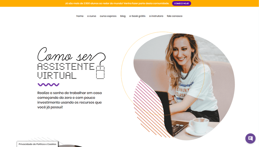
This site was submitted by Fernanda Prevedello. This site uses lots of patterned cutouts for images and graphical patterns with yellow and purple highlights throughout. The hero section displays a title and tagline to one side and an image on the other with several shapes. The next section displays a similar design with the image on the other side to create a CTA. Areas of expertise are shown within blurbs with large text and icons. A section about creating a new job uses an interesting circled design to tie a set of videos and a blog section together. Near the bottom of the layout, the site starts to use more purple and larger modules with rounded edges, including an email opt-in and ebook CTA, and information about the site owner. I love the colors and patterns on this website.
10. Digifirozi
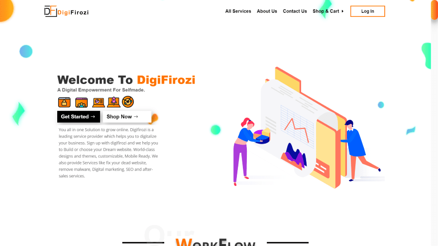
This site was submitted by Shiv Singh Verma. This site has one of the neatest scrolling designs I’ve seen. It scrolls downward as normal until about the middle of the layout and then it scrolls horizontally for a while before returning to a downward scroll. The hero section displays a CTA on one side with an animated graphic on the other. The workflow is shown within blurbs over a splotchy background and vertical titles. Tabs are shown over a styled background that appears over a patterned background in true parallax. More blurbs appear with their backgrounds in parallax. The horizontal section shows services with blurbs and graphics. It also includes a styled blog section, pricing tables, and more. The pages use lots of alternating backgrounds. It also includes a styled back-to-top button. This site makes excellent use of graphics, color, and shadow effects.
Conclusion
That’s our 10 best community Divi website submissions for the month of March. These sites look amazing and as always we want to thank everyone for your submissions!
If you’d like your own design considered please feel free to email our editor at nathan at elegant themes dot com. Be sure to make the subject of the email “DIVI SITE SUBMISSION”.
We’d also like to hear from you in the comments! Tell us what you like about these websites and if there is anything they’ve done you want us to teach on the blog.
Featured Image via blocberry / shutterstock.com


All last 4 websites are gorgeous! 👏
My voice is for #1, #4, and #5.
Very creative designs!
Nice page scrolling effect @ #10 👌🏼