It’s that time again for our monthly Divi Showcase where we take a look at 10 amazing Divi websites made by our community members. Each month we showcase the best Divi websites that were submitted from our community and today we want to share with you the top ten websites for the month of May. Throughout the post I’ll point out some of my favorite design features that draw me to each of the websites.
I hope you like them!
Divi Design Showcase: New Submissions from May 2018
1. Ergo
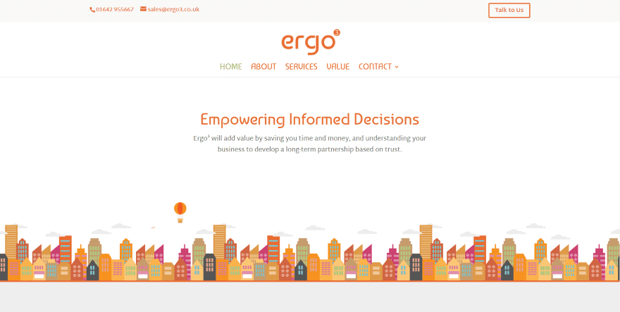
This site was submitted by Clément Gonnet. The orange color palette captures my attention immediately (I’m from TN, so I am partial to orange). The colors do work well with this site’s design. The hero section displays an interesting graphic of a skyline (which also includes a lot of orange) as the information text spins into place. They’ve made an interesting choice of fonts for the titles. Orange and white blurbs show the services followed by a full-width CTA and a client logo slider. An even larger version of the skyline leads into the footer, which includes multiple shades of orange that grow darker as you get closer to the bottom of the page.
2. Moniker Branding
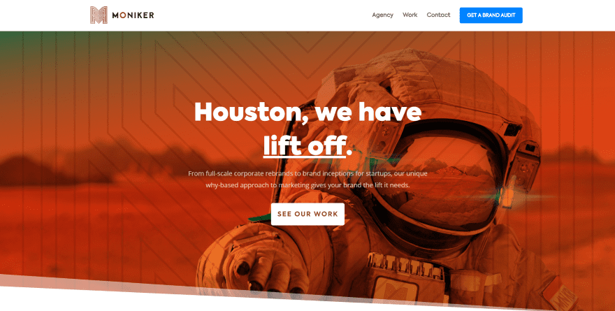
This site was submitted by Josh Allan. This one also makes excellent use of orange but this time it’s in the form of a gradient overlay with a nice pattern and section separator, within the logo, and as a background behind the contact form. Styled blurbs provide information about services and use hover effects and an interesting color top border. Shadow effects are also used for images and person modules which stand out nicely. The elegant fonts and angled sections are icing on the cake. I like watching the CTA in the menu expand and change colors on scroll.
3. Emmanuel Community Church
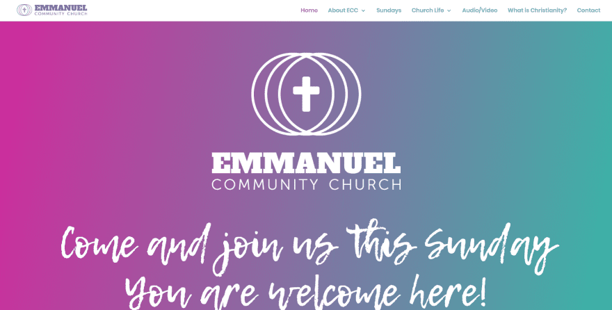
This site was submitted by Rob Rochford. It utilizes two main colors that appear within the menu, as a gradient in the hero section, as background colors for sections, backgrounds for blurbs with line-art, dates with dividers, and as text in contact information and the contact form. Even the embedded video uses the same blue within its images. The typography fits well within the site’s design. Links to pages look great with the styled images. I also like the embedded audio players, map, and angled section dividers.
4. Wolfbyte Web Design
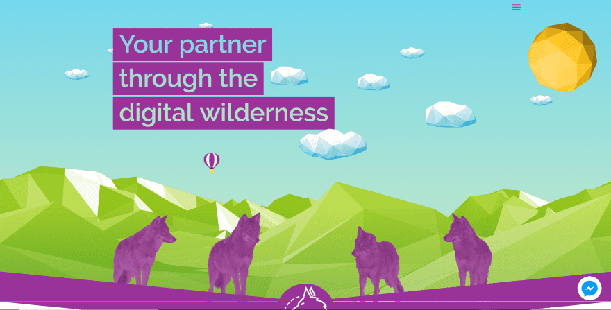
This site was submitted by Joel Whitaker. It uses some interesting links in the hero section that appear when you hover over the balloon or over the wolves. The clouds move in the opposite direction of your mouse as you move around. This site has one of the most interesting section dividers that I’ve seen. It’s a thick purple downward arrow with a large logo in the center. An even larger version of this arrow is used as sections throughout the page. I like the use of purple and green within the sections, icons, and the two-sided button.
5. Mollerup Design
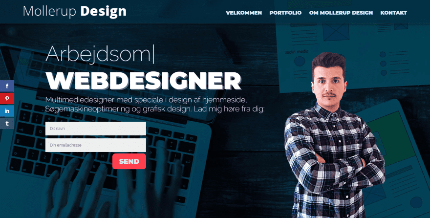
This site was submitted by Rasmus Strøbech. This site uses a one-page design that displays information using a typing effect and a contact CTA within the hero section along with an image in the foreground that looks great against the background that scrolls in true parallax. A similar section is used for the contact section at the bottom of the page. The portfolio section shows work with zoom and shadow effects. Blurbs use interesting hover effects with animation. I also like the blue behind the fonts and the border shadow effects used for the section dividers.
6. Maison Beach Chalet
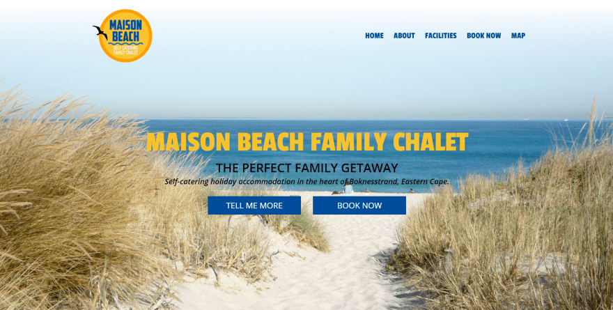
This site was submitted by Tessa MacTaggart. This is a one-page design with a built-in booking feature created with a contact form. The background image in the hero section scrolls downward as the text and the next section scroll upward to cover it. It makes great use of shadow effects for both square and round images. I especially like the use of different sizes for the round images which sets the text in different columns within the layout. The graphics of waves with a bird in silhouette is a nice touch as a section separator. The footer is made from the waves which also divide if from the section above.
7. SDK Atelier
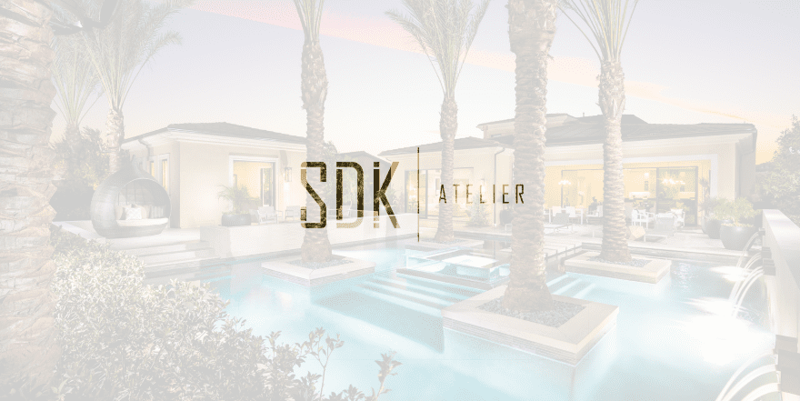
This site was submitted by Nathan Igo. This site has a simple but unique home page. The background is a full-screen image slider while the foreground is a white transparent overlay with a cutout for the logo that allows the background to show through. Clicking the screen removes the overlay, placing the logo in the upper left corner and a hamburger menu in the right corner. The menu opens in full screen and shows another image behind an overlay. This site also has one of the more unique project pages. The projects are displayed with large images that scrolls one project at a time.
8. Bachelor Recipe
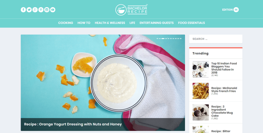
This site was submitted by Jaykishan Prithiani. This is a recipe magazine made with Extra. The header places social buttons on the left, the logo in the center, and a button to choose your country on the right. Links are placed below that. The homepage displays posts in a multi-column layout and a sidebar to take advantage of Extra’s widgets. The slider displays the latest posts followed by two columns for categories, a single column for the shop, three columns for more categories, and a single column with tabbed posts. The pages for each category display posts without excerpts, creating a clean design.
9. Provigis
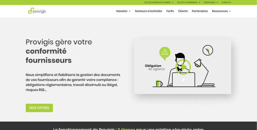
This site was submitted by Aurélien Dumont. The site makes great use of green highlights with black, dark gray, and off-white backgrounds. The tagline uses a combination of regular and bold text to draw attention. I like the box shadow for the embedded video in the hero section. The green highlights continue throughout the design including the text for blurbs, icons, dividers, to highlight text within CTA’s, buttons, and even the background color for the secondary menu. The Sectors page is interesting with its alternating layout in two columns. It displays an image in one column with a divider, text, and company logos in the other. The backgrounds alternate various shades of off-white to help them stand apart.
10. Primal Fitness
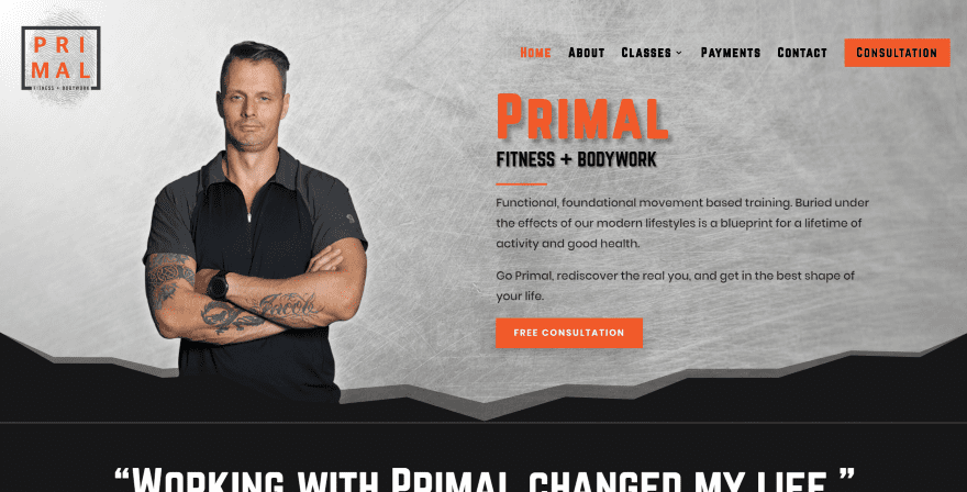
This site was submitted by Justin Bailey. This site makes great use of color. The hero section displays a large image and CTA that stands out nicely. I love the shadow behind the title text. The CTA also stands out in the menu. The first and section sections utilize section separators to create an interesting CTA. The images throughout the layout are placed over blocks of color. When multiple images are used within the same block they’re offset from each other. This site has one of my favorite designs for blurbs. They overlap a black box and include top border styling. The blurbs and the box in the background have shadow effects. Each of the pages follow a similar layout and include the dark orange highlights and section styling.
Conclusion
That’s our 10 best community Divi website submissions for the month of May. These sites look amazing and as always we want to thank everyone for your submissions!
If you’d like your own design considered please feel free to email our editor at nathan at elegant themes dot com. Be sure to make the subject of the email “DIVI SITE SUBMISSION”.
We’d also like to hear from you in the comments! Tell us what you like about these websites and if there is anything they’ve done you want us to teach on the blog.
Featured image via VitaminCo / shutterstock.com


I really liked the site of SDK Atelier, I do not identify is what control was used for the projects page.
Thank you for liking this site. It was a challenge meeting all the clients needs with this. For the projects page I used fullpage.js which is supposed to not work with Divi but modified it a bit so it works. The site is still a work in progress as the menu will change to something else to be more fluid but I think it is still pretty good as is.
If you liked this there are many more in the works that take Divi to the next level.
All of these look terrific. Nice job and shows off the range of things you can do with Divi.
How to make the typing text effect from this site:
https://mollerupdesign.dk
Can anyone help me out here?
Typed.js is the script he likely used
https://mattboldt.com/demos/typed-js
Nice designs. About the speed issues some have mentioned, I think as long as they load fine on mobile they should be ok. If they are slow on mobile that’s going to be a problem.
Very nice designs, always nice to see other work using Divi. It’d be interesting to learn the average price charged for any one of these? Possible?
This is probably one of my favorite batches of designs in a long while. There’s a couple here that really stood out to me, especially with the use of colors. I’m really into colors nowadays.
But when it comes to optimization most of the ones I like performed poorly based on pingdom tools. I’m trying to put more focus on web optimization. Not to say my site is getting great scores but it’s a work in progress.
I reported this issue also month ago.
I wish the development team would fix the gap and jagged line issue that happens with the dividers. I’m on mac/chrome and you can see it on the Wolfbyte web design site. It’s on the green “Start your journey” CTA.
I posted a link to a screenshot of it in the website field of this comment.
Dear Divi Team, How is the paralax effect on this site https://wolfbyte.co.uk/ done? I mean, it works on mobile – my paralax provided by divi is not able to do that.
Plugin Revolution Slider.
How is it possible to create this “typing text effect” with Divi? Have never seen that feature before.
First time ever in Divi.. Really curious!
https://mollerupdesign.dk
Slider Revolution have this effect and works very well with Divi 🙂
I would add punkgraphic.com. It’s totally different but still a Divi
Love your site!!!!! It’s amazing 🙂
We really like what you’ve done here. Very cool site!
Hello wonderful Elegant Theme Team, I am so thankful for your auto repair layout pack that I used to develop this website http://www.jojosgarage.co.uk. Please any chance of assisting me with the following layout packs for establishments in Africa:
1. One suitable for NGO in developing country (that has a consortium of Doctors, lawyers, pharmacists and business men). They support prisoners with medical, medicinal and legal needs as well as provide technical training to prisoners, ex-convicts and destitute.
2. Another one suitable for a candle production and marketing company
3. Finally a layout pack suitable for a business that offer wedding gowns/dresses hiring, make-up for brides, and weeding hall decorations including table and chair decorations for wedding ceremonies
I am most grateful.
Martin
Hi.
I always like to look at these examples and I get inspired, but I think it would be useful if you also did some spagespeed tests when presenting these websites. Some of the above don’t get so good results, and some really bad results in pageload, due to many factors ofcourse, and layout/UX probaly being one. It would be good to read why and your thoughts about this….
Thx John
It’s always good practice to make websites efficient and high in scores, but in practical terms, loading times are negligible these days (millisecond difference) and as long as the resources aren’t too heavy to disrupt usability and scroll performance, sacrificing elite page test scores in the name of distinguished and unique / beautiful designs, seems like a reasonable trade-off.
Just thinking the same. Looking at some of these sites from the UK most of these sites are horrendously slow. Sure it’s a never ending battle to make sites fast however most of these are so slow, we clicked away.
Hey ho!
Someone should tell the Provigis team they have a typo in their php(probably in footer)
Showing at the bottom of their page.
Hi Jesse, I’m in Provigis team and I tried to find my php typo. Didn’t see anything especially in the footer.?? Do you have more info to help me to reproduce and fix ? Thanks
I had the answer, it was a temp misconfig in a google tag manager integration. Now fixed ! Thanks Jesse for your comment. Hope you like our website. From our side we love Divi !