It’s that time again for our monthly Divi Showcase, where we take a look at ten amazing Divi websites made by our community members. Each month we showcase the best Divi websites that were submitted from our community and today we want to share with you the top ten websites for the month of May. Throughout the post, I’ll point out some of my favorite design features that draw me to each of the websites.
I hope you like them!
Divi Design Showcase: New Submissions from May 2021
1. National Science Day
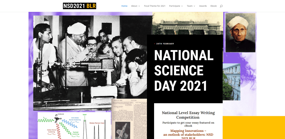
This site was submitted by Omshivaprakash. It’s a one-page website that makes interesting use of color and layout design. The hero section displays overlapping images with a CTA in the foreground. This leads into a section with logos that overlap large blocks of color with large text and countdown timers. Several sections display text to one side with a vertical title on the left side. These titles have different background colors that match other elements from the website. Several of the sections use images or graphics. I especially like the use of color for the text or the backgrounds behind the text.
2. Baitic
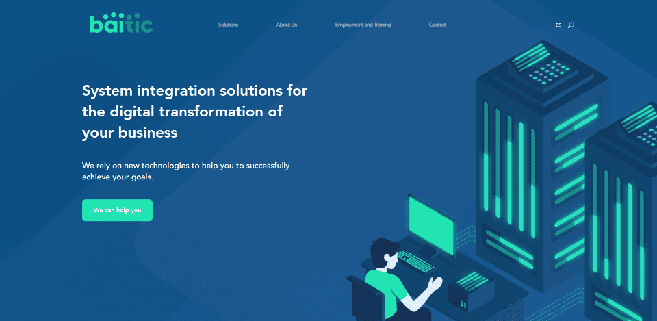
This site was submitted by João Martins. This one makes interesting use of color and background angles. Backgrounds display angled patterns. Blue backgrounds display shades of blue while white display patches of light gray with green lines that work with the perspective of the graphics. The blue and green are used in the large two-color graphics that take almost half the screen and appear on the left or right as you scroll to their sections. Many of the icons, buttons, and textual elements are in the same green. The graphics are minimal and visually stunning at the same time. The graphics and text work perfectly together to create a clean layout.
3. Grow My Business
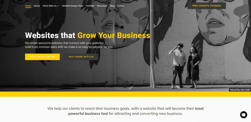
This site was submitted by Ben Elwood. This one makes excellent use of yellow highlights against gray or white backgrounds. Yellow is used in the menu, titles, buttons, links, borders, quotes, icons, etc. Most of the backgrounds are white and work well with the yellow highlights. The few that are gray look even better and, since there are only a few of them, stand out even more. Several full-width sections with gray backgrounds display testimonials or create CTAs. I especially like the section of three blurbs. They include gray, white, and yellow backgrounds. Each has a circled icon and they alternate between gray and yellow for the circle and the icon. I also like the hover animations throughout the site that change the colors.
4. Future Football Profs

This site was submitted by Maurice Veraa. This one makes elegant use of blue backgrounds and yellow highlights. It also has lots of micro-animations that loop or responds to hover. I also like the title text design that appears over the background video in the hero section. It stands apart from the background and even includes a small angled yellow block behind the text to give it some color. Many of the titles include a smaller version of the angled block within the title. Similar angled blocks in blue or yellow overlap or separate images. Many of the images include a block title that overlaps the image.
5. Bartlett Farms
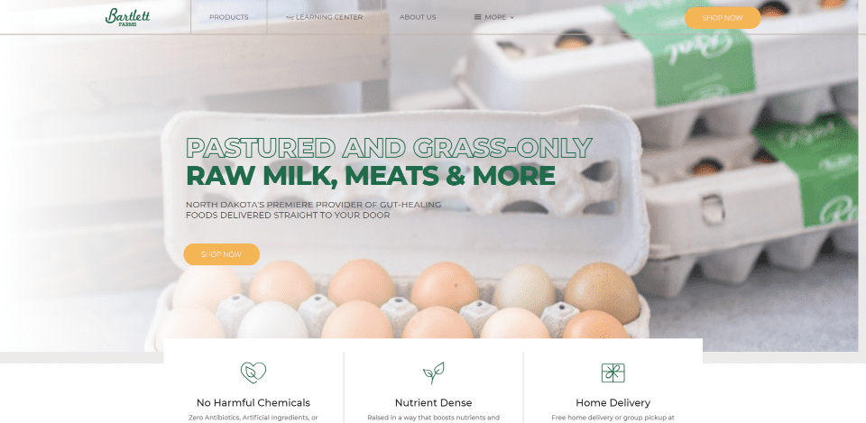
This site was submitted by Andrew Bartlett. This one makes excellent use of images and menus. The hero section displays a full-width slider with large CTAs in the foreground. The CTAs make interesting use of text. The top line of the title Is clear and outlined in green. The bottom line of the title is solid green. Several sections include overlapping blurbs that provide information, a timeline, bullets, etc. Blog posts have a unique design for the meta. My favorite section shows cards as links to products. The cards have a neat design that almost looks like bookmarks. The cards include an image and information divided into sections. A similar design is used in the mega-menu with just the title and image.
6. Pop-Up Kombi
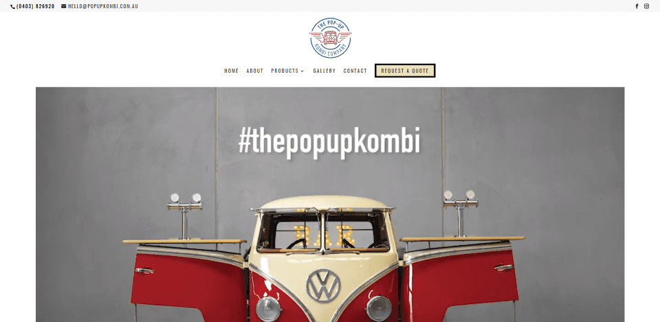
This site was submitted by Justine Carter. This site makes excellent use of photography and video. The hero section shows a background video that creates a unique demonstration of the product. A CTA is centered under this in a section by itself with both a link to the contact page and a link that opens the contact form in a popup. The product is also displayed in a full-width gallery that matches the video. Images of the product are also used for services. Many of the links and icons match the red color from the product photos. A CTA in the menu and the contact form button match the tan from the product photos. The highlights work well to tie the site and photography together.
7. Brandartica
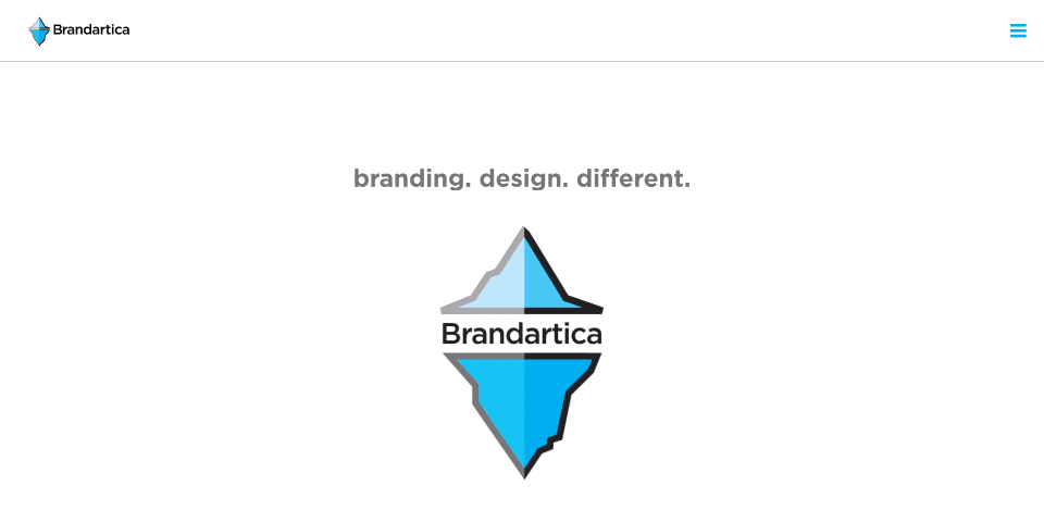
This site was submitted by Jeff Litcofsky. This one also makes great use of a branded color. A cool animation in the branded blue color introduces the website and turns into the logo and tagline at the end. Blue is also used for the image overlays, buttons, a CTA background, the back-to-top button, and the hamburger menu. Work is shown within a mosaic layout. The menu opens in full-screen with a blue background that allows the website to just be visible. The pages show a patterned background with styled dividers behind the title. These pages also use the branded blue color for podcasts, icons, a sticky button, and more. The site also makes good use of a before-and-after slider to show examples of work.
8. Cassandra Worthy
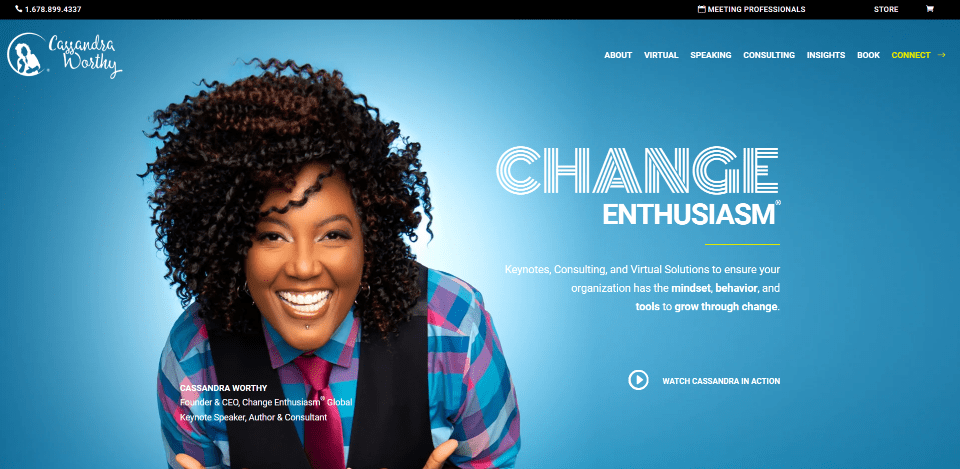
This site was submitted by Alfonso Perez-Verdia Ochoa. This one also makes great use of color and background patterns. The hero section displays a full-screen image with a blue background that creates a white hotspot behind the subject. White text creates the CTA that includes an animated button to see a video. Several sections include a black background with a circled dot pattern. Most of these sections display a single testimonial, embedded video, or similar element. My favorite is the section that shows steps. The numbers for the steps are circled with elegant designs in bold colors. The steps and their descriptions are offset from each other. I also like the sections with services that show an image on one side and a description on the other with a bold color background.
9. JP Events
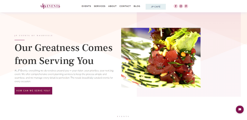
This site was submitted by Tom Carmona. This one uses an elegant layout with colors that range from soft to bold as you scroll through the site. The background for the hero section includes multiple soft colors that overlap to create a unique pattern. Images in a slider highlight some of the same colors. The highlights for buttons and a divider are a darker color that becomes more prominent as you scroll down the page. Services display images with borders in slightly bolder colors than the hero section. The backgrounds are kept softer as the highlights get darker. Icons use the darker color from the hero section’s CTA while the footer uses the darker color as the background. I love the mega-menu in this one. The links include icons and use all of the colors from the website. The colors work great for the celebration focus of the site.
10. Volny Studio
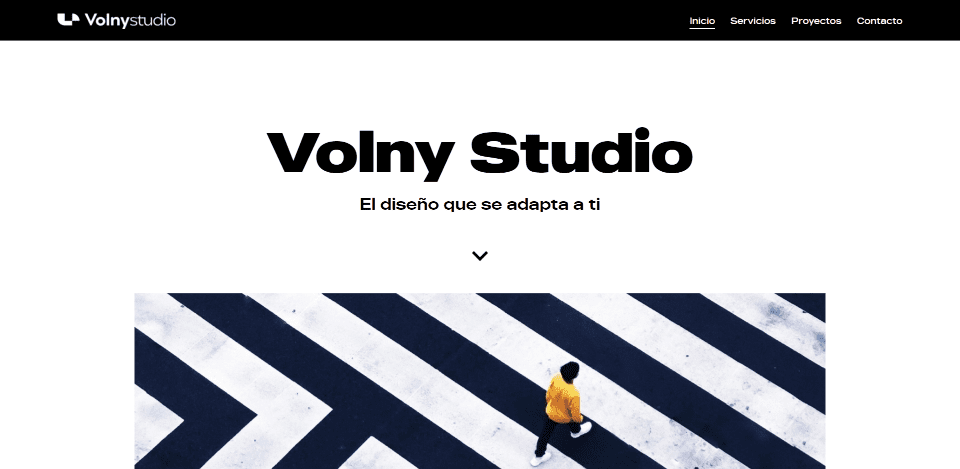
This site was submitted by Volny Studio. This website makes elegant use of a minimal design. The backgrounds are off-white and most of the text and visual elements are black. It brings in enough color in the highlights and images to make it interesting. The hero section displays an image that overlaps the CTA under it. Several sections show images on one side and text on the other in an alternating layout. Some include blocks of color to stand out. My favorite section shows the services in numbered columns. The numbers are Roman numerals that are created with blocks of color. The projects section is also interesting with two images in a single row with a larger image on the right. The images have minimal backgrounds so the projects stand out. They overlap in the project pages. I also like the minimal footer design that separates information into sections.
Until Next Month!
That’s our 10 best community Divi website submissions for the month of May. These sites look amazing and as always we want to thank everyone for your submissions!
If you’d like your own design considered please feel free to email our editor at nathan at elegant themes dot com. Be sure to make the subject of the email “DIVI SITE SUBMISSION”.
We’d also like to hear from you in the comments! Tell us what you like about these websites and if there is anything they’ve done you want us to teach on the blog.
Featured Image via Mascha Tace / shutterstock.com


Leave A Reply