Divi Girl is a child theme for Divi. It comes with dozens of pages that include lots of WooCommerce product templates and blog layouts. In this article, we’ll look at Divi Girl’s pages and layouts to help you decide if this is the right Divi child theme for your needs.
- 1 Installing Divi Girl Child Theme
- 2 Divi Girl Child Theme Layouts
- 3 12 Divi Girl Child Theme Homepages
- 4 Divi Girl Child Theme About Page
- 5 Theme Builder Pages
- 6 Blog Pages
- 7 Divi Girl Chile Theme Product Pages
- 8 Divi Girl Child Theme Headers
- 9 Divi Girl Chile Theme Footers
- 10 Where to Purchase Divi Girl Child Theme
- 11 Ending Thoughts
Installing Divi Girl Child Theme

Installation is straightforward and went as expected. With Divi activated, upload and activate Divi Girl as you would any WordPress theme.
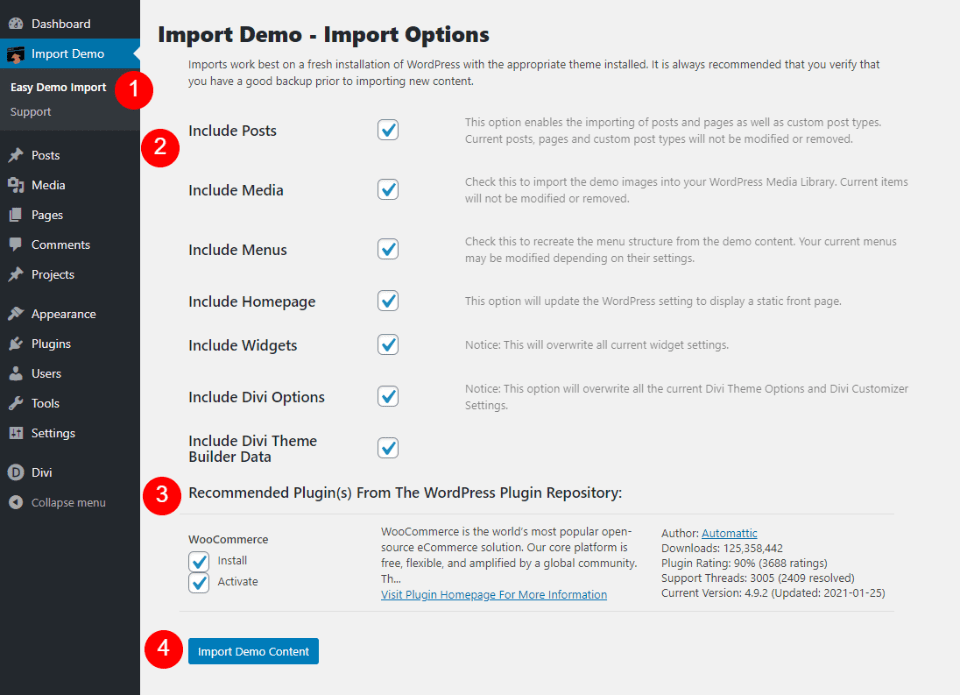
Once activated, you’ll need to import the demo content. Go to Import Demo > Easy Demo Import in the WordPress dashboard menu. Choose the files you want to import such as posts, media, menus, widgets, etc. You’ll see the option to install and activate WooCommerce.
All are selected by default. I recommend leaving everything selected. Click Import Demo Content and wait for the import to complete. Your website will now look like the Divi Girl demo including pages, images, menus, etc.
Divi Girl Child Theme Layouts
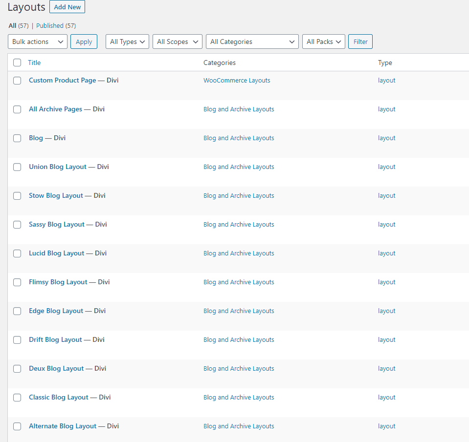
57 layouts were added to the Divi Library. These include blog layouts, headers, footers, product pages, and lots more. We’ll look at a sampling of these pages and layouts.
12 Divi Girl Child Theme Homepages
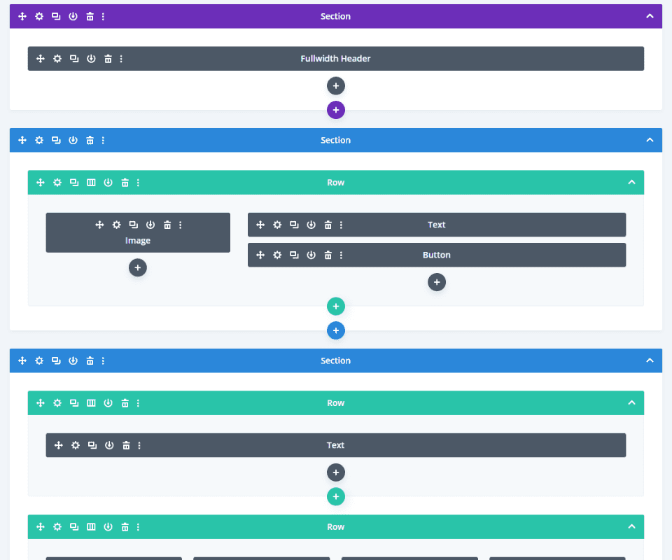
The Divi Girl child theme includes 12 homepages to choose from. Each has peach colors and elegant fonts to attract the preferred audience.
Default Homepage
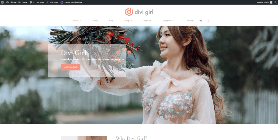
This is the default homepage. It includes a full-width image for the hero section with a CTA in a small overlay that links to the blog page.
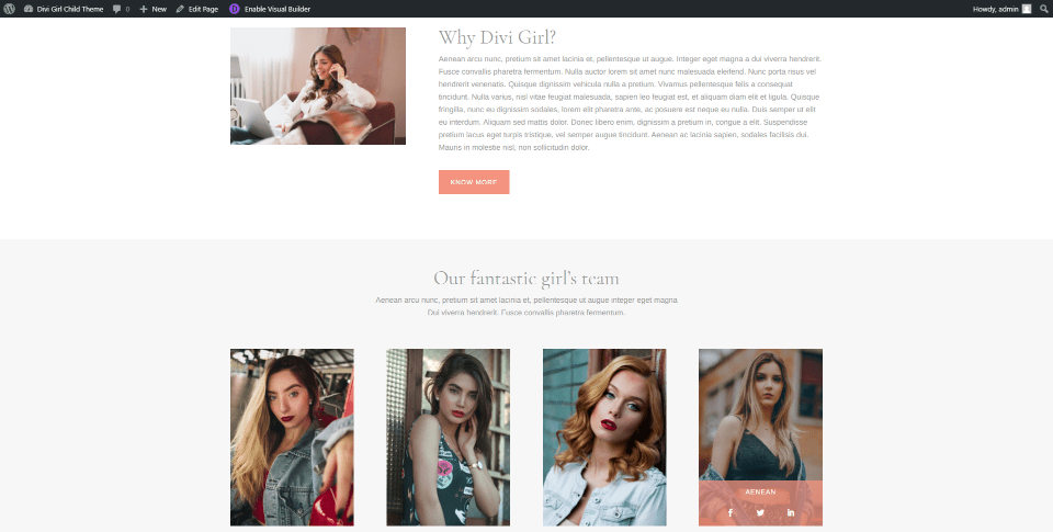
Information is provided with a small CTA that includes an image, text, and a button to read more. Team members include overlays with their name and social icons.
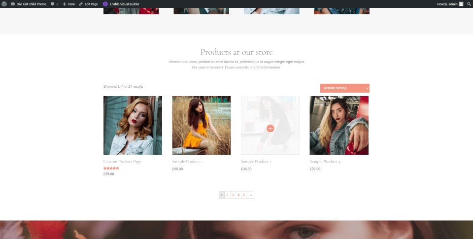
Products include styled sorting, overlays, star ratings, and pagination.
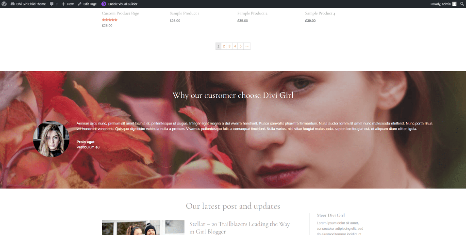
Testimonials include a full-width background image and a circled thumbnail on one side.
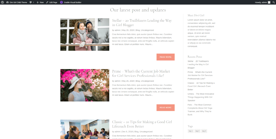
Blog posts show the featured image on the left and a styled read more button. The sidebar provides information, recent posts, and tags.
Blog Homepage
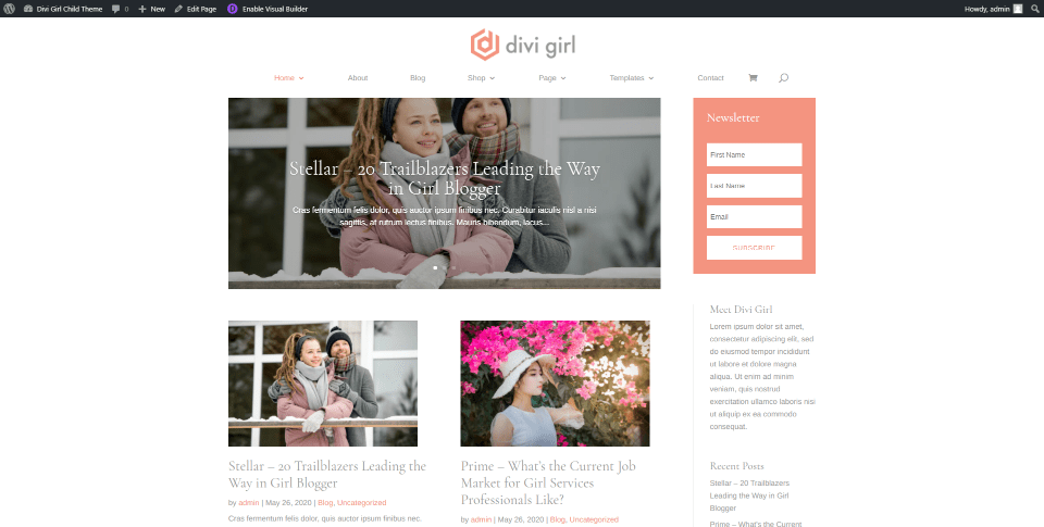
The blog homepage displays a post slider followed by the two latest posts in two columns and the rest in a single column. A styled newsletter sits in the sidebar.
Life Coach Homepage
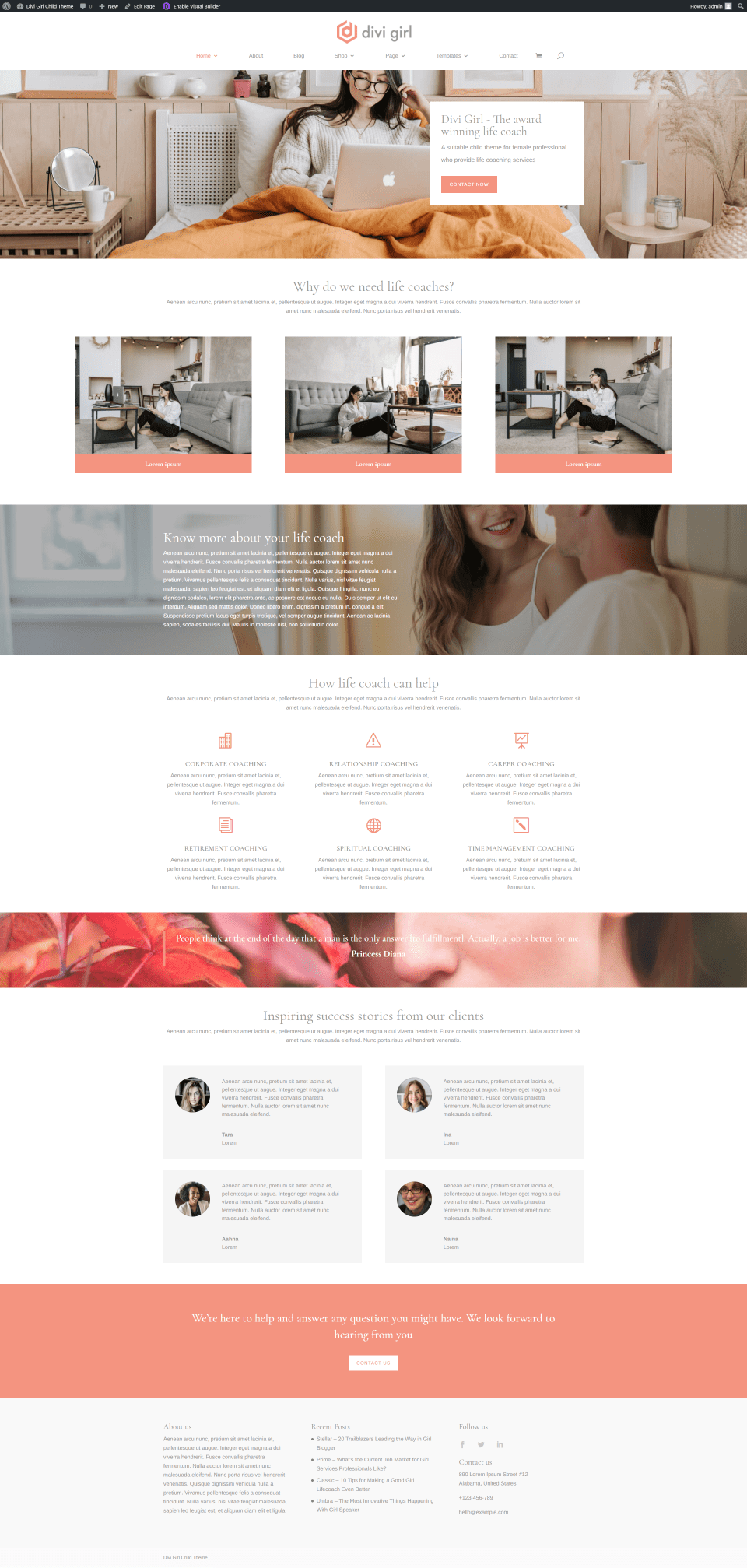
Life Coach adds images for categories, blurbs for services, full-width images for information and quotes, testimonials in a grid, and a full-width CTA.
Services Homepage
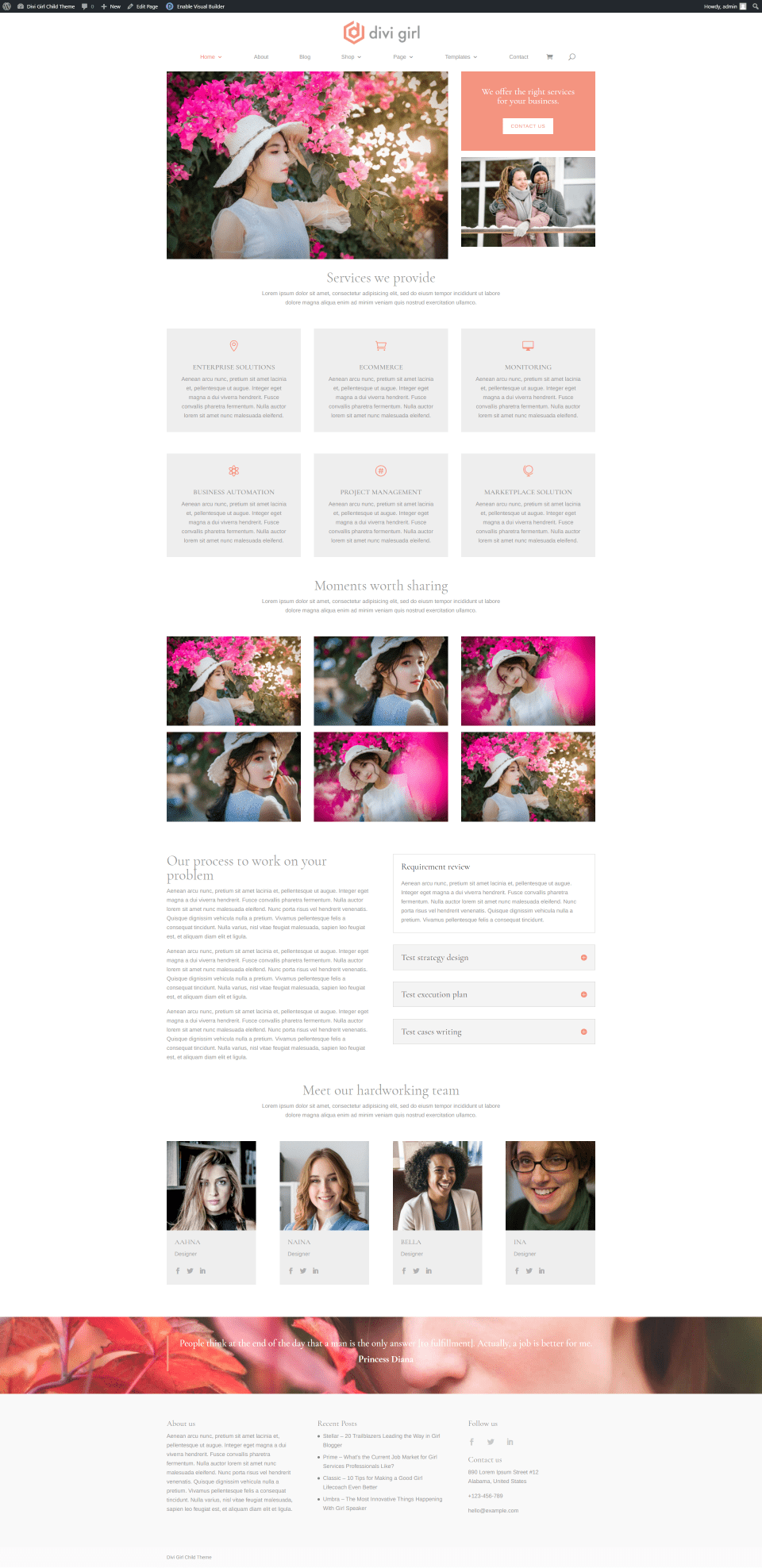
Services adds images and a CTA in a multi-column layout, blurbs for services, a gallery, and information about the process with text on one side and an accordion on the other.
Speaker Homepage
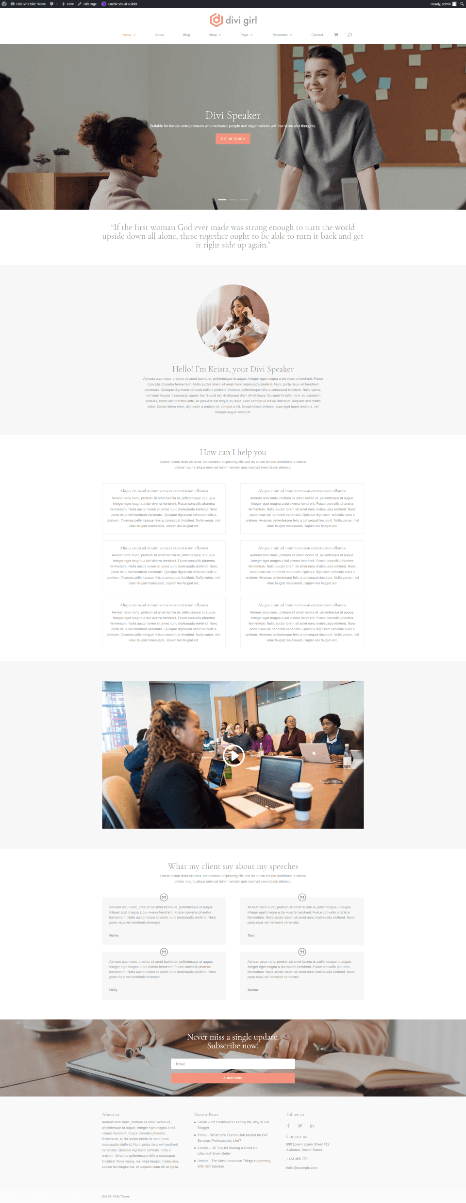
Speaker is the most different up to this point. It has a full-width slider, a quote, information with a circled image, text to describe services, an embedded video, a grid of testimonials, and a full-width email CTA.
Yoga Trainer Homepage
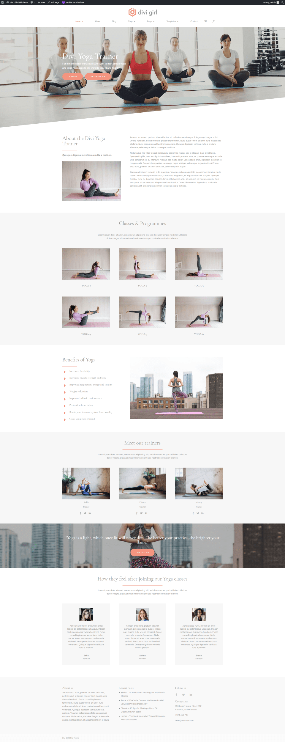
Yoga Trainer adds some new styling elements. Its hero section displays and background image with two CTAs and an angled divider. Images show the different classes available. Benefits show bullets on one side and an image on the other. A section about the trainers shows a photo, name, title, and social media icons. It also includes a full-width CTA and testimonials in three columns.
Makeup Artist Homepage
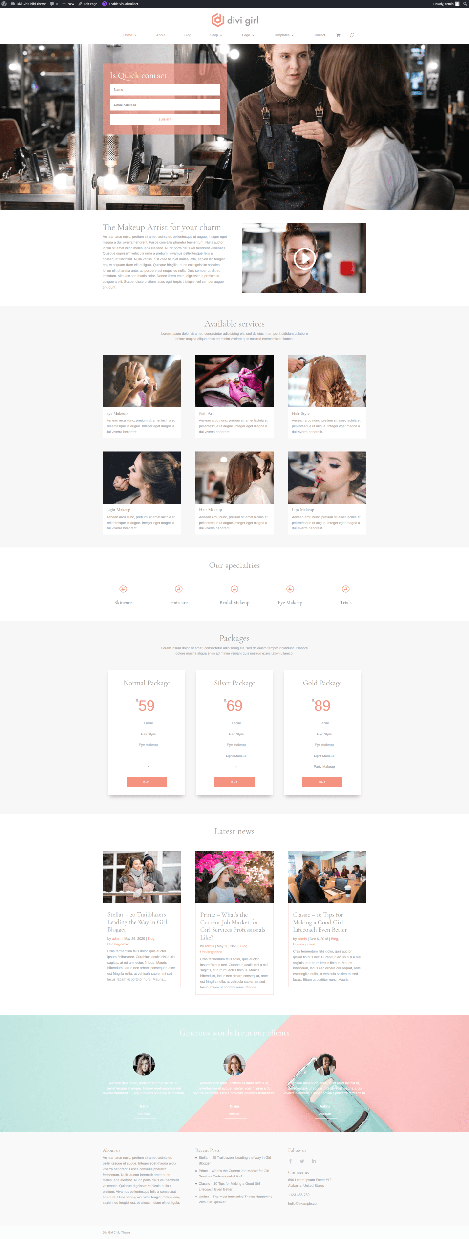
Makeup Artist adds several interesting elements. The hero section includes an email form. Information is shown with an embedded video. Blurbs provide images and information about services. Icons list specialties in a horizontal line. Pricing tables show available packages. It also includes a blog section and testimonials.
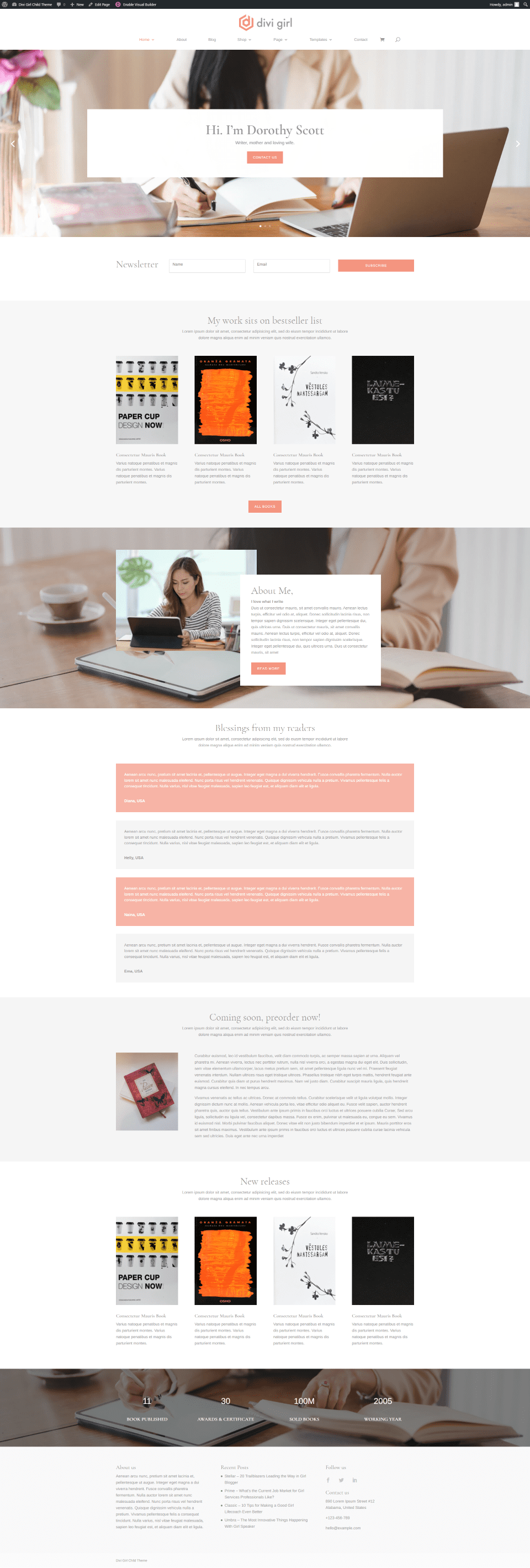
Author includes a slider with contact CTAs. Following this is a full-width email form, Book covers show a link to see more. An about section displays overlapping images. Testimonials stack in a single column with alternating colors. A coming soon CTA shows a book cover and provides information. New releases show book covers with short descriptions. Number counters provide stats.
Senior Care Homepage
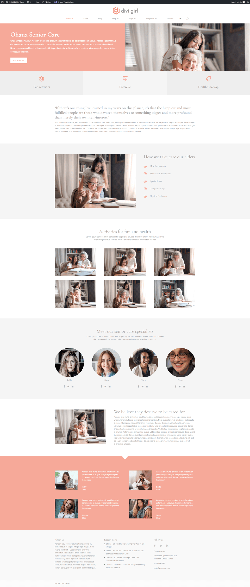
Senior Care provides a CTA in the hero section with the text on one side over a solid background and an image on the other side. Blurbs with icons site under this and take the full width. This layout also adds information in bullets, a gallery, team members with circled images, and testimonials with a solid background.
Childcare Homepage
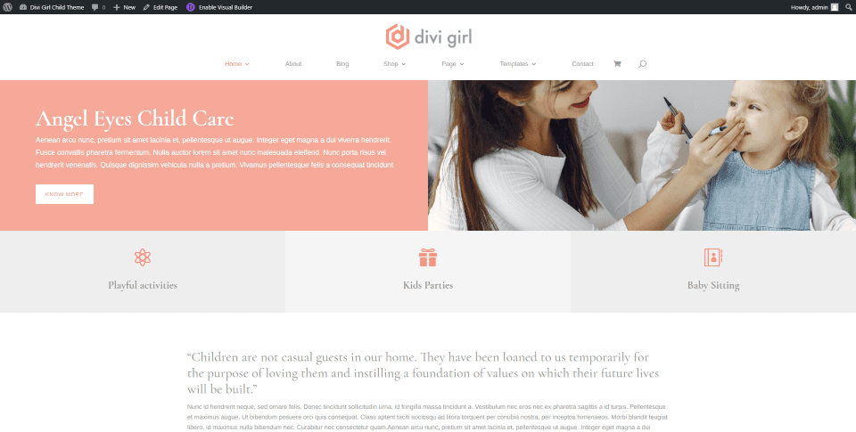
Childcare follows the same design as Senior Care, but with images, titles, and icons that fit the childcare genre.
Musician Homepage
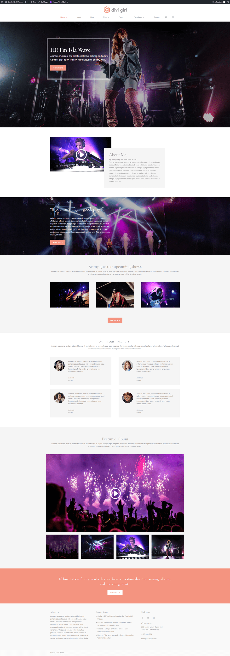
Musician includes a full-screen background image with a CTA. It also adds an embedded video, links to shows, testimonials, two video sliders, and a full-width contact CTA.
Wedding Planner Homepage

Wedding Planner is another unique layout and I think it’s the most elegant. It includes a full-screen slider with a welcome message. Services are shown as images next to a title and description. A gallery displays large photos in 4 columns. Recent events show images with text on a tilt. Testimonials include circled images and they’re placed over a full-screen background image.
Divi Girl Child Theme About Page
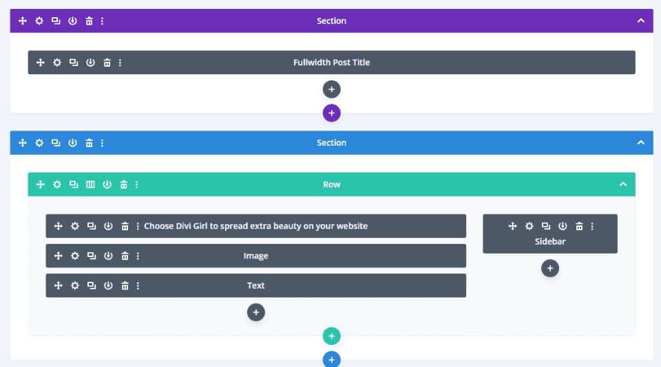
The About page has a blog post feel. It shows a full-width post title with text, an image, and a sidebar.
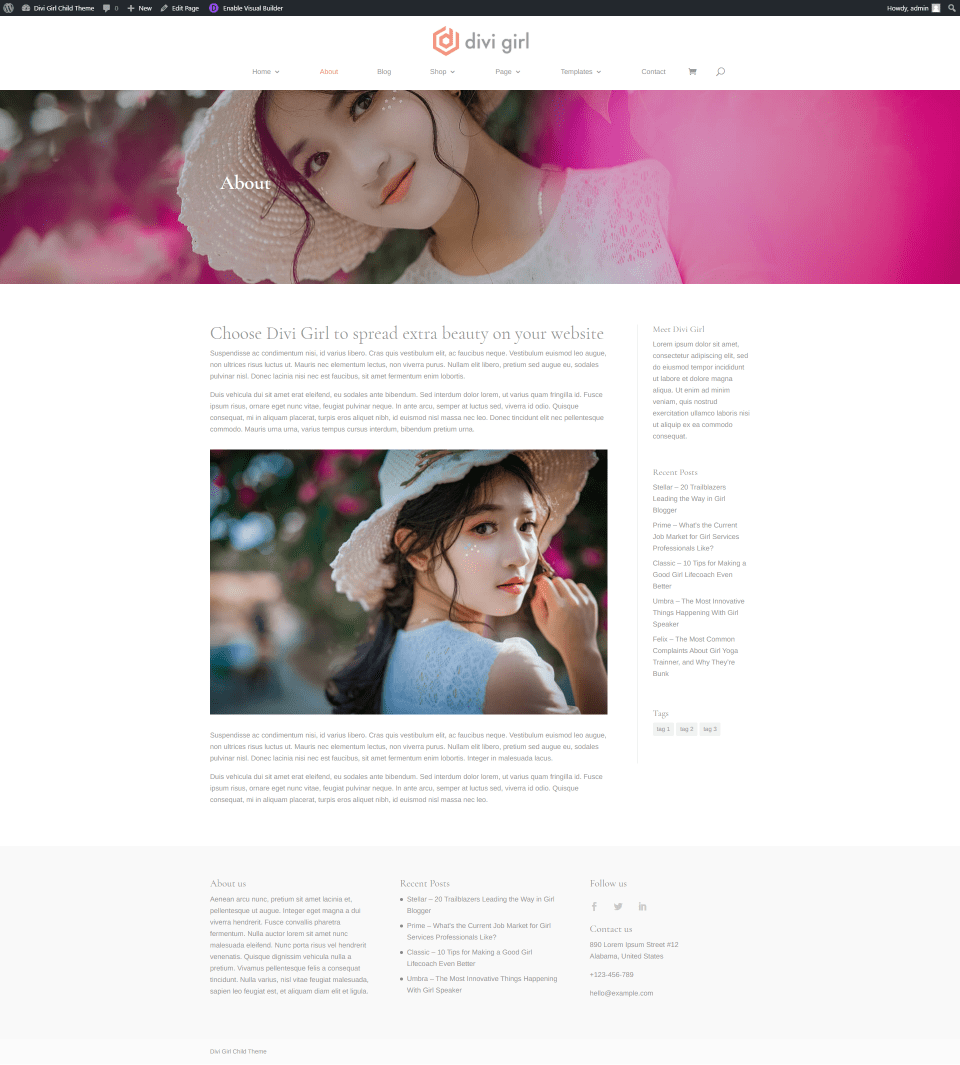
Here’s a look at the page on the frontend.
Theme Builder Pages
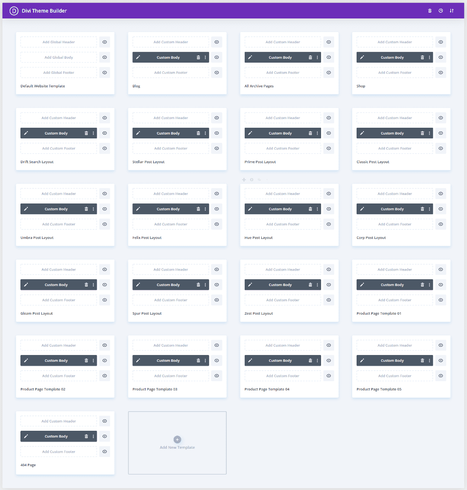
The Theme Builder has 20 layouts that include the blog, 10 post layouts, shop, 5 product page layouts, archive, search, and 404 pages. Theme Builder layouts do not include headers and footers, but since they’re in the Divi Library, you can easily assign them here.
Blog Pages
It includes a blog archive page and 10 post layouts to choose from. They’re created in the Theme Builder.
Blog Page
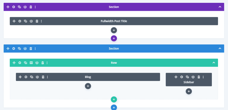
The blog page includes a fullwidth post title at the top of the page followed by a blog with a sidebar.
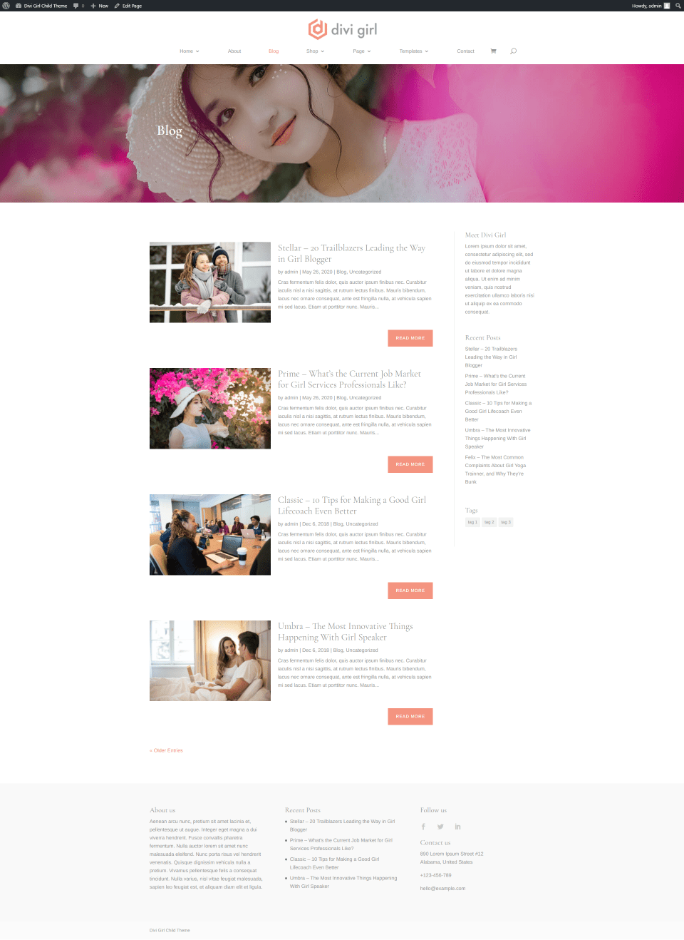
Here’s the blog archive page on the frontend.
Stellar Post Layout
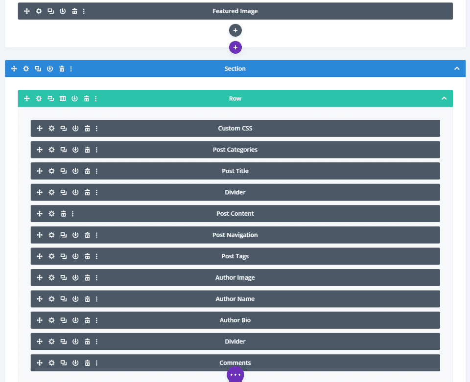
The Stellar Layout includes a featured image, custom CSS, post categories, title, divider, content, navigation, tags, images, author bio, comments, and more.
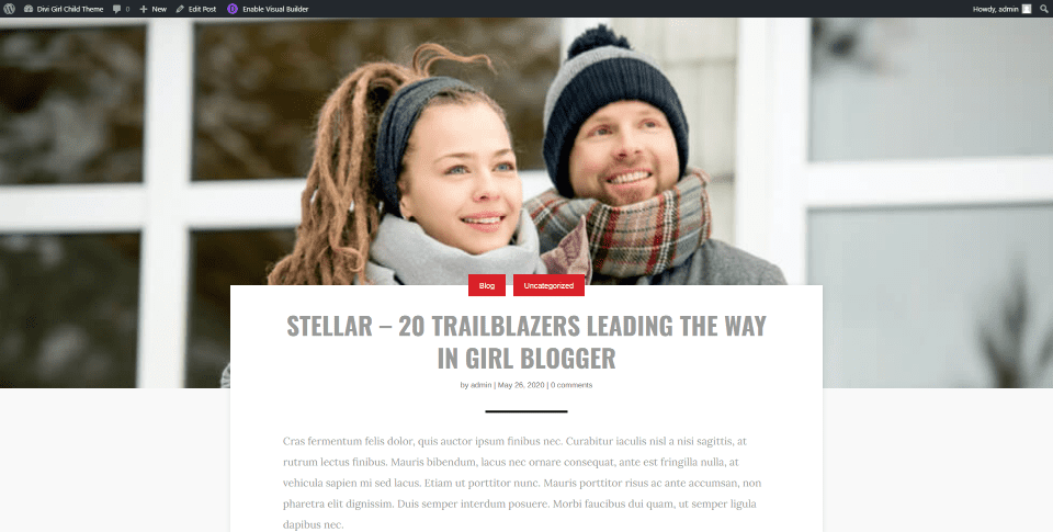
This creates an interesting layout with the featured image in true parallax and the content overlapping it.
Spur Post Layout
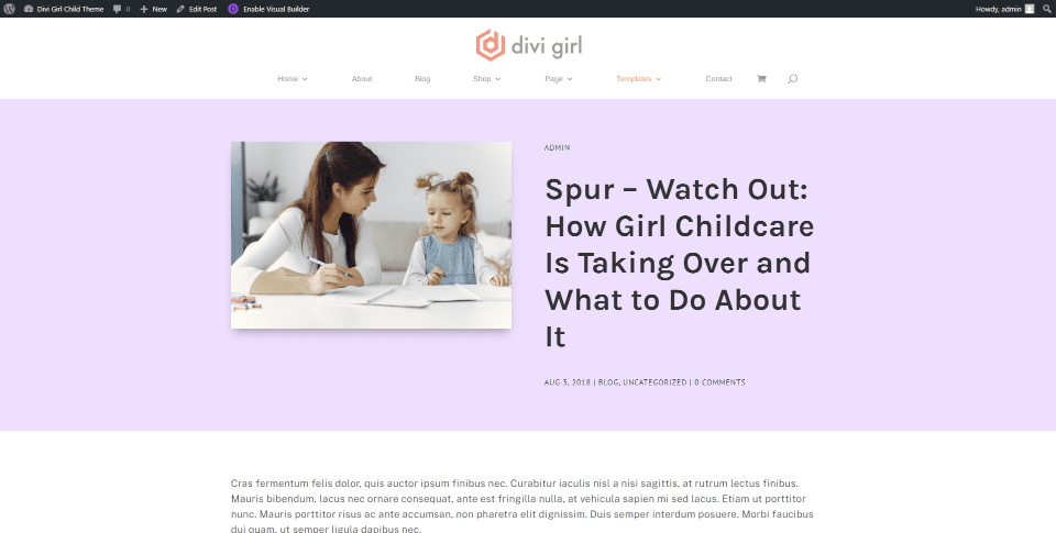
Spur post layout displays the featured image title, and meta over a background, and the post content in a single column. The featured image includes a box shadow.
Zest Post Template
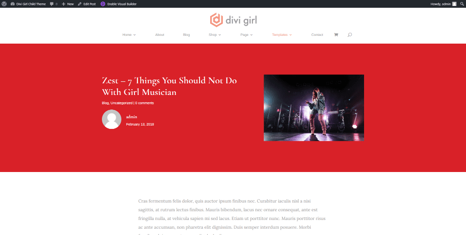
The Zest post-template places the title, meta, and author’s image on the left and the featured image on the right, over a background color. The post content is in a single column.
Divi Girl Chile Theme Product Pages
Product pages include one shop page and 5 product page templates.
Shop Page
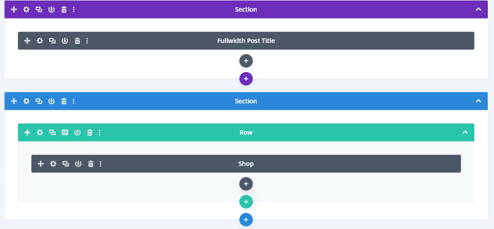
The Shop page includes a fullwidth post title and a shop module.
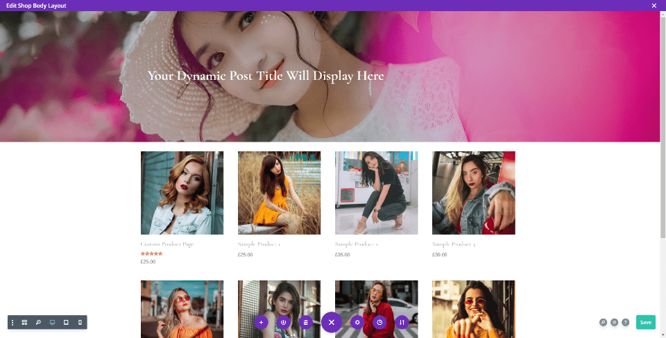
The shop includes sample products.
Product Template One
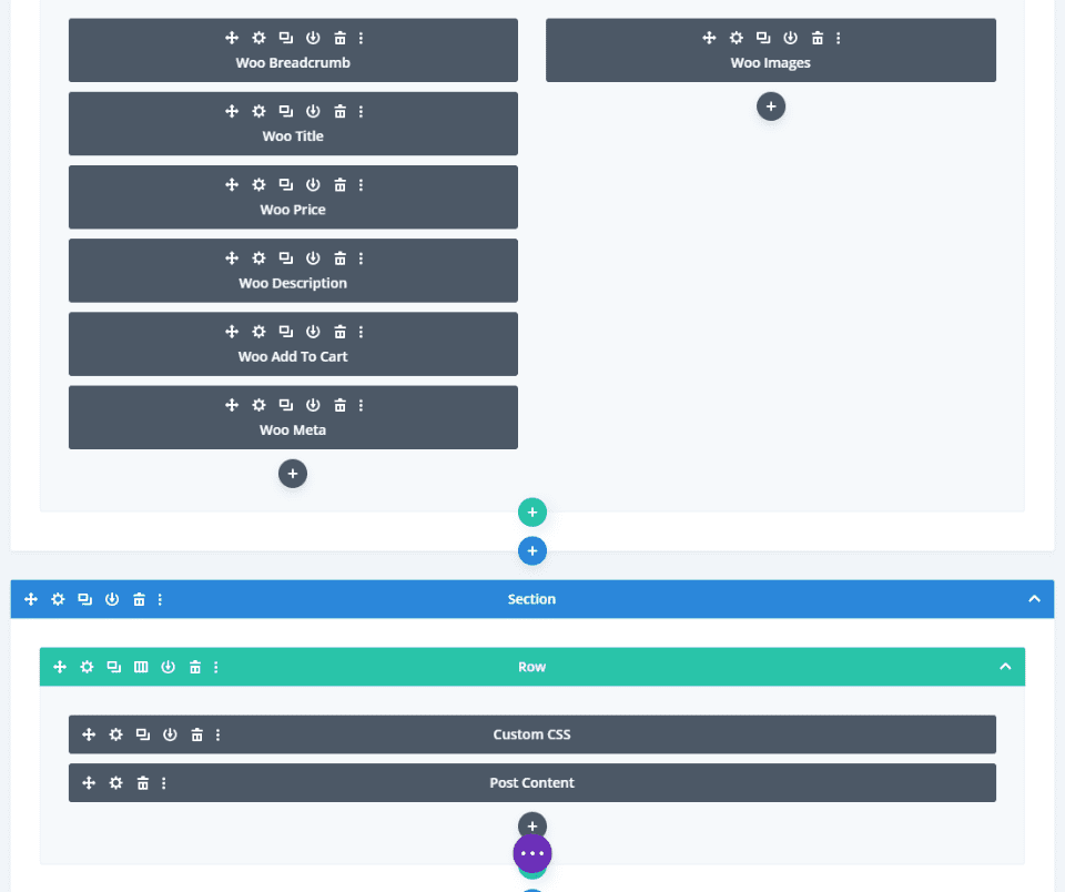
Post Layout 1 includes lots of WooCommerce modules for the product information, custom CSS, post content, additional information, gallery, related products, and reviews.
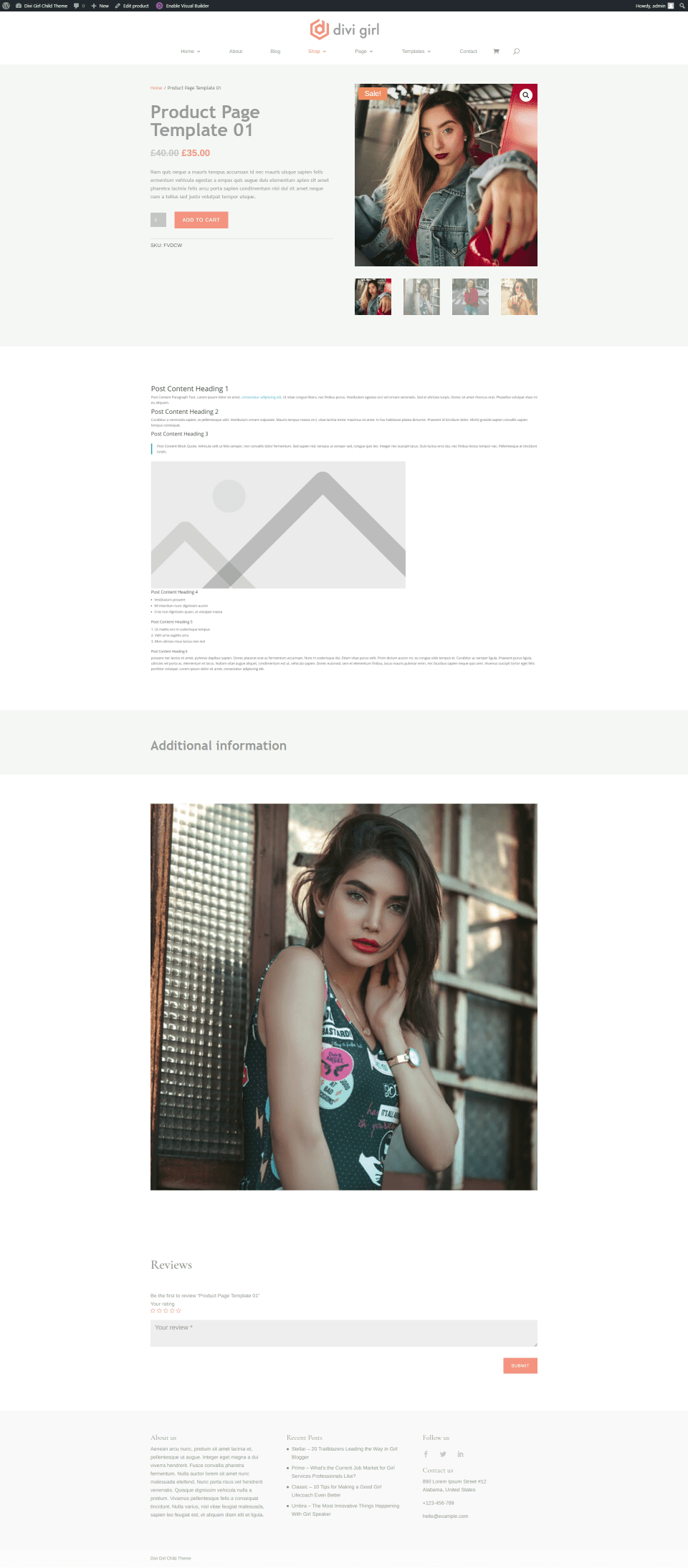
Here’s how this product layout looks on the frontend.
Product Template Two
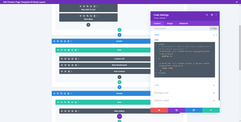
Product Template 2 includes custom CSS, breadcrumbs, post content, a gallery, additional information, description, related products, and reviews.
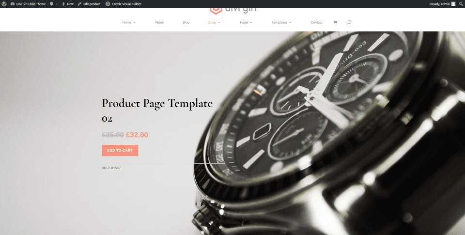
It provides a full screen featured image with the information in the foreground.
Product Template Three
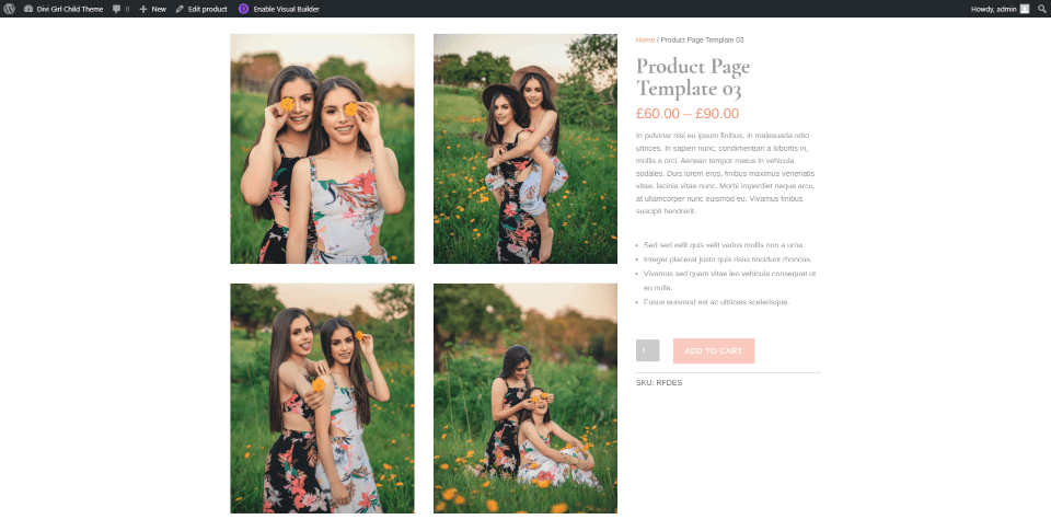
Product Template 3 displays a gallery in the center of the screen with the information on the right. It also includes post content, additional information, and reviews. Product Template 4 looks like this, but with smaller images.
Product Template Five
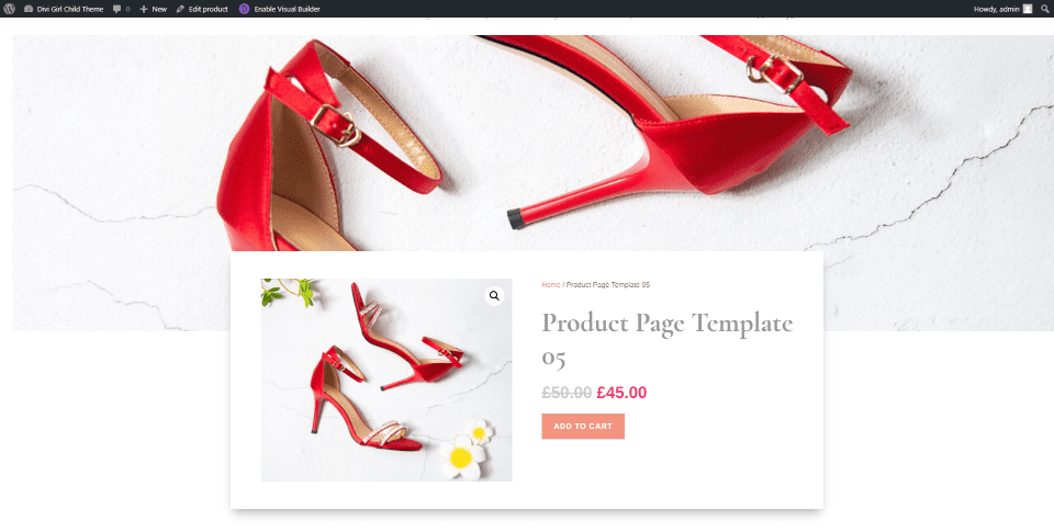
This is product Template 5, which displays a full width featured image and places the image with information in the center, overlapping the image.
Divi Girl Child Theme Headers
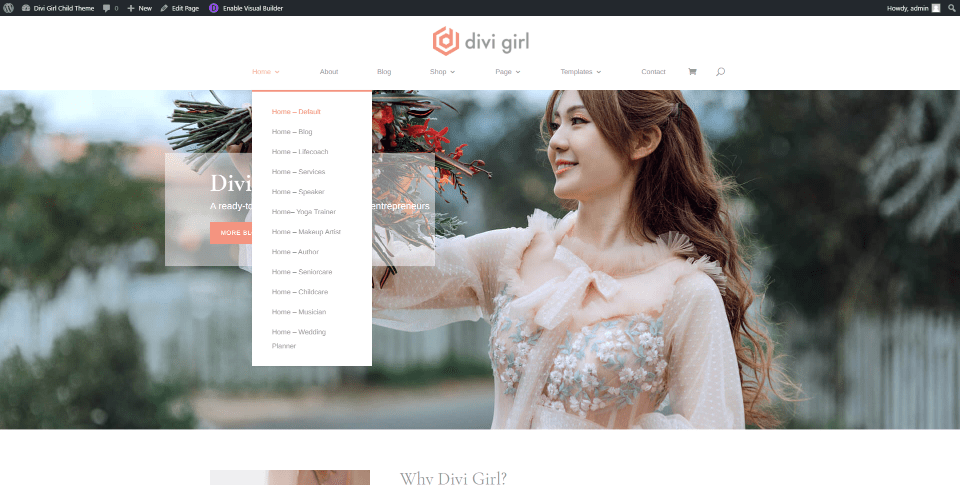
There are 5 headers available. You’ll find them in the Divi Library. The default header places the logo in the center with the menu links under it.
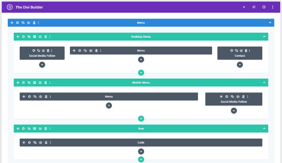
Header 2 includes multiple menus and social media modules, contact, and a code module. Others add a CTA, search, contact information, provide different layouts, etc.

This is header 4. It includes three rows of modules that include phone, address, social buttons, multiple menus, etc.
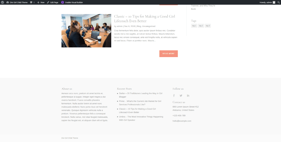
Divi Girl adds 5 footers to the Divi Library. This is the default footer, which uses a light background and includes three columns with About information, recent posts, and contact information.
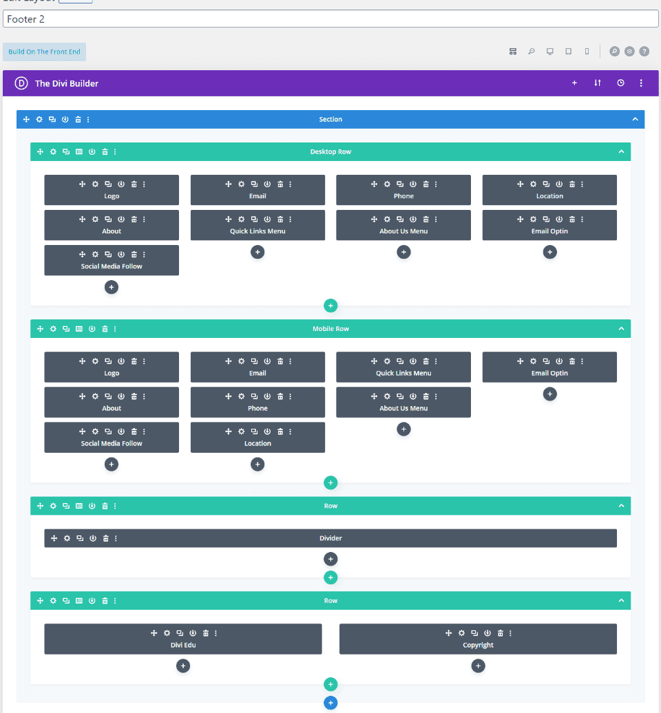
This is footer 2, which includes separate desktop and mobile sections.
Here’s the footer’s layout in the Divi Builder.

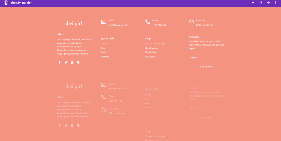
This is footer 5, which displays the content in a stack over a full-width background image with an overlay.
Where to Purchase Divi Girl Child Theme
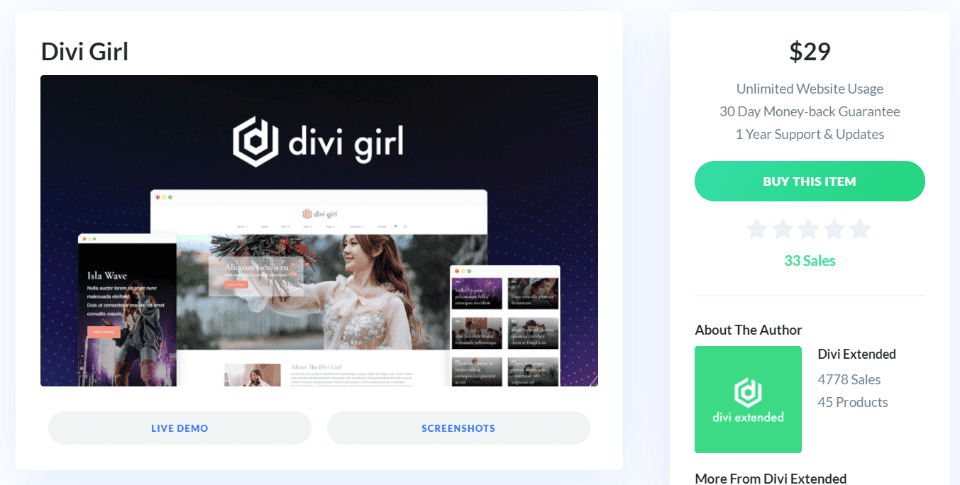
The Divi Girl child theme is available in the Divi Marketplace. It includes unlimited website usage and 1 year of support and updates.
Ending Thoughts
That’s our look at the Divi Girl child theme. This child theme includes lots of pages and templates. The 12 homepages make it highly versatile. Headers and footers work in any combination, giving you lots of design options. The custom CSS makes the templates stand out. The number of and design of the blog layouts make it a great choice for blogging on any feminine topic. It works well with WooCommerce, making it a great choice for a feminine online shop.
If you’re interested in a Divi child theme with a feminine design and lots of templates, Divi Girl is worth considering.
We want to hear from you. Have you tried the Divi Girl child theme? Let us know what you think about it in the comments.
Featured Image via Mary Long / shutterstock.com



Is this a typo or is it supposed to be this way?
Divi Girl Chile Theme Product Pages
Product pages include one shop page and 5 product page templates.
under wedding planner
Yep, that was a typo. Fixed now. Thanks.
also here
Divi Girl Chile Theme Footers
Seems like a handy childtheme to have. By the way; why is it so, that almost every childtheme out there with a Woo shop has the same ADD TO CART button with a 1 next to it and tiny arrows, that are almost inpossible to click on? I just don’t get it. After all those years, that seems to be like ugh Netscape 1.0 😉 Is it so hard to add a + and – button next to the 1?
It makes a lot of them not suitable for a shop.
This article was very helpful but I have a question please solve it .Can I put review schema in the e-commerce website?
I’ve been using Divi Girl recently, and love it! Excellent post too. Nice spotlight on a really useful product!