Divi is a great option for any type of food website. This includes specialized websites such as those for pizzerias. As you’ve probably guessed, there are a few child themes and layout packs available in the Divi community that can give you a good starting point. In this article, we’ll look at five Divi layouts for pizzerias.
The layouts include single or multi-page designs. They include food menus, contact forms to order online, and lots of photos for the menus and backgrounds (which can be helpful considering that many pizzas and pizza kitchens look similar anyway. Mm. Pizza.).
Note – A couple of these layouts are available as both layout packs and as child themes. You’ll want to make sure of what you need before making a decision. Here’s how you can decide: if you need JSON files to upload to your Divi library then you need a layout. If you want a 100% pre-made design including pages and navigation menus, then you need a child theme. That’s overly simplified, but maybe it will help.
Now, on to the layouts. They’re in no particular order.
Subscribe To Our Youtube Channel
1. Divi Layout Pack – Divi Ready Pizza
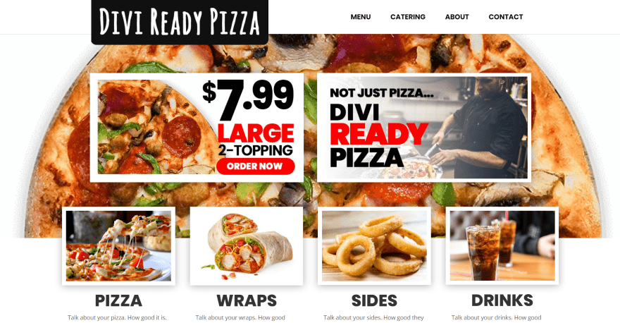
Divi Ready Pizza is a layout pack with 5 pages including a food menu and catering. The home page includes a full-width background image with 2 CTAs in the overlay. Under this is a set of images for the types of food. The images have hover animations that add a border and tilt the image. A tagline is placed in the overlay of a background image in parallax. Chefs are shown within styled person modules. Images of the pizzas are shown from an overhead view with descriptions, all placed over a background video of the pizzeria oven. The Menu page shows squared images with thick borders, a title, description, and button to purchase. The Catering page shows events and includes a contact form. It includes royalty-free videos and images.
Price: $49.95 | More Information
2. Divi Pizza Layout Pack
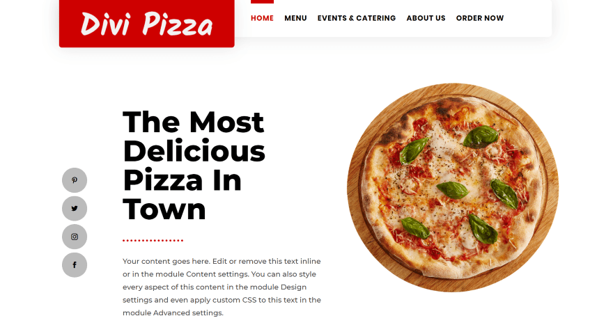
Divi Pizza Layout Pack comes with 5 pages including a food menu, events and catering, and an online ordering page. The hero section displays social buttons in a vertical stack to the left side, the title and description in the center with a button to see the menu or the About Us page, and an image of a pizza to the right. Menu categories are shown in 4 columns with titles and descriptions above or below the images to create an offset design. A section about the cooks shows a block of text with a button to the About Us page and an overlapping image. Services and events are shown as blurbs. The Menu page provides categories to filter the menu and shows images with buttons to order. The Catering page includes a styled contact form.
Price: $25 | More Information
3. Pizza Layout Pack
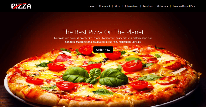
Pizza Layout Pack is a one-page layout that includes a menu/logo placement option for either the left or right side. The hero section includes a full-screen background image with a slider that shows the tagline, description, and button to place an order online. A detailed About section shows an image of the chef on one side and the information in the other with a button to see the menu. The menu shows the food in tabs and includes a photo, description, price, and button to purchase. Other sections include details about the chefs, a full-width map, and a custom footer with a contact form and information over a background image in parallax.
Price: Free | More Information
4. Divi Pizza shop 1 page layout
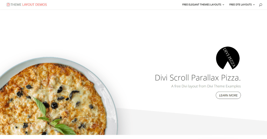
Divi Pizza shop 1 page layout comes with custom CSS to create hover effects. The hero section shows an image that sits above the diagonal section divider and scrolls in parallax. This scroll and parallax design is used throughout the layout. On the other side of the screen is the logo, title, tagline, and a button. Scrolling reveals a pizza hotline with an image and phone number on the right and a description and Trip Advisor scrolling text on the other. The food menu includes several sections that display in 4 columns with text in the outer columns and photos of the pizzas in the inner columns. The photos zoom on hover. The menu sections include large text in the backgrounds. Another menu section uses large title text for the categories and regular text for the items.
Price: Free | More Information
5. Kebab
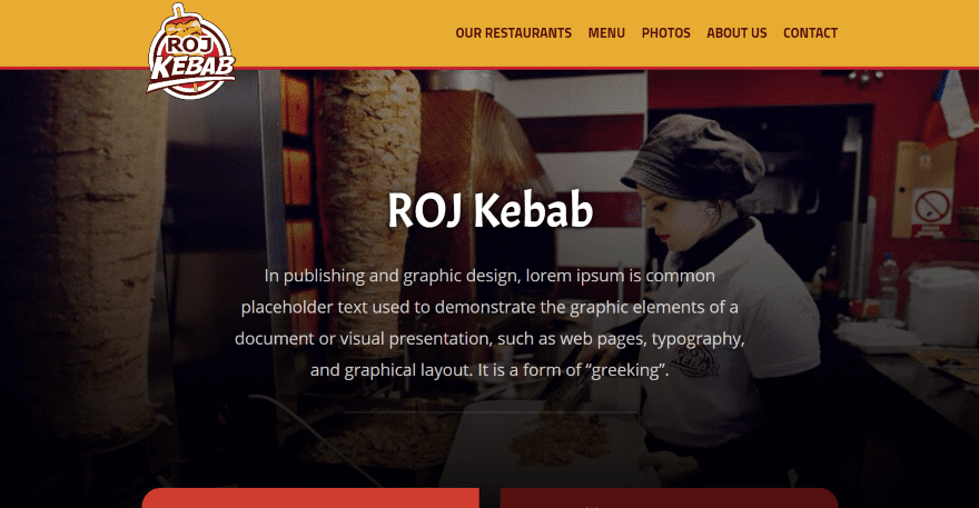
Kebab is a one-page layout for pizzerias and other types of food websites. The hero section includes a full-screen background image with the title and description in the overlay. Two blocks with location information overlap the hero section and include the addresses, opening times, and images of the locations. A menu displays categories with anchor tags that take you to that category. The menu items are shown in a single column and include the image, options, and prices. They include colored backgrounds and are placed over a background image. A gallery shows the food in black-and-white and then shows them in color on hover. An About section includes an embedded video. Also included are a full-width map and a contact section with a styled contact form. The images are included.
Price: $7.49 | More Information
Ending Thoughts
That’s our look at 5 Divi layouts for pizzerias. The layouts include some amazing designs and photography. They include food menus, online ordering systems, food and location galleries, excellent choices of text and color, and lots of styled modules.
These layouts will also work well for just about any type of food website including dinners, cafes, bakeries, coffee shops, and more. There’s something here in just about any price range. No matter what type of pizzeria website you need to build, there’s sure to be something here to help you get started on your next pizza and Divi project.
Looking to add more features to these great layouts? Check out our recommendations for the best restaurant plugins and food menu plugins for WordPress websites.
We want to hear from you! Have you tried any of these Divi layouts for Pizzerias? Let us know about your experience in the comments.
Featured Image via mountain beetle / shutterstock.com


The Divi Ready Pizza layout pack with 5 pages is the way to go. The $50 investment is minimal considering the time saved in developing a truly stunning site! It’s got everything I need. It makes comparing the options a snap. Really nice job on the article Randy. Thanks much.
Amazing layouts!
You having a laugh
Hi Randy
I have to say sadly some of these are just pretty horrible in layout design and context, too many people
look at divi easy of use as an excuse to just be lazy and slap section together with ZERO thought to
the visitor journey and then call themselves web designers.
With the nerve to ask money for something YOU GUYS have better in your theme library everyone of your themes
are better than those. Out of them all 2 were just about OK in my opinion, the others my nephew can do a better job.
HERE IS AN IDEA…Randy
Why don’t you guys do showcase for some of YOUR work? Remind people how good those themes are and refresh their mind.
After all you guys always work on improving Divi, but showcase poor design like those, does nothing to help anyone who wanted
to create a pizza website using Divi, it has the opposite effect in fact if people think that the standard using this tools they likely
to be put off rather than inspired.
Hope this help.
Thanks for the post
Thanks for sharing this Article with us, I like all of them. but as a developer very disappointment with the “Mobile Menu ” . I hope Divi will focus on the mobile menu as well as all the developers who share there site please do some work on the mobile menu. because 80% of customer come from Small devices.
Why did I read this before lunch? … Now I’m really hungry……..