Welcome to Day 26 of our Divi 100 Marathon. Keep tuning in for 100 days in a row of awesome Divi resources as we count down to the amazing release of Divi 3.0 on the final day of the series!
By now most Divi users are familiar with the Divi Library enough to know that if they have created a layout, section, row, or module that they would like to re-use on another part of their website that they can save it to the Divi Library. But what many may not know, is that the Divi Library’s Selective Sync Feature allows you to save some but not all of the associated settings in order to make deploying slightly different versions of your saved elements even easier.
In this article, we’re going to explore the different ways you can use the Selective Sync feature in the Divi Library to simplify the way you design (and redesign) your sites. We’ll also look at how this feature can make it easier to optimize marketing strategies for better results.
How Divi Library’s Selective Sync Works
Subscribe To Our Youtube Channel
Let’s take a moment to go over how Selective Sync works. The Divi Builder (which is available as a stand-alone plugin, as well as being integrated into the Divi and Extra themes) includes the Divi Library. This feature allows you to save any of the Divi modules you’ve customized for reuse elsewhere on your site.
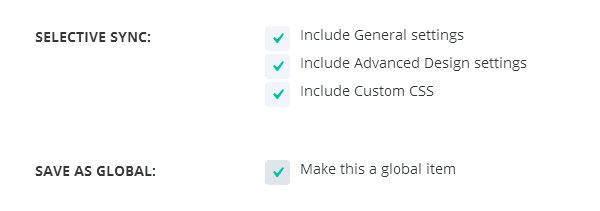
All modules have three groups of settings you can adjust: General, Advanced, and Custom CSS. When you want to save an item to your Divi Library, Selective Sync allows you to save one, two, or all three of these attributes of your customized module.
Why is this important? This whole post is dedicated to that, but basically, what this allows you to do is to save the most basic settings of a module to ensure that all you have to do is add a few new settings to create a new version of that module.
For example, if you add a slider to your post, Selective Sync allows you to save the Advanced settings for your slider, such as its font and color settings, but leave the General settings, where you add your content.
What this means is that when you want to add another slider to your site with the same basic style, you won’t need to reconfigure the padding, font, or color settings. All you’ll have to do is add new content, as your other customizations will have been previously saved.
Let’s go over a few different ways we can use the Divi Library and Selective Sync to design sites in a more efficient manner and target our products toward specific markets.
Using Selective Sync with Global Modules
This is something that’s mentioned in the documentation for Divi, but it’s worth covering again if only to emphasize how powerful using Selective Sync with Global Modules can be. If you don’t already know, with Divi you have the option of saving a module as a Global Module when you save it to your Divi Library.
There are three Selective Sync selections above the Global Module selection when you attempt to save something to your library, as we already explained. This is useful for modules you place on multiple pages or posts. If the module is global, and you use Selective Sync to save only its Advanced settings, you can change that module’s basic style at any given time.
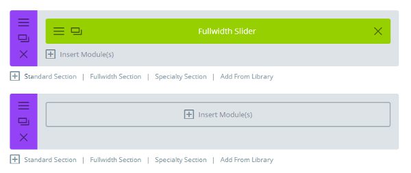
The demo used in the documentation is a great example of how powerful this feature can be. If you create a slider, save it as a Global Module, and selectively sync only its Advanced and Custom CSS settings, you can edit those Advanced settings at any time to change its basic style.
Because it’s a Global Module, you only need to change the Advanced settings once, and it’ll change the basic style for that module sitewide, no matter how many different pages and posts you’ve placed that slider on.
So, if you use the module to create a slider that introduces your team on one page, and then use it to create a slider that displays your team’s best work on another page, your basic settings — which include your padding and font settings — will be changed simultaneously by only editing the Advanced settings for the Global Module once. The content you add in the General Settings section will remain untouched for both sliders.
I’m sure you’re starting to see how much time and effort the Selective Sync feature of Divi can save you, especially on larger websites.
Site Redesigns – The Easy Way
Continuing with the method of using Global Modules with Selective Sync, this is perhaps one of the easiest ways to make sitewide stylistic changes with a few simple clicks.
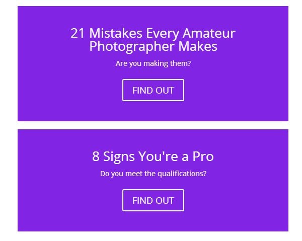
Do you use the Divi Builder’s Call to Action module at the end of every blog post? Using a global version of this module with Selective Sync allows you to change the module’s text colors, fonts and other advanced settings no matter how many different versions of this module you’ve placed in your posts, whether that be a handful posts or hundreds of articles.
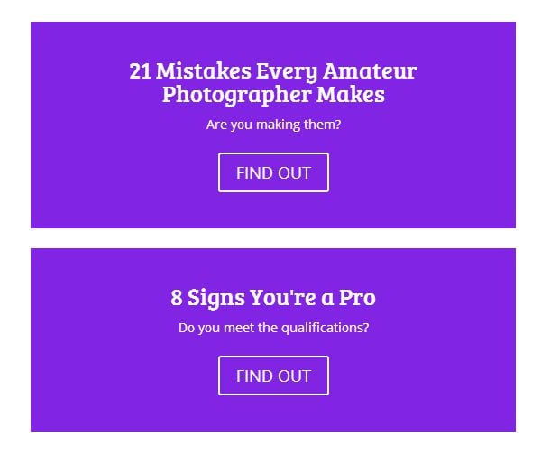
Have you ever wanted to make major stylistic changes to a particular module beyond calls to actions, such as completely redesigning its font, padding, and any available color options? If every module you use on your site is global and you use the Selective Sync feature for each module, you’ll only need to adjust these settings in the Advanced Settings section for each module once.
This allows you to change the styles of multiple modules at the drop of a hat with just a few clicks. This is a great of example of how Selective Sync can be used to help you redesign your site for improved conversions and a better user experience.
Building New Pages with Ease
The Divi Builder allows you to build an entire page from scratch using nothing but modules. You can even save that page as a layout in the Divi Library for easy reuse. If you use Selective Sync to save the Advanced settings for each module, you only need to think about adding new content when loading the layout from the library.
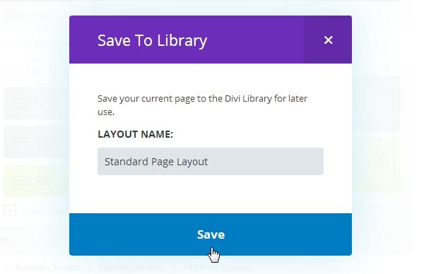
This is most useful for new sites, and it’s especially useful for those wishing to use Divi to create unique designs for their sites. Typically, creating a unique design would mean spending extra time or money to build something from scratch or use code to modify something that already exists.
The Divi Builder already makes it simple for you to create a unique design for your site, but a powerful attribute of Selective Sync is its ability to cut down on the amount of time required to build the framework for a new page. You can even save an individual section in case you want to use the same style for the header of each new page but have a unique design for the rest of the page.
How to Get Started with Selective Sync and Global Modules
The best way to start is by deciding which sections you want for the pages on your site before deciding what modules you want to put in those sections. Save each individual module as a Global Module, and use Selective Sync to save only its Advanced and Custom CSS settings.
Once you’ve set up the framework for your page, save the entire page as a layout.
As an example, let’s use the site of a photography company run by a small team. We want every page to use a full-width slider in the header. This slider will give a visual overview of the information on each page. However, we want the rest of the page to have a unique look to set it apart from the other content on our site.
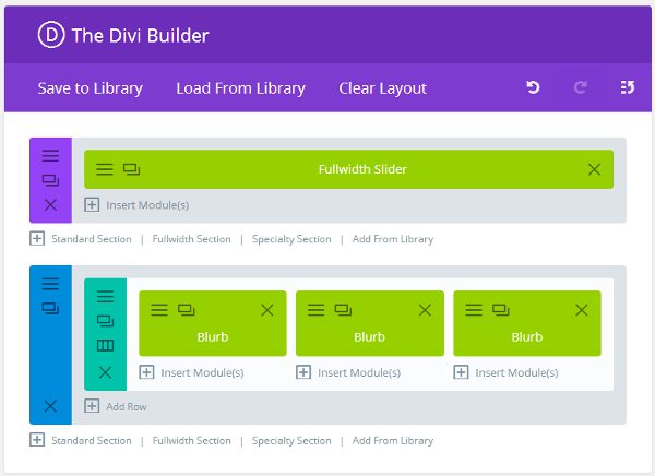
We can create a new page and use the Divi Builder to make sure nothing exists on the page outside of a Full-width Section. We can then build our slider, let’s say for an “Our Team” page, where the slider gives a brief introduction of each team member.
Save as a Global Module with Selective Sync
We’ll save our slider as a Global Module and use Selective Sync to save the Advanced and Custom CSS settings. If you want additional parts of your page to be uniform with the rest of the pages on your site, such as a row of three blurbs underneath the slider on every page, add those sections and modules as well, before moving on to the next step.
Once we’re done building our page, and we’re certain all of our modules have been saved individually as global modules and selectively synced with Advanced and Custom CSS settings, we can then save the entire page as a new layout.
Create a New Page
When we create a new page, let’s say an “Our Work” page, we can load this layout from the library and use the pre-made module, which is our full-width header slider to add new content. For example, we can add a slideshow of our team’s best work to our new page without having to redesign the framework for it.
Targeted Product Marketing
This trick is for bloggers who have a few products, such as courses and ebooks, as well as those promoting affiliate offers. If you are monetizing your site in this way, you should be advertising these items somewhere on every blog post.
However, you can’t just place an ad for your product in the sidebar and expect people to be interested enough to click it. Product marketing efforts need to be a little more strategic than that, and Selective Sync makes it really simple for us to do that.
Let’s say you run a photography blog that teaches photographers at different skill levels how to become masters of their craft. Would an advanced photographer reading a post about an advanced tip be interested in a course that teaches amateurs how to become pros? Probably not.
Instead, we can create a Blurb module for the sidebar that promotes a photography course for beginners and then use the Divi Builder to place this module in posts that contain tips for beginners. That way we can make sure we’re only advertising this course to those interested in beginner tips.
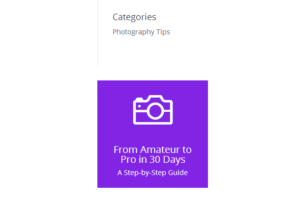
When we save this module to our Divi Library, we leave the Include General Settings selection unchecked. This saves the color and padding settings but excludes the icon, text, and link we’ve placed in the Blurb.
Now we can add this module into a new post targeted toward advanced photographers but change the General settings to advertise a course aimed at advanced photographers instead. There’s no need to play around with color options and padding dimensions again. They’re already set.

To make things even simpler, we can keep a copy of the base module in our library and save each new module we make as a separate library item. This way we can create new product promotion modules easily and reuse them in later posts. This is one way Selective Sync can make your life easier.
You can also use this approach to customize opt-in incentives for email forms to ensure the lead magnet you’re offering matches the content of the page you’re promoting it on.
Final Thoughts
The Divi Builder is a feature-packed tool that’s changing the way people create websites with WordPress. This is thanks to its ability to simplify nearly every part of the process — and the Divi Library feature plays a huge part in making this possible.
The ability to save each and every module you create for later use is an amazing feature that cuts down on the number of times you need to apply the same styles over and over again. It also allows you to reuse a module you’ve already created an unlimited number of times, at the touch of a button.
By using Selective Sync, especially with Global Modules, you get access to yet another time-saving feature that’s built into the Divi Library. This combination of features helps remove many of the time and energy-intensive tasks that go into site redesigns and updates.
Therefore, if you want to make it as easy as possible to update the appearance of your site and optimize its elements at a later date, for higher conversion rates, using Divi and its Selective Sync and Divi Library features is essential.
How will Selective Sync help you? Do you plan to use it in ways we haven’t mentioned here? Let us and the Divi community know in the comments below.
Article thumbnail image by Mascha Tace / shutterstock.com

Divi 100 Day 26
The Countdown To Divi 3.0
This post is part of our Divi 100 marathon. Follow along as we post free Divi resources for 100 days in a row! This 100-day countdown will end with the game-changing release of Divi 3.0, including our brand new visual editor built from the ground up using React. Divi 3.0 will change the way you build websites with the Divi Builder forever!
Let the countdown begin.


Please tell me, just to make sure, if there’s any way now to save whole section or row as a global item but leave modules general settings intact?
Whenever I try to save whole section or row as a global item it changes modules general settings to global as well, making it impossible to change content on every page.
Is there any way to do it now? If not – will it be possible to do in 3.0?
This whole article is great in theory. I mean don’t get me wrong, I love Divi, and it has saved me lots and lots of time…BUT, the only problem I have with this, (on top of what some others have said before me already), is that some of the modules (sections, etc) don’t all have the same customization options, and many, if not all of them do not have enough customization options, to the point where a good amount of the time I find myself writing custom css outside of the module itself (ie in child theme css)..so in this scenario no matter how many times I save and sync any settings, there end up being too many settings not being able to be carried over in the saved module and make it hard to organize and use this feature fully.
I find I have to comment out my css really well in order to keep track of all of them, and this can get really hard to organize and keep track of to keep everything together for a future use case. This will become a really great feature to use once more options are added to the modules, so as not to have to use css elsewhere in a themes settings.
Hi Joe,
Please respond to these comments. I think most of us are really interested in your opinion on this.
I also agree with Sidian. I’d love to be able to assign a default layout for post types such as posts or any CPT that I create. I don’t want to have to explain to clients that each time they create a new post they have to add the layout from the library – it’s too clunky when they layout will always be the same.
+1
+1
Lots of +1s for separation of Content and Settings / design. I’d like to see a content only tab so that I can clearly close off any settings and design configuration options from clients.
+1 (or 100 if I can!) for this…this is a great idea, to be able to “hide” the other setting options from clients…
Divi Builder needs the ability to design blog post templates that you can just assign as default to posts. Would save all the work of adding things from the library, especially in cases where you have tons of users making their own posts and you don’t want or need them futzing around with Divi Builder items.
This describes my problem exactly!
Being a company that sells classroom & online courses, we have many trainers that will not only blog but are also responsible for the pages containing info on their respective fields.
Example:
1. Our Prime Agile Trainer has to maintain 16 pages. He is not a webdesigner and finds Divi too difficult.
2. The one who keeps products up-to-date need to be able to quickly add new courses (read: Pages), then pass it on to the trainer who will be responsible for the content after that.
Clear separation of content and design would make these use cases are lot better to handle.
The added ability to ‘lock’ it to content types -like the blog post you suggest- would make it perfect.
I really hope someone from ET is reading the comments on this great article by Joe. I’d love to read a reply on this.
Call me selfish, but I actually don’t like the idea of making Divi so easy that just anyone could use it, cause that’s what I am getting paid for! Outside of Nova’s idea of having the possibility to hide config options from clients, I would rather Elegant Themes keep B2B in mind and keep us as their target market first before B2C.
Also as Jeffrey B stated above, I also want the ability to create from blank slate. And sometimes I find even now Divi in all its glory, very limiting…
I would rather see features brought in that cater to web workers being able to do more rather than making it any easier…
Just my 2 cents!
Joe, thank you for the post. I’m building my new site and hadn’t been able to “get my head around” the concepts behind using Selective Sync to begin a website. for example, “The best way to get started is to decide what Sections yo want, then choose Modules, style the Modules, and Selective Sync the Modules and/or the whole Section. Practice makes perfect for me.
To readers, this is a great post. I expected more replies. I think some people want Divi to automatically make a website for them. I want the ability to design starting from a blank slate.
This is a very helpful feature of Divi. I’ll be definitely using it.
And another +1 for further separation of Content & Design.
Most modules still have too many design settings on the general tab.
This idea has been posted in the Facebook group and received 360 votes!
https://www.facebook.com/groups/DiviThemeUsers/permalink/782585011871097/
After that it was also cross posted into the suggestion forum here
https://www.elegantthemes.com/forum/viewtopic.php?f=22&t=507225
+1 to separation of Content & Design.
Thanks for the helpful article Joe.
Divi Library, Global Modules and Selective Sync are incredibly valuable when creating a site. You only manually edit 40+ blurbs cause you decided to use a different font ONCE. Next time you’ll use a Global Module with only the Advanced Design settings synced. There’s still room for improvement though, I would in particular like to see:
* Further of separation content and design, in many modules quite many design settings are located in “General Settings” tab.
* A way to apply a Global Module layout to existing modules. Think “format painter” for Divi 😉
* A better way to identify exactly WHAT Global Module layout a module uses. When returning to site months after creation its impossible to see unless everyone adheres to crazy naming conventions.
* A way to have Global Sections with non-global content (rows). (Yeah, mom always called me a difficult child)…
Thank’s for a great theme! Looking forward to version 3 🙂
+1!
+1
As always great little tip!
Thanks for the great work!
This is an incredibly valuable article!
One of the very few things I did not like about Divi was how hard it is for my editors to add content while keeping the design the same. It just did not register with me that syncing everything except ‘General settings’ would solve that problem. It was me, not Divi!
I hope in the future the difference between content and design is made more clear. I now finally know how to do it right, but still it will be hard for the editors.
Actually, I just remembered there is a role editor in there. Maybe it’s time I give that one some attention too 🙂
Question: Is there an easy way to apply this to pages I’ve already created using library layout’s that are not global (yet)?
What I mean is, instead of the tabs:
1. “General Settings”
2. “Advanced Design Settings”
3. “Custom CSS”
I’d like to have:
1. “Content”
2. “Design”
3. “Custom CSS”
With all options reflecting these names.
I hope this makes any sense.
Yes! I’d written this up as a suggestion at one point, and even mentioned it in the recent survey, precisely because the documentation was so unclear.
I’d be happy if just #1 had said “Content” in its title somewhere so it was more obvious that’s what it meant.
“General Settings & Content” would have clarified things imensly.