The Divi Matcha Shop child theme is a minimal theme that helps you focus on selling your products. It includes WooCommerce pages that are styled to match the child theme. It also adds simplified pages such as a blog, contact, and more. In this article, we’ll look at the Divi Matcha Shop child theme to help you decide if it’s the right choice for your needs.
Installing the Divi Matcha Shop Child Theme

All the installation and setup are manual. Fortunately, this isn’t difficult. Anyone with Divi experience will have no trouble. The setup process was easy and only took a few minutes. The information is included on the sales page.
Firstly, with Divi activated, upload and activate the child theme as you would any WordPress theme. Secondly, activate the child theme. The child theme adds the CSS stylesheet. It comes with the files for the theme options, customizer settings, and layouts. The files are named according to where they are to be used.
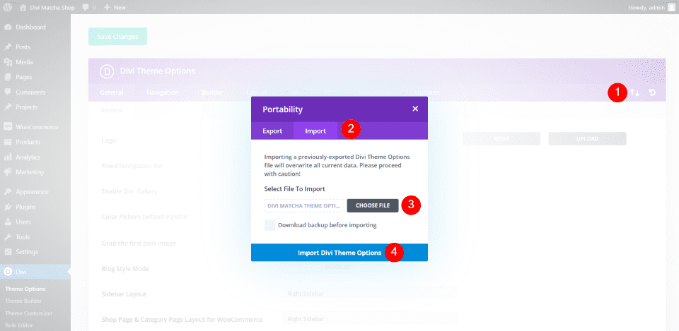
A supplemental zip file is included with files to import. It also includes layouts to upload to the Divi Library. Thirdly, now that your child theme is activated, you’ll need to create the pages manually. Finally, you’ll also need to create the menu and remove the default sidebar and footer widgets. In this example, I’m importing the theme options in the Divi Theme Options screen.
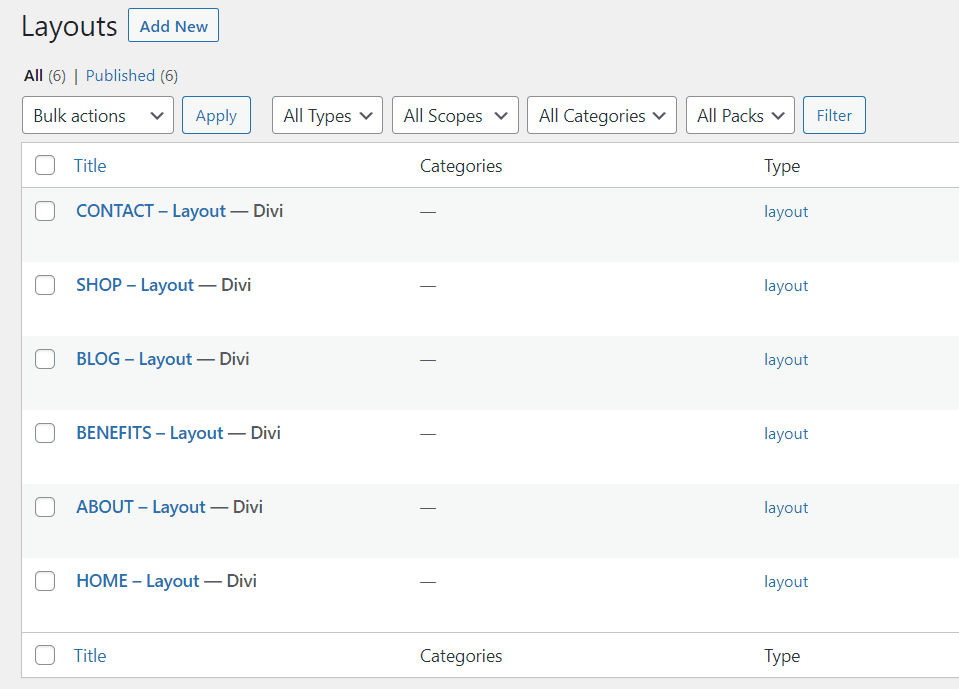
All the layouts are uploaded with one click. Here are the layouts. It has designs for 6 pages. You’ll need to create the pages using the layouts and then create your menu. Your website will then look like the Divi Matcha Shop child theme demo. You’ll just need to add your content.
Divi Matcha Shop Child Theme Pages
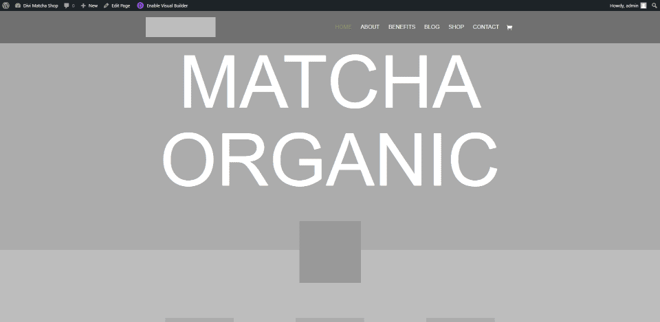
The demo page includes images and icons. For legal reasons, the images and icons are not included in the layout files (which is understandable). Because of this, I’m using images from the demo (they just look better and give a better idea of how to use the child theme). This is common, but I wanted to mention it so you’ll know why your site looks different from the one in this article.
Divi Matcha Shop Child Theme Home Page
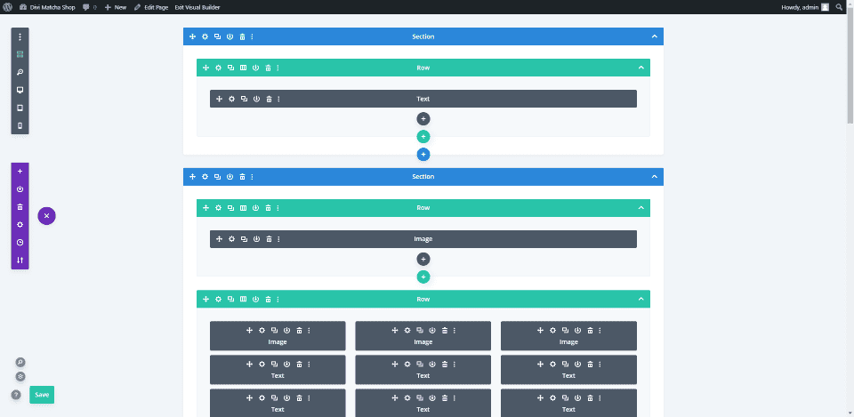
The home page includes lots of text modules, images, buttons, number counters, a video module, and a contact form. Here’s the wireframe view. Let’s take a look at each section on the frontend.
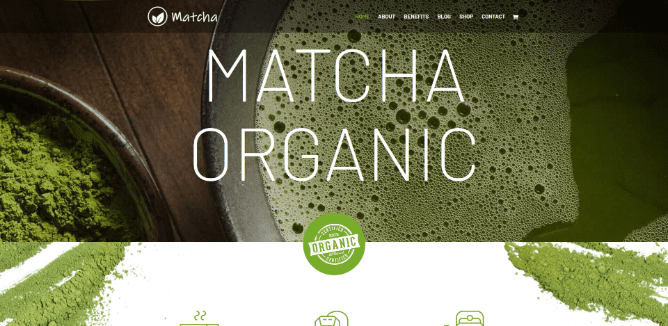
The home page displays a full-width background with extra-large text that rotates into place as the page loads. An image overlaps this and the next section. It zooms into place as the page loads. I like how the focus is on the product throughout the homepage.
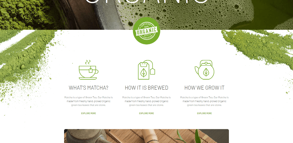
The second section displays a full-width background with sets of information that work as blurbs. They include images (or icons) with a title, description, and a link to read more about each one. These provide information about the product. Images slide into place from both sides of the screen.
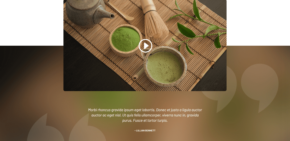
The next section provides space for an embedded video. The video overlaps two sections. A testimonial Appears under the video. The colored background and graphics for the testimonial aren’t included, but they do give a great idea of how the testimonial can be used.
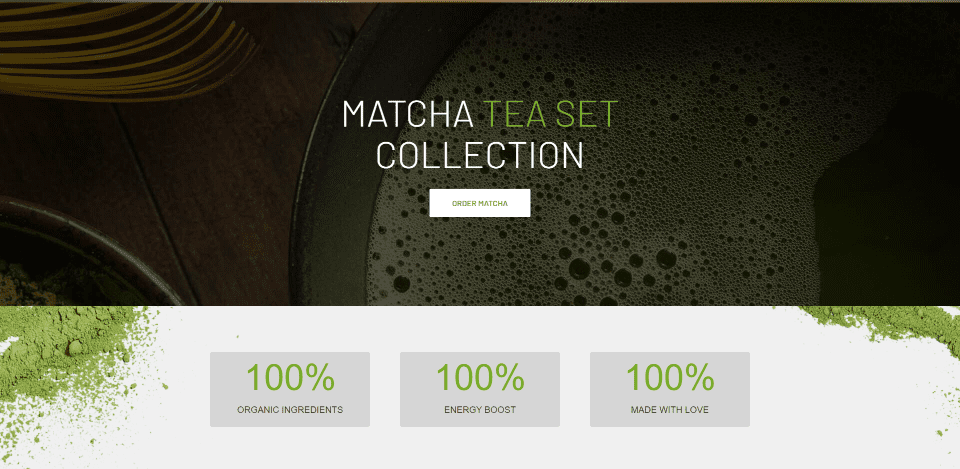
A full-width CTA displays over a parallax background. Number counters provide information. The text for the CTA slides up into place and the number counters count as you scroll to this section.
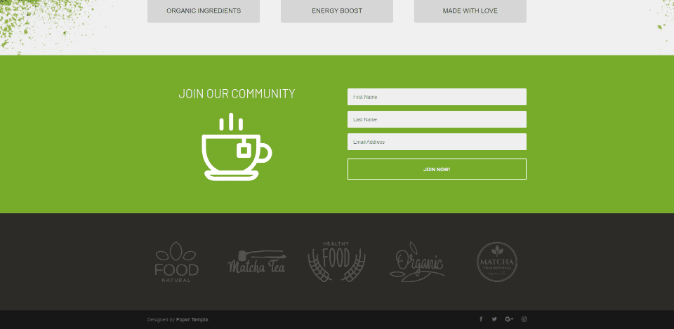
The footer displays a styled full-width newsletter sign-up form followed by a section for logos. These are great for clients, certifications, brands you’re affiliated with or provide, etc. The image next to the contact form slides into place as you scroll to this section.
About Page
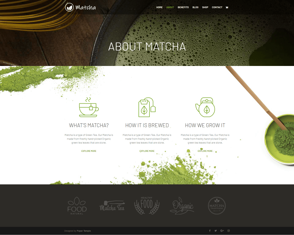
The About page displays a title section with a parallax background. It also uses the product information and logo sections from the home page. This layout can be and used to create a page for each product if you provide more than one.
Benefits Page
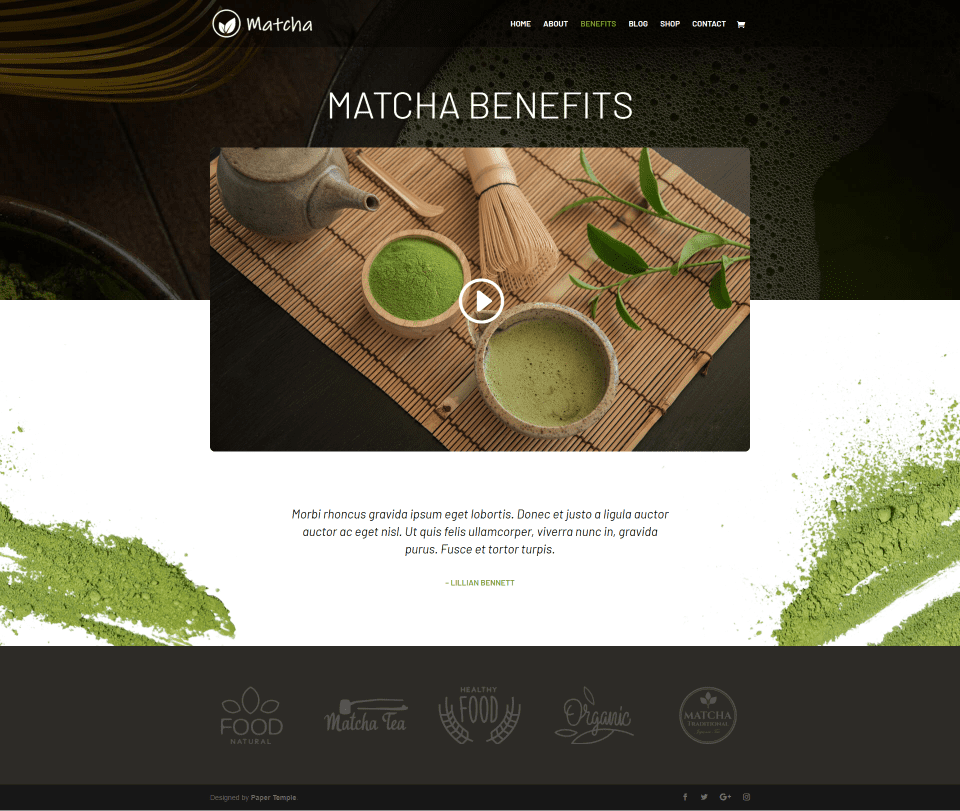
The Benefits page displays the benefits of the product using the video and testimonial section from the home page. The video overlaps the parallax hero section. This layout can be used to create a page for each product. You can also create multiple sections to focus on each benefit.
Blog Page
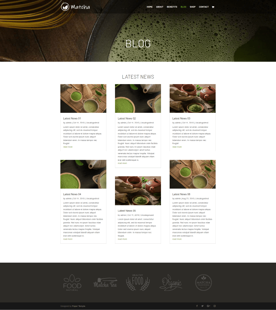
The Blog page has a clean design that displays blog posts in 3 columns. The cards include borders, images at the top, a title, meta, excerpt, and a styled link to read more. It also includes the parallax title section and logos for the footer.
Shop Page
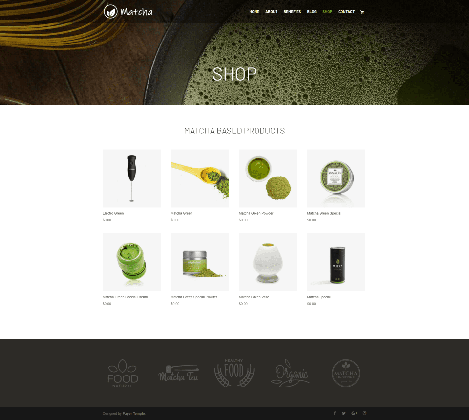
The Shop page adds a shop module with 4 columns. The title and footer are included on this page as well. A green icon displays as you hover over a product image.
Product Page
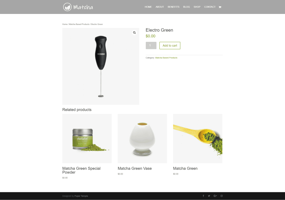
The product page follows the standard WooCommerce layout and includes styling to match the site. It includes green styling for the price, add to cart button, category, star ratings in the reviews section, and the hover icon for the related products.
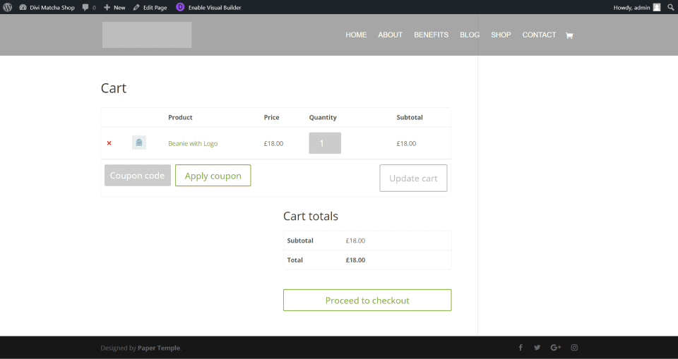
The shopping cart and other WooCommerce pages also include green styling. This example shows the shopping cart with the product name, coupon button, and checkout button styled in green.
Contact Page
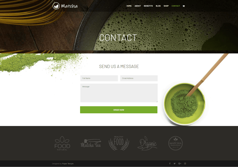
The Contact page also includes the header and footer and adds a styled contact form over a background image.
Divi Matcha Shop Child Theme CSS
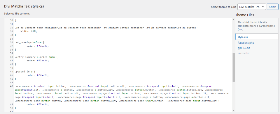
All the styling is added to the child theme’s stylesheet. If you’re familiar with CSS it will be easy for you to customize the colors in the stylesheet. Fortunately, you don’t have to dig into the theme files to make the CSS changes.
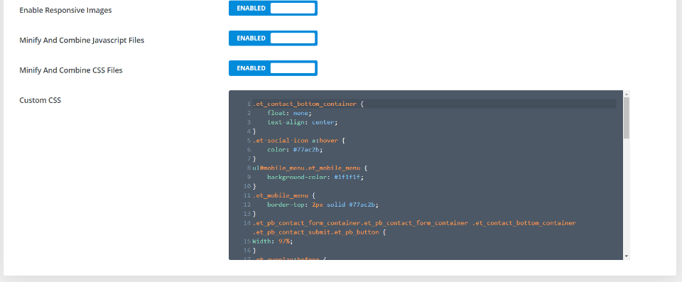
The CSS is also added to the Divi Theme Options. Alternately, you can make the changes here in the theme option. This keeps you from having to change the child theme’s files. CSS added here takes precedence over CSS added to the stylesheet.
Where to Purchase
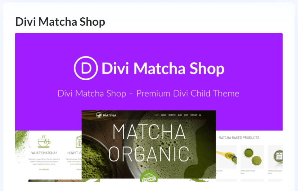
The Divi Matcha Shop child theme is available in the Divi Marketplace for $29. It includes unlimited usage and one year of support and updates.
Ending Thoughts
That’s our look at the Divi Matcha Shop child theme from Paper Temple. This is a simple child theme that looks clean and elegant. The simplicity is a great way to focus on the products. I especially like the home page design. The benefits page is a great way to provide product information with video. The About page makes good use of blurb-style cards to help the buyer to understand more about the products and processes. In conclusion, if you’re looking for an eCommerce Divi child theme that’s simple and easy to use, Divi Matcha Shop is worth a look.
We want to hear from you. Have you tried the Divi Matcha Shop child theme? Let us know what you think about it in the comments.
Featured Image via Letters-Shmetters / shutterstock.com


Awesome review. I have been using this theme for last few months on one of our site. But now I would like to do some customization to make it better. Looking for a tutorial.