Running a successful online sale can be one of the best ways to boost revenue and get more customers for your business. Using Divi makes the process much easier by providing a powerful platform (and ecosystem) for building your online store from top to bottom, including hundreds of tools at your fingertips to optimize your sale for huge returns.
In this article, we’ll be sharing some effective, time-tested tips you (or any company) can use to run a successful online sale with Divi.
Once your toolbox is full, you’ll be more than ready to follow these 25 Tips for running a successful online sale with Divi.
- 1 1. Start Planning Far in Advance
- 2 2. Determine Essential Sale Details
- 3 3. Identify Technical Tasks and Challenges
- 4 4. Design Your Sales Funnel from Start to Finish
- 5 5. Create a Content Production Plan
- 6 6. Prepare Your Site for Traffic
- 7 7. Involve Your Community
- 8 8. Form Partnerships
- 9 9. Mobilize Your Affiliates
- 10 10. Sponsor Content from Influencers
- 11 11. Conduct a Giveaway
- 12 12. Create a Sale Specific Landing Page
- 13 13. Provide as Many Payment Gateways as Possible
- 14 14. Optimize Your Ecommerce Features
- 15 15. Optimize Your Ecommerce SEO
- 16 16. Create Site-wide Sale Notifications and CTAs
- 17 17. Create a Mega Menu for Showcasing Sale Content
- 18 18. Create an Expanding Footer CTA
- 19 19. Create a Special Post Template for Sale Related Blog Posts
- 20 20. Use Position Options to Create Floating Banners
- 21 21. Optimize Social Sharing Options
- 22 22. Use Conditional Options to Hide/Show Sale Content Based on Visitor Activity (or even Site Language)
- 23 23. Build Mailing Lists with the Email Optin Module
- 24 24. Optimize Everything for Mobile
- 25 25. Set Your Marketing Campaign in Motion Before the Sale Starts
- 26 In Conclusion
1. Start Planning Far in Advance

The first step to any well-run sale is planning. If you’ve never done one before, it may surprise you just how much work goes into it. But don’t worry, we’re here to point you in the right direction.
In many cases, creating an online sale that is simple and effective tends to yield a much higher return than trying to force marketing tactics or tools that don’t line up with your skillset or goals. Just because it can be done, doesn’t mean it should. In general, stick to the methods that you are confident will work to meet your goals. You can always make improvements for your next sale.
If you are just starting, there’s no shame in using the same techniques that other similar companies in your niche have found to be successful. Our big tip here is to write it all down and create a production schedule for everything your sale entails. Then, reverse engineer a timeline to get everything done ahead of time. This can’t be done at the last minute. To do it right you’ll need to start as far in advance of your target date as reasonably possible.
2. Determine Essential Sale Details

There are a few essential details you’ll need to work out before you can do everything else:
- Determine when the sale will begin and how long it will run. Many people and companies run sales in sync with the seasons of the year or with holidays. Such as a “Summer Sale” or a “Black Friday Sale” which takes place immediately after the United States Thanksgiving Holiday each year.
- Determine what will be on sale and how far it will be discounted. This is likely going to look different for everyone depending on their specific business. However, if you want to grab folks’ attention you’ll want to choose products with a large margin and mark them down as low as you can afford to. Discounts of 50% and above are eye-catching. This is where digital products with nearly no overhead per unit can really shine!
3. Identify Technical Tasks and Challenges
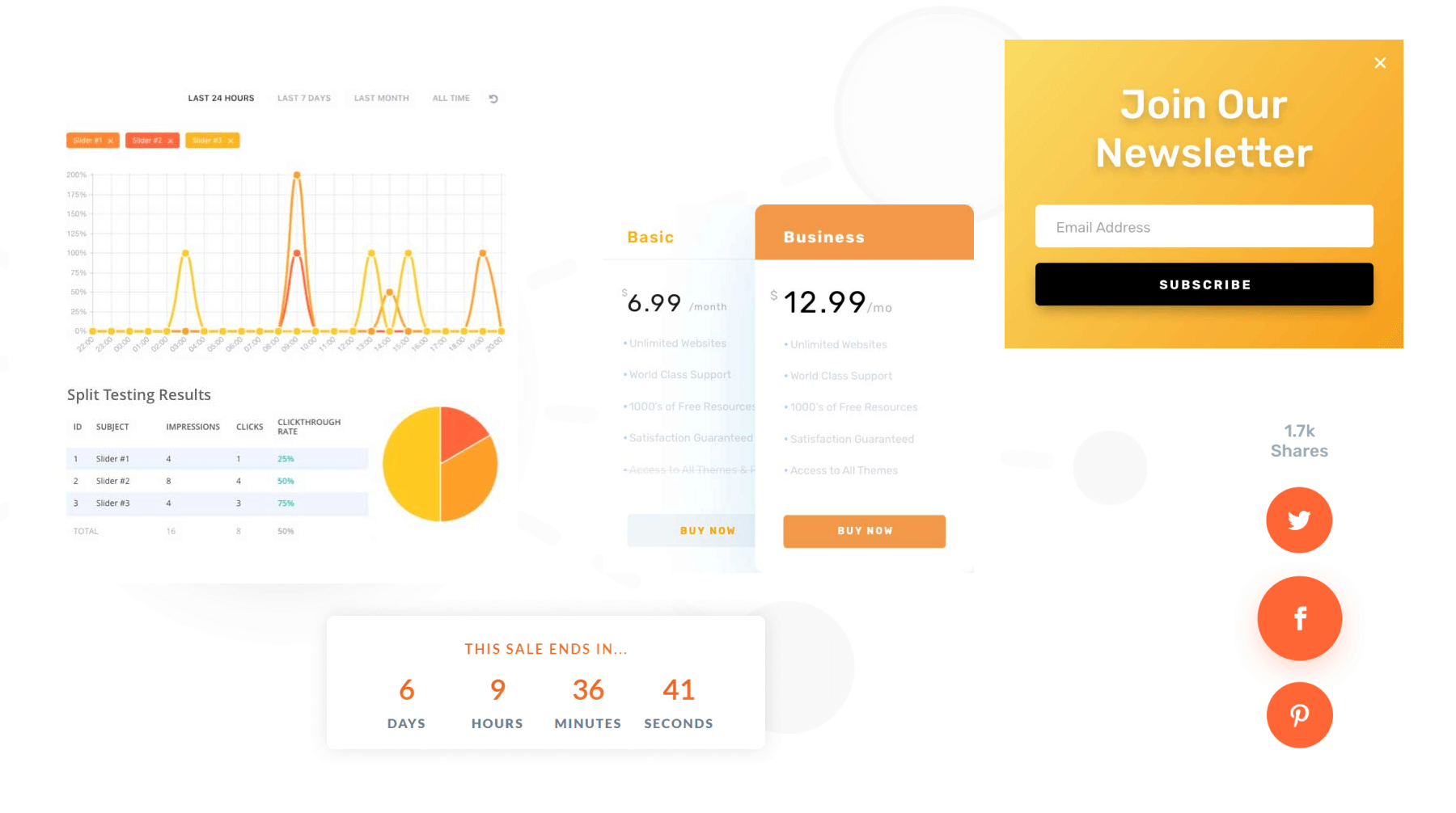
These are not easily recognized at the beginning of the process. They reveal themselves as you start working on your sale. As your vision begins to take shape, you’ll want to keep a running list of anything you need to design, write, code, or build to pull it off. The time and resources required to do all these things will determine how soon you need to begin production work.
Here are a few examples (but far from a complete list):
- Sale landing page – Divi comes with over 2,000 page layouts, hundreds of which are professionally designed landing pages. And our community has thousands more landing pages available in the Divi Marketplace!
- Countdown timer section – For this, you can of course use Divi’s own countdown timer module. However, if you want even more advanced countdown features you can once again explore the amazing variety of countdown plugins for WordPress.
- Top bar call to action – With Divi’s theme builder and built-in sticky options you can easily create a top bar call to action. Add dynamic content, conditional display rules, and more.
- Expanding footer call to action – This too is easily doable all with out-of-the-box Divi features!
- Sale graphics for blog posts, emails, and social media – On our blog, we release layout packs weekly. When we do, we give away free design assets like images and illustrations. All of which are free to use for anything.
- Ads for Google, YouTube, Facebook, Instagram, and more – While this isn’t an area Divi directly helps with, you can again use any of our free design assets for whatever you want.
- Sale assets for affiliate marketers – Same idea as the other graphics/assets points above.
4. Design Your Sales Funnel from Start to Finish

Featured Image via vectorpouch / shutterstock.com
A sales funnel represents the purchasing path someone takes to get from your “top of funnel” content (such as ads or social media) to your sales page and then past the point of conversion. A sales funnel should be optimized to make buying your product(s) as easy, streamlined, and exciting as possible.
Most sales funnels will need at least the following pages:
- Landing Page (or Sales Page)
- Cart Page – with upsells
- Checkout Page
- Upsell/downsell page (optional)
- Thank You Page – with upsells
With Divi, you can design all the pages needed for your sales funnel (or choose from hundreds of premade layouts). And you can use a funnel plugin like CartFlows to help streamline the process.
Landing Page
The landing page (or sales page) is a critical step in the sales funnel. It is your chance to wow your visitors with your amazing deals and get them to click that buy button. Consider a landing page plugin like Divi which has hundreds of premade landing page layouts included in the library you can choose from. Or take advantage of our Cyber Monday Sale and get a pack of exclusive landing page layouts optimized for conversion.
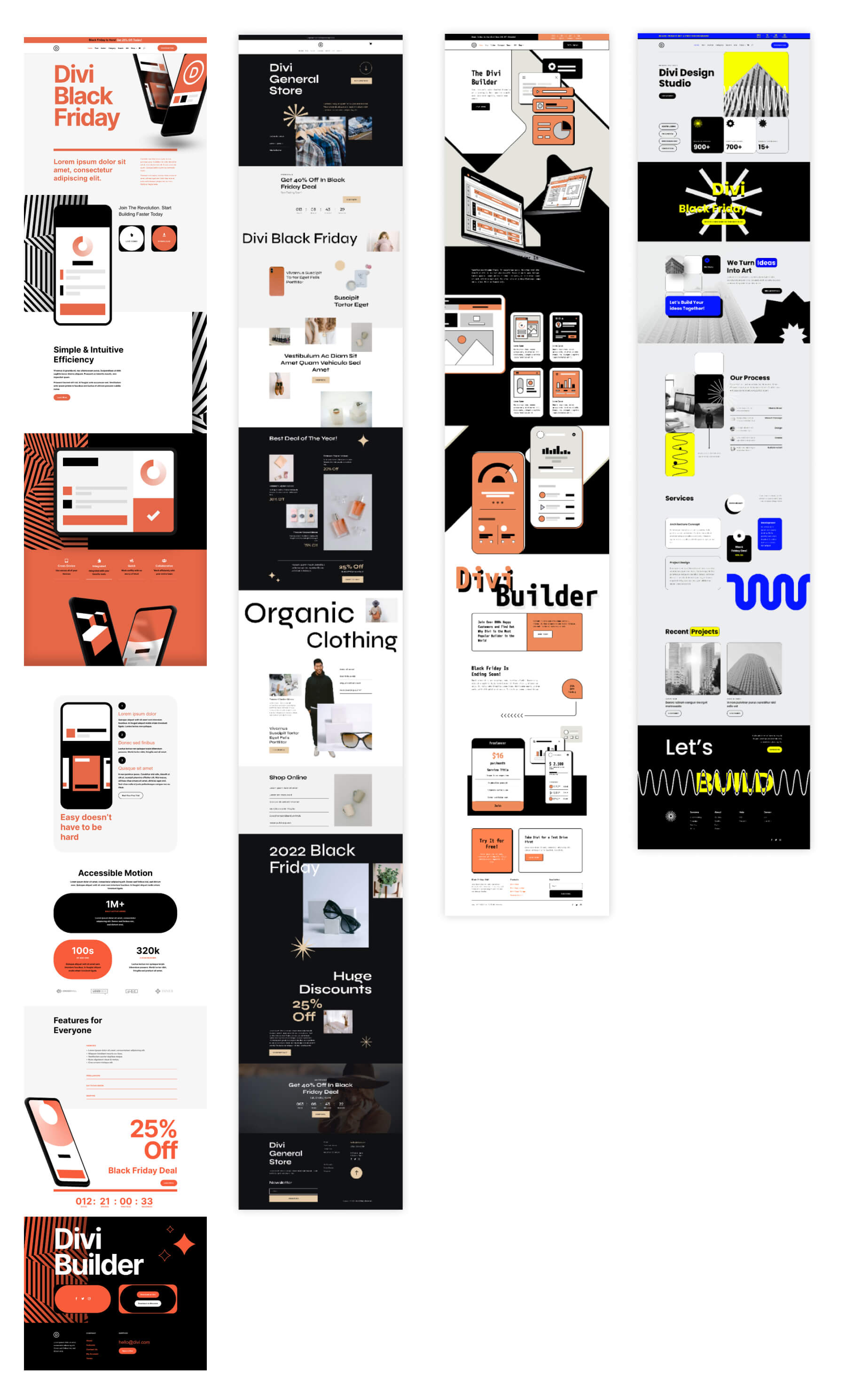
And of course, there’s plenty of community-designed layouts in the Divi Marketplace. You can add these to your site in just a few clicks. We’ll have more to say about your landing page below.
Cart Page
Normally, in WooCommerce, visitors will visit the cart page before heading over to the Checkout Page. In some cases, this isn’t an ideal user experience since it adds a seemingly unnecessary step in many cases. This is a good opportunity to include a mini cart in your header or sidebar so that users can see their cart item in real-time and go straight to the checkout page.
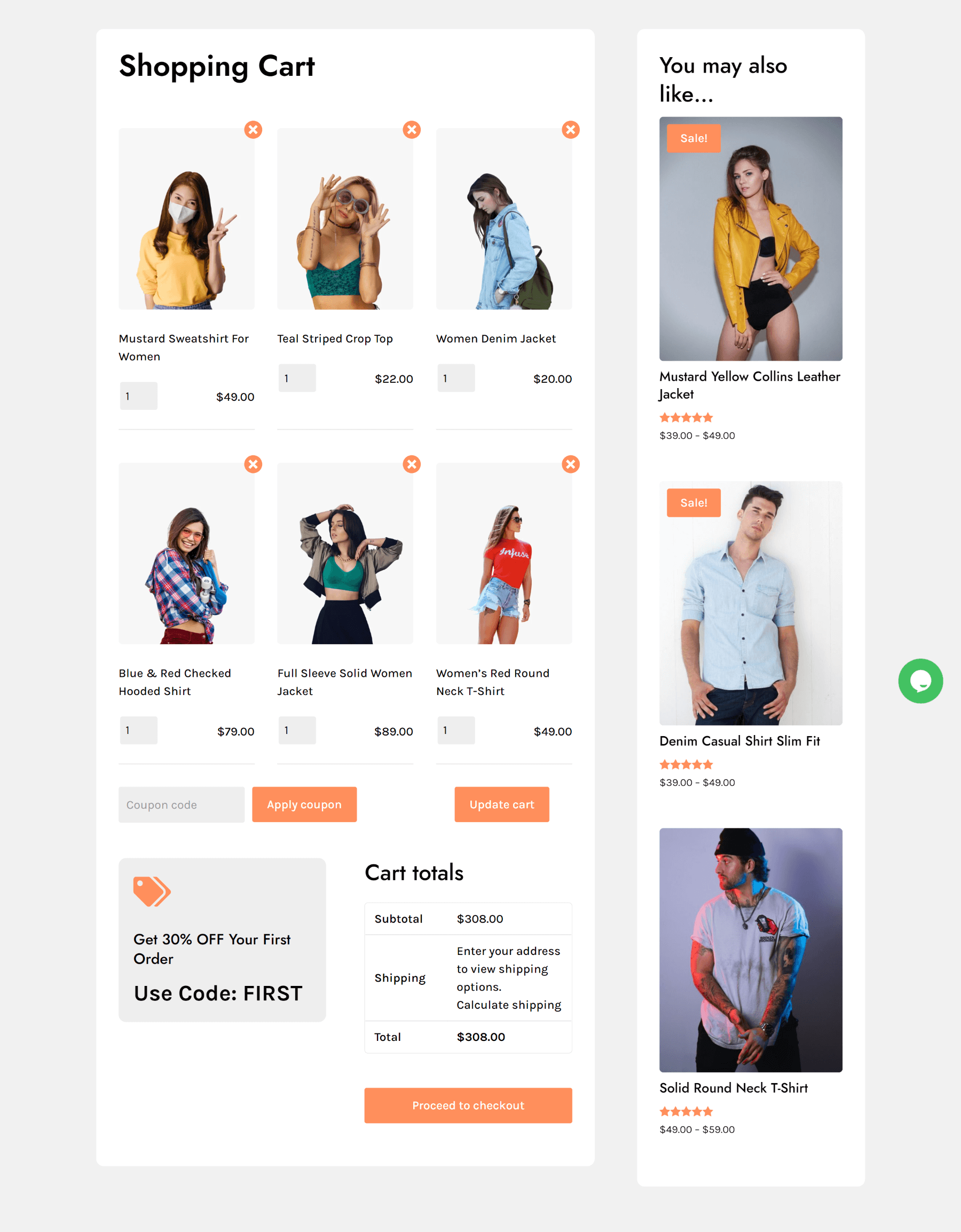
However, if you are going to take full advantage of the cart page, you will want to include upsells. Upsells are related products that the customer may want to add to their cart. It is a great opportunity to sell more products to customers already vested in your products.
Here is an example of a Cart Page from one of the layouts included in WooCommerce Layouts for Divi. Notice the upsells featured in the right sidebar under “You may also like…”.
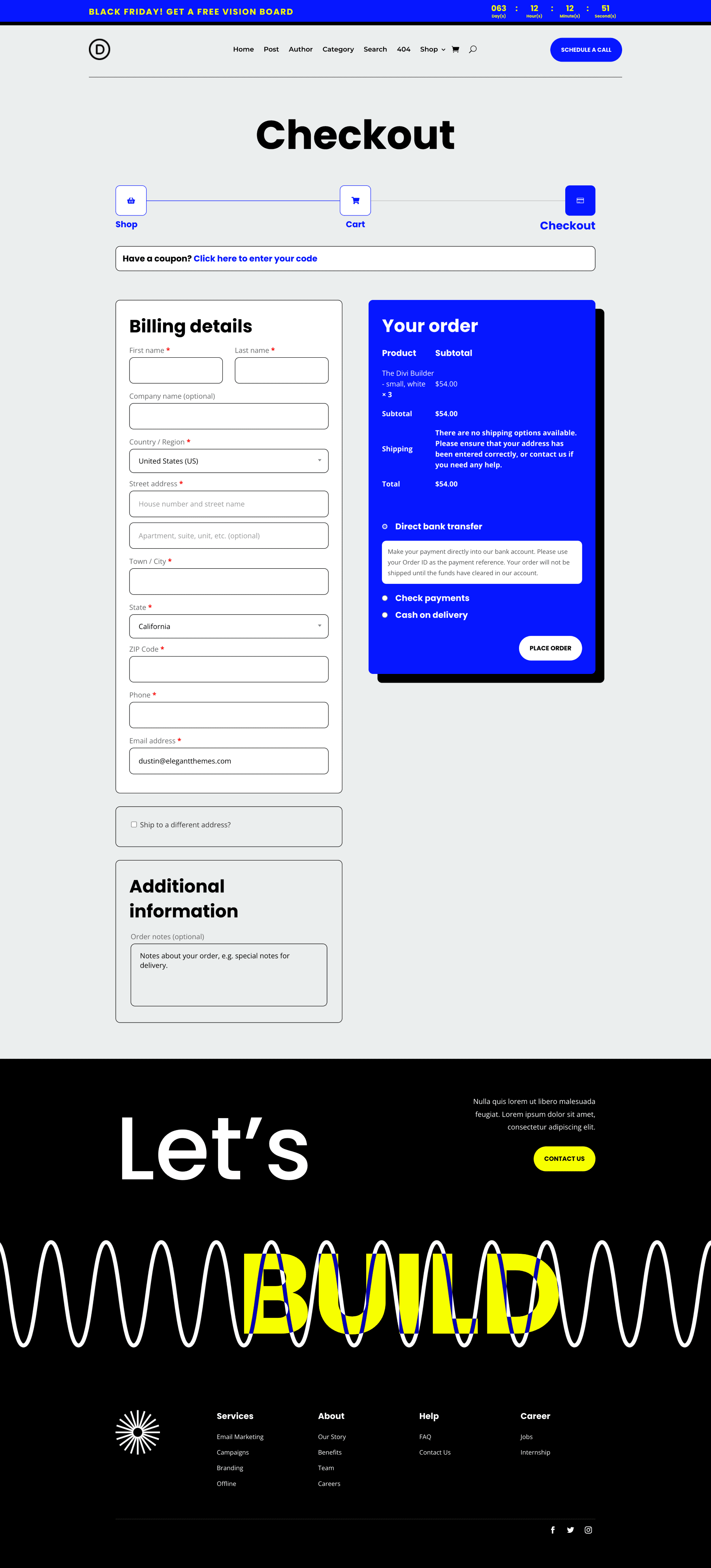
Checkout Page
The Checkout Page is the next sales funnel page that can easily be designed using Divi’s Theme Builder and WooCommerce Modules. It is important to think carefully about the elements you include on this page.
You may want to include some testimonials to help close the deal on the checkout page. Since this is the page that most people will probably leave (maybe they’re having second thoughts), this is also a great opportunity to add a popup on exit intent that gives them a coupon code that might push them over the edge. For that, you’ll want to look at popup plugins that offer conditional display logic.
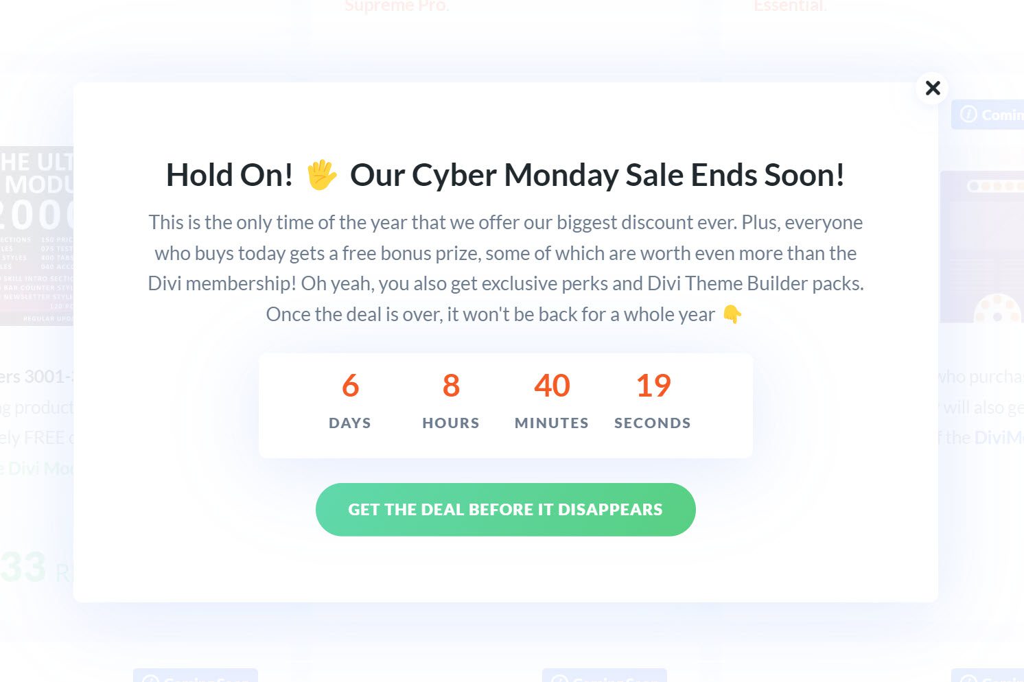
Also, it is always a good idea to have a follow-up plan in place for those that abandon their carts like an automated email that reminds them to come back to their cart. Or you can have a custom popup that shows up whenever they come back to the site that includes a discount if they purchase now. Divi has built-in condition options to show or hide elements based on if a user visits a cart page but hasn’t made a purchase. And there are products like Hide & Show Pro in the Marketplace that extends these features to give you even more control over conditional content.
Here is an example of a Checkout Page from one of our exclusive Cyber Monday Theme Builder Packs:
Upsell/Downsell Page
The Upsell/Downsell Page is an important step in the funnel. This is the page that users are redirected to after completing a purchase. An Upsell Page doesn’t have to have a lot of content. It just needs to feature another deal they may be interested in. For example, if a customer just purchased a basic level membership, you could offer a lifetime membership at a big discount on the upsell page.
Building an Upsell or Downsell page in Divi is extremely easy since you would only need an image/video, a block of text, and a couple of buttons. If the customer decides to take the upsells, you should make this process seamless so that the customer doesn’t have to go through the entire checkout process again. If the customer refuses the upsell, you could have it redirect to the thank you page.
Thank You Page
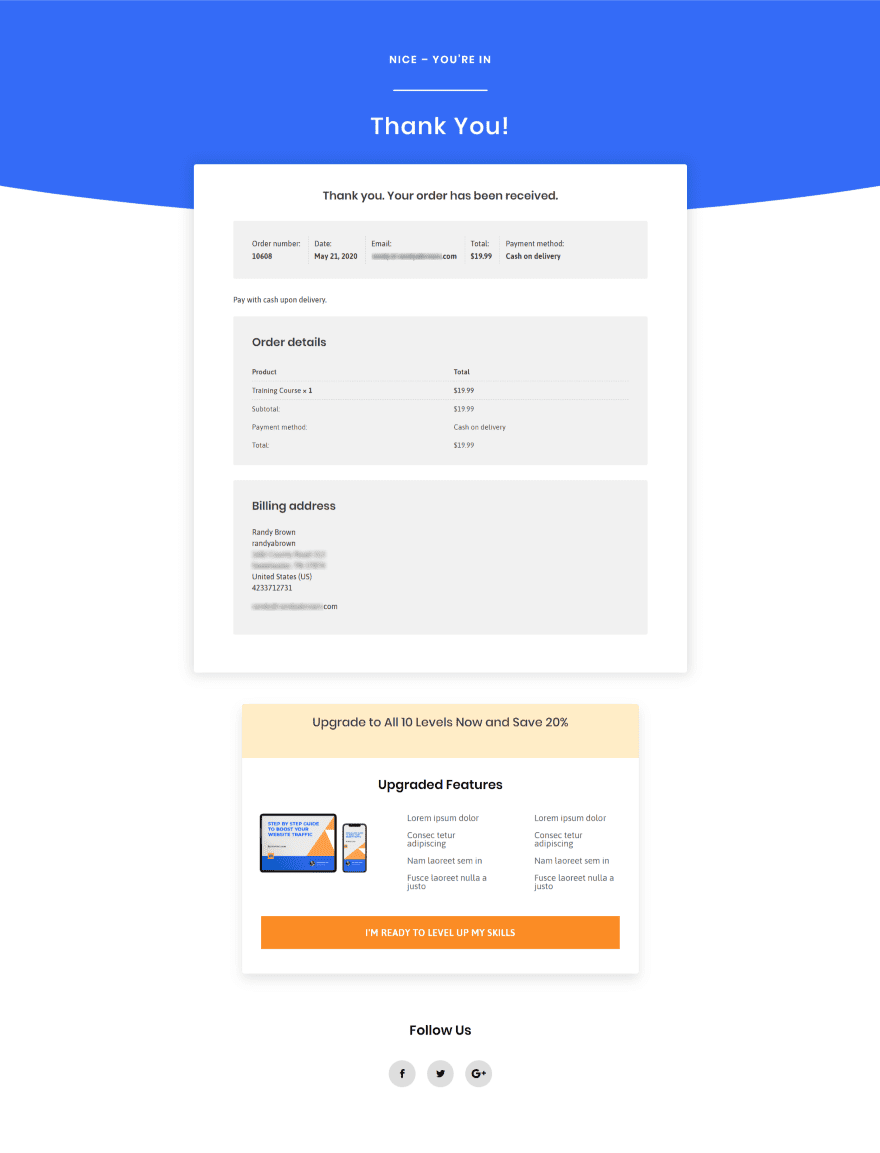
The Thank You Page is the final step in the sales funnel. But don’t miss out on an opportunity to include more upsells or downsells on that page as well. Remember, they already like your products, so these are already qualified customers you are selling to. In fact, in many cases, your thank you page can be your main upsell page.
Here is an example thank you page with an upsell to upgrade their membership at a discount.
For more, check out this Free Guide Funnel Layout Pack that includes a landing page layout for a free-offer email opt-in and a thank you page with upsells.
5. Create a Content Production Plan

With every sale, there comes a lot of content. The content you produce needs to go through several phases, so the earlier you begin, the better. The first phase of setting up your content plan focuses on the discovery phase. Content is going to be your way of telling your audience about the sale, so you’ll want to make sure the message is as clear as possible. It’s not about bulk, but about quality. Here are some questions you can ask yourself before starting to plan your content:
- What is the main message of my sale?
- What’s the main CTA of my sale?
- Who am I targeting?
- How does each piece of content feed into or progress visitors through my sales funnel?
These are all questions that you most likely want to be answered before you start creating your content. That way, you’ll know exactly what purpose each piece of content will serve.
Once you have a clear view of your sale and how your content relates to it, you can start planning your content and begin the production. You’ll want to create a harmonized strategy across all the content formats you’re using:
- Blog posts
- Emails
- Social posts
- Ads
- And (potentially) more
6. Prepare Your Site for Traffic

For any online sale to be successful, your site needs to be optimized for performance and speed. After all, you are hopefully going to be getting a massive increase in traffic. And the last thing you want to do is have a slow-loading sales page or checkout page. Or, even worse, your whole site could crash because of a bad hosting environment. An easy place to start when it comes to performance is to download a database optimization plugin. Cleaning up your database is a surefire way to increase the levels of performance of your site during a sale. We offer Divi-optimized hosting through our select hosting partners. While you’ll still need to make sure your plan fits the traffic you’re expecting, you can at the very least start with a hosting provider that’s meant to provide top-of-the-line performance for Divi websites. We’ve also created a great resource for speeding up your Divi website from all angles.
7. Involve Your Community
It’s always a good idea to involve your community. It’s the digital equivalent of word-of-mouth marketing. People relate to people, so involving your community in your sale will spark interest. They are your audience, and the earlier you involve them the sooner your target audience becomes aware of the sale you’re planning.
There are different ways to involve your community. Here are a few ideas:
- Conduct a survey, either formally or informally via simple conversations, on what they’d like out of a sale. Which products they’re most interested in and why. Any insights you can gain here on what will move the needle during your sale will be helpful.
- Incentivize community participation in your sale. This can be done with a special discount, gift, or other perks just for your existing community.
- Incentivize sharing the sale outside your existing community. This can be done with a giveaway, contest, or something similar.
8. Form Partnerships

One of the best ways to make your sale better is by using partnerships to boost your offering’s value. A good example is a bundle of similar products for the price of one. It’s a win-win-win type of situation that will:
- Help you boost sales
- Help your partners boost sales
- Help your audience get more value out of their purchase(s)
Partnerships make your sale stronger. People want to get the most value for their money, so the better your offer, the more organically you’ll see your sales grow. There are different types of partnerships you can create, but you’ll want to make sure that the products added by them are supplementary to your core sale.
9. Mobilize Your Affiliates
Using an affiliate program is also a great way to involve your community in your sale. Affiliates make a percentage on every purchase they send your way, so it’s only logical that you’d want to inform your affiliates of the sale in advance. That way, they can use this additional incentive in their own marketing strategies. It’s easy to add an affiliate program to your website using one of the top WordPress affiliate plugins.
10. Sponsor Content from Influencers

Featured Image via venimo / shutterstock.com
Similar to affiliates, sponsored content allows you to reach an extended audience through content channels owned and operated by others. Even on a small scale, this technique can be very effective. People with a platform that’s part of your target audience have built a certain connection with their audience, and are more likely to participate in a sale if the information is coming directly from someone they follow.
11. Conduct a Giveaway

Giveaways are a great way to involve your community and encourage them to share your sale with others. You’re giving them the chance to win something, while also benefiting from the requirements to enter the giveaway–such as sharing your sale on social media, subscribing to your newsletter, opting into a browser notification, and many other potential sale-boosting actions.
Giveaways are easy to run on WordPress and be run in many different ways. You could start by choosing one of several excellent contest plugins. If looking for an easier way to run a contest, you may also run your giveaway using only your email marketing tool. All new subscribers (from a specific opt-in form or by looking at the newest subscribers in your email account) can be considered entered into your contest. This works well since email is an owned marketing channel that you can continue to use and build your business. If going in the email marketing tool direction, consider these opt-in form plugins for your contest.
12. Create a Sale Specific Landing Page

No sale is complete without a proper landing page. And to be clear, this should be a different landing page than your normal one.
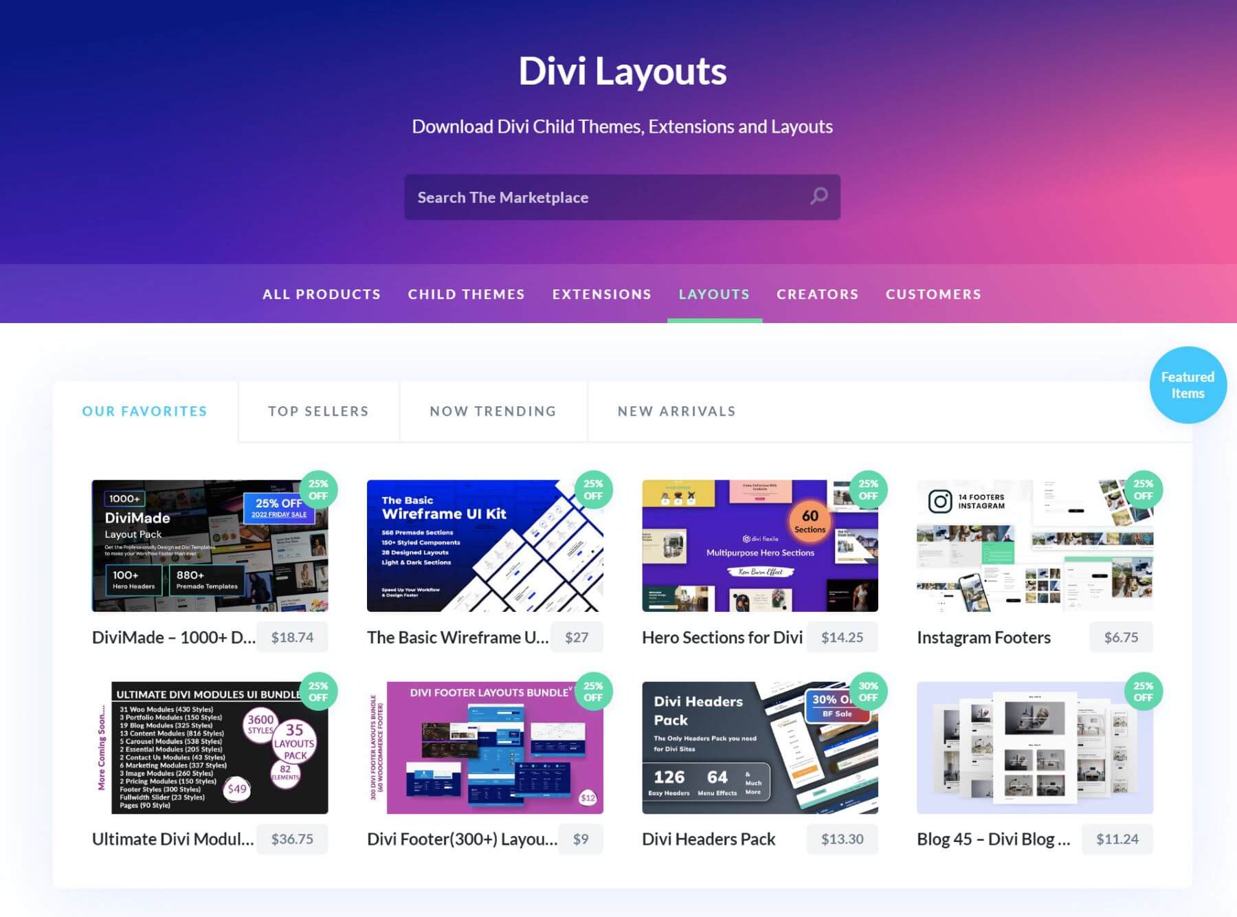
When building your landing page with Divi, you don’t have to start from scratch. We have a ton of premade landing page layouts that can serve as the base of your landing page. Or you can search through our Divi Marketplace to find even more sale-specific landing pages, like this one.
A good combination of the three above, and a good sales offer, is what makes a landing page effective. There are some widely-used tactics you can use. Let’s go over them.
A/B Testing
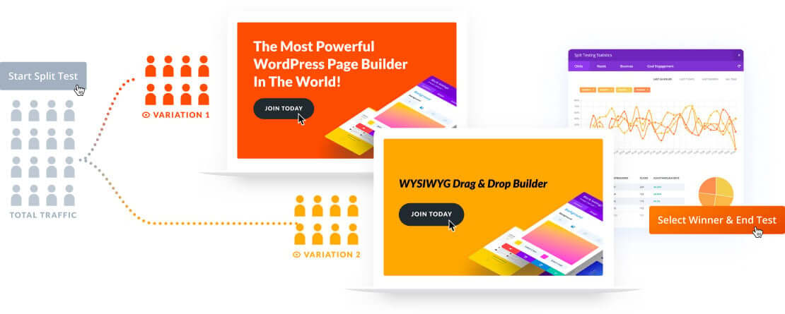
The effectiveness of your landing page is measurable through A/B testing. Numbers don’t lie. If Landing Page A is getting a higher conversion rate than Landing Page B, that means the UX, copy and design are doing a better job on Landing Page A.
Divi Leads is a part of Divi and allows you to effortlessly do split testing on your landing page. It lets you change anything you want and has data at your disposal as soon as it is available.
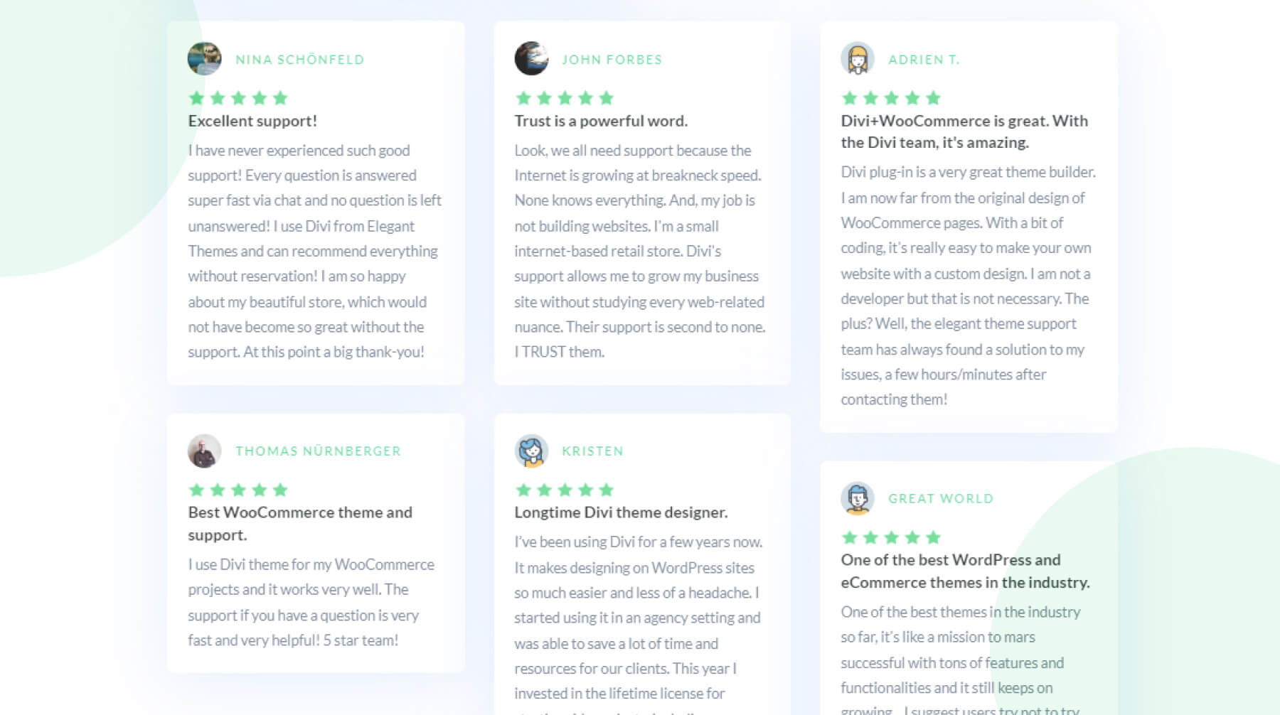
Social proof is another important part of your landing page, both design and UX-wise. People tend to relate to people more than anything else. That’s why testimonials are so effective and can be a great addition to your landing page.
Divi has a built-in Testimonial Module that you can use, but there’s also a very good Divi extension called Divi Testimonial Extended on the Divi Marketplace. This extension provides you with over 20 testimonial layouts + a slider & grid view!
Countdown Timer for Urgency
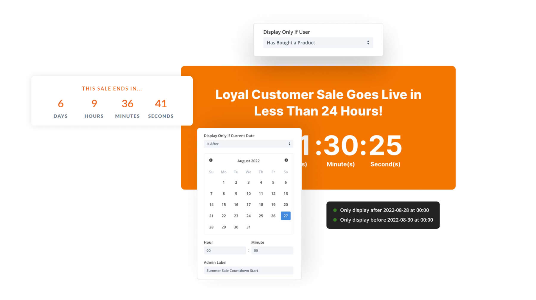
One of the things that makes a sale so compelling is the time restriction applied to it. Whatever deal you’re offering, it’s only for a limited time. So why not highlight that? You can use a countdown timer to add urgency to your landing page.
We have a built-in Divi Countdown Module, but there’s also a great Divi extension, called Divi Timer Pro, on the Divi Marketplace that allows you to further customize the countdown on your landing page.
Engaging Product Images
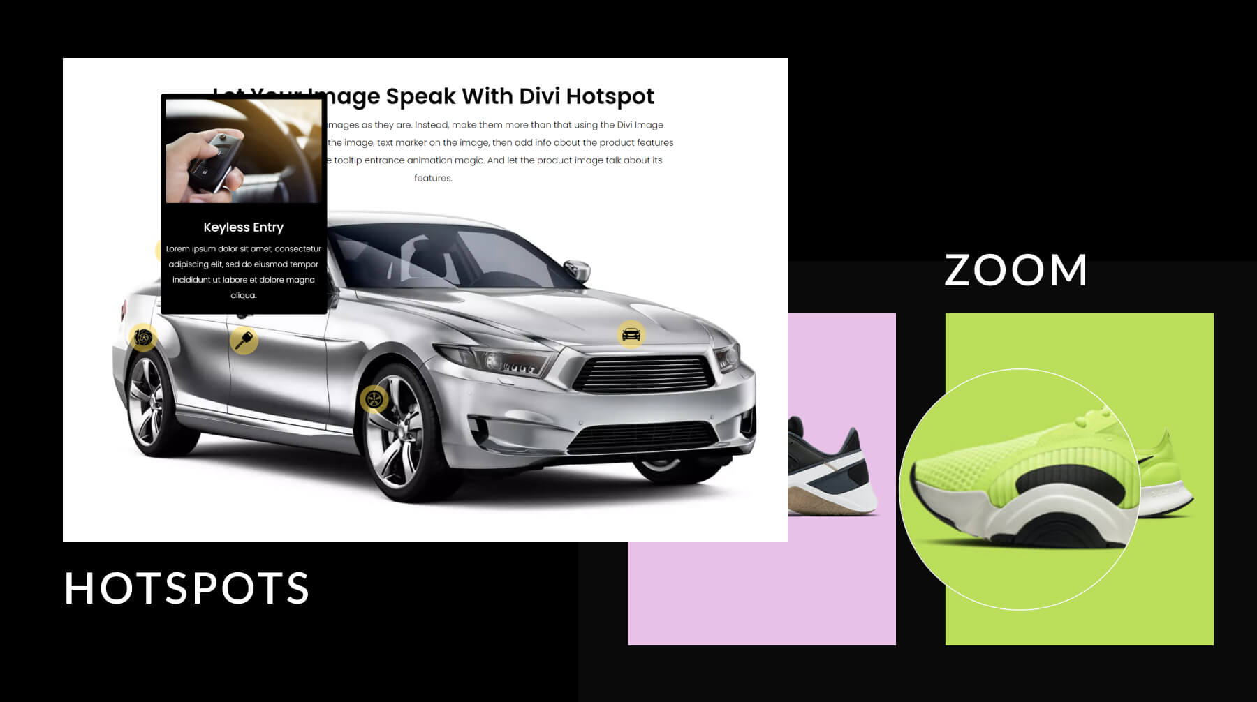
Another effective way to draw visitors’ attention to your products is through high-quality, enhanced product images. Enhancements like image magnification, animated SVGs, hotspots, before and after sliders, and much more.
Pricing Table Toggles
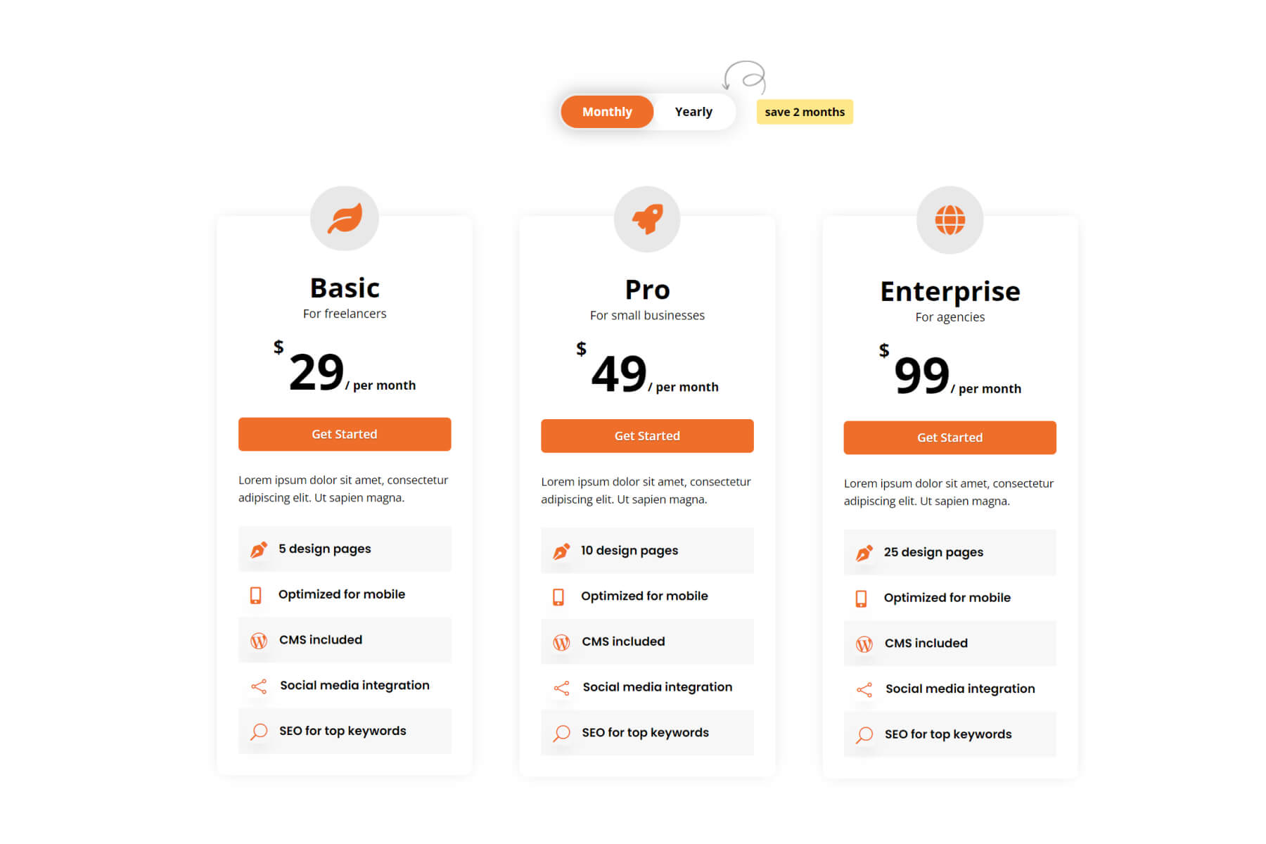
Create a Content Toggle for Pricing Tables on your sales page for an optimal user experience. Divi Flash includes a content toggle module that is perfect for creating pricing tables with customizable toggle buttons including 5 built-in toggle types and designs, animations, badges, and more. You can also check some of the most popular table plugins for this feature as well.
13. Provide as Many Payment Gateways as Possible

Image by Dzm1try / shutterstock.com
When running an online sale, it’s important to give users multiple payment gateways (PayPal, Authorize.net, Stripe, etc.) to choose from when completing their orders. But you also have to consider the quality of the payment gateways beforehand to make sure the transfers are efficient and secure. Since Divi works seamlessly with WooCommerce, here are some of the best payment gateways for WooCommerce. Outside of WooCommerce, you can use other payment plugins to collect payments using multiple gateways.
And it is always a good idea to help build trust with customers by highlighting those payment solutions on the checkout page. Customers who easily recognize a safe payment option they’ve used before will be more likely to proceed with the purchase.
14. Optimize Your Ecommerce Features

In general, eCommerce sites are more difficult to create because it requires much more customization, both on the back end and the front end. Thankfully Divi does a lot of the heavy lifting for you. It’s compatible with WooCommerce out of the box and gives you complete control over the design of WooCommerce page layouts, including templates and dynamic content elements–no code needed. But, in some cases, it just makes sense to use a Divi eCommerce Child Theme that has all of the features you need already built-in. Or if you need to add more WooCommerce Modules, layouts, or designs, many products in the marketplace have everything you need and more.
Woo Essential comes with tons of WooCommerce layouts, templates, and unique modules to help design all the important eCommerce pages (like Shop, Cart, Checkout, Product, and more). Standout features include WooCommerce wishlist functionality, quick view product information popups, product comparisons, mini cart, and advanced filterable product grids.
WooCommerce Extended also includes some powerful tools for optimizing your eCommerce features. Use it to add an ajax product search bar for a better UX, a mini cart popup icon, advanced product displays, product carousels, and more. It even includes a nifty tab manager extension to add and customize new tabs to the WooCommerce product information tabs.
15. Optimize Your Ecommerce SEO
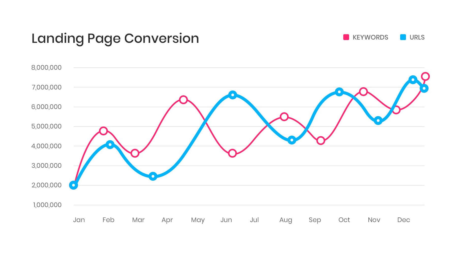
SEO and marketing go hand in hand. So you never want to ignore SEO when creating web content for your online sale. Ranking high in the SERPs is the most powerful free marketing you are going to get for an online store. But you can’t wait to launch a sale to start optimizing your site for SEO.
There is a lot of competition out there so having an SEO strategy in place will set you up to rank higher in the long term so you don’t have to spend so much on paid advertising and endure sleepless nights worrying about your Cost Per Click campaigns.
For optimal results, we would start using advanced SEO techniques and optimizing your WooCommerce SEO. Using a Divi-friendly SEO plugin like Rank Math or Yoast will help with all of the on-page SEO needs for your online store content. And, if you really want to look good in the search results (and make Google like you), you can use the Divi Schema Plugin to optimize your sale and product pages with schema markup for content like FAQs.
16. Create Site-wide Sale Notifications and CTAs
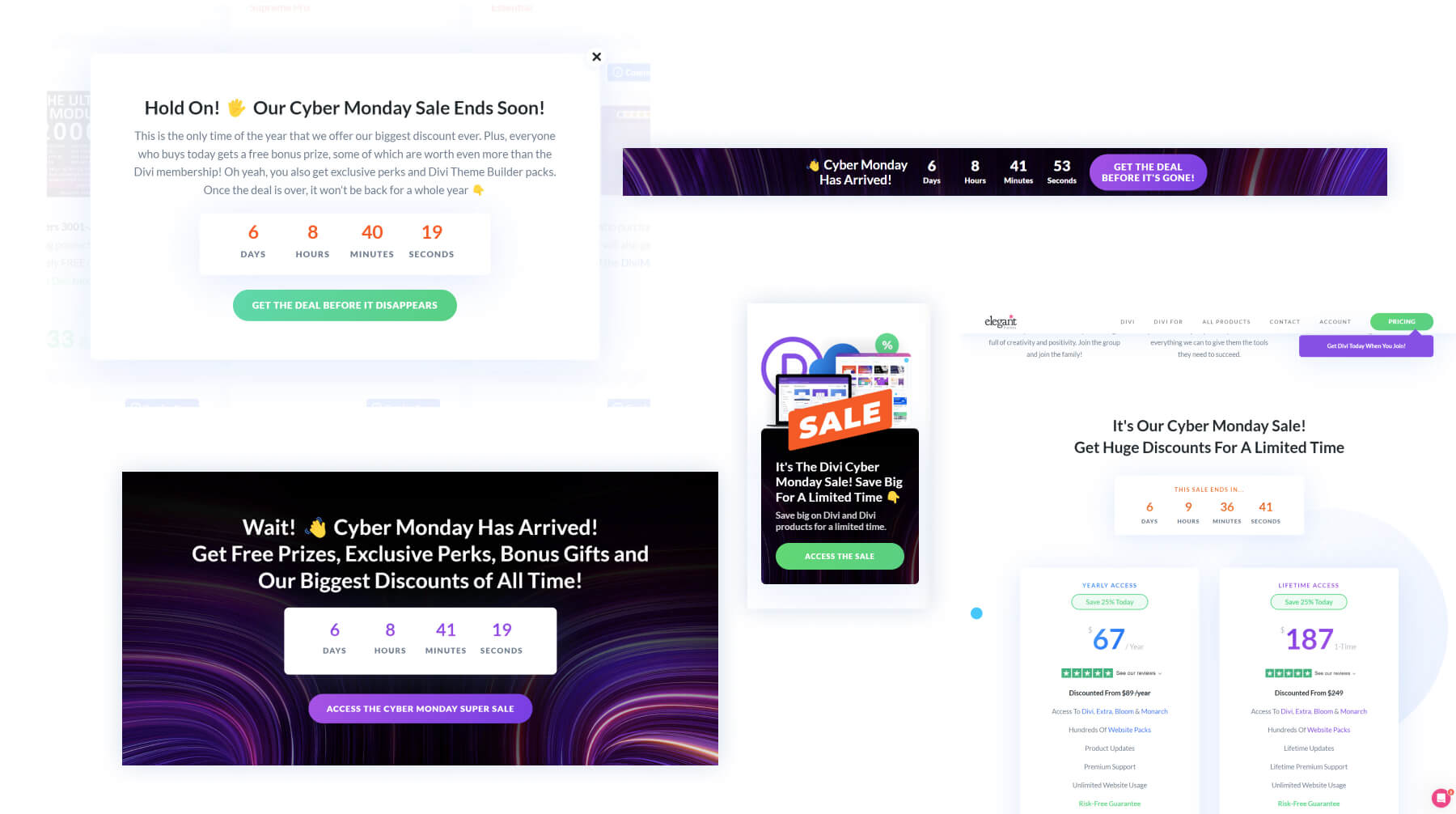
The Divi Theme Builder makes it easier than ever to deploy dynamic content site-wide, like a sale notification bar, pop-ups, custom headers, page templates, footers, you name it.
For site-wide email optins, simply use Divi’s email opt-in module that allows you to customize email optin displays in creative and effective ways to get users into your email campaigns as a part of your sales funnel strategy.
If you are looking to create even more customizable promotional popups, the Divi Overlays plugin can handle that and so much more. If you are looking for some beautiful CTA layouts, our layout packs are full of CTA designs and, with Divi Layouts Extended, you can get 25 CTA layouts and 600+ additional layouts to help design your most important pages. Plus, you can save all of these layouts and more in your Divi Cloud to deploy them anywhere with a few clicks.
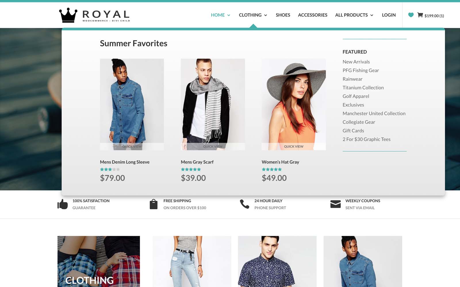
A website’s header is a great place to put some promotional content. It’s something that follows the visitors throughout their entire stay on your website, and people interact with it often. To help drive more traffic to your sale’s landing page, consider building a mega menu for your header, and dedicating a column to your sale. You can use popular menu plugins like the Divi Mega Pro extension or DiviMenus to expand the menu possibilities you have in Divi. Mega menus tend to have a lot more space than regular menus. This provides you with the opportunity to design a sales banner or other CTA.
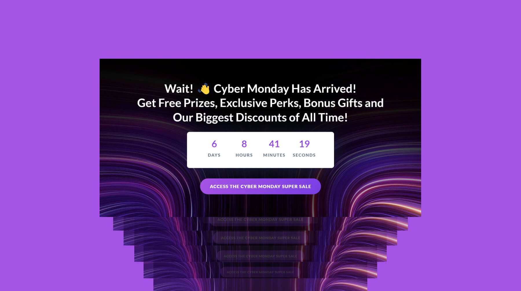
While not necessary, this is something we’ve done and it’s an easy way to increase user engagement and conversions. With Divi, you can use premade footer layout designs on your templates to get a stunning footer design that can easily be optimized with one or more CTAs related to your online sale. You can get over 175 footer designs if you buy the Footers Pack for Divi (which happens to be on sale at the time of this writing).
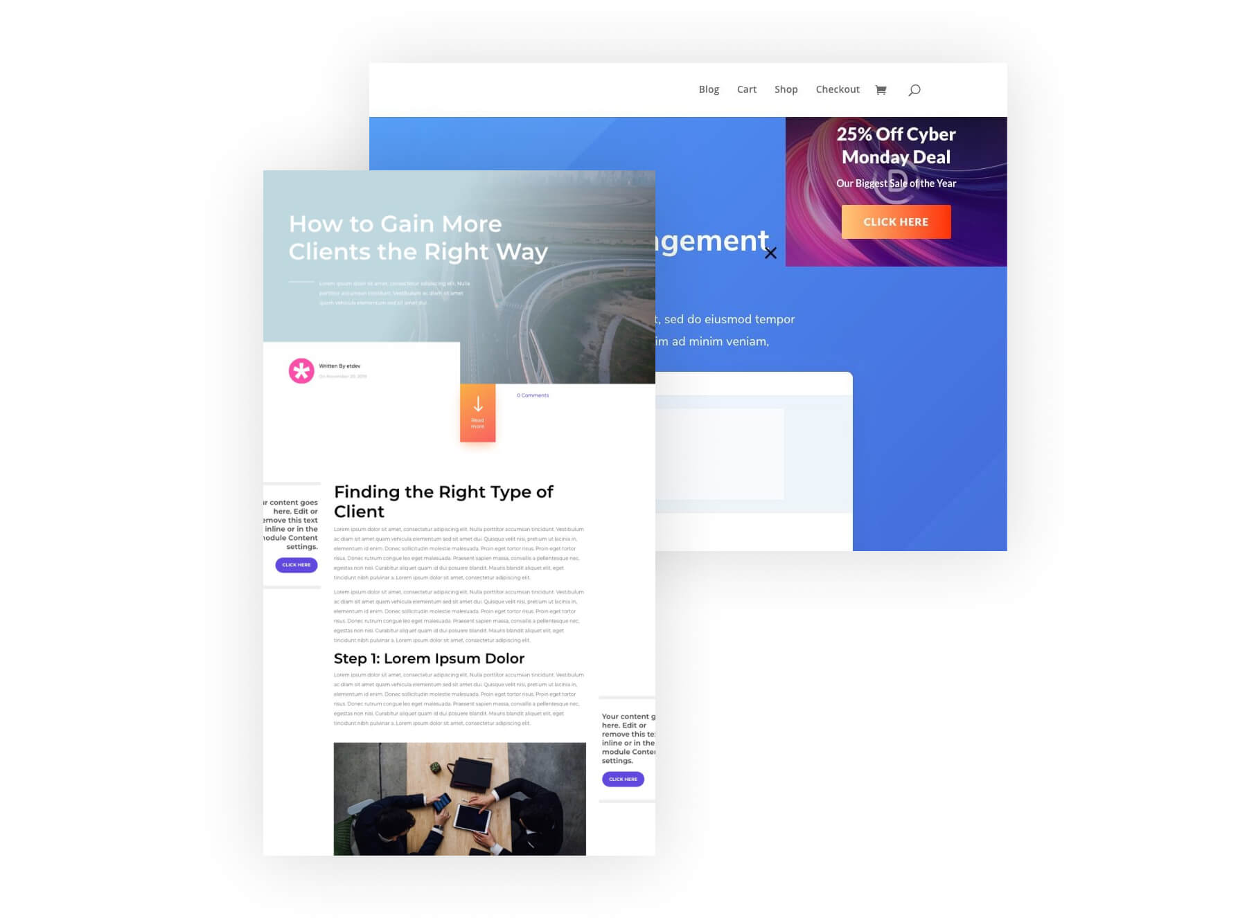
Divi gives you complete control over the design of your blog post template–which is the default design of your individual blog posts. This allows you to add additional sale-related content to your posts in creative ways. For example, you could create a sticky promotional CTA that floats in the sidebar as the user scrolls through the content.
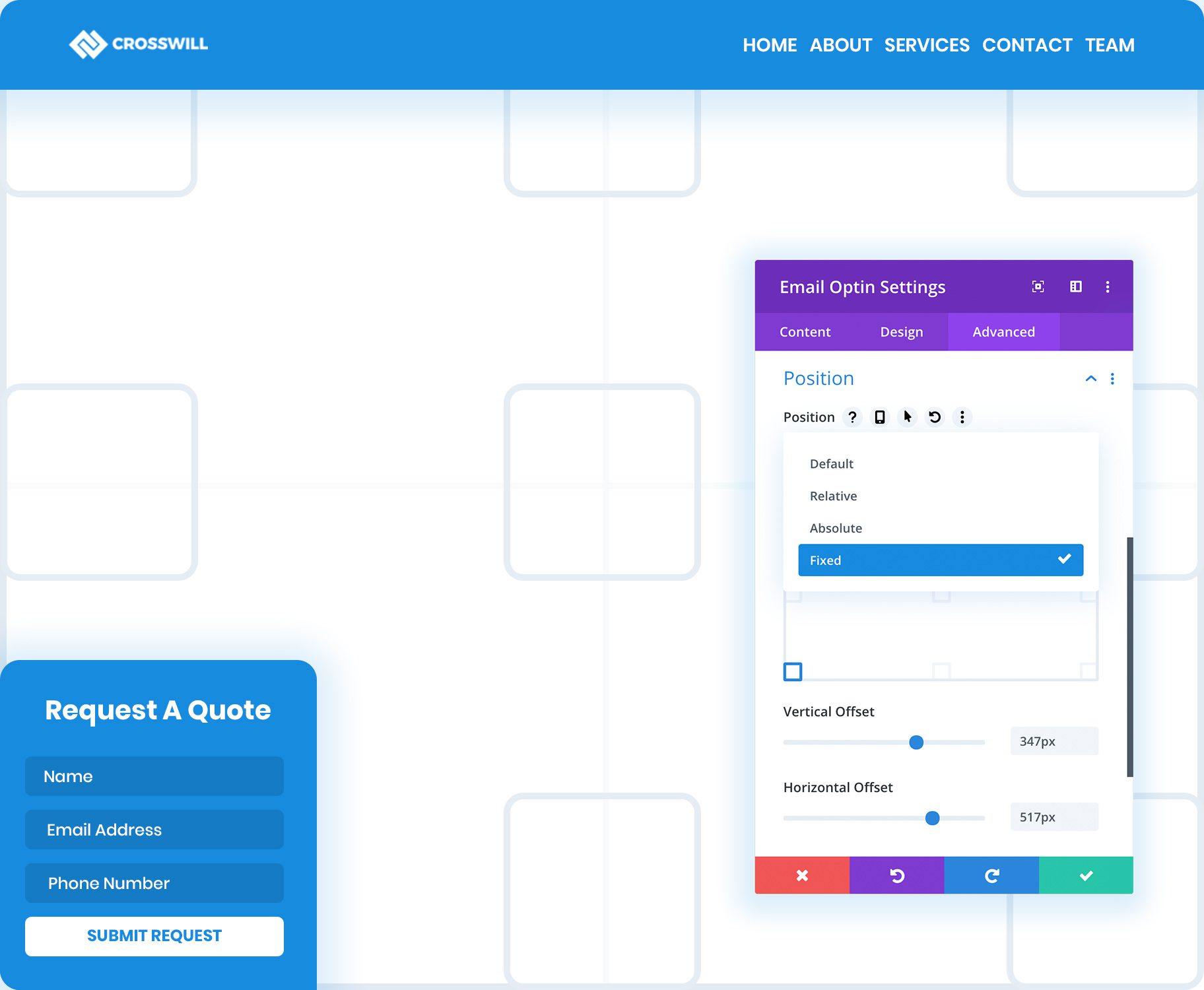
Putting banners on your website is a great way to divert traffic from one part of your website to another. You can use the position options to create a floating effect as well, so you can choose where exactly the banner shows up in your design. Here’s a tutorial on how to create a floating banner, and you can even go as far as setting time restrictions on your banner, as demonstrated in this tutorial.
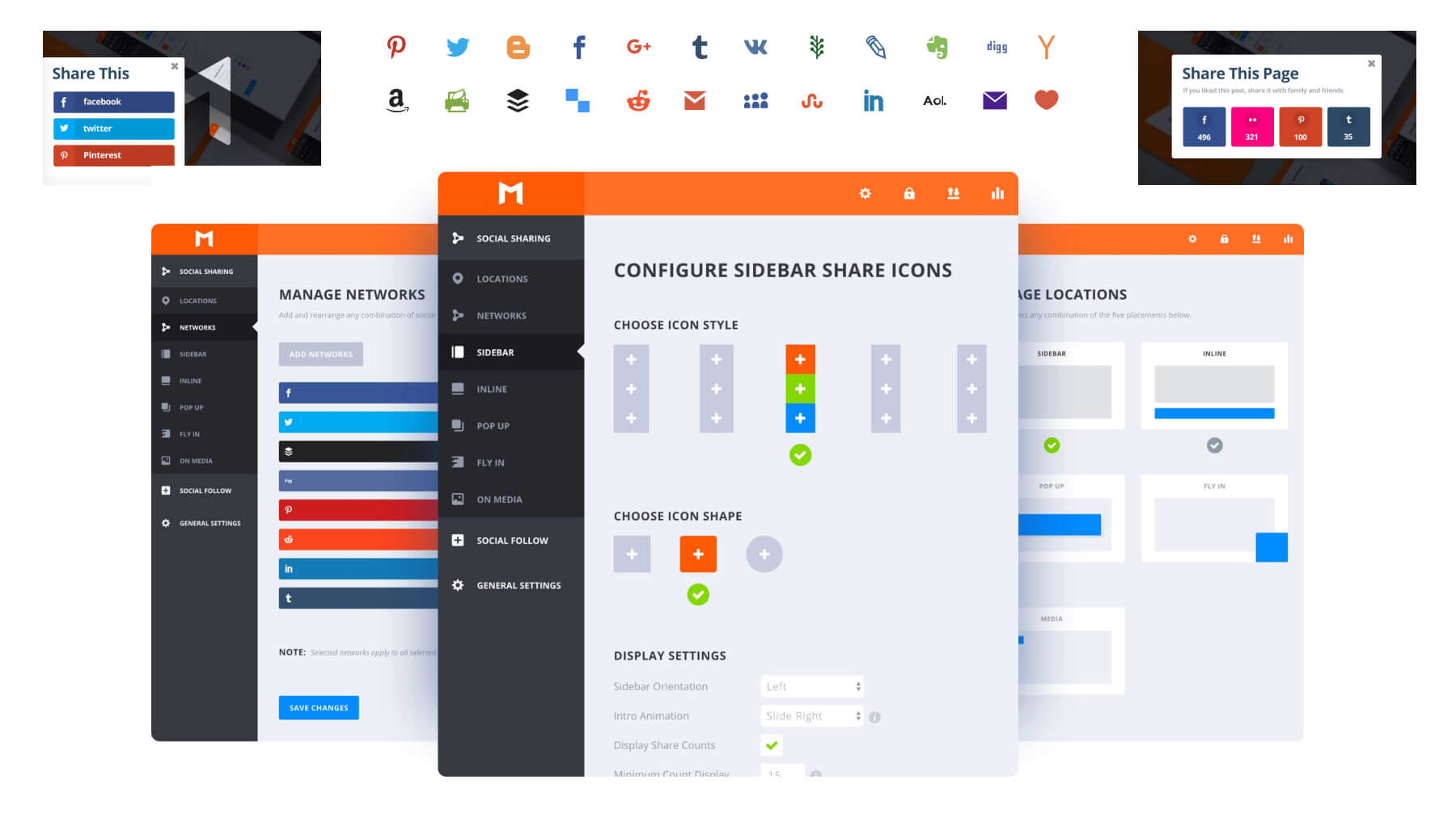
During your online sale, you won’t want to miss out on the opportunity of having your visitors do some marketing for you by sharing your sale with their friends on social media. You’ll want to have a powerful, easy-to-use social sharing plugin like Monarch or Divi Social Sharing Buttons. These plugins will allow you to apply site-wide social sharing buttons (for all the popular social networks) throughout your store and product pages. If you know that you have a strong following on a specific social media network – let’s say Instagram – it may also be a good idea to get a plugin specifically to meet the needs of the audience coming from that platform. You can even customize the content being shared for more targeted marketing to promote your sale. For more, check out our list of top social media plugins for WordPress.
22. Use Conditional Options to Hide/Show Sale Content Based on Visitor Activity (or even Site Language)
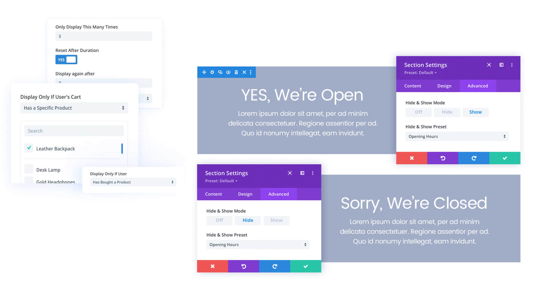
With Divi’s built-in conditional display options, not only can you control what sale content to display, but you can also choose when and under what conditions the content is visible to users. For example, you can show bonus discounts and products only for purchasers or members, show promotion popups only to new visitors, and much more. Plus, the Hide & Show Pro plugin takes conditional display to a whole new level with tons of powerful features. It even integrates with popular WordPress translation plugins, like WPML, to display sales copy in different translations based on the user’s selected language. This allows you to target potential customers on a global scale.
23. Build Mailing Lists with the Email Optin Module
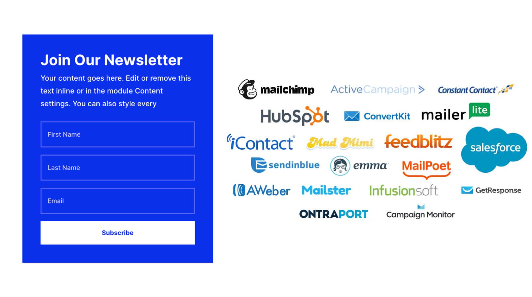
In addition to site-wide email opt-in popups, you can also add email optins on your sales pages or product pages using the email optin module. When creating the email opt-in CTA, it is a good idea to offer something enticing in exchange for their email address (like a coupon code for 20% off, free shipping, or even a free gift). The email opt-in module integrates with 20+ email marketing platforms so you can start growing your list and adding them to your sales funnel.
24. Optimize Everything for Mobile
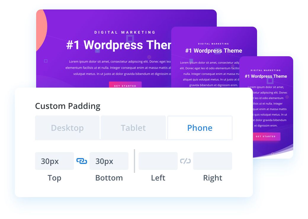
Let’s face it. People like to shop and buy stuff on their phones. So, if you want your online sale to succeed, you will have to think mobile first when it comes to designing your sales pages and product pages. The obvious reason is for a better user experience that will lead to more sales. You don’t want broken and unreadable content or popups getting in the way of a potential conversion.
Use Divi’s responsive options to make sure your store is easy to navigate, read, and purchase products. The ultimate Divi Responsive Helper is a perfect solution for optimizing your online store for mobile including the ability to customize the column layouts of WooCommerce Product modules. And don’t forget about the importance of mobile SEO. Having a responsive site with great content optimized for search engines is even more important on mobile these days.
25. Set Your Marketing Campaign in Motion Before the Sale Starts

To get the most out of all your other efforts, make sure to begin promoting your sale days if not weeks before it starts. By the time your sale begins your community and marketing audience should be enthusiastic and ready to buy. You’ll also want to make sure your community, partners, and affiliates have time to learn about your sale and spread the word.
In Conclusion
A lot goes into running a sale, but a successful sale is worth the effort. Planning in advance is key to making all the other components work. Plus, the more sales you plan, the better you’ll get at it. We hope this post will help you set up your next online sale, and do not hesitate to leave us any questions you might have in the comments section below!
And if you’ve made it this far but still don’t have Divi or the Divi tools you need to pull your sale off, what are you waiting for? Head over to our Divi Cyber Monday Sale right now and fill out your web design, development, and marketing tools to create the best online sale you’ve ever done!



Leave A Reply