Divi Pet Care is a Divi child theme that was designed for any type of pet website in mind including veterinarian offices, clinics, spas, grooming, etc. It has a clean modern design with a dash of color, a strong CTA, and over 25 pages to create your website. In this article, we’ll take a close look at Divi Pet Care to help you decide if it’s the right Divi child theme for your needs.
Installing the Pet Care Divi Child Theme

Installation is simple. First, with Divi activated, upload the Divi Pet Care child theme and activate it as you would any WordPress theme.
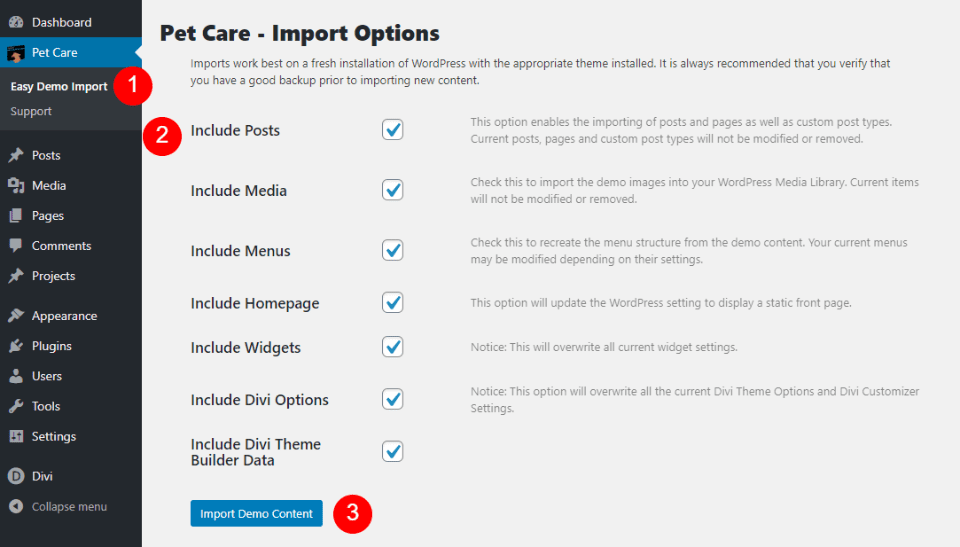
The one-click demo import worked exactly as shown in the documentation. The pages and menus are assigned automatically, so you’ll only need to add your images and content. Let’s take a closer look at the pages.
Pet Care Child Theme Pages
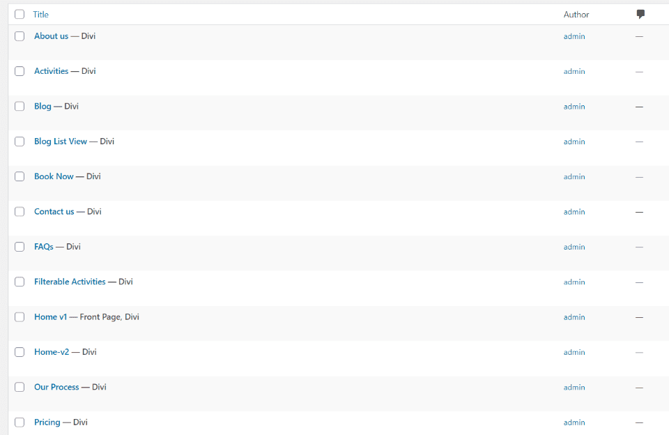
The Pet Care Divi child theme comes with over 25 pages including 2 home pages, About Us, several Activities pages, several Blog pages, Book Now, Contact Us, FAQs, Our Process, Pricing, several Privacy Policy pages, several Services pages, a team page, and a timeline page. More pages, such as the 404 page, are created with the Theme Builder. Pages include graphics, styled menus, buttons, etc.
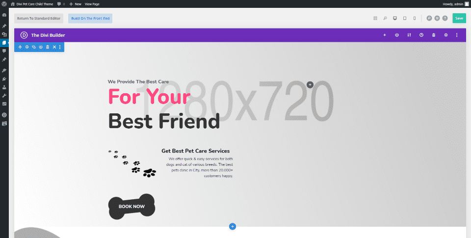
The pages use common design elements between them including a bright red highlight, splotchy background patterns, paw print background elements, paw print icons, a bone button design, and sticky elements. Let’s look at a few of the pages.
Home V1
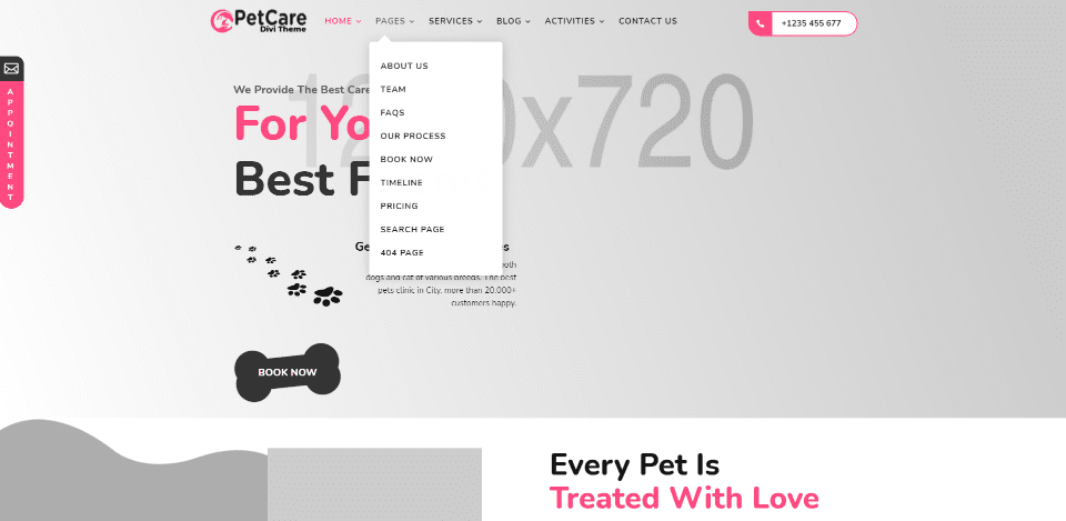
Home V1 is the default home page. The appointment and phone CTA’s are clickable. The menu and appointment CTA are sticky. The hero section shows a full-width image. The header is created in the Theme Builder. Many of the pages include elements from this page as well as unique elements such as custom headers.
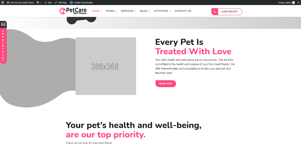
The next section includes a booking CTA with an image and a wavy background pattern.
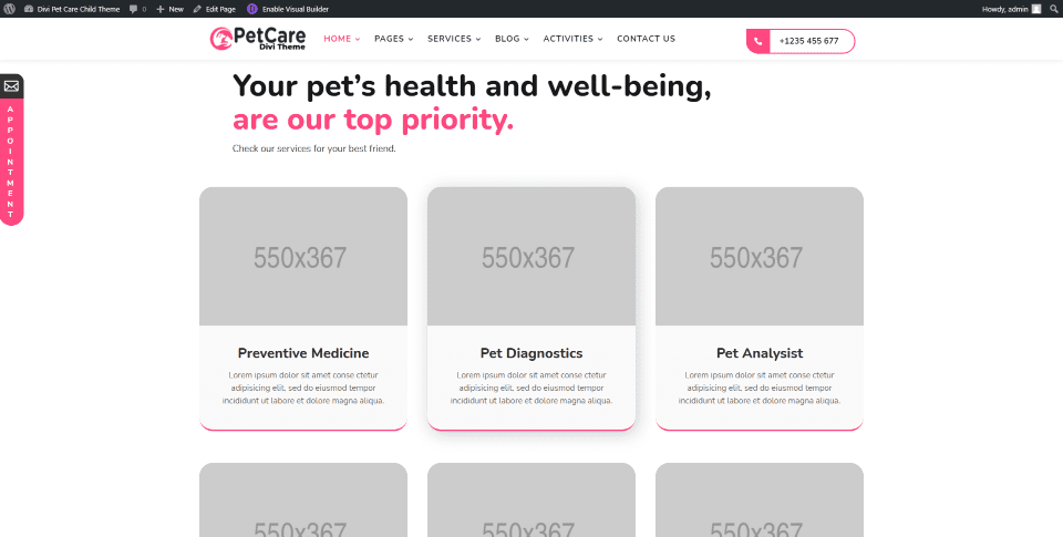
Services are shown with styled blurbs. They include hover effects that show a box shadow, which you can see in the center blurb.
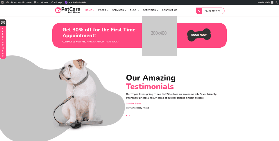
The next section shows testimonials in a slider. A CTA appears above this with an image, message, and link.
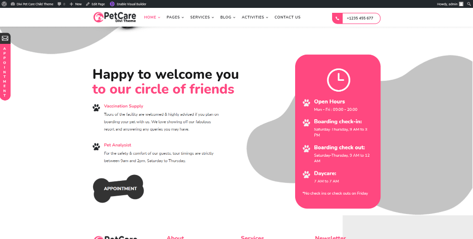
Contact information is placed within a styled box. This section also includes a booking CTA and a splotchy background pattern.

The global footer appears at the bottom of the page. This is created in the Theme Builder.
Home V2
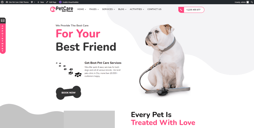
The second home page displays a different background pattern for the hero section. This one also uses the global header and has a few elements that are used in the other pages.
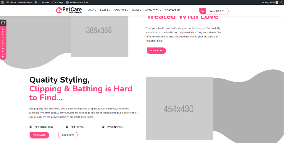
Several sections include CTAs in an alternating layout.
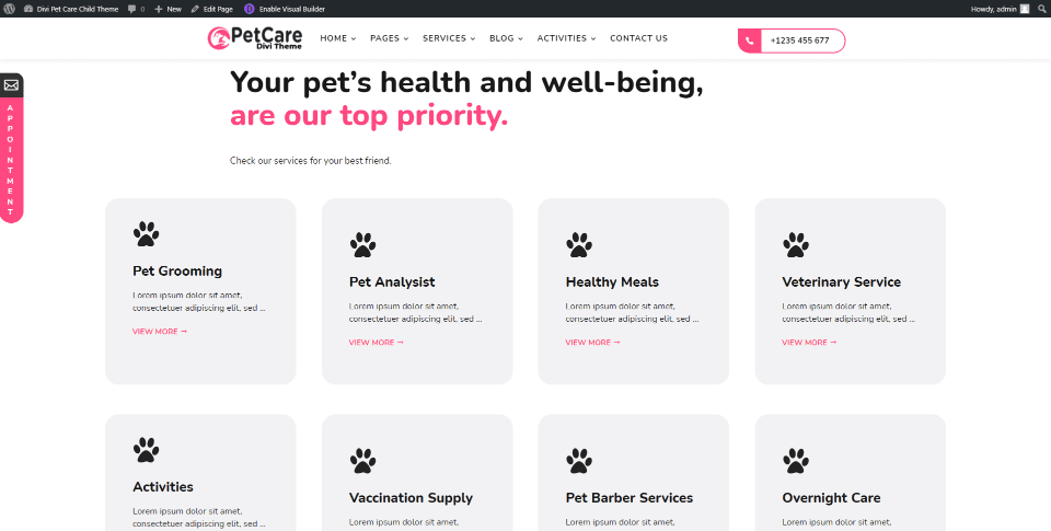
Services are shown within blurbs with paw prints in place of large images.
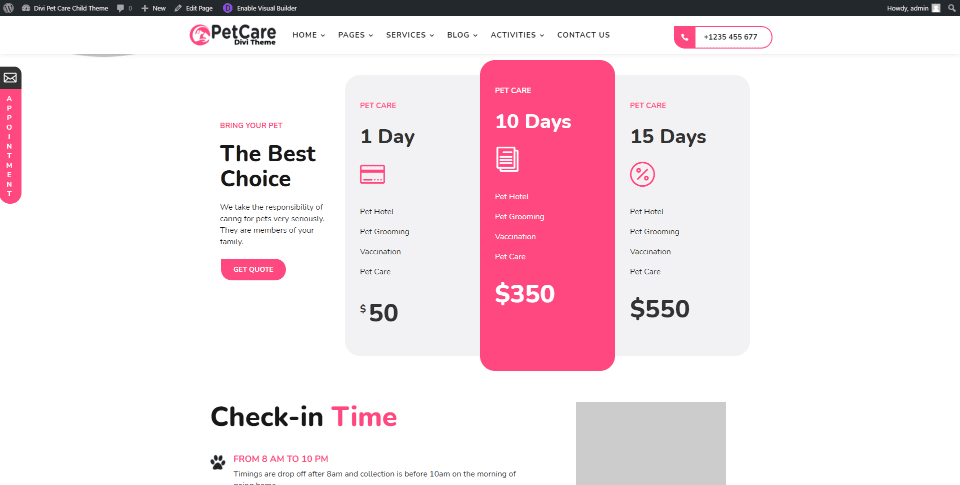
This layout includes styled pricing tables with a CTA to get a quote.
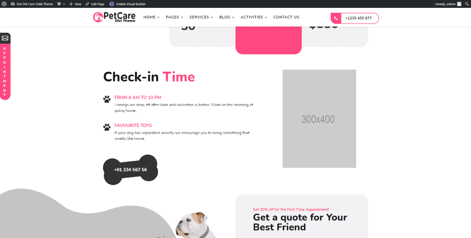
Opening hours are shown with bullets that display paw print icons. The phone number is clickable and has a hover animation.
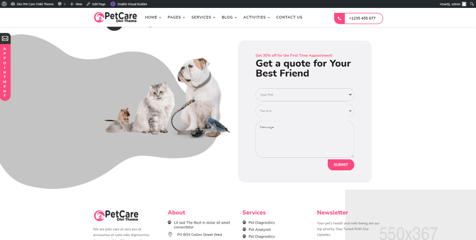
A contact form is placed above the footer to get a quote.
About Us
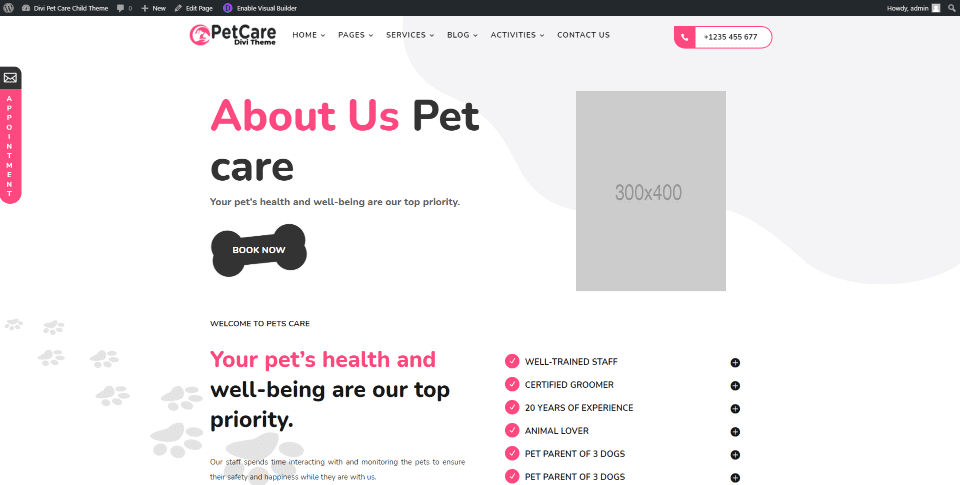
The About Us page hero section includes a booking CTA and a small image. Information is provided with bullets and blurbs. The page also includes the CTA and operation hours from the first home page, a veterinarian section introducing the doctors, a section of images, and the global footer.
Team
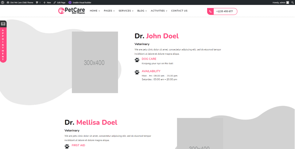
The Team page has a similar design as the About Us page and adds information about the doctors in an alternating layout. Blurbs highlight their specialties and their availability.
FAQs
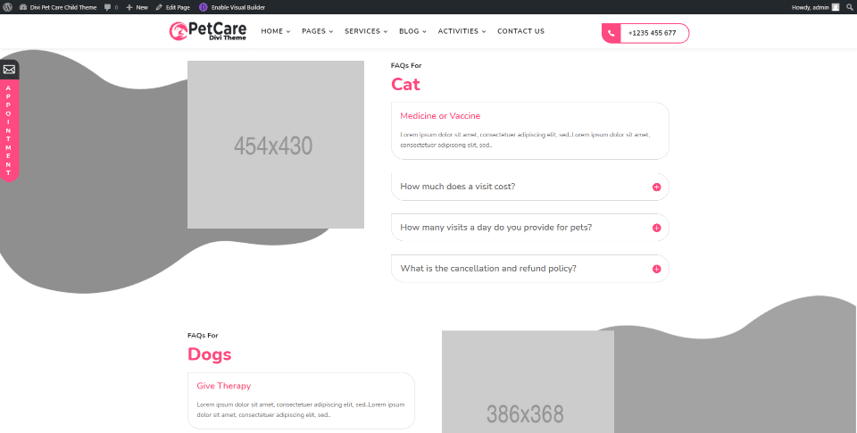
The FAQs page contains many elements from the home page and adds sections with questions placed in an accordion. They’re arranged by animal type in an alternating layout.
Our Process
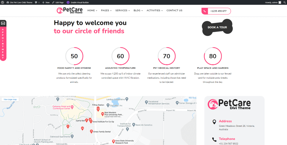
The Our Process page adds two sections with circle counters and an embedded map along with many of the sections from the home page. The map section also includes contact information.
Book Now
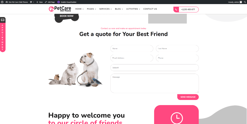
The Book Now page includes a styled contact form along with the standard hero section and contact information with blurbs.
Timeline
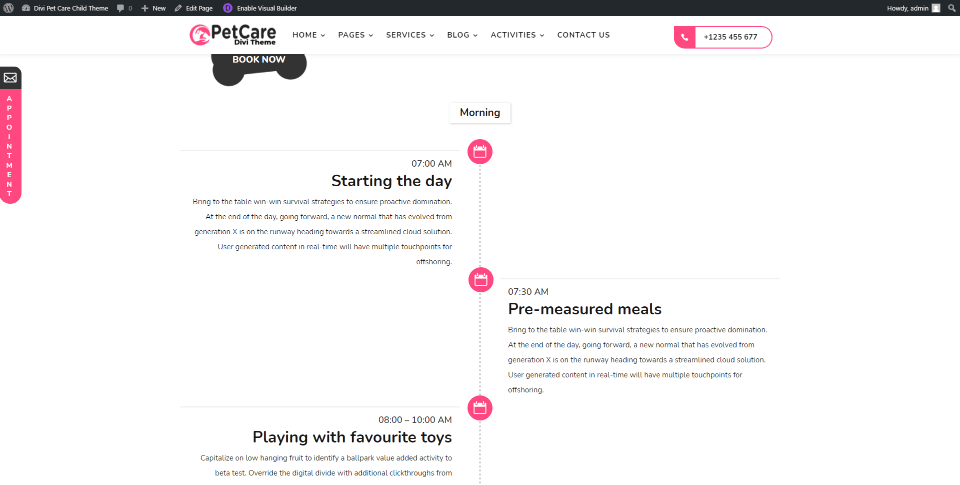
The Timeline page displays a timeline created with blurb modules to show your daily activities with the pets. This page also includes the standard header, contact form, and footer.
Pricing
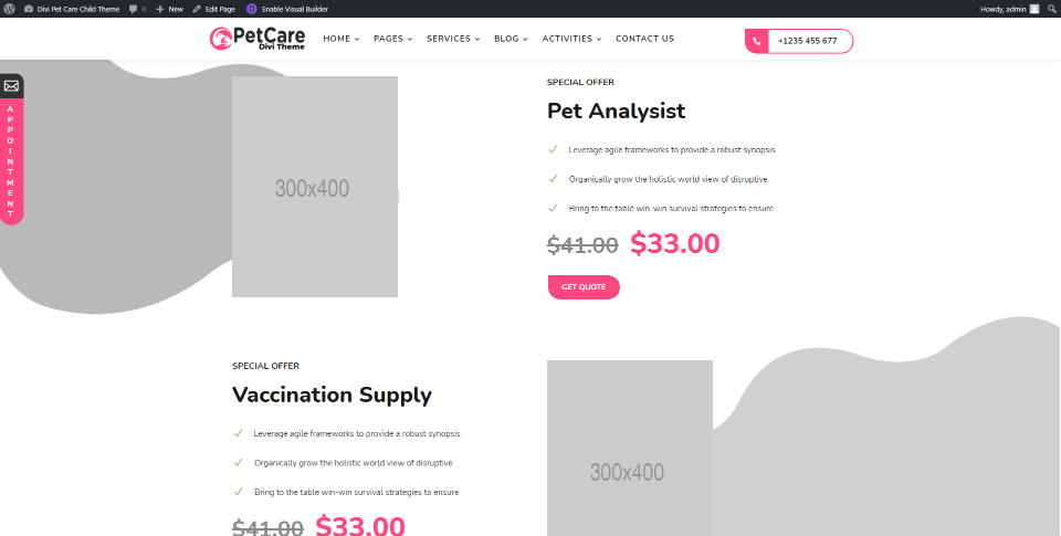
The Pricing page displays products and services with images on one side and the description on the other in an alternating layout. The page also includes the styled pricing tables from the second home page.
Services
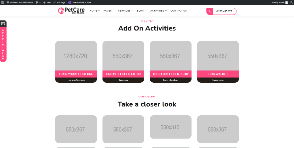
There are two different pages for Services. They display the services within different types of blurbs. This is the second Services page, which uses a blurb with an image, title, and short description. It also includes the header, multiple types of blurbs for information, links to services, etc.
Single Service
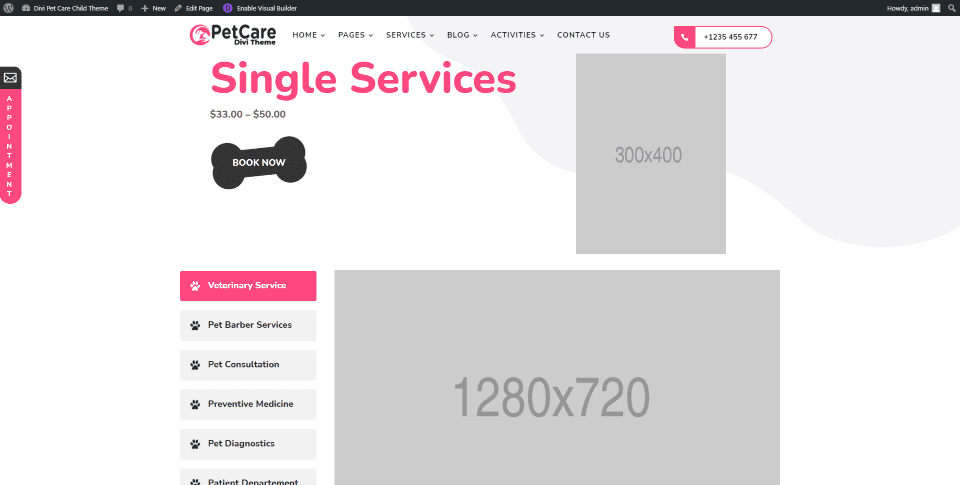
There are also two different pages for a single service. This is the second Service page, which shows the service as a product, a large image, links to other services as a sidebar, opening hours, circle counters, blurbs for information, a contact form, and the footer.
Blog
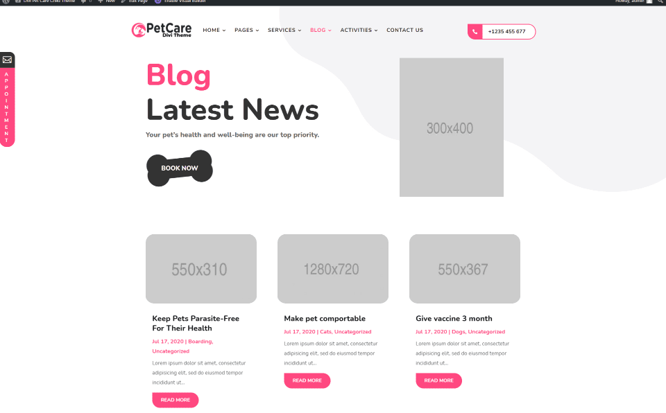
Blog pages include a standard blog, a list view, a category page, and a post page. Some include a sidebar with standard blog widgets. This is the standard blog without a sidebar.
Activities
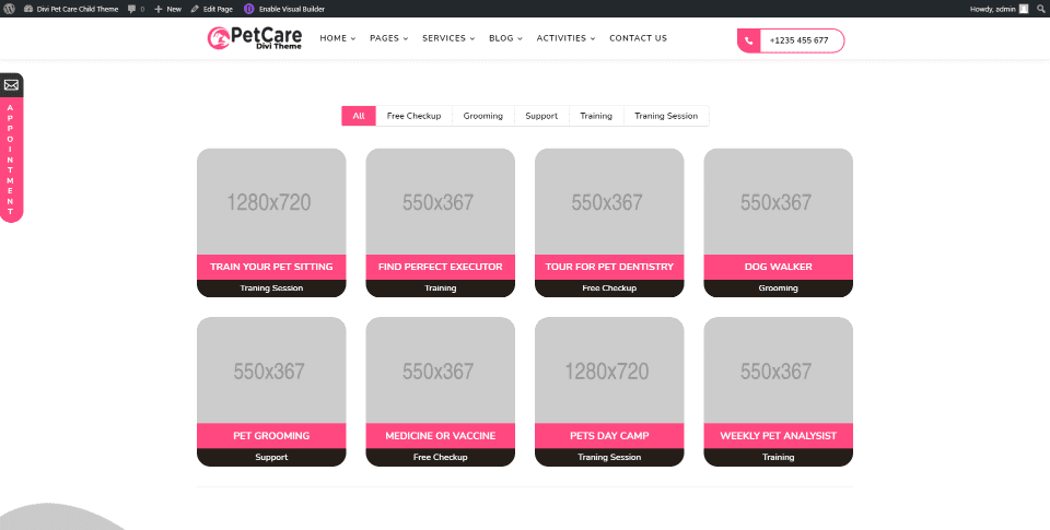
Two Activities are included. The first, seen in this example, is a filterable list that shows the activities as projects. The second is a category page that provides information about a specific activity.
Theme Builder
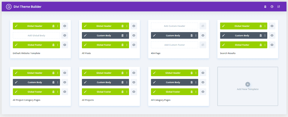
The Theme Builder has 7 templates including global headers, posts, 404 page, search results, project category pages, all projects, category pages, and global footers.
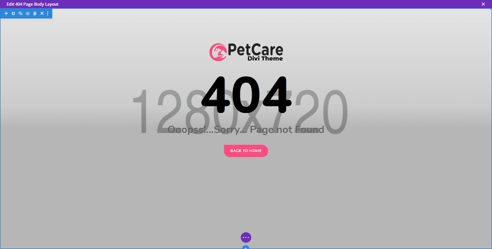
Here’s the 404 page. It’s simple but effective. It has a place to add a full-screen background image and includes the logo, message, and home button in the foreground. This page doesn’t have a header or footer, but the rest do.
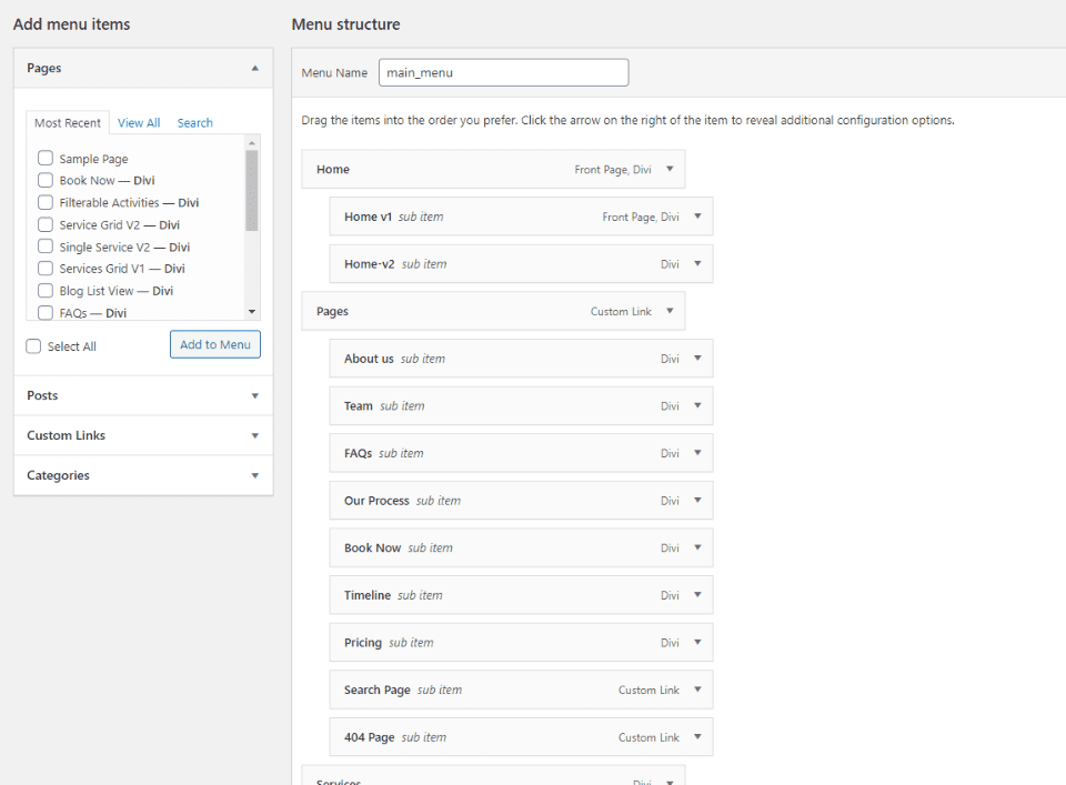
The primary menu is already created and assigned. The only changes you’ll need to make is to remove any of the pages you don’t want to use or to have displayed in the menu (such as the 404 page). I like this approach. I find it to be easier to remove what I don’t want in the menu than to add what I want to it if it’s a large menu.
Booking Form
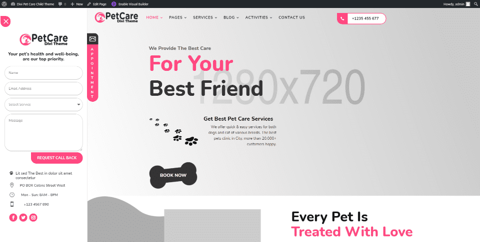
A booking appointment slide-in form appears when you click on the appointment icon that sticks to the left of the page. This slides the website to the right. The form includes contact fields, contact information, and social follow buttons. A dropdown box allows visitors to choose the type of service they’re interested in. A close button in the left corner closes the form and moves the website back into place.
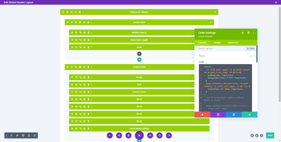
The booking form is built into the global header in the Theme Builder using several modules for the images, text, form, and buttons, and CSS and jQuery in a code module. The styling uses a combination of the Divi settings and CSS.
Pet Care Graphics
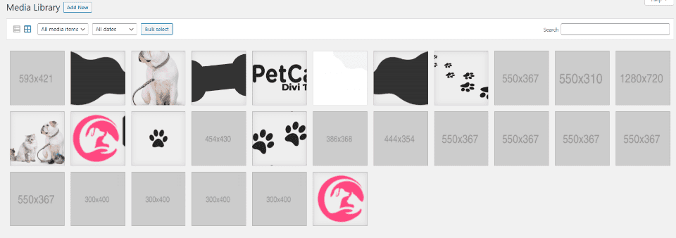
The graphics are added to the media library where you can easily access them. They’re used within the blurbs and other modules in the premade pages. Dummy images show the size, making it easy to know what size images to replace them with.
Preloader

The child theme includes a preloader of a dog running. I enjoy watching this. It fits the genre of the child theme better than most preloaders.
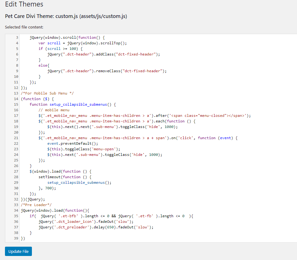
Code for the preloader is added to the child theme custom.js file. You’ll need some code editing skills to customize it.
Where to Purchase Divi Pet Care
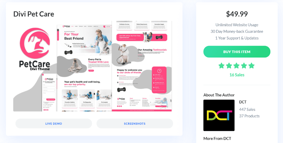
The Divi Pet Care child theme is available in the Divi Marketplace. It costs $49.99 and includes unlimited website usage and 1 year of support and updates.
Ending Thoughts
That’s our look at the Divi Pet Care child theme. It has an elegant and clean design. Installation was easy and there are a lot of pages to build just about any type of website for a pet care business.
It has a clean layout with a strong focus on setting appointments. The colors highlight the elements well and the splotchy backgrounds give it enough visual flair to stand out without taking over the design. Clickable elements have small hover animations that change colors, rotate elements, or add box shadows. If you’re interested in a Divi child theme for a website that focuses on pets, Divi Pet Care is worth a look.
We want to hear from you. Have you tried the Divi Pet Care child theme? Let us know what you think about it in the comments.
Featured Image via Lucky clover / shutterstock.com


Love this website layout, it is just adorable. Although I am not in the pet niche, I like to see how different layouts are set up so I can get ideas for my sites. Thank you so much for sharing so many wonderful resources and inspiration!