Divi Photography Portfolio is a third-party Divi child theme designed with photographers and videographers. It comes with lots of pages in both a light and dark design and throws in extra features with premium plugins. In this post, we’ll look at the Divi Photography Portfolio child theme to help you decide if it’s the right child theme for your needs.
- 1 Installing Divi Photography Portfolio
-
2
Divi Photography Portfolio Features
- 2.1 Divi Photography Portfolio — Home Pages
- 2.2 Divi Photography Portfolio — About Me Pages
- 2.3 Divi Photography Portfolio — Contact Pages
- 2.4 Divi Photography Portfolio — Portfolio Pages
- 2.5 Divi Photography Portfolio — Video Gallery Pages
- 2.6 Divi Photography Portfolio — Blog Pages
- 2.7 Divi Photography Portfolio — Blog Posts
- 2.8 Divi Photography Portfolio — Contact Pages
- 3 Divi Photography Portfolio — Header
- 4 Divi Photography Portfolio — Footer
- 5 Where to Purchase Divi Photography Portfolio
- 6 Ending Thoughts
Installing Divi Photography Portfolio
The Divi Photography Portfolio child theme is easy to install. With Divi activated, go to Appearance > Themes > Add New.

Click Upload Theme, Choose File, and navigate to your zipped file. Click Install Now.

Activate the child theme.

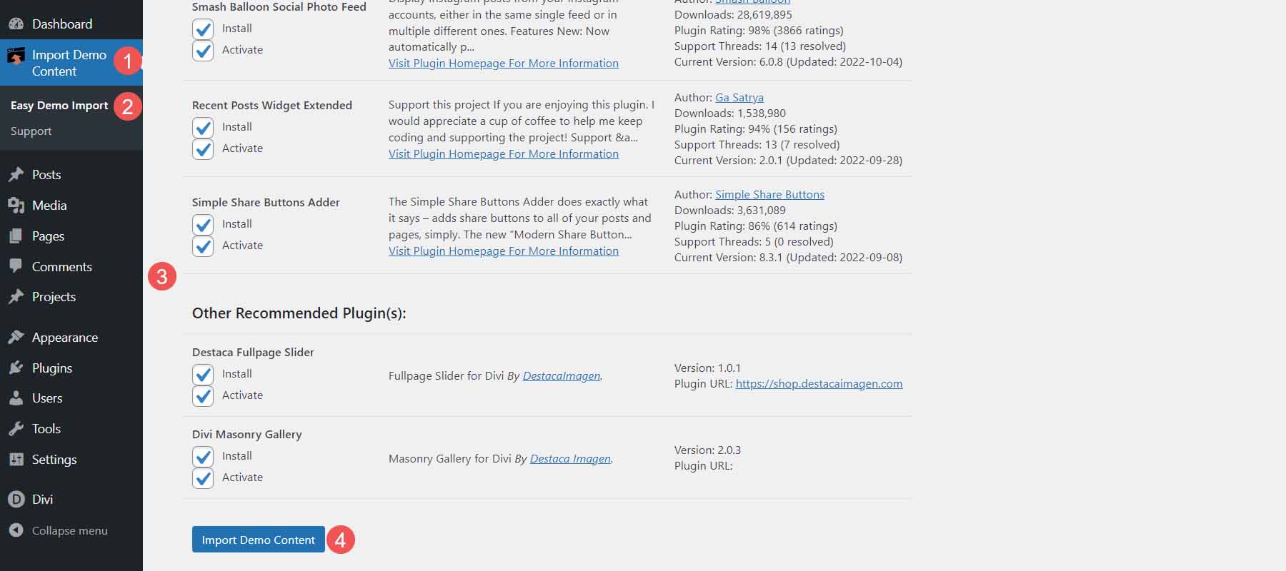
Next, you’ll need to import the demo content. Select Import Demo Content > Easy Demo Import. Chose all the files you want to import. I recommend leaving this in the default settings. Click Import Demo Content.
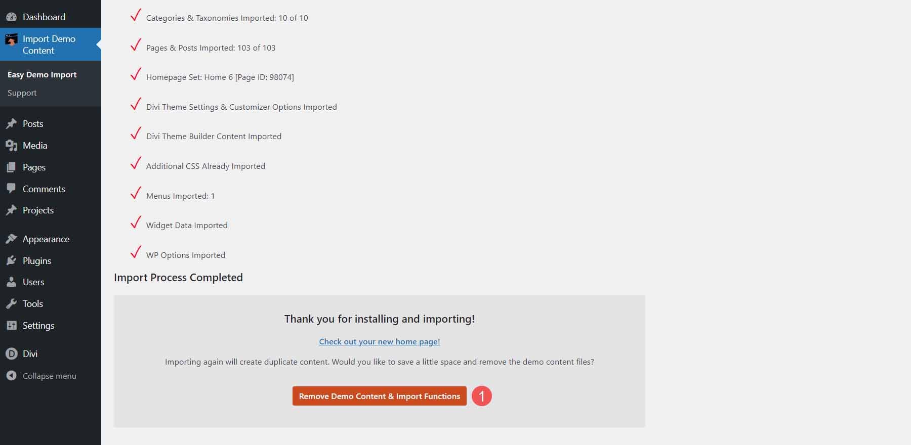
Once the import completes, click Remove Demo Content & Import Functions to remove the files you no longer need. Your website will now look like the demo.
Divi Photography Portfolio Features
Divi Photography Portfolio has both a light and a dark version with 9 home pages, 3 portfolio layouts, 8 project layouts, 2 video galleries, 2 About Me pages, 2 Contact pages, and 2 blog designs. Overall, it adds 36 layouts to the Divi Library, 7 templates to the Divi Theme Builder, and 26 pages. I’m using the light version in my examples.
It also includes the plugins Divi Masonry Gallery, Divi Video Gallery, Destaca Fullpage Slider, Recent Posts Widget Extended, Simple Share Buttons Adder, and Smash Balloon Instagram Feed. Many of the elements include animations or scroll effects.
Divi Photography Portfolio — Home Pages
Let’s take a look at the home pages and see how they’re different.
Home 6 — the Default Home Page
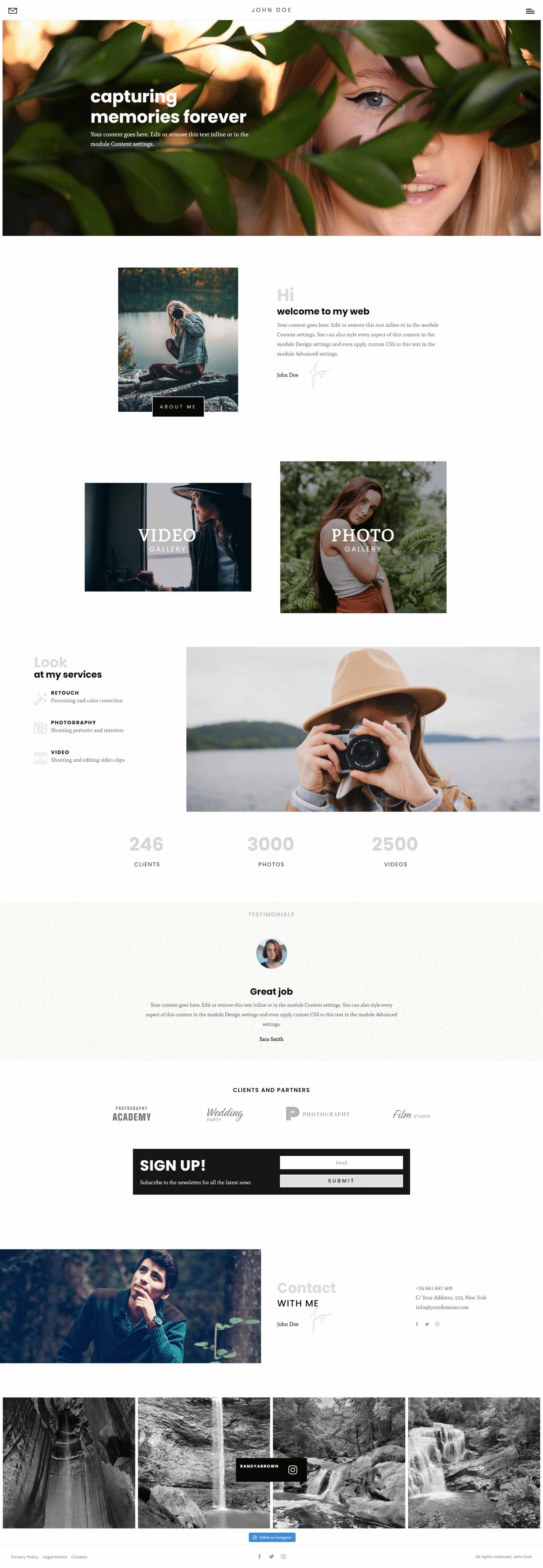
Here’s the main home page in light. This is Home Page 6. It includes a fullscreen slider, a welcome message with the number of years of experience, images that link to types of photography, blurbs that link to services, a mosaic portfolio, number counters, a testimonial slider, client logos, email form, and contact information.

Home 1
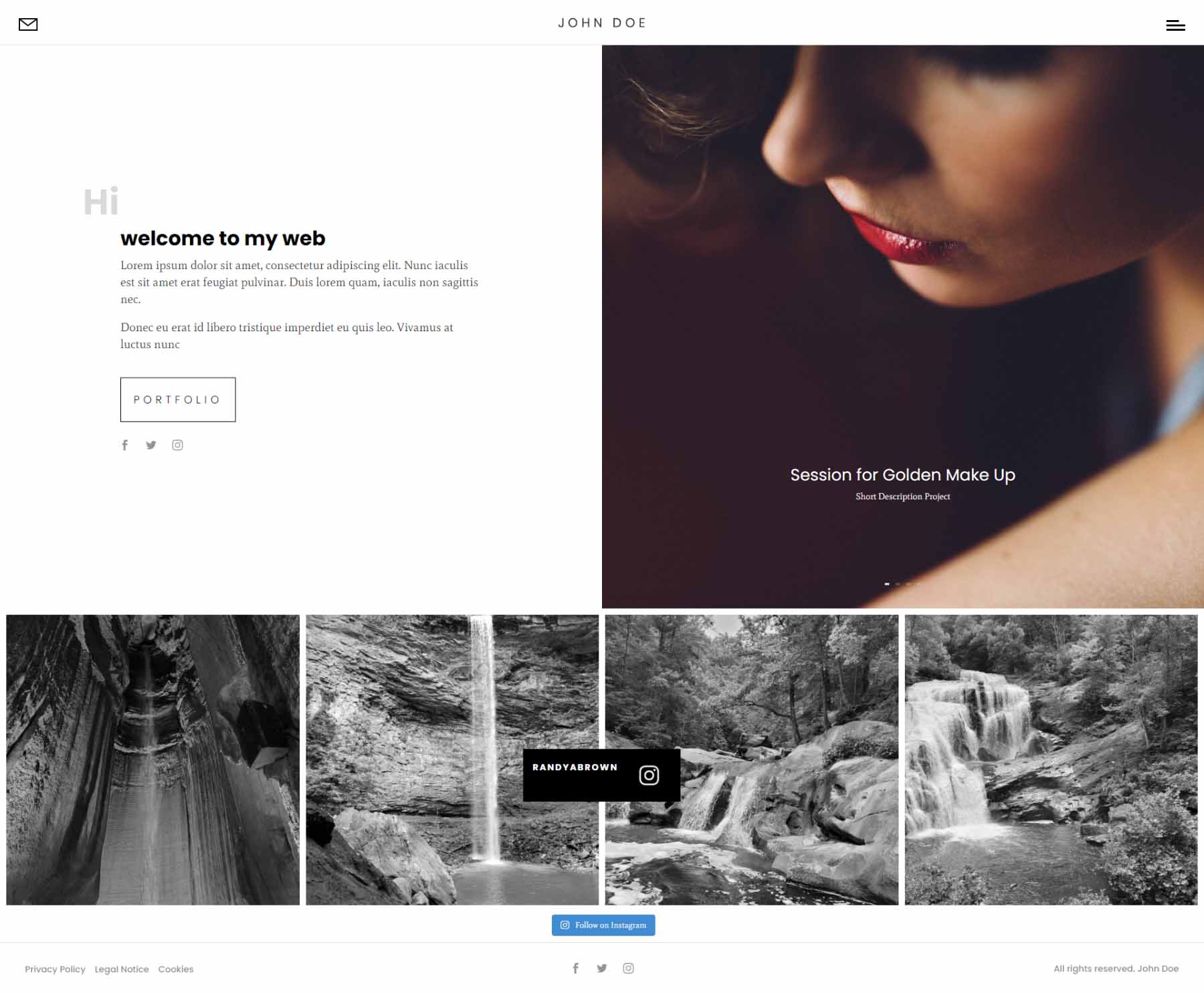
Homepage 1 is short. It has a top section with a welcome message on one side that includes a link to the portfolio and social follow buttons. The other side contains an image slider.
Home 2
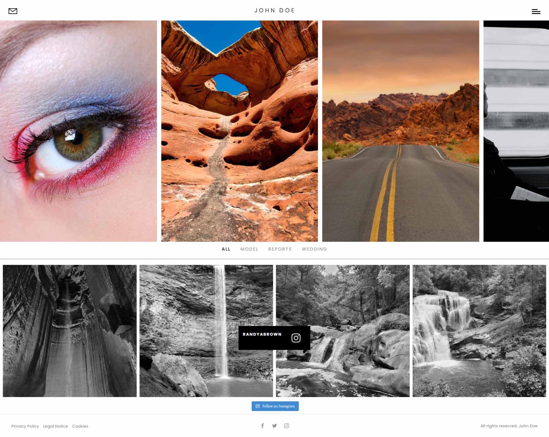
The second home page is especially interesting. It includes a slider that moves from side to side with your mouse’s scroll wheel. Hovering over an image shows the title and category. It also includes the Instagram feed. It displays the categories at the bottom of the screen until you scroll to that point.
Home 3
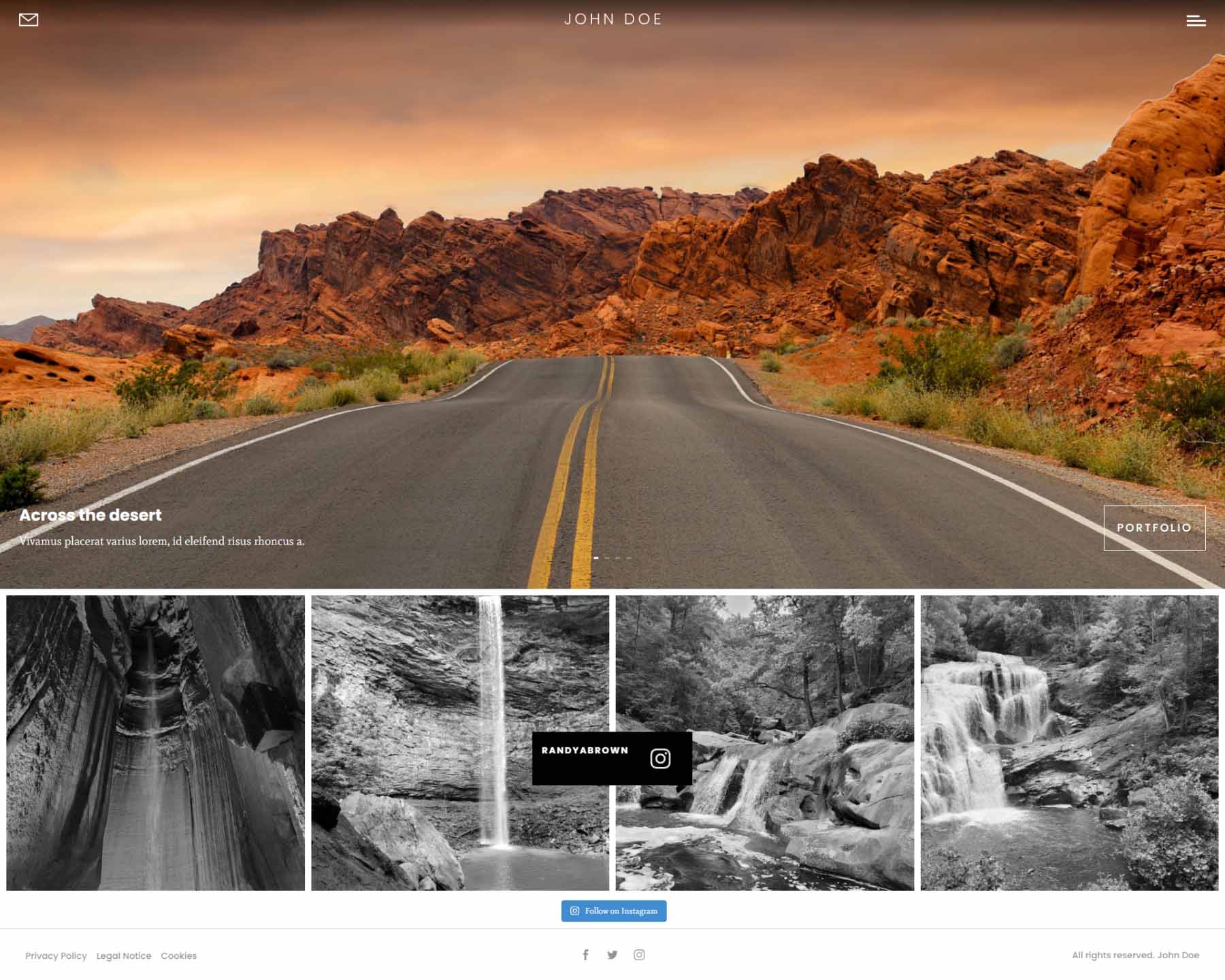
The third home page displays a full-screen slider with the title in the lower left corner of the image and a button that links to the portfolio page in the bottom right corner.
Home 4
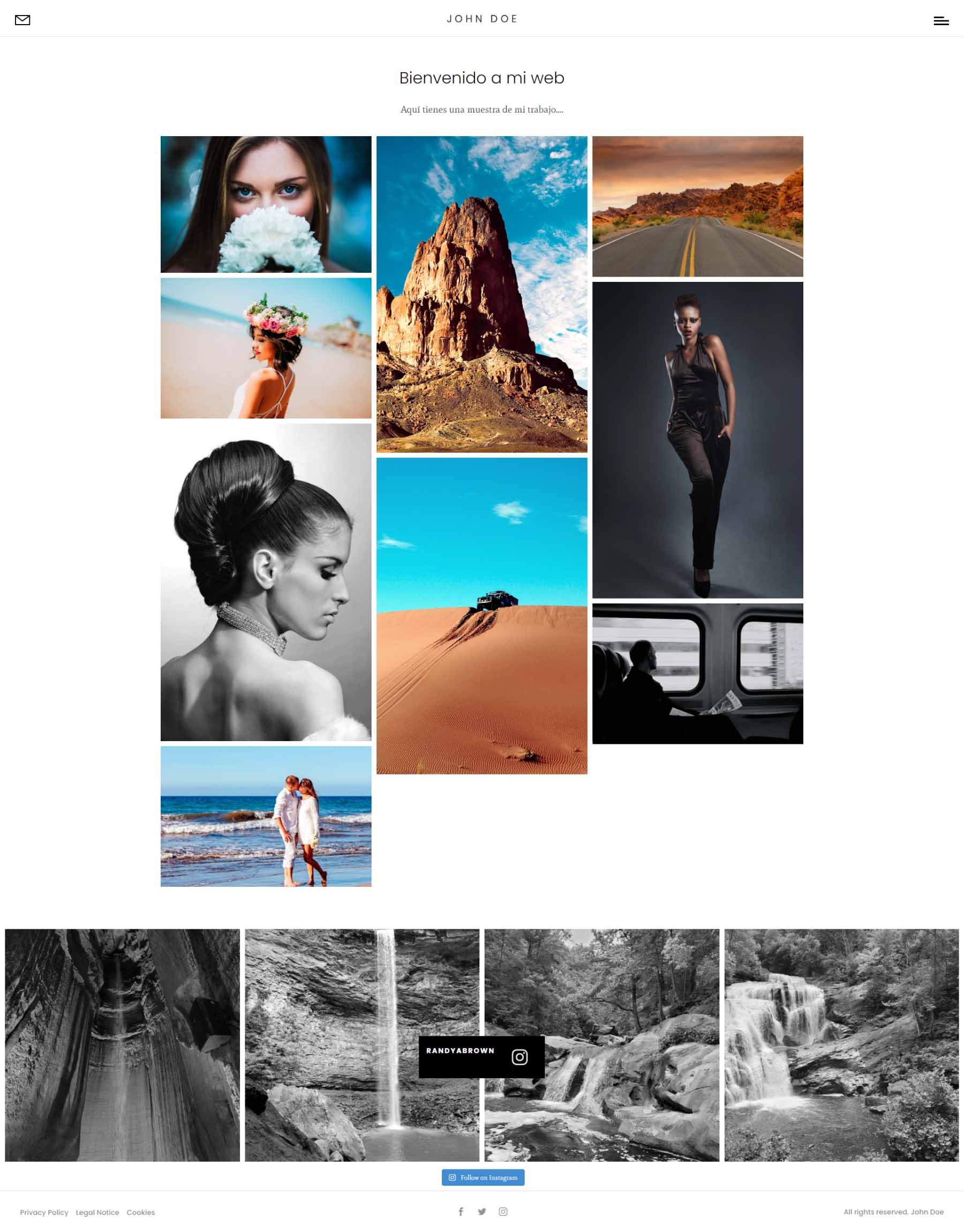
The fourth home page displays images in a mosaic. The title appears on hover.
Home 5
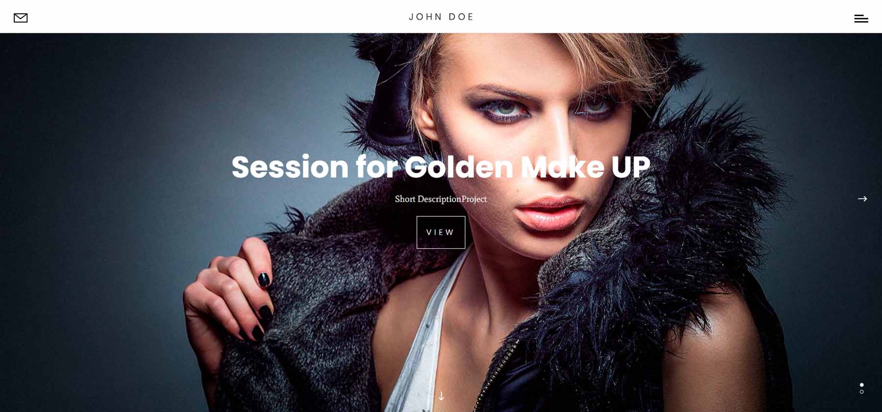
The fifth home page is a unique full-screen slider. The displays a slider with navigation to slide down or to the side. When you scroll, it changes to the next slide, which is sticky. You can click the arrows to the sides, and it slides to the side where you’ll see the next two slides. Dots indicate which slide you’re viewing. This is one of the most interesting home pages I’ve seen for photography websites.
Home 7
The seventh home page is another large home page. It includes a large slider in the hero section, a unique section of images that scroll at different rates that link to services, a blog, and a mosaic portfolio.

Home 8
The eigth home page 8 includes several video backgrounds. The hero section displays a full-width background video. Several images link to other pages. Another video draws attention to your services.
Home 9
Home 9 also includes videos, and it uses a stacked About section. The Services section displays a few images of different sizes along with the blurbs that link to the services.

Divi Photography Portfolio — About Me Pages
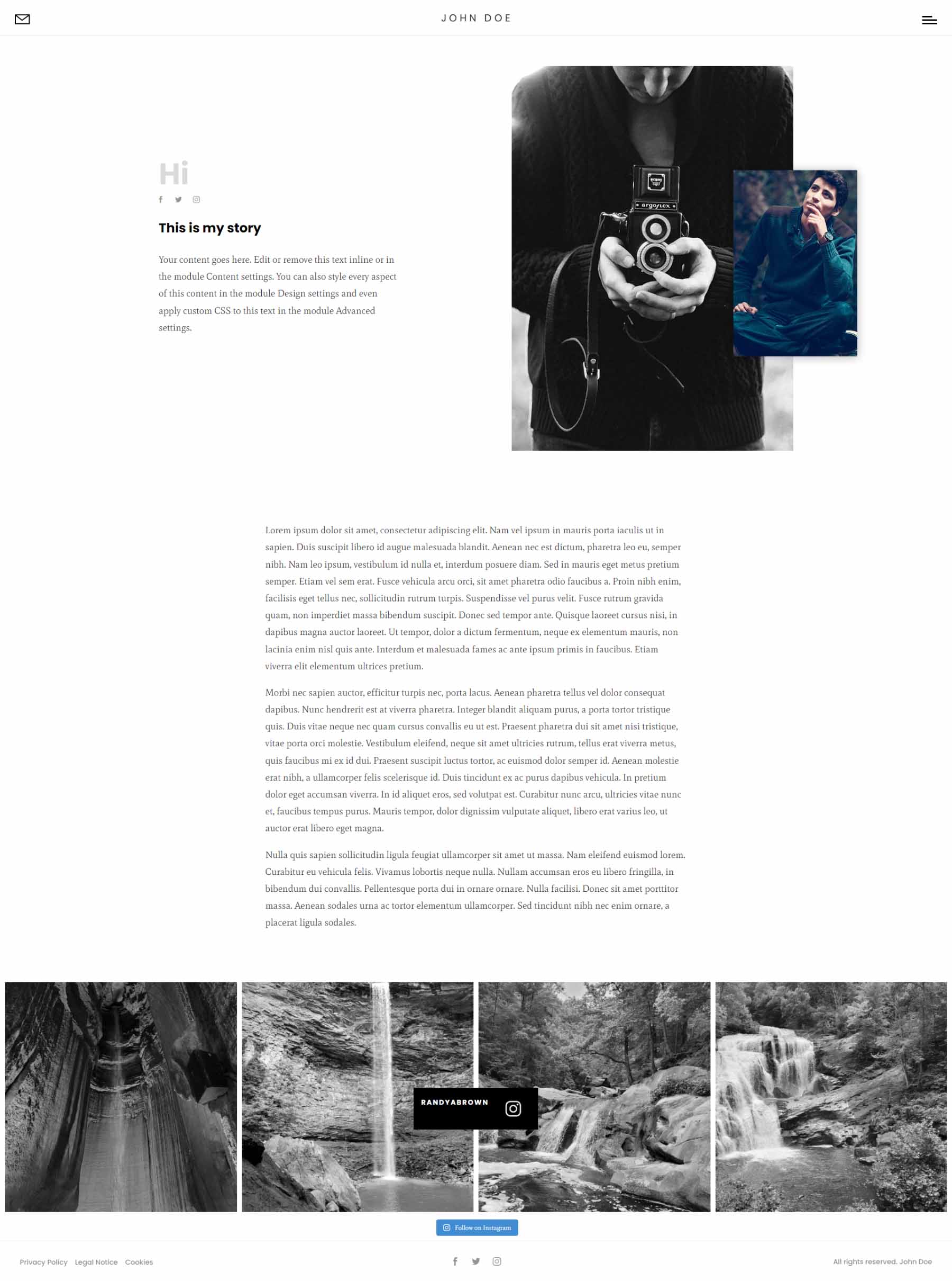
Divi Photography Portfolio includes two About Me pages. The first About Me page shows text on one side and overlapping images on the other side for the hero section, followed by text.
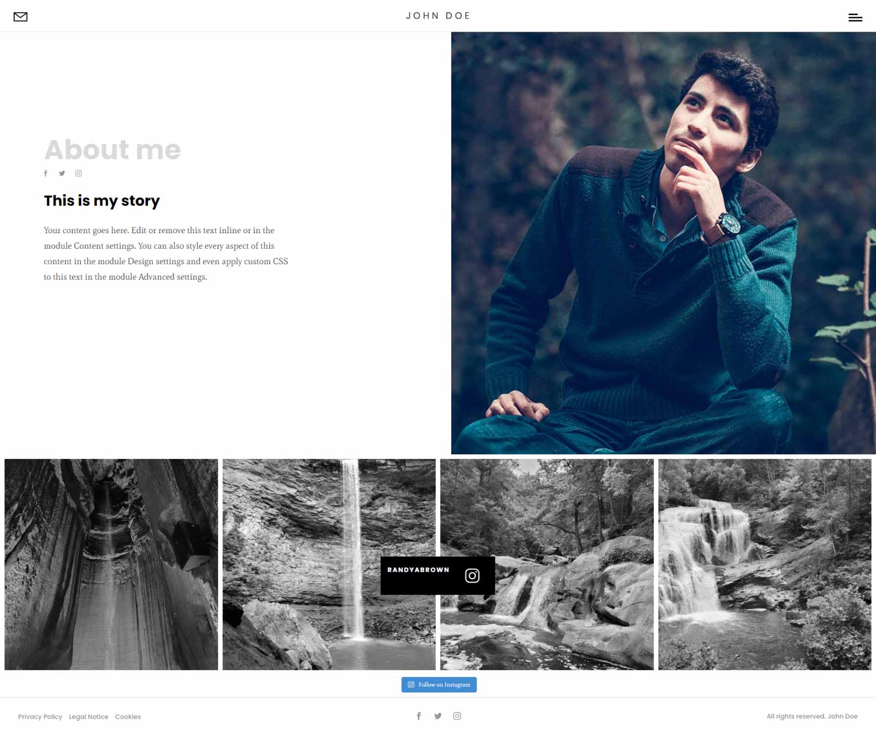
The second About Me page places text on the left and a larger image on the right for the hero section. It removes the text section.
Divi Photography Portfolio — Contact Pages
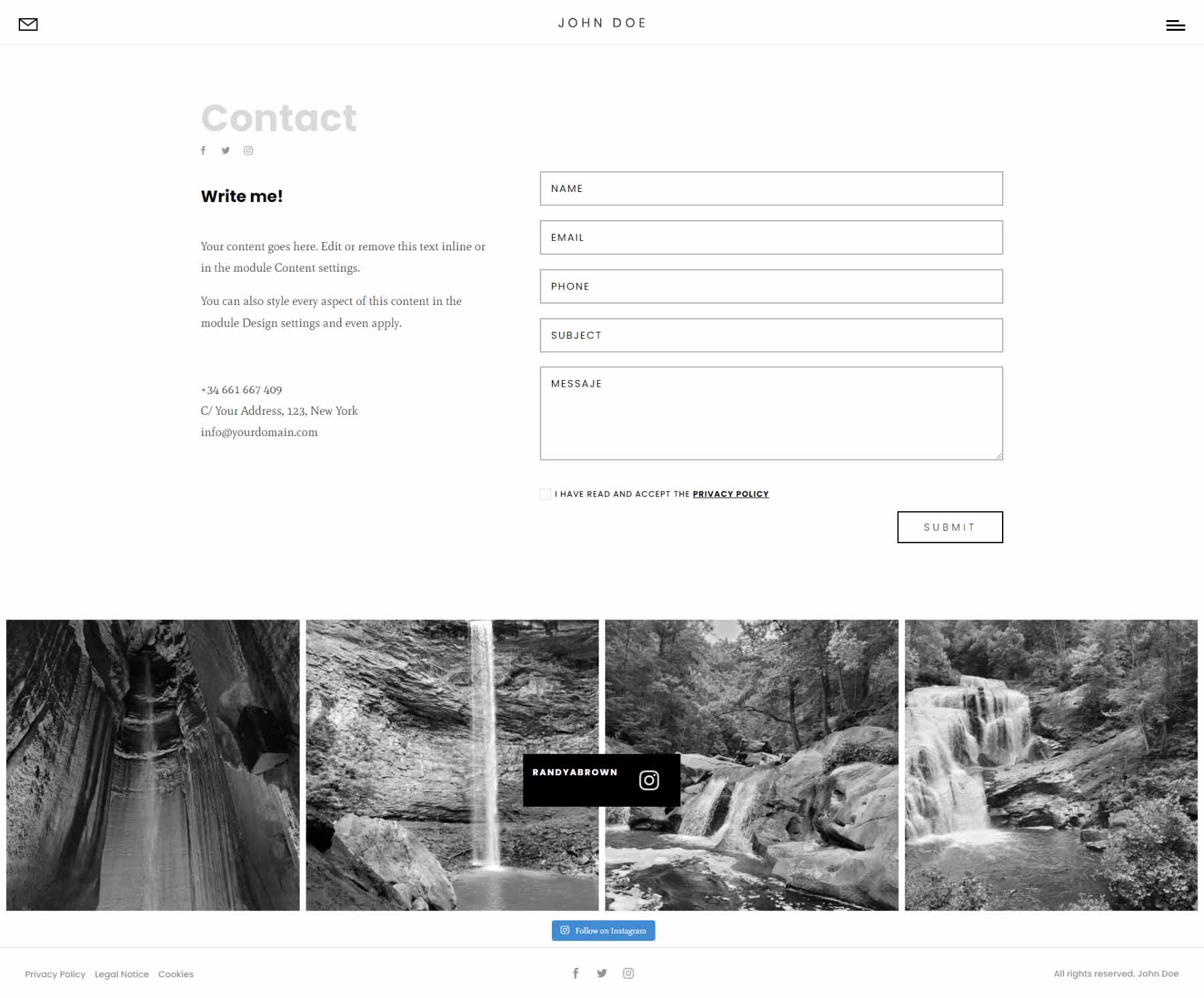
The first Contact page displays a large contact form in the hero section.
The second adds a full-width map to the top of the page.

Divi Photography Portfolio — Portfolio Pages
It includes three portfolio pages.
Portfolio Grid
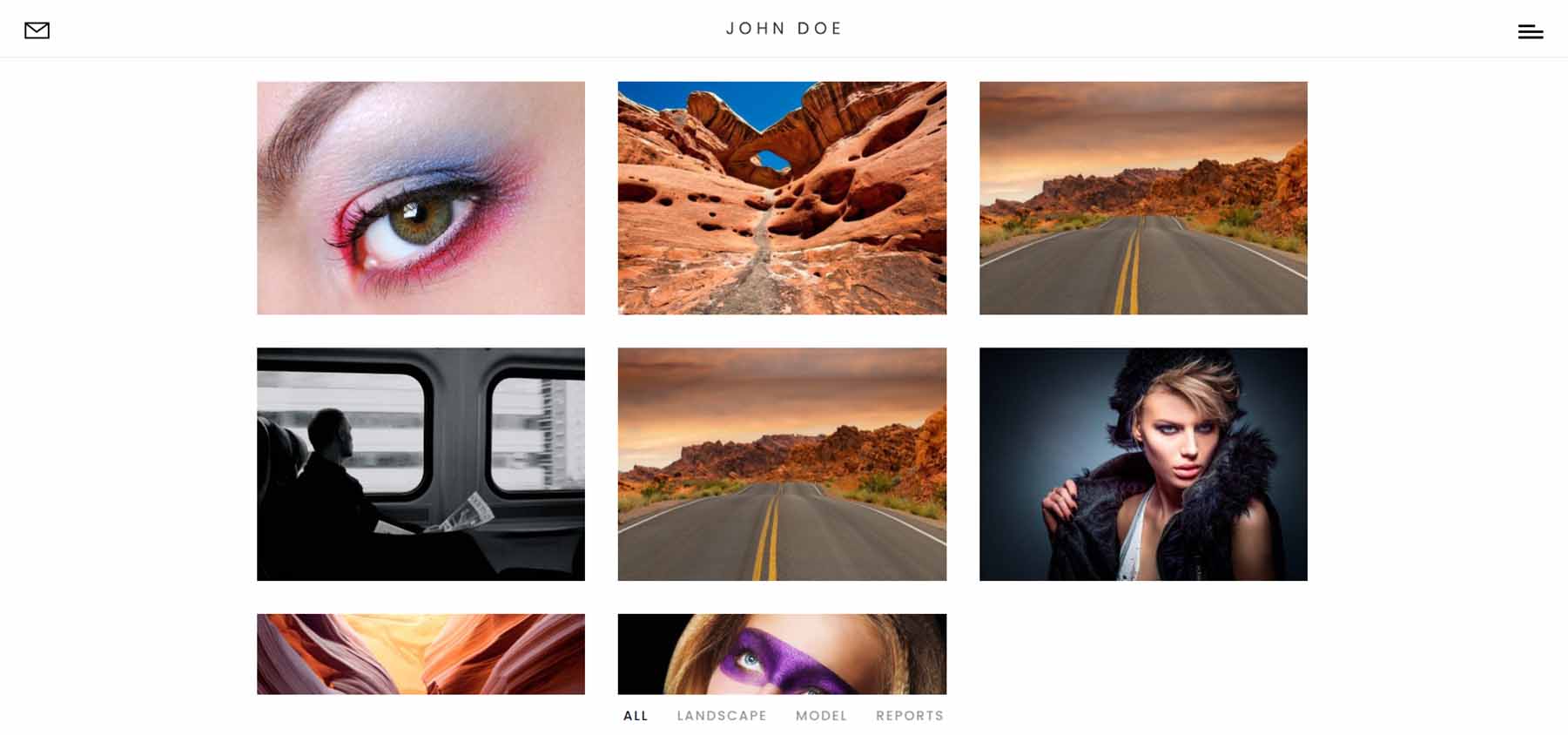
The first portfolio page displays projects in a grid. The categories appear at the bottom of the page until you scroll to that point.
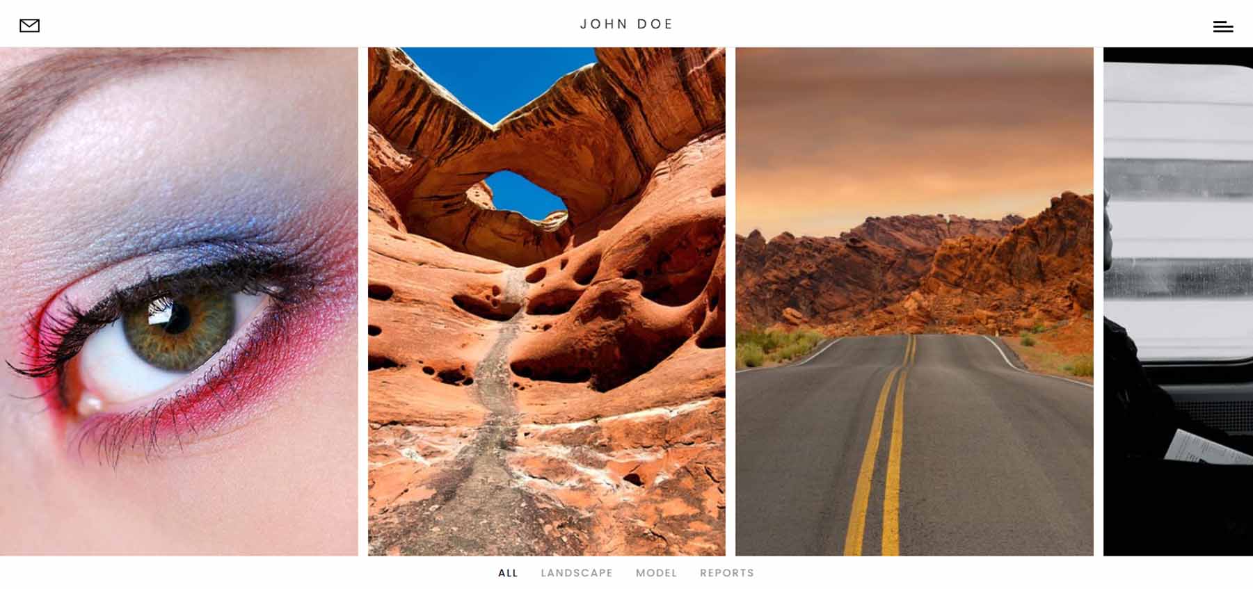
Portfolio Horizontal
The horizontal portfolio includes a slider that slides horizontally as you scroll. Categories are placed under the slider.
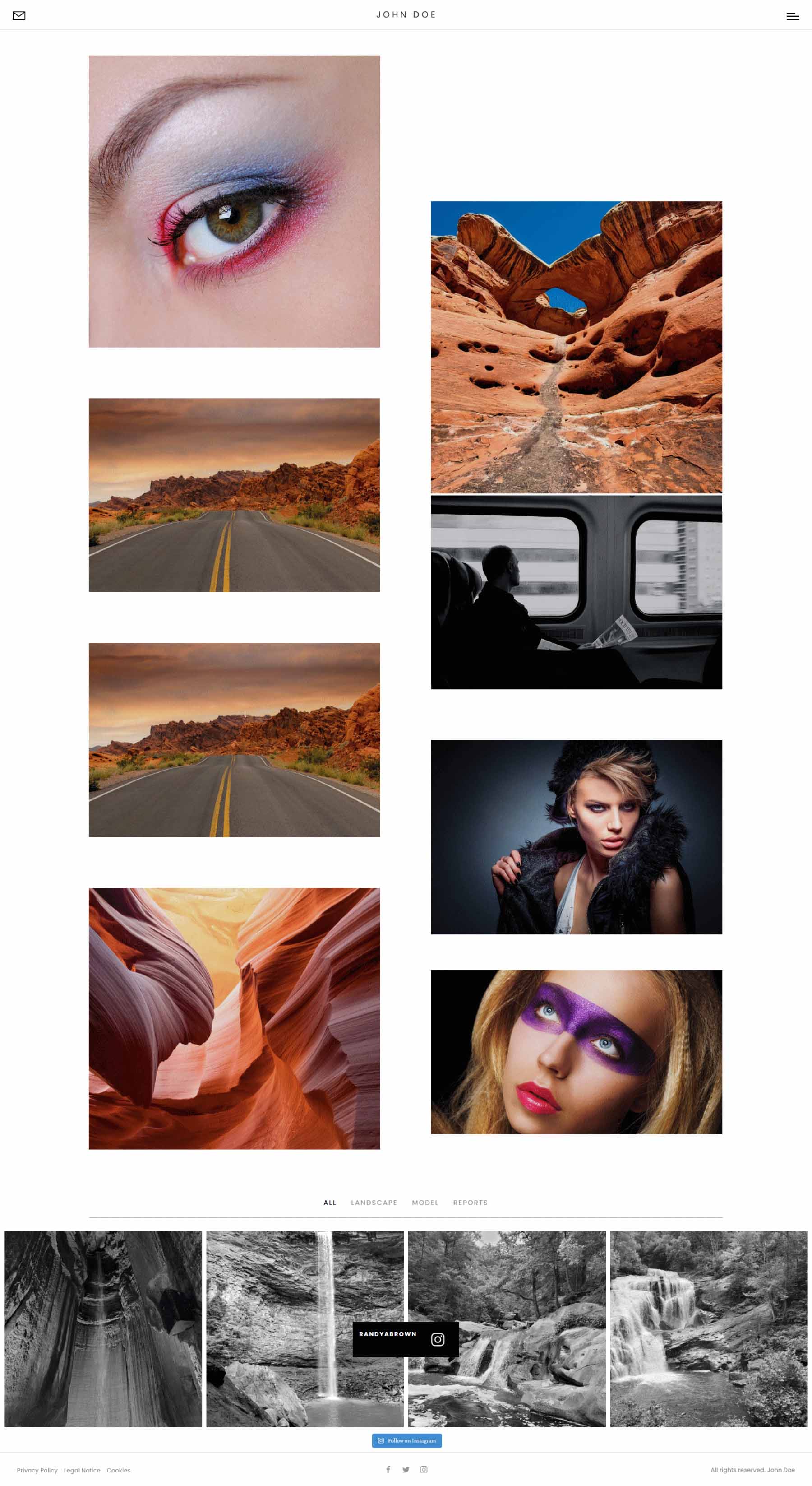
Portfolio Vertical
The vertical portfolio presents the projects in a two-column mosaic. The categories remain at the bottom of the screen until you scroll past the portfolio.
Divi Photography Portfolio — Video Gallery Pages
It includes two video gallery pages. These use the Video Gallery module included with the child theme.
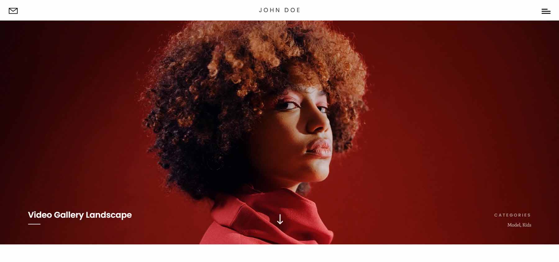
Video Gallery Landscape
Video Gallery Landscape provides a large video hero section that displays a title in the bottom left corner and the categories in the bottom right corner.
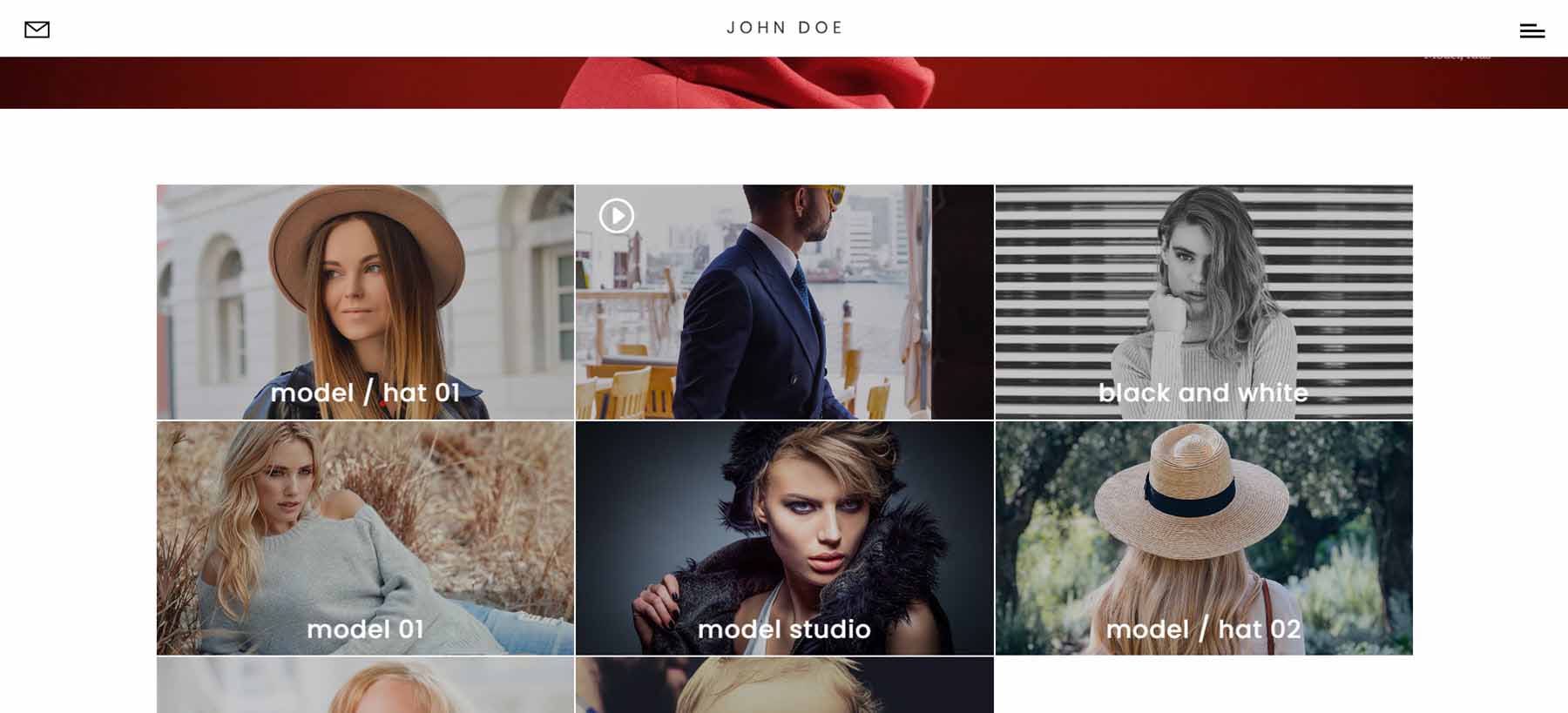
This is followed by the video gallery. It displays the video’s featured images in a grid with the category. Hovering removes the category and shows the play button. I’m hovering over the second video in this example.
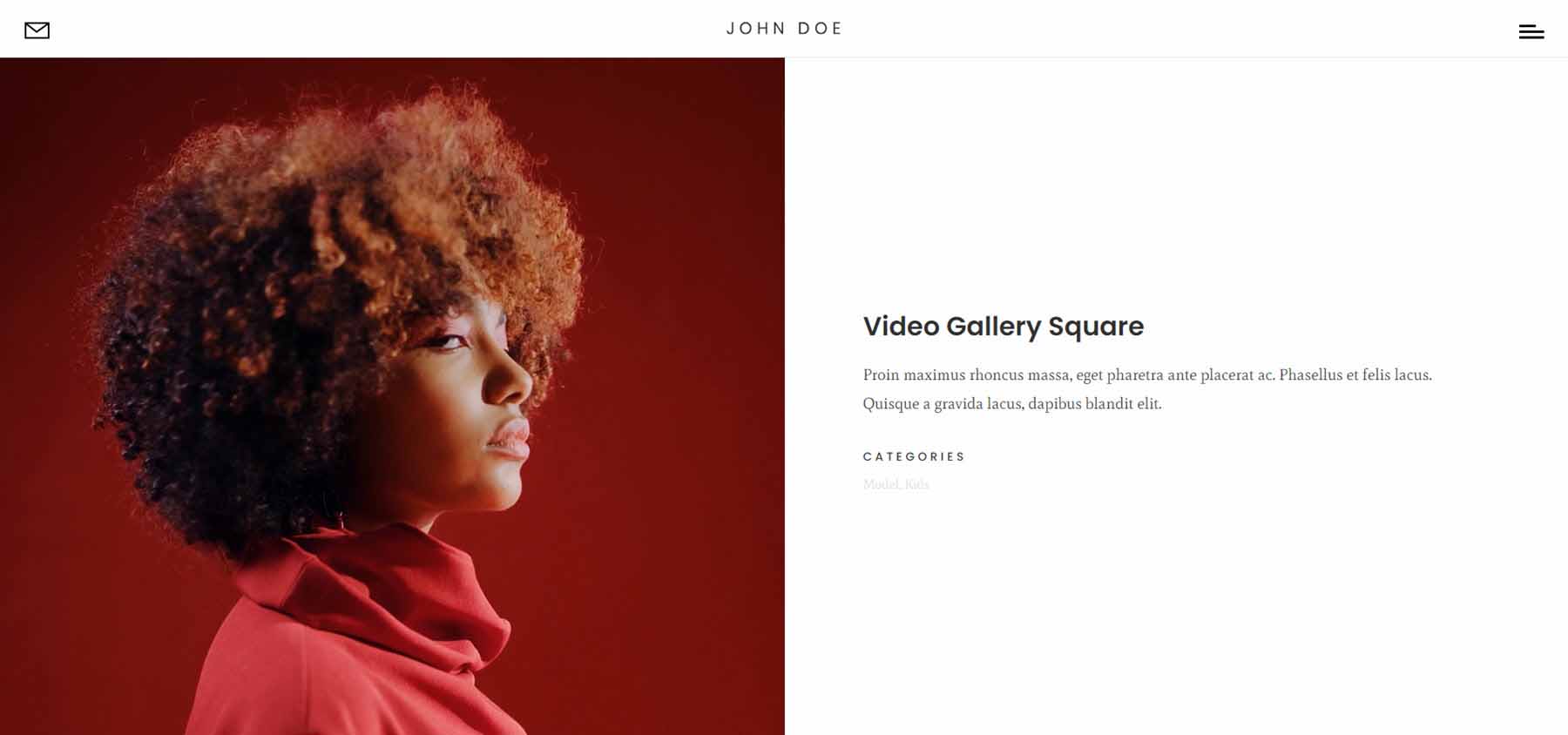
Video Gallery Square
The square version places the video in the left half of the hero section. The right half shows the title, description, and categories.
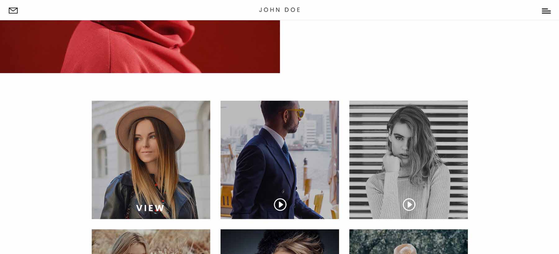
This page also includes the video grid. This grid shows the play icon and replaces it with the word View on hover. I’m hovering over the first video in this example.
Divi Photography Portfolio — Blog Pages
It includes two blog page designs that look very different from each other.
Blog
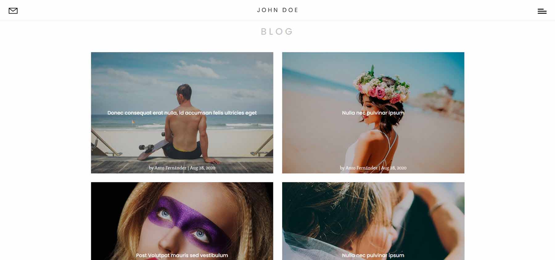
The first blog layout places blog posts in a two-column grid. It shows the featured image with the title, author, date, and overlay over the image. On hover, the image zooms and removes the overlay and text. It also includes pagination.
Blog 2
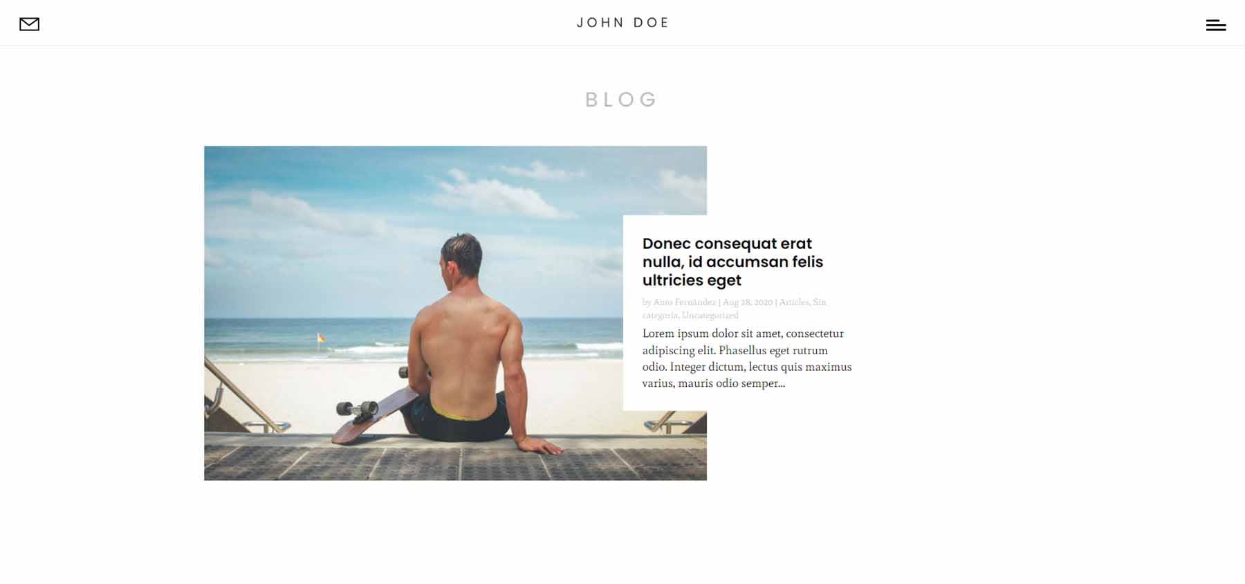
The second blog layout displays blog posts in a single column in an alternating layout. It shows the featured image and the title, meta, and excerpt in a box overlapping the image. The text box slides, and the image displays an arrow icon on hover. It also includes pagination.
Divi Photography Portfolio — Blog Posts
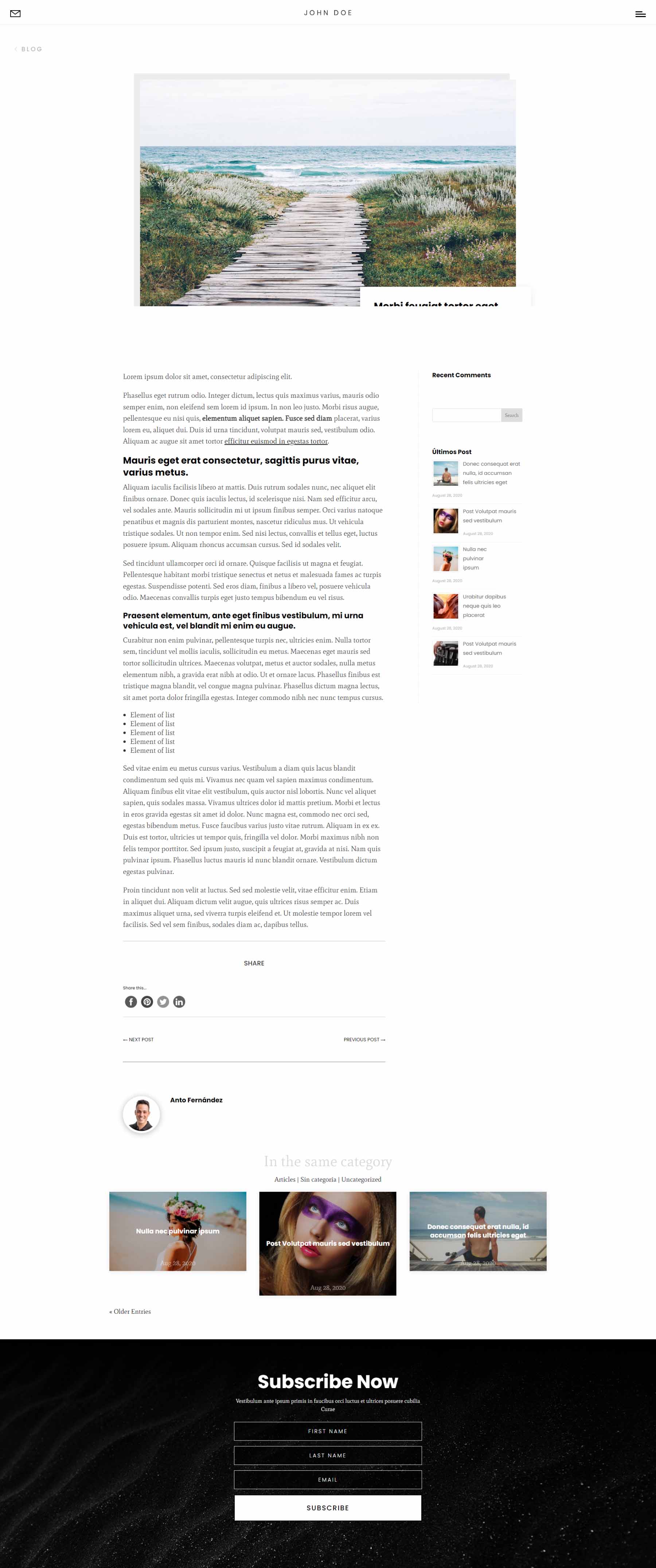
Two blog post layouts are included. The first includes a sidebar while the second does not. Both show the featured image with a floating title and meta, share buttons, navigation, more posts in the same category, and a subscription form.
Divi Photography Portfolio — Contact Pages
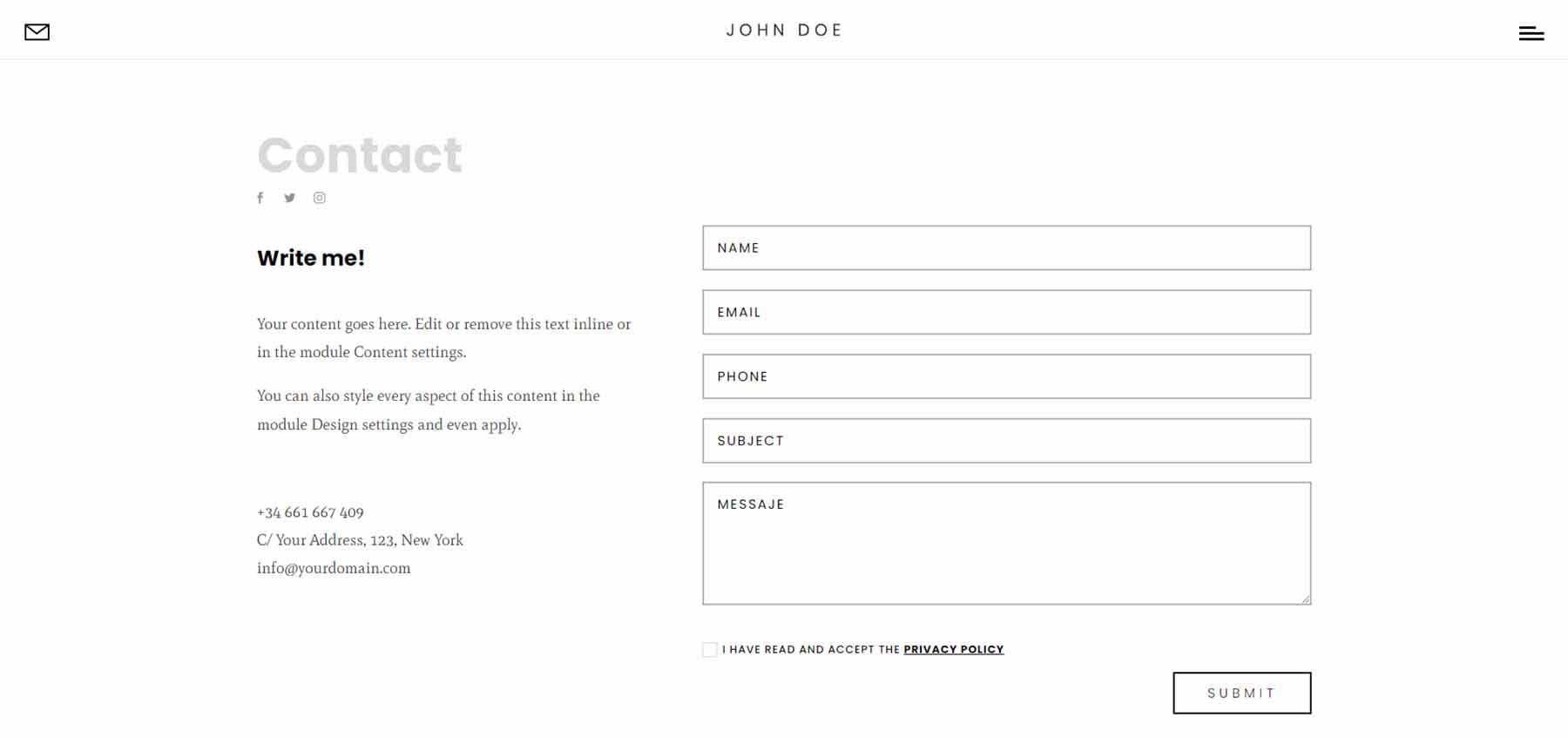
It includes two contact pages. Both include a contact form and a clean design.
Contact
The standard contact page includes contact information on one side and the contact form on the other. The fields are gray, but they darken when you hover over them.
Contact Map
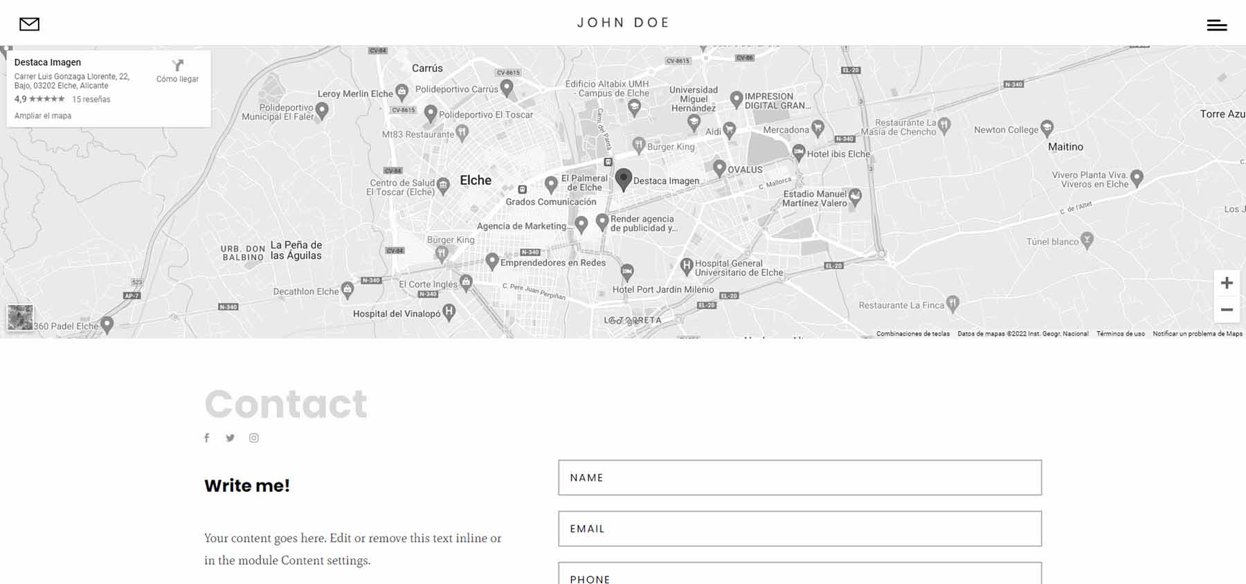
The contact map page displays the same form as the standard contact page but adds a full-width map to the top of the page. It’s monochrome and doesn’t zoom on scroll.
Divi Photography Portfolio — Header
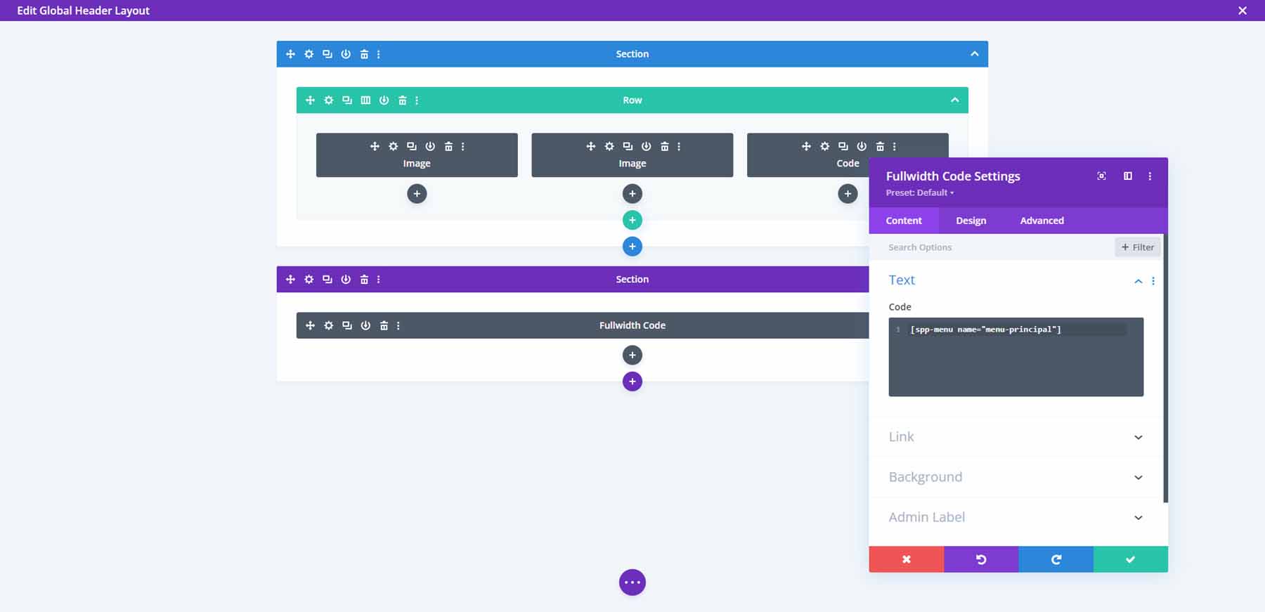
The global header includes two Image Modules and two Code Modules. The first Image Module displays an email icon while the other displays the logo. The first Code Module includes the code for the hamburger icon and the second includes the shortcode for the menu.
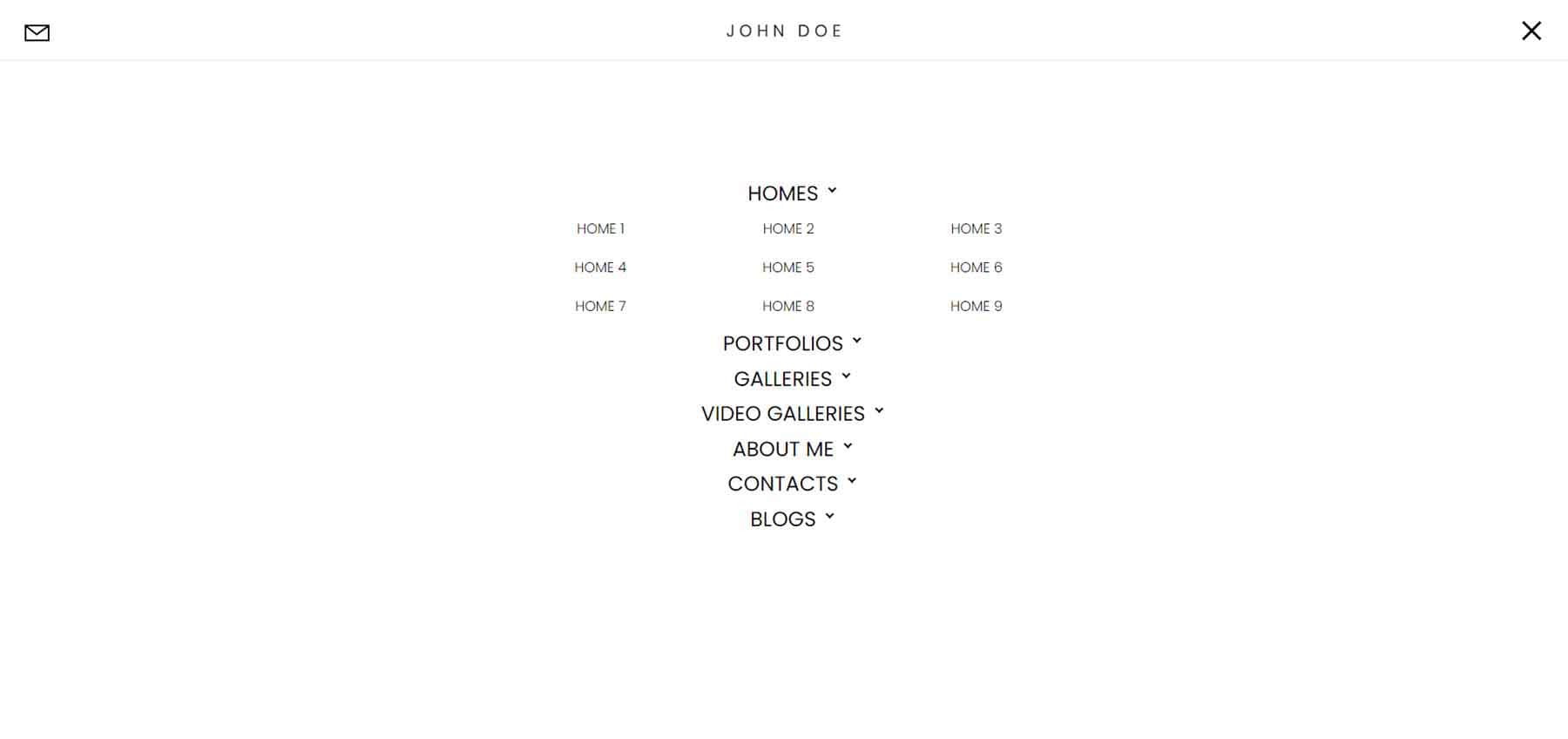
The menu opens full-screen and displays the menu items with arrows. Clicking a menu item shows its submenu. Clicking a different menu item closes the first one. The hamburger icon changes to an X. Click the X icon to close the menu.
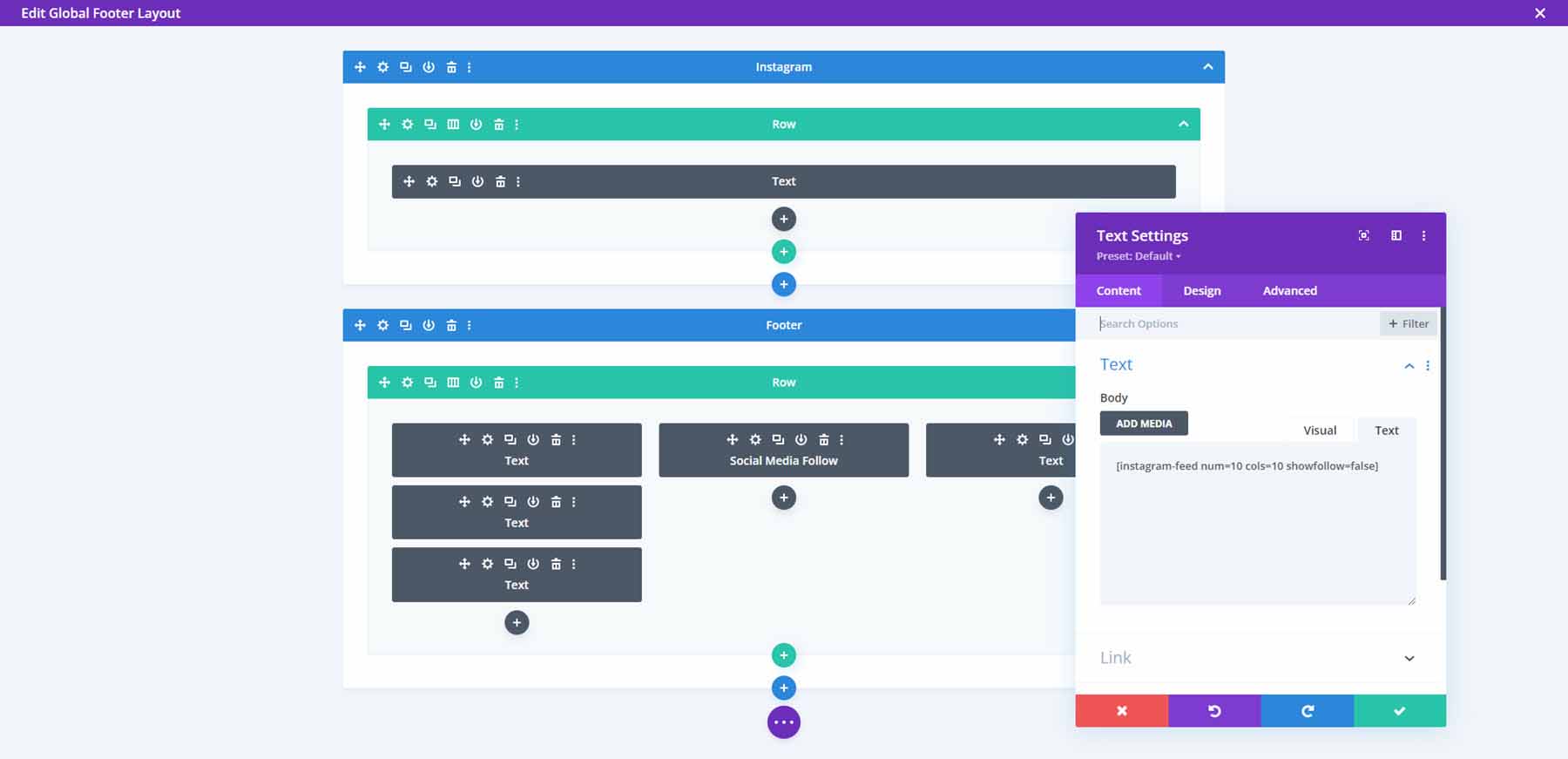
The global footer contains 6 Divi Modules for the Instagram feed, legal notices, and social media follow buttons.
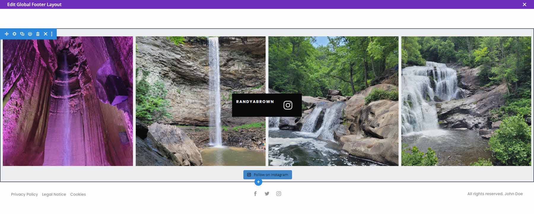
Here’s how it looks on the front end (the photos are mine, from East Tennessee).
Where to Purchase Divi Photography Portfolio
Divi Photography Portfolio is available in the Divi Marketplace for $65. It includes unlimited website usage, 1 year of updates and support, and a 30-day money-back guarantee.
Ending Thoughts
That’s our look at the Divi Photography Portfolio child theme. This is an interesting child theme with lots of page options. Extra features are added with free and premium plugins. It also includes a dark version of all the pages so you can easily get started with either design. Divi Photography Portfolio is an excellent Divi child theme for any photographer or videographer.
We want to hear from you. Have you tried the Divi Photography Portfolio child theme? Let us know what you think about it in the comments.


It includes two video gallery pages. These use the Video Gallery module included with the child theme.