Find It In The Divi Marketplace
Divi Sensei Counter is available in the Divi Marketplace! That means it has passed our review and has been found to meet our quality standards. You can visit Divi Sensei in the marketplace to see all of their available products. Products purchased from the Divi Marketplace come with unlimited website usage and a 30 day money back guarantee (just like Divi).
Divi has a number counter module that allows you to enter a number, add a title and a percent sign, and style it with the common styling options. It’s a good module, but what if you wanted a few more features, such as adding your own prefixes and suffixes, and even creating a circle counter? A third-party plugin called Counter for Divi does that and more.
Counter for Divi allows you to count by numbers, dates, or posts and you can choose how it does the count. Add decimal places and show percentages with either positive or negative numbers. Adjust the animation duration. The circle feature lets you create pie charts and circle charts, and adds a scale to the circle.
Counter for Divi Module
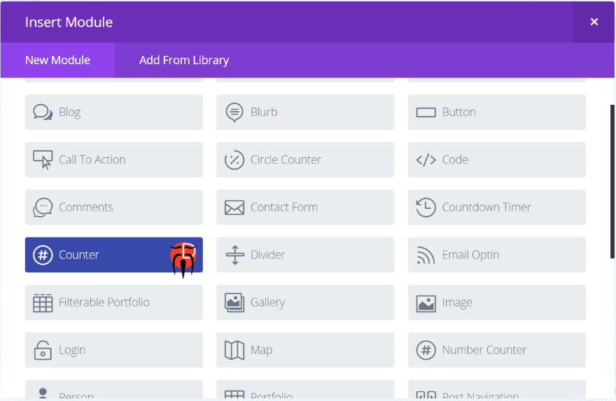
Counter for Divi adds a new module to the Divi Builder called Counter. It’s dark blue and includes the developer’s logo so it stands out. I like it when developers do this so I can see quickly which modules are third-party modules.
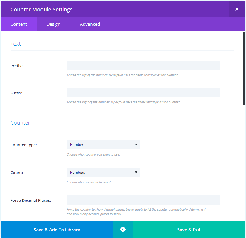
The content tab includes settings for the text prefix and suffix, counter type (choose between number and circle), count (choose between numbers, dates, and posts), decimal place, separators, count to, count from, and background.
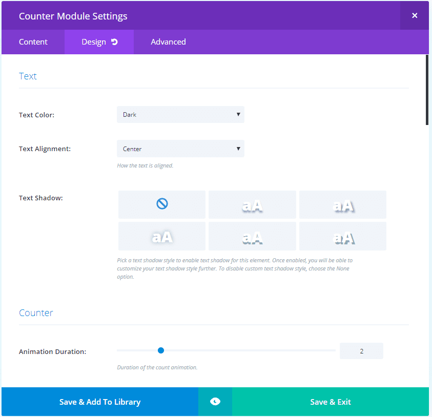
The Design tab includes settings for the text, counter, number text, spacing, border, box shadow, and animation.
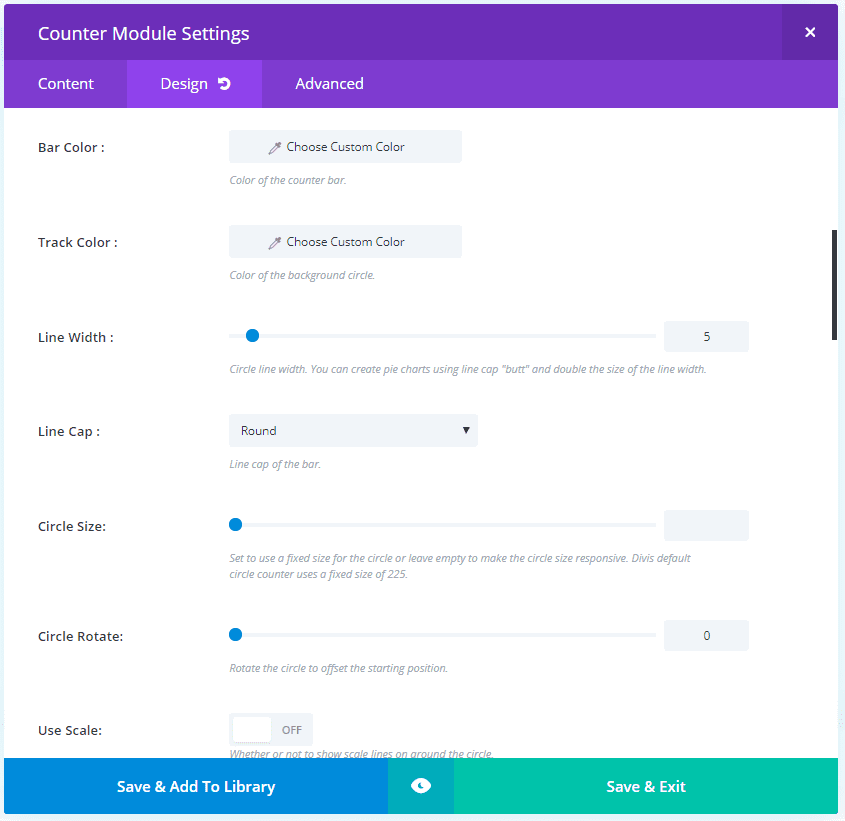
Choosing Circle in the Content tab adds a few circle options to the Design tab. Here you can adjust the line width, line cap, track color, etc.
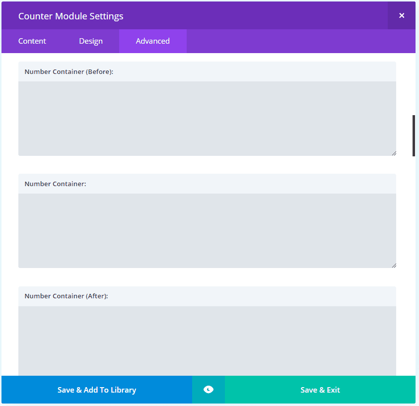
The Advanced tab adds fields for the number container, prefix, suffix, hover, etc.
Using Counter for Divi
Number
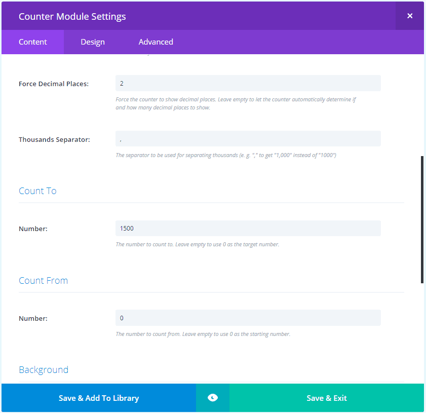
Choose the type of counter you want, what you want it to count, and enter to the number you want to count to and the number you want to count from. I’ve also added a comma for the thousandths separator and forced decimal places to 2.

Here are the standard settings. I’ve added a light blue and green gradient so it doesn’t blend with the blog. I’ve added the description as a prefix. Anything you enter into the fields is displayed. You’ll need to add a space or two to get the look you want.
Circle
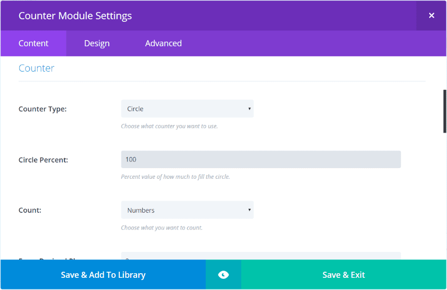
Circle adds percent. All the other settings are here. Add the percent if you want just part of the circle to complete.

The circle takes the full width of the column. I’ve placed it into a three-column row so it doesn’t fill the screen.
Dates
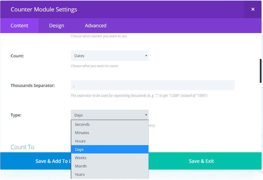
Dates adds the type of date to count. Choose between seconds, minutes, hours, days, weeks, months, and years.
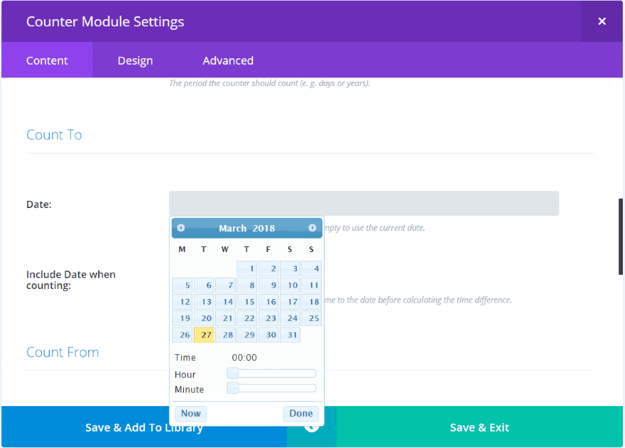
It adds date pickers so you can count to and from specific dates.

It displays the number of days. It’s showing here with my suffix.
Posts
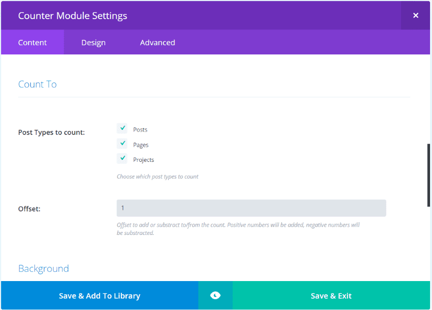
Posts lets you choose the post types to count and has an offset number to count to or from.

It displays the number of posts, pages, and projects that I have published minus the 1 I chose to offset by. I’ve added the description as a suffix.
Counter for Styling Divi Examples
Here are a few styling examples of number and circles.
Number Examples

This one uses the date counter. I’ve changed the background of the section and added shadow to the module. I’ve also changed the color of the text.
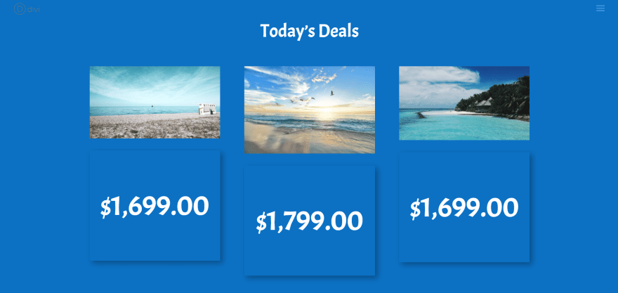
For this example I’ve added a heading using a text module and image modules to create a simple pricing table. I made the text white and changed the font to ACME.
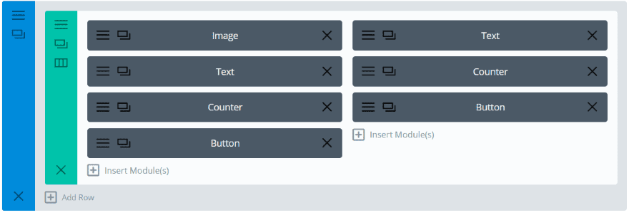
For the next example I’ve added other modules to create some calls to action. I’ve using an image, text, counter, and button as seen in the image above.
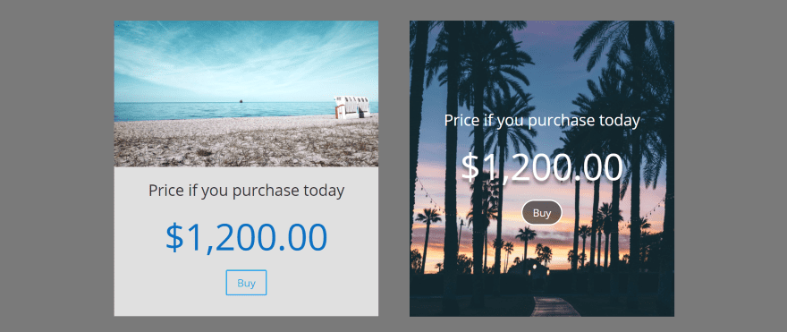
For the one on the left I’ve added a background color to the column within the row settings and added padding at the bottom. It creates a card with a purchase button.
For the one on the right I added the image within the background of the column within the row settings so all of the modules within that column will appear over it. I’ve changed the text for each of the modules to white and added a shadow to the counter module’s text.
Circle Examples

Here are some circles. For the one on the left I’ve reduced the size to 250 and changed the text and circle color to blue.
For the one in the center I added a prefix, changed the text and circle to purple, and change the stop position to 60. I changed the line width to 10 and left the track color default.
For the one on the right I added a suffix, changed the color for the text, circle, and track, and set the line width to 20. The circle percent is 75, but I changed the circle rotation to 80 so it’s offset.

For these I’ve changed the size of the circles, set the font location, changed the font weights, and added shadow effects to the fonts. For the one on the right I’ve added a border with rounded corners and a border shadow.

For the one on the left I’ve changed the bar color and set the track color to match the background. I’ve set the line width to 50 and the line cap to round.
For the one in the middle I’ve changed the bar color and left the track color to default. The line width is 100 and the line cap is set to Butt. The circle percent is 45.
The one on the left uses square for the line cap. Line width is 75. I changed the bar color and set the track color to match the background.

For these examples I’ve added the scale. For the one on the left I’ve changed the bar color to blue and set the track color to match the background. The line width is 100. I set the scale color to match the bar color and set the scale length to 10.
For the one in the middle I’ve changed the bar and track color, changed the line width to 15, and rotated the circle to 38. For the scale, I’ve set the length to 20 and changed the color to black so it will stand out.
For the one on the right I’ve changed the number color, font, and set it to italics. I’ve also changed the color of the circle and track. The line width is set to 71, the circle size is 330, and the circle rotate is 203. I’ve left the scale size at 5 (which is the default) and changed the color.
I like the scale features. Changing the scale size and colors can create some interesting designs. I’d like to be able to set the scale width. This would let them stand out more and even create a look of gears. I’m sure this can be done with CSS.

Here are a few pie charts. For the one on the left I changed the bar and track colors, set the line width to 160, and the line cap to Butt. I also changed the font to Actor, reduced its size, and added a text shadow.
For the middle I changed the track color to match the background and removed the number.
For the one on the right I changed the colors of the bar, track, and font, and added a suffix and a text shadow.
These are actually easy to make but I was confused at first because I was using the slider, which stopped at 100, instead of entering a number manually. You can even add too much which can have an effect of negative space in the center.
Using Counter for Divi with Extra
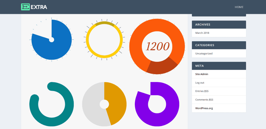
It also works with Extra. I didn’t have to make any adjustments to work with Extra, but the sidebar did change the effect of the pie charts. I had to change the line width.
License and Purchase
There are two licenses to choose from:
- Single site – $9.99
- Unlimited sites – $29.99
You can see the purchase information at the developer’s website
Ending Thoughts
I found Counter for Divi to be easy to use. It works well with other modules and has a lot of design features. I especially like the effect I got with the number counter as a call to action. I also like what can be done with circles. It’s a great choice for creating pie charts or any type of circle chart.
If you’re interested in a number counter module with more features than the standard Divi module, I recommend taking a look at Counter for Divi.
We want to hear from you. Have you tried Counter for Divi? Let us know about your experience in the comments.
Featured Image via Ron Dale / shutterstock.com




Is this plugin multi-language compatible? For example, can I use comma as a decimal separator (the current norm in French)? So can it display 5,3 instead of 5.3 in French pages?
Hi There
I am a bit concerned that elegant themes is not advancing their current modules and adding newly advanced modules to their list fast enough. Just looking at Bever and Elementor at this stage and I see they are pushing ahead fast and furious with new functionality.
As a partner of yours we need to shake thing up faster and not get left behind, and the reason I call you my partner is that I have invested in you guys and would like to stay for good. It is not a good idea for all the third-party developers to take all the module ideas and put them into action whereas Divi could have done this.
Please take this message to the top as I see a lot of people have the same feeling.
Thanks For Listening
No, they don’t. Not everyone feels this way at all.
The team at Divi have shown fantastic forethought and foresight with how they’re building their theme.
I can’t speak for Beaver and Elementor, but I get the impression that Divi has a greater developer base, and so they’re spending more time building an API that makes module development better and more robust.
Give them a break, and have some gratitude. 🙂 I’m fantastically glad that the ET team allows a community of 3rd party developers to be able to make income, and provide amazing support, on top of their hard work.
The only thing holding anyone back with Divi is their ability to imagine and learn. And work hard. 🙂 Kudos!
Fully agree.
I’m thinking more and more to switch to Elementor. Basic stuff are missing despite several users pointed this out since a while. The answer we get is through Blog posts using additional WordPress Plugins, which, on the top, are not free.
We should as well have more transparency on coming development and what modules you are focusing on.
Sincerely, you did a very good job with Divi 3.0 and never forget that other are also improving.
+1
I’m going off topic here…but when is Divi getting a multisite feature? or even a white labeling feature? I just noticed that Beaver Builder offers a white label option for their agency package. As much as I love Divi, having a white labeling option is pretty neat. But I’m more interested in multisite feature since I work with multisites. The role editor could be better if it had a multisite network option.
This would be good, but doesn’t seem to be a priority for Divi at present so you’d have to purchase another plugin called Ghostery or something like that to enable the white-label you might want where it would conceal code to clients.
Thanks for the post! No doubt it is good to know plugins that are born around the Divi atmosphere. Good design features, but I’d really like to see something that would allow you to schedule an action after reaching the end of a countdown for example! Omit the counter or even a message!
OptimizePress has that feature. After the counter reaches zero it takes all visitors to the URL of choice. This would be awesome in Divi.
Hi. Quick question for you. Does this counter also count how many visitors has been to each individual blog post? Curious minds want to know. 🙂
Hi DNN. It doesn’t. It only counts to a number you enter.
Cool plugin… but again why is it that ET did not do this with the “Number Counter” module?
I know this bugs me and other ET users.
And it’s like none of the ET Programmers read this blog hearing that we don’t like adding more plugins that are obvious to most which could easily be added to the core module code like the Number Counter.
And not only do we have another plugin to purchase and add, but also HOPE that the plugin developer will keep up with the code changes from WordPress and not disappear because they did not make enough money or got another job elsewhere which happens all the time with WordPress Plugin Developers!
I hear you, but I disagree. ET is in charge of a massive community, and working hard to overhaul their code and bring basic functionality to everyone.
Tweaking niceties like a counter module isn’t high on their list of todos. Creating a robust API and preparing for things like Gutenberg are much more important.
As ever, Nick and the team are constantly looking ahead, and preparing a platform that other developers can build on and extend. If it costs more for me to create custom layouts, then so be it.
I’m massively grateful that they’ve delivered everything they have, with the speed and amazing flexibility.
I’m with you; there’s always the niggling hope that the 3rd party developers update in sync with Divi. But that’s been the rub since the dawn of plugins. That’s part of playing the game.
🙂
Yip! I agree wholeheartedly too!
+1…very true
I think these are valid points. Rather than simply tweak and update or add more depth options to current Divi modules, the changes seem focused more on overall broad layout features that most people seem to like. But then that creates more bugs and more features to learn about as opposed to just updating and improving what we’ve got to work with. I agree – adding another plugin is another cost, and you have to hope the plugin is updated when Divi is, just as often – when it seems like this would be a relatively easy add on if only the desire to do it were there.
“Who knows what evil lurks in the hearts of men?”
Agreed.
I recently hacked together a 404 page using the counter… although, I may tweak it a bit after reading these tips!
Unfortunately we haven’t found a way yet to make the scale thicker since it’s drawn in a canvas. We actually use the same underlaying JavaScript for our module as the Divi counters.