Find It In The Divi Marketplace
Divi Blog Extras is available in the Divi Marketplace! That means it has passed our review and has been found to meet our quality standards. You can visit Divi Extended in the marketplace to see all of their available products. Products purchased from the Divi Marketplace come with unlimited website usage and a 30 day money back guarantee (just like Divi).
Divi includes a blog module to display your posts in a full width or grid layout. It’s a nice module and gets the job done. What if you wanted different layouts and features? That can be done with CSS, but a third-party plugin called Divi Blog Extras makes the task much easier.
Divi Blog Extras is a third party plugin from Divi Extended that adds a new module to the Divi Builder with several new features to display your blog posts. It includes six different layout designs and adds an AJAX loading feature with a load more button. The posts load as you scroll and loading is fast. You can change the text for both the read more and the load more buttons.
In this plugin highlight we’ll take a look at Divi Blog Extras and get some ideas of what can be done with this plugin. Images for these examples were taken from Unsplash.com.
Divi Blog Extras Installation and Settings
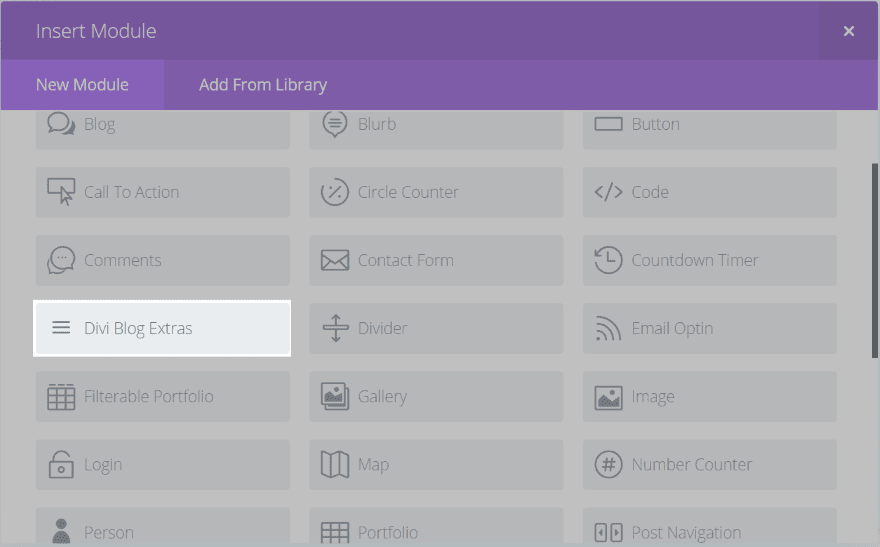
Upload and activate as normal. A new module called Divi Blog Extras will then be available in the Divi Builder. To use it simply drop it into a row just like any module. Since the options are the same as standard Divi Builder modules, using this module is intuitive.
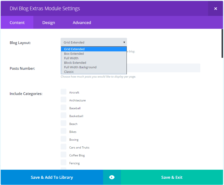
The Content settings includes the familiar options and has six layout choices, excerpt length, category colors, load more button text, featured image overlay, read more button text, and text color options. The Design settings include header, meta, and body text, and border styling. The Block Extended layout adds image position and Classic adds social icons. Let’s look closer at each of the layouts.
Grid Extended
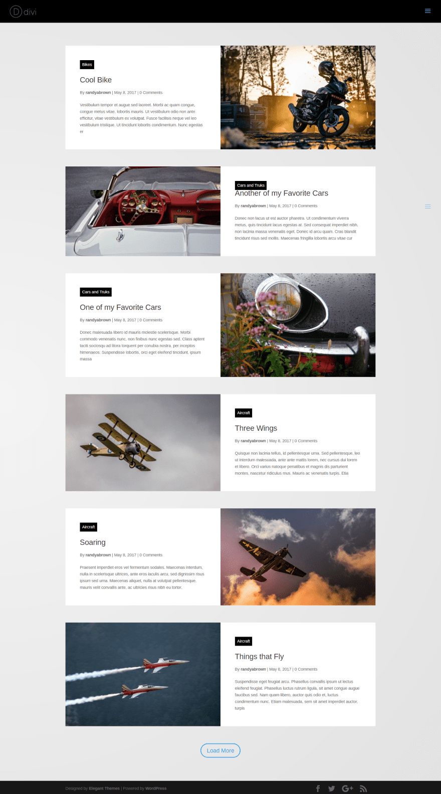
The default layout, Grid Extended, displays blog posts with images and text alternating. The images brighten on hover. Category names are placed within a box. in responsive mode the images are placed on top.
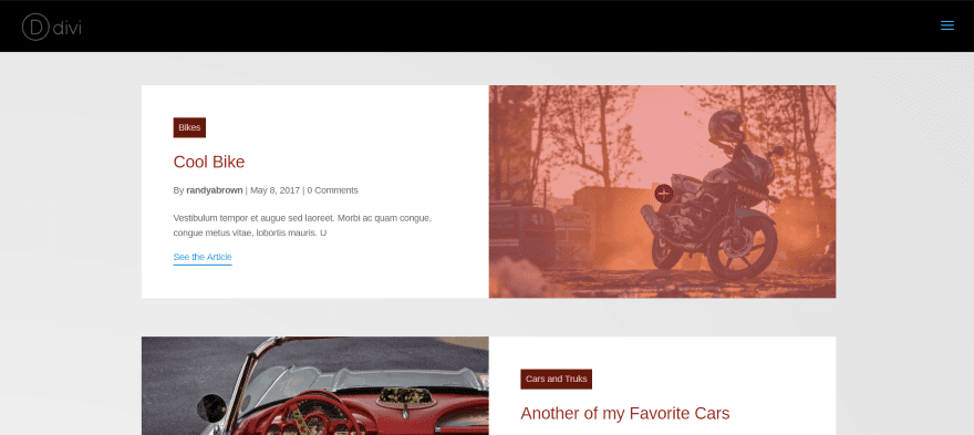
In this example I’ve added a hover overlay, hover icon, changed the read more text, limited the excerpt to 100 characters, and changed the category text and background colors. The hover animation displays when you hover over any part of the post.
Box Extended
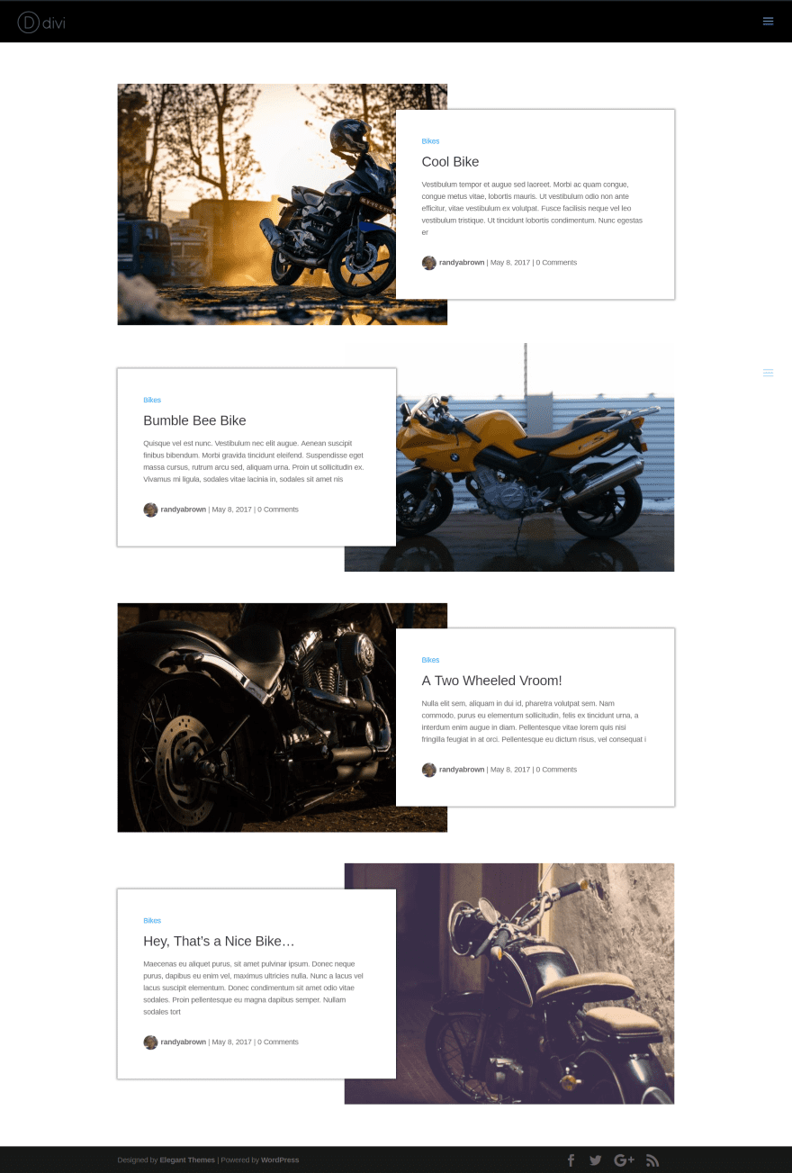
Box Extended places the excerpt in a box that overlaps the image and removes the box around the category name. The author’s image is added to the meta section. The images and text alternate. This is one of the more elegant blog layouts.
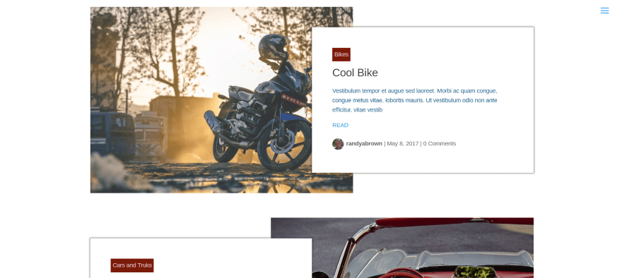
In this example I’ve changed the category font and background colors, limited the excerpt length to 150 characters and changed the font to blue, and changed the read more button text. The default hover brightens the image as seen in the top image above.
Full Width
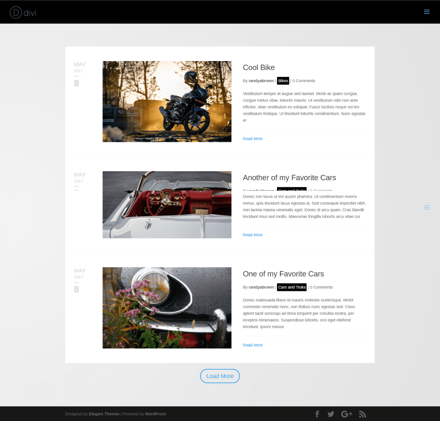
Full Width places the images on the left and excerpt on the right, adding a styled date to the far left. Each post is separated by a line. The category name is placed within meta.
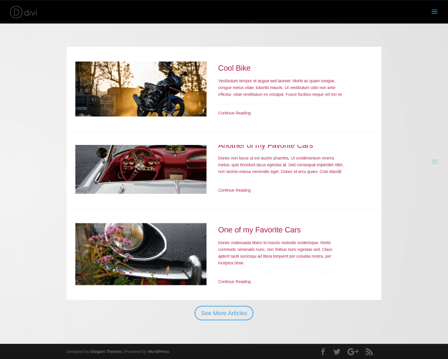
This example disables the date and meta info. The text uses custom colors. I’ve changed the read more and load more button text. The excerpt is limited to 200 characters.
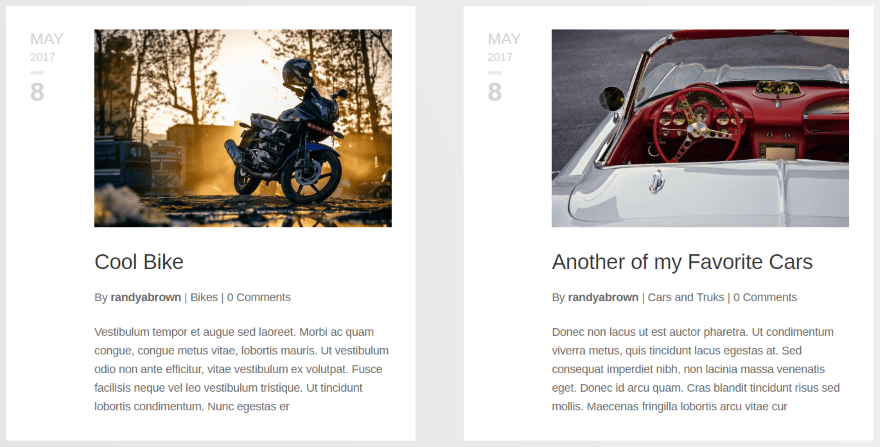
All of the layouts are responsive. Here’s a look at Full Width’s responsive look. This shows two modules side-by-side in a 2-column row.
Block Extended
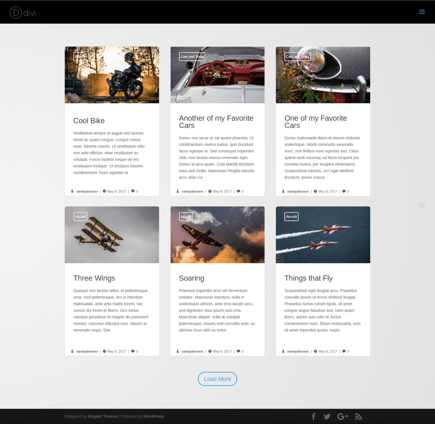
Block Extended is a blog grid that adds the category name over the image and meta at the bottom of the card. The image zooms when you hover over any part of the card. I like this type of micro-interaction because it shows the card is clickable.
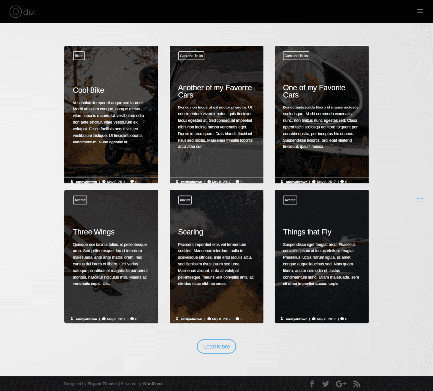
Block Extended has three options for displaying the images. This example places the featured image in the background with the text in an overlay.
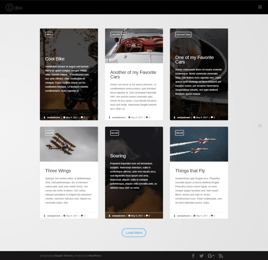
This example alternates the background image between the first two choices.
Full Width Background
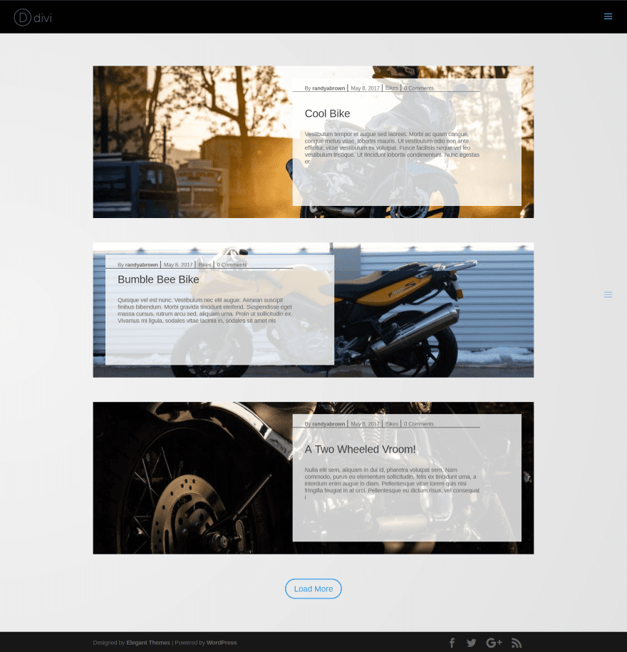
Full Width Background displays a cropped version of the image in full width and places the excerpt with meta in an overlay over the image. The excerpt placement alternates. Meta is separated from the excerpt with a line.
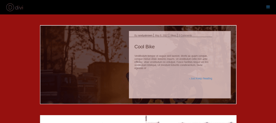
This example uses a dark overlay over the image to show that the excerpt’s overlay doesn’t use the same overlay on hover. The background of the section is red for this example. Notice the red shows through on hover. I’ve also added my own read more button text and a 2 pixel border.
Classic
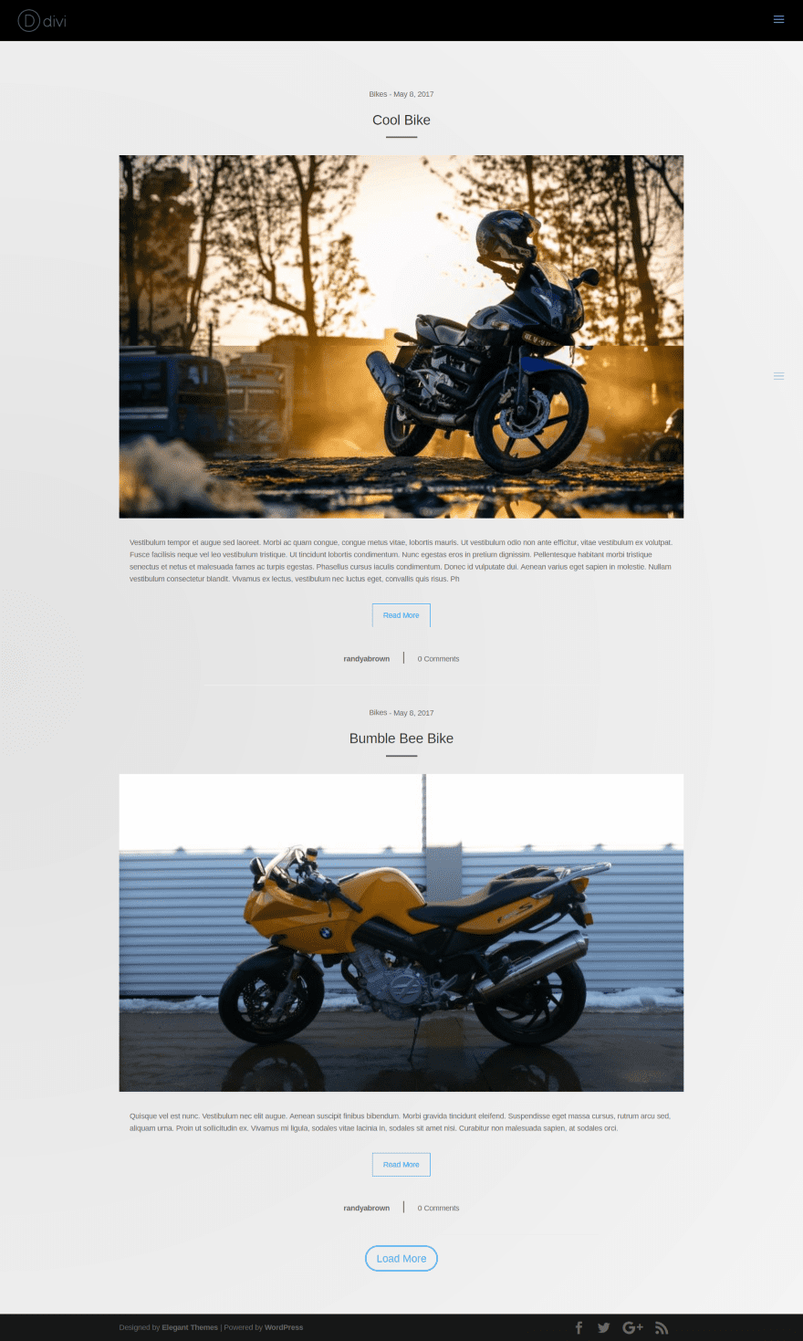
The Classic layout displays the blog posts with full size images and full width excerpts under the images. The category and date is place above the title. The title includes a short line separator to make it stand apart from the image. Under the excerpt is the author’s name and number of comments separated by a bar. A thinner and wider line separator separates the posts from each other.
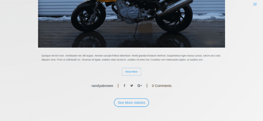
This layout has an option to display social icons. Clicking Load More (or as I’ve labeled it – See More Articles) displays the next set of posts, which equals the number of posts that I’ve selected to display. In this example I’m displaying two posts. Load More loads the next 2 posts.
Creating a Unique Layout with Divi Blog Extras
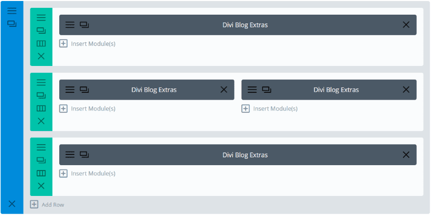
Multiple modules can be used together to create magazine layouts. This simple layout includes four modules displaying the Gird Extended layout. Each module displays different categories. The two in the middle display two posts each.
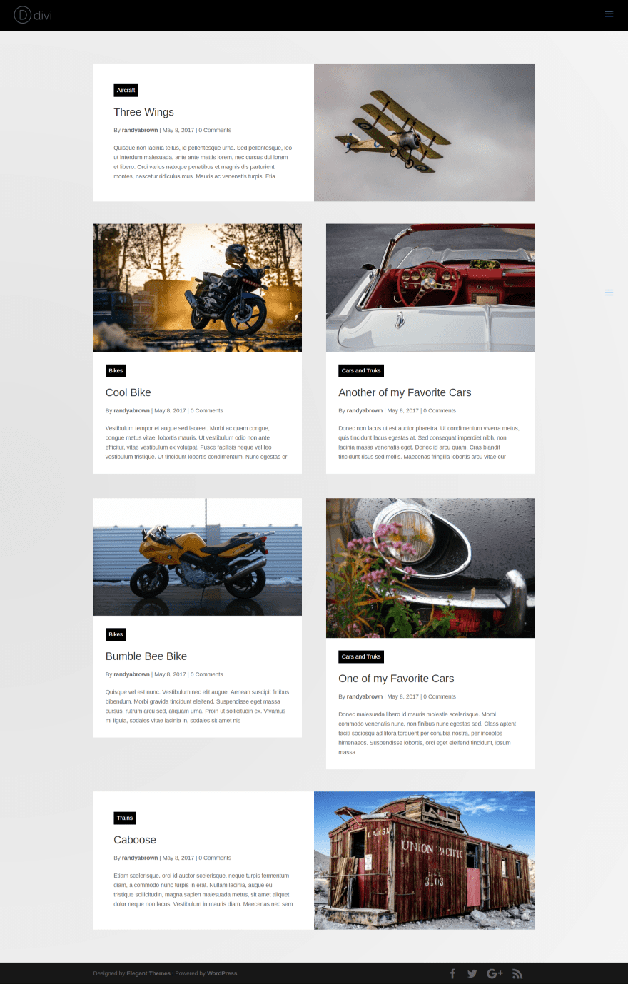
This creates a magazine layout with different categories for the various sections. This examples shows how the Extended Grid looks as responsive.
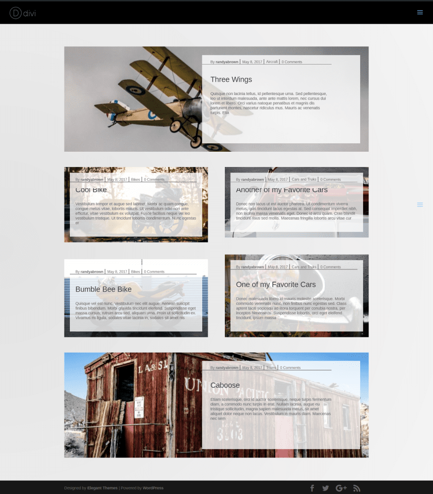
This is the same Divi Builder layout but uses Full Width Background. The overlays cover the images almost completely when in responsive mode.
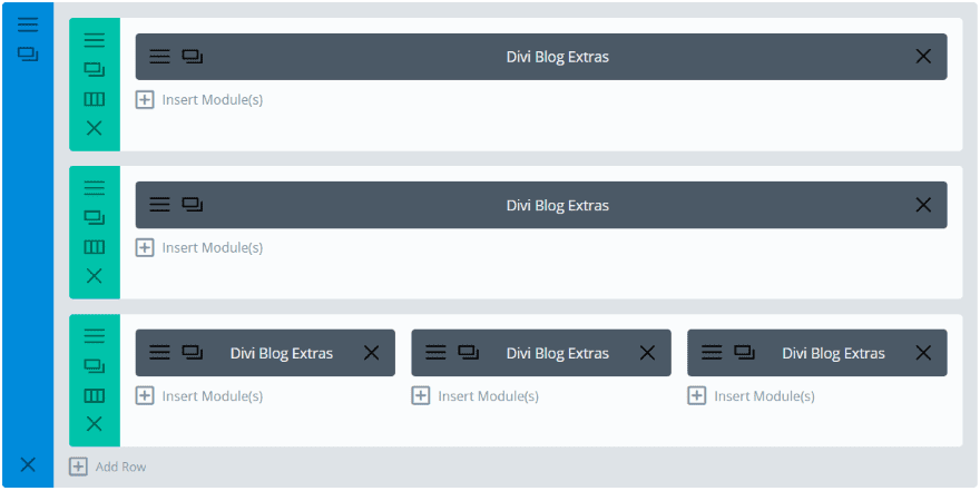
This example uses the Classic layout for the top module and Grid Extended for the next two modules. Each of the modules display different categories and have their own styling for the category text. The top module does not display an excerpt.
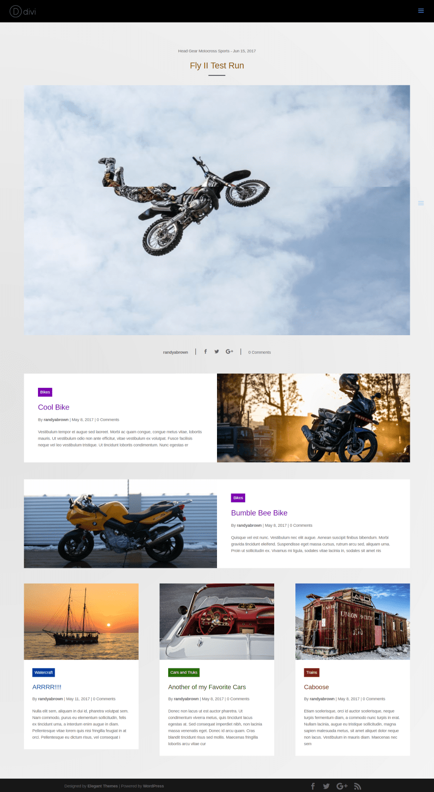
This creates an interesting magazine layout. I also set the rows to display full width. You can mix and match the layouts to get a unique design. I’ve created the layouts with different categories for each module. In a future update the module will have an offset feature so you could use multiple modules within the same category.
License
A single site is $15. The extended license is $30 and can be used on unlimited sites for you and your clients. It includes lifetime updates.
This plugin does not work with Extra.
- You can purchase this plugin at Divi Extended’s website.
Final Thoughts
Divi Blog Extras adds some nice styling and design features to give your blog module some pizazz. It also adds the ability to style category backgrounds and text. It uses AJAX for loading and includes a new load button. You can even add your own text to the load more and read more buttons. Each of these designs are great for giving your blog a unique look from the standard blog. If you want a blog design that goes beyond the standard Divi Builder blog module, Divi Blog Extras might the module you’re looking for.
We want to hear from you. Have you tried Divi Blog Extras? Let us know about your experience in the comments below.
Featured Image via pulsar011 / shutterstock.com


Does this plugin work with older versions of Divi?
What is your Divi version?
It’s an awesome plugin and just got better: the new version supports offset to skip the first x posts within the module. Now it’s close to perfect!
1. word-break
How to make an excerpt from the words! Not from the letters
screenshot: https://www.dropbox.com/s/lwkvkv3evcnif4s/347a4-clip-95kb.jpg
Thank you for your input. We added better excerpt control in the latest version.
Will not work on my installation. Today I bought this plugin for my website (newest versions of DIVI and WordPress) and it will not work. I got only a hanging process, when I will use it. Not good.
I just bought this plugin and started using it. Superb work! Hats off to the developer of the plugin. It’s a perfect complement to Divi. You can set the excerpt length in the Divi Blogs Extra Module Settings.
I had bought this plugin, quite some time ago, but this plugin is basically useless without post offset option that is there in the default blog module. A couple of months ago I spoke with the plugin developer and he said he might add it, but so many updates have been issued since then, but this feature is still missing. So this plugin is not very useful.
Hi Bikram,
The offset feature is available now.
In regards to the Extra theme layouts in general…
I understand you can’t give us the layouts due to the images being copyrighted. However, it would be so much easier on your customers AND your support if you provided these layouts WITHOUT the photos. Which could easily be replaced with “grey” placeholders for the images.
I’ve already wasted tons of time searching the forums and Google trying to find answers. Answers that could have been resolved in minutes if I had these layouts (Extra theme).
I have so many more questions, that could be easily answered with the layouts provided, and will be wasting more time trying to figure it out.
Not cool.
Please forward this concern to someone that cares.
Thanks,
Chris
Is there a way of ending the excerpt with ‘…’ ellipses rather than it ending on a random half word or an orphaned letter. I know you can alter the character count but this is a guessing game for each blog, plus I think it may change on responsive breaks. Is there some nice Custom CSS code we can have to do some …?
Cheers,
Ken
(p.s awesome plugin.)
The excerpt in this plugin can end with … by using some css. You may contact plugin support for the code.
It’s great. Is there an option to take it into the Divi Builder plugin?
Thanks Dina, Not now but an update is planned for compatibility with the Divi Builder plugin as well as Extra theme. This will make the layouts available everywhere the Divi builder is used.
That sounds great, thank you
I was wondering if you will have a “post offset” in the future. I would like to do the box extended, 3 column and use the same category…. the only way would be with a post offset.
Is this a future feature of this great plugin?
Thanks
Hi Marianne,
The plugin now has offset feature.
x2, I would very much like this feature as well
Hi Jfrancais,
Updating to 2.0.8 version will get you the offset feature.
Me too!
Hi, this is useful plugin. I´d like to ask. Is it possible to add social icons for each layout? Thank you
I’d like that too please!
Currently, You can add social media icon at Full Width Layout only.
I am working on a community project with membership lists and the email describing your plugin arrived. Your Bloc Extended layout in particular struck me, as it appears to be well suited for my membership project if (1) it could feed the content from WordPress Users instead of Posts, and (2) there was some control over which User fields could be displayed in Bloc Extended.
Is this possible in anyway? Any advice?
Jean, This plugin can feed data from default WordPress posts but not from user table.
This is excellent. Can’t wait to play around with it.
Can we use this for category pages as well?
Not now but you can use redirection plugin to redirect archive page at your page.
Is there an option to sort posts asc/desc by name/date/…?
Currently it only has a chronological display.
Hi this is great, any tips for using Tags?
Would be very interested in tags as well. Thanks!
Being a newbie I wonder how do I also get a sidebar with lists of posts by time and by meta?
Just add the ‘sidebar’ module to your page. The sidebar can most easily be customised to show what you want it to in the ‘widgets’ area. You can then add things like a post calendar, a tags or categories cloud etc. There are loads of options for showing the sort of data you’re wanting to. Hope that helps 🙂
This is a much needed extension to the Divi Blog module. Until today, we were using the “Blog Designer – Post and Widget” plugin, which required quite a bit of customization to get the look and feel we wanted.
The Divi Blog Extras plugin looks great out of the box and is 100% compatible with our Divi website.
We created a page to see what the various designs/layouts look like. You can take a look here:
https://nubranch.ca/divi-extra-blog-layout/
We went with the full width layout for our blog page. What layout do you guys think looks the best?
My vote is for the full width 🙂
We’re really loving the plugin! Great job! So many layouts, we might switch it up from time to time! 🙂
Looks great.
Randy, thank you for the detailed explanation and images for DIVI Blog Extras. The options in this plugin look fantastic and your article did a great job of explaining AND showing how it works. At $15/$30 it’s a no-brainer for saving time and creating some terrific effects for the blog. Kudos to the developers.
Hi, Thanks for a detailed article on this plugin, but I am facing a problem using the Block Extended with the featured image as background option. When I select that option the output is not similar to yours. All I get is the excerpt overlaying on a dark grey background. No featured image. What could be the problem?
Hi Bikram,
We’re really very sorry for inconvenience. You should not have faced this issue.
Can you please raise a support ticket including your website URL at our website so that we can look this issue closely.
Thanks – Arif
Thanks Arif for your reply. Sure I will do that. The only thing is it is on my local XAMPP server. I will not be able to send you the link, but I can send you the screenshots.
Hello Randy,
nice plugin, thanks for reporting.
I would give it a try if one can shut off meta in any alternative.
Is this possible?
Thanks for answering.
Hello Ulf,
You can turn off individual meta info. Like Show/Hide Date, Show/Hide Author and so on. I hope this will help you.
Thanks – Arif
Thanks, Mohammed, this is good news!
Hello Randy,
nice plugin, thanks for reporting.
I would give it a try if one can shut off meta in any alternative.
Is this possible?
Thanks for answering.
Randy, that was a magnificent job. And FOR THE PRICE! It’s awesome.
Thanks!
This is a much needed extension to the Divi Blog module. Until today, we were using the “Blog Designer – Post and Widget” plugin, which required quite a bit of customization to get the look and feel we wanted.
The Divi Blog Extras plugin looks great out of the box and is 100% compatible with our Divi website.
We created a page to see what the various designs/layouts look like. You can take a look here:
https://nubranch.ca/divi-extra-blog-layout/
We went with the full width layout for our blog page. What layout do you guys think looks the best?
For what it’s worth, I like the box extended best but the first one is also good. Personally, I don’t like the blue type. I think it looks like a sales ad and is not serious enough. Dark gray would be better in my opinion.
This looks pretty useful, thanks for sharing.
The stitching of the screenshots was throwing me off a little, I see a lot of meta info and titles getting clipped short. I’m assuming the code is fine. 🙂
Yes. That was my screen capture plugin for Chrome. I’m working on a solution 🙂
wow cool, it’s cheap too, I think i would try it on my next projects!
thanks
Divi is a great theme and this is a very nice add-on indeed.
I was trying to incorporate a popup with Divi the other day without luck. Any tips or suggestions for how to accomplish this?
I will try it, thank you!
This is nice for the initial blog listing page but like most other ‘fully design your blog’ tool offerings – it does not however extend its capability to style the archive listing pages nor Author listing pages nor by category – so don’t see the point in doing a really nice design for the initial list page and then it is back to standard WP styling for all other list type pages – The only blog utility I know that offers a few great styles which also style the other listing pages as well incl search results page is one called Divi Custom Modules plugin featured on ET’s blog here https://www.elegantthemes.com/blog/divi-resources/divi-plugin-highlight-divi-custom-blog-module worth checking out as an alternative to consider.
Elegant themes constantly neglect archive and category pages when talking about amazing blog layouts. Seems a bit short-sighted to me.
That’s really helpful. Thanks. You’re right that it’s always the archive and category pages that end up letting down your design because they’re so hard to customise. Designers of these plugins never seem to think about them. Like you say, no point making an initial screen look great if people then click through to something with a totally different (and generally pretty ugly) design. Doesn’t do much for your branding or site consistency. I will definitely be looking further into the plugin you have suggested.
This is exactly what I was looking for one of my clients, great job.
Hi Randy,
This plugin is a result of love and passion for Divi and WordPress.
Thank you for your efforts in bringing this beautiful article about Divi Blog Extras.
Team – Divi Extended
Thanks Marshall!
Will this be compatible with extra theme any time in the future?!?
Support for extra is planned for future versions of the plugin.
When using the block extended grid options, does the plugin automatically create responsive even-sized grids?
I want my blog modules to look even and one of the things that drives me crazy about the standard Divi blog grid is its inability to do this.
If the answer is yes, I’m getting it! 🙂
The height of the block automatically adjust according to content & height of each row is the maximum height of the tallest column in that row.
Thanks, but I’m still a bit unclear… So with this plugin, if the titles are a different length, will the excerpt adjust accordingly, or will the grid modules be a different height (more like cobbles than a grid), like they are in the standard Divi blog grid layout?
Also, is it easy to change the colour of the font and background?
Thanks again.
You could set a character limit for each excerpt, or even enter excerpts manually, to avoid the need to code this.
Great! How did you style the categories so they appear in different colours? Thanks
Nice work. Any plans to get this working with Extra? (thanks)
Thanks Keith, support for extra is planned for future versions of the plugin.
Is there an accidental sentence under “license”? “This plugin does not work with Extra.” Or what does it means.
Hi G.J, the plugin currently works only with Divi theme. An update is planned that will add support for the Divi builder plugin and Extra theme.
That’s just awesome! thanks for your hard work
This is cool… i am going to try this.