When I’m navigating a website, one of the navigation tools I look for is breadcrumbs. They’re great for showing you where you are within the navigation hierarchy and make it easy to find other articles within the structure. Breadcrumbs can be added to Divi with a plugin called Divi Breadcrumbs Module.
Divi Breadcrumbs Module is a third-party plugin from CodeCrater that creates location-based breadcrumbs. In other words, it shows you the hierarchy of the categories of the page you’re currently reading. The also provides links for each element in the hierarchy so you can easily see the latest posts for each of the categories. The breadcrumbs are highly customizable.
Using the Breadcrumbs Module you can place breadcrumbs on individual pages and posts that use the Divi Builder. It also works with Extra and the Divi Builder plugin. In this plugin highlight we’ll take a look at plugin in both Divi and Extra and see some of the ways it can be customized.
Breadcrumbs leave a trail that shows the category hierarchy and is a great way to improve navigation. They don’t take up a lot of space and they can reduce and simplify the number of actions a user has to take to navigate your content. This is especially important if you have a lot of embedded categories.
Divi Breadcrumbs Module improves SEO by providing Google with hierarchy information about your website. This means you should choose keywords for your categories that you want to rank for. This also forces designers to use category names that are easier to understand.
Breadcrumbs improve both UX and UI. They shouldn’t take the place of your standard menu navigation but they can build interest and keep visitors on your site longer.

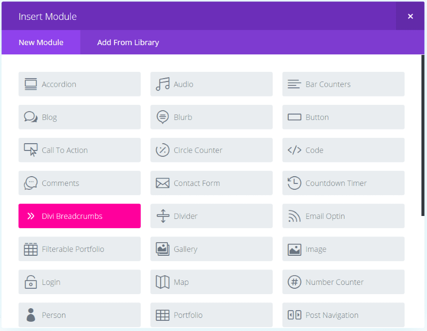
Upload and activate the plugin as normal. The module will appear in a bright red called Hollywood Cerise. Many breadcrumbs plugins require Yoast because they’re pulling their breadcrumbs from the Yoast plugin, but Divi Breadcrumbs Module doesn’t require Yoast. Instead, it creates its own breadcrumbs. So there are no other plugins required.

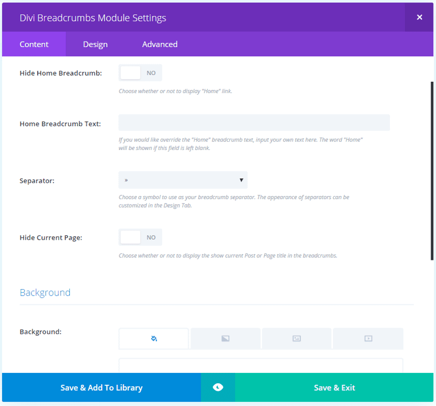
Content settings include hiding the home breadcrumb, adding your own home breadcrumb text, choosing the separator icon (from 12 choices), hiding the current page, background settings, and the admin label. Design settings include style for the icons, text, and links, and the standard spacing options.

This is a basic article layout with the post title module with image, breadcrumbs module, and the articles’ text module. I left the breadcrumbs settings at their defaults.

This is how the module looks with the default settings. The links for Home and Fencing are in blue to show they’re clickable. The breadcrumbs can be placed on the left, centered, or on the right.

In this example I’ve placed the breadcrumbs in the center and added a gradient background and increased the font sizes for both the article’s title (14 point) and the links (12 point). The text is white. Since they’re printed over a gradient I made them the same color. I also changed the line separator. In a regular post I wouldn’t draw attention to breadcrumbs with a gradient background, but this shows what you can do with it.

The best place to add breadcrumbs is at the top of the page. In this example I created a post using a fullwidth menu and set the padding and margins to 0 for both the fullwidth section and the standard section. I embedded the categories to show the hierarchy.

I changed the breadcrumb’s font colors to match the fullwidth menu, but then softened them so they don’t stand out. I changed the separator to an arrow and removed Home and the current page from the breadcrumb’s navigation.
Notice the breadcrumb’s follow the same embedded structure as the categories in the image above it. The article itself also includes those categories, but there’s no hierarchal structure. They can be removed from the title if you don’t want to show the same categories multiple times.

In this example I placed the background color in the row, made it full width, changed the color of the font so it doesn’t overpower to menu, and added 1 pixel to the letter spacing. Small changes can make a big difference.

This is the same settings using the background within the breadcrumbs module instead of the row. I added padding to reduce the width. I like that it creates a small element that looks separate but attached to the menu above it.
Styling the Separator

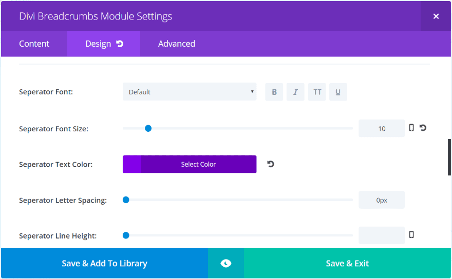
The separator also has styling features. Change the font style, size, color, spacing, and height. Between the separator options and the styling features you can easily make separators to match your website’s branding.

This example uses the default font in purple and a font size of 20 for the separators.

Here’s the same separator with a Georgia font for the separator. Simply changing the separator’s font is enough to give it a new look.

Here’s the same separator using the Black Ops One font. It’s bolder and stands out more.

This is Droid Serif at 20 point font with a line spacing of 4 pixels. I’ve made the font a dark red.

Even the dots change shape with the font choices. This one is Passion One at 24 point. It’s worth spending some time to experiment with fonts, colors, and sizes to create something unique. It’s easy to do with the standard styling controls.

Divi Breadcrumbs Module works with Extra and the Divi Builder plugin. Here’s a look at Extra with breadcrumbs below the image on the right. I included the post’s name since the breadcrumbs are so far away from the title at the top of the screen. It uses a bar separator.
Ideally the breadcrumbs would be at the top of the page. In my page layout the breadcrumbs module is at the top. The reason it shows below the image is I’m allowing Extra to display the featured image.

In this example I’ve placed the image within the layout and set the section to have 0 top padding. I removed the current post and made the separator red.
License, Updates, Support
The plugin can be installed on unlimited websites for you and your clients. Updates are for life. It includes six months of support.
- Click here to purchase: Divi Breadcrumbs Module
Final Thoughts
Breadcrumb’s are one of those little things that you notice when it’s missing. If designed correctly they’ll be there when the user needs them and stay out of the way when they do not. Divi Breadcrumbs Module is a great way to add them to your Divi pages and posts and they can easily be styled to fit within your site’s branding. It’s simple and intuitive.
If you’re interested in adding breadcrumbs to your Divi layouts, Divi Breadcrumbs Module might be the plugin you need. If you are looking for more great breadcrumbs plugins, check out our list of the top five breadcrumbs plugins for WordPress.
We’d like to hear from you! Have you tried Divi Breadcrumbs Module? Let us know about your experience in the comments below.
Featured Image via Yevgenij_D / shutterstock.com


How does the plugin play with Woocommerce breadcrumbs?
We have a company that needs to be WCAG 2.0 compliant and breadcrumbs could be an important part of the solution.
Free Plugin Update Released! 6/27/2017
v1.1.1
* Added support for Divi 3.0.53
Thank you for your continued support!
Correction: 6/29/2017
Dear Dom,
the plugin doesn’t work on custom post. The parent element gets rendered outside the section and row where it has been placed.
You can see this image: https://ibb.co/hvn94a (top left corner under logo)
Hi Fabrizio,
I have released a free update with a fix included. Your website should automatically check for the update within a day or two but you can force your website to check for the update by going to “Dashboard –> Updates” and clicking the button up top that says “Check Again”.
Please let me know if you need any help. Thank you for your support!
Is anyone else having trouble with this plugin after the latest update? The breadcrumbs show up correctly for me, but I can’t customize them at all. ???
Hi Sally,
I’m the developer of this plugin and I’m looking into this. I think it may be a conflict with Divi’s new caching. I will roll out a free update with a fix.
Thank you, Dom!
Hi Sally,
I have released a free update with a fix included. Your website should automatically check for the update within a day or two but you can force your website to check for the update by going to “Dashboard –> Updates” and clicking the button up top that says “Check Again”.
Please let me know if you need any help. Thank you for your support!
It’s working perfectly again. Thanks for the update!
hi developer of divi breadcrumb
It doesn’t work on fullwidth section.
Is it possible to add this functionality in the future?
thx in advance
Gian
PS: Have i to write request or suggestion on your site divi cake?
Hi Gian,
I will look into adding support for fullwidth section and include it in an update. If you have suggestions feel free to contact on the Divi Cake.
Hi Dom,
thx for the answer. In general my divi post and page is fullwidth and i put the breadcrumb before the title (inserted in a full widht section).
waiting for update.
thx again
Hi,
Is it possible to add the breadcrumbs at all pages at once otherwise I have to insert the module on 100 pages one by one 🙂
Hi Roel,
You can make the module or section into a global one and use them on every page that way.
This should have been a part of DIVI long ago. To promote a 3rd party plugin, that seems to not work so well with the builder, is just rude.
I have struggled with breadcrumbs and DIVI for several sites now and am not adding to my headache with yet another plugin/
This was the beauty of DIVI, not needing a ton of plugins to weigh you down and make you vulnerable.
Hi Lois,
Divi is a great product but it will never be perfect for everyone. Elegant Themes does a good job of keeping everyone happy but for times where Divi comes up short I think its great that talented developers can come up with a solution to share with others.
I’m the developer of this plugin and I’d like you to know I developed it with performance in mind. It doesn’t make any external calls or add any http requests. Meaning I can guarantee this plugin won’t weigh your site down or make it vulnerable.
It also comes with free updates for life. I hope that helps you make a more informed decision. Cheers!
dom it doesn’t work on fullwidth section. Is it possible to expand this functionality in the future?
thx in advance
gian
You have to be very careful buying all these plugins.
I bought AC Shortcodes to Ayanize. I have tried to contact them by all means to support, but never answer anyone. It’s a ghost business. 🙁
Hi Francisco,
While I can’t speak for the developers of AC Shortcodes, I can promise I will be responsive to your potential support requests. Feel free to contact me via my website or email me at [email protected] if you have issues.
I love this! It is perfect! It really should be native in extra and divi.
A lot of times I don’t agree when someone but says this or that should be included in Divi, but in this case, I definitely agree.
breadcrumbs are critical to good SEO.
Randy,
I wish you had STARTED this post with an illustration of breadcrumbs. It’s not until 12 paragraphs in the blog that I get to see what it is we are learning to make. But I saw the modules and all the details. Seems backwards to me.
Thanks for this. You’ve given examples for posts with category based breadcrumbs. How does it work for pages?
I just bought it and tried it with a page and it shifted my sidebar to the bottom 🙁
Did anyone have success using this plug in on pages (and not just posts). I don’t want to waste time and money if it won’t work.
Hi Laryssa,
Could you email me the details including a link to the page? I will help you get this resolved. My email: [email protected]
This seems to be something that should be native to Divi and Extra for sure, I like to keep the plugins to a minimum to help keep load times down and to keep from running into conflicts with 3rd party add-ons.
at first place the title itself is deceiving- ‘Divi Plugin Highlight’ – is it part of divi plugin. i dont know why ET is doing so ..
Hi Siva,
just my humble opinion, but I don’t see anything wrong or deceiving here, since there are many Divi plugins by third-party developers, not just by ET themselves. Among all these Divi plugins, Randy highlights and reviews selected ones in this series, so why not call it “Divi Plugin Highlights”? 🙂
Hi Michael,
I developed this plugin and I’d like you to know I developed it with speed in mind. It doesn’t make any external calls or add any http requests. I also designed it to be conflict-free and comes with free updates for life. I hope that helps you make a more informed decision. Cheers!
Hi Dom,
Your above feedback includes important license information that I am actually missing in quite a few Divi third-party shops and, alas, also at Divi Cake. As I can’t find any license related info on the product page, I turn to the “Licenses” link at the bottom of the product page. It doesn’t help either, since obviously none of it applies to this product, as Randy’s info and your comment above show.
Having to search for precise license information (even more so not finding any :-)) is really something that irks me in quite a few Divi related shops. It’s a pet peeve of mine and I would like to inform you and other sellers of Divi related products, who might be reading this, that missing or unclear license details on a product page are definitely a hindrance to my happily buying more of these products.
In a commendable way, Randy always includes this precise info at the end of his plugin articles (see above), but, as a potential buyer, I really expect these details in an easily accessible place and in an unambiguous way on each product page of a shop. It’s a very important requirement for commercial trust building.
Apart from the missing license details, I really like your new Divi resource portal and I wish you good luck!
Hi xtradivilove,
Thanks for your kind words, they mean a lot. I take your feedback to heart and will figure out a way to improve that in the future. If you have any other feedback I’d love to hear it. You can send it to [email protected] Cheers!
Hi Dom,
Nice to see your positive reaction! Much appreciated.
Thanks… Just purchased it!
Does this work with LearnDash? I purchased this plugin the other day but while it adds the name of the LearnDash course/lesson, it does not make that text a clickable link. Am I doing something wrong, or is there a way to make this work? I really dislike the breadcrumbs option that comes with Uncanny Owl and was hoping to use this solution!
Hi Angela,
I’m not familiar with LearnDash myself. I can take a closer look if you’d like to email me the details here: [email protected]
I’m glad to hear you find this easier than the Uncanny Owl breadcrumbs.
Okaaaaayyy… I just installed this and activated it. It’s there in my plugin directory, but it doesn’t show up in the Divi builder. I can’t find any help or support on their site. Hmmm.
Ah. It doesn’t work in the visual builder. Nice of them to tell us that. 🙂
Hi Sally,
At this time, not many third party Divi Plugins have visual builder support. It’s something we’d like to add in the future as Divi grows and the documentation supports visual builder tweaks officially. The plugin includes free updates so it’s possible it will be included in the future.
No problem, once you know it. I have it installed and it’s working great. Easy to customize, lightweight, looks good.
This module is better than Yoast for a few reasons. Yoast doesn’t have a shortcode, it requires PHP.
This module has Divi settings for fonts, colors, breadcrumb separators, etc.
Some people don’t use Yoast on their site at all.
I may take a look at this, but what separates it from just using a yoast breadcrumb which is simple to implement.
Interesting Dave! How do you implement the Yoast breadcrumbs in a Divi site? Yoast doesn’t have a shortcode to add it.
Yoast does have a shortcode: [wpseo_breadcrumb]
Well we do have the Surbma – Yoast Breadcrumb Shortcode plugin we could use for that.
That’s great for static pages that are built with Divi, but those breadcrumbs won’t appear in standard posts or category pages, which will mess with the consistency of your user experience.
Better off using Yoast’s breadcrumbs code and styling it to fit. And you’ll save $15! 😀
In the first example, what is a post title module? How was that styled please?
I took this directly from the Elegant Themes documentation.
“The Post Title Module displays the title of your current post, and optionally the post Featured Image and meta data in an elegant fashion.”
It is really handy for pages too, because it will display the title of the current page.
Hi Chris. It’s a Post Title module, then Divi Breadcrumbs, followed by a Text module.