Divi’s blog module allows for all kinds of customizations. Aside from its standard adjustments, such as layout, font styles, borders, overlays, content, etc., you can adjust it even further with CSS. What if you wanted to change the look and add some features without having to code your own? A third party plugin called Divi Custom Blog Module might be what you need.
Divi Custom Blog Module (now called DTS Blog Module Pro) adds a new module to the Divi Builder that provides new styling and features including social media tags, background colors for meta and categories, and more. It works in both full width and grid layouts. Add your own CSS to customize it even further. It adds 12 new customizer options so you can adjust colors in real time. It also includes three new widgets to place in your sidebars.
In this article we take a look at the Divi Custom Blog Module plugin and see what it can do. I’ve created a few sample blog posts so we can see how it works. The images for the blog posts are from Unsplash.com.
Installation and Settings
Upload and activate the plugin just like any premium plugin. Once it’s activated you’ll find a new menu item in your dashboard called Divi Custom Modules.
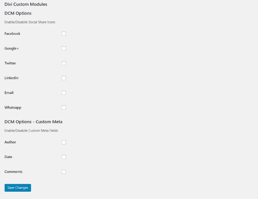
This menu lets you choose the additional items that can be added to the blog snippets.
DCM Options allow you to enable or disable social media and email icons that are displayed on the blog snippet.
DCM Options – Custom Meta allows you to enable or disable custom meta fields for author, date, and comments.
I’ve included all of these options within my examples.
Creating a Blog Layout
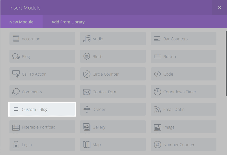
I created a page to display my sample blog posts and placed the module. Notice there are now two blog modules – the original Divi module (simply called Blog) and a new module called Custom – Blog. Select Custom – Blog.
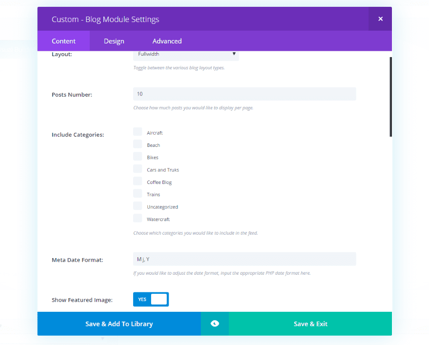
All of the blog features that you’re used to are here including layout, post number, categories, meta, pagination, offset, featured image, image overlay, font styles, borders, icons, etc. You can set up the blog layout and design it the same way you would the standard Divi blog module with the same level of control.
To help us see the added features I first want to show the standard blog module. I’ve selected a grid layout and left everything else at default. It includes the featured image, name of author, date, category, number of comments, and a snippet of the article. It’s clean and looks great.
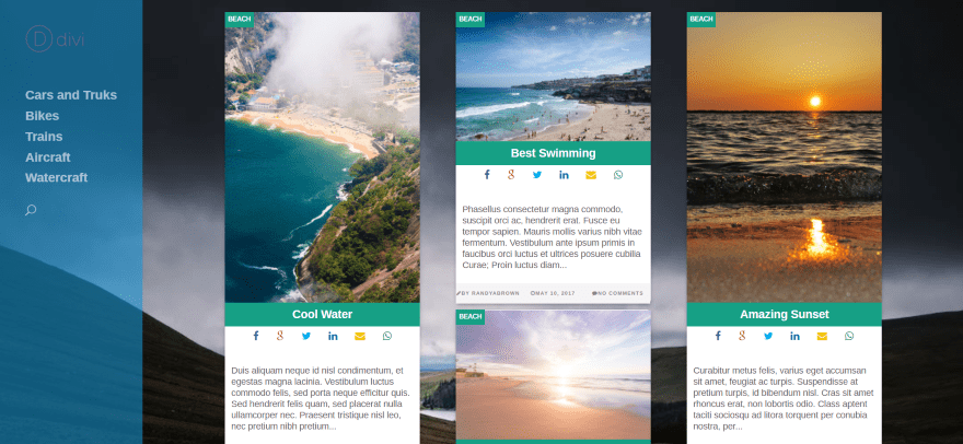
Here’s the blog layout using the Divi Custom Blog Module with the same settings. It moves the category name to the upper left corner, centers the post name and places it within a colored box, adds the social sharing buttons that I selected in the dashboard menu, and moves the meta information under the post snippet.
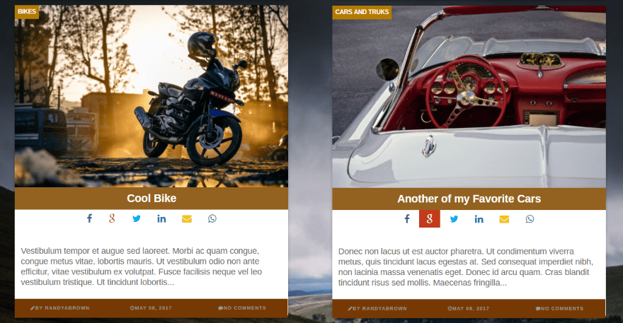
Here’s a closer view. Hovering over the social icons swaps the icon color and its background color – so the icon is now white while its background color is the social network’s branded color. In this example I’m hovering over the Google+ icon. Clicking the button takes you to that social network where you can share the article (just like any social sharing button).
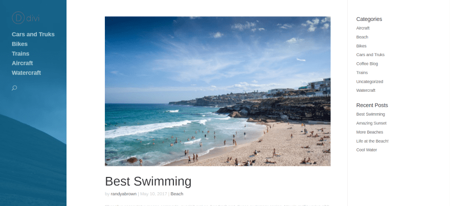
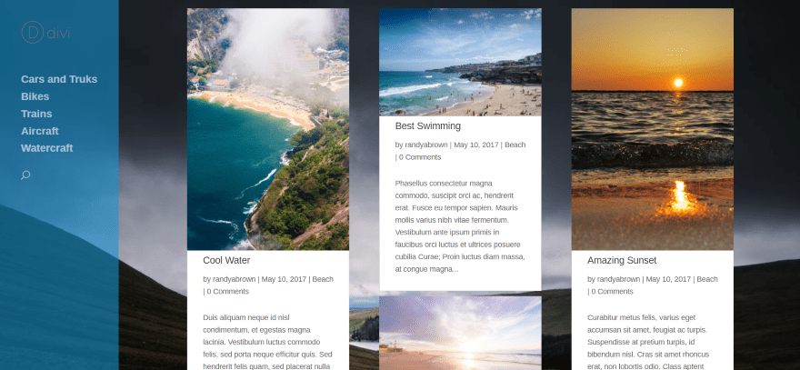
Here’s the regular homepage (not using the Divi Builder) that just displays the latest posts. It’s using vertical navigation with an image in the background, the standard WordPress posts, and regular WordPress widgets in the sidebar. I wanted to show this for comparison.
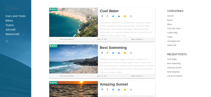
Here’s a look at the normal WordPress post layout with Divi Custom Modules active. Even though this page wasn’t built with the Divi Builder it still displays the posts using Divi Custom Blog Module in full width layout with all of the same additional content.
The posts are stacked vertically with the image to the left, the title without a styled background, social follow buttons, and snippet. The category is in the upper left corner and the meta information across the bottom just like using the module.
Three New Widgets
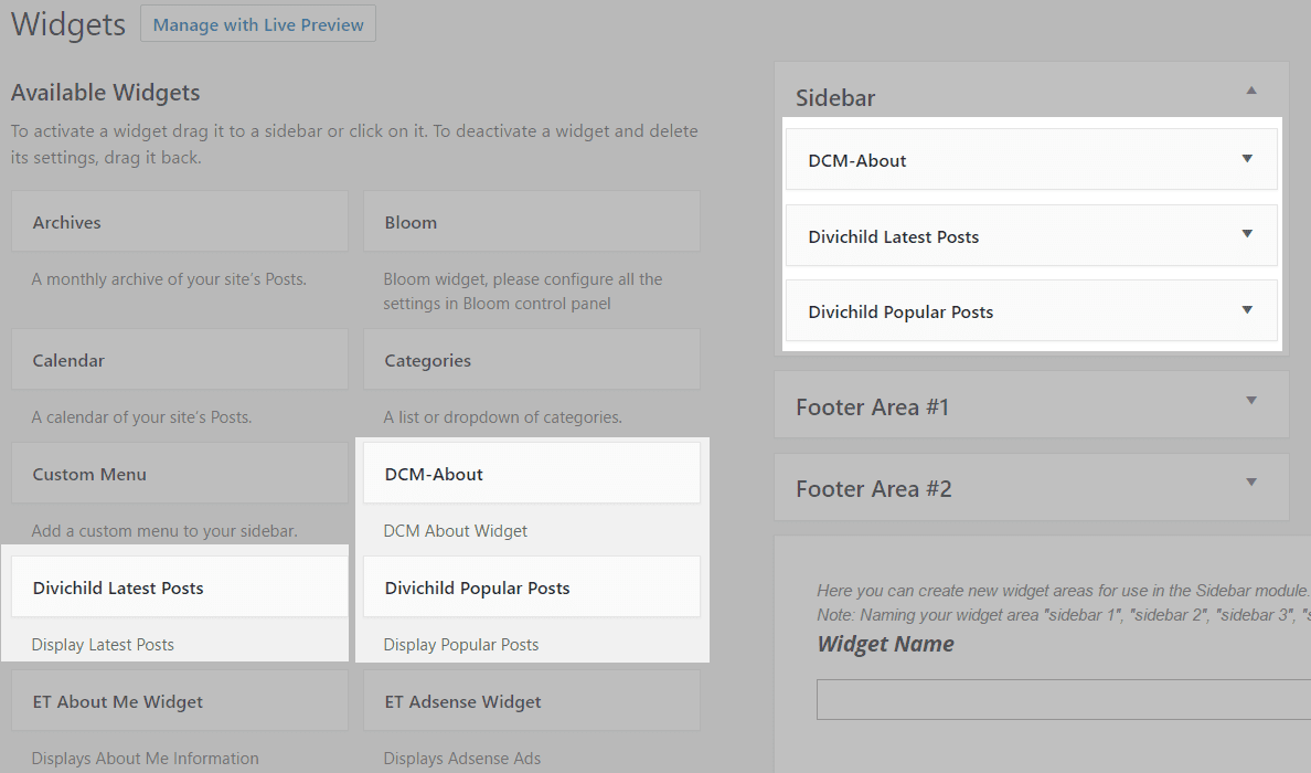
The plugin also adds three new widgets:
DCM-About – name, title, position, image, description, and social networks.
Divichild Latest Posts – title, number of posts, category.
Divichild Popular Posts – title, number of posts, category.
Like the Divi Custom Blog Module, the widgets can be styled with the Theme Customizer.
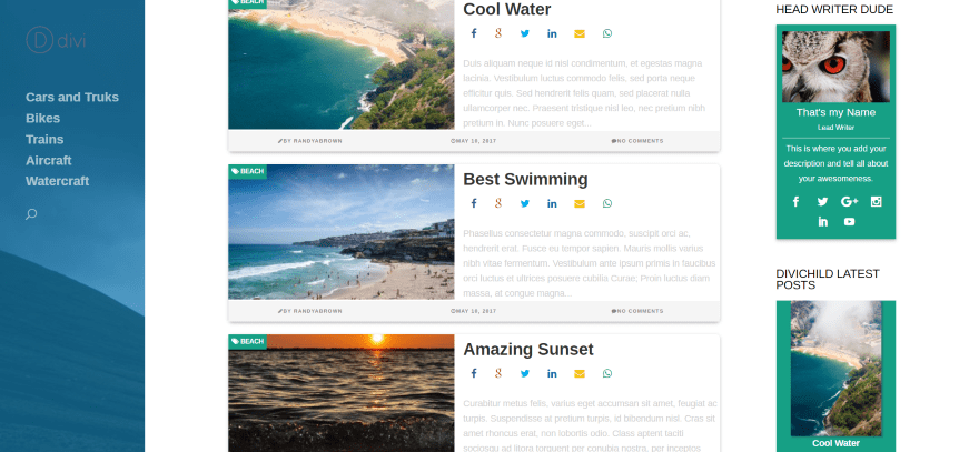
Here’s a look at the widgets when placed on the standard WordPress homepage. The widgets are encased with the module’s colors. The About widget uses a similar layout design as the module when viewed within a grid.
Theme Customizer
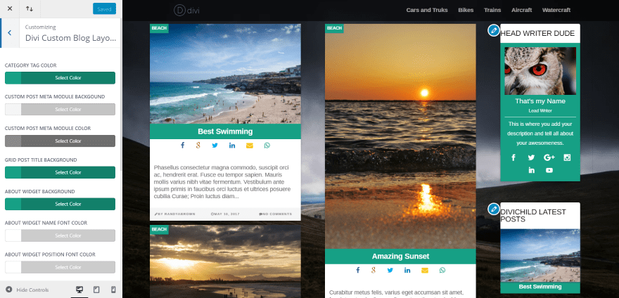
Of course the fonts and colors can be modified to your heart’s content and you can add overlays with icons just like the standard blog module. We can do even more customizations using the Theme Customizer.
A new customization is added to the Theme Customizer called Divi Custom Blog Layout. Here you can adjust the colors of the tags, backgrounds, fonts, icons, and links for the module and the widgets. You can adjust the widgets individually or all together.
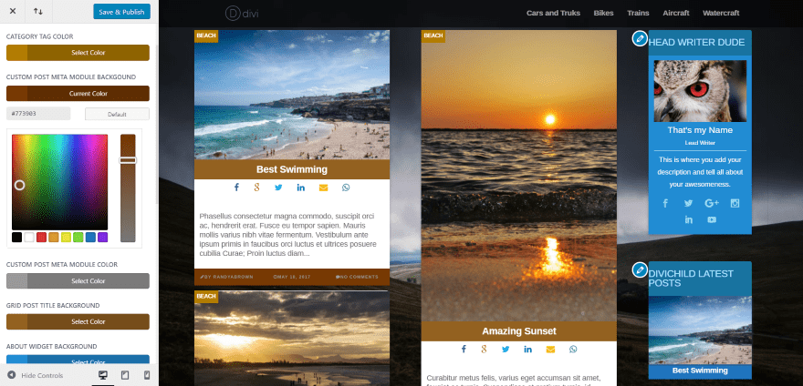
In this example I’ve adjusted the background, icon, and font colors. You can see all of the adjustments in real time.
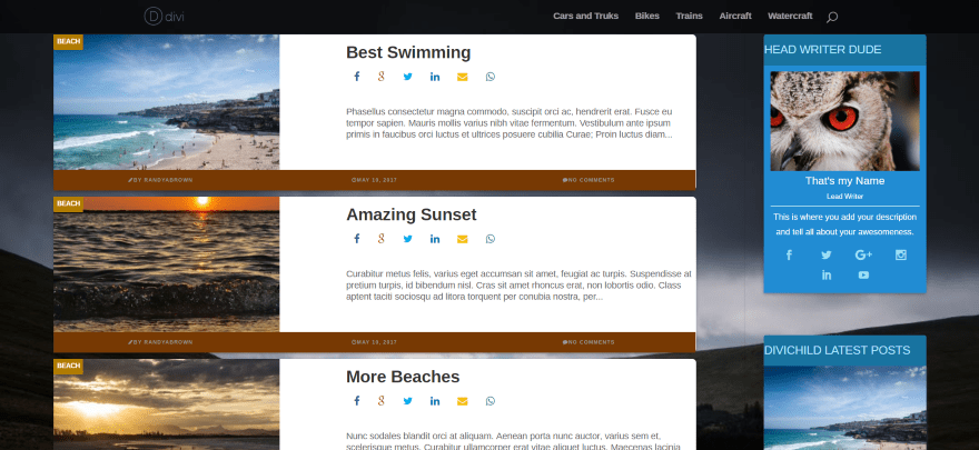
Here’s a look at the blog module in full width with all of the adjustments I made in the Theme Customizer. This one uses the full width layout. Adjustments include the category tag color, meta module background and font colors, post title background, About widget background and social icons colors, and all widgets title color.
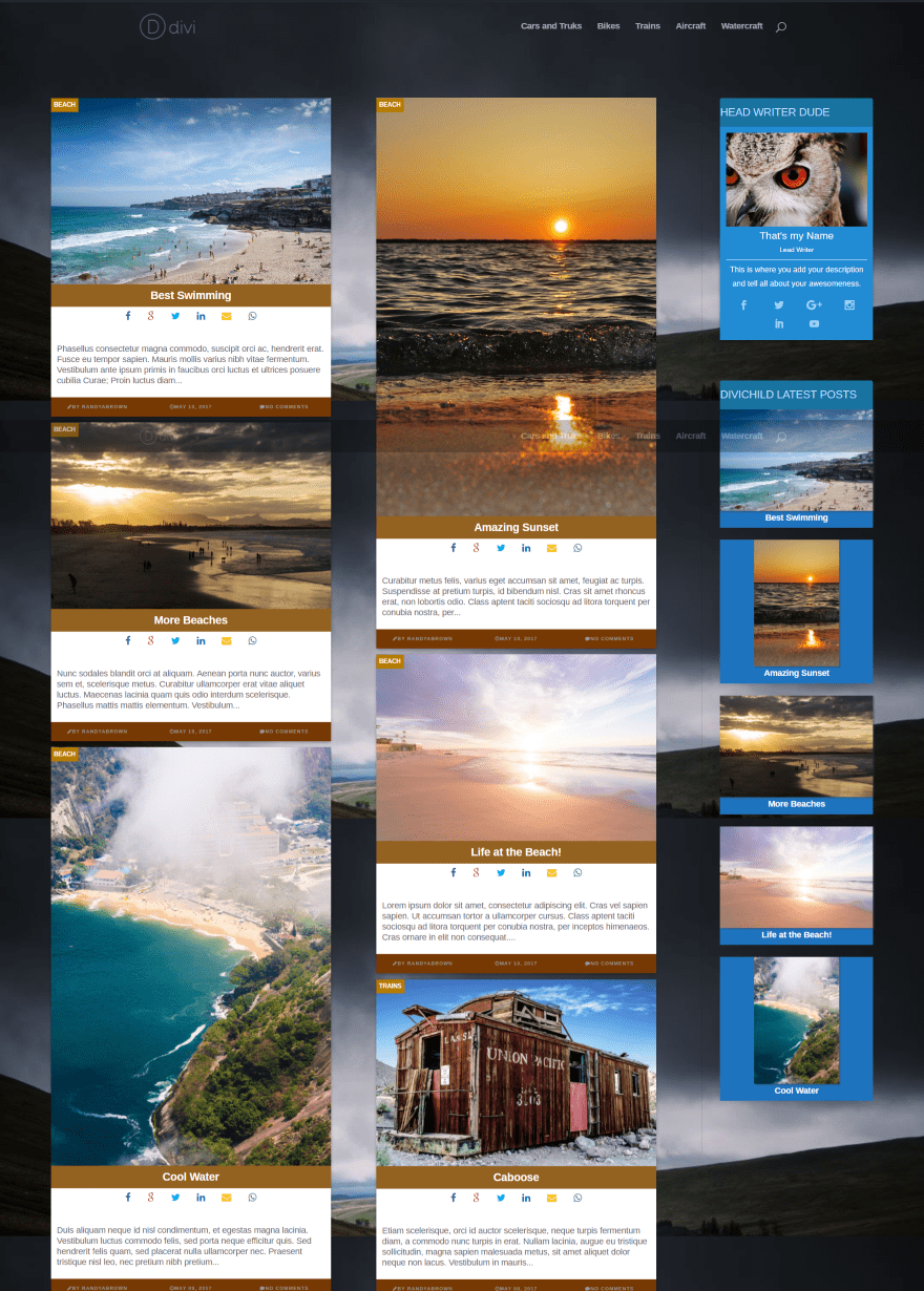
This one uses the grid layout. Both blog card styles look great.
License
The license allows for the plugin to be used on unlimited websites for you and your clients for as long as you like. Divi Custom Blog Module is so easy to use it doesn’t require documentation. If you can use a Divi module and the Theme Customizer you can use this third party plugin.
- This is a premium plugin. Follow this link to purchase: Divi Custom Blog Module
Final Thoughts
All of the additional elements give the post snippets a new look, but it isn’t just visual. The additions are actually useful. And of course you can adjust the colors and fonts to make it fit perfectly with your branding or topic.
I especially like the social sharing buttons added to each post and the About widget with social follow buttons. The Latest Posts and Popular Posts widgets add even more flare, allowing you to match the styling or style them individually.
Divi Custom Blog Module is simple, but between the module and the widgets it adds quite a bit of customization to make any blog look great. If you want to add some new features to your blog page or sidebars, this plugin is worth a look.
We’d like to hear from you! Have you tried Divi Custom Blog Module? Let us know about your experience in the comments.
Featured Image via hanss / shutterstock.com


I also have isuues with this plugin, in the module list (insert new module) the custom blog doesn’t appear at all except in the frontpage with visual builder wher it appears, but shows no parameters.
This is not a good plugin. I bought it a couple weeks ago. There is no custom meta ability at all. It the same standard non-custom meta-fields. And using a template for a CPT it breaks my site. I had to turn it off. i liked the idea of the images having a colored flag based on category.. i am not done with it yet. i need to get my 12 bucks worth.. i am gonna try to fix it. this is a well written article. and this article is the reason i bought this plugin.
Does anyone know if the Divi Theme Store is continuing to update its content? It looks like it could be potentially outdated based on their Facebook page’s most recent post. The most recent post is April of this past year.
This plugin flat out does not work as advertised. Highly advise you avoid and save your money.
Going to have to quit purchasing these. Too many problems with these 3rd party solutions. Too bad. It looked like it would be good. It is not.
Thats great.Really I like this post.But It was missing a nice blog module!
I have just purchased the plugin and having the same issues as RHFarm, however i guess its all the changes to Divi, looking forward to an update from the developer.
Very nice plugin but I would like to know how you obtain vertical featured images like the example post “cool water” and “amazing sunset”, while “best swimming” is orizontal. Which measures?
I will appreciate
thanks
Just got this plugin yesterday, however, it appears to be broken, possibly by the latest update to Divi. Installed and removed it twice just to make sure there wasn’t something failing in the loading. It won’t save the initial settings and will revert back to previous ones, and the custom blog module does not show up at all in the module lists. A simple troubleshooting FAQ would be nice, alas, there appears to be no such self-support options or forums for this plugin.
Came across this blog post this morning & thought, PERFECT! just what I need.
But! I’m having a few issues..
Custom – Blog Module Settings aren’t working for me. I select all the settings I want, preview & it looks good. Click save, the page loads but none of my changes have saved, unless I go back into the module & preview it.
I want to remove the post title & writer from the preview text but can’t for the life of me figure out where & how to do so.
Add a little padding to the preview copy on mobile & tablet view.
Centre widget headings
DCM Options – Custom Meta
Meta author auto links to the home page for some mysterious reason, where do I add a link?
How can I increase the font size?
Even worse does it look in the “full width” view!
http://prntscr.com/fe57h0
Unfortunately, this plugin is complete waste of money!
The design does not look nearly the same as in the example!
http://prntscr.com/fe56ca
I am disappointed and can not recommend it!
No offense meant, Khun, but you might be doing sth wrong or have an incompatibility with another plugin or problems with CSS etc., since it looks really nice and convincing on Ben’s website (see the post above yours). So it sure is no complete waste of money for everybody. Such sweeping judgments are a bit unjust. 😉
Currently using it on my site. Love it!
Can you show us how it looks on your site? Would be great.
Do This plugin work with Extra theme?
Got really excited about this plugin, paid my cash but … very disappointing. This so called plugin to Divi is rubbish. Won’t work with the Visual Builder at all. Looks nothing like the screen shots that are on the sample page and dose not show the meta info like it claims.
Take my advice and brush up on your CSS skills, their probably more reliable.
I would recommend you to try this: http://bit.ly/2qEN0Bf
I love this and would buy it, but there is nothing about any updates being provided.
In fact, it sounds like they don’t plan on updating it.
The plugin author states “Divi Theme Store is not responsible for any conflicts due to WordPress updates, Divi updates or third party plugin updates.”
This is problematic. Too bad. Looks beautiful.
Hopefully, Elegant Themes will add some features to the blog module. It certainly could use them.
I have to agree with Corey about the built in Blog Module. It’s a source of endless frustration because it’s so limited…. and it’s on a blogging platform!
Really hoping that the Blog module is one slated for a rethink in the upcoming Divi updates.
Hi Corey,
I hope you are having a good day!
I’m the dev of this plugin and owner of Divi Theme Store and we provide constant updates to keep everything running without problems, this week i’m working to provide updates for 2 of my plugins.
We and other devs need to inform this terms because it’s impossible to secure compatibility with all wordpress plugins and many users update their sites without check if the latest versions of their themes, plugins
and even the wordpress installations are working well and are free of bugs. Unfortunally we cannot control this kind of issue.
I hope you understand ^^
Fell free to contact us on our site if you have any question!
Best Regards!
One thing I still can’t figure out how to customize: the standard Blog post layout has both the Post’s title wrapped in an tag, and the “Comments” header wrapped in an tag. That’s bad SEO and shows up as an SEO error on our site audit. I’d like to remove the tag from around the word “Comments” which shows up only when people start commenting on our posts. But I can’t find that option. Any thoughts?
I’m referring to H1 tags, but I put them in Brackets in my comment above they didn’t show up. I’d like to remove the H1 tag from around the “Comments” header.
Hi Randy,
I really like this “Divi Plugin Highlight” series with the detailed hands-on descriptions, very interesting and useful, thanks a lot!
If I may suggest something for future articles of this kind: A few words on who is behind the project (written either by yourself or perhaps, upon your invitation, by the plugin authors themselves) would also be very much appreciated (the more so, as in this case, if such info cannot be found on the seller’s site, either, afaics.)
This is also directed at the plugin authors presented in this series and hopefully following these blog articles. I really like to know who is behind a given project, and, by the way, I also appreciate having this kind of trust-building info before buying something online.
Thanks again for your interesting articles!
I agree. I am often wondering if there som link between the writers and the plugin authors.
Hello, i just bought this plugin and will test it.Looks promising, keep us updated with this kind of useful plugins!
This is a great improvement! It was missing a nice blog module!
Would this work on EXTRA?
This plugin looks very cool! I’m going to try it out on my next Divi project :-). Thank you!
Yes, I can use Divi Custom Blog Module for my website.
Thank you very much
it is looking good. but as usual, all the core and important awaiting customisation features getting exported to the third party paid plugins.. it is still continuing, which I feel is not good for divi business in the long run to sustain its old customers and to consider divi as the first choice with good features and friendly environment. the other side of it- its competitor is upgrading with most of the good looking and important features even in their free version..
Hummm… I kind of disagree when I give this a second thoughts 🙂
It’s good to have a rock solid theme on which we can build useful and stable advanced plugins. Trying to cover every needs other then basic in the core theme would dilute the quality and the opportunity for other developer to be creative and create plugins. More functionalities in the core product means more complexities for other developer and more potentials issues.
The strength of a rock solid theme as DIVI is the possibility of advance optimisations through plugins made by other developer which give life to the awesome ecosystem and communities that are emerging.
I’m pretty new to Divi theme but I’m more then impress by the quality and the ressources available. If DIVI was going to have everything in itself it won’t thrive as it does now and would simply be a theme among other that you find on Theme Forest.
There is nothing that you can’t do with DIVI. Simple website can be made by anybody but complexed website can also be done by agencies like me that hire good developers.
The fact that DIVI focus on the core and essence of its theme and allow other to develop tools, plugins, ressources around is a wonderful business strategy. For a simple user this may be not regarded as a good thing but I won’t be surprised that big part of the DIVI customers are agencies that are not scared of having to customized a bit using css and scripts when needed.
Anyhow what is 15-25$ for a plugin when this saves you countless hours of researching or coding ? And for agencies like me we would simply charge it to customer. So at the end, I like the way DIVI is developing it’s core product.
I agree with Mr. Prasad. Many Divi module plugins should already be a default attribute. We’re already paying for a product that should already have many of these features.
Thanks for the wonderful info on this plugin.
Does it allow for the category pages to show the posts in a grid layout too?