Find It In The Divi Marketplace
Divi Events Calendar Module is available in the Divi Marketplace! That means it has passed our review and has been found to meet our quality standards. You can visit Pee-Aye Creative in the marketplace to see all of their available products. Products purchased from the Divi Marketplace come with unlimited website usage and a 30 day money back guarantee (just like Divi).
The Events Calendar is the gold standard events calendar for WordPress. It works well with Divi, but to add it to your Divi layouts requires you to use a shortcode. Styling is done from its settings tab in the WordPress dashboard. This makes it difficult to integrate the styling with your Divi layout. A third-party plugin called Divi Events Calendar Module solves that problem by displaying The Events Calendar as a Divi module. In this article, we’ll look at Divi Events Calendar Module and see what it can do.
Installing Divi Events Calendar Module

First, install The Events Calendar plugin. If this plugin is not installed, you’ll get an error message that tells you it must be installed and provides a link to the WordPress page for the plugin (guess how I know).
For more information about The Events Calendar, see the article The Events Calendar: A Detailed Overview of the Free Version right here in the ET blog. The Events Calendar also tops our list of the best WordPress events calendar plugins.
Next, upload and activate the Divi Events Calendar Module plugin and activate it.
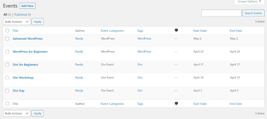
For my examples, I’ve created a set of events for Divi and WordPress with different categories, organizers, venues, and dates.
Divi Events Calendar Module
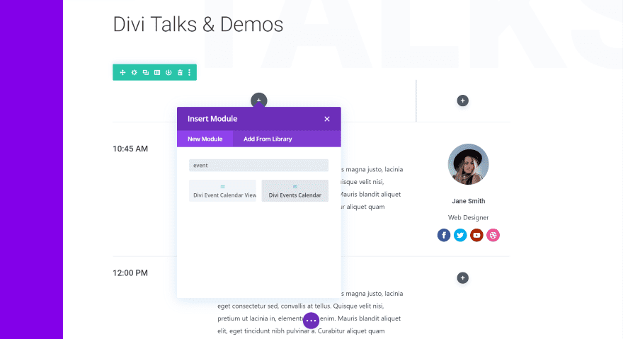
Two new modules are added to the Divi Builder. The first, called Divi Events Calendar, displays the events as cards in a list much like blog posts. The second, called Divi Event Calendar View, displays the events on a calendar. Calendar View module is still in beta. It currently has limited features. We’ll look at both modules.
For the first one, I’m using the Meetup Schedule page Meetup layout pack. I’ve replaced the events on that page with the Divi Events Calendar module.
Content Tab
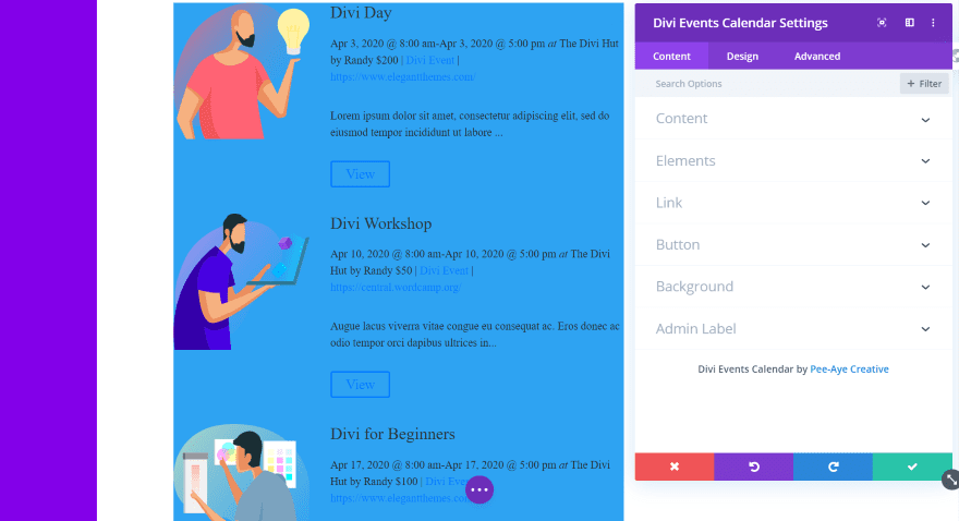
The module automatically displays the events. It includes the standard Divi tabs. The Content tab adds Content and Elements. It adds a blue background by default.
Content
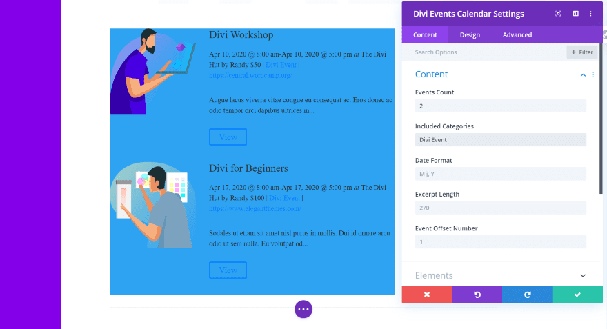
The Content section lets you enter the number of events to display, categories to include, date format, excerpt length, and the offset number. In this example, I’ve limited the events to 2 in the Divi Events category. I’ve set the offset to 1.
Elements
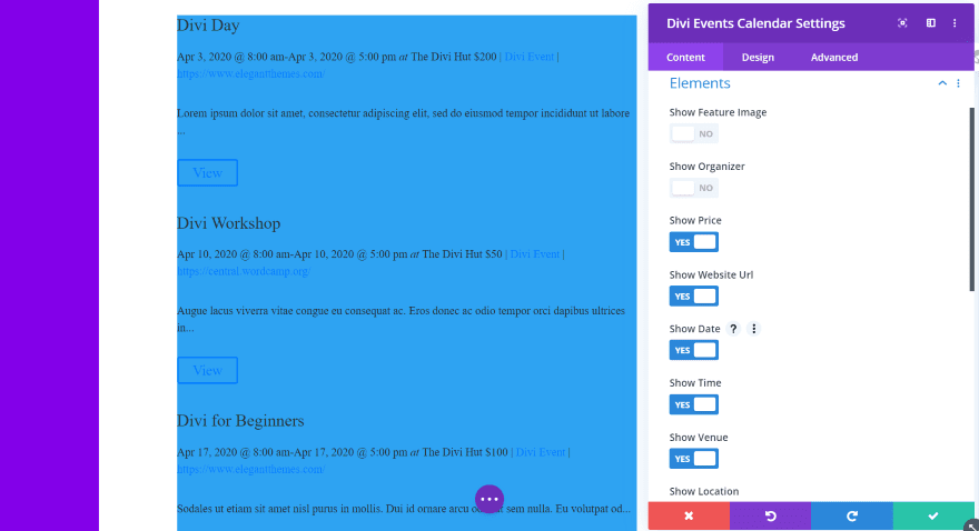
Elements allows you to choose the elements that display. This includes the featured image, show organizer, website URL, date, time, venue, location, excerpt, category, more information button, and past events (which limits the module to only show past events). I’ve set it to hide the featured image and the show organizer.
Design Tab
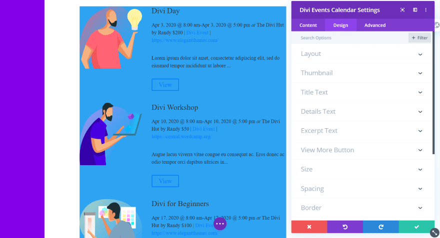
The Design tab adds options for the layout, thumbnail, title text, details text, excerpt text, and view more button. The text works the same as the regular text module. We’ll look closer at the layout, thumbnail, and view more button. Border and box shadow work for individual cards. This is something I’ve wanted to see in lots of Divi modules.
Layout
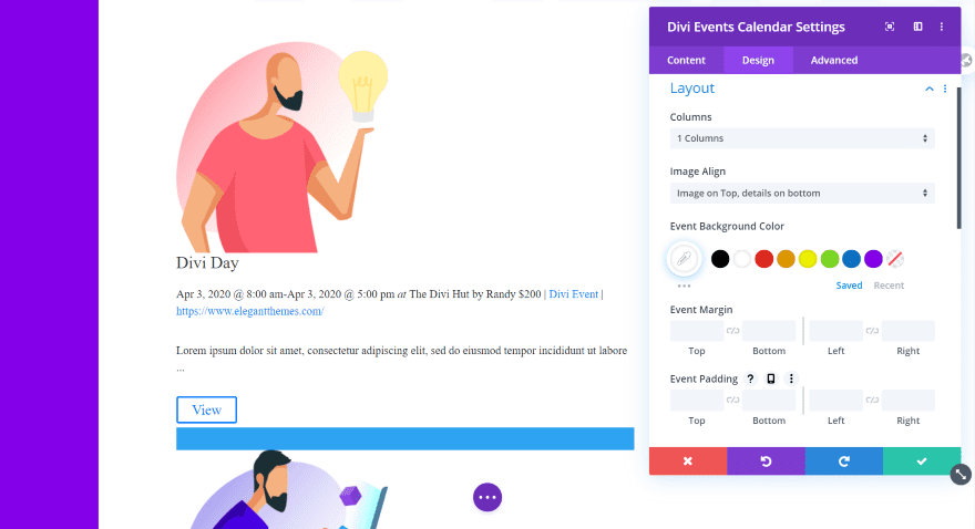
Layout lets you choose the number of columns (1-4), image alignment (left or top), background color, margin, and padding. I’ve set the image on top and changed the background to white. The blue still shows between the event cards.
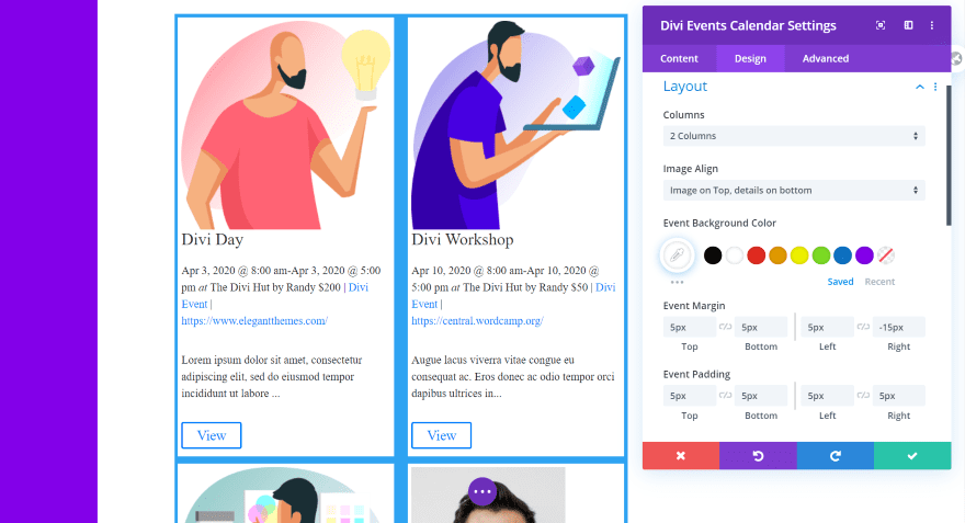
For this example, I’ve set the columns to 2 and added margin and padding to make the cards fit within the blue background, creating a border.
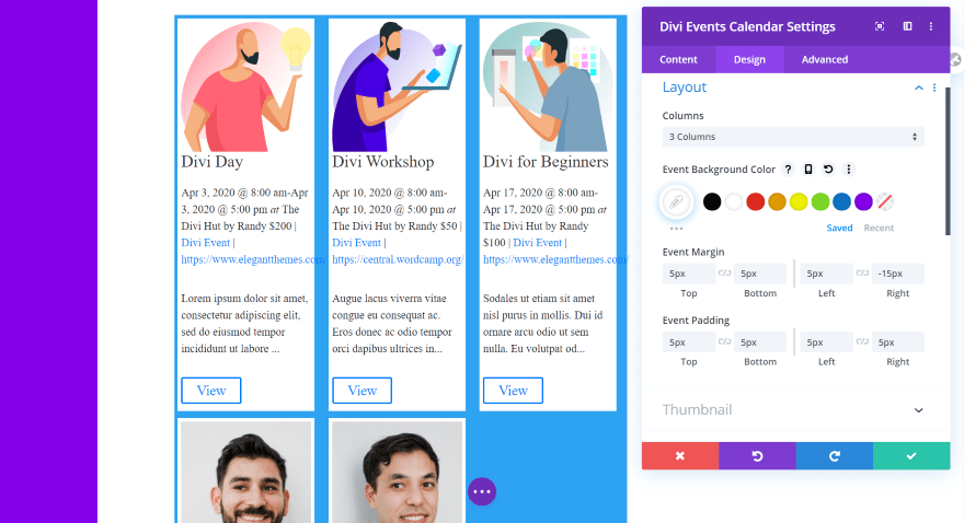
Here’s the example with 3 columns. I can adjust the URL text to fit. At 3 columns, the image placement isn’t an option.
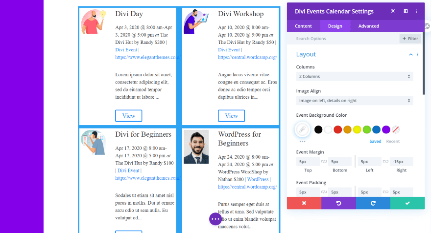
This one has 2 columns with the images on the left.
Thumbnail
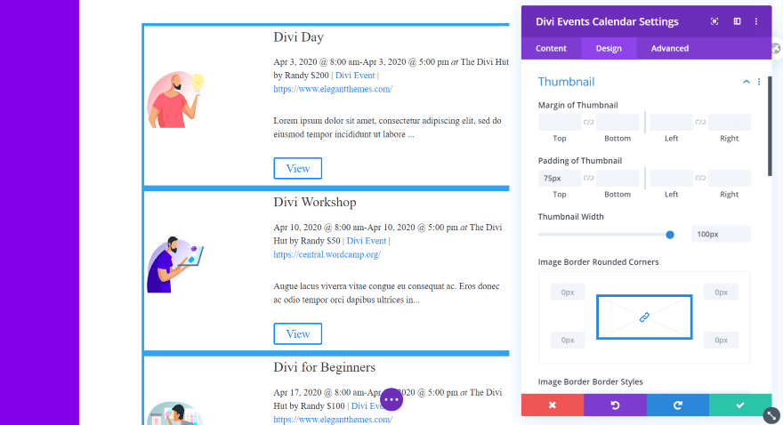
Thumbnail settings include the margin, padding, width, corners, border styles, border width, border color, and border style. In this example, I’ve set the padding to 75 to bring the image to the center of the card and the width to 100.
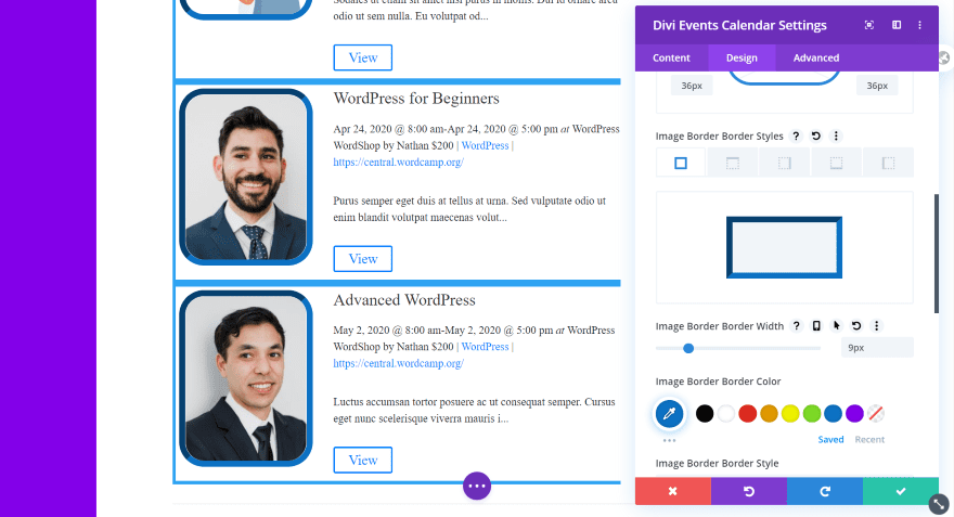
For this example, I’ve set the corners to 36px and gave it a border width of 9px. I’ve styled the border colors and gave it an inset style.
Text
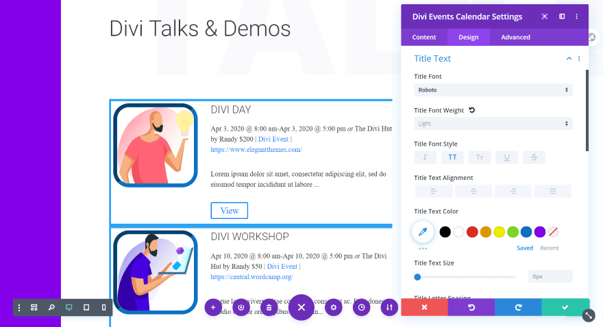
I’ve adjusted the title text to match the layout, with Roboto with a light weight and all-caps. I’ve left the excerpt and details text at default.
View More Button
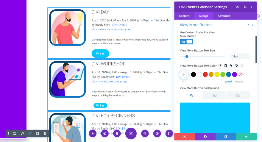
In this example, I’ve used the styling from the layout for the button. I set the size to 14px, adjusted the background color, changed the border width and radius, and selected Roboto bold in all-caps. I’ve left the hover effect at default, which increases the size of the button as you can see in the top button. I’ve also left the text at default, which says VIEW.
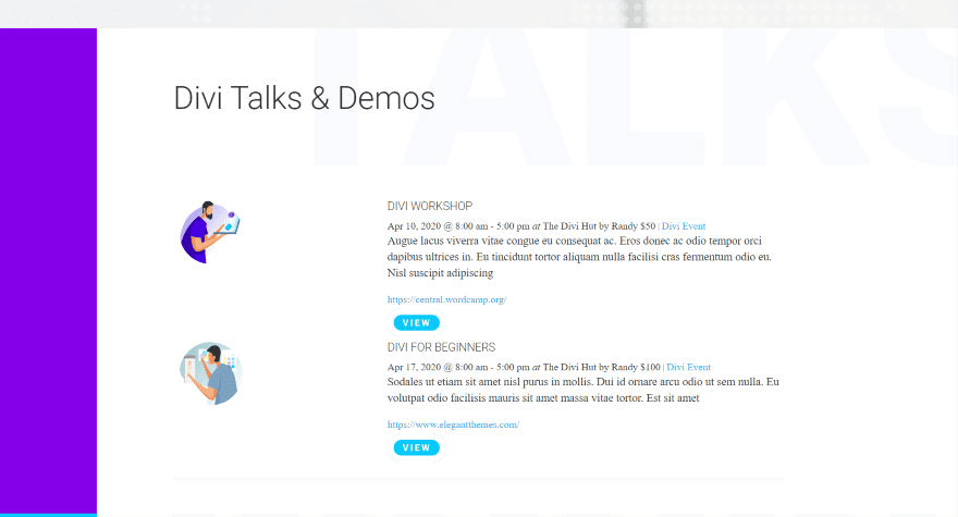
For this example, I’ve used most of the settings from the previous examples, but with a couple of modifications. I’ve removed the blue background, changed the border radius, and removed the border. I’ve also limited the categories to only show Divi Events (one of the two example categories that I created). The limit is set to 2 events.
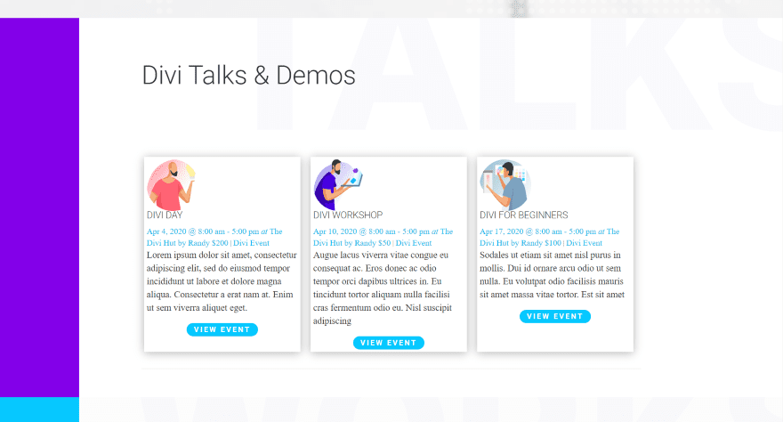
For this example, I’ve set the layout to show 3 columns. I’ve removed the button border and centered the button alignment. I’ve also removed the URL, changed the detail text color, changed the button text, and given the cards a shadow so they stand out from the background.
Divi Event Calendar View Module
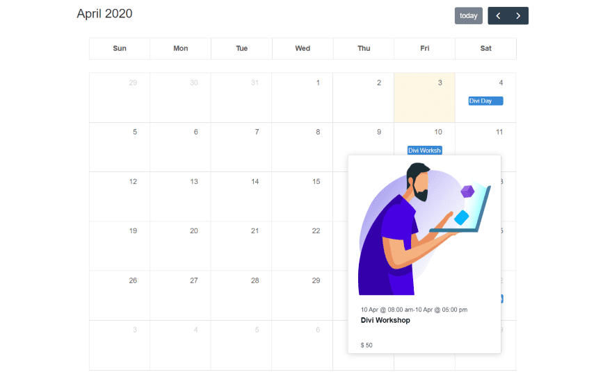
Here’s a look at the second module. It provides a calendar view of your events. The calendar includes the month, year, navigation, and it highlights today’s date. This is the Events page from the Art Gallery layout pack. Hovering over an event shows a popup with the information. This is the default view.
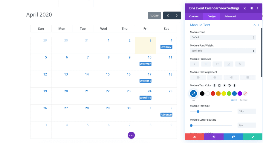
The Design tab adds settings for the module text. It will eventually include settings for the title, month, etc. In this example, I’ve adjusted the weight, color, and size of the text. This adjusts the dates on the calendar.
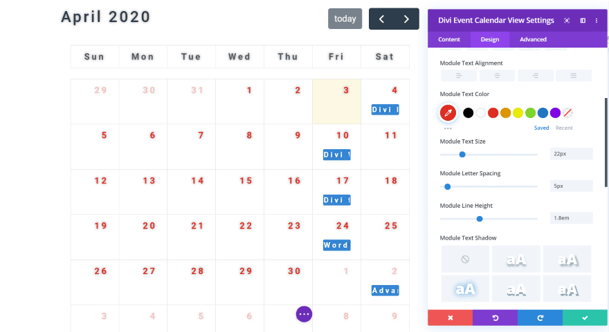
For this example, I’ve changed the font family to Roboto and adjusted the color, size, letter spacing, and line-height. I’ve also given the text a shadow to help it stand out. All of the text except for the ‘today’ button is affected by the size, spacing, and height.
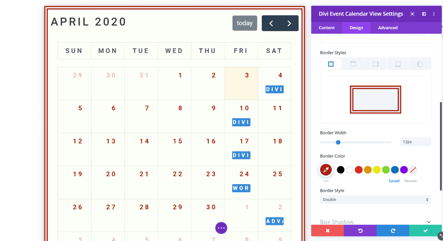
You can also adjust the border, backgrounds, box shadows, etc. In this example, I’ve set the module text to all-caps. This includes the text for the month and the day. I’ve also adjusted the background, gave the module a border (using the double border style), and given it a box shadow. The border is the same color as the text.
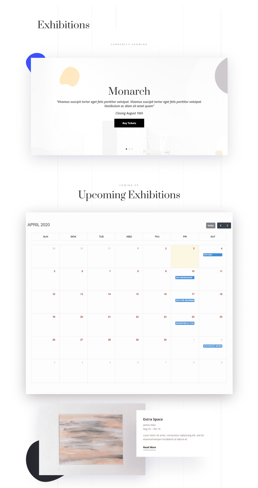
For this one, I’ve included the colors and box shadow settings from the layout. I like how it works with the layout’s design. Even with its limited amount of adjustments, the calendar view module is worth using with your Divi layouts.
Price and Documentation
You can get the Events Calendar Module from the developer’s website for $35. It includes unlimited website usage, lifetime support and updates, and 30-day money-back guarantee.
Documentation is handled with a video and a short article to step you through installation, and a couple of short articles to show how to use it and how to perform updates. I was fortunate that I didn’t need to consult the documentation (the modules are highly intuitive), but I’m glad to see that it’s available for when it is needed.
Ending Thoughts
That’s our look at the Divi Events Calendar Module plugin for Divi. The modules work just like any Divi module, so it’s easy to style your events to work with your Divi layouts. The main calendar module even includes padding, margin, and border adjustments for the individual elements within the module. This gives you control to style them as individual cards.
It does allow you to enter the categories to display if you want to have more control. This is the one thing that does work differently from other modules that allow you to select your options from a drop-down list. I do prefer the drop-down list option. This is something I’d like to see changed in the future. I’d also like the ability to choose events based on venues, event organizers, etc.
The Event Calendar itself is an excellent tool for any website. It’s useful for photoshoots, concerts, product shows, trade events, meetups, and lots more. If you want to use The Events Calendar plugin with your Divi website, the Divi Events Calendar Module plugin is well worth a look.
We want to hear from you. Have you tried the Divi Events Calendar Module? Let us know what you think about it in the comments below.
Featured Image via VectorKnight / shutterstock.com



How do you style individual event pages in Divi when using The Events Calendar?
This article is poorly written and doesn not clearly explain how to install and start using the plugin with Divi.
Hm… It’s a shame we can’t seem to style the interface buttons on the calendar. I hope they add this! I can’t even seem to pull them up in the chrome inspector.
I bought the plugin and my events do not show up (even if I check the “show past events” option). I haven’t had any news from the plugin author in 5 days. I think I just lost 35 USD.
I’d recommend getting in touch with their support before calling it a loss.
I might consider this, but right now my The Events Calendar will not work with the new block system, so I am afraid to even try it with Divi blocks. So frustrating with everything works and then because of updates it doesn’t.
Thanks for providing such a wonderful information… Big Fan!
The developer is a great guy and love to follow his work. Thanks for this post and don’t hesitate to get the plugin!
This is pure gold. I have been juggling around with this very, very NOT USER-FRIENDLY events calender in terms of styling. It has to be all done manually… some of the reasons why I use Divi, because it so extreme powerfull and easy. I def will check out this plugin!
Can you display multiple calendars on multiple pages?
For example showing just field trips on our field trips page, public programs on our programs page, and a third dedicated calendar only page. All must default to Monthly Calendar View mode.
Can you toggle between “Agenda” and other list views? I thought Timely All-in-One Calendar and WordPress in general didn’t recommend displaying same calendar in multiple places.
Wish you’d also do a post on #2 most popular Timely All-in-One Calendar. Wish I could change Timely’s default font size in Calendar View to make it big and bold enough for older peoples eyes and mobile. Love their design, but plug-in’s been problematic. May be using too many system resources and so thinking about switching to Events Calendar.
This looks great. If they keep it up it will be better than the 2 options that get most use now. Calendars tend to break over time. Thank you for posting this.
Will this plugin work on EXTRA theme also?
Our weekly newspaper is on EXTRA
Calendar would be nice