Divi Gravity Forms is a plugin for the Divi Builder that allows you to customize your Gravity Form from the Divi Builder. The plugin adds a new module to the Divi Builder with options to change the design of every aspect of the form. If you are a Gravity Form user, this plugin will help integrate Divi and Gravity Forms and allow you to change the form design just like you would any other element on your Divi page. In this article, we’ll take a look at the settings that come with the Divi Gravity Forms Module and show you how you can customize your form within the Divi Builder.
Let’s get started!
Installing Divi Gravity Forms
First, you will need to have the Gravity Forms plugin installed and activated on your website.

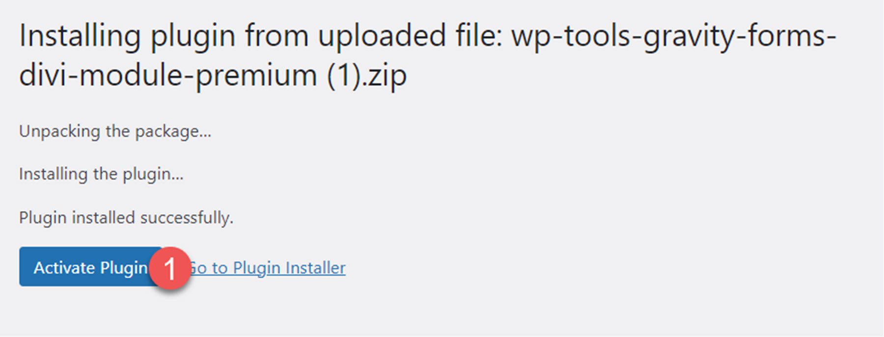
Divi Gravity Forms can be installed just like any other WordPress plugin. Open the plugins page in the WordPress dashboard and click Add New. Click Upload Plugin at the top, then select the .zip plugin file from your computer.

Once the plugin is installed, activate the plugin.
Divi Gravity Forms
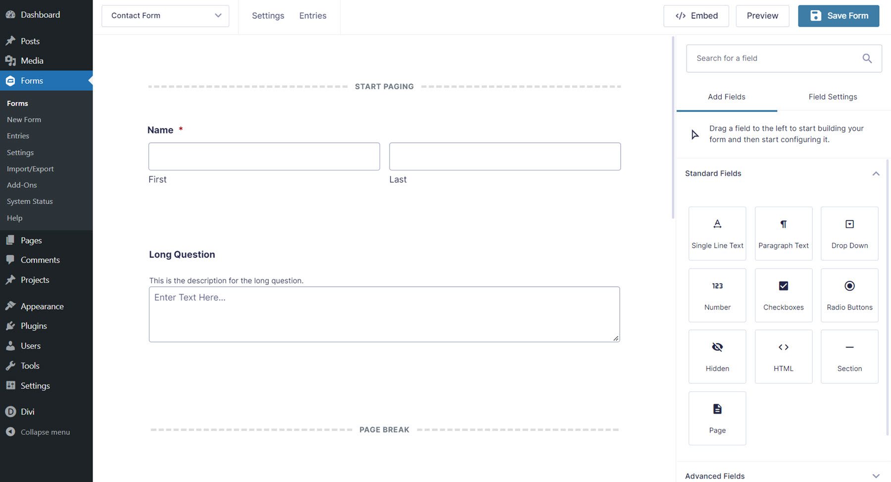
The Divi Gravity Forms plugin allows you to add and customize the Gravity Form right within the Divi Builder. To get started, you will first need to build the form within the Gravity Forms settings page. Once you have laid out the basic structure and function of your contact form, you can move over to the Divi Builder to customize the design.
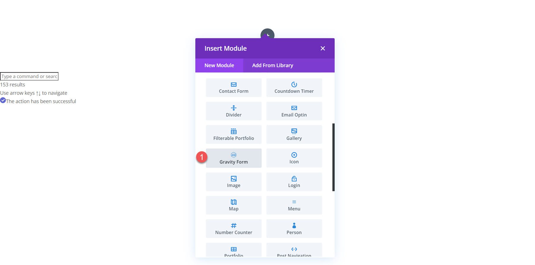
Open your page in the Divi Builder and click the grey plus icon to insert a new module. Select the Gravity Form module from the list.
Content Settings
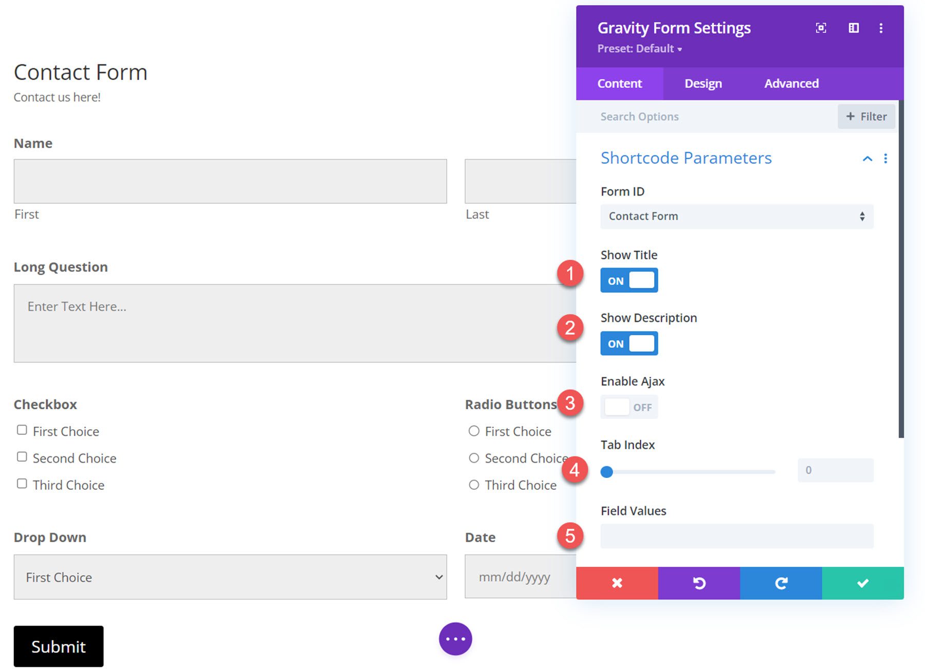
Open the Gravity Form module settings to the content tab. In addition to the default Background and Admin Label sections, the module comes with a new section called Shortcode Parameters.
Shortcode Parameters
Select the Gravity Form you would like to display from the Form ID dropdown. Once selected, your form will appear on the page.
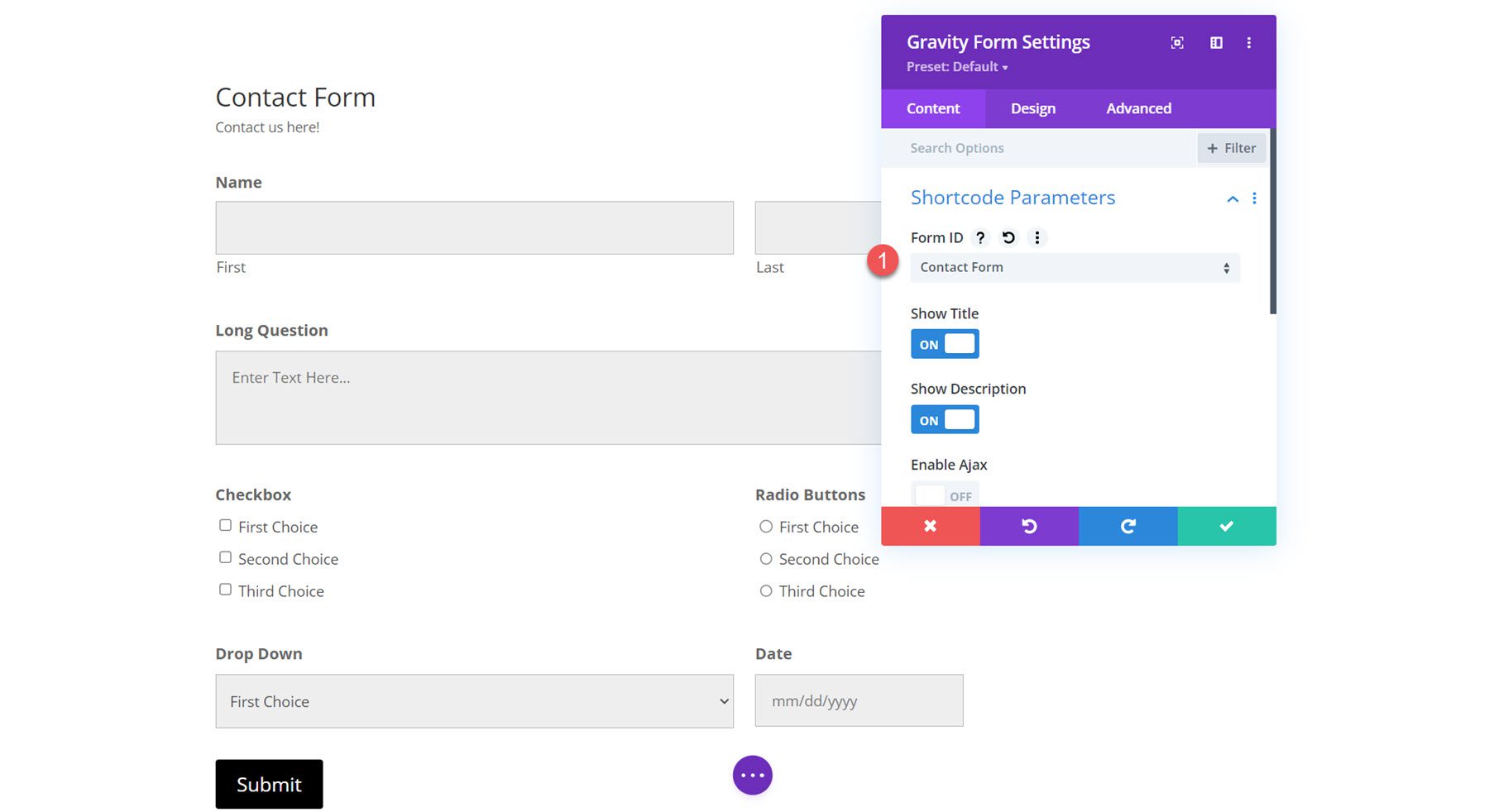
Within the shortcode parameters settings, you can also choose to show or hide the title and description and enable or disable Ajax. Additionally, you can specify the starting tab index for the form fields and specify default field values.
Design Settings
The bulk of the customization settings for Divi Gravity Forms is located under the Design tab. These settings give you great flexibility with your form’s appearance, and you can change the design of almost every aspect of your form. Let’s take a look at the different design settings you can use.
Form Titles
First is the form title settings.
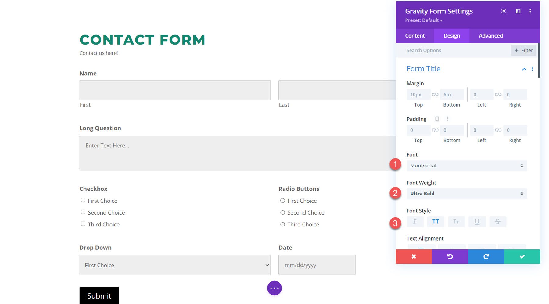
You can change the title margin padding, font settings, alignment, color, size, spacing, line height, and shadow.
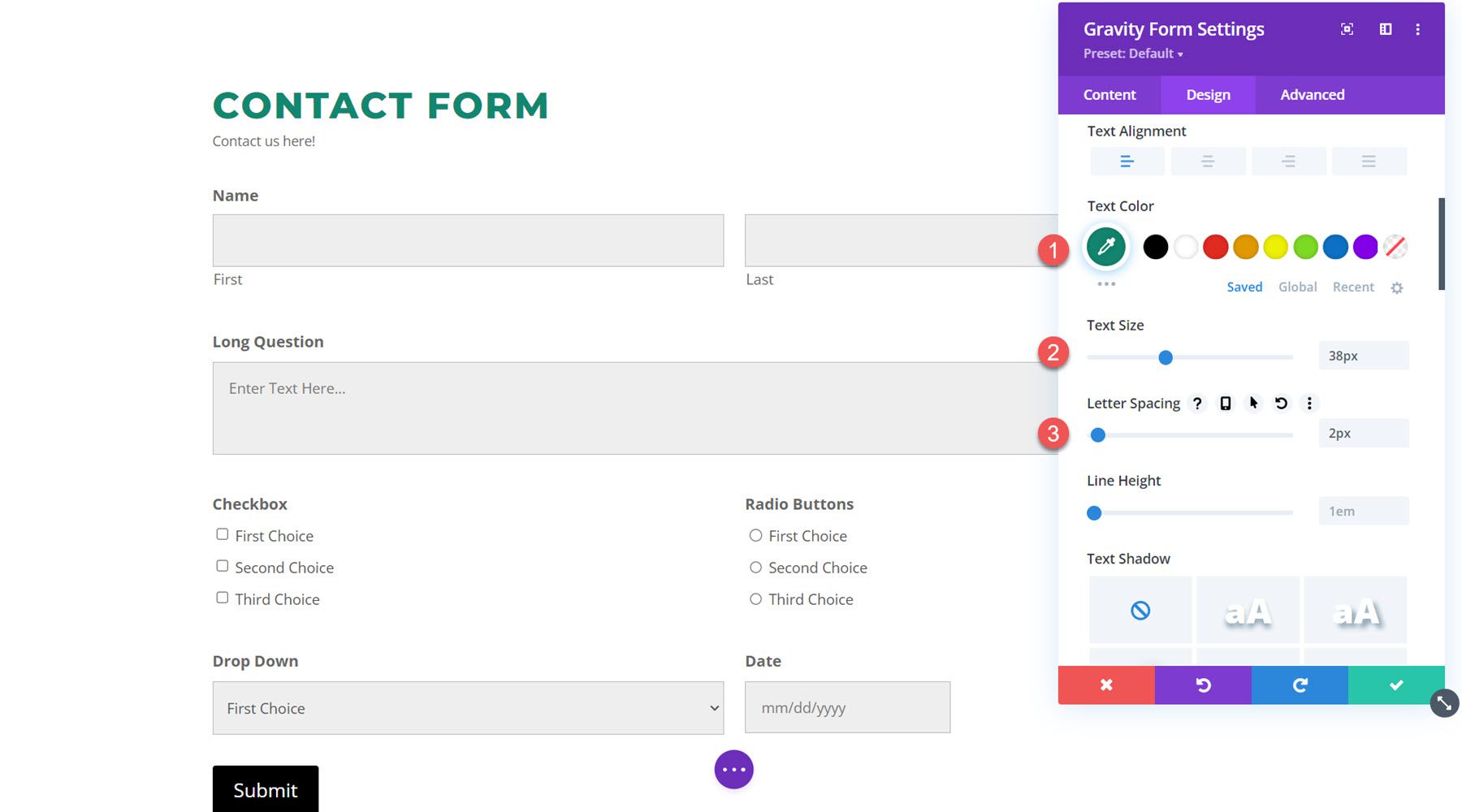
Form Description
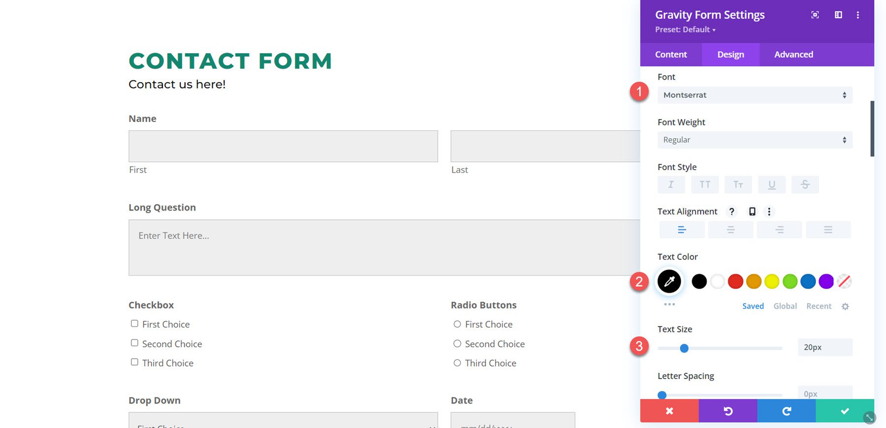
The form description settings are the same as the form title settings. Here is the form description with customized font, text color, text size, and line height.
Field Wrapper
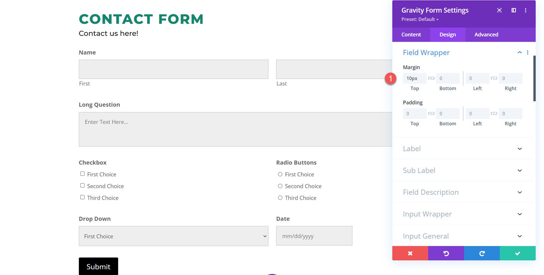
The field wrapper settings allow you to change the margin and padding of the fields. In this example, I decreased the top margin so that the fields were placed closer together.
Label
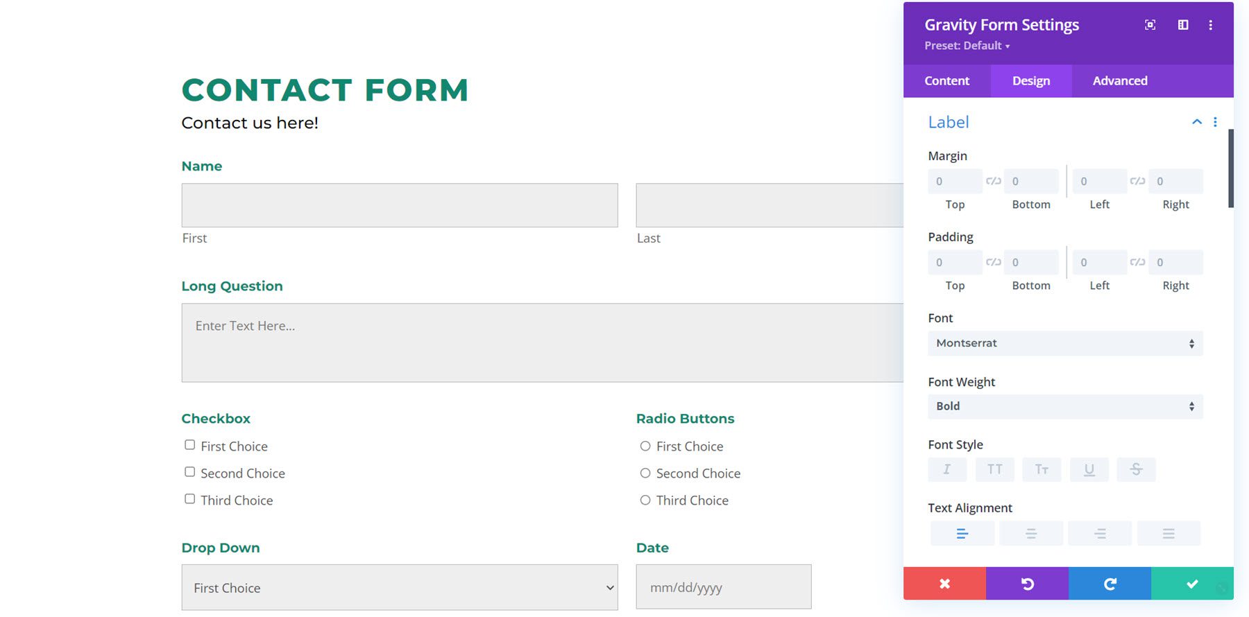
Under the label tab, you have all of the default text customization options. I customized the label font and changed the text color to green.
Sub Label
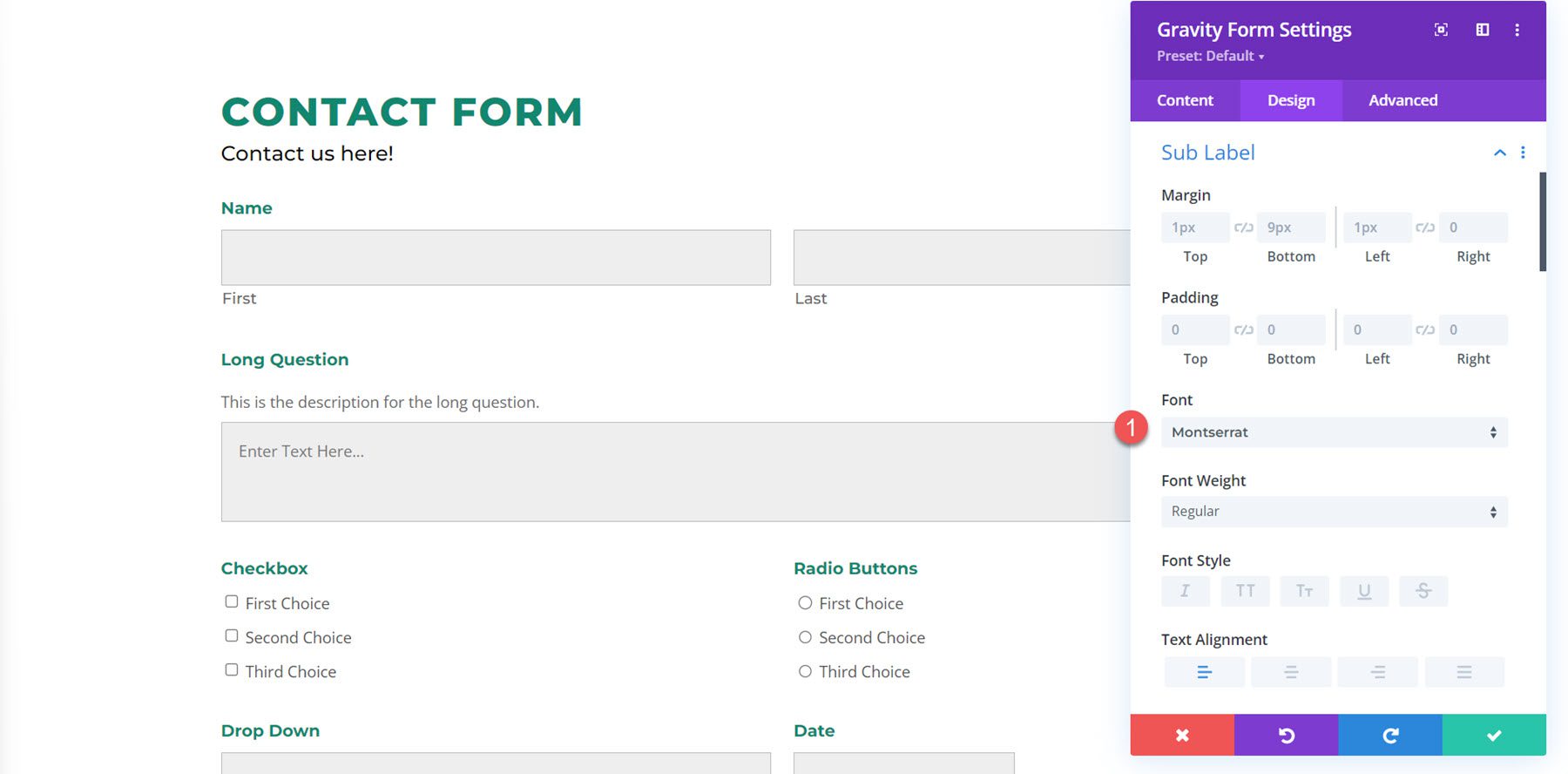
The sub label settings also feature the default text design options. In this example, the sub labels are the “First” and “Last” text labels below the name fields. I customized the sub label font.
Field Description
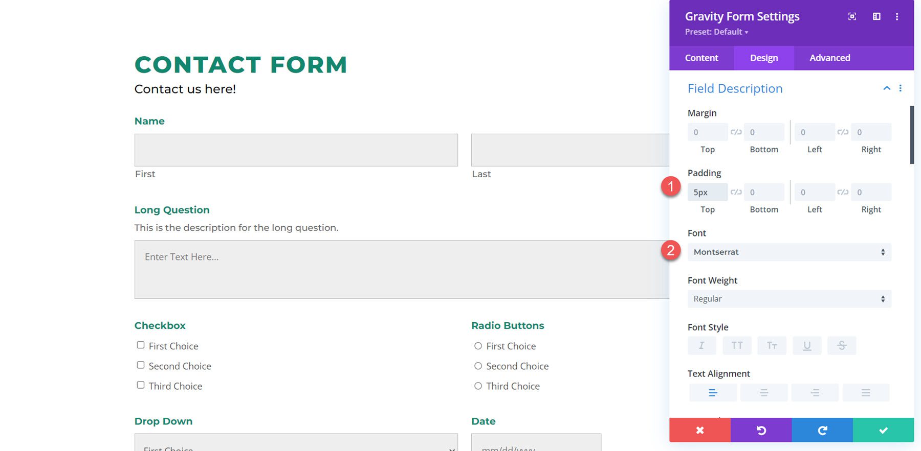
The field description example is located above the Long Question field. Here I decreased the top padding to bring the text closer to the label and changed the font.
Input Wrapper
The input wrapper settings allow you to change the margin or padding around the input box. In this example, I decreased the top margin, bringing the input box closer to the label and description.
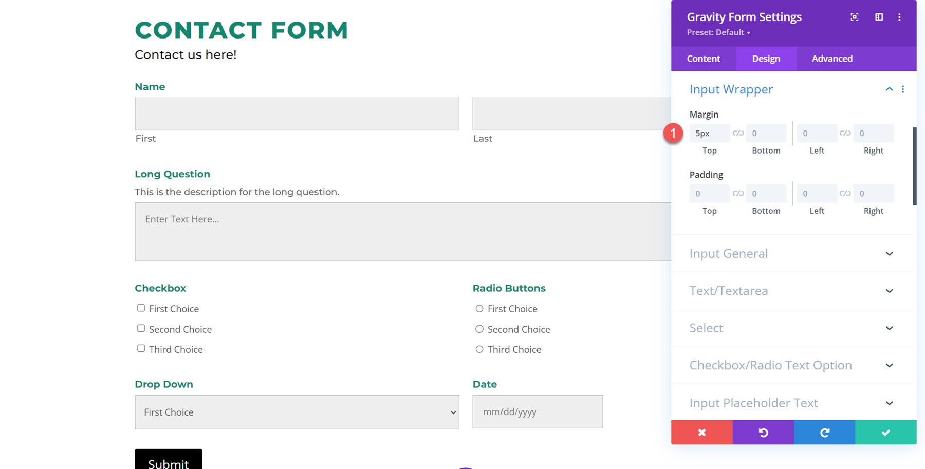
Input General
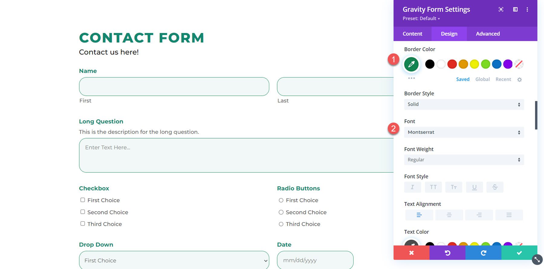
The input general settings section is where you can completely customize the design of the input box. You can modify the background color, add rounded corners, change the border, and completely customize the input font settings.

Here I added rounded corners, changed the input background color, changed the border color, and changed the text font.
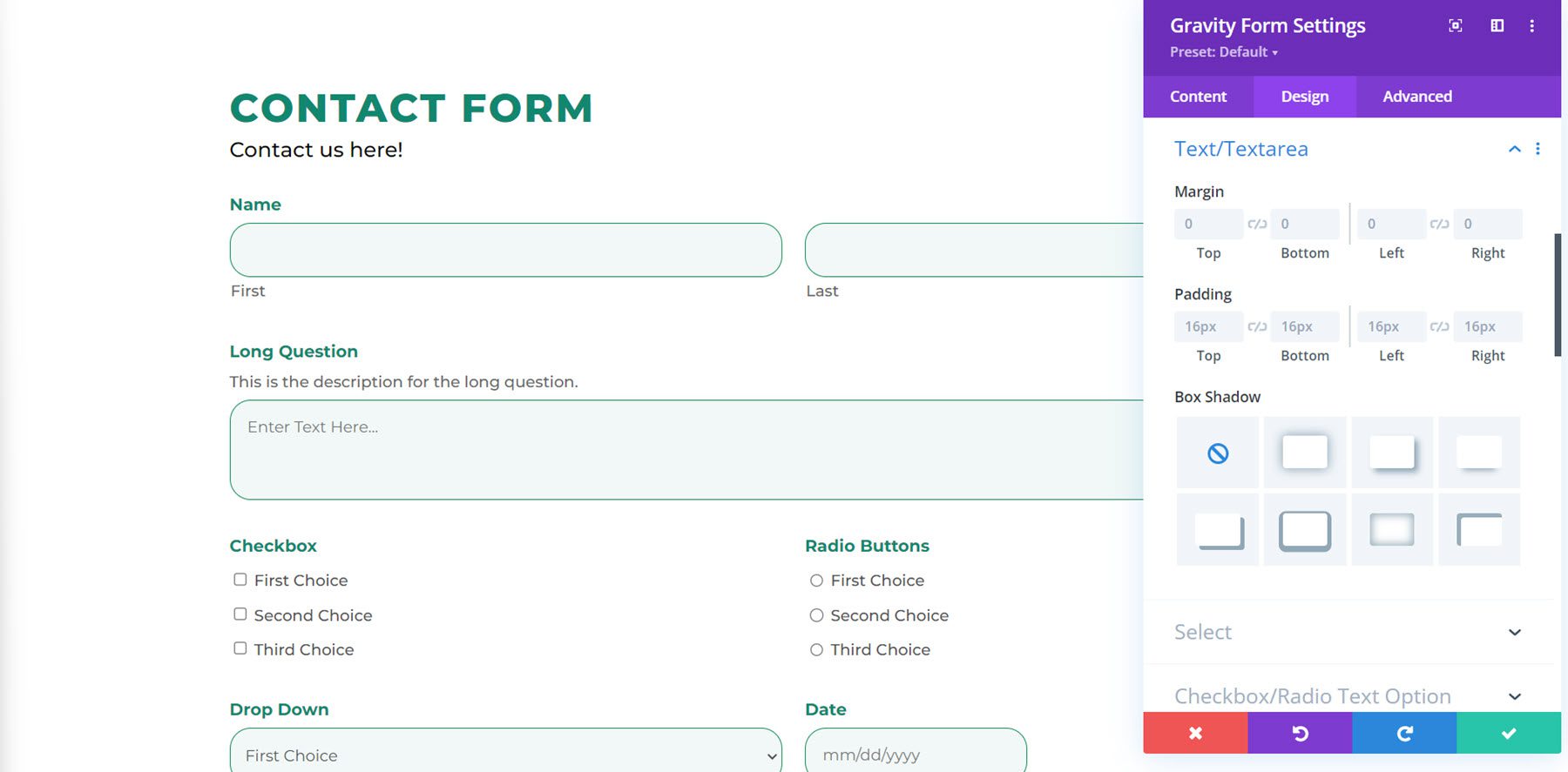
Text/Textarea
In the text/textarea settings, you can change the margin, padding, or add a box shadow to the fields.
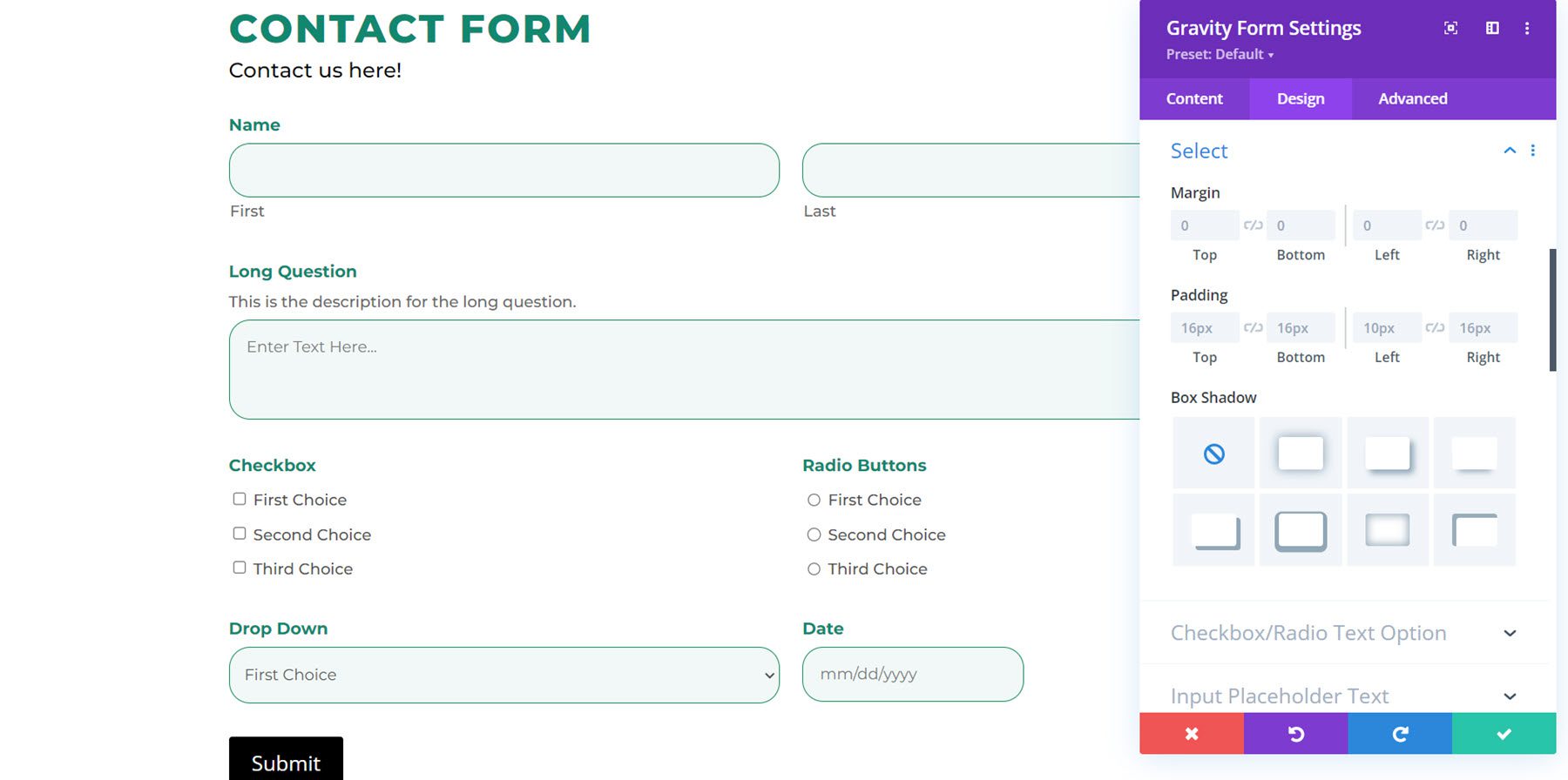
Select
The select section has the same settings as the text/textarea section. You can customize the margin, padding, and box shadow to your select fields.
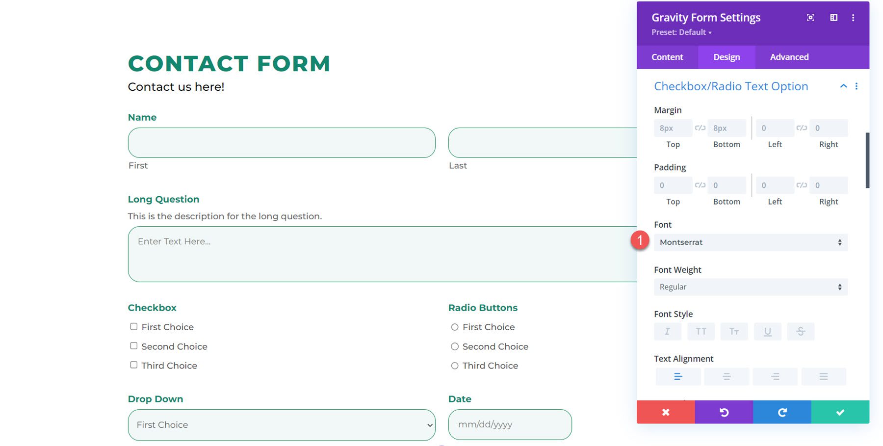
Checkbox/Radio Text Option
Here you can change the margin and padding, and customize the font for the checkbox/radio text option. I customized the font in this example.
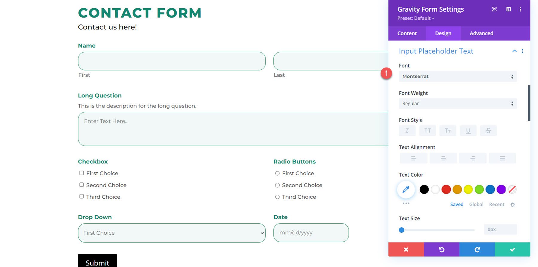
Input Placeholder Text
You can customize the font settings for the input placeholder text here. I changed the font to Montserrat.
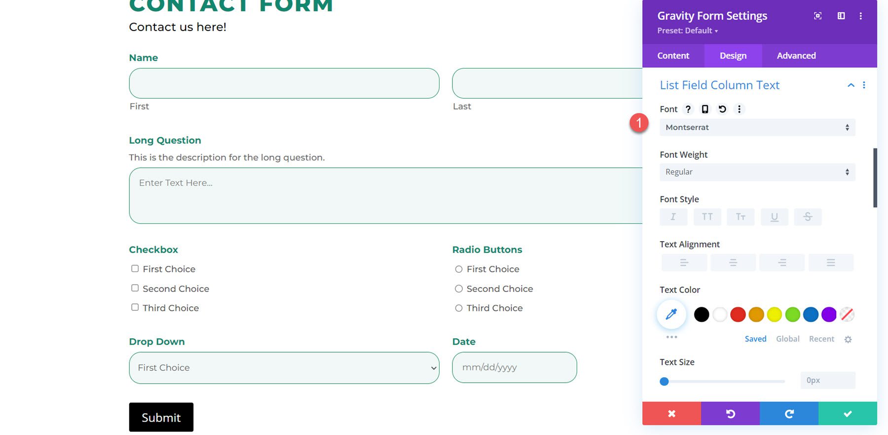
List Field Column Text
Same settings here as the input field text section. Once again, I customized the font for the list field column text.
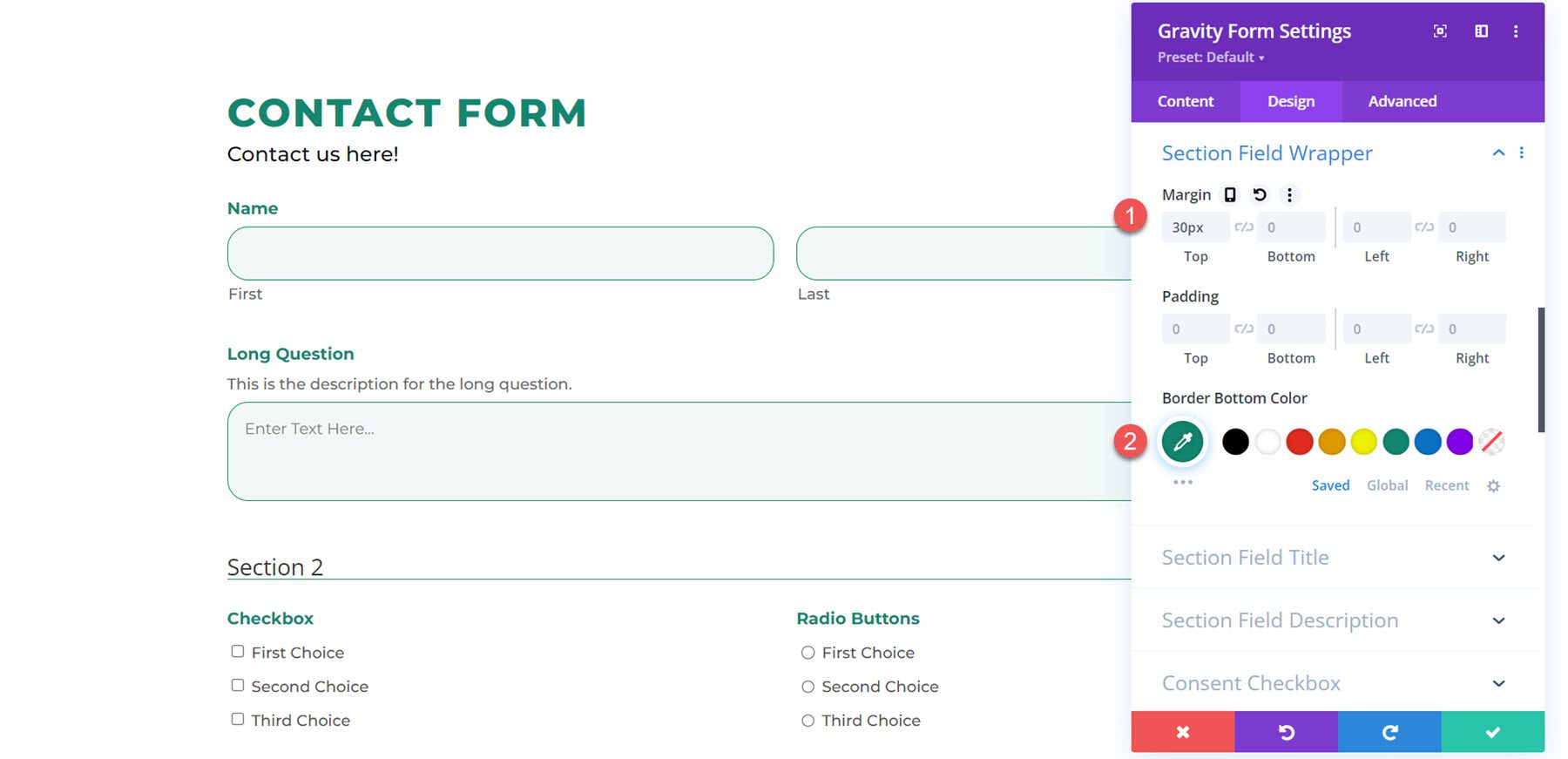
Section Field Wrapper
The section field wrapper settings allow you to change the margin, padding, and border bottom color. I added a section to my form and added a top margin and changed the border bottom color.
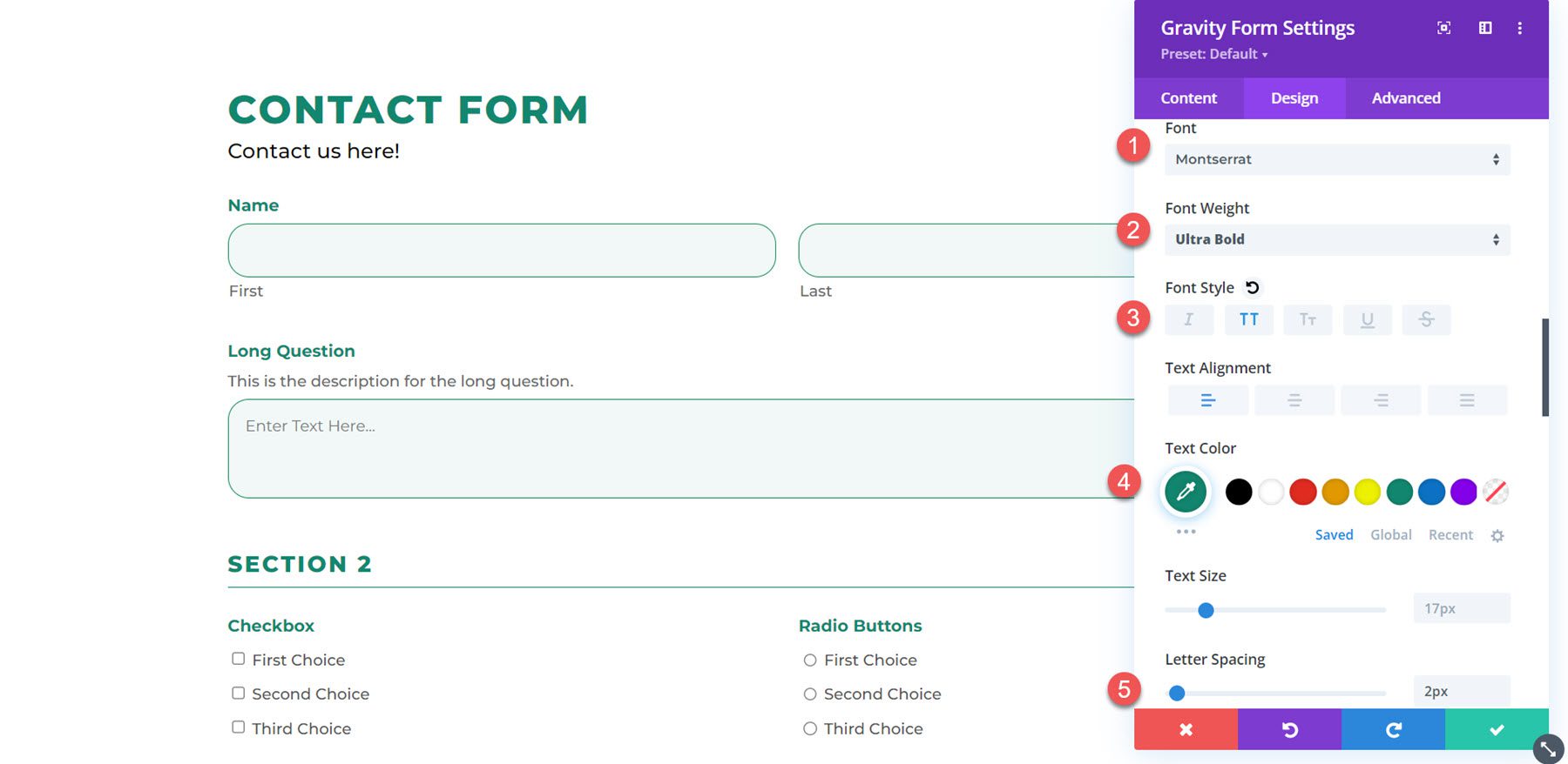
Section Field Title
To customize the section field title, I modified the font, font weight, font style, text color, and letter spacing here.
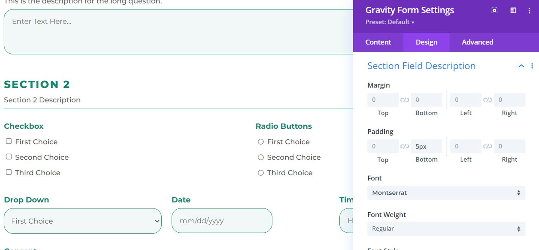
Section Field Description
In this example, I added a description to the section and modified the font. I also added some bottom padding to add space between the description and the line.
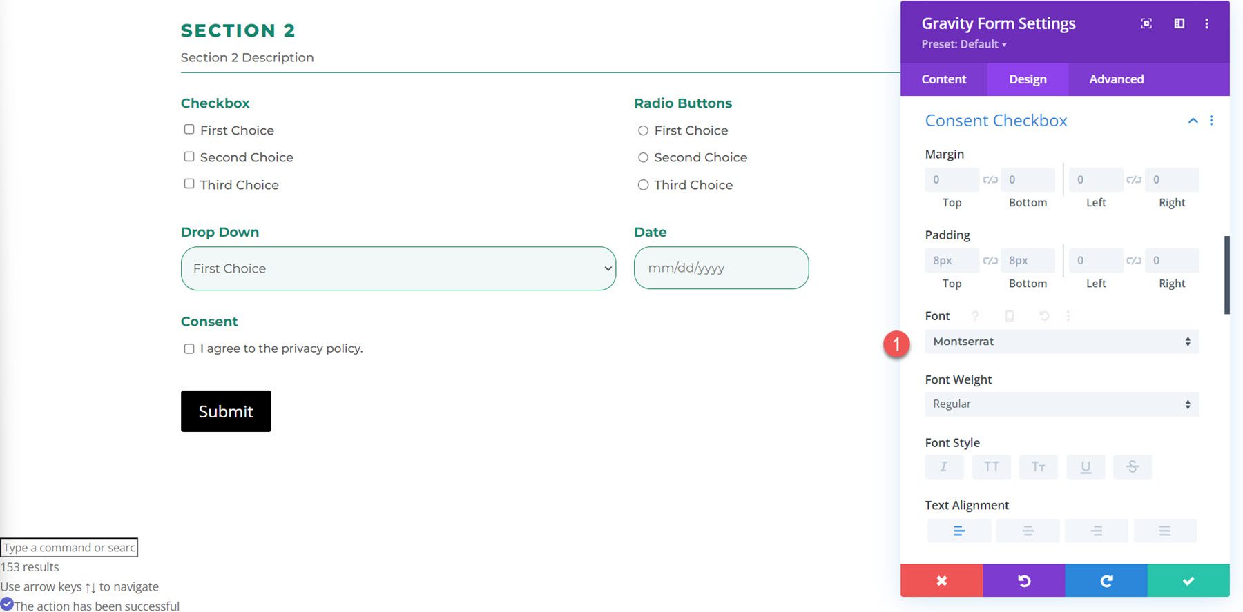
Consent Checkbox
The design settings for the consent checkbox allow you to modify the margin, padding, and font settings. Here I modified the font.
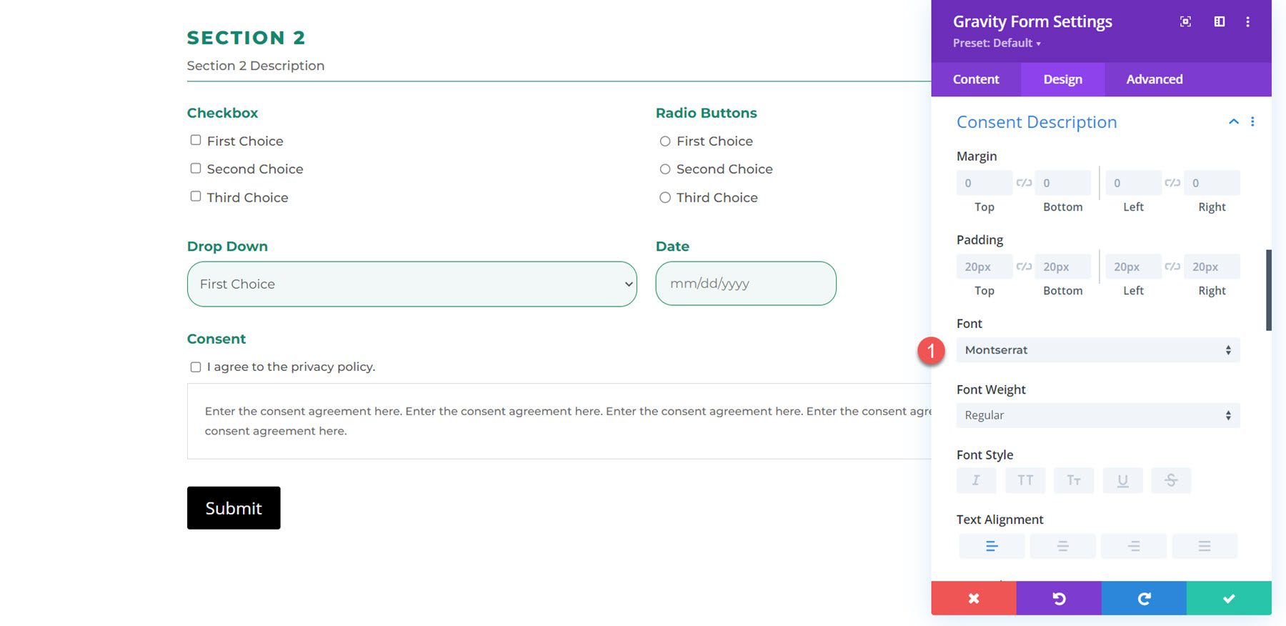
Consent Description
Same with the consent description settings, you can modify the margin and padding and customize the font. In this example, I changed the font.
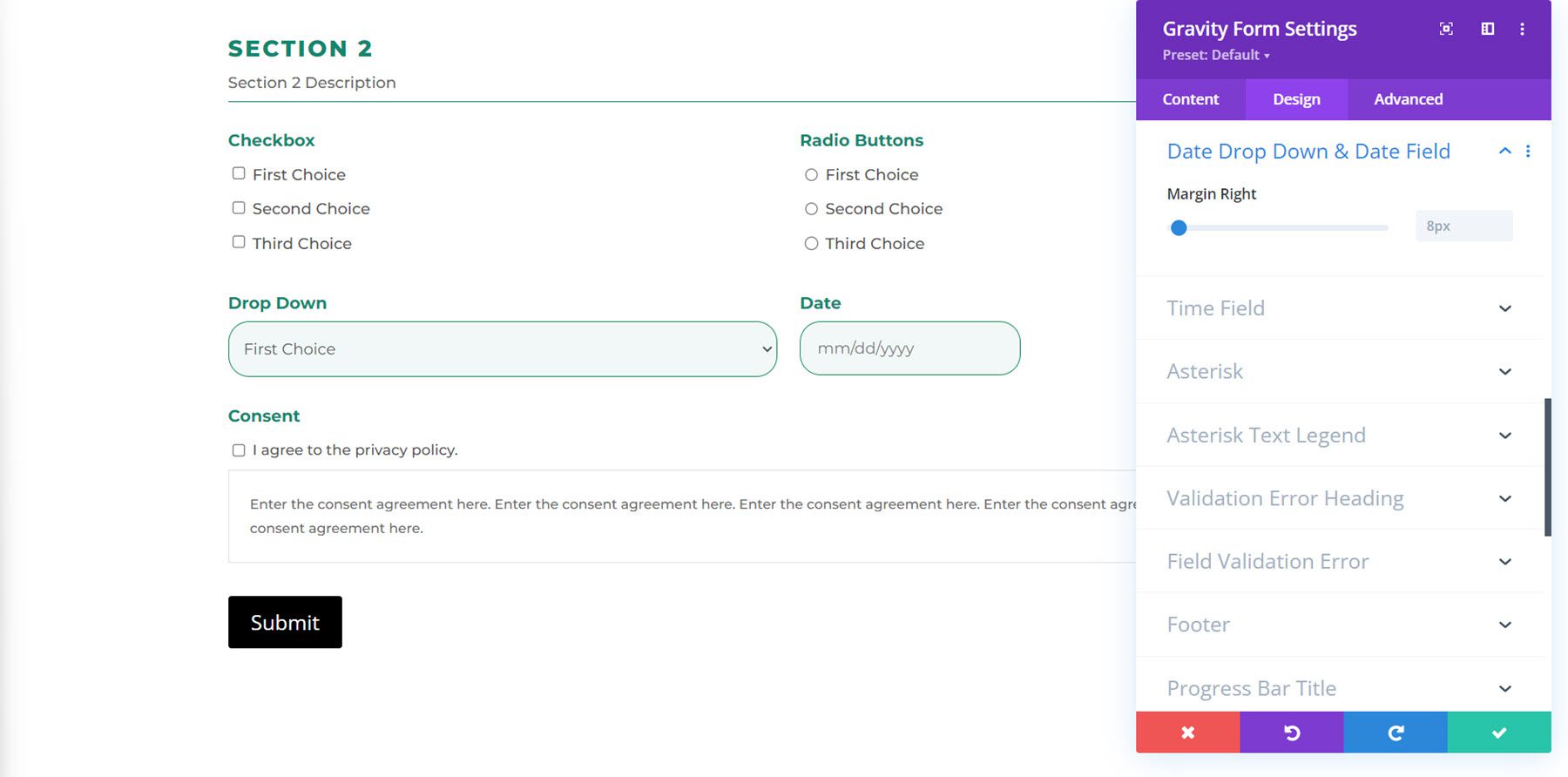
Date Drop Down & Date Field
Here you can change the right margin.
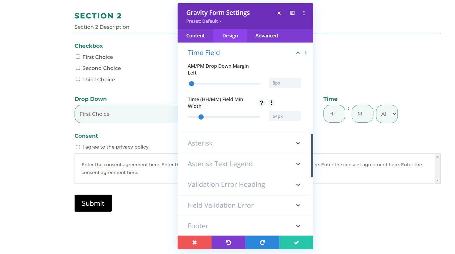
Time Field
In the time field settings, you can customize the AM/PM drop-down margin-left and the Time (HH/MM) Field Minimum Width.
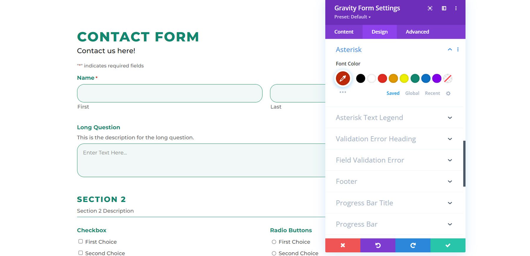
Asterisk
Under the asterisk settings, you can change the font color.
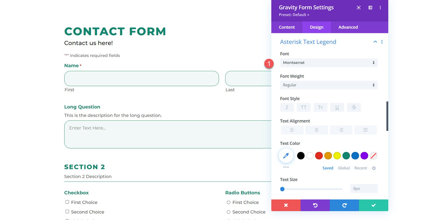
Asterisk Text Legend
Using the asterisk text legend settings, you can customize the asterisk text legend font, size, spacing, and more. In this example, I modified the font.
Validation Error Heading
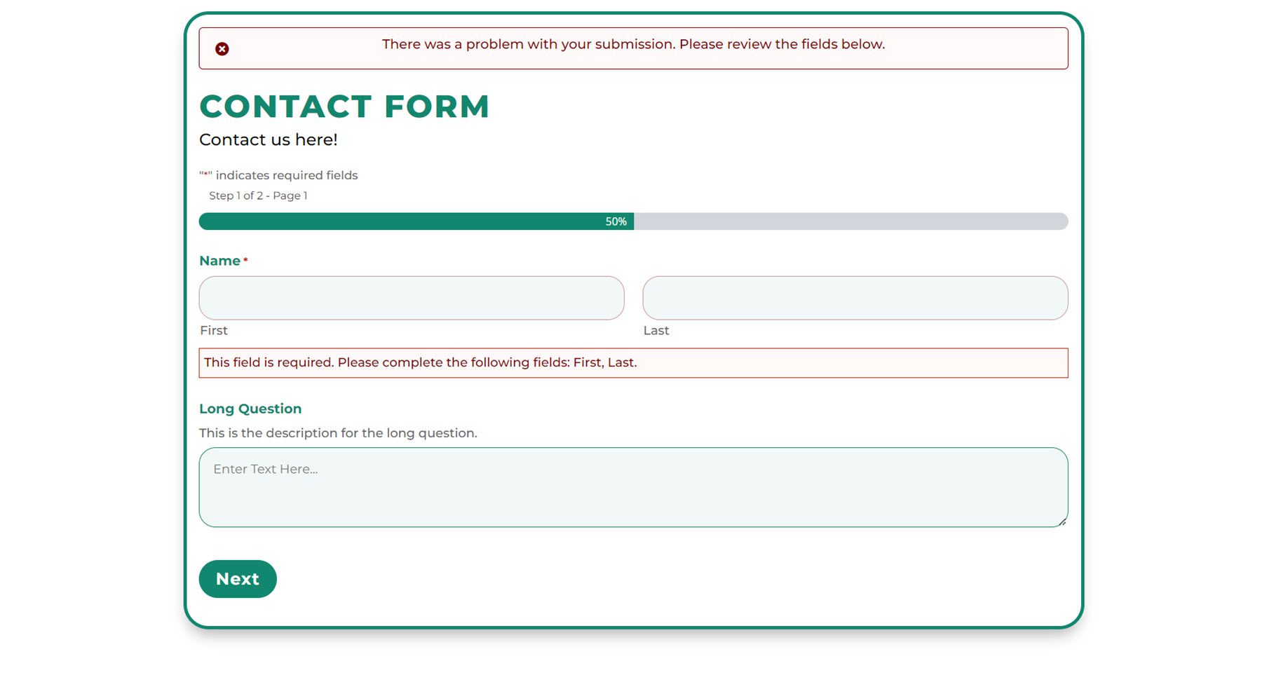
Here you can customize the background color, margin and padding, and font design for the validation error heading. Here is the customized validation error heading, with modified padding, a different font, and a larger font size.

Field Validation Error
And here you can customize the field validation error in the same way as the validation error heading. I added some padding to the top, bottom, and left, and modified the font. Here is the result on the front end.

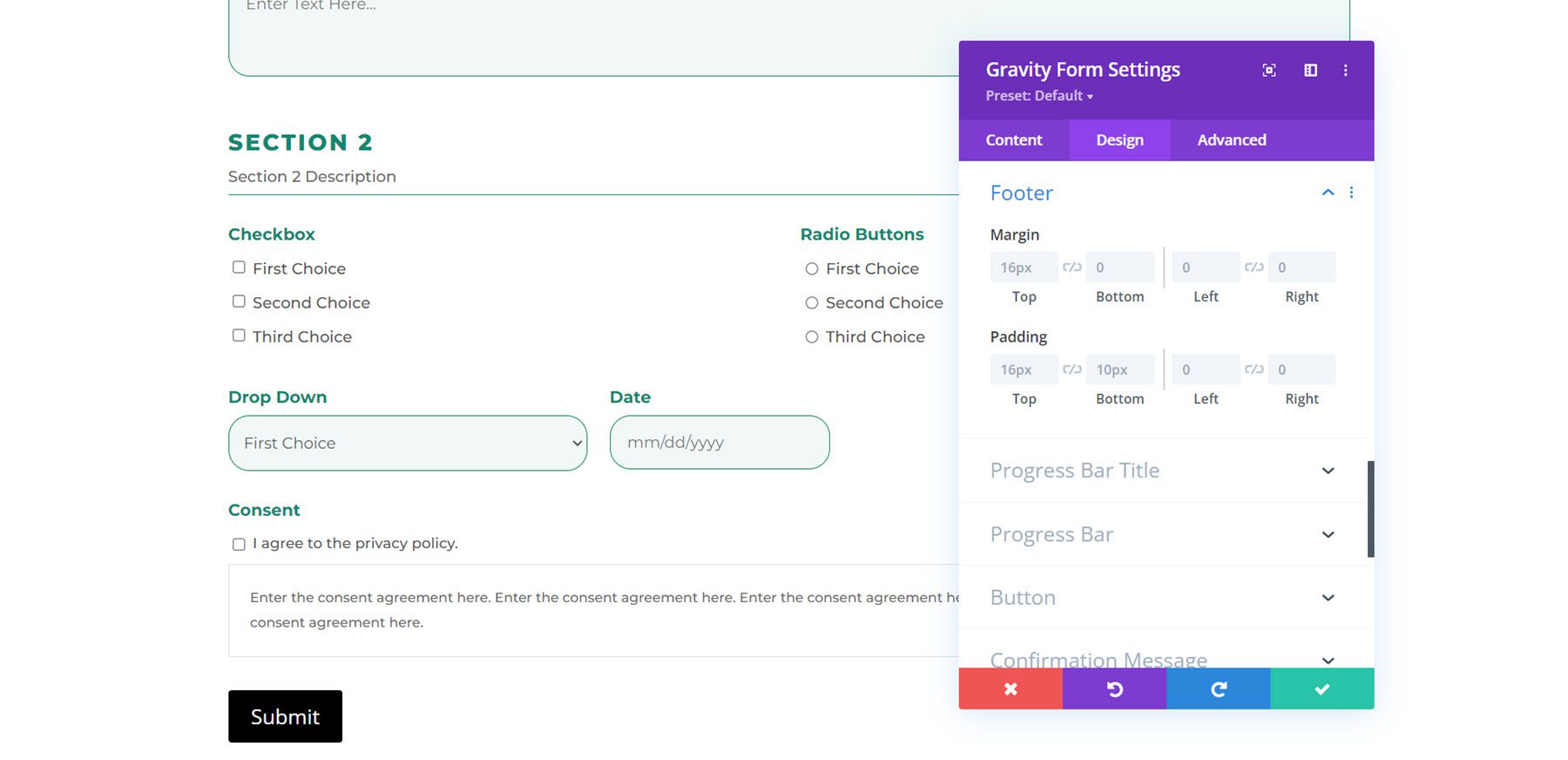
Footer
With these settings, you can change the footer margin and padding.
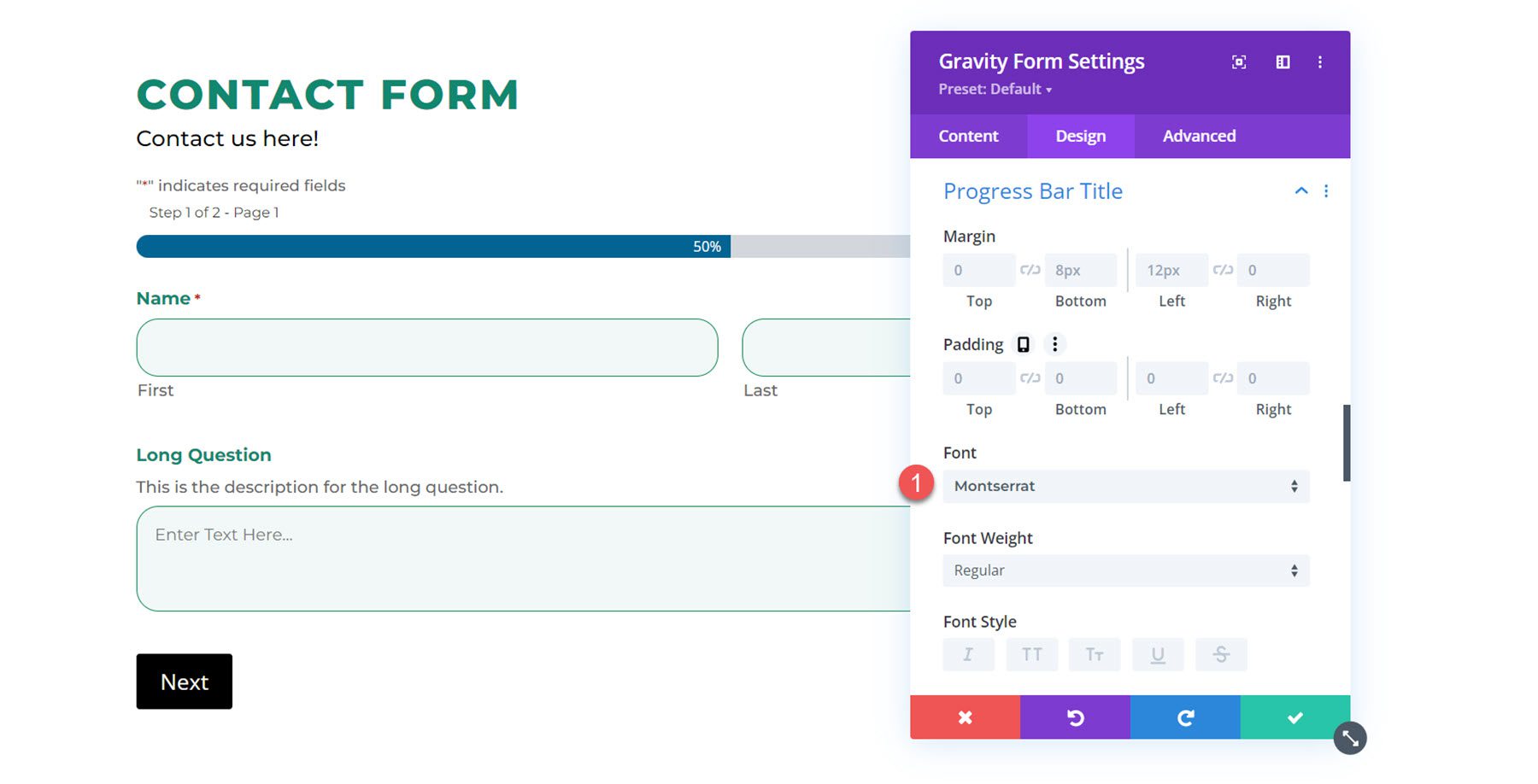
Progress Bar Title
Here you can modify the progress bar margin and padding as well as the font design.
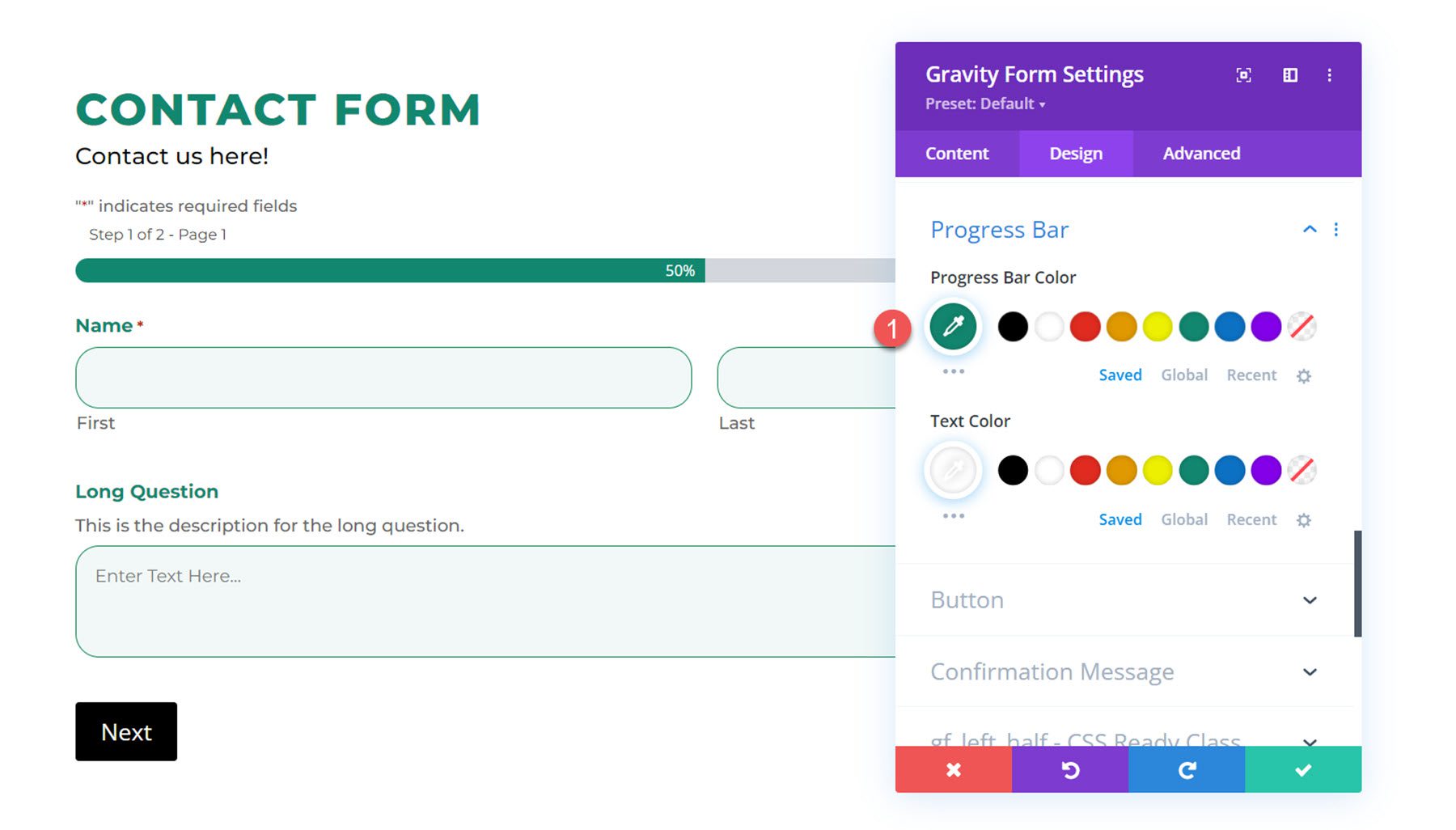
Progress Bar
In the progress bar settings, you can modify the progress bar color and text color. I changed the progress bar color to green.
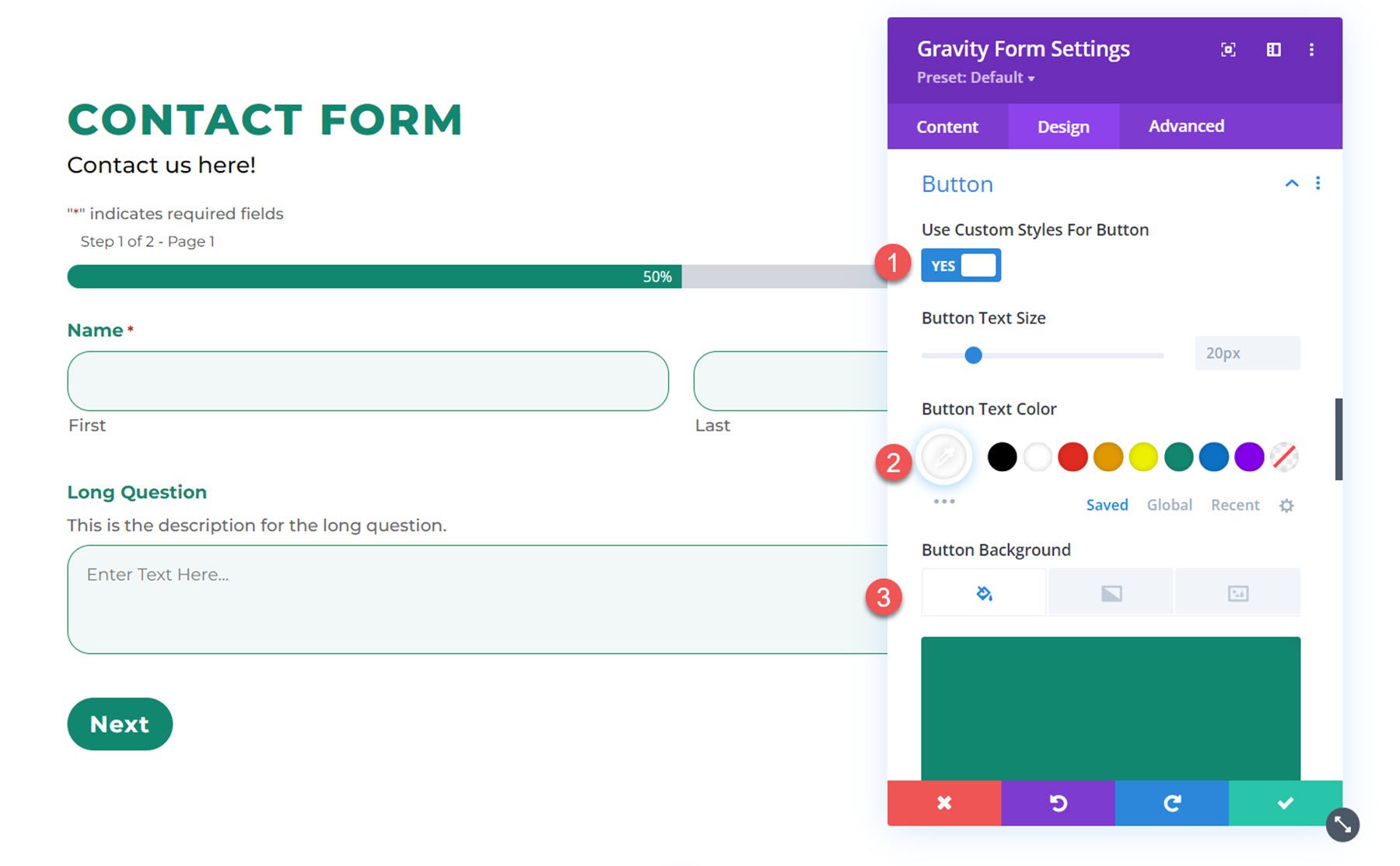
Button
Next, the button settings allow you to apply customizes styles to the form submission button. You can also change the button alignment. Here I changed the text color, background, font, font weight, border radius, and letter spacing to style the button.
Confirmation Message
In the confirmation message settings, you can modify how the confirmation message appears after the form is submitted. I changed the background color, font, and text color in this example.
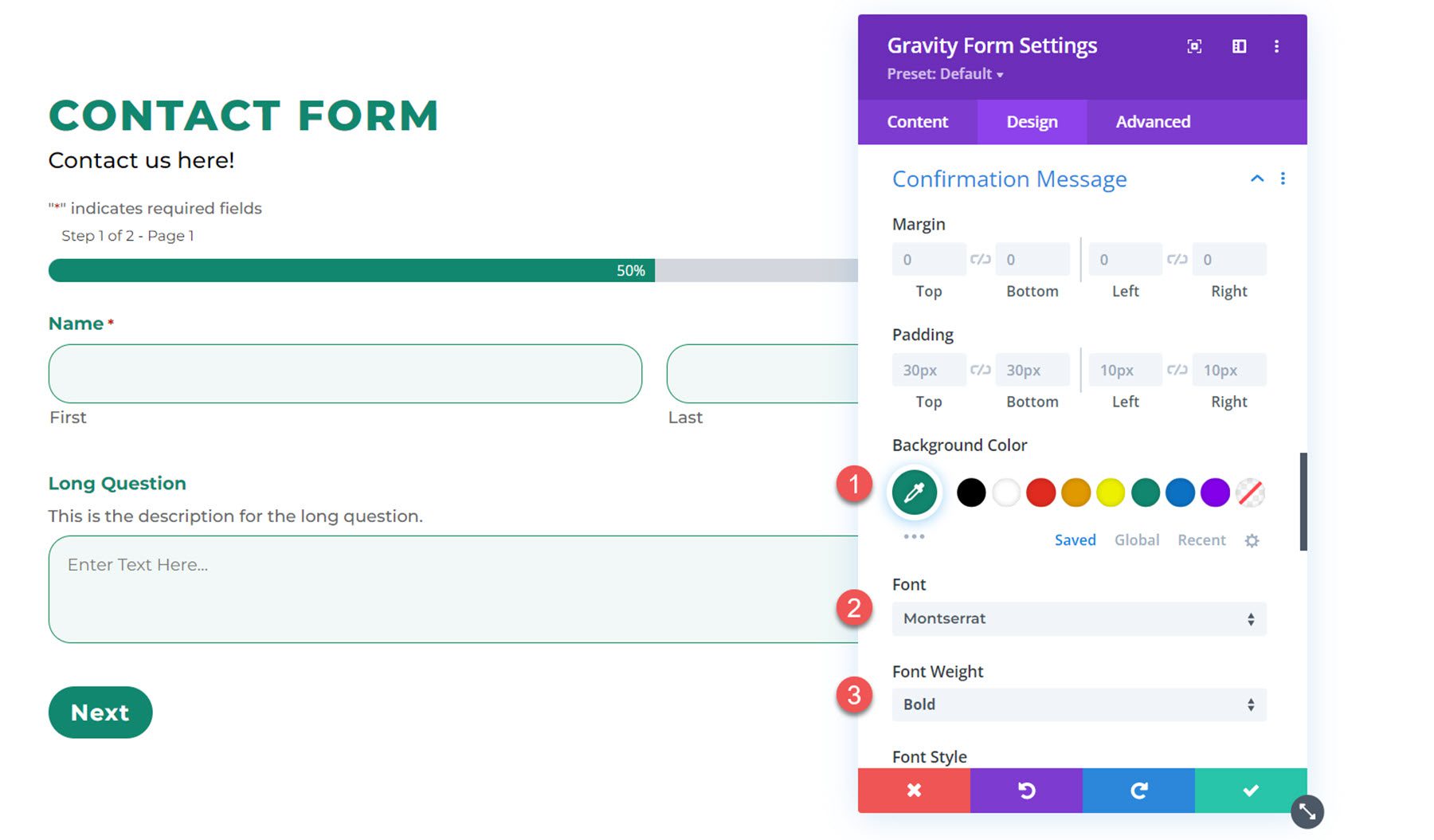
And here is the confirmation message.

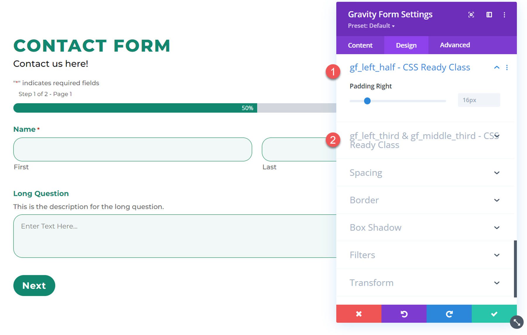
Gf_left_half – CSS Ready Class and Gf_left_third & gf_middle_third – CSS Ready Class
You can apply these CSS classes to a Gravity Forms field in order to create more advanced layouts. These design settings allow you to customize the right padding for the fields with these CSS classes.
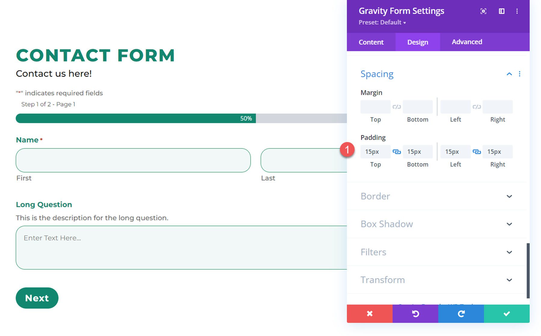
Spacing
The spacing settings allow you to customize the margin and padding for the entire form. Here I added some inner padding to all 4 sides of my form.
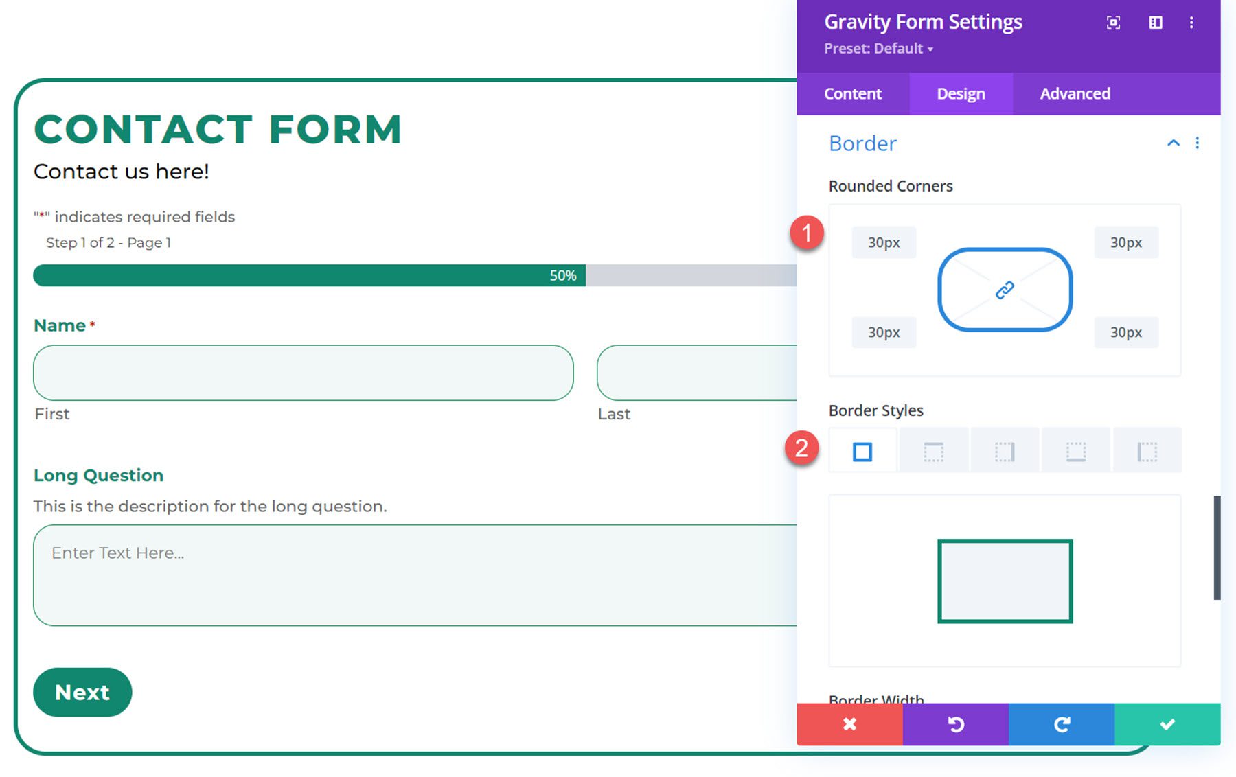
Border
In the border settings, you can add a border to your form, change the border color and size, add rounded corners, and more. For this example, I added a border with rounded corners to the form.
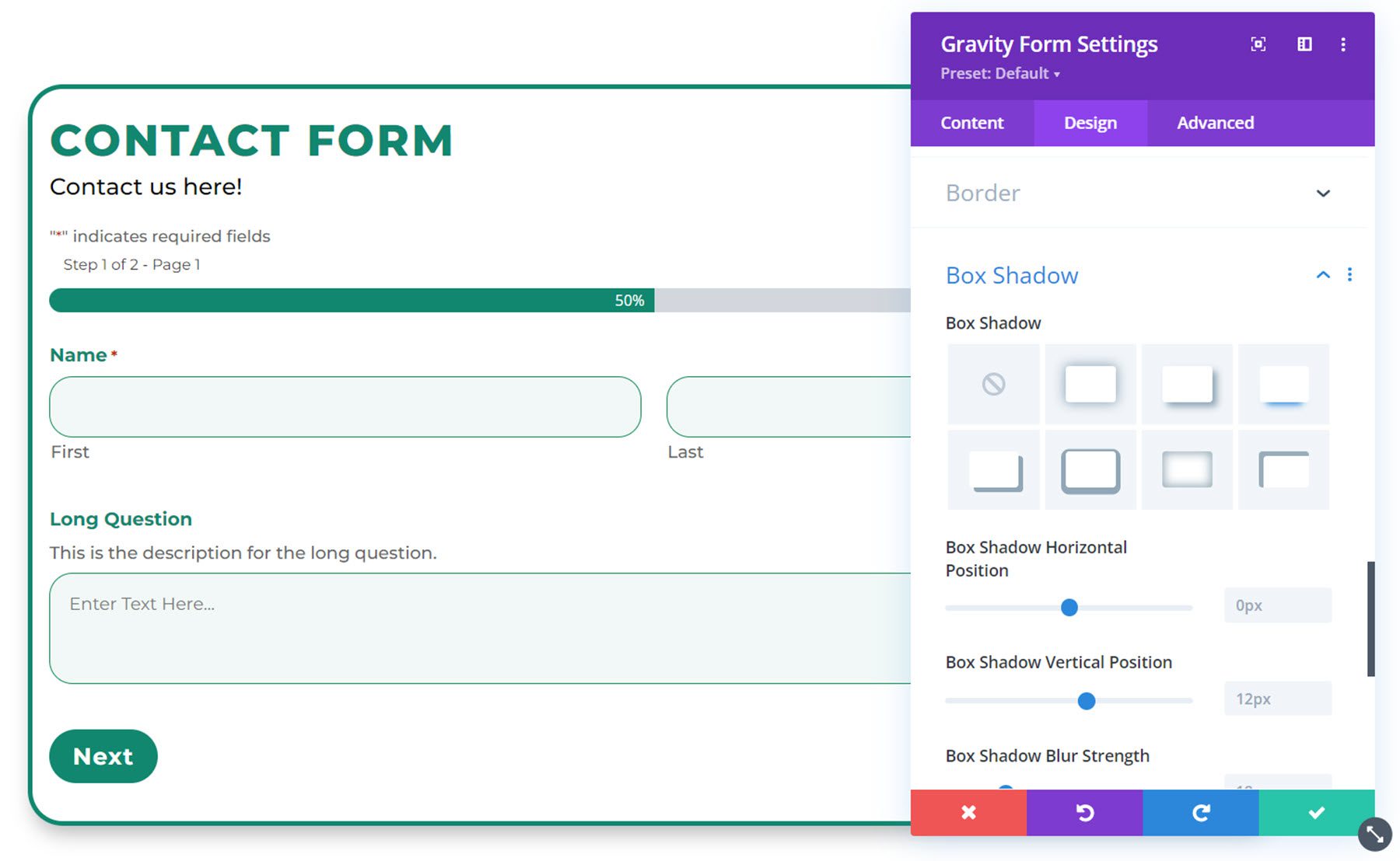
Box Shadow
You can add a box shadow to your form with this setting.
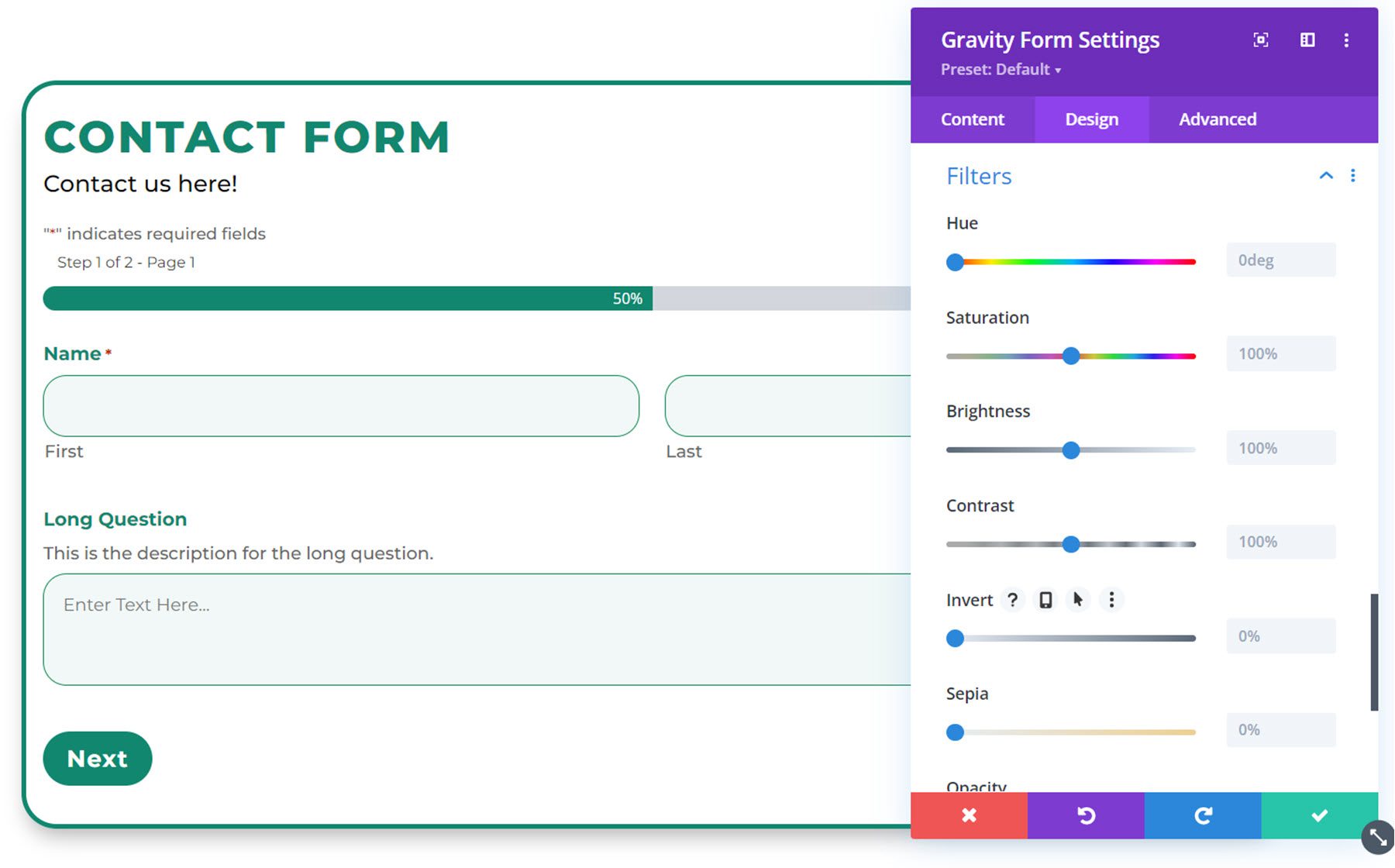
Filters
The filters settings allow you to modify the color of your design by adding a filter.
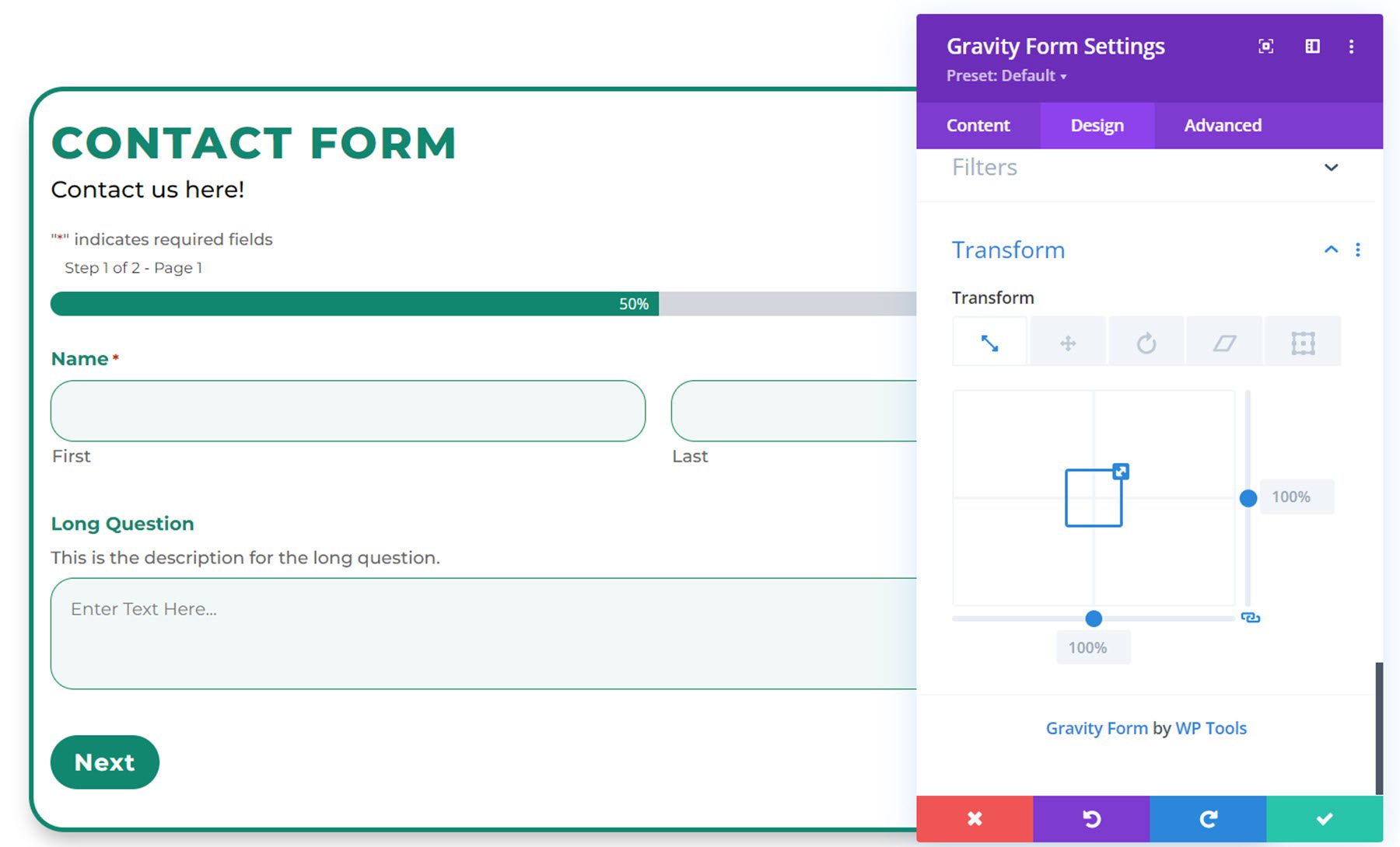
Transform
Finally, the transform settings enable you to modify the placement of the form on the page.
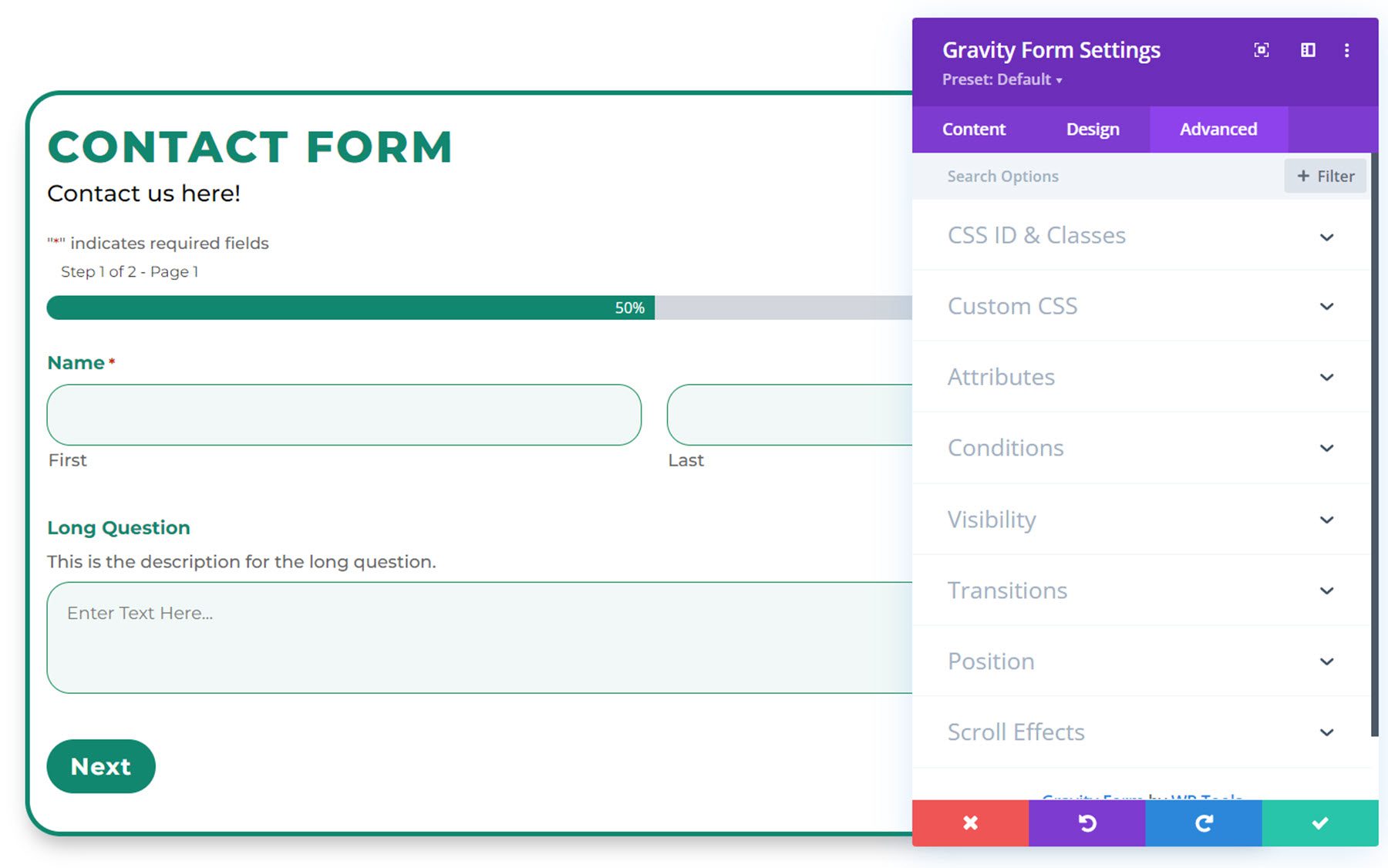
Advanced Settings
Moving over to the advanced tab, you’ll see that the default advanced sections are listed.
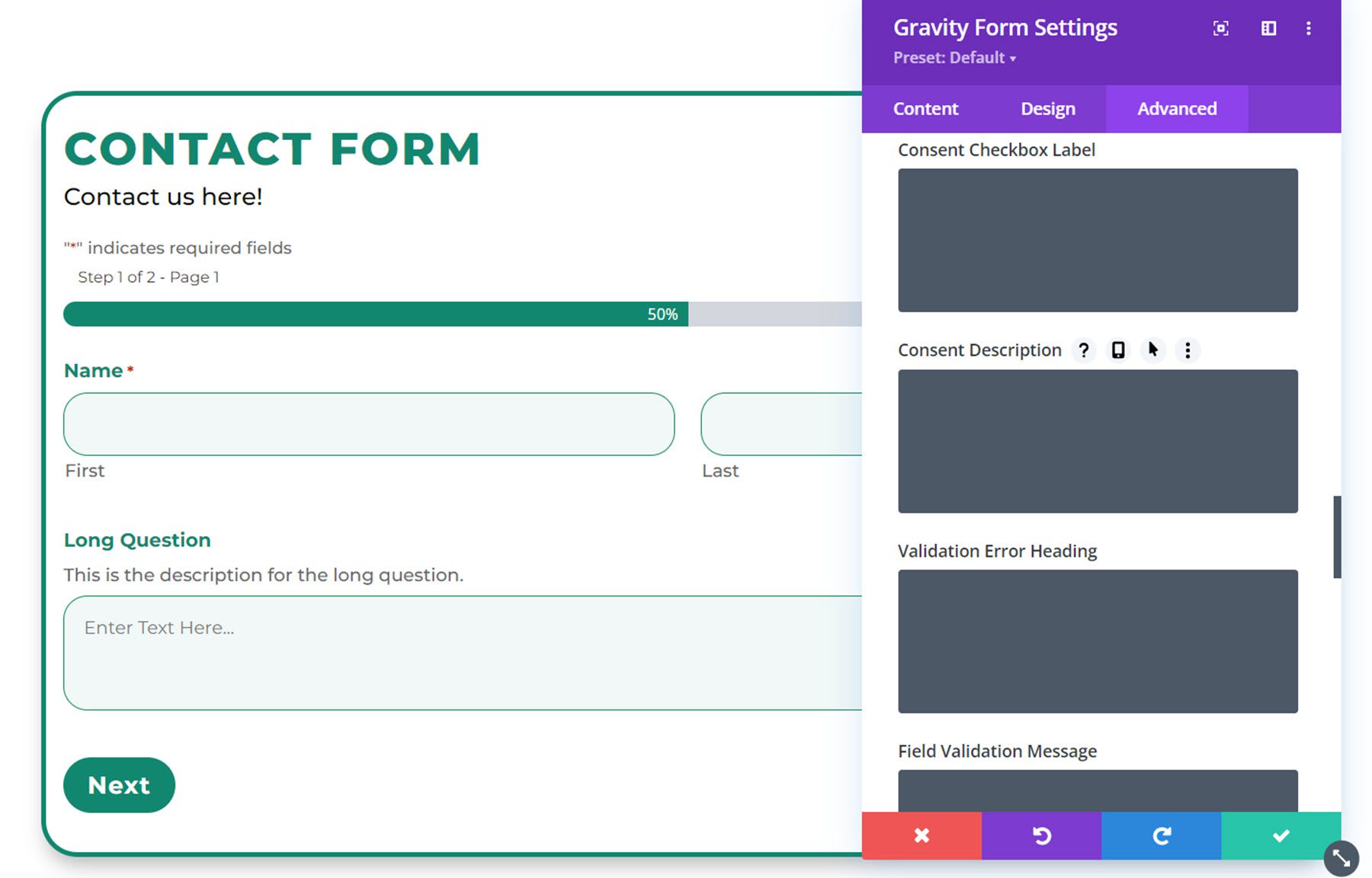
If you select the Custom CSS tab, you can add custom CSS to the different elements of the Gravity Form, including the title, description, label, text field, select field, checkbox/radio field, consent checkbox label, validation error heading, button, and much more.
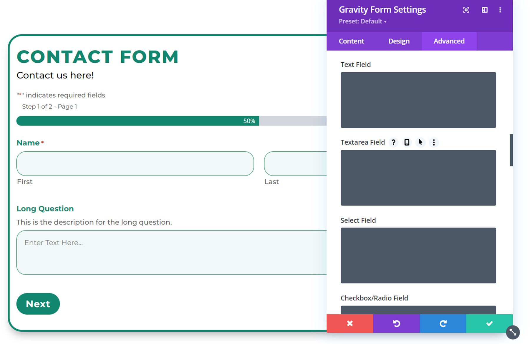
This allows you to completely customize your form, even beyond the options that Divi Gravity Forms adds to the Divi Builder.
Divi Gravity Forms Example
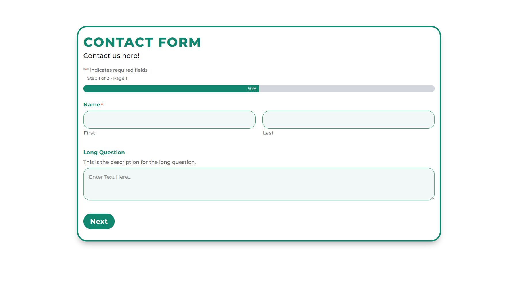
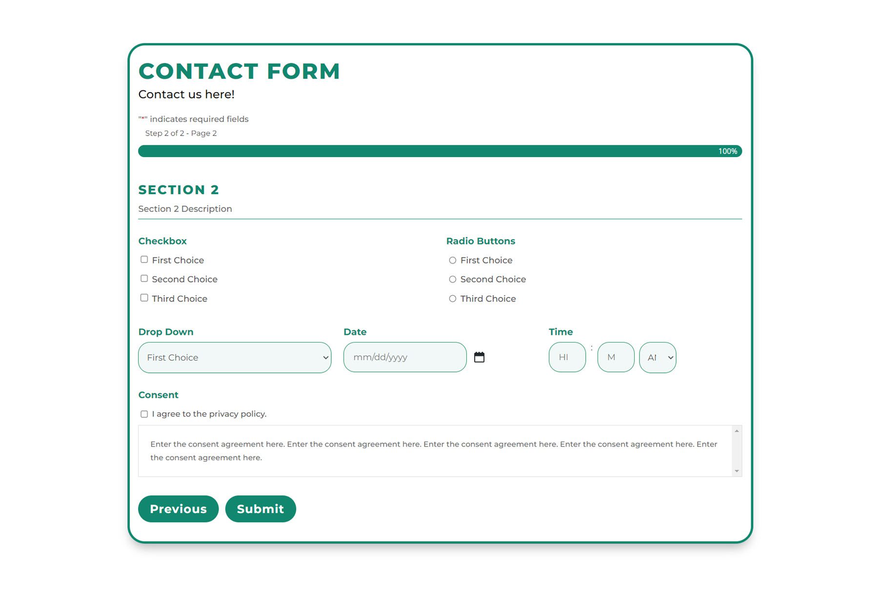
Here is the final result of the Gravity Form customized with Divi Gravity Forms.
Page 1
Page 2
Confirmation Message

Validation Error Message
Purchase Divi Gravity Forms
Divi Gravity Forms is available in the Divi Marketplace. It costs $69 for unlimited website usage and 1 year of support and updates. The price also includes a 30-day money-back guarantee.
Final Thoughts
Divi Gravity Forms makes it easy to completely design your form within the Divi Builder. The plugin automatically refreshes your form after every change you make so that you can see the most up-to-date preview, right within the Divi Builder. If you’re a Gravity Forms user designing websites with Divi, this may be the perfect tool to help you design and customize your forms with the ease and convenience of the Divi Builder.
We would love to hear from you! Have you tried Divi Gravity Forms? Let us know what you think about it in the comments!




Divi should provide this module instead of 3rd party plugins for this basic feature
Nice to have extra design options, but personally, I find functionality at least just as important. The original Divi form does not have an option to upload files. I know there’s a plugin for that, but I would love to see that option built into the original Divi form.