Find It In The Divi Marketplace
Divi Mobile is available in the Divi Marketplace! That means it has passed our review and has been found to meet our quality standards. You can visit Divi Engine in the marketplace to see all of their available products. Products purchased from the Divi Marketplace come with unlimited website usage and a 30 day money back guarantee (just like Divi).
Divi Mobile is a third-party plugin for Divi that makes it easy to create custom mobile menus for Divi websites. All of the settings are found in the theme customizer, so you can see a live preview of your mobile menu designs. It’s an easy plugin to use and it can create just about any type of menu you might need. In this Divi plugin highlight, we’ll step through the features of Divi Mobile to help you decide if you need it in your Divi toolbox.
Default Divi Mobile Menu
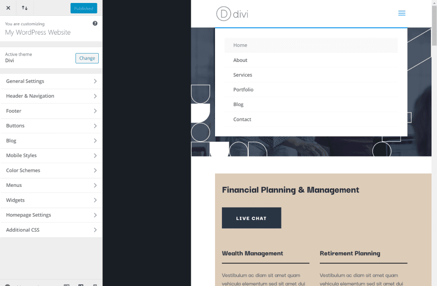
For comparison, here is Divi’s default mobile menu. The menu automatically changes to show a hamburger menu. Clicking on the menu reveals a drop-down menu with all of the links. This isn’t adjustable separately from the standard menu.
Theme Customizer
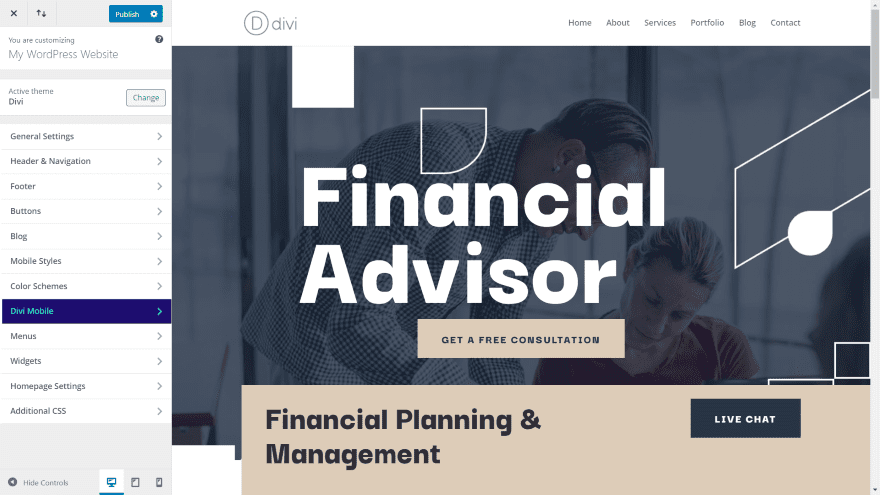
A new menu is added to the theme customizer called Divi Mobile. It’s dark blue with green text so it stands out. All of the adjustments are done within this menu. I’m using the Financial Advisor layout pack.
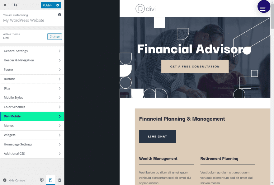
In a mobile view, such as the tablet view in the example above, the menu is automatically set to the Divi Mobile default settings. It includes a hamburger menu in white within a dark blue circle. I’m hovering over the Divi Mobile menu, which has now swapped colors.
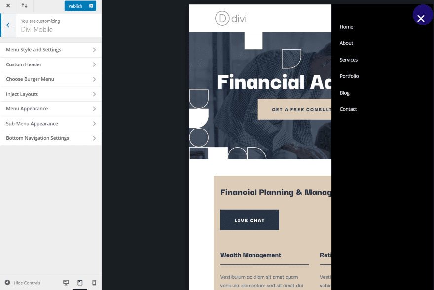
Clicking the hamburger menu opens the menu, which slides in from the side and covers the entire side of the screen. I’ve opened the menu in the theme customizer to show the tabs. Other items will appear based on the selections you choose. Let’s look at the main adjustments.
Menu Style and Settings
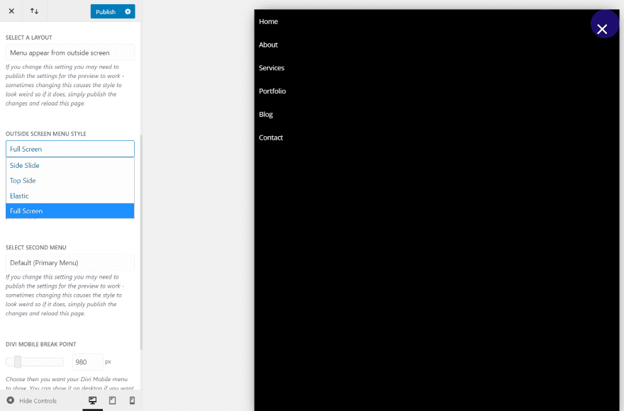
Menu Style and Settings has several options for selecting the menus. Layout options include the menu appearing from the outside of the screen (the default view), expanding from a shape, and bottom navigation. The Outside Screen Menu Style adds open animations and fully open styles to the menu. Each of the three layouts includes different options.
The example above shows the same menu as the previous example, but I’ve selected Full Screen for the menu style. A Preview mode sets which mode is shown by default. I like this because it makes the background light.
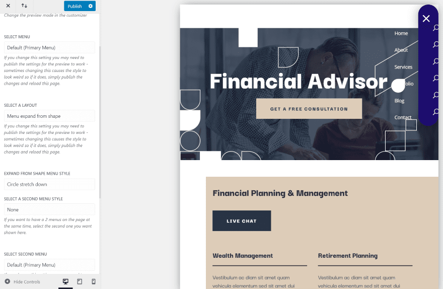
Expanding from a shape covers the entire screen starting in the upper right corner. It can also expand from the top as a stretch down. This adds icons over the background and places the links outside the background as I have it in the example above. You can adjust the colors and icons in other settings in another menu called Circle Stretch Settings.
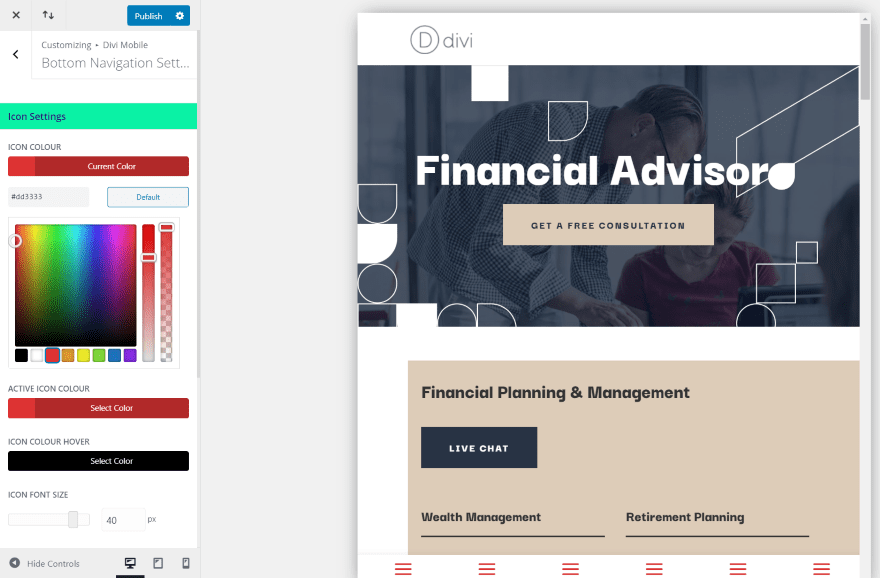
Bottom Navigation displays icons at the bottom of the screen. This is adjusted in another menu called Bottom Navigation Settings.
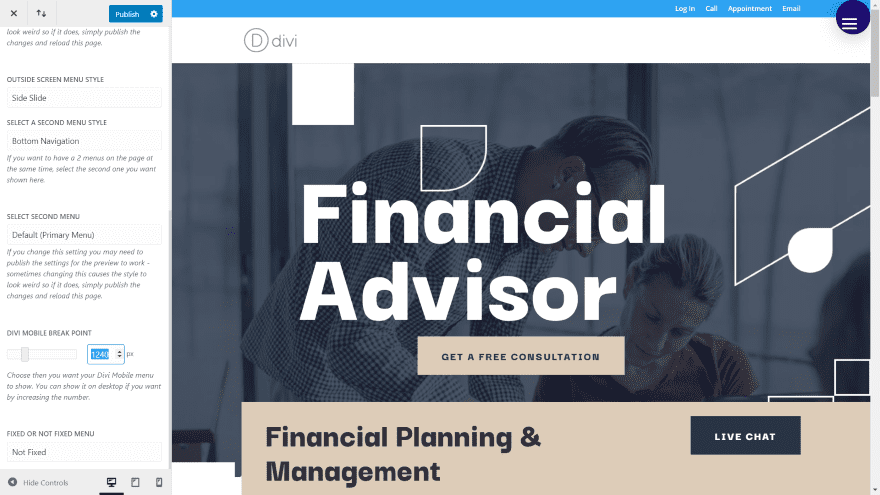
By adjusting the breakpoint you can have it to display the mobile menu on the desktop.
Custom Header
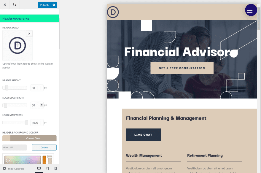
Custom Header gives you complete control over the header. The first section is Header Appearance. Add a new logo, adjust its size, adjust the background color, shadow length, blur radius, shadow color, etc. I’ve added a new logo and changed the background color in this example.
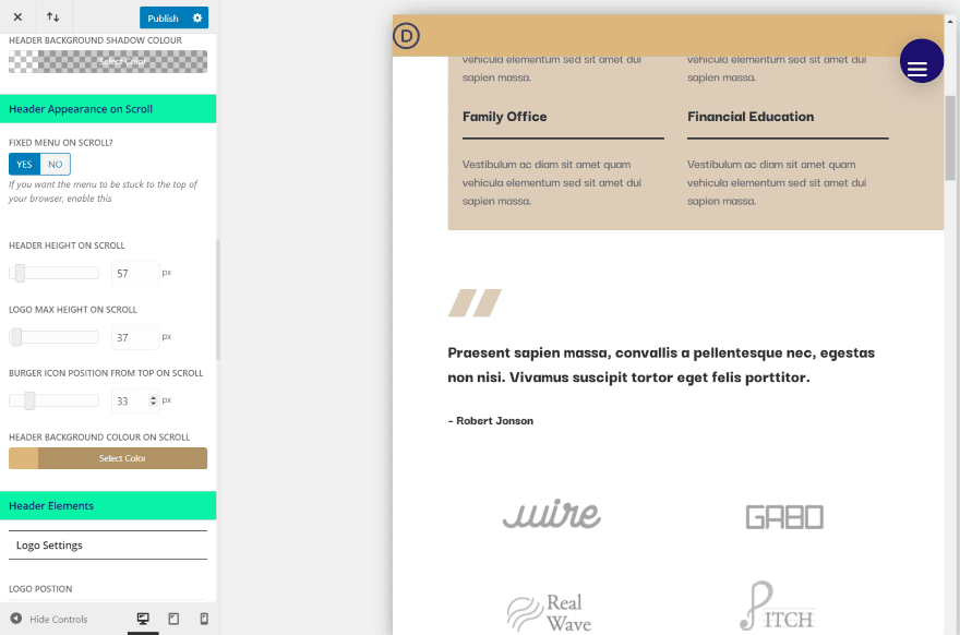
The next section is Header Appearance on Scroll. Set the menu to fixed, adjust the height, logo size, burger icon position, and background color. I’ve made changes to each of these settings.
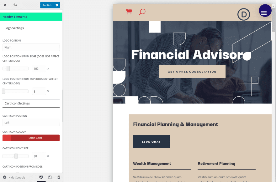
Header Elements let you add elements to the header and adjust their position, size, and color. I’ve moved the logo to the right and set it slightly lower than normal (you can set it as low as you want to overlap the header or the content). I’ve also added the WooCommerce shopping cart, enabled the search icon, placed them on the left, changed them to red, and increased their size.
Choose Burger Menu
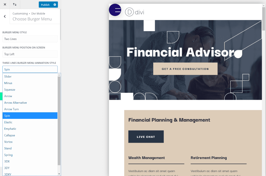
Choose Burger Menu gives you lots of options over the hamburger menu icon. Set to the right or left, select from three icons (three lines, two lines, or three dots), and choose animation styles, and choose the animation direction. I’ve placed it on the left and selected two lines.
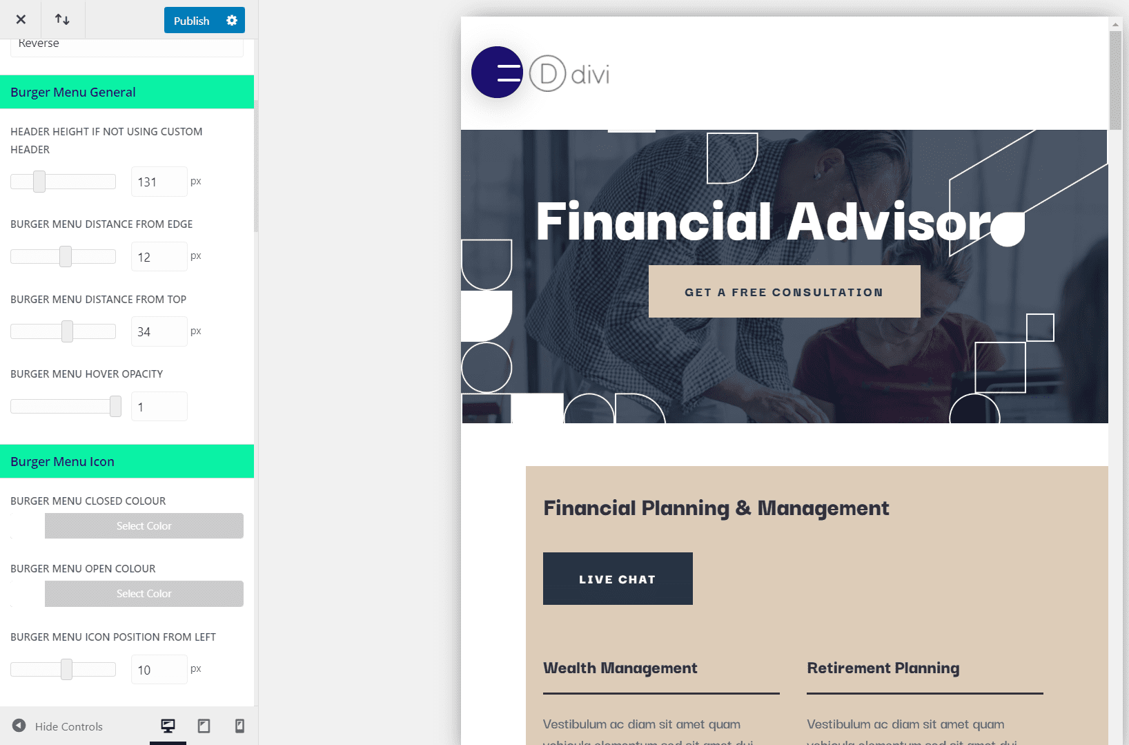
Burger Menu General lets you adjust the menu height, set the hamburger icon distance from the edge and top, and adjust its hover opacity. I’ve changed each of these adjustments in this example.
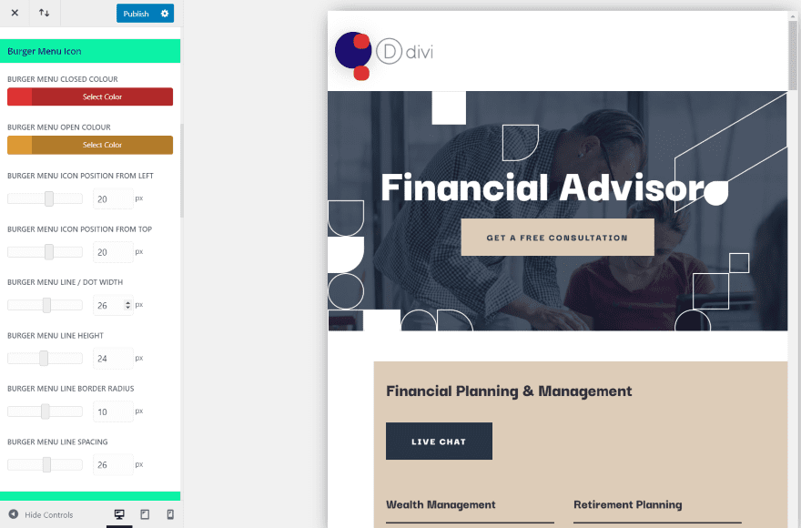
The Burger Menu Icon adjustments let you adjust the size and color of the lines or dots on the hamburger icon for both the closed and open positions. You also have control over the line height, border radius, and line spacing. This is the closed position. I’ve set the color of the lines to red.
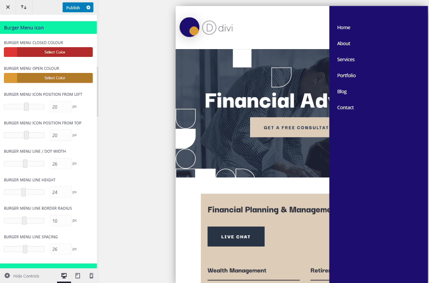
I’ve set the color of the open icon to gold.
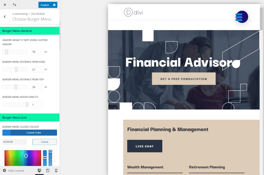
For this one, I’ve placed the menu icon on the right and selected three lines. I’ve adjusted the colors, line height, border radius, and position of the three lines.
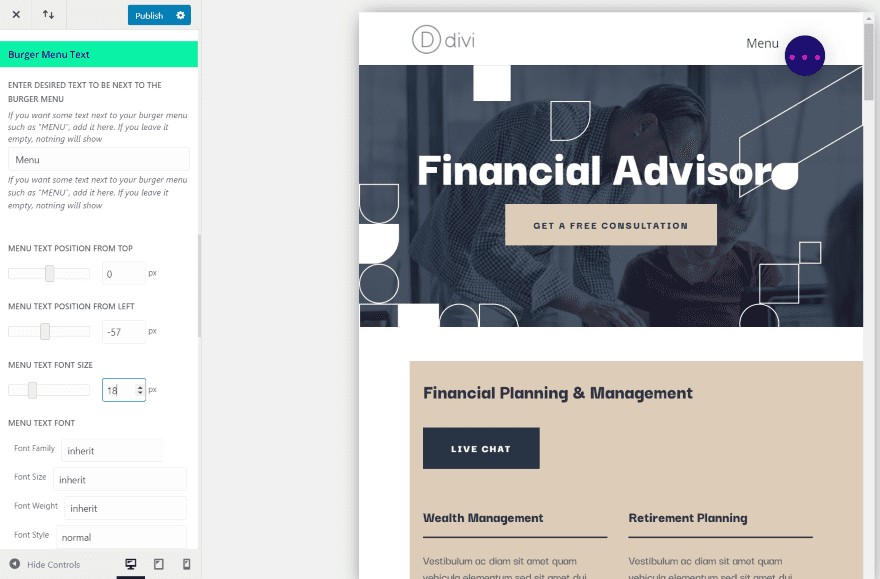
You can also add text. It gives you full control over the text including the horizontal and vertical position, font size, color, and styling. This example includes the option with three dots.
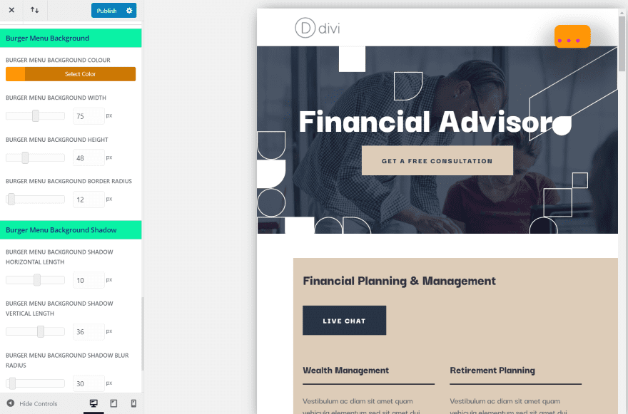
Burger Menu Background and Burger Menu Background Shadow provide settings similar to Divi buttons. They include the color, width, height, border radius, shadow horizontal and vertical length, blur radius, and blur color. I’ve adjusted most of the settings in this example, making the icon a square rather than a circle.
Inject Layouts
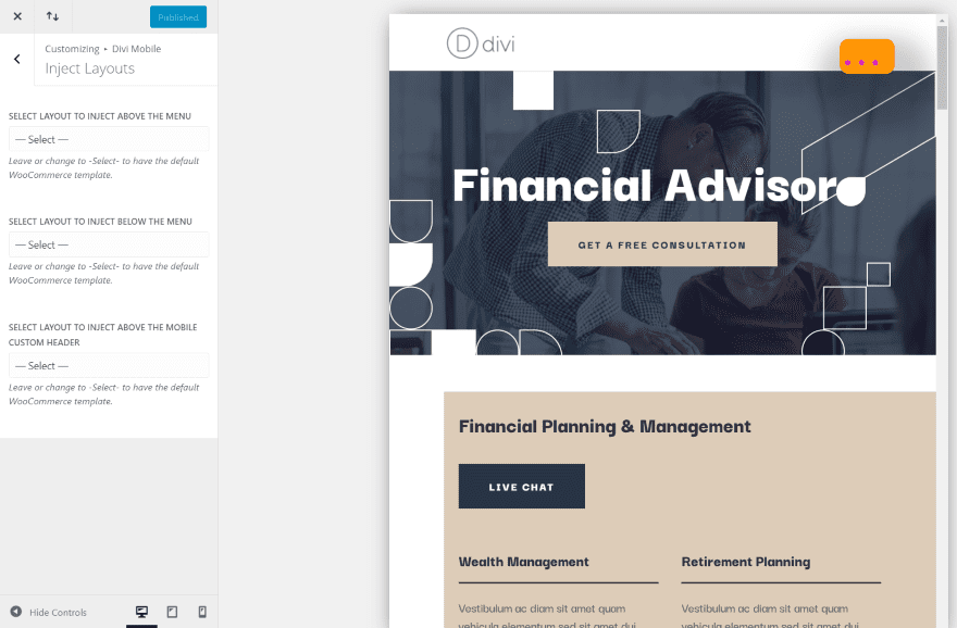
Inject Layouts lets you select layouts from your Divi library to inject into various locations on your header. Place layouts above the menu, below the menu, or above the mobile custom header.
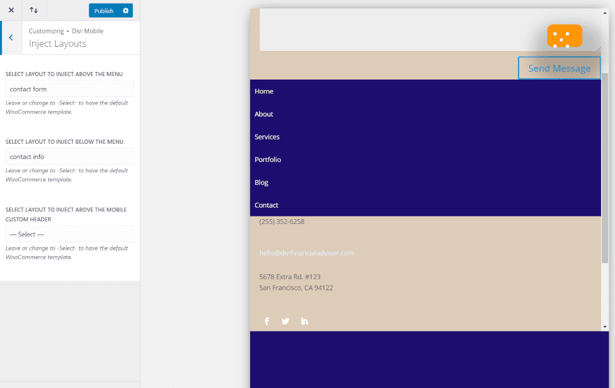
For this example, I’ve added sections from the layout pack that I’m using to place a contact form above the menu and contact information below the menu. I’ve made the menu full-screen so it’s easier to see.
Menu Appearance
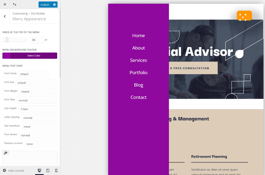
Menu Appearance lets you change the background color, link placement, font size, family, color, hover color, the side of the screen it appears on, and the width of the menu area. I’ve moved the menu to the left, changed the background, increased the font size, changed the position from the top of where the links appear and centered the links.
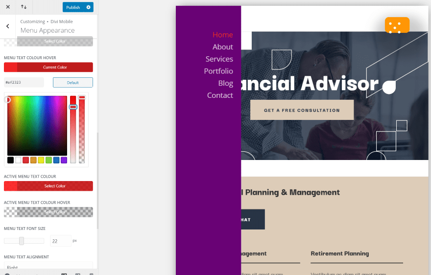
For this one, I’ve narrowed the menu area, raised the links, right-justified the links, and adjusted the font hover color.
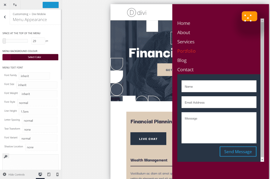
In this one, I’ve moved the menu back to the right, made it wider, left-justified the text, changed the color, and injected a contact form below the menu.
Sub-Menu Appearance
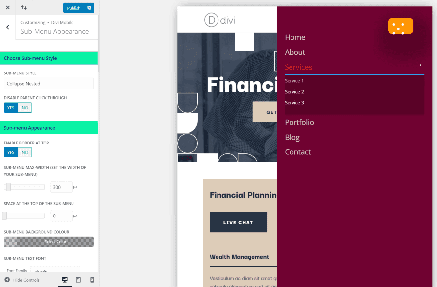
There are several styles for displaying submenus. This is the collapse nested style. I’ve left the settings at default. You can also adjust the appearance, remove the border, and change the icon.
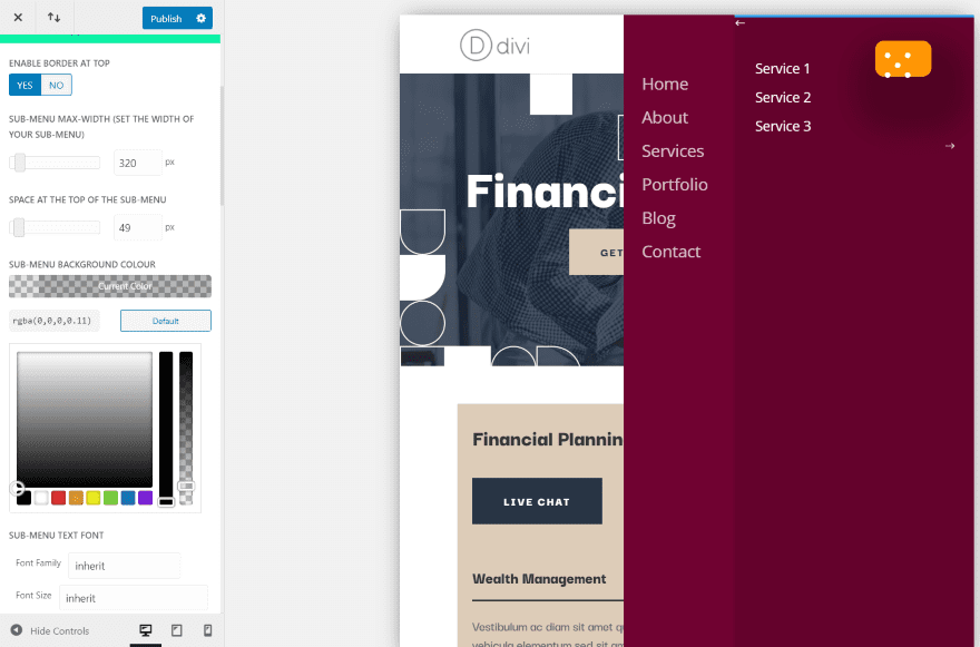
This is Overlap Slide In. You can adjust the font size, color, height, hover color, content area, etc. I’ve adjusted most of these settings for this example.
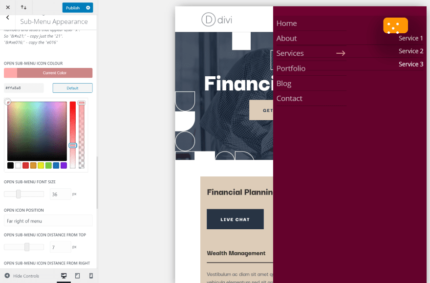
This is sub-menu style Side By Side. It places an arrow icon, pointing to the sub-menu items. You can adjust the height, position, color, etc. for both the open and close icon. I’ve adjusted the settings for the open icon.
Stop Stacking
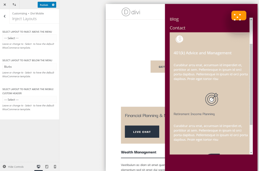
One of the issues with injecting layouts is the modules will stack. Divi Mobile includes a Divi module that you can add to the layout that will keep it from stacking. The example above is a layout with elements that are stacking.
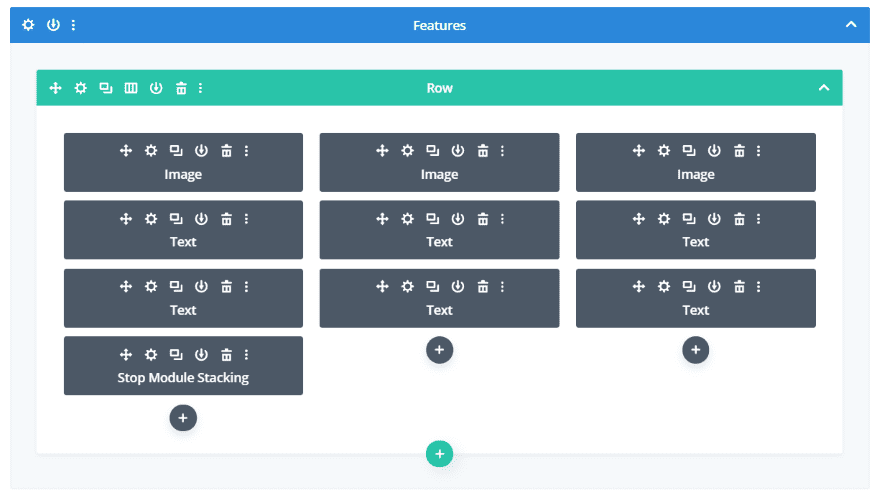
Just add the module to the row. Nothing else is needed.
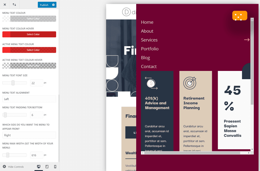
The columns no longer stack. Depending on your layout, you might need to adjust the width of your menu to get everything to fit the way you want it to. It also works with the other menu layouts and designs. This is a great way to make a mega menu.
Where to Purchase
Divi Mobile is available from the developer’s website. There are multiple licenses to choose from:
Annual
- 1 Site £12
- 2 – 5 Sites £36
- Unlimited £64
Lifetime
- 1 Site £40
- Unlimited £196
It includes 1 year of support. You’ll get updates for long as the license is activated on your website.
Ending Thoughts
That’s our look at the Divi Mobile plugin. It’s an excellent plugin for designing mobile menus. I’ve only scratched the surface of what can be done with it. It’s easy to use and has a lot of adjustments to choose from. I like that it uses the theme customizer to see the changes live.
There were a few times I had to save and reload the page to see the changes, but that could have been my server. I would like to see a default reset button so you can easily get back to the default settings like you can with standard Divi controls. This might not be needed, though.
I was impressed with what I could do with Divi Mobile. If you’re interested in a Divi plugin to create custom mobile menus, Divi Mobile is worth a look.
We want to hear from you. Have you tried Divi Mobile? Let us know what you think about it in the comments.
Featured Image via venimo / shutterstock.com


Whilst Divi is a great platform, I have to agree that in these ‘mobile first’ times, Divi does fall down a bit.
We have blog posts like this and others walking us through ‘how to make the mobile menu sticky’ etc.
My question is: why aren’t these already features of the theme?
How difficult is it to have a toggle for sticky or not for example? Mobile menu options? A mobile contact bar at the bottom of the page?
Come on Nick…do the right thing and go mobile with Divi…everyone else has including Google.
I agree with the others. Mostly this just points out the glaring basics that Divi has categorically refused to look out for years. Because of their bad business practices, it just opens up the doors to overpriced – and by the looks of the screenshots in this post – not fully functional plugins.
+1000
I can’t imagine why DIVI is not having this on the theme. Every others Themes I bought/have is having to ability to customize mobile view sych as display, color, hamburger icon etc… This should be standard in a theme.
DIVI please add those features.
Agreed, the Divi menu mobile menu options are worthless. It’s 2020, we need full-screen menus!
Fully agree. Not to mention the steep price, and the poor presentation* of the menu makes it a total dealbreaker.
(* The presentation may be Randy’s doing and not the plugin, but I’m sure as hell not buying it at that price to find out.)
+1000
I agree with the previous comments, $240 for this is very expensive. However it does look like it could be a beneficial product to work with. Shame about the price.
Hi Midas,
£196 license is aimed for agencies where they are making money to pay for this. It will cut down time in development so it is worth it in the long run. If you have a single site, it is £12 which I think is very reasonable.
Hope you have a great week
In all the screenshots, the hamburger button, menu button, etc, is off center. like the CSS is off or something? Not sure if it is just the customizer is doing this, but it is, may be worth adding a mention about this in the article.
Like Bruno mentioned $237 USD is a little high. IMHO the feature set in QuadMenu PRO is better and for $60/lifetime & unlmited sites it’s hard to beat.
Hey matt. Not sure about quadmenu menu pro, not used it. In terms of the burger icon being off center, there is a setting to change the position of this so you can get it pixel perfect. I think Randy had his settings wrong so it is not nicely centered. We give the opportunity to change it yourself rather than make it centered as this allows for all kinds of possibilities.
About the price, check my reply to Bruno.
Have a great week
240$… really?
Hey Bruno. Thanks for the comment. It is around this price for unlimited sites and lifetime support and updates. This is made for agencies really who are making money from doing websites. You can make this money back in one sale and the amount of time that would be saved to code it yourself out weights the price. I think that it is worth it just for the dev time you would save. Again this price is not for everyone.
A single annual site for example only costs £12.
Wish you all the best
Good to know. For now I didn’t found that I needed something special for mobile menus, but everyday more people use their smartphone to visit websites. So it could be useful sometime.