Find It In The Divi Marketplace
Divi Next Blurb is available in the Divi Marketplace! That means it has passed our review and has been found to meet our quality standards. You can visit Divi Next in the marketplace to see all of their available products. Products purchased from the Divi Marketplace come with unlimited website usage and a 30 day money back guarantee (just like Divi).
Divi Next Blurb is a third-party blurb module that adds several features to create unique blurb designs. The module displays icons and images at the same time, lets you customize practically every element independently, and even adds lots of hover effects to most elements. In this article, we’ll take a look at Divi Next Blurb and see what it can do.
Divi Next Blurb Module
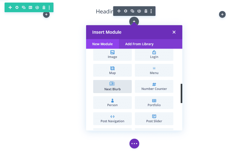
Once you upload and activate Divi Next Blurb, a new module is added to the Divi Builder called Next Blurb. You won’t have to set up anything. It’s ready to use.
Divi Next Blurb Content Tab
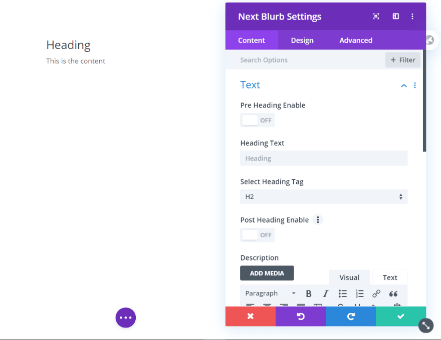
The Content tab includes settings for the text, allowing you to enable a pre-heading text, enter the text, choose the heading tag, and enable post heading text. You can also add content.
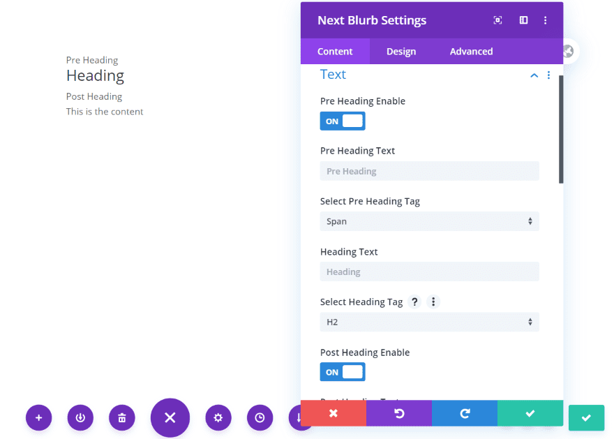
The pre heading place text above the heading while the post heading places text below the heading. You can change the heading tag for each.
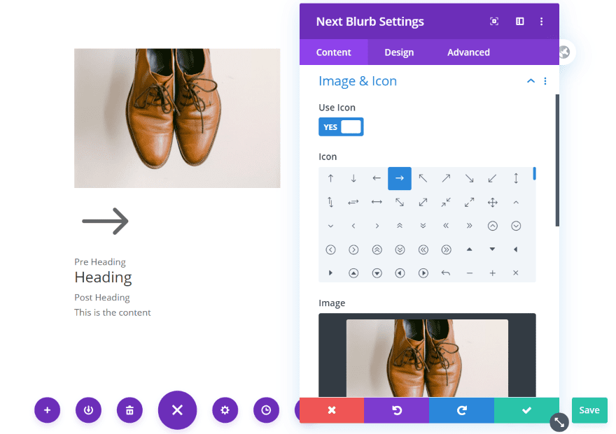
Add an image and an icon at the same time or independently. The standard Divi blurb module only displays one or the other. Divi Next Blurb opens up a lot of design possibilities by allowing you to display both at the same time.
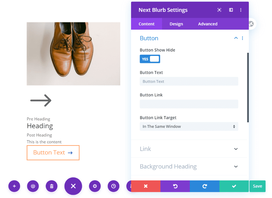
Include a button with the standard button styling.
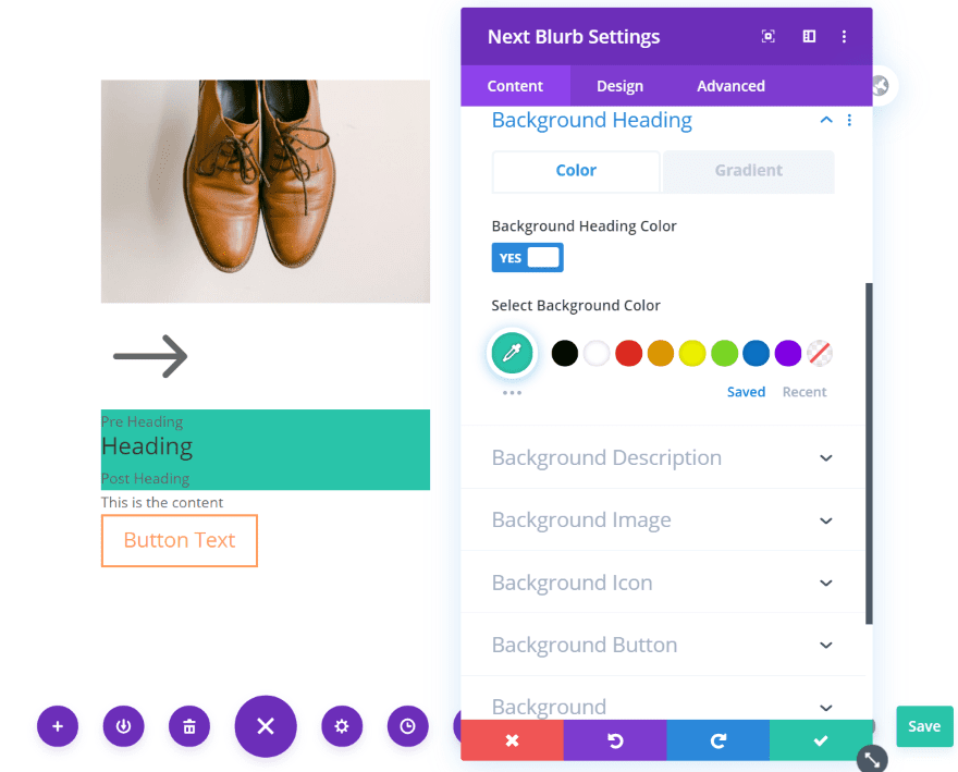
It also includes lots of background color options for the heading, description, image, icon, and button. You can enable and adjust them independently. Choose a color or a gradient for each one.
Divi Next Blurb Design Tab
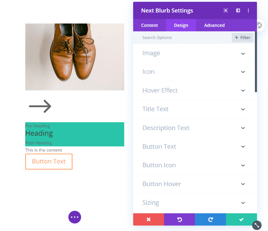
The Design tab includes settings for the image, icon, hover effects, title and description text, and button text, icon, and hover effects. Most of the elements also have separate sections for spacing, borders, and box shadows. There are plenty of adjustments to design your blurb.
Next Blurb Image
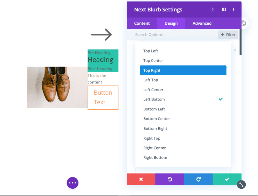
The image settings let you select the image placement and adjust the border. This example places the image on the left bottom.
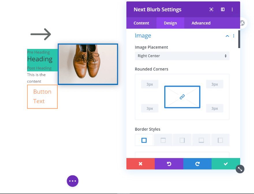
This one places the image in the right center. I’ve added a border and changed its color. I’ve also added a box shadow.
For this example, I’ve placed the image in the bottom center. I removed the border and rounded the corners. This one has a different box shadow.
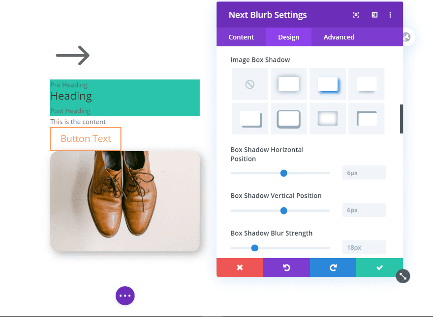
The icon also includes placement options. You can also adjust the size, color, border, etc. For this example, I’ve placed the icon in the bottom right.
Next Blurb Icon
![]()
This example shows the icon in the left center. I’ve increased the size, added a border, and changed the border’s color.
![]()
This example shows the icon in the top center. I’ve reduced the size, added a box shadow, and rounded to corners to create a circle.
Next Blurb Hover Effects
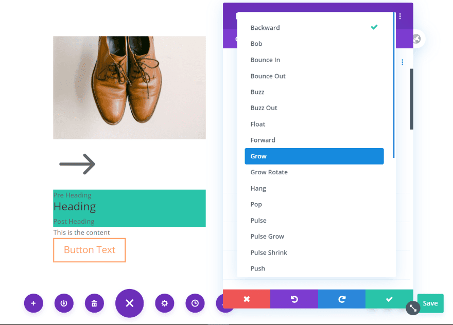
The hover effect includes a 2D and Tilt option. The 2D option provides 16 effects to choose from.
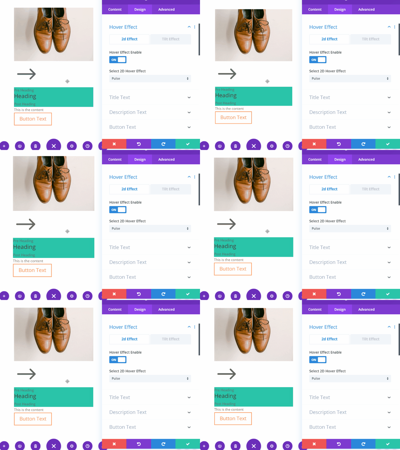
This example shows the pulse hover effect.
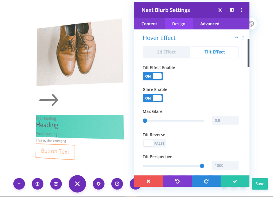
The tilt effect includes glare options, a reverse option, perspective, speed, starting and ending points, etc. This example shows the standard tilt option with glare enabled. I’ve left the settings at default.
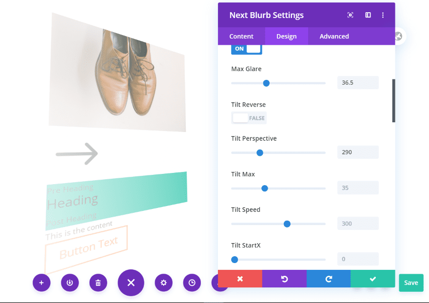
This example adds more glare and perspective. There are a lot of ways to customize the tilt.
Next Blurb Text
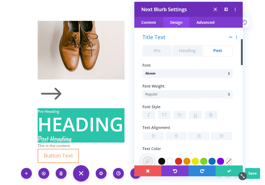
The title text has settings for the pre, heading, and post text. They include all of the settings you’d expect for text. I’ve adjusted all three sets of text in this example.
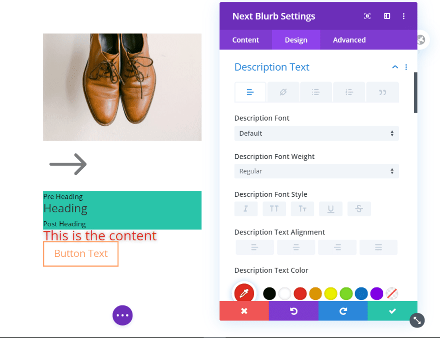
The description text includes all of the standard text settings including adjustments for the text, links, bullets, quotes, etc. In this example, I’ve increased the font size, changed it to red, and added a shadow effect.
Next Blurb Buttons
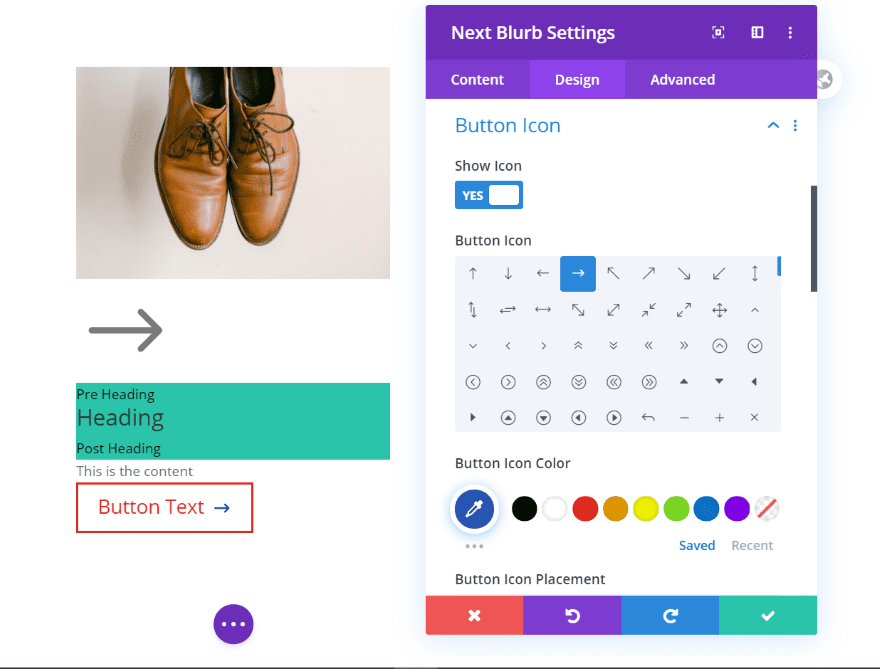
All of the standard button text and icon adjustments are included. I’ve increased the font size and changed the color. This example shows the button icon settings.
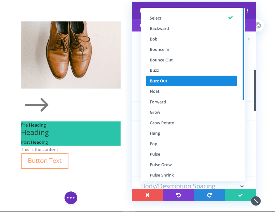
Button Hover includes lots of adjustments including 2D, background, stroke, and icon. The 2D settings include lots of hover effects.
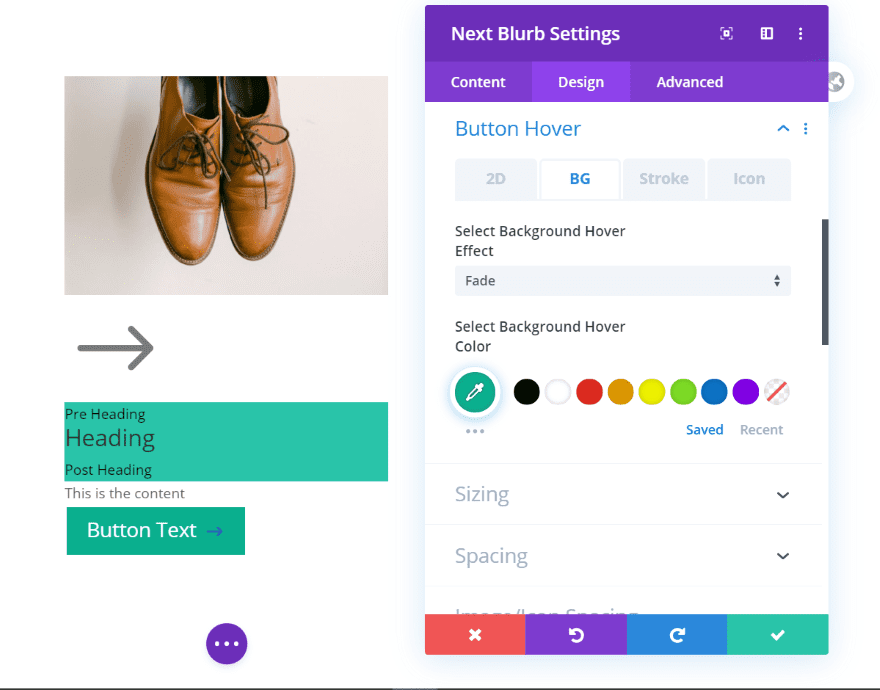
Button Hover includes lots of adjustments including 2D, background, stroke, and icon. The 2D settings have lots of hover effects. The background effect includes another set of effects. This shows the button on hover.
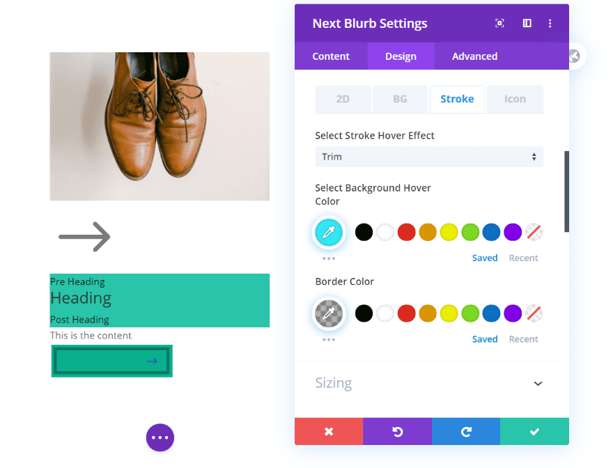
Stroke adds background and border adjustments as well as several hover effects. This example adds a border around the inside and changes the colors.
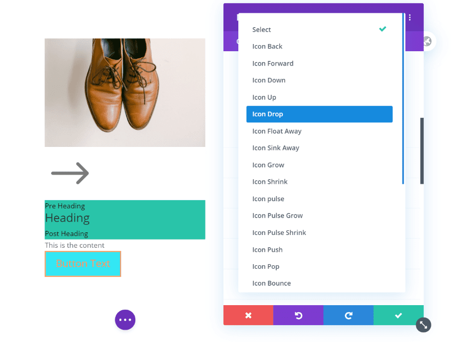
Icon also adds a lot of hover effects that will only affect the icon on hover.
Divi Next Blurb Example One
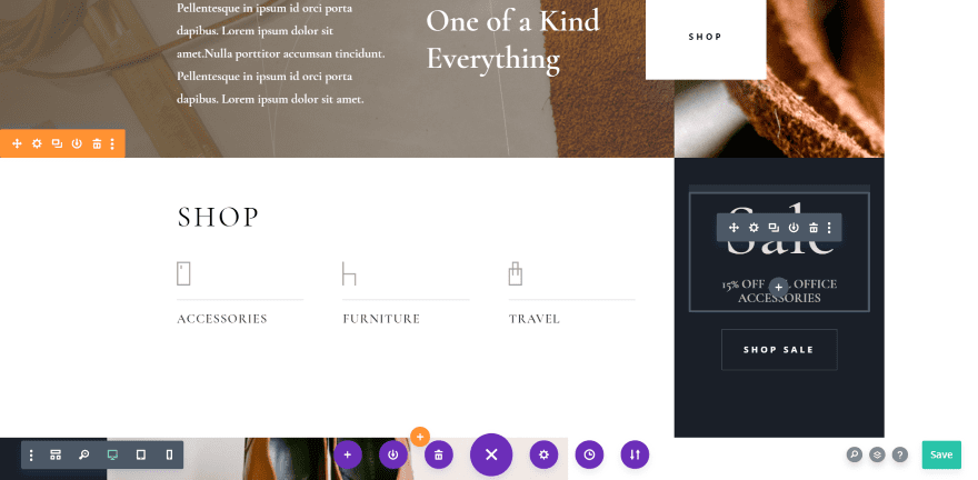
As an example, I want to replace the Sale text on the right side in the Leather Company layout with a Next Blurb module and add a few features.
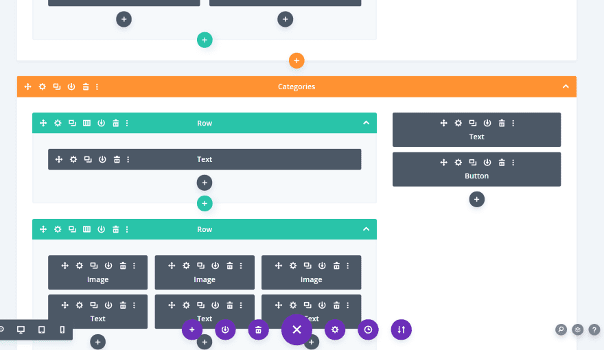
It’s normally made with a text module and a button, as you can see here in the wireframe view. The black background is added to the column.
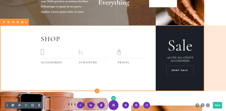
Here’s the recreated Sale call to action using just the Next Blurb module. I’m still using the black background for the column in this example.
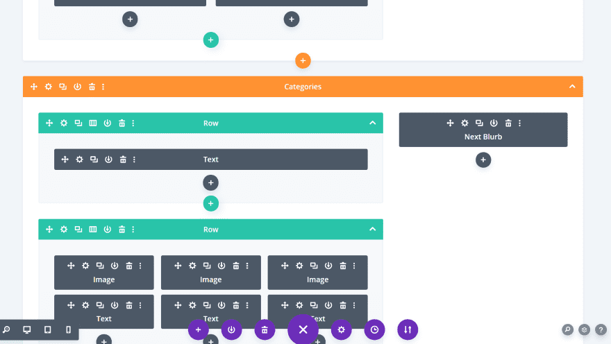
Here’s a look at the wireframe view. The module does work well with the specialty sections.
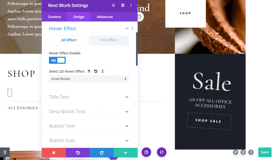
I can now add effects and features that I couldn’t get with the image and button in the original layout. For example, I’ve added a Grow Rotate 2D hover effect. Since I placed the header text and button over the black background for that column space, the card seems to remain in place while the content tilts.
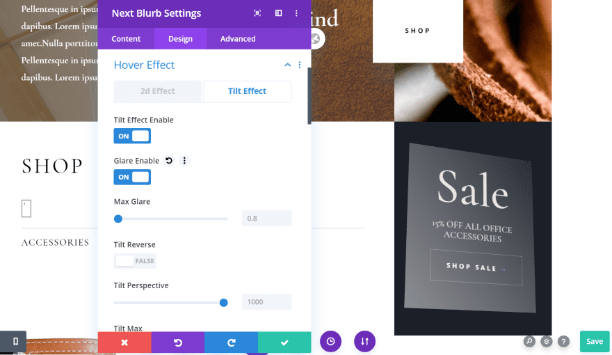
This one includes the tilt effect. I’ve added a glare so the card is visible within the background on hover.
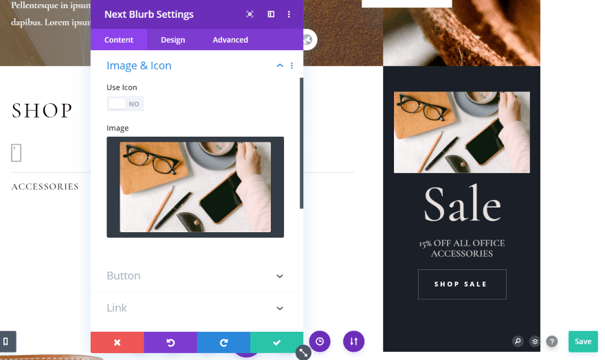
For this example, I’ve added an image to the blurb. I left it on the top of the blurb card.
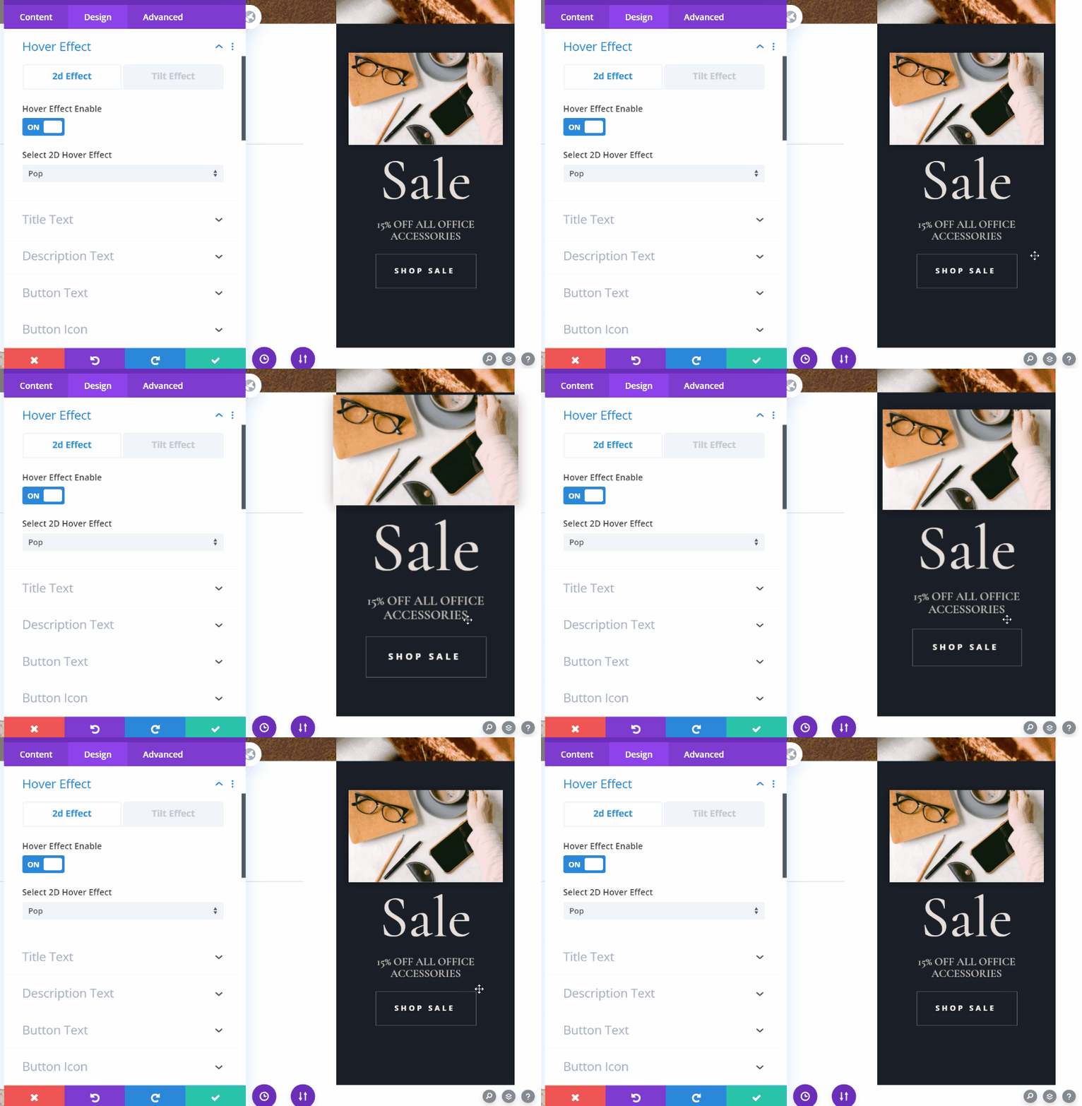
For this one I’ve added the pop hover effect, just to show the animation. This is a good way to grab the attention of visitors as they hover over the blurb.
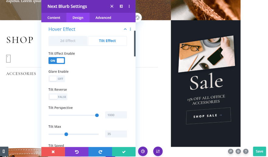
This one includes the tilt effect without glare enabled. The card tilts within the column, but the borders of the card to not as perceived.
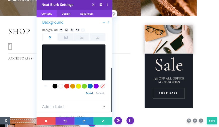
I’ve removed the background from the column and added it to the module. This keeps the black background behind the text. I’ve also added a box shadow just to the image. I removed the border so when I use a tilt effect the border doesn’t show.
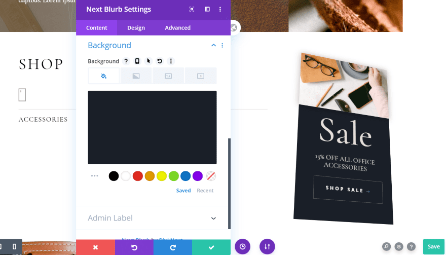
Here’s how it looks with the tilt effect. It does a great job of adding perspective to the image. I love the look of the box shadow.
Divi Next Blurb Example Two
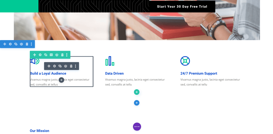
For this example, I want to replace the blurbs in the Startup home page layout with Next Blurb modules and make them a little more complex in their design.
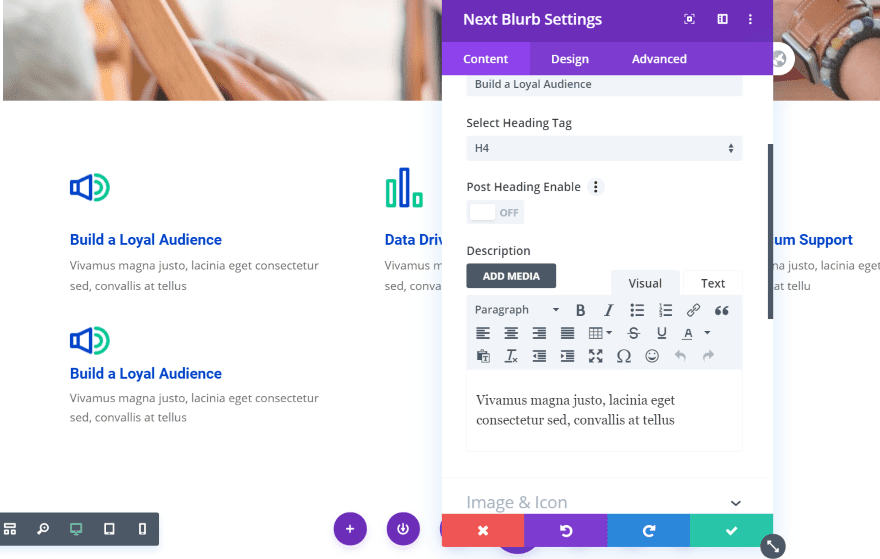
It was easy to recreate the blurb with its current settings. All I’ve done here is add the image, title, and content. Now, I’ll make some adjustments.
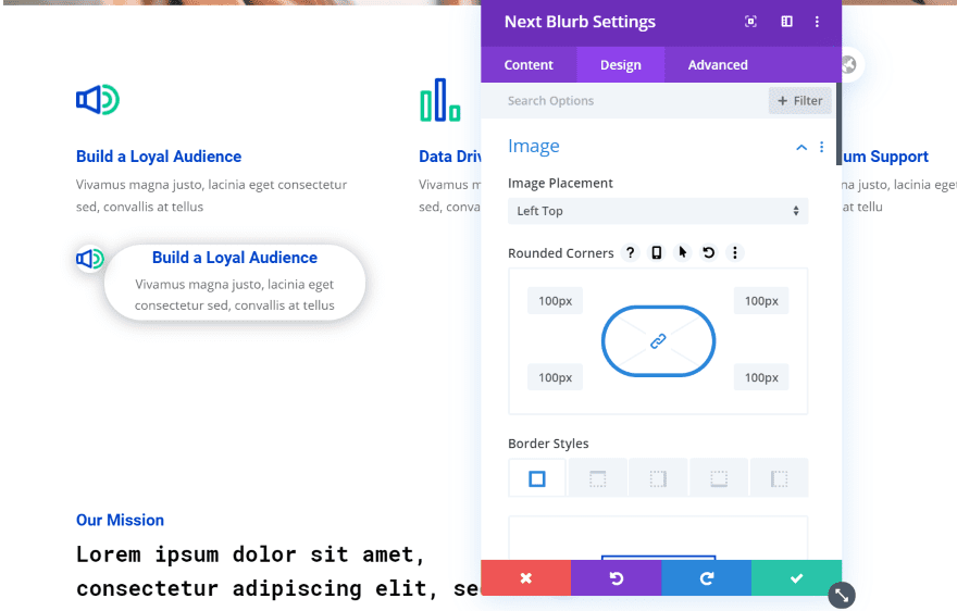
I moved the image to the left top and added a box shadow to both the image and the body text. The border’s corners are rounded and the body text now has 5 pixels of padding for the top and bottom.
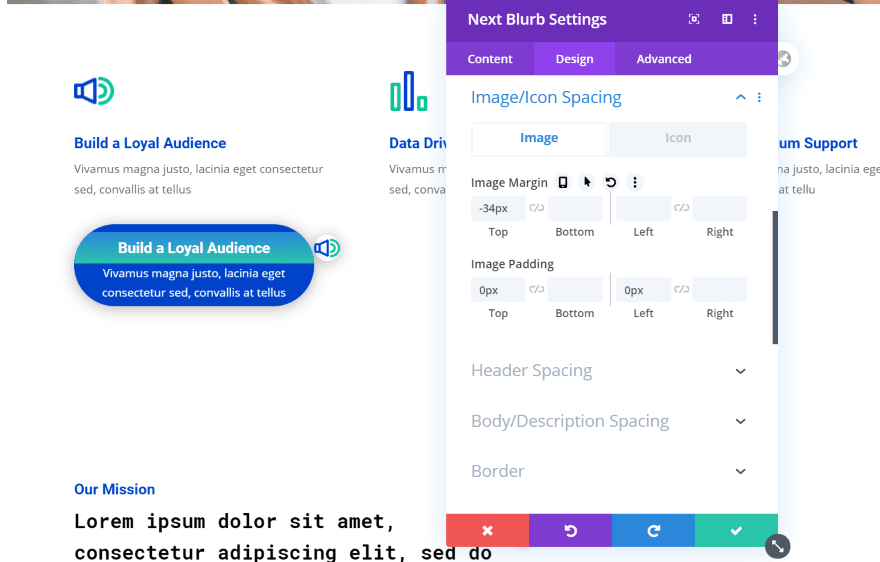
For this one, I placed the icon on the right center and adjusted the image spacing to align it with the heading text. I’ve made the text white and given the background for the body the original text color. For the heading text, I’ve made the background a gradient.
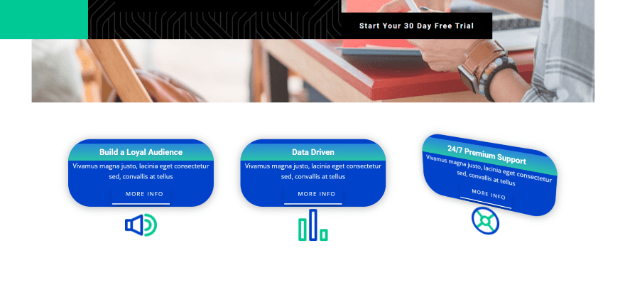
Here are the results. I’ve added padding to the top of the heading text, centered all of the text, and added a button with a bottom border. I’ve added the images to the bottom center and increased their size. The images include a touch of padding at the top to add some space between them and the content area. The buttons have a box shadow that’s just noticeable. I’ve hidden the top and side borders so only the bottom border displays. For the hover effect, I’ve added 3D tilt.
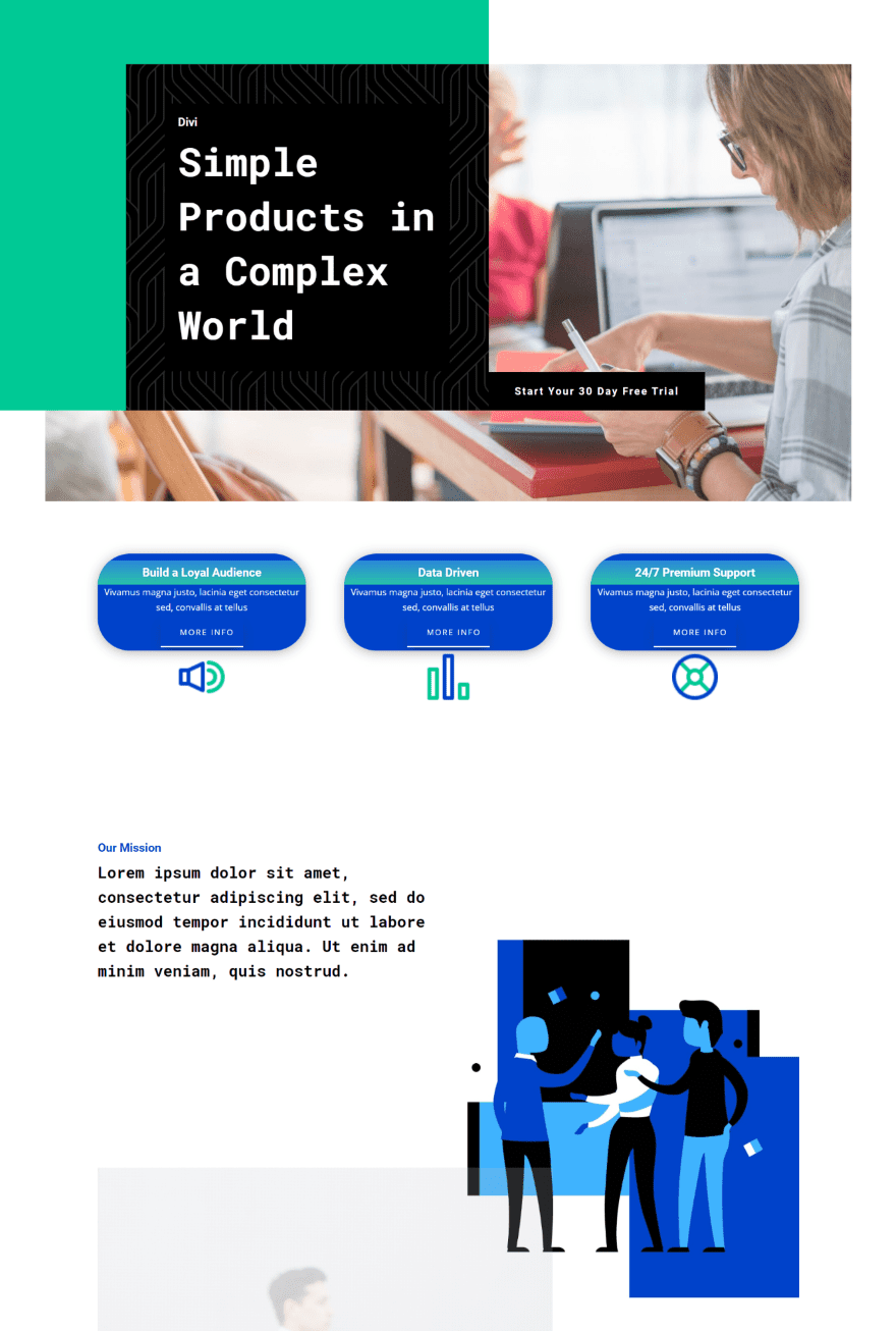
Here’s how the Next Blurbs look within the layout.
Divi Next Blurb Price and Where to Purchase
Divi Next Blurb has three licenses available:
- Single License – $25.00
- Unlimited License – $49.00
- Lifetime License – $99.00
You can purchase it from the developer’s website.
Ending Thoughts
Divi Next Blurb is an interesting module for Divi. I’ve only scratched the surface of what it can do and what can be designed with it. It has a lot more settings and adjustments than I expected. Just about every element has its own border, spacing, and box shadow settings.
There are a few features that seem like they could be placed in more standard areas. For example, the heading tag selector is in the content tab rather than the design tab. It’s still easy to figure out where things are and I had no trouble understanding what any of the settings do.
I like Divi Next Blurb a lot. If you’re interested in an easy-to-use blurb module that does a lot more than the standard Divi module, Divi Next Blurb is worth a look.
We want to hear from you. Have you tried Divi Next Blurb? Let us know what you think about it in the comments.
Featured Image via Leonid Zarubin / shutterstock.com



Hey Guys thanks for so much amazing stuff. Buying Divi for life was one of the best decisions I ever made. Simply love what you guys keep on adding.
But does it do the only thing I really want a Blurb to do, which is make the image clickable to open in a lightbox? Using Blurbs to make an illustrated restaurant Menu grid seems like a no-brainer (and something I could use for several clients), but currently the images are stuck as tiny little thumbnails.