Divi Product Carousel Module is a third-party plugin for Divi that displays WooCommerce products within a carousel slider. Build a product carousel and place it within any Divi layout. You can style them and choose multiple layout and display options. In this article, we’ll look at Divi Product Carousel Module, see its features, and see how easy it is to use.
Divi Product Carousel Module is available from the developer’s website and in the Divi marketplaces.
Divi Product Carousel Module
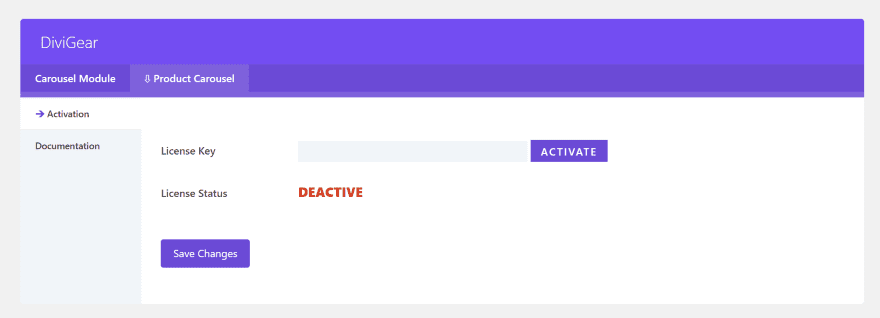
Once you upload and activate the plugin, go to DiviGear in the dashboard menu and activate your license. If you have multiple plugins from this developer you’ll need to select the plugin’s tab.
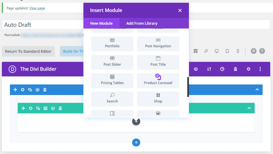
A new module is added to the Divi Builder called Product Carousel. It includes a purple icon so it stands out from the crowd.
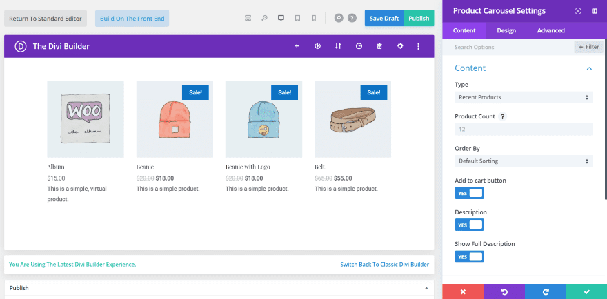
The settings include Content, Design, and Advanced tabs. The Content tab has settings for the WooCommerce content. Choose the product type from recent, featured, sale, best selling, top rated, or product category from the dropdown box. Enter a number for the product count you want to display. Choose the sorting order from popularity, rating, date, or price. You can also enable the Add to cart button and description. Show the full description or an excerpt.
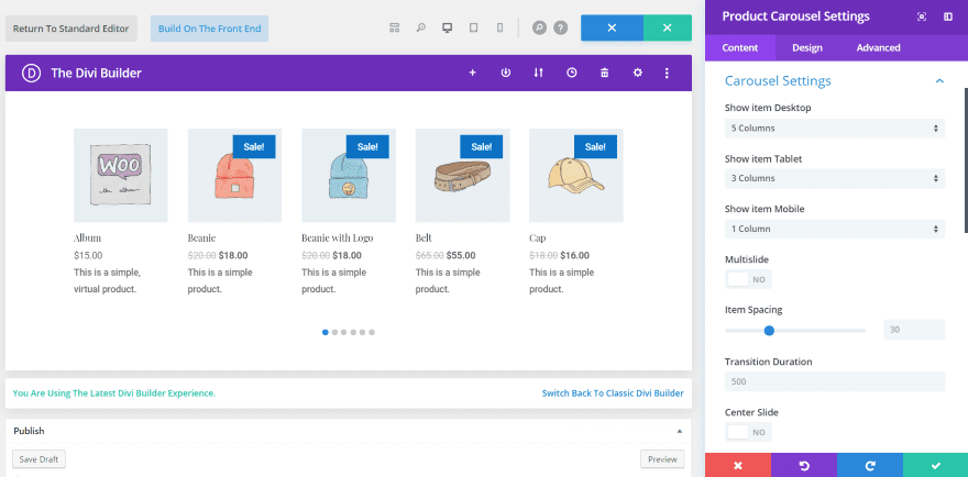
The Carousel Settings let you choose the number of columns based on the device used. It also includes multislide (enable it to slide by the number of the slides on the screen or disable it to slide one slide at a time), item spacing, transition duration, center, loop, autoplay, dot and arrow navigation, alignment, and slide effect. Other settings include the link and background. It’s interesting that you can use the dots and arrows together. You can place the dots on the right, middle, or left at the bottom of the slide.
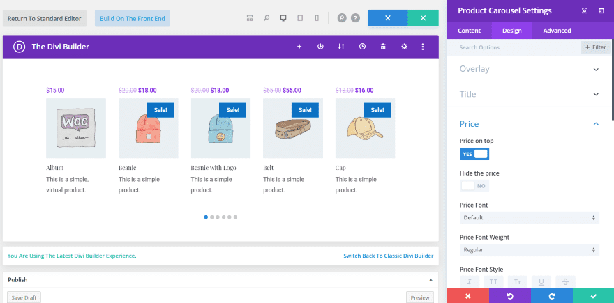
The Design tab includes settings for the overlay, title, price, description, sale badge, add to cart button, review, arrow, dots, image, hover, spacing, border, and box shadow. Other settings are added based on the selections you choose. Each of these settings is extensive.
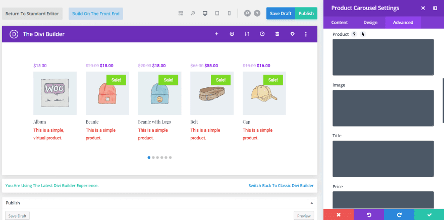
The Advanced tab includes the expected CSS, visibility, and transitions features. The Custom CSS includes fields for product, image, title, price, sale badge arrow previous, arrow next, and dots. This gives you a lot of control with CSS.
Divi Product Carousel Module Settings
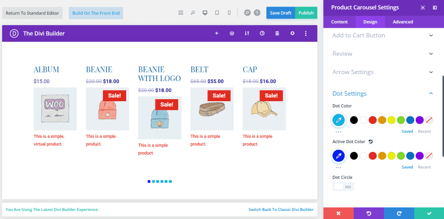
You can move the titles and prices to the top or bottom. In this example, I’ve moved both to the top and changed their size and color. I’ve styled the sale badge by changing the background color and font size. I also styled the inactive and active dots.
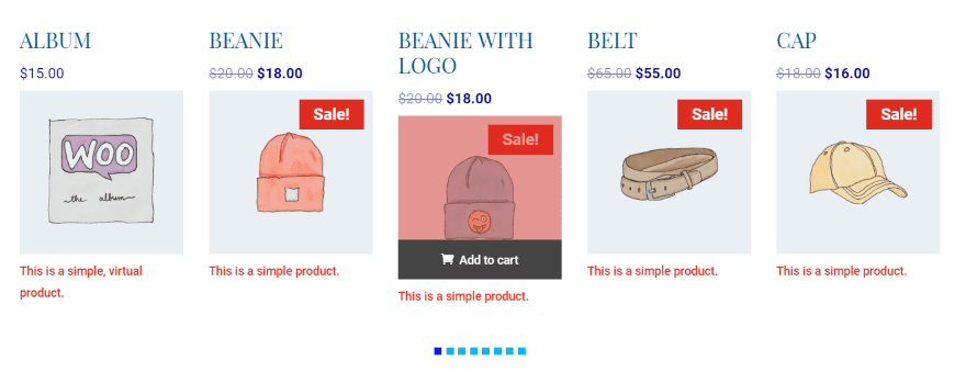
Here’s how it looks on the front end. I’ve also added an overlay and the Add to cart button appears on hover. You can style this button for both the overlay hover and the button hover.
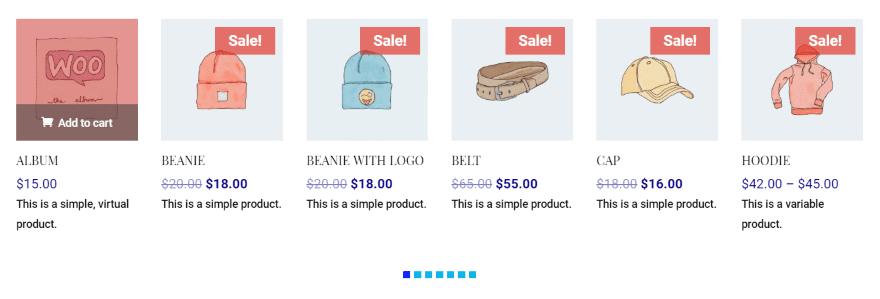
In this one, I’ve selected 6 columns, moved the all of the text back to the bottom, adjusted the text colors, and added some opacity to the add to cart button. I left the hover opacity at default, so the button is solid if you hover over the button itself.
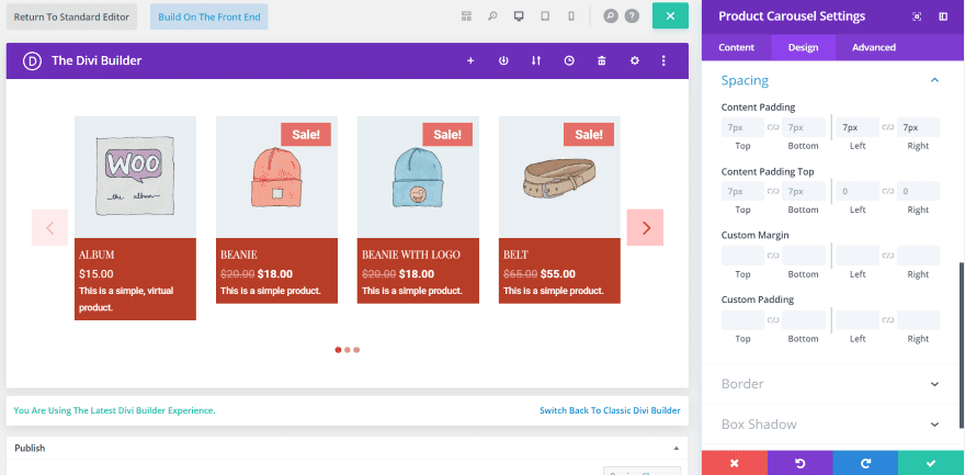
For this one, I set the layout to 4 columns. I’ve added arrows and changed the colors of the arrows and the dots. I’ve also added a background to the title, price, and description, and changed all of the text to white. In order to get the text aligned well within the box, I added some content padding. It also includes content padding for the top (in case you place the title or price above the image).
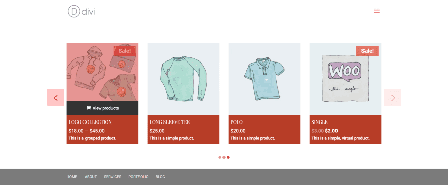
Here’s how it looks on the front end. The arrow on the right is lighter to indicate that it’s at the end of the products it can display. If I set it to loop it would be the normal color.
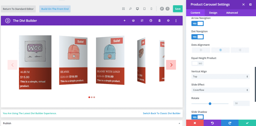
Here’s how it looks with Overflow selected. It provides a nice 3D card effect. You can adjust the amount of rotation and enable the slide shadow.
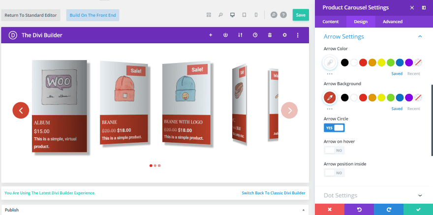
In this example, I’ve given the cards a box shadow and adjusted the blur. I’ve also changed the arrows to a circle and adjusted the colors.
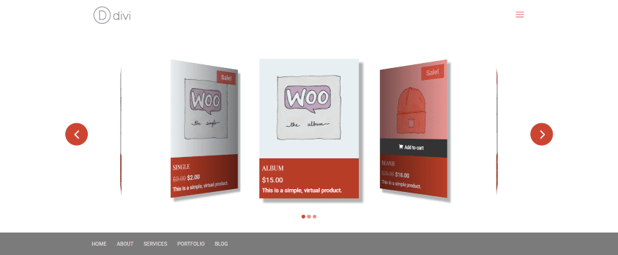
Here’s how it looks on the front end with Center Slide enabled. This is the 4-column layout. It does display differently when you select Center Slide.
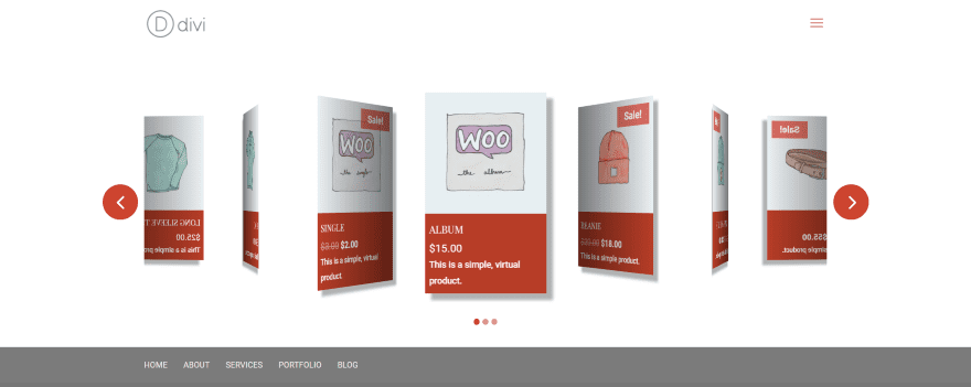
This is the 5-column layout using the same settings as the example above.
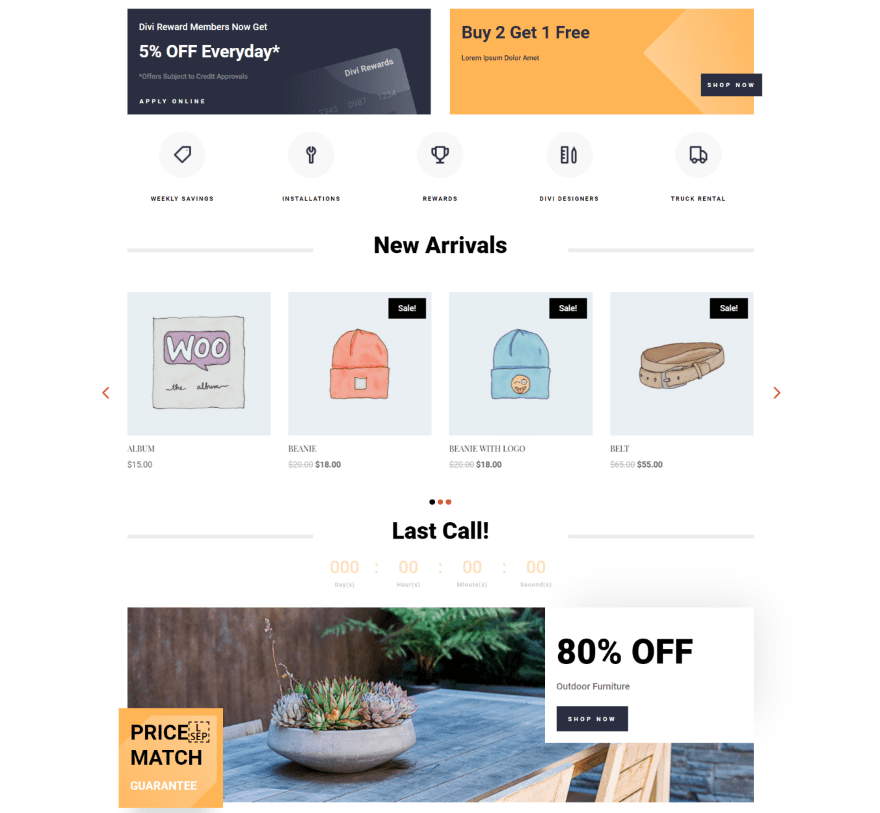
The product carousel fits well within the Divi layouts. In this example, I’ve replaced the Divi shop module with the Divi Product Carousel Module and styled it to match the layout.
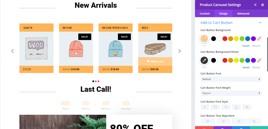
In this one, I moved the title to the top, added some padding to the top and bottom, and made the titles semi-bold. I’ve also changed the color of the Add to cart button to match the layout.
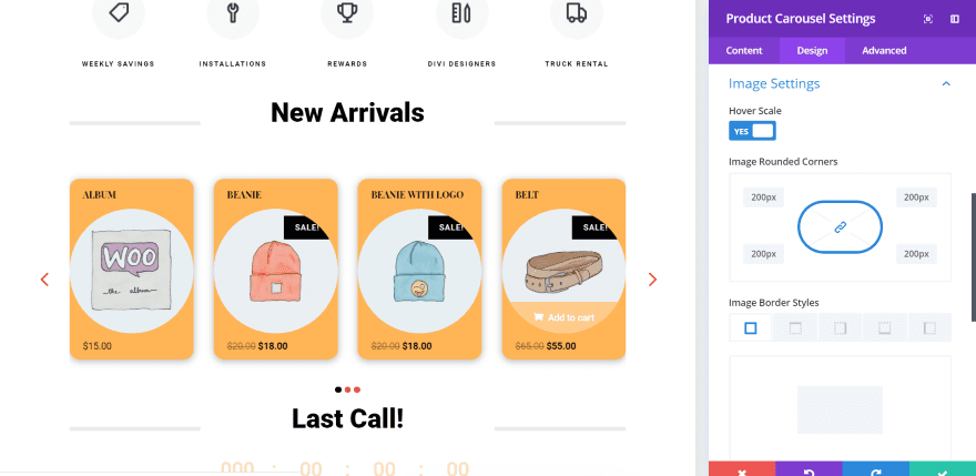
For this one, I’ve adjusted the borders for the slides and the images to create rounded corners. I went ahead and made the images into circles. I’ve also added a box shadow.
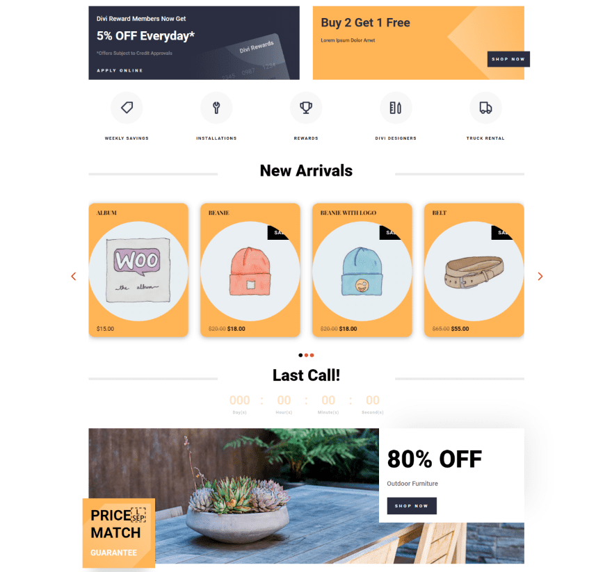
It looks excellent within the layout. It does hide most of the sale badge, though. There’s probably a way around that with CSS.
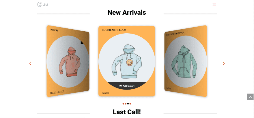
This one uses Overflow with the 3-column layout.
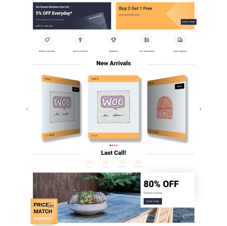
For this one, I removed the image border but kept the border for the slides. I added a box shadow and adjusted its strength and position.
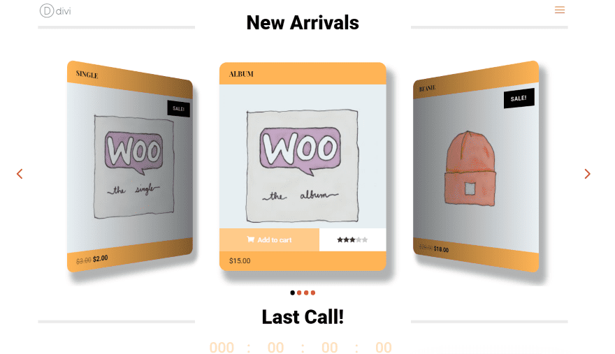
It also shows the star rating from the reviews on hover. It places the rating next to the Add to cart button. It brings them together with a cool animation. This is the default settings. You can style the colors of the background and the stars.
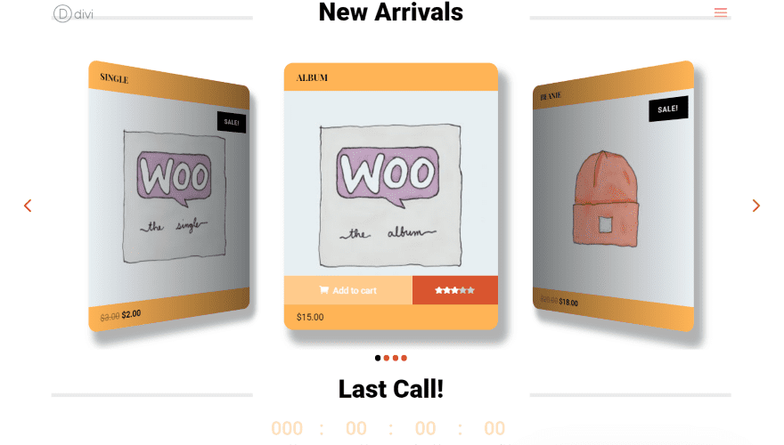
In this one, I’ve styled the ratings to match elements from the layout.
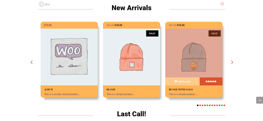
For this one, I moved the price to the top and the title to the bottom. I’ve added a description and an overlay. I moved the dot navigation to the right. I had to add some padding for the box shadow to show on the sides. Without the padding, it places the product at the edge of the module’s space.
Divi Product Carousel Module Demos
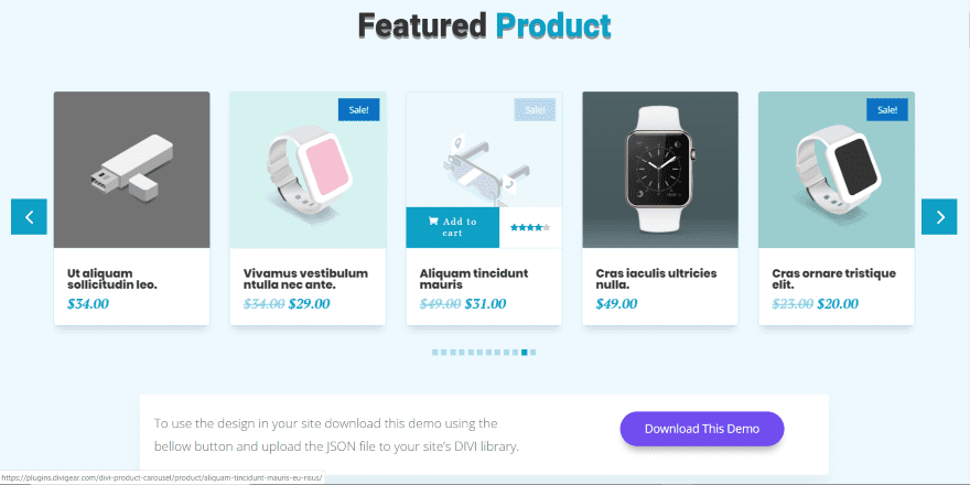
There are currently 13 downloadable demos on the developer’s website. These are layouts that you can upload to the Divi Library and use with any Divi layout. All include styling for the Divi Product Carousel module and some include other styled modules and backgrounds. These are good for getting a starting point with your product carousel designs and to show some of the things that can be done with the module. Let’s look at a few of them.
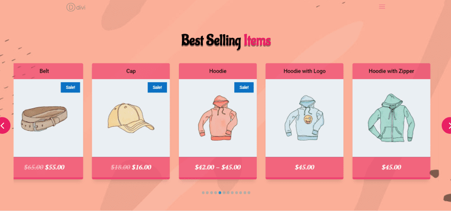
This one places the titles at the top, styles to top and bottom to match, adds circled arrows outside the images and includes dots. It also has a bottom border to make the slides stand out. I like the bold colors. The top and bottom have a little bit of transparency so the background patterns show through. This layout includes a styled text module for the title.
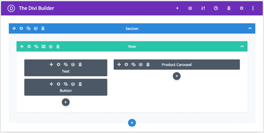
Several of the layouts include other modules with styling. This one uses a two-column layout to add a call to action using text and button modules.
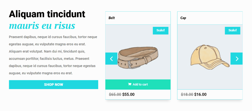
Here’s how it looks from the front end. It includes a border, titles at the top, and two colors for the Add to cart button. The arrows show within the images of the module.
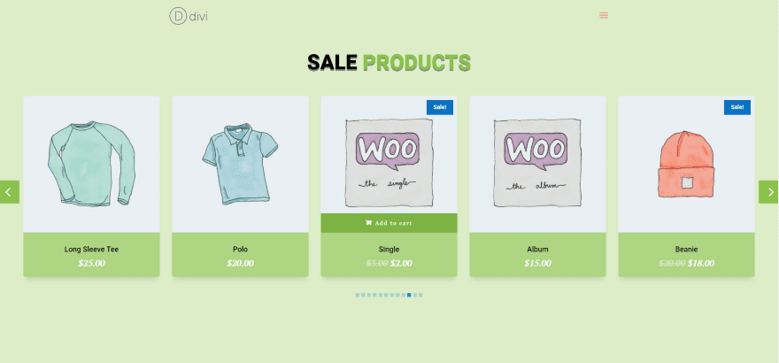
This one includes a green background and styled slides to match. The Add to cart button is light green when you hover over the product and then dark green when you hover over the button. It includes a styled text module for the title.
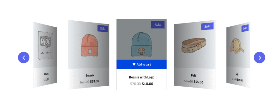
This one includes blue styling for the sale badges, round arrows outside of the images, and the Add to cart button. It adds a small border to the slides. It displays the slides with the Overflow effect.
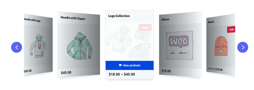
This one also displays products with the Overflow effect. It also uses blue for the arrows and Add to cart button. The title is moved to the top. The overlay is white with a high opacity and the sale badge is red.
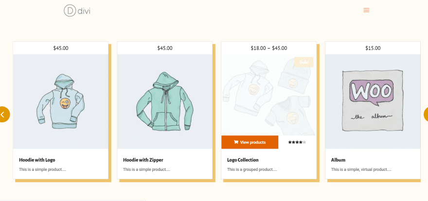
This one includes a styled background and adds a border, styled Add to cart button, sale badge, and circled arrows. The overlay is white. It places the price at the top and all of the other data at the bottom.
Divi Product Carousel Module Price and Documentation
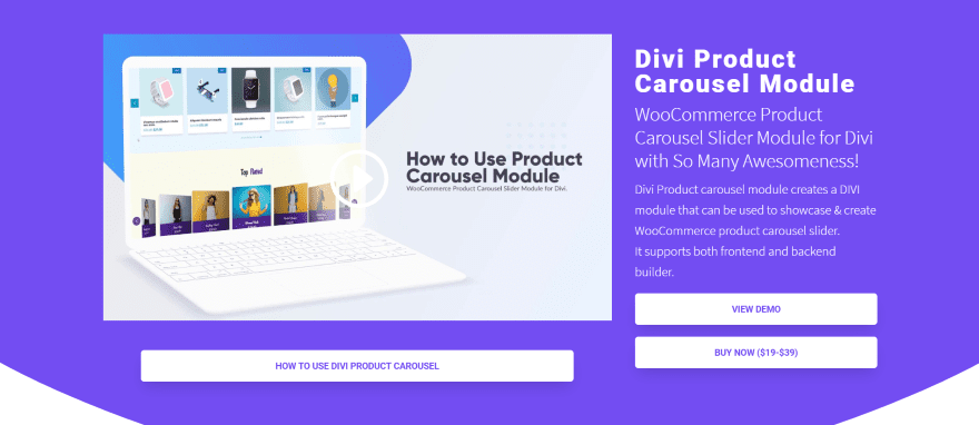
There are two purchase options for Divi Product Carousel Module:
- Single site – $19
- Unlimited sites – $39
It’s available from the developer’s website and in the marketplaces.
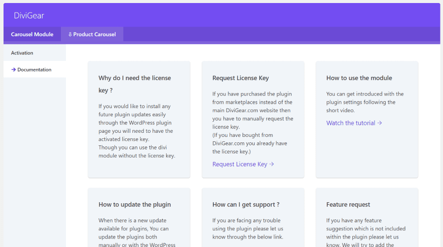
Documentation is supplied by a YouTube video that walks you through the features. You’ll find a link to it in the DiviGear menu in the dashboard. If you have more than one DiviGear product, select the product’s tab and then select Documentation.
Ending Thoughts
Divi Product Carousel is easy to use and it’s great for making your products stand out. Even if you don’t want to display them as a slider it has a lot of styling and product presentation options to make it worth considering. I didn’t work that well with Extra. I’d love to see Extra supported since it already has a lot of WooCommerce features and is a great platform for building WooCommerce stores.
I like that it has downloadable demos. They include the backgrounds and styling for the module. These are great for giving you a starting point or sparking your imagination for presenting your WooCommerce products within your Divi layouts.
If you’re interested in presenting your WooCommerce products in a carousel, or just having a few more design options, Divi Product Carousel Module is worth a look. It’s available from the developer’s website and in the Divi marketplaces.
We want to hear from you. Have you tried Divi Product Carousel Module? Let us know what you think about it in the comments.
Featured Image Letters-Shmetters / shutterstock.com


Hello Randy A. Brown,
How I get this plugin??
Thanks to Randy for sharing this useful post
Where is the woocommerce module you you showed back in September?
how i get this plugin?
How I got Divi Product Carousel Module ?