Divi’s Person module is a great way to showcase your staff. It includes a location for their name, position, social media links, description, and an image. It’s a simple module with all of the person’s information stored within the module itself. What if you wanted to add categories and select which team members to display based on those categories? What if you wanted to change the design for every team member at once? What about layout options or a filter?
A third-party plugin for Divi called Divi Team Members does exactly that. It adds 6 modules to the Divi Builder with multiple layout options and styling features and an area to create your team members. You can place as many modules as you want and select which categories each module will display.
Let’s take a look at Divi Team Members and see what it can do. Images from these examples came from Elegant Themes layouts. I’m using a combination of squared and circled images.
Installing and Activating Divi Team Members
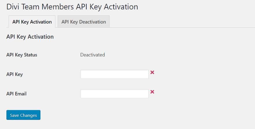
Once you upload and activate the Divi Team Members plugin you’ll need to activate the license. In the dashboard, go to Settings > Divi Team Members, and enter your API key and email.
A new menu is added to the dashboard called Team Members. Within this menu you’ll find the list of team members, area to create a new team member, department categories, and settings.
Adding a Team Member
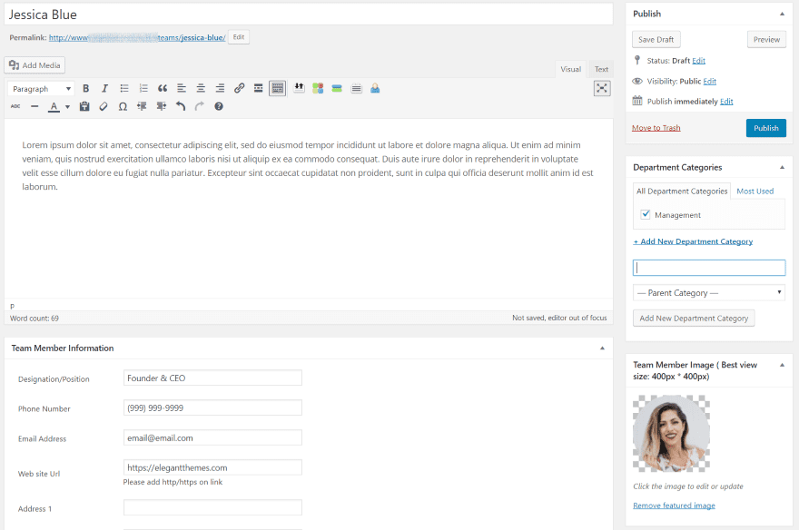
Create Team Member includes a TinyMCE editor, department categories, team member image, and team member information. Here you can add content and create categories just like with a WordPress post. Create the team member and hit Publish.
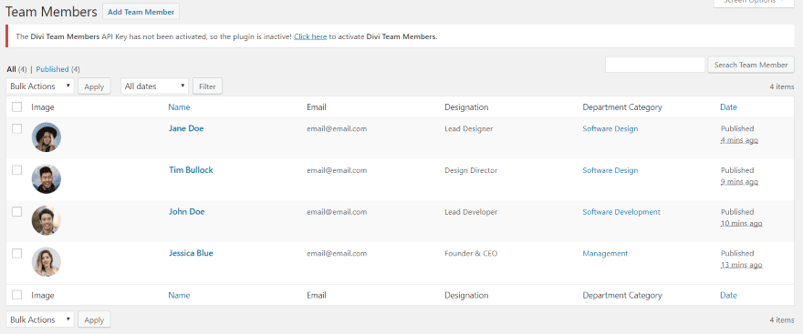
Team Members lists each of the team members that you’ve created. You can search, perform bulk actions, and view by category.
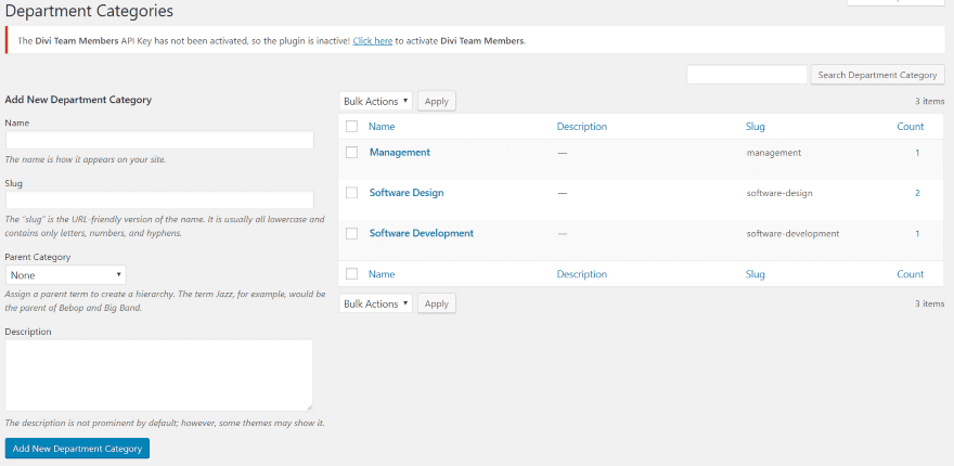
Department Categories works the same as normal WordPress Categories. Add the name, slug, parent, description, etc.
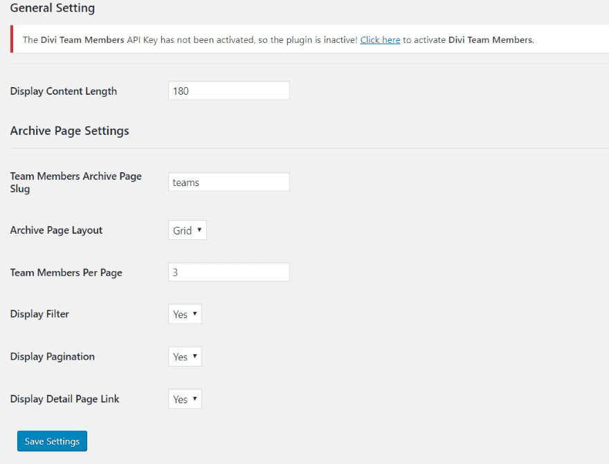
General Settings allow you to set the display length for the content, choose the archive page, set the archive page layout (grid or list), choose the number of members per page, show the filter, pagination, and detail link.
Divi Team Members Modules
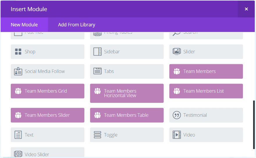
The Divi Team Members plugin adds 6 new modules to the Divi Builder:
- Team Members
- Team Members Grid
- Team Members Horizontal View
- Team Members List
- Team Members Slider
- Team Members Table
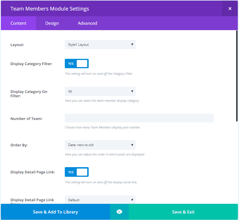
Most of the modules includes the same or similar options, but display differently. The Team Members and Team Members Grid modules have 52 layout options. Other features include a category filter, categories, ordering, link type (includes custom options), color options, display the social link, etc. The Team Members List module includes 4 layout options. The filter button has 20 different styles built in.
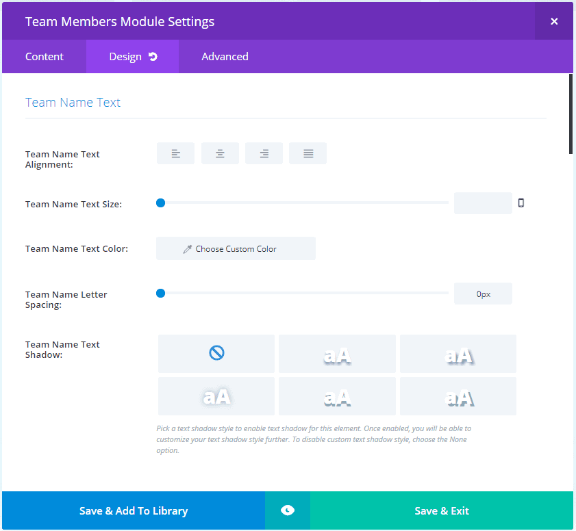
The Design tab includes the team name text, designation name text, description name text, border, box shadow, and animation. Some of the modules include customizations for telephone text and website text. They have basic customizations for the fonts.
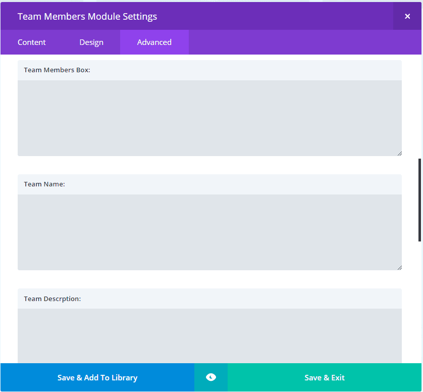
The Advanced tab includes custom CSS fields so you can style many of the elements individually.
With 52 layout styles and 20 button styles, it clearly has enough design options to create practically any type of style you could want. Each of the elements are customizable. You can adjust the background colors, overlay colors, text, icons, and filter buttons.
Divi Team Members Examples
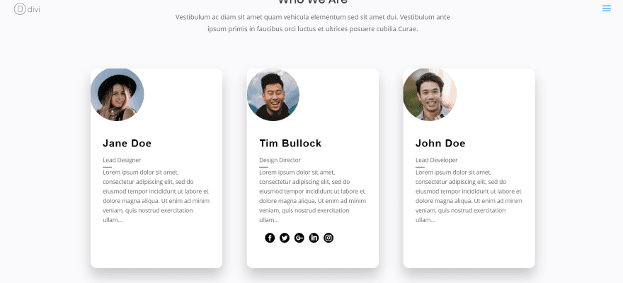
Here’s the Team Members module using the default settings. It actually displays all of my team members, but only three on a single line. The team members are shown as individual cards. It zooms the image and shows the social links on hover. In this example I’m hovering over the middle card. This is the Style1 layout. Even the default settings has an elegant enough design to use as it is.
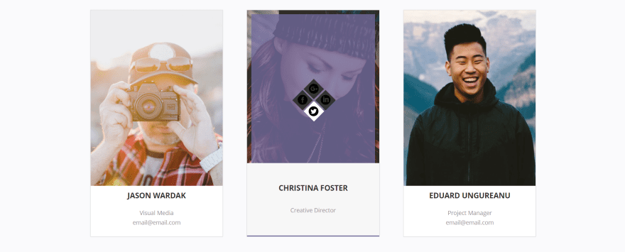
Here’s the Style2 layout. It adds an overlay with social links on hover.

Style3 adds a READ MORE link on hover.

Style4 adds an overlay with gradient and social icons on hover.

Style6 adds a circular overlay with all of the text animated.

Style7 brings in the social icons and adds a styled tab to the bottom.
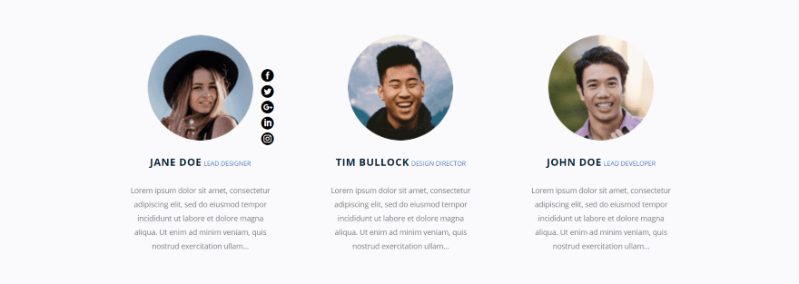
Style8 brings in the social buttons to the right on hover.
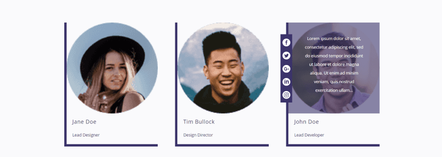
Style10 shows the text in an overlay on hover and adds the social icons to the left.
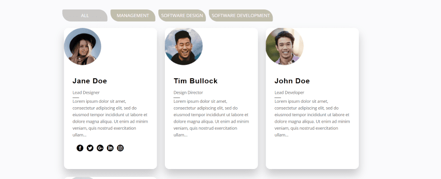
Here’s the Style1 layout for the Team Members Grid module. It adds a filter for all of the categories. This is filter style 1.
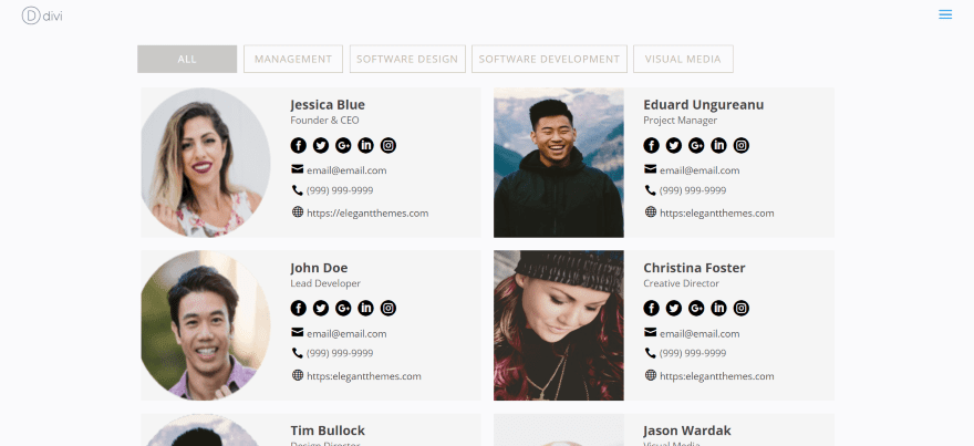
The Team Members Horizontal View module shows all of the information within a card. This is layout Style1. It’s also filterable. This one uses Style2 for the filter button.
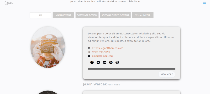
The Team Members List module moves the image outside of the card, and adds an excerpt from the content and a button to view more. It also includes the filter. This is layout Style1 with Syle3 for the filter button. This was a square image that the module is showing as an oval.
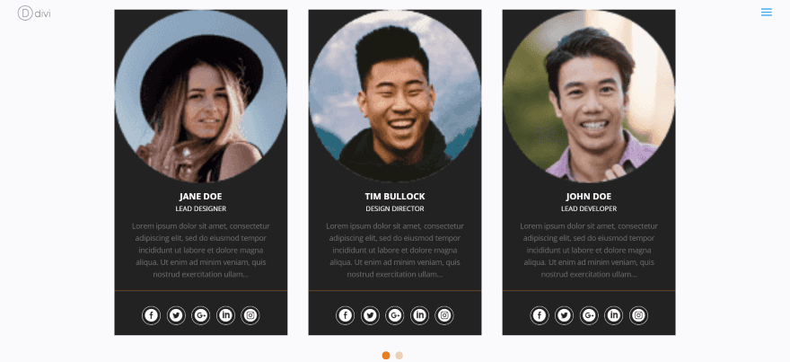
The Team Members Slider module includes navigation. It doesn’t include layout styles and isn’t filterable, but all of the elements are customizable.
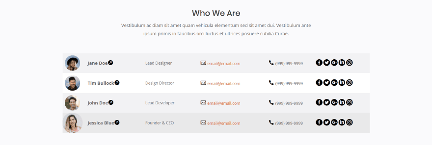
The Team Members Table module displays a table with all of the information on a line. Every other line is a different color. You can style odd and even lines individually. I’m hovering over the bottom team member, which changes color and increases the size of the image on hover.

Here’s the Team Member’s module using Style13 within the About page of the Elegant Themes Digital Payments layout. This is the default settings.
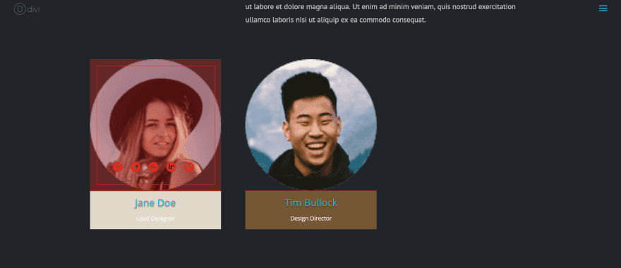
I’ve made a few modifications including colors for the background, icons, border, overlay, and name text. I’ve set it to show 2 team members. The cards remain the same size as if it were showing 3. The size will change though if I place it within a smaller column. If I change styles, the colors stay with that style- so I can set different colors for each style. The social icons remain the same throughout the styles.

This is Style15. It keeps the colors for the social icons, but my custom colors for the overlays are default, allowing me to use a different color for each style.
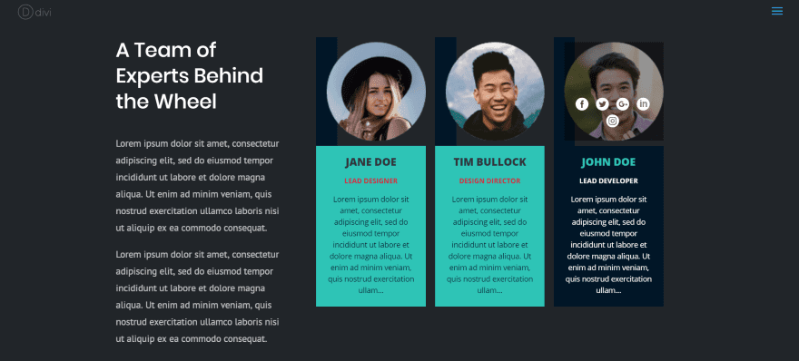
This is the Team Members Grid module displaying 3 team members using Style16. I’ve placed it within a smaller column within the section.
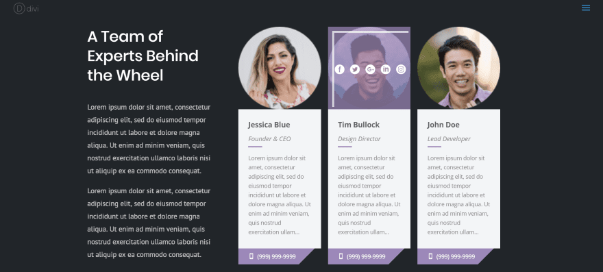
Here’s the same module using Style17 and Random for the team member selection. I’m hovering over the middle team member, which displays the social icons in an overlay. The colors are default.
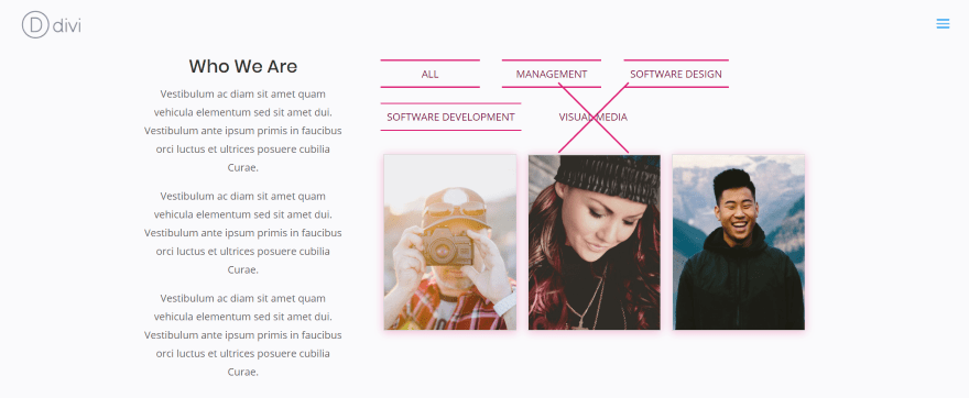
Here’s Team Members Grid with layout Style19 and filter button style 5. I’ve changed the button colors and added a background shadow to the cards to match. In this example I’m hovering over Visual Media in the filter to show the button animation.
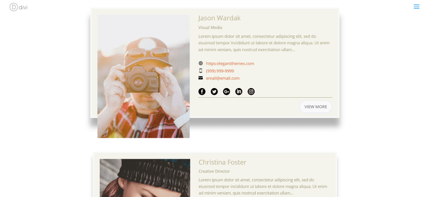
This one uses the Design Agency layout with Team Members List module using the Style4 layout.
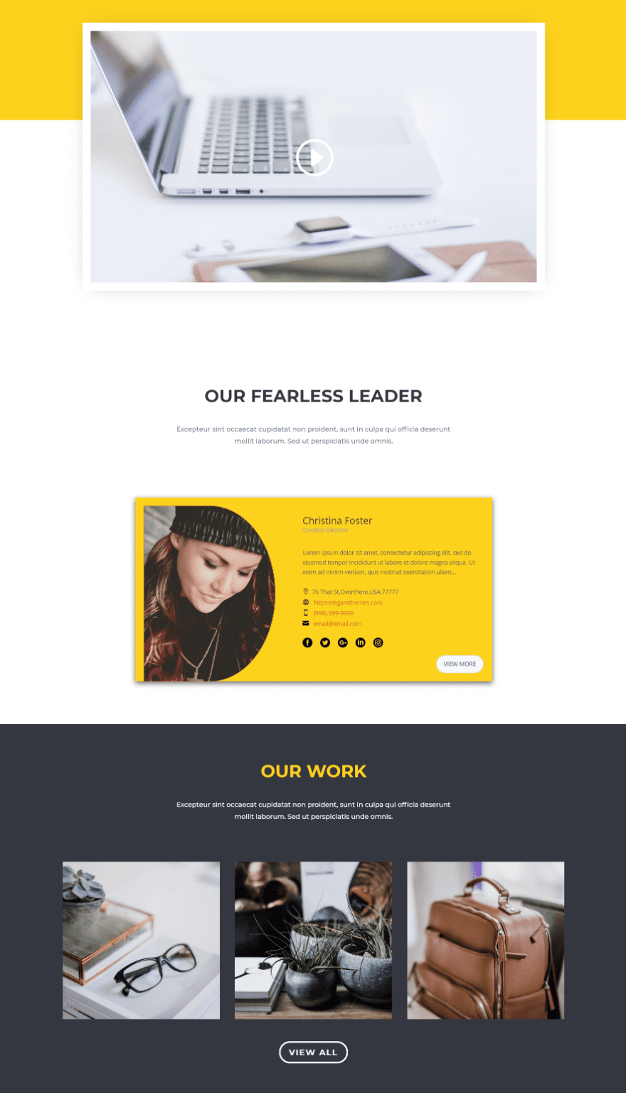
This Team Members List module uses Style3. I’ve customized the background color to fight within the layout’s design. I’ve set it to show only one team member.
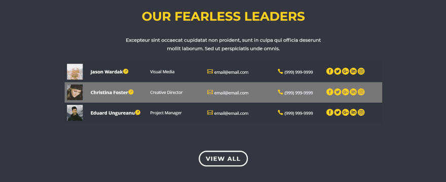
Here’s the Team Members Table module within the Our Work section of the Design Agency layout. I’ve styled the colors to blend with the site, using white for the text and yellow for all of the icons.
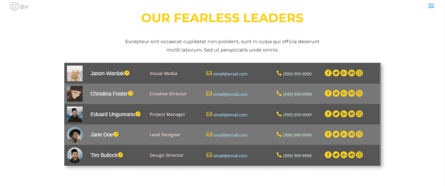
You can adjust font colors independently. I’ve added a few more team members, changed the colors of the fonts, increased the font size of the team member’s name and changed it to Arimo (only the name has this option, and only this module), added a background for odd and even rows, and added a border with shadow.
Using Divi Team Members with Extra
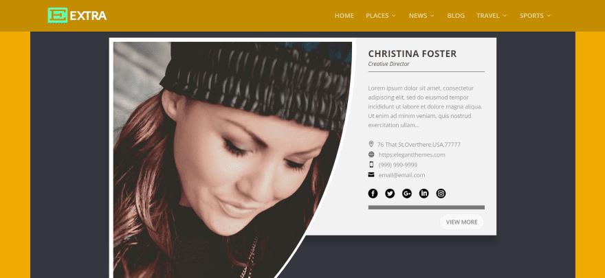
Divi Team Members works well with Extra. This is the Team Members List module using Style2.
Divi Team Members License and Documentation
There are three licenses to choose from:
- 1 site – $35
- 5 sites – $60
- Unlimited sites – $80
Documentation is provided as a download file at the developer’s website. It’s a 15-page document with detailed information about each module.
You can see more information and purchase the Divi Team Members plugin at the developer’s website.
Ending Thoughts
Divi Team Members is easy to use and looks great within Divi layouts. There are so many layout styles built in that I didn’t feel the need for much customizing. With 52 layout styles and 20 button styles in several modules, I had no issues finding something that worked within my layouts. Most of the time I just needed to style the colors to match my layout.
There were a few times I wanted to make a font bold or make some other adjustment but didn’t have a styling option for it. Styling features are still being added, so I’m sure this will be taken care of. I’m hoping to see some styling options for images such as sizes and shapes, and more font styling options. It would be nice to have a universal style that I could select rather than having to create the same overlay color when I changed layout styles.
If you’re interested in a module that’s simple and provides lots of layout options to display your team members, Divi Team Members might be the plugin you need.
We want to hear from you. Have you tried Divi Team Members? Let us know about your experience in the comments.
Featured Image via Sentavio / shutterstock.com


Don’t buy it guys it’s money waste. Buggy and sucky. I’ve never wasted money in my life like i did with this one.
It has too many options I didn’t need and didn’t have the options I did need. Oh well. The search continues. Seems like it’d be easy enough to find a plugin or something that allows filterable team members without lots of fluff.
They maybe have good Design-Ideas. But i am not glad with it. I bought the unlimited version (80 Dollars).
It is not “Divi-Like” and “Divi-Easy”, even if it seems so. It also seems “not finished”. Many functions, unsorted and confusing. API-Informations are “visible” to all Admin-Users, should be encoded. Further bad things: No compliant invoice, no refund policy.
Overpriced.
The Divi Person module certainly needs some upgrade with a custom post type, category filters and a search field.
So here comes a third party plugin to fill the gap. Demo looks -ehm- good albeit those three level menus, but I see no real life need for so many preset styles, compatibility with Divi’s customizer options is ok. A search feature would be much welcomed and useful.
Documentation is a Word file!!!
Come on guys, not even a PDF for all those of us who do not have Calibri font installed 😉
Wow, look what just showed up — Dive Team Members plugin. The universe delivers! My next new project is a site redesign for an artist’s organization with 120 members — each needing simple ID info on display and the ability to sort by artistic style or media. Thank — you!