DiviMenus is a third-party plugin for Divi. It’s a menu-builder that makes it easy to manually create new menus to use instead of the default WordPress menus. It’s now been updated with a new module to create mega menus, dropdowns using WordPress menus, and all sorts of new creative ways to navigate through your content. In this post, we’ll look at DiviMenus via the Divi Popup Picnic Layout Pack to help you decide if it’s the right product for your needs.
Before we dive into the module, let’s take a look at some things you can expect from the DiviMenus plugin.
Features
The DiviMenus plugin includes 2 different modules: “DiviMenus” and “DiviMenus Flex”. You can use the one that suits you the best and assign link types to your menu items.
An example of this is being able to toggle entire Divi Sections as a Tabs module. This allows you to reveal any Layout stored in your Divi Library as a Popup or Mega Menu. You can also reveal a WordPress Menu stored in Appearance > Menus as a Collapsible Dropdown Menu. The features are advanced and completely customizable to your needs!
Free Layouts
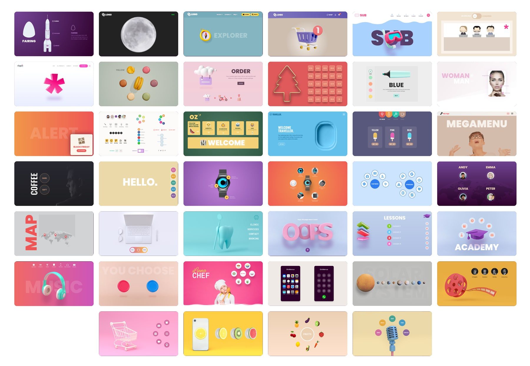
DiviMenus also comes with a bunch of free layouts that you’re able to use when signing up. Let’s take a look at some examples.
Example #1
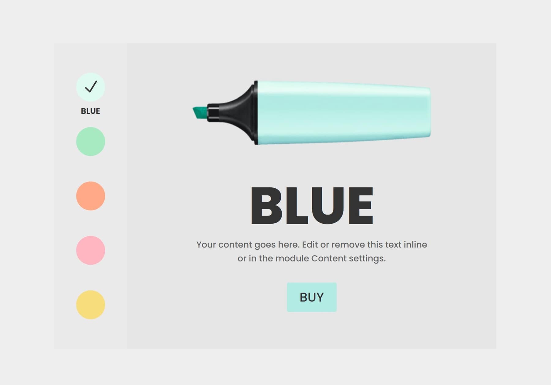
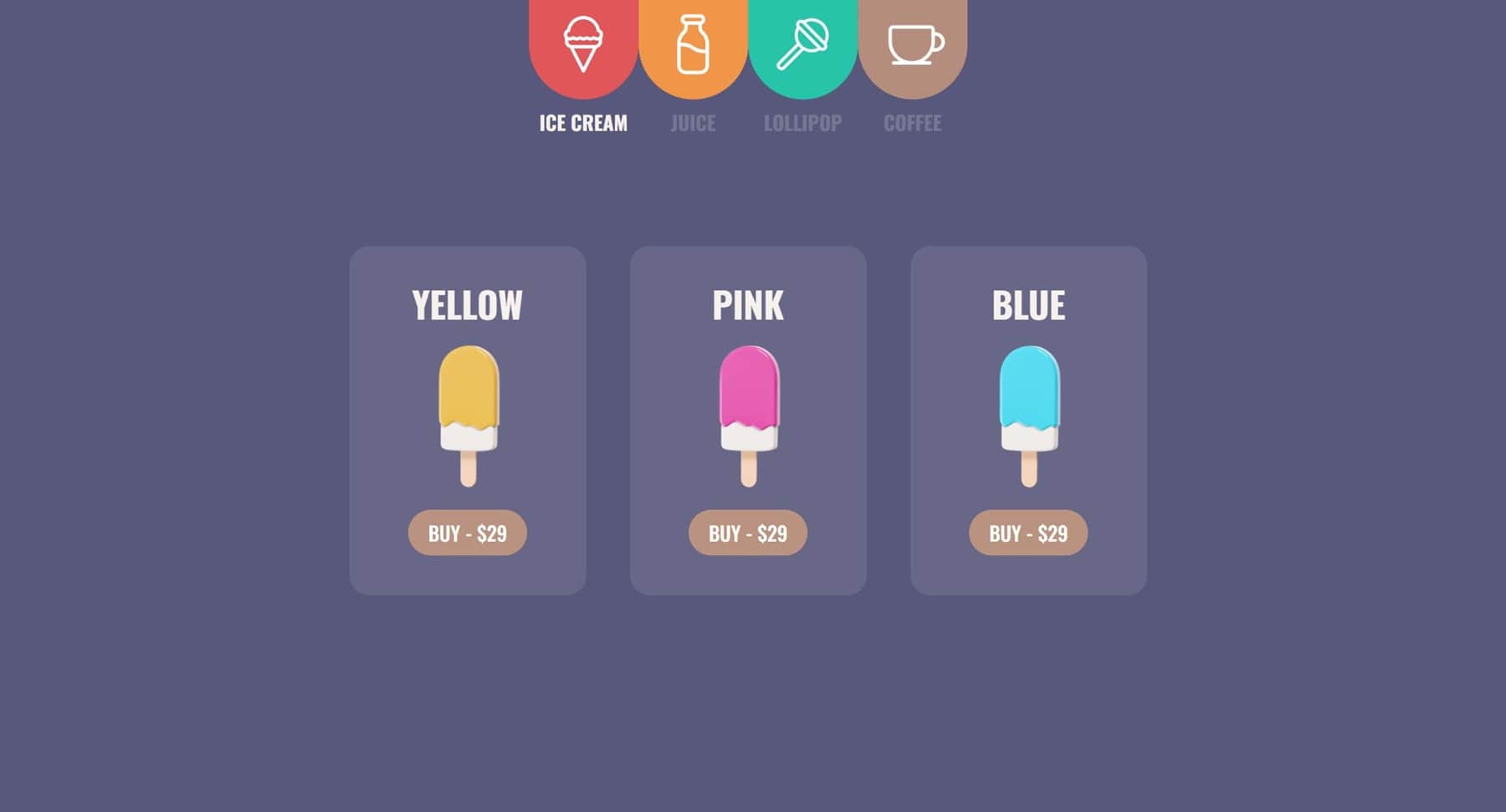
The first layout example highlights different marker colors on click. You can view the demo here.
Example #2
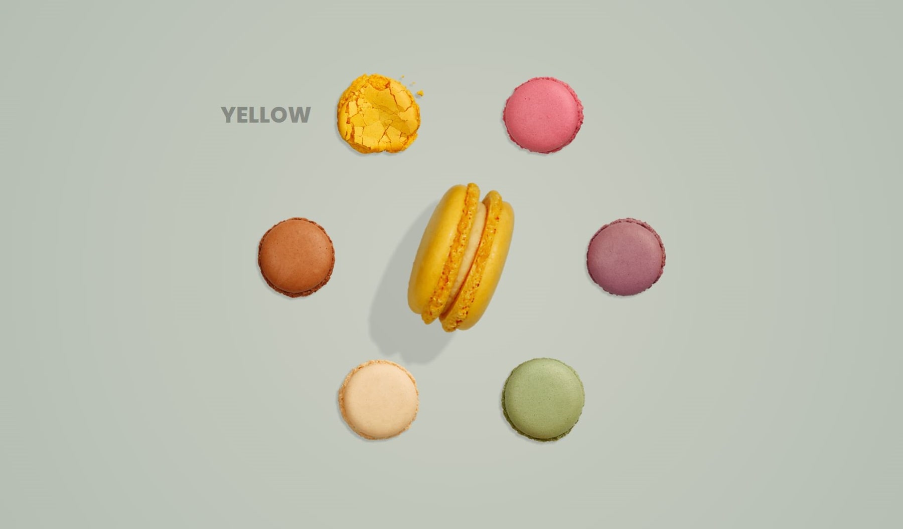
The second example lets you reveal any content by clicking on images displayed in a circular shape. View the live demo here.
Example #3
The last example lets you switch between Divi Sections by recreating a versatile Tab module. You can view the live demo here.
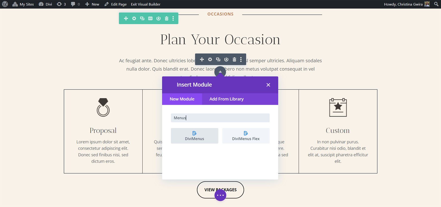
DiviMenus adds two modules to the Divi Builder. Firstly, is the original module called DiviMenus. Secondly, is a new module called DiviMenus Flex.
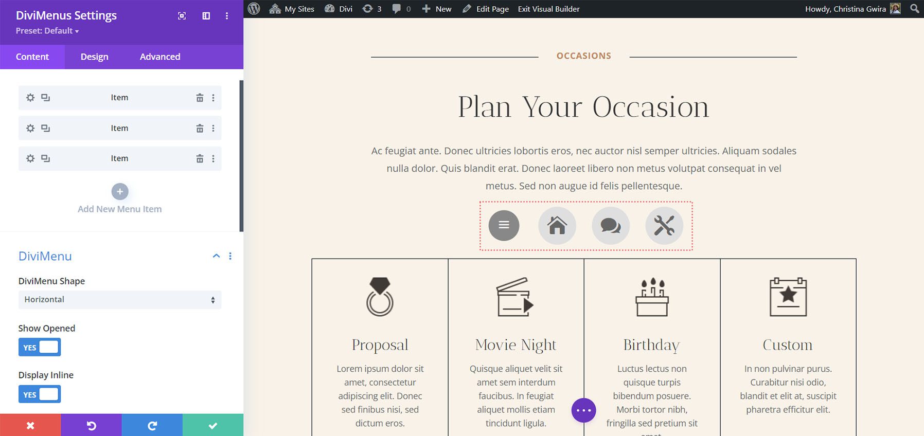
DiviMenus includes submodules for each of the menu items. You can also adjust the menu’s shape, choose how it opens, choose the menu button type, adjust the title, choose icons, specify the URL, and more. The default is a hamburger icon within a gray circle. It can create menus that open on click or hover, menus that float in place, mega menus, and lots more.

Submodule
The submodule adds the items to the menu. I’ve added three menu items in the example below. Give each one a title, choose an icon, adjust how they work, and style them individually from the submodule’s settings. On the front end, these menu items show when the user clicks the hamburger icon. Additionally, you have the option to display the DiviMenu already open when the page loads and even hide the Menu Button.
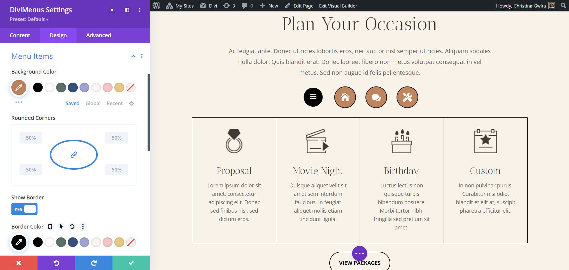
The Design tab gives you control over the colors, sizes, borders, spacing, etc. If you don’t use custom styles in the Design tab, the menu item will inherit the styles from the main module. In the example below, I’ve changed the background color, icon color, and icon size. I also added a border to the menu items and changed the color of the hamburger menu.
DiviMenus Settings
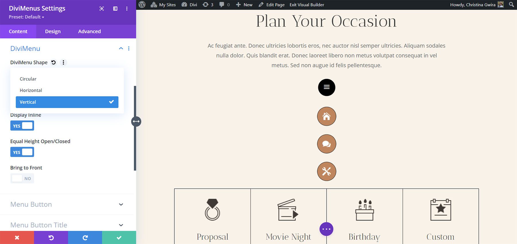
DiviMenu Shape sets the menu in a specific layout. Choose from horizontal, vertical layout, or circular. The default is horizontal. This example shows Vertical. You can also adjust its open state, display inline, equal the heights for opened and closed, and bring the menu to the front.
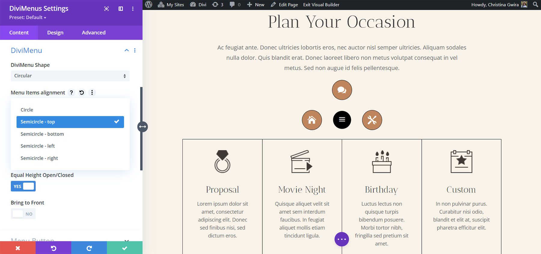
The Circular option opens another menu where you can choose the menu items’ alignment. Choose from a full circle or a semicircle and choose its location. This example shows Semicircle – top. The items create a semicircle at the top of the menu icon.
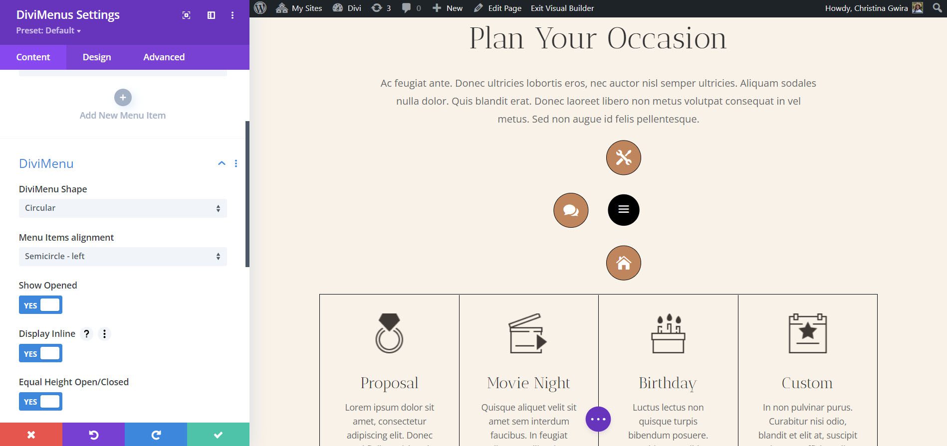
This example shows Semicircle – left. All the items circle the left half of the menu icon.
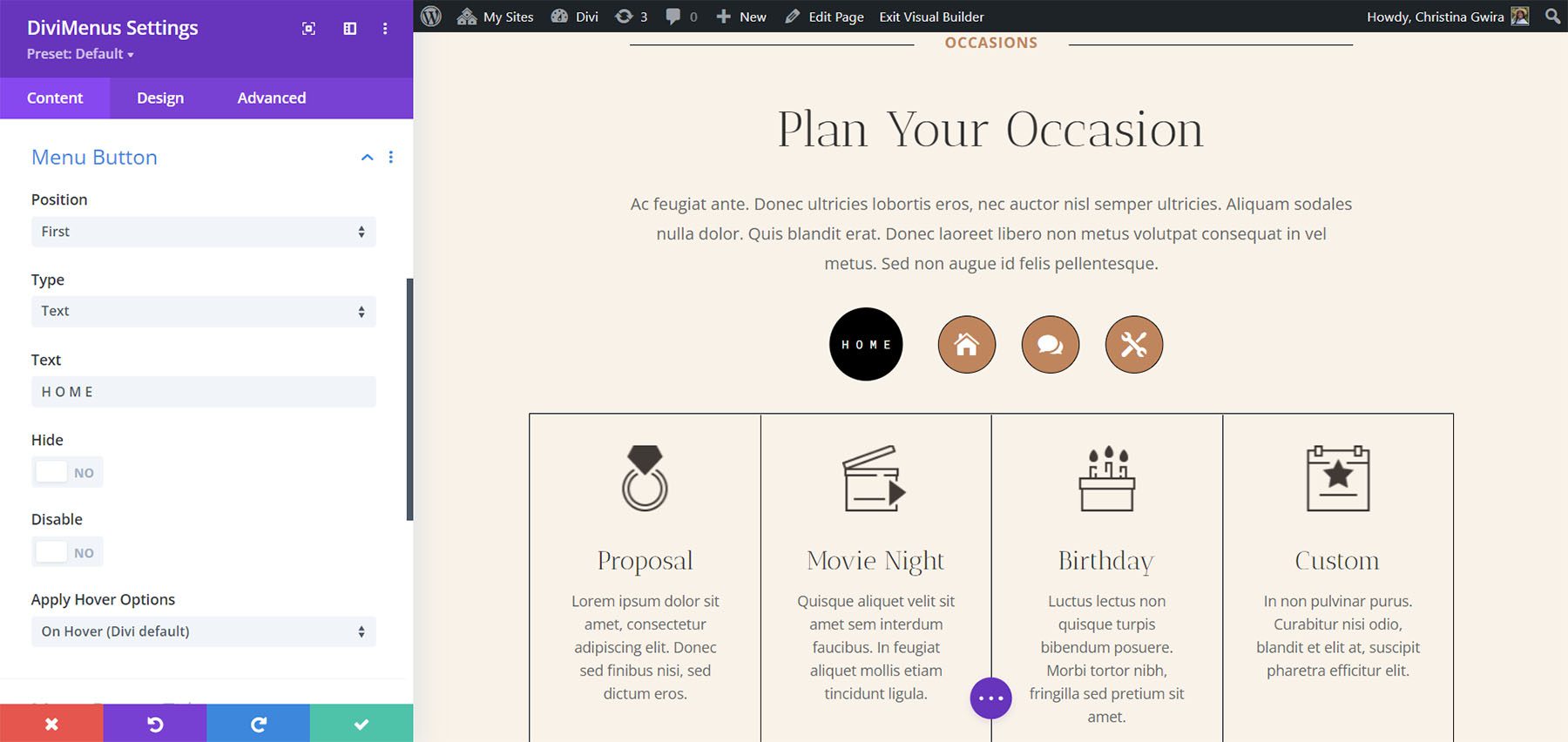
Menu Button
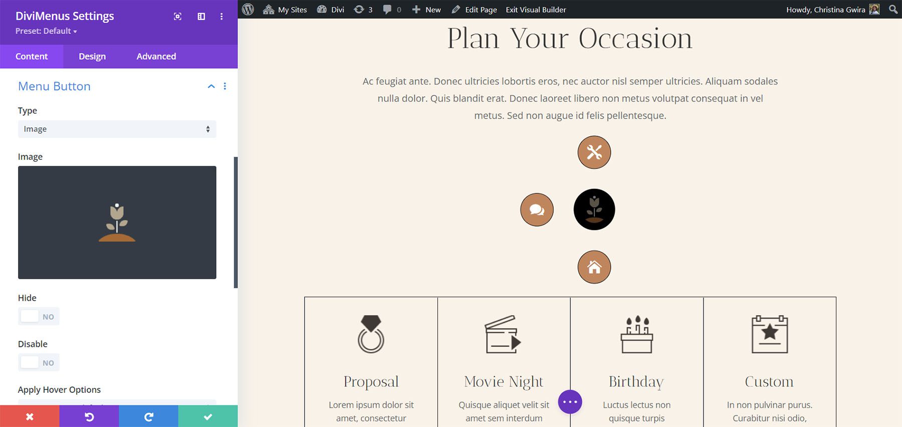
The Menu Button settings let you use an icon, image, or text for the menu button and set its position within the open menu. The default is an icon. You can also hide, disable, or display it on click or hover. This example shows an image. I’ve selected a Divi logo.
This is Text. Enter any text you want into the field.
Menu Button Title
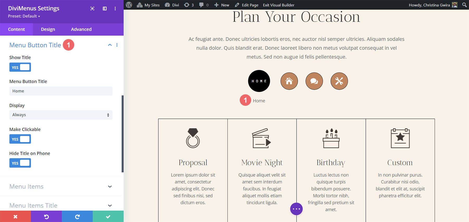
Menu Button Title adds a title to the menu icon. You can enter the text, choose when it displays, make it clickable, and hide it on phones.
Menu Items
The menu items can also be icons, images, or text. Icons are the default. This example shows an Image.
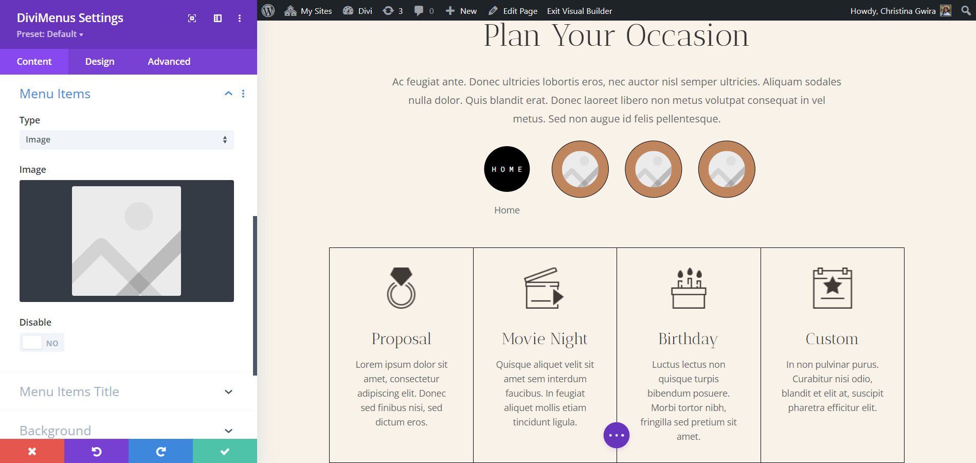
Once you select Image, the image settings open in the submodules, allowing you to specify an image for each menu item.
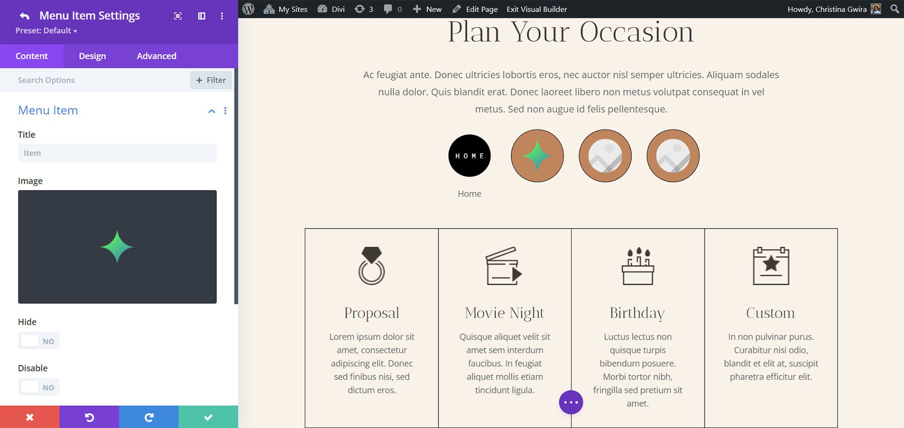
If you choose Text, each menu item displays the title you’ve given it.

Menu Items Title
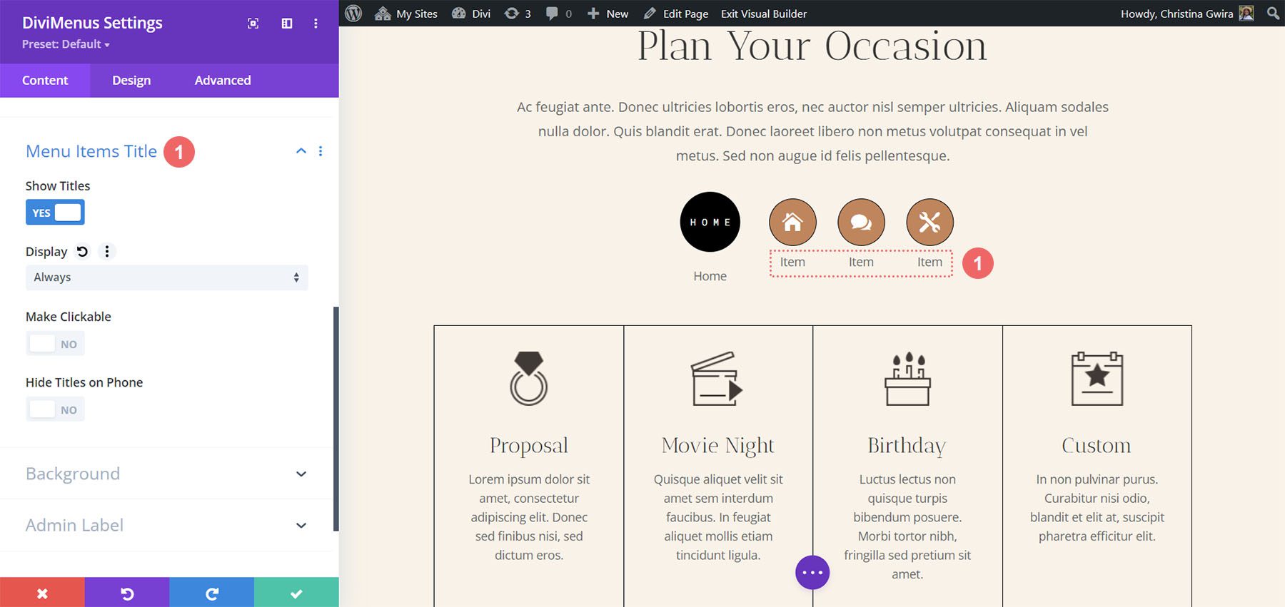
You can also show the menu item titles along with the icons and images. Choose to display them on hover or always. You can also make them clickable and hide them on phones. This setting did work for me in the Divi Visual Builder.
DiviMenus Design Settings
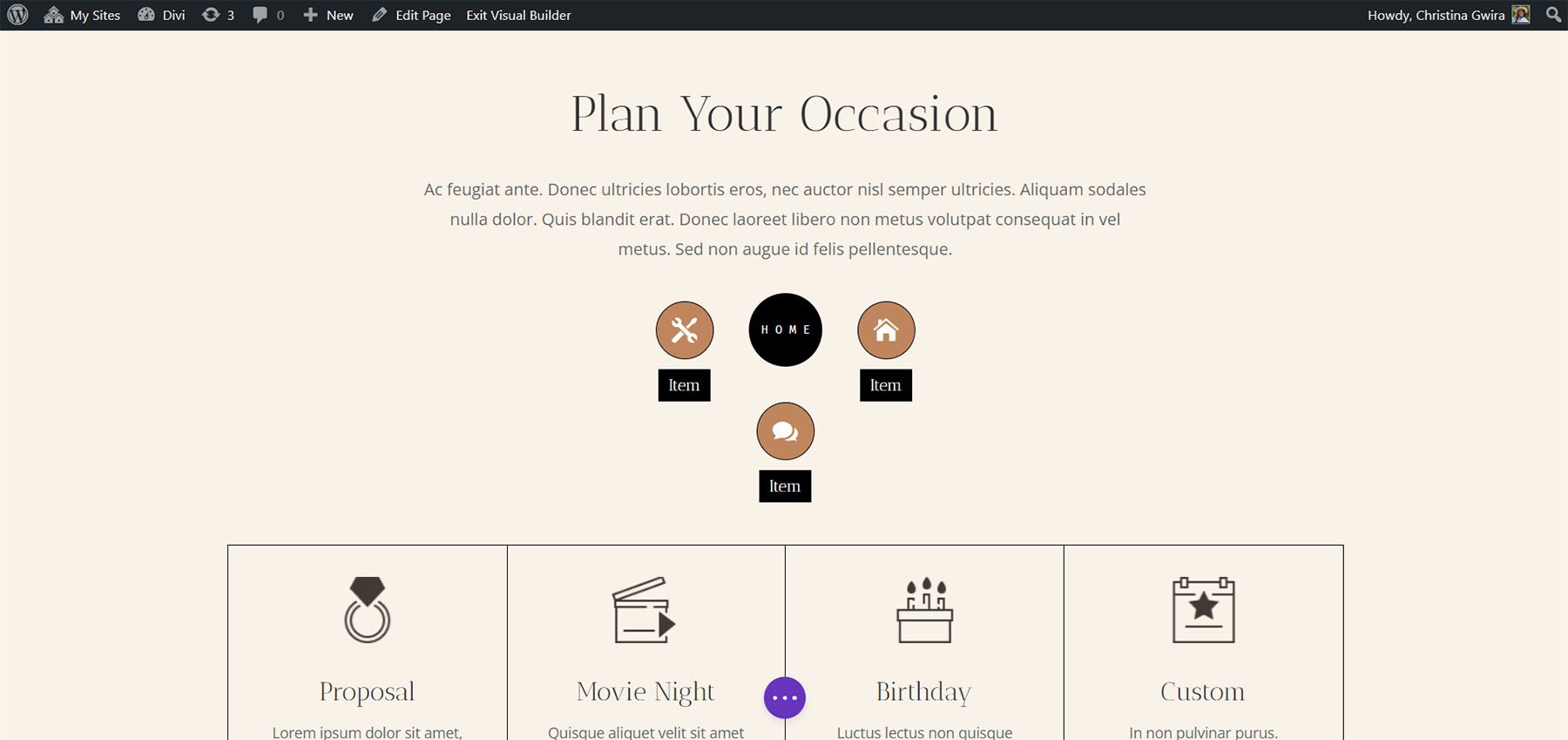
The Design tab includes settings for the main menu and the menu items. Adjust the sizes, icon and text colors, background colors, border shapes, border colors, choose the text alignment, add padding, etc. For the text alignment, set the text at the top, bottom, right, or left of the menu item. I’ve adjusted many of these settings in the example below to match our layout pack better.
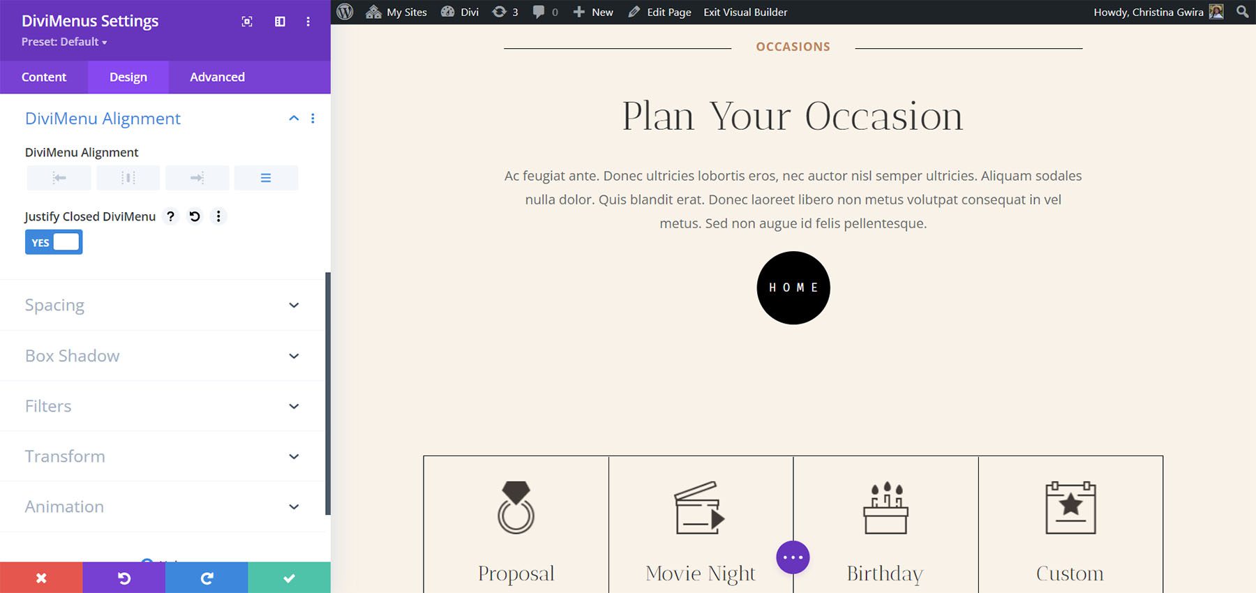
You can also adjust the DiviMenu alignment and choose to justify the closed DiviMenu, which will move the hamburger icon when the menu is closed. For this example, I’ve justified the closed DiviMenu. The menu icon moves to the center when the menu is closed. If you choose an alignment option, the menu icon remains in that location when closed.
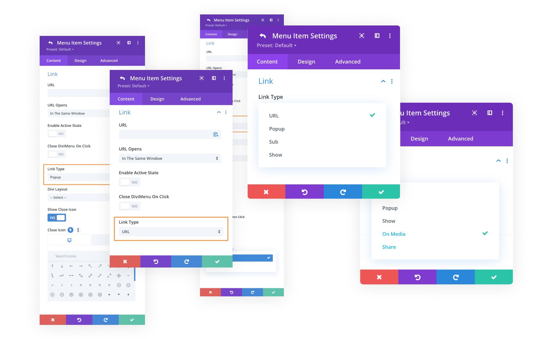
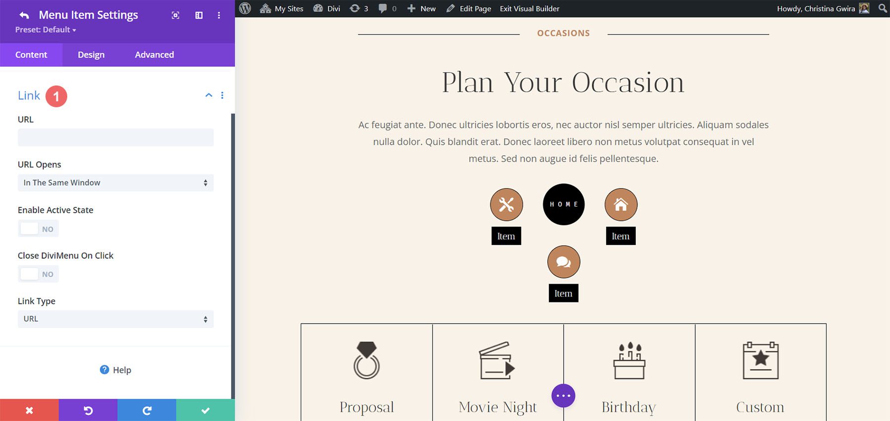
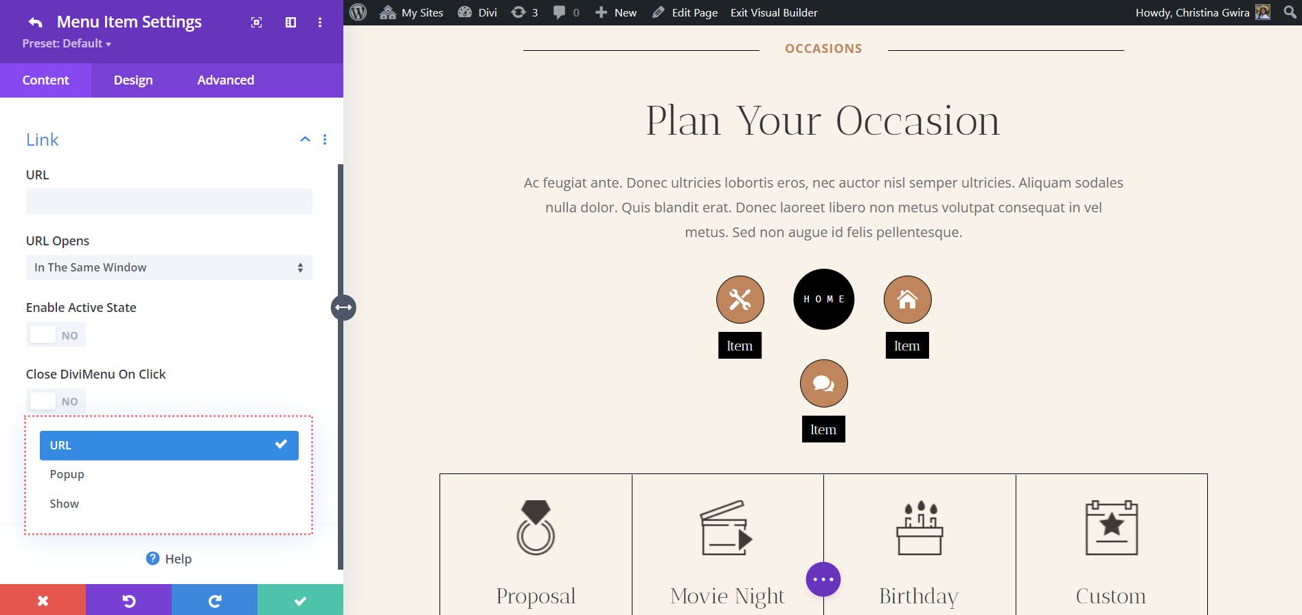
Each submodule contains a section for links. Here, you can specify the URL, how the URL opens, enable it as active, set it to close on click, and choose the link type.
Link Type
The link type allows us to create some interesting menus. This includes URL, Popup, and Show. URL opens the page you’ve entered as the URL.
Popup Link Type
The Popup link type lets you choose a layout from your Divi library to display when the menu item is selected. Have it show on hover, add a close icon, etc. I’ve chosen a layout called Contact Form to display on hover.
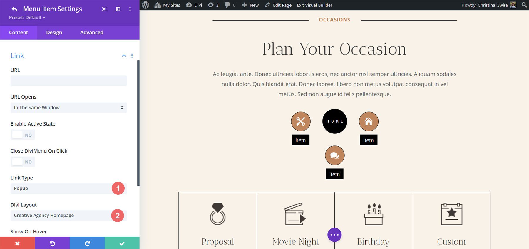
When the user hovers over the menu item, the homepage layout displays as a popup. You can style the popup in the Design tab.
Show Link Type
Show provides settings to show or hide elements. It includes CSS options to bind the elements and is a little more complicated than the other settings. It’s a good setting to use because you can create submenus. You just have to know the CSS IDs of the elements you want to show. You can also add classes to the elements.
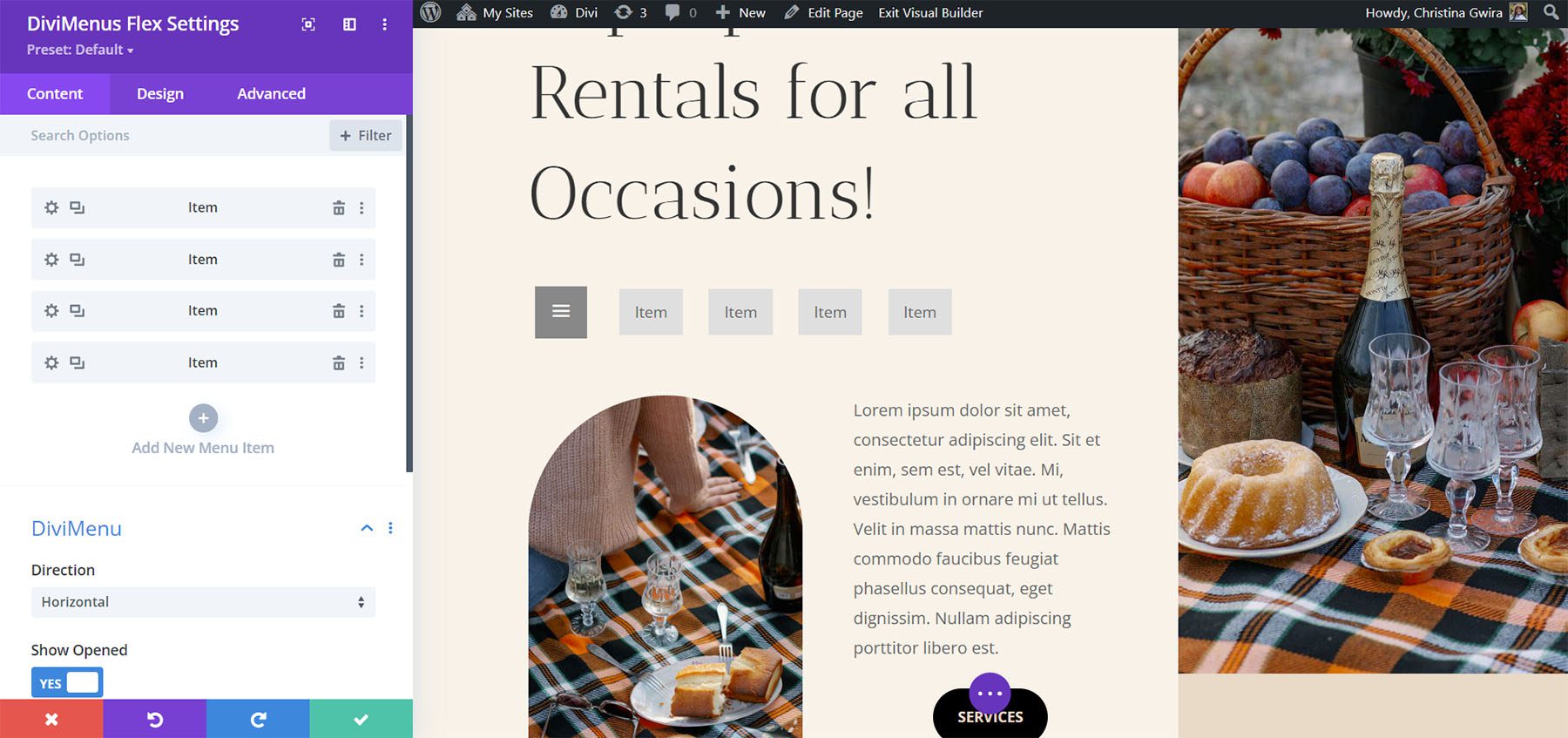
DiviMenus Flex is the newest module. It uses CSS flexbox and the new Sub Link Type to create mega menus and dropdown menus. It also works with WooCommerce and Easy Digital Downloads, and displays the number of items in the shopping cart. In this example, I’ve already added four menu items.
Submodules
The submodules create the menu items. Add a title, choose the content type, disable the click event, show the icon/image, and choose between hover and click options. It also includes link options to specify the URL and how it works, choose the link type to create popups and mega menus, or even show/hide any other element of your page content.
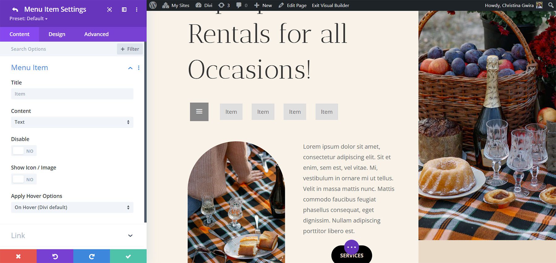
DiviMenus Flex Settings
The settings include direction and to show opened or closed. For the direction, select between horizontal and vertical. Horizontal is the default setting. I’ve selected Vertical in this example.
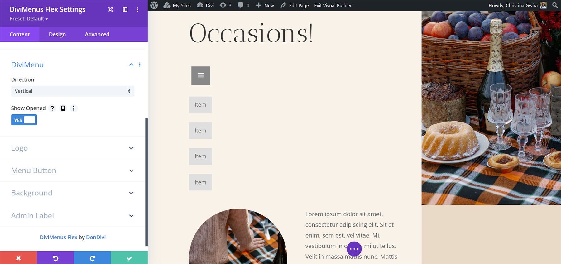
The logo settings let you add a logo to the menu. You can make it clickable and add the URL.
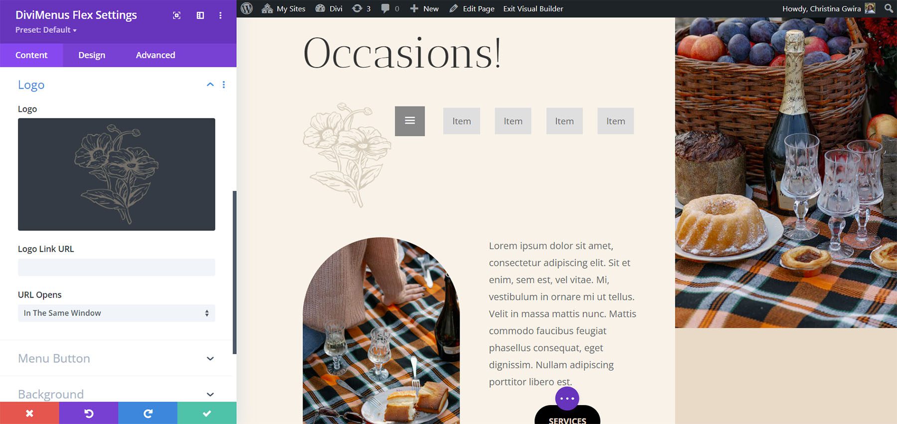
The menu button settings let you set the button’s position. Choose from first or last. You can also choose the content type. Select between icon, image, or text. Other options include hiding the button, disabling the button, and applying hover effects. Text provides a field where you can enter the text you want to display. I’ve added text and moved the button to last in this example.
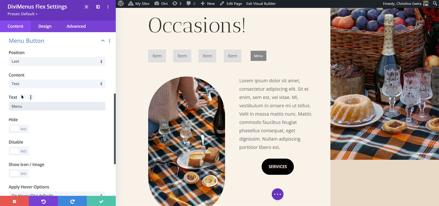
Text also includes an option to add an icon or an image to the button. Choose the icon or image, and the placement, add padding, hide the text on certain devices, hide the icon or image on certain devices, and apply hover options.
![]()
Design Settings
The Design settings include lots of new features. Set the horizontal and vertical alignment, make the menu items fullwidth, make the menu button fullwidth, and adjust the logo. The logo settings let you choose the logo placement, alignment, width, and absolute position. I’ve adjusted the fullwidth menu button and horizontal alignment settings for the example below.
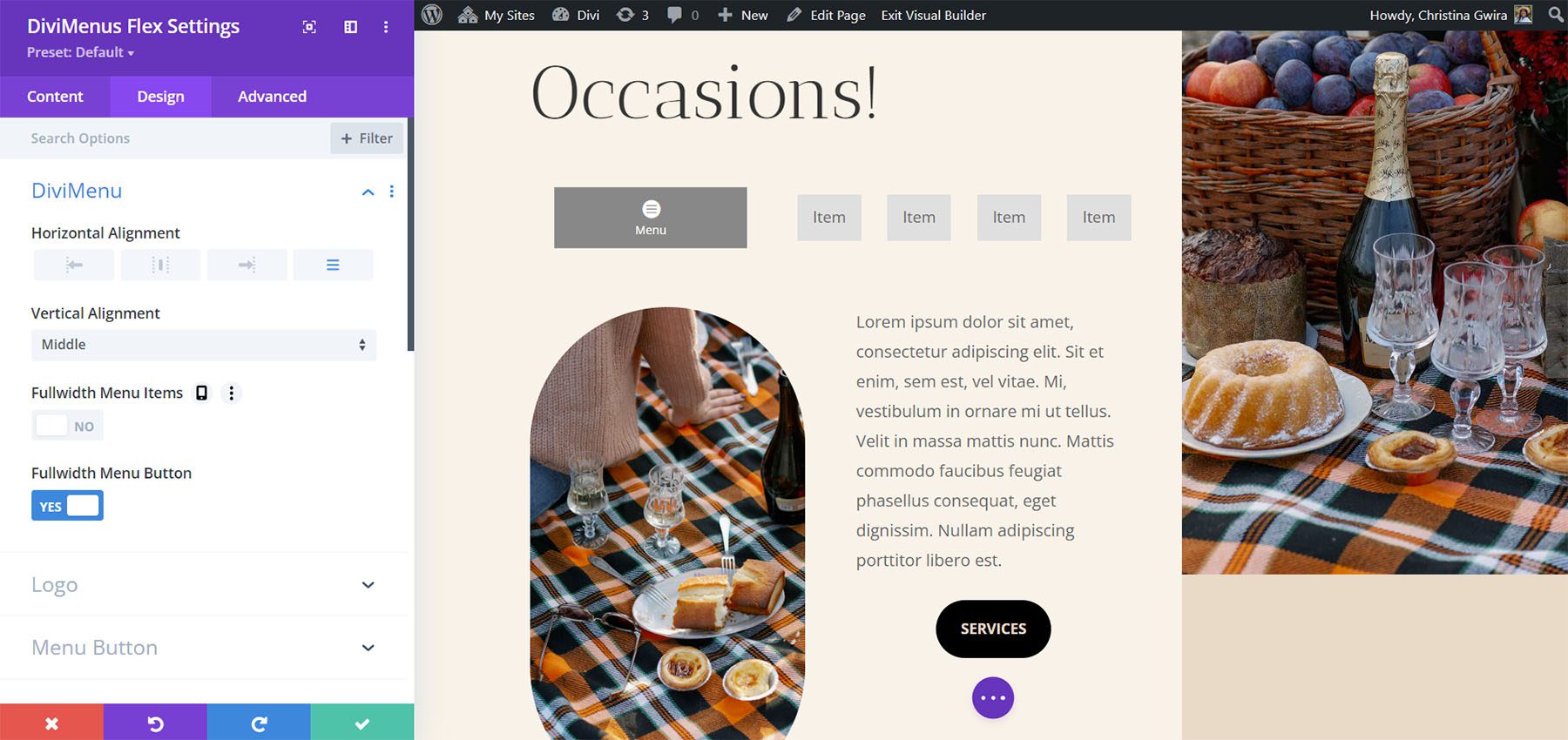
Adjust the colors, fonts, sizes, padding, position, and lots more. Adjust the menu button and menu items separately. The menu items follow the settings in the Design tab unless you’ve adjusted them in their submodules. For this example, I’ve added icons, and text to the menu items and then adjusted their background and font colors. I’ve adjusted the same settings for the button.

The link options in the menu item submodules let us use DiviMenus Flex to build regular menus, add dropdown menus, create popups, and build mega menus. The Link Type option does this for us. If we choose URL, the default setting, the menu works as normal. Add the link, choose how it opens, choose its active state, and choose how it closes.

Popup Link Type
The popup link type lets you choose a layout from your Divi Library to use as a popup. If you choose to show the close icon, you’ll see an icon picker.
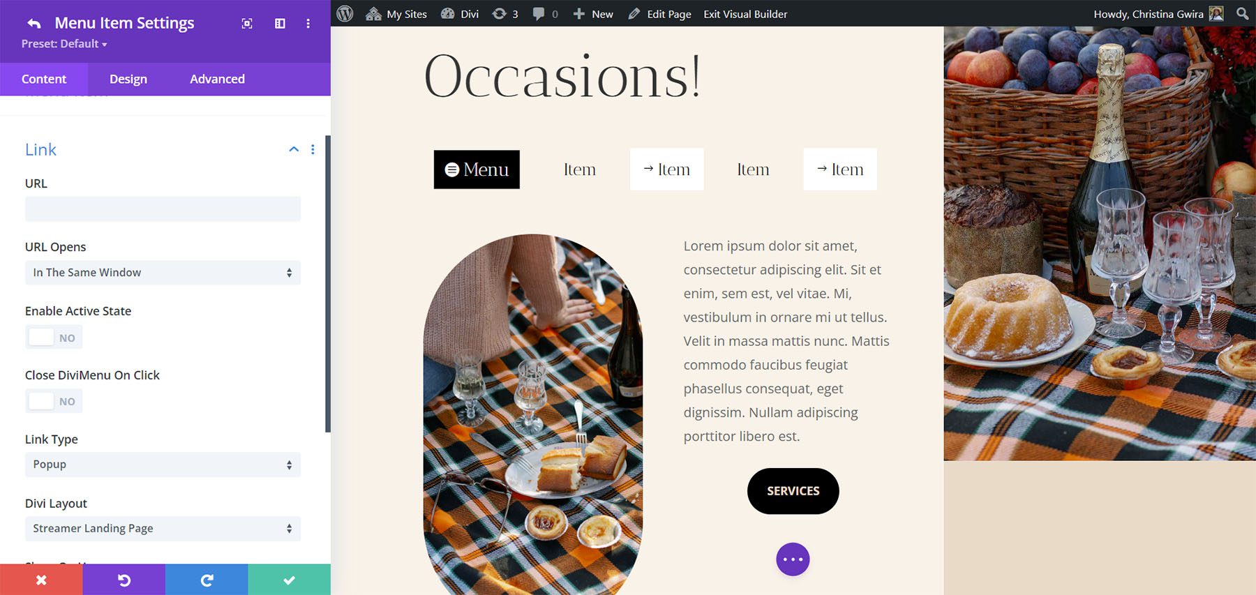
The Design tab adds options to style the popup, allowing you to apply customizable entrance and exit animations to enhance its visual effects.
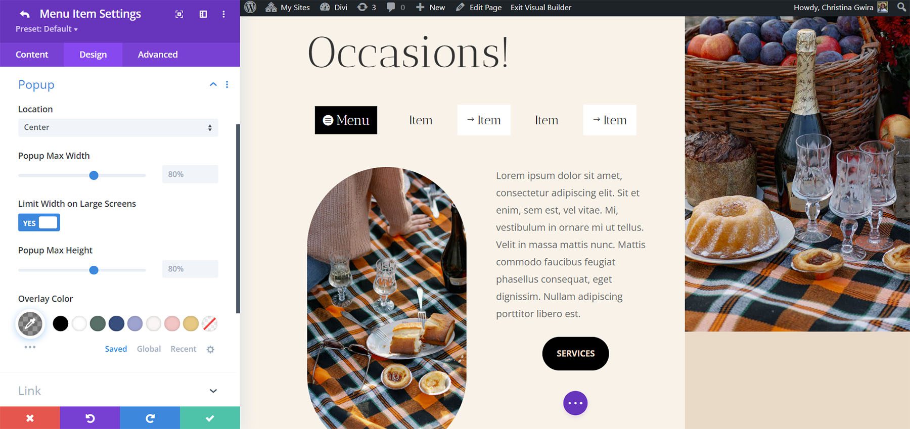
Sub Link Type
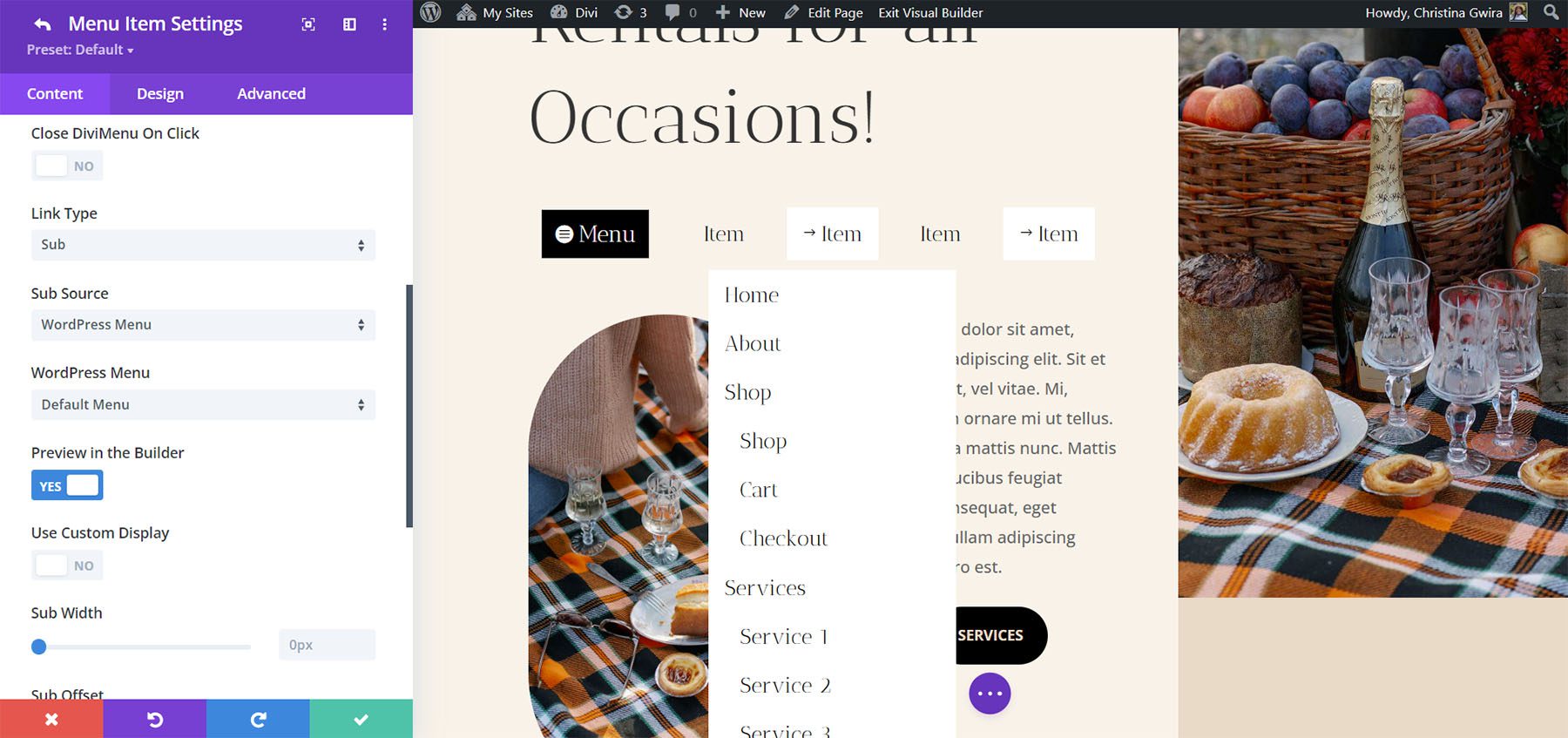
The Sub Link type is interesting. It lets you choose something to use as a dropdown menu. Choose from a WordPress menu or a Divi Library layout.

If you choose a WordPress menu, you can select the menu from those you’ve created. You can enable to preview it in the Builder, use a custom display, choose how the menu behaves, make it collapsible, enable accordion, show a direction arrow, choose the icon, etc. This is great for creating custom menus that also use the standard WordPress menus. You’ll need to create a different menu for each one of the menu items where you want to display a WordPress menu.
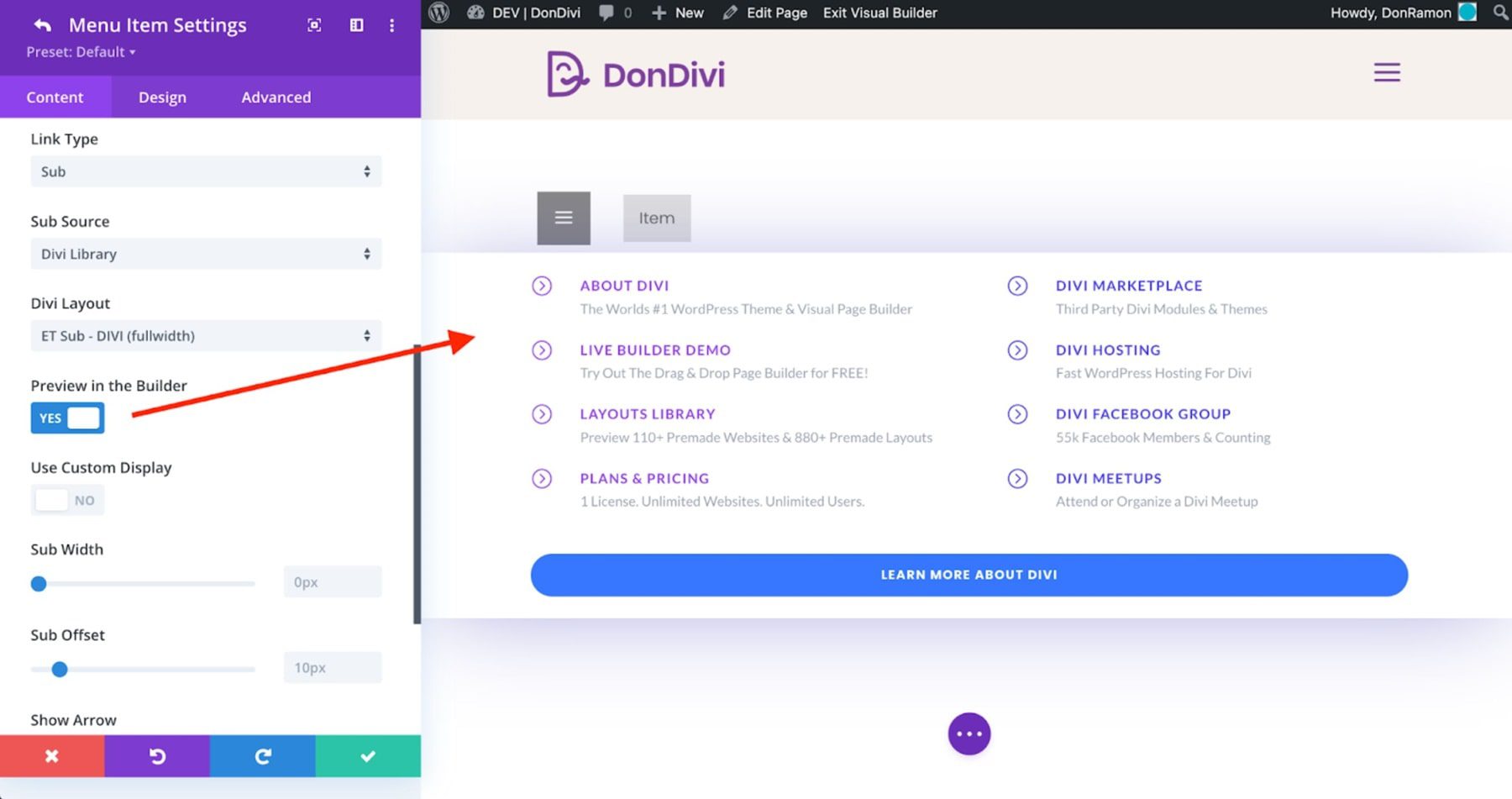
If you choose Divi Library, you can select the layout to display. This allows you to use Divi layouts as mega menus. To enhance your editing experience, you have the option to enable the “Preview in the Builder” feature. This allows you to view the selected Divi layout within the Divi Builder itself, providing a glimpse of how it will appear outside of the builder. It’s worth noting that certain styles may appear slightly different due to the specific elements within the layout. However, this preview feature serves as a helpful aid, and the final result will be accurately displayed on the frontend.
Show Link Type
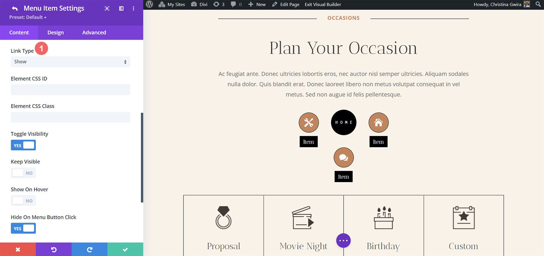
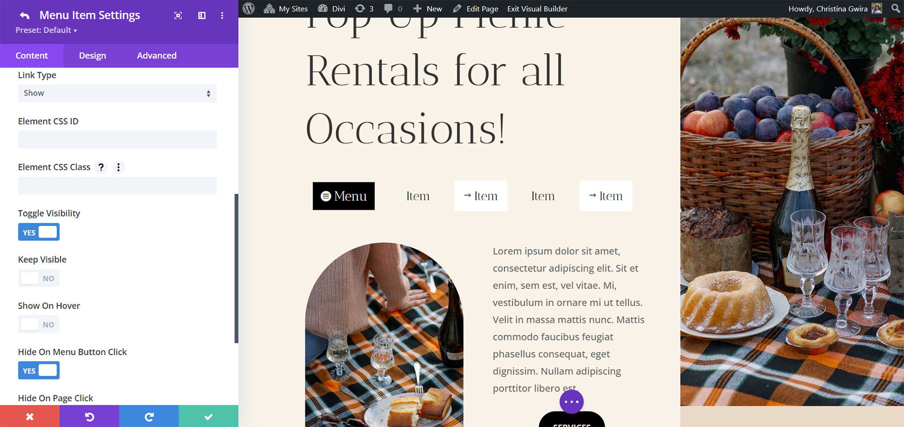
DiviMenus Flex also includes the Show link type that will show elements based on the CSS IDs or CSS Class you’ve included. Toggle the visibility, keep it visible, show on hover, hide on button click, hide on page click, and choose the initial state on page load. For example, when clicking on a menu item, you can reveal a specific element with a unique CSS ID, or simultaneously reveal multiple elements on your page with the same CSS Class.
DiviMenus is available in the Divi Marketplace for $49. It includes unlimited usage and one year of support and updates and comes with a 30-day money-back guarantee.
Ending Thoughts
That’s our look at DiviMenus. This is a powerful menu builder. I’ve only scratched the surface of what DiviMenus can do. I like that it now includes two modules and adds a logo, the ability to use WordPress menus as submenus, and the ability to easily create mega menus with Divi layouts. I found it intuitive, and it includes all the style options to customize every element of the menu. If you’re interested in a powerful menu builder, DiviMenus is worth a look.
We want to hear from you. Have you tried DiviMenus? Let us know what you think about it in the comments.



I’ve been using this plugin for years, and now it’s a must for every website I develop. It’s powerful and easy to use, and not only for main menu, but you can also create floating menus that are activated on click, and work great in mobile websites. And you won’t find a better support! Ramon is a person who is always willing to help, even recording videos to show you how to fix the problem. Grande Ramón!
Can you do mobile menus with this ? I read that 60% of all users come from a mobile device but it seems to
Be an afterthought with divi
Thank you Ruben! 😍 Gracias!
Wow, I must say, DIVI plugins have been an absolute game-changer for my web design projects! The versatility and ease of use they bring to the DIVI theme are unmatched.
It’s very helpful for me. Although it looks pretty, I really wish some of these mega plugin authors considered accessibility as a priority or even a consideration. While almost every country has some sort of accessibility guidelines, none of these developers seem to give a single thought to accessibility. Navigation is pretty important.
This looks so cool! I will definately give this a closer look. It looks like, this plugin can give a webdesign a completely different look.
Thank you Anders! 😍 Happy building!
WOW… $63.75 and that is yearly ROFLMAO…. all in with addon’s because everything that is shown here is not everything you get unless you buy the DiviMenus and a few additional addons… for a little menu tool…. if that doesn’t make you learn to code not sure what well…
Hi Noah, I’m afraid you’re wrong… DiviMenus costs $49 (even cheaper by taking advantage of the current Cyber Monday offer) and includes unlimited website usage, 1 year of support, updates, and premium layouts. Everything shown in this post is made only by using the DiviMenus module, without any other additional add-ons, although of course you can get even more amazing functionalities by expanding DiviMenus as Randy explains at the end of the post … But you are right, after all DiviMenus is just a tool to make work easier for many web designers, and end customers, since they can edit all this from just 1 module in the Visual Builder…, and you simply prefer to do all this with code instead. Great, isn’t it?
The coffee menu is adorable!
For everyday use I tried a lot of Divi Menu plugins so far and all had their weaknesses.
I wish Divi would come with some more menu options itself. Especially the mobile menus!
Thank you Judith! Divi is better and more powerful every day, and surely very soon it will amaze us again with what you say and we all hope too! 🥳 Meanwhile from DonDivi we create tools that make waiting easier! 🙃
I have used Divi Plugins and Themes for a long time now. And I must say the plugins and the tools and even the demos are satisfactory.
Thanks for sharing a review.
Although it looks pretty, I really wish some of these mega menu/ Divi menu plugin authors considered accessibility as a priority or even a consideration. While almost every country has some sort of accessibility guidelines, none of these developers seem to give a single thought to accessibility. Navigation is pretty important.
In Canada we have AODA, which stipulates heavy fines for websites that are not WCAG 2.0 compliant as of January 2021. Divi’s menu isn’t currently 100% compliant as it is, I can’t even consider adding something that decreases accessibility even further.
Hi Mike,
There is a Divi Plugin called Divi Accessibility in the WordPress repo that takes care of some of the issues https://wordpress.org/plugins/accessible-divi/
That plugin is unavailable — since 2019.
💜 T H A N K · Y O U 💜
Really proud to read this great review of our DiviMenus plugin on ET Blog. Thanks Randy!. More stunning features coming soon! 🥳
+1 ❤️👍